Skip to content
Material Design 2
Main Navigation
v3
v2
v1

English

简体中文
繁體中文
Español
Français
Русский
Português – Brasil
Deutsch
日本語
한국어
Italiano
Polski
Türkçe
čeština
magyar

English

简体中文
繁體中文
Español
Français
Русский
Português – Brasil
Deutsch
日本語
한국어
Italiano
Polski
Türkçe
čeština
magyar

Appearance

Sidebar Navigation

Material System

Introduction

Material studies

About our Material studies

Basil

Crane

Fortnightly

Owl

Rally

Reply

Shrine

Material Foundation

Environment

Surfaces

Elevation

Light and shadows

Layout

Understanding layout

Pixel density

Responsive layout grid

Spacing methods

Component behavior

Applying density

Navigation

Understanding navigation

Navigation transitions

Search

Color

The color system

Applying color to UI

Color usage

Text legibility

Dark theme

Typography

The type system

Understanding typography

Language support

Sound

About sound

Applying sound to UI

Sound attributes

Sound choreography

Iconography

Product icons

System icons

Animated icons

Shape

About shape

Shape and hierarchy

Shape as expression

Shape and motion

Applying shape to UI

Motion

Understanding motion

The motion system

Speed

Choreography

Customization

Interaction

Gestures

Selection

States

Communication

Confirmation & acknowledgement

Data formats

Data visualization

Empty states

Help & feedback

Imagery

Launch screen

Onboarding

Offline states

Writing

Machine learning

Machine learning patterns

Object detection: live camera

Object detection: static image

Barcode Scanning

Material Guidelines

Material Theming

Overview

Implementing your theme

Usability

Accessibility

Bidirectionality

Platform guidance

Android bars

Android fingerprint

Android haptics

Android icons

Android navigating between apps

Android notifications

Android permissions

Android slices

Android split-screen

Android swipe-to-refresh

Android text selection toolbar

Android widget

Cross-platform adaptation

Components

App bars: bottom

App bars: top

Backdrop

Banners

Bottom navigation

Buttons

Buttons: floating action button

Cards

Checkboxes

Chips

Data tables

Date pickers

Dialogs

Dividers

Image lists

Lists

Menus

Navigation drawer

Navigation rail

Progress indicators

Radio buttons

Sheets: bottom

Sheets: side

Sliders

Snackbars

Switches

Tabs

Text fields

Time pickers

Tooltips

On this page

The type system ​

Use typography to present your design and content as clearly and efficiently as possible.

Type scale ​

The Material Design type scale includes a range of contrasting styles that support the needs of your product and its content.

The type scale is a combination of thirteen styles that are supported by the type system. It contains reusable categories of text, each with an intended application and meaning.

Type scale generator ​

Powered by Google Fonts, the type scale generator is a tool for creating type scales and corresponding code. Any font you choose is automatically resized and optimized based on Material typography guidance for readability.

Select a category in the type scale to view the font’s details. Adjust your font choice through the menus on the right.

Example type scale ​

This example type scale uses the Roboto typeface for all headlines, subtitles, body, and captions, creating a cohesive typography experience. Hierarchy is communicated through differences in font weight (Light, Medium, Regular), size, letter spacing, and case.
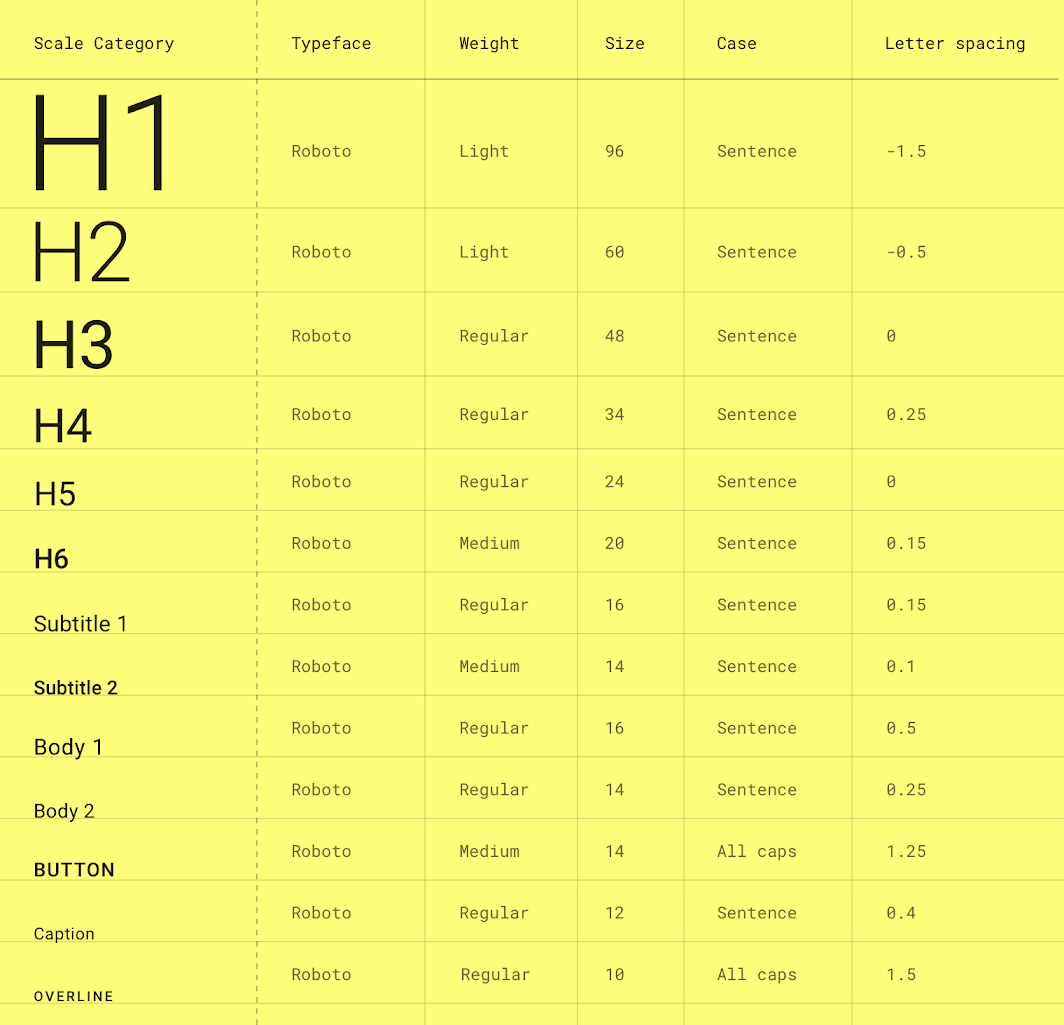
The Material Design type scale
The Material Design type scale. (Letter spacing values are compatible with Sketch.)

Download this Roboto type scale using type styles in Sketch.

Download Roboto Type scale

Font size units ​

The following units are used to express font size on Android, iOS, and the web.

PlatformAndroidiOSWeb
Font size unitspptrem
Conversion ratio1.01.00.0625

Example conversions

AndroidiOSWeb
10sp10pt0.625rem
12sp12pt0.75rem
24sp24pt1.5rem
60sp60pt3.75rem

Web browsers calculate the REM (the root em size) based on the root element size. The default for modern web browsers is 16px, so the conversion is SP_SIZE/16 = rem.

Letter spacing units ​

The following units are for spacing letters in a UI.

PlatformAndroidiOSWeb
Letter spacing unitemptrem
Conversion ratio(Tracking from Sketch / font size in sp) = letter spacing1.0(Tracking from Sketch / font size in px) = letter spacing

Letter spacing examples

AndroidiOSWeb
(.2 tracking / 16sp font size) = 0.0125 em-0.1 pt(.2 tracking / 16px font size) = 0.0125 rem

Applying the type scale ​

The type scale appears as text in components and the overall layout. Type attributes can use custom values for the typeface, font, case, size, and letter spacing.
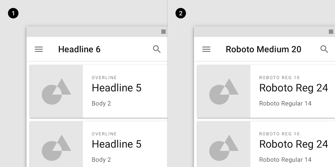
Diagram of scale categories, actual values
1. Scale categories
2. Actual values

Headlines ​

In the type scale, headlines span from a range of 1 through 6. Headlines are the largest text on the screen, reserved for short, important text or numerals.

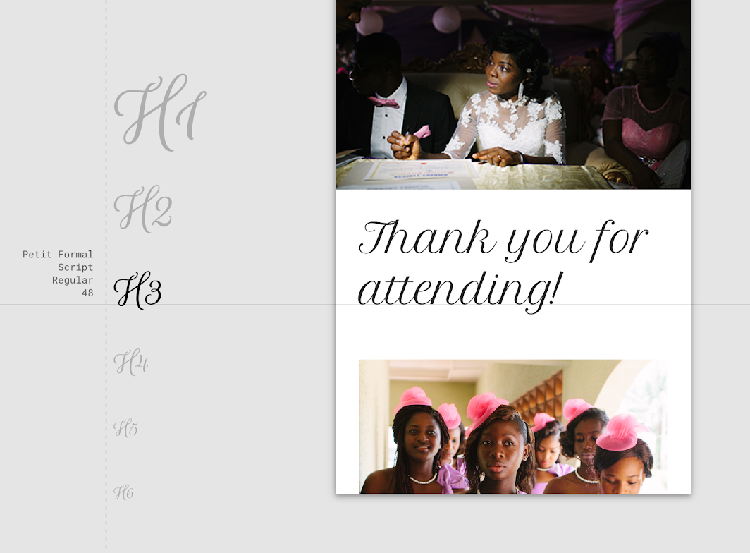
For headlines, you can choose an expressive font, such as a display, handwritten, or script style. These unconventional font designs have details and intricacy that help attract the eye.
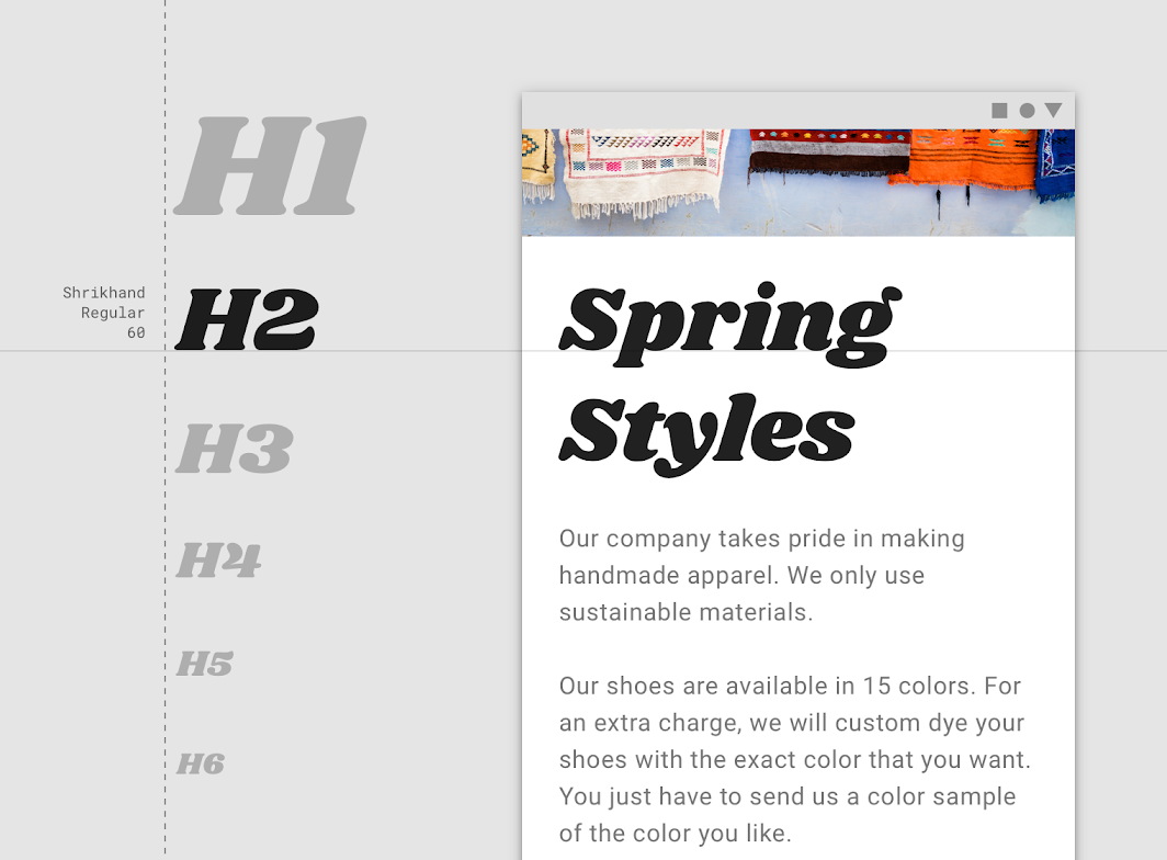
A display style is used for Headline 2
A display style is used for Headline 2.

A script style is used for Headline 3
A script style is used for Headline 3.

Serif or sans serif typefaces work well for headlines, especially at smaller sizes.
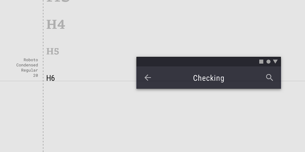
A sans serif is used for Headline 6
A sans serif is used for Headline 6.

Expressive fonts

A collection of expressive display and handwriting fonts available on Google Fonts.

Related link

Subtitles ​

Subtitles are smaller than headlines. They are typically reserved for medium-emphasis text that is shorter in length. Serif or sans serif typefaces work well for subtitles.
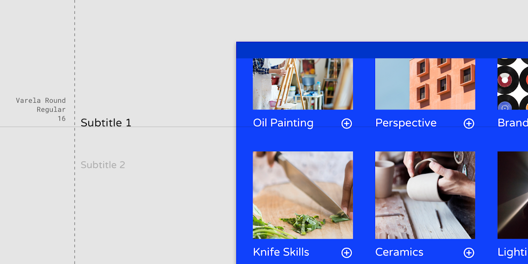
A sans serif typeface is used for Subtitle 1
A sans serif typeface is used for Subtitle 1.

For subtitles, use caution when using expressive fonts, including display, handwritten, and script styles.
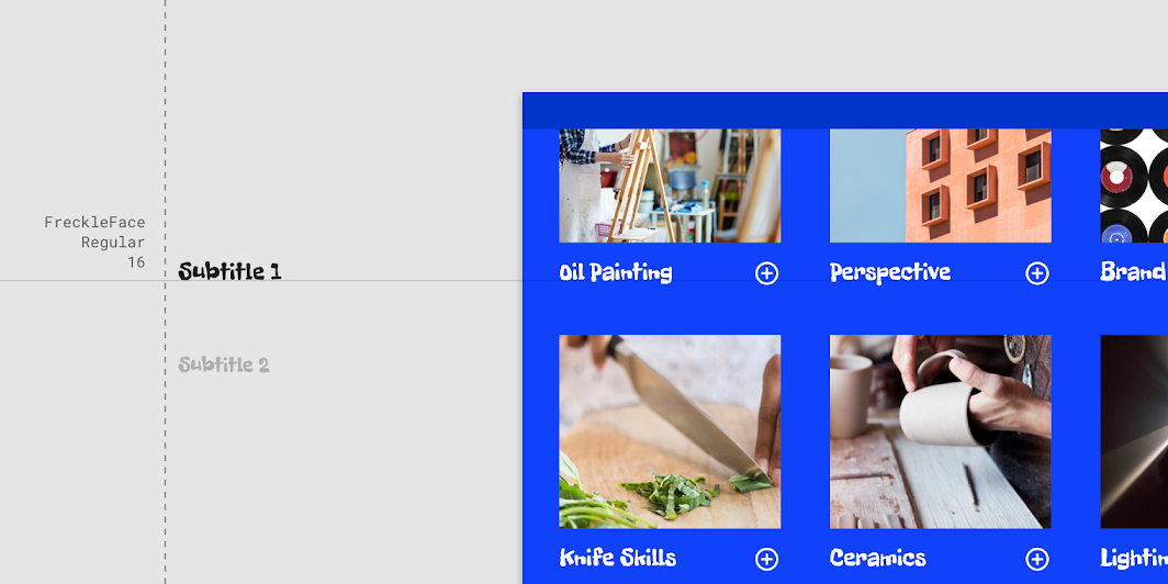
Caution: use caution when using expressive fonts for subtitles

Caution

Use caution when using expressive fonts for subtitles.

Sans Serif fonts

A collection of sans serif fonts available on Google Fonts.

Related link

Body ​

Body text comes in ranges 1-2, and it’s typically used for long-form writing as it works well for small text sizes. For longer sections of text, a serif or sans serif typeface is recommended.
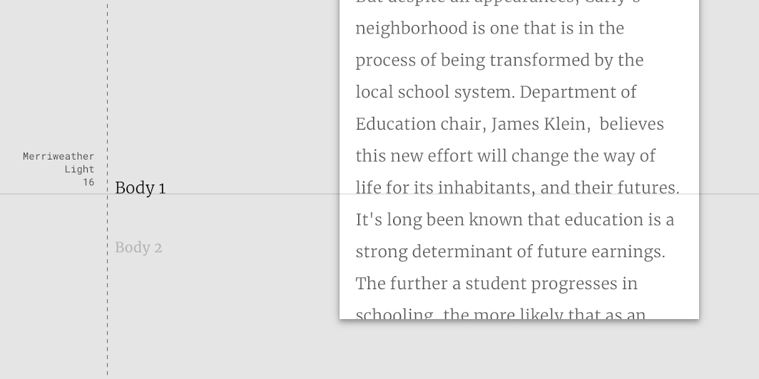
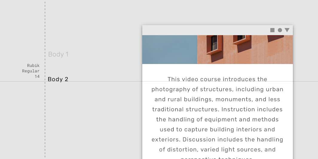
A serif typeface is used for Body 1
A serif typeface is used for Body 1.

A sans serif typeface is used for Body 2
A sans serif typeface is used for Body 2.

Don’t use expressive fonts, including display, handwritten, and script styles for body copy.
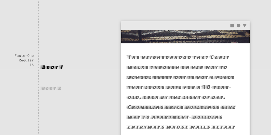
Don’t use expressive fonts for body text

Don't

Don’t use expressive fonts for body text.

Serif fonts

A collection of serif fonts available on Google Fonts.

Related link

Caption and overline ​

Caption and overline text (text with a line above it) are the smallest font sizes. They are used sparingly to annotate imagery or to introduce a headline.
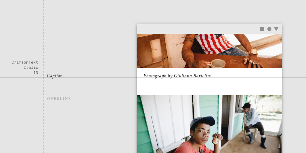
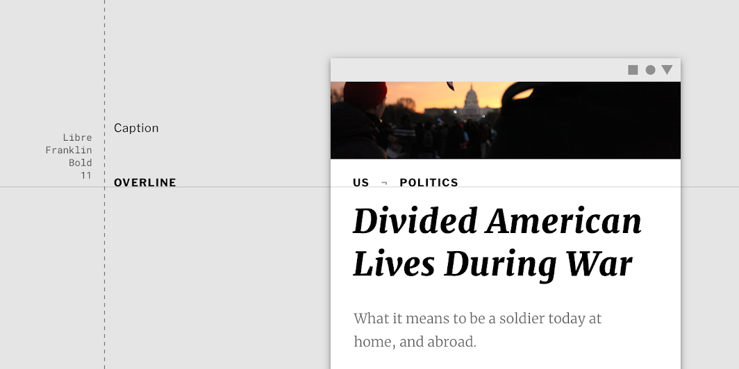
A serif typeface being used for a caption
A serif typeface being used for a caption.

A sans serif typeface being used for an overline
A sans serif typeface being used for an overline.

Don’t use expressive fonts, including display, handwritten, and script styles for caption or overline.
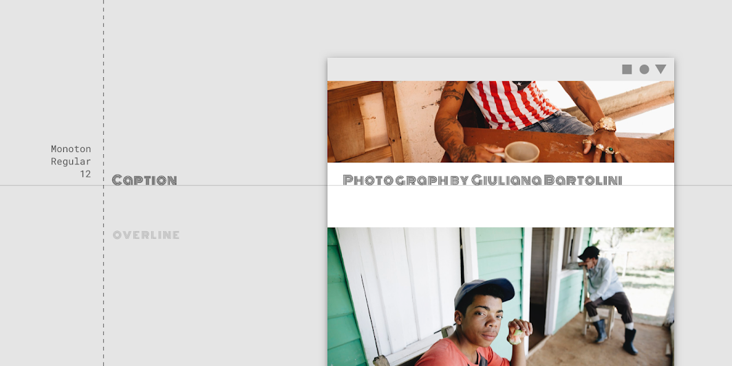
Don’t use expressive fonts for an overline

Don't

Don’t use expressive fonts for an overline.

Serif fonts

A collection of serif fonts available on Google Fonts.

Related link

Button ​

Button text is a call to action used by different types of buttons (such as text, outlined and contained buttons) and in tabs, dialogs, and cards.

Button text is typically an all caps sans serif.
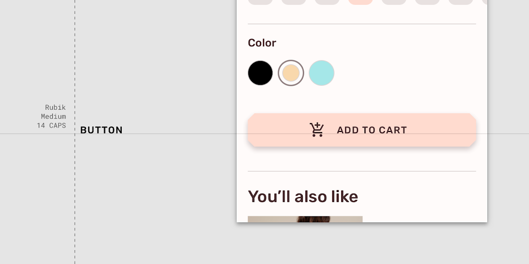
An all caps sans serif typeface being used for a button
An all caps sans serif typeface being used for a button.

Button text can be sentence case, sans serif, or serif.
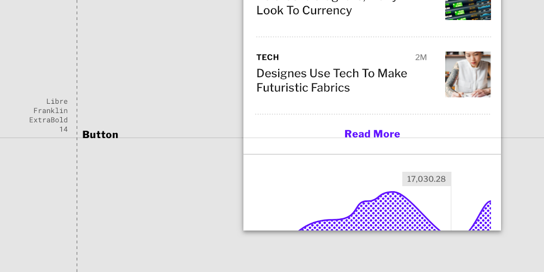
Caution: use caution when having button text appear distinct from non-interactive text

Caution

Use caution when having button text appear distinct from non-interactive text, such as this upper lower, sans serif typeface on a button.

Don’t use expressive fonts as button text, including display, handwritten, and script styles.
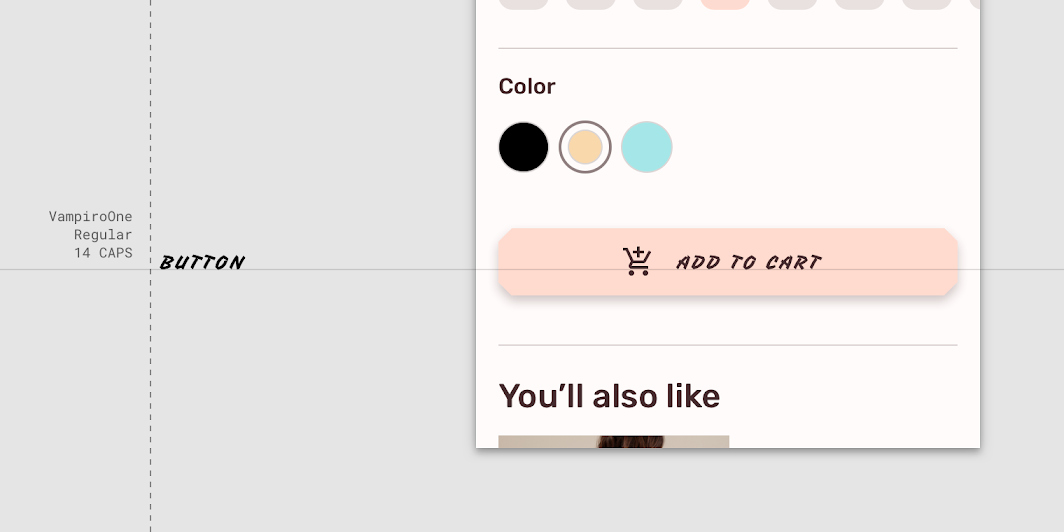
Don’t use a display style for button text

Don't

Don’t use a display style for button text.

Sans Serif fonts

A collection of sans serif fonts available on Google Fonts.

Related link

Pager
Previous pageDark theme
Next pageUnderstanding typography

Released under the Apache-2.0

Copyright © 2018-Present Google

https://m2.material.io/design/typography/the-type-system.html

Released under the Apache-2.0

Copyright © 2018-Present Google