

Crane
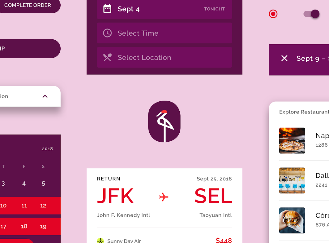
Crane is a travel app that uses Material Design components and Material Theming to create a personalized, on-brand experience.
About Crane
Crane is a travel app that helps users find and book travel, lodging, and restaurant options that match their input preferences. The Crane app is both functional (used for booking reservations) and informative (allowing users to explore and learn about new experiences).
Crane’s brand is refined and expressive, with an attention to visual and motion details that create an experience that feels tailor-made to the user.
Flexible aesthetic
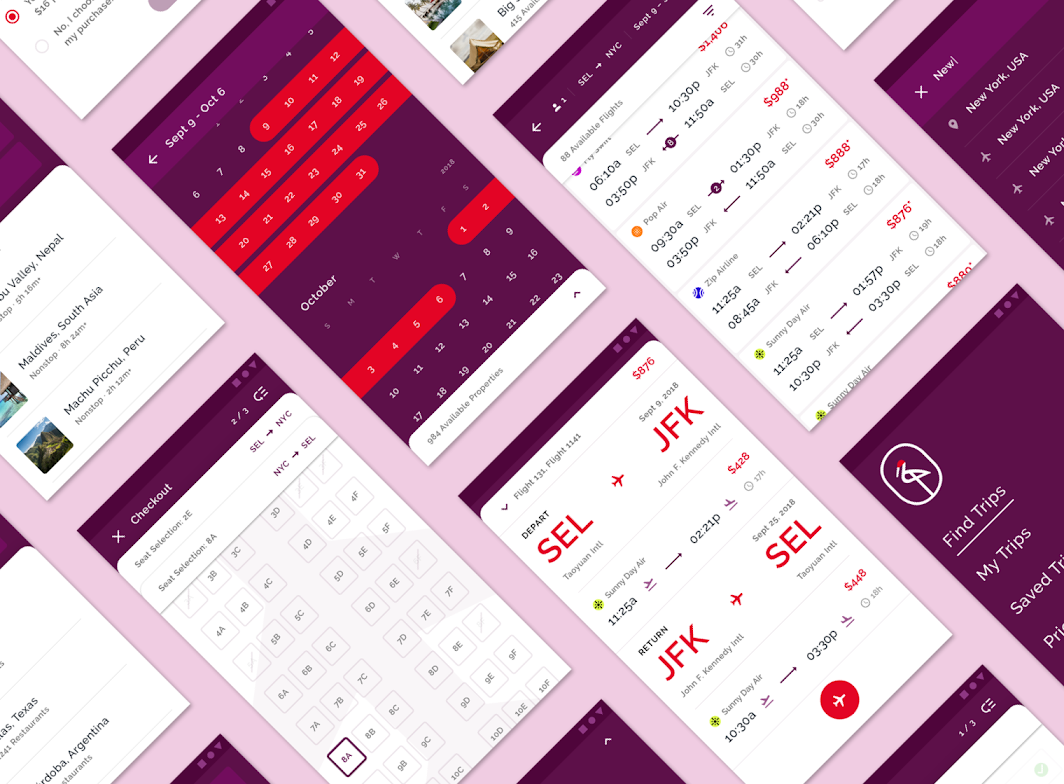
Along with being both functional and informative, the Crane app provides a variety of filters to customize content so it's relevant to the user.
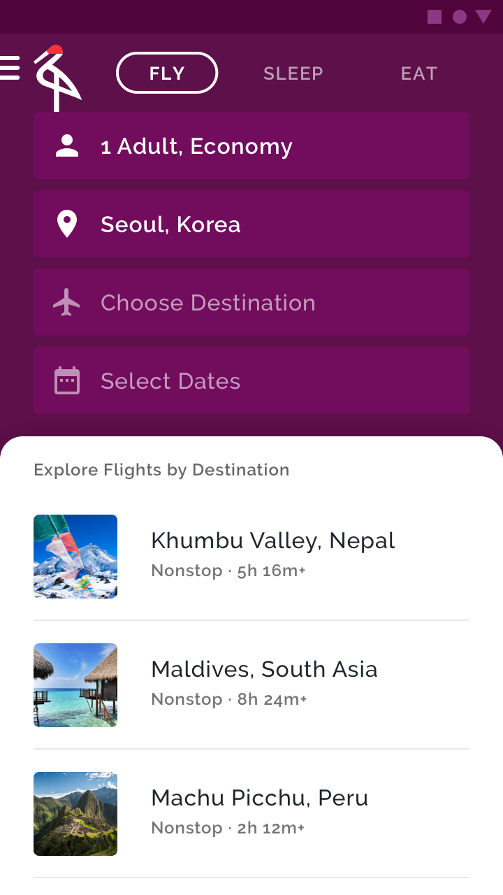
To make it easy for users to understand this flexibility, interactions are centered around the use of a backdrop component. Changes to preferences or filters on the backdrop's back layer immediately update content found on the front layers of the backdrop. For example, when a user is looking for a flight on Crane, they input information such as destination and dates on the back layer. After inputting this information, flights that fit their preferences are shown in the front layer. This interplay reinforces how Crane tailors its content to the preference of the user, presenting options in a way that is both bold and classy, direct but respectful.
Product architecture
The Crane app's information architecture uses a flow structure. A flow structure is a task-based structure, requiring screens to be accessed in consecutive order.
A flow structure is best for Crane because it provides the flexibility needed for users interested in exploring filtered content, by making them actionable so they can book a specific choice.
Main sections
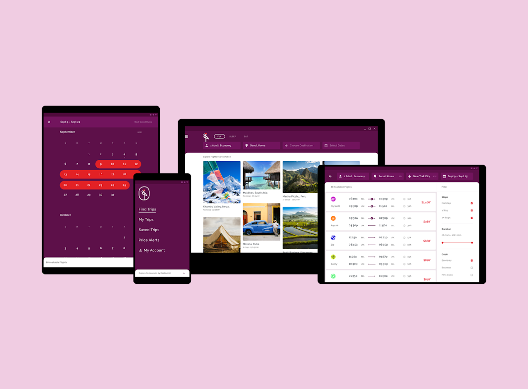
The Crane app has three main sections:
- Fly
- Sleep
- Eat
Navigate to these main sections by using the tabs along the top of the screen.
These tabs are nested in the back layer of a backdrop component, which also contains relevant filters and contextual actions.
Content filtering
Users can quickly customize Crane's content according to their preferences. The back layer contains controls that affect the content displayed on the front layer, allowing users to view content customized for them.
Layout
Grid system
Crane uses a responsive grid system, which has flexible columns and padding that can resize depending on the screen width (such as mobile, tablet, and desktop). Content is stacked in columns, which vertically expand and contract upon user interaction.
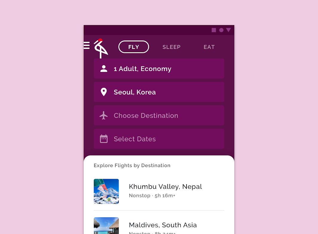
Tabs and backdrop (mobile)
Because of limited screen space, each backdrop item stacks vertically on top of the others.
Tabs and backdrop (tablet)
Since tablets have more screen space than mobile, there is enough horizontal room to place backdrop items next to one other.
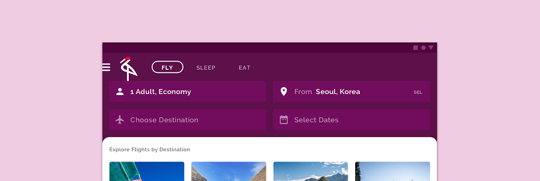
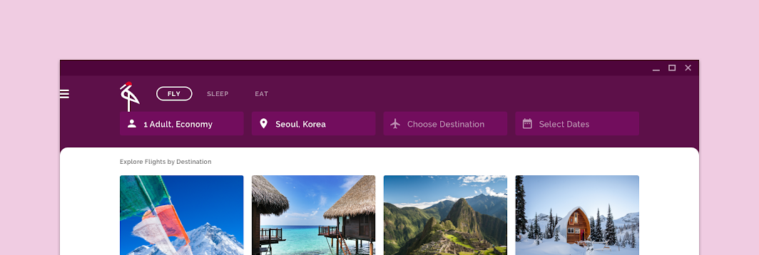
Tabs and backdrop (desktop)
Because there is more screen space on a desktop than on a tablet, there is enough space for all backdrop items to be placed next to one another, horizontally.
Elevation
Using color
Crane's UI uses color to express elevation differences between elements, rather than shadows. For example, cards show the boundaries of their containers by having a color distinct from the background, without casting shadows.
The backdrop shadow
The one instance that Crane uses shadow to express elevation is when content scrolls in the front layer of the backdrop component. In this case, the default behavior of the backdrop remains in place, producing a shadow to separate the front layer subheader from the content scrolling behind it.
Color
Color theme
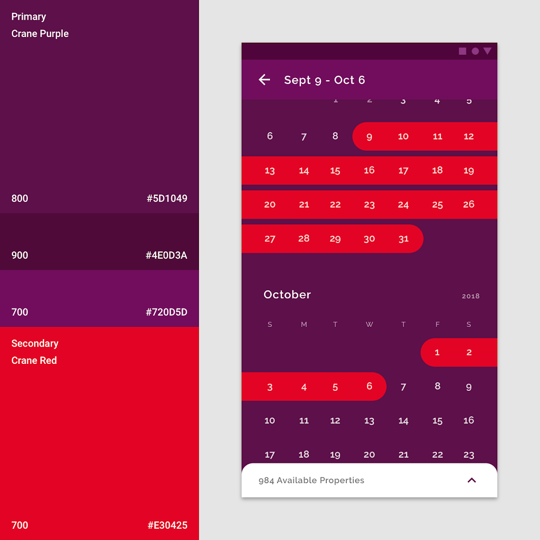
Primary color
Crane's primary color is purple. It uses three variations of this color to distinguish different UI elements.
Secondary color
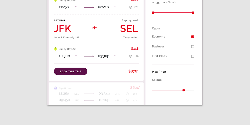
Crane's secondary color is red, which it uses to highlight selected items.
Distinct elements and states
Not all screens need to use the secondary color. Variations of Crane's primary color purple are sufficient to create distinction between elements. Since Crane's secondary color red is often used for selected states, its absence is helpful in indicating when no selection has been made.
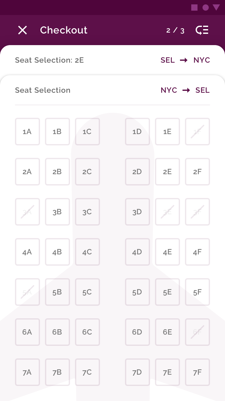
Crane's secondary color red is used to indicate selected states for components such as checkboxes, sliders, and radio buttons. Red can also be used to give typographic emphasis.
Alternative error color
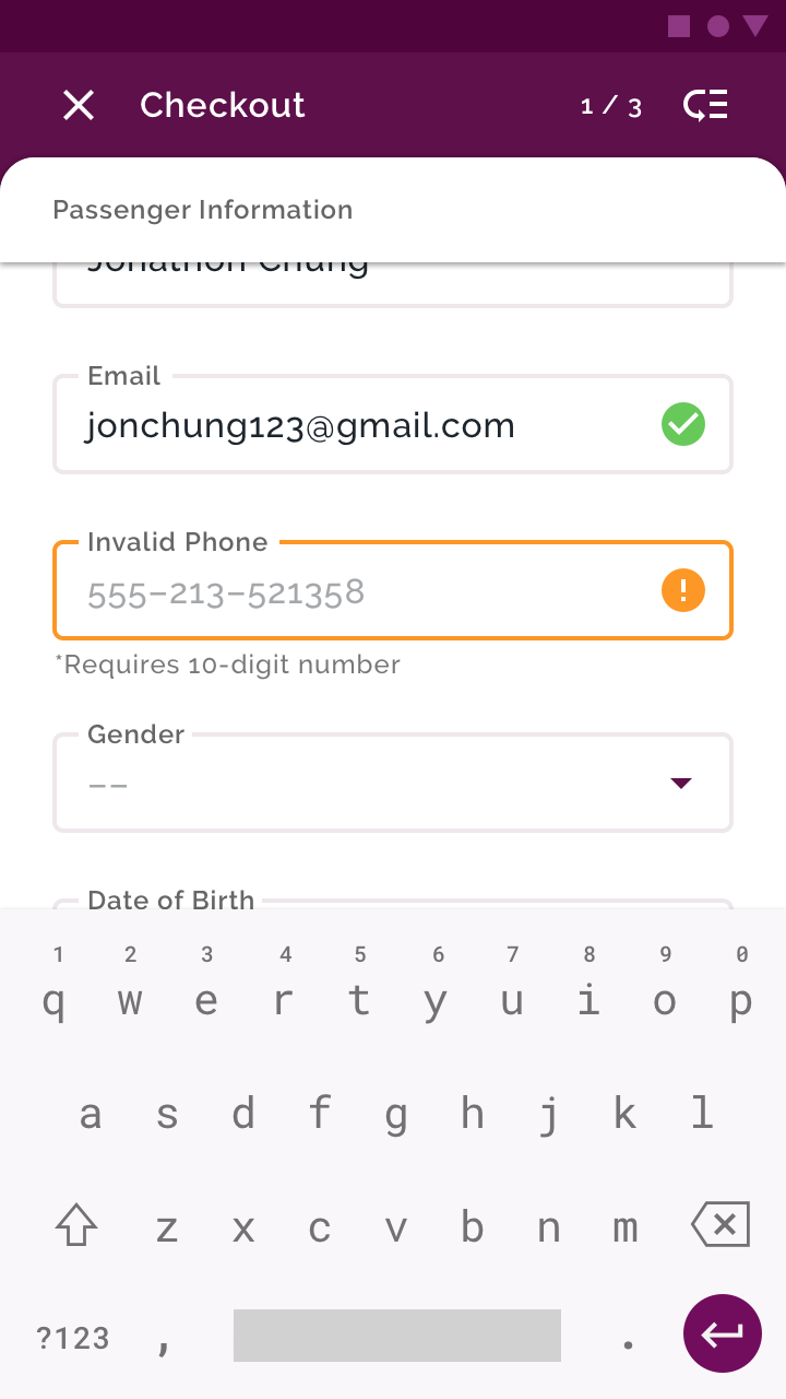
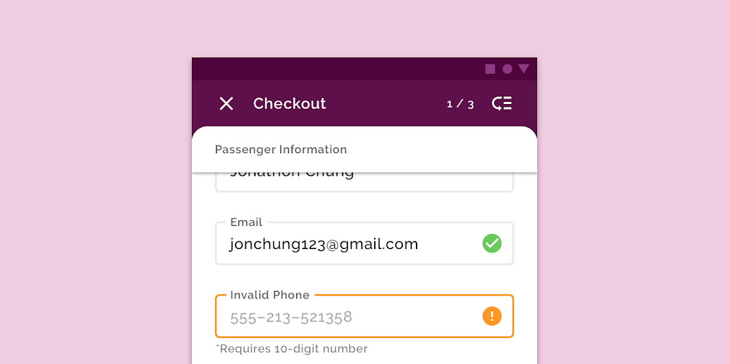
Crane's color theme uses an alternative color for error states: orange.
This is because red is Crane's secondary color, and a red error would not sufficiently stand out from the surrounding UI, and may be misread as a selected state.
Typography
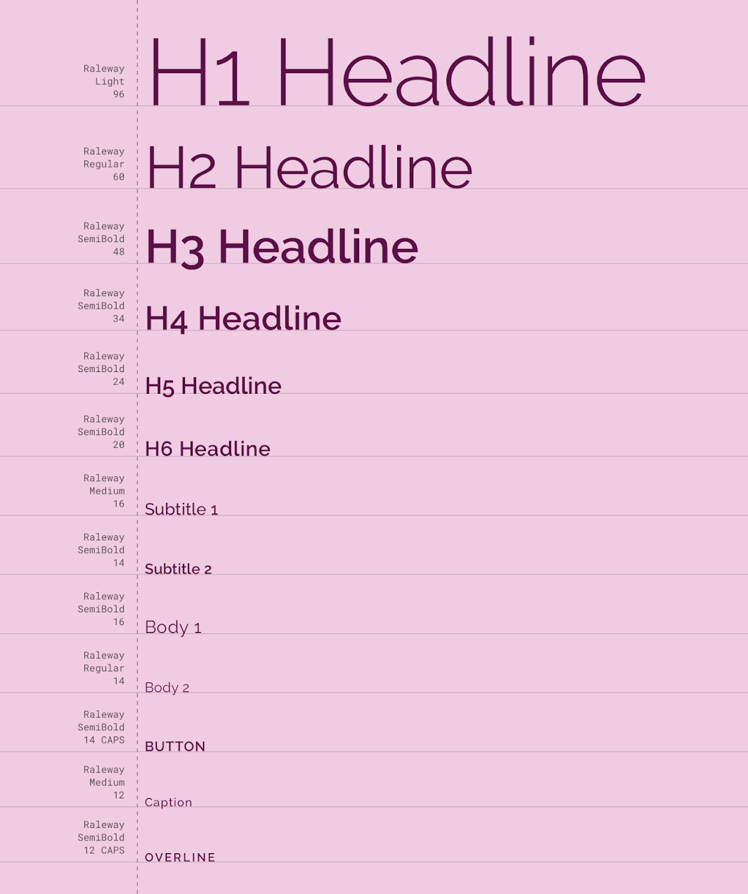
Type scale
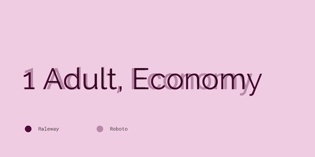
Crane's type scale provides the typographic variety necessary for its app content. All items in the type scale use Raleway as the typeface, making use of the variety of weights available with Raleway Light, Regular, Medium, and SemiBold.
Raleway
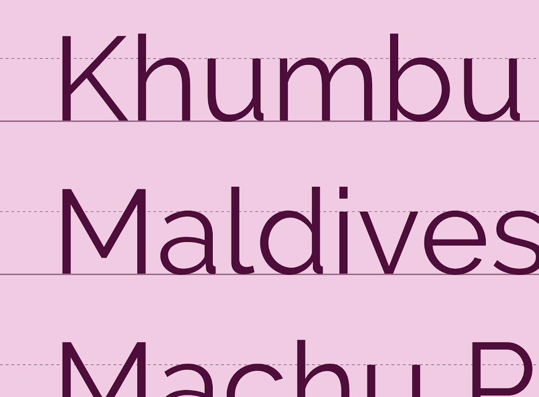
Crane uses the sans-serif typeface Raleway across the entire app.
Although Raleway was initially made as a display typeface, intended for headings and large sizes, it was expanded into a 9-weight family that is suitable for body copy. The use of a single typeface across the Crane app gives the UI consistently, allowing other elements (such as photography and small visual details) to stand out.
Iconography
Crane's iconography is reminiscent of icons found in travel settings, such as airports and train stations.
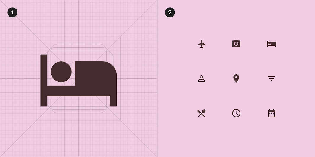
2. A collection of Crane's icons
Shape
Categories
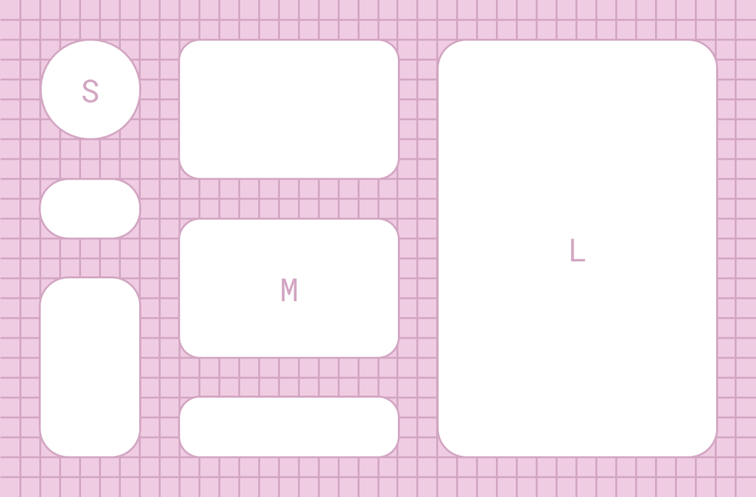
Components are grouped into shape categories based on their size.
Shape categories let you set multiple component values at once. Shape categories include:
- Small components
- Medium components
- Large components
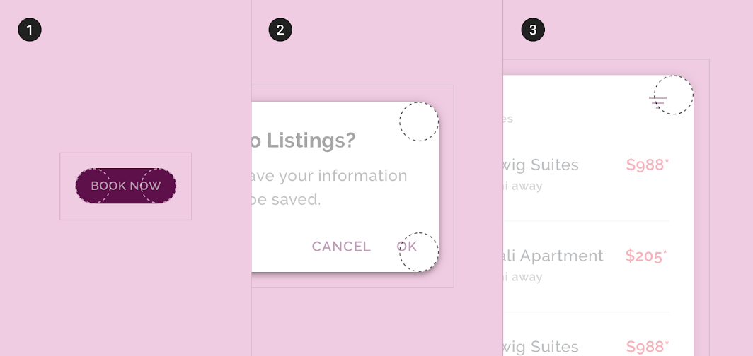
2. Medium component
3. Large component
Small components
Outlined text fields have rounded corners with a 4dp corner radius.
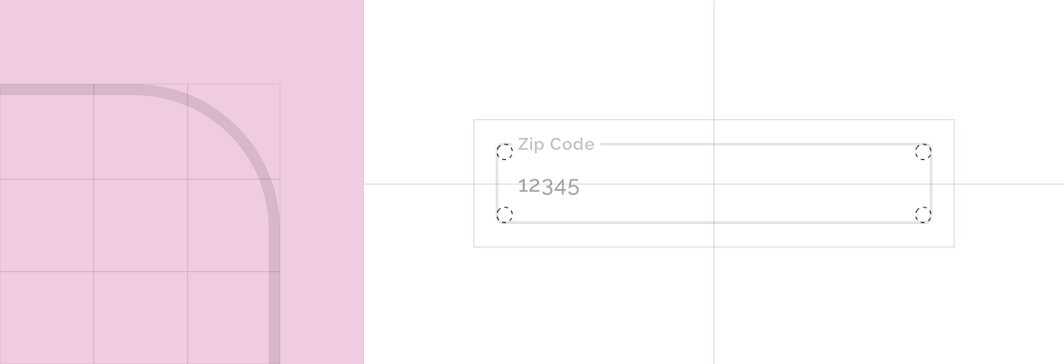
| Component | Category | Attribute | Value |
|---|---|---|---|
| Outlined text field | Small component | Family Size | Rounded 4dp;4dp;4dp;4dp |
Buttons have rounded corners with a 50% corner radius.
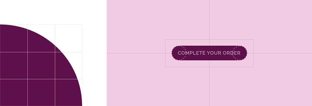
| Component | Category | Attribute | Value |
|---|---|---|---|
| Button | Override* | Family Size | Rounded 50% |
*Crane buttons use an override of the small component shape category size value.
Medium components
Image lists have rounded corners with a 16dp corner radius.
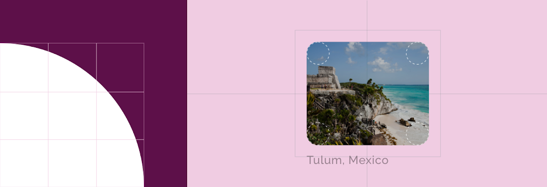
| Component | Category | Attribute | Value |
|---|---|---|---|
| Image list | Medium components | Family Size | Rounded 16dp;16dp;16dp;16dp |
Large components
A backdrop has rounded corners with a 20dp corner radius.
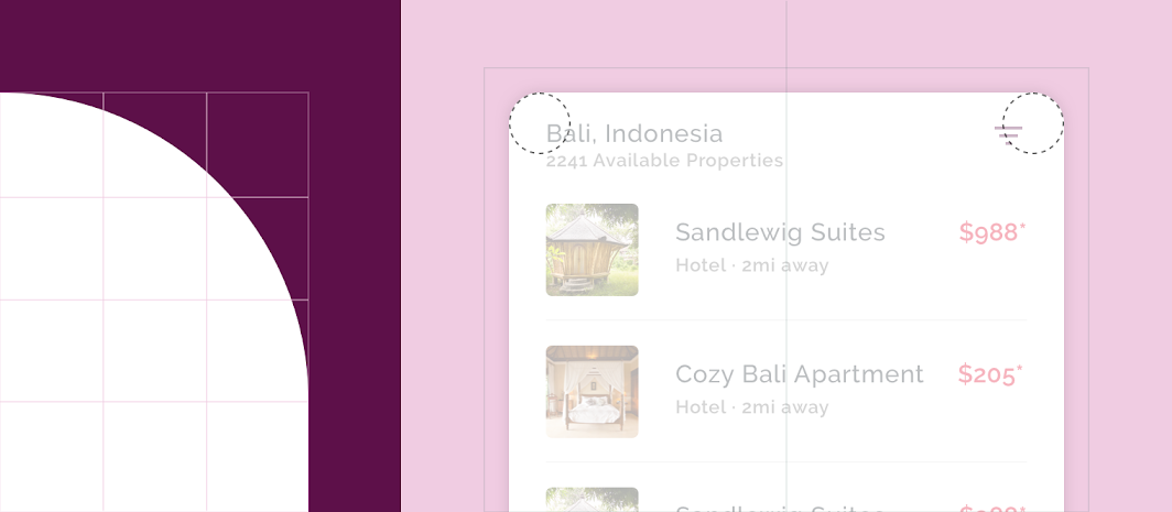
| Component | Category | Attribute | Value |
|---|---|---|---|
| Backdrop | Large components | Family Size | Rounded 20dp;20dp;n/a;n/a* |
*A backdrop can only apply shape to top-left and top-right corners.
Components
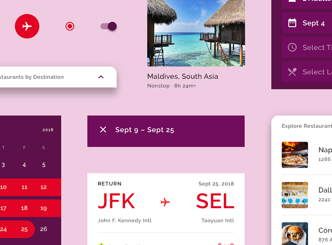
Image List
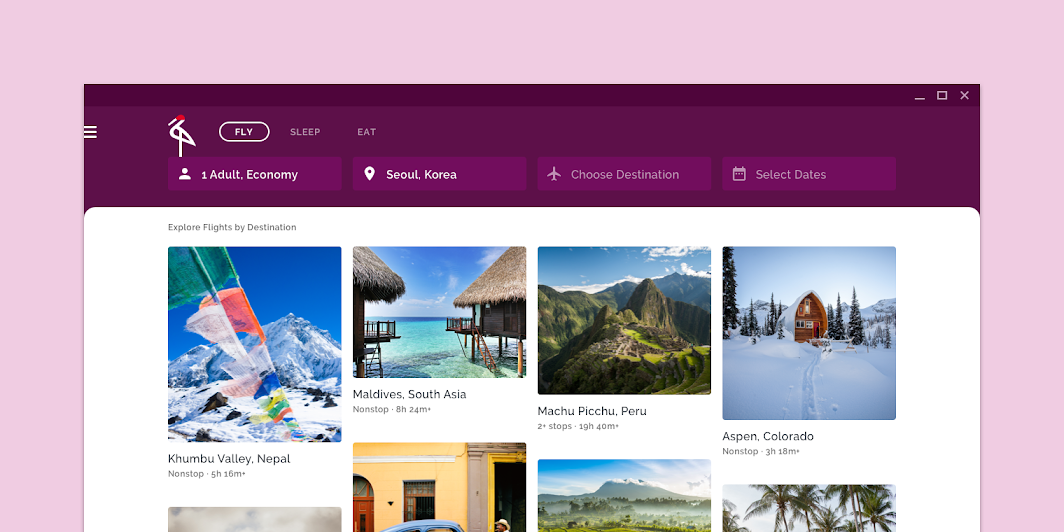
Crane lets users explore content using an image list (on tablet and desktop).
Masonry grid
This image list uses a masonry grid, which dynamically sizes image container heights based on the original image size. The masonry grid style ensures that photos that are landscape, portrait, or square formats all show as much content as possible. It creates an exciting, unpredictable rhythm, inviting the user to continue to scroll down and explore content.
Image labels
The image list has been customized to display text labels with each item. Custom padding gives more space above and below each item, ensuring there is no confusion about which text label belongs to which image.
List
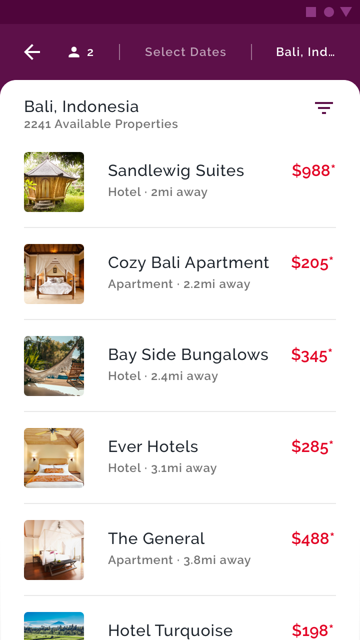
On mobile, Crane uses the list component to organize content. The list component is customized to incorporate Crane’s typography and color.
Each list item contains content that is most relevant to the user (including location name, type, distance, and cost) and a photo.
Cards
Crane uses cards to show detailed search results, such as flight options with departure and arrival times, cost, airport, and carrier information.
Vertical card collection
Crane's cards appear in a vertically stacked card collection. Color indicates a card's container by having a white fill color that contrasts with the light purple background color. Crane's cards don't cast shadows, allowing them to have very little padding between each card, for easy scannability.
On tablet and desktop, a card expands when tapped to reveal more information and allow users to take action on the item. When a card in a collection is expanded, all other cards in the collection are given a white overlay with an 80% opacity to give emphasis to the expanded card.
Text fields
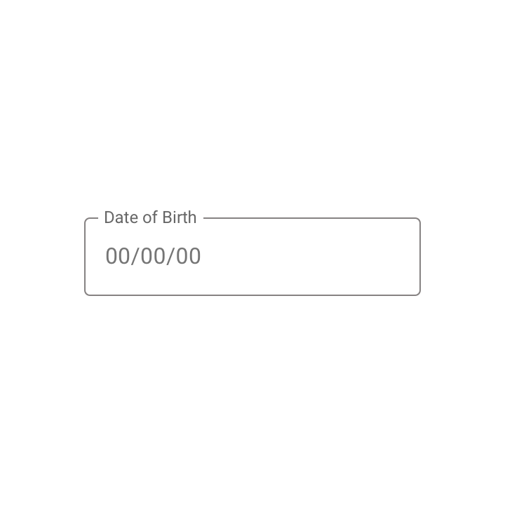
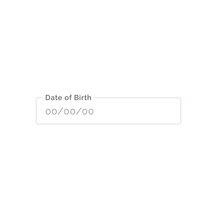
Outlined text fields
Crane uses outlined text fields, customized with the brand’s typeface and colors. Because Crane uses red as its secondary color, errors are expressed using orange to ensure that they stand out.
Filled text fields
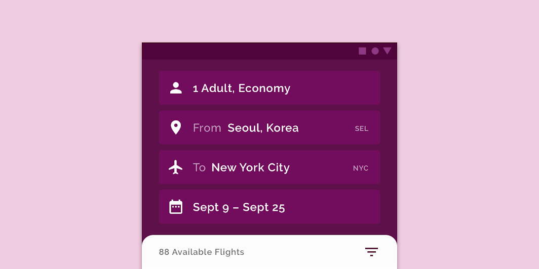
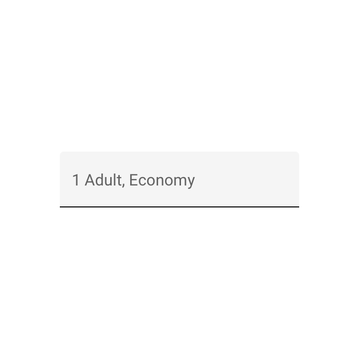
Crane uses filled text fields for inputting user preferences. They have a custom shape with rounded corners on all four sides and use Crane's brand colors, typography, and iconography.
Selection controls and sliders
Crane uses a variety of selection controls to help users filter search results and make selections during the checkout process. These controls include checkboxes, radio buttons, sliders, and switches, that are customized with Crane’s brand colors.
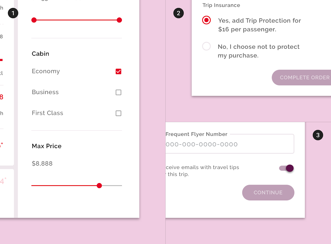
2. Crane’s radio buttons
3. Crane’s switches
Tabs
To signal a tab's active state, Crane uses a pill-shaped selector as visual affordance.
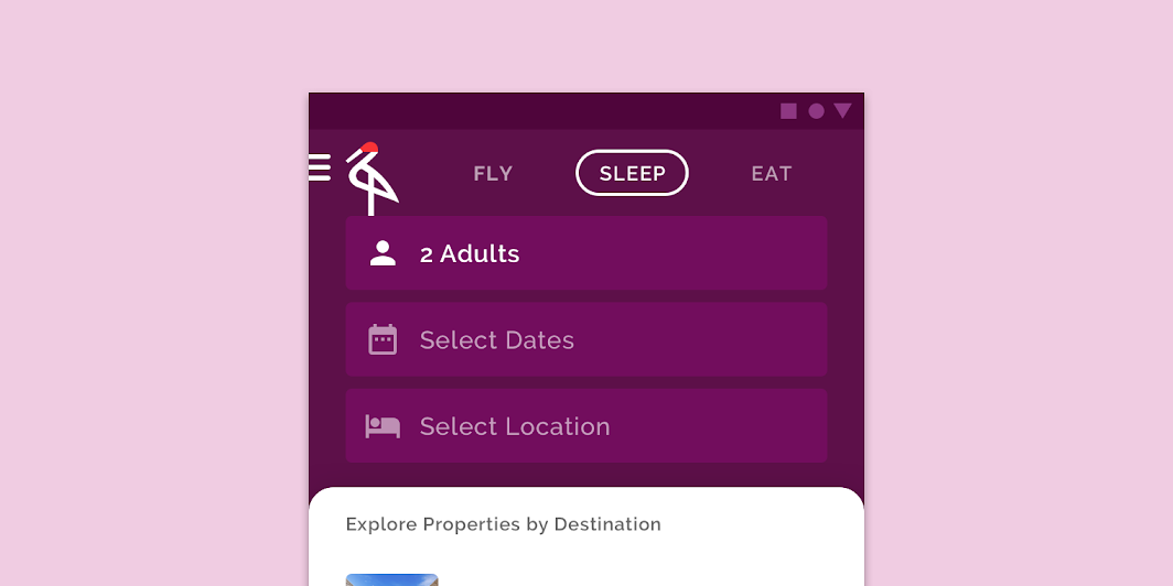
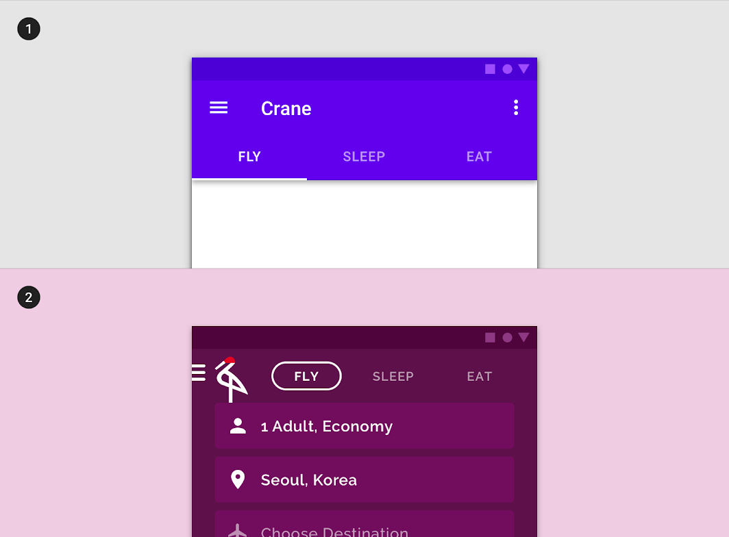
2. Crane's tabs use custom typography, color, and states. The custom selected state includes a pill-shaped line around the tab, and a change in type color.
Backdrop
The backdrop component provides the main structure for Crane by containing navigation, filters, and contextual actions on the back layer, and main content on the front layer. This allows users to quickly move from passively browsing information to taking action on it – all within the same screen, making flows easy and efficient to move through.
The back layer has been customized to use Crane's primary color purple, which stands in high contrast to the white front layer. The front layer has been customized to have rounded curves on the top edges, to mimic the curvature of Crane's logo.
Stepper
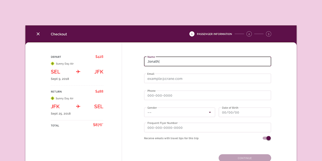
Steppers make it easy for Crane users to book flights, lodging, and make dining reservations. Crane uses one style of stepper for desktop and tablet, and another for mobile.
On mobile, steps are surfaced on the back layer of the backdrop, with the related form on the front layer. If the user wishes to see more of the front layer, Crane's stepper has a collapsed state that lets the user know where they are in the stepper process at the top of the screen.
The larger size of tablet and desktop allows Crane to fit all the steppers along the top of the screen.
Motion
Launch screen
Character animation, emphasized easing, and staggers set a sophisticated and premium tone.
Navigation transitions
Crane's navigation transitions use emphasized easing and longer durations to add a sophisticated tone.
Fade through, shared transformations and emphasized easing are used to maintain continuity.
Emphasized easing is used on peer transitions.
Stagger
Staggers are used when new lists or cards enter the screen. The cascade effect gives the transition a polished tone.