Skip to content
Material Design 2
Main Navigation
v3
v2
v1

English

简体中文
繁體中文
Español
Français
Русский
Português – Brasil
Deutsch
日本語
한국어
Italiano
Polski
Türkçe
čeština
magyar

English

简体中文
繁體中文
Español
Français
Русский
Português – Brasil
Deutsch
日本語
한국어
Italiano
Polski
Türkçe
čeština
magyar

Appearance

Sidebar Navigation

Material System

Introduction

Material studies

About our Material studies

Basil

Crane

Fortnightly

Owl

Rally

Reply

Shrine

Material Foundation

Environment

Surfaces

Elevation

Light and shadows

Layout

Understanding layout

Pixel density

Responsive layout grid

Spacing methods

Component behavior

Applying density

Navigation

Understanding navigation

Navigation transitions

Search

Color

The color system

Applying color to UI

Color usage

Text legibility

Dark theme

Typography

The type system

Understanding typography

Language support

Sound

About sound

Applying sound to UI

Sound attributes

Sound choreography

Iconography

Product icons

System icons

Animated icons

Shape

About shape

Shape and hierarchy

Shape as expression

Shape and motion

Applying shape to UI

Motion

Understanding motion

The motion system

Speed

Choreography

Customization

Interaction

Gestures

Selection

States

Communication

Confirmation & acknowledgement

Data formats

Data visualization

Empty states

Help & feedback

Imagery

Launch screen

Onboarding

Offline states

Writing

Machine learning

Machine learning patterns

Object detection: live camera

Object detection: static image

Barcode Scanning

Material Guidelines

Material Theming

Overview

Implementing your theme

Usability

Accessibility

Bidirectionality

Platform guidance

Android bars

Android fingerprint

Android haptics

Android icons

Android navigating between apps

Android notifications

Android permissions

Android slices

Android split-screen

Android swipe-to-refresh

Android text selection toolbar

Android widget

Cross-platform adaptation

Components

App bars: bottom

App bars: top

Backdrop

Banners

Bottom navigation

Buttons

Buttons: floating action button

Cards

Checkboxes

Chips

Data tables

Date pickers

Dialogs

Dividers

Image lists

Lists

Menus

Navigation drawer

Navigation rail

Progress indicators

Radio buttons

Sheets: bottom

Sheets: side

Sliders

Snackbars

Switches

Tabs

Text fields

Time pickers

Tooltips

On this page

Image lists ​

Image lists display a collection of images in an organized grid.
Image lists hero image

Usage ​

Image lists represent a collection of items in a repeated pattern. They help improve the visual comprehension of the content they hold.


Lists

Lists are continuous, vertical display of text or images.

Related article

Cards

Containing content & links on a single subject

Related article

Principles ​


Image list principle: visual

Visual

Image lists allow users to scan content based on images.
Image list principle: comparable

Comparable

Image lists allow users to easily compare items within a collection.
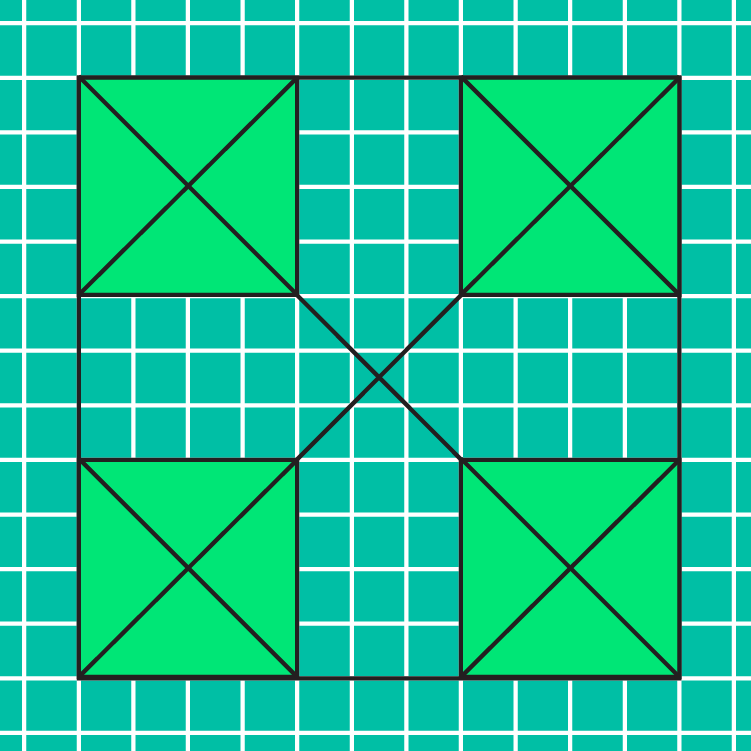
Image list principle: integrated

Integrated

Image lists are responsively integrated with the surrounding content and layout.

Types ​
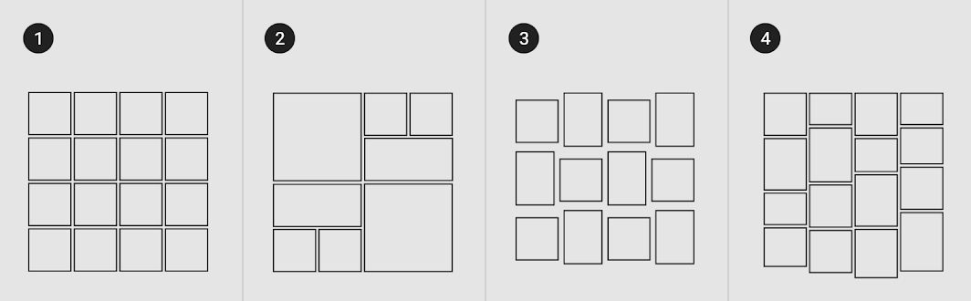

Standard image lists are best for items of equal importance
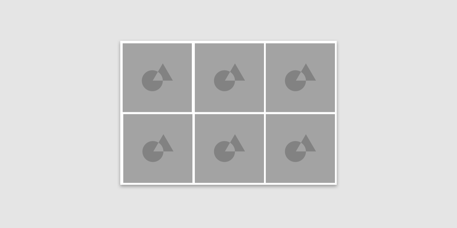
1. Standard image lists are best for items of equal importance. They have a uniform container size, ratio, and padding.

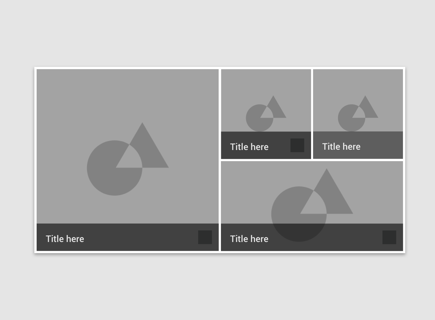
2. Quilted image lists emphasize certain items over others in a collection. They create hierarchy using varied container sizes and ratios.

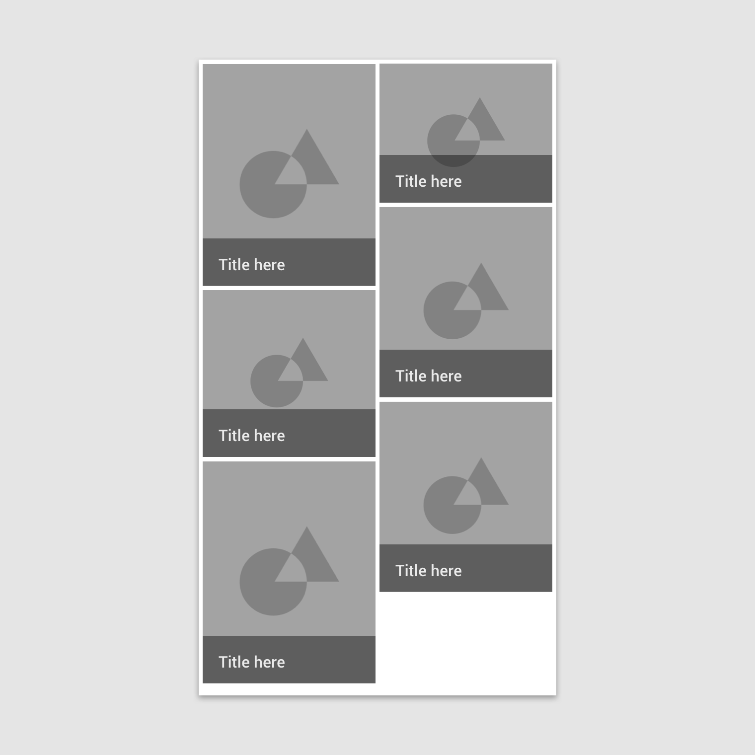
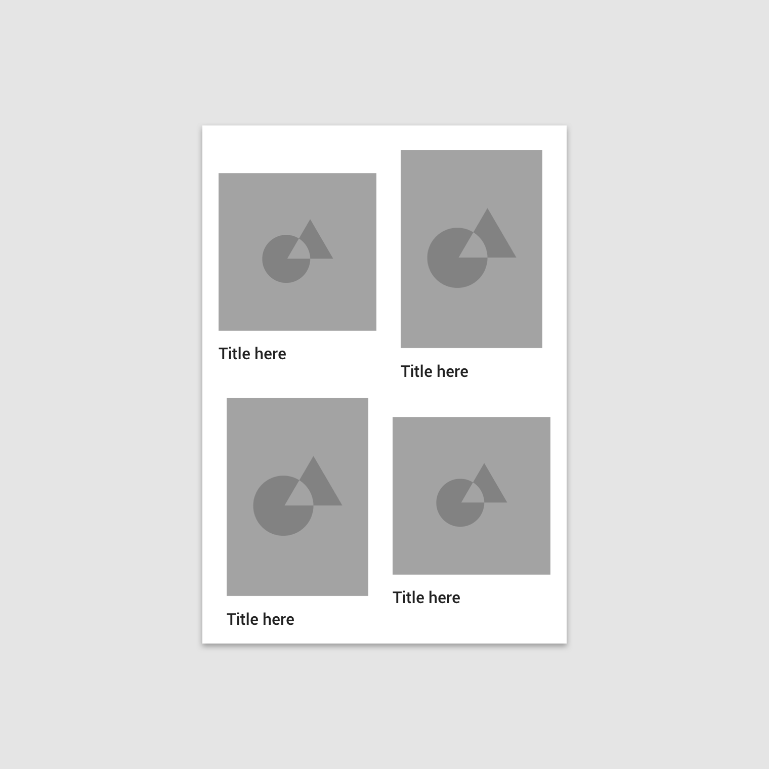
3. Woven image lists facilitate the browsing of peer content. They display content in containers of varying ratios to create a rhythmic layout.

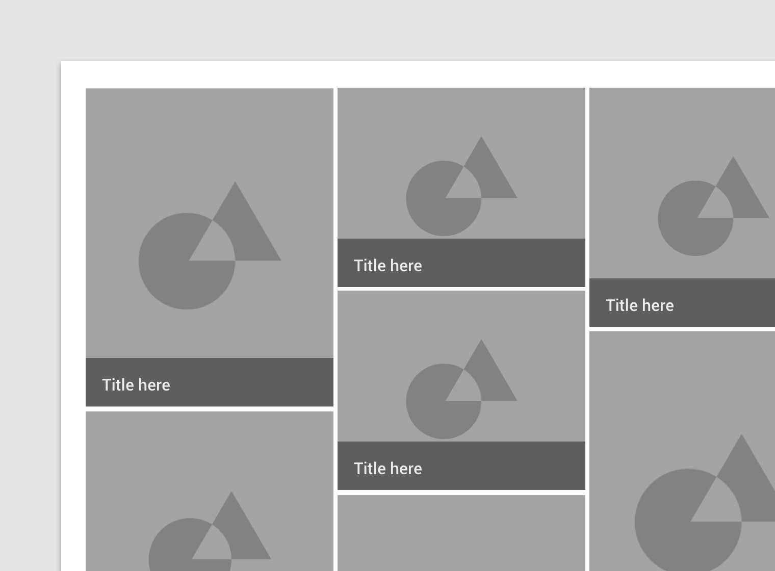
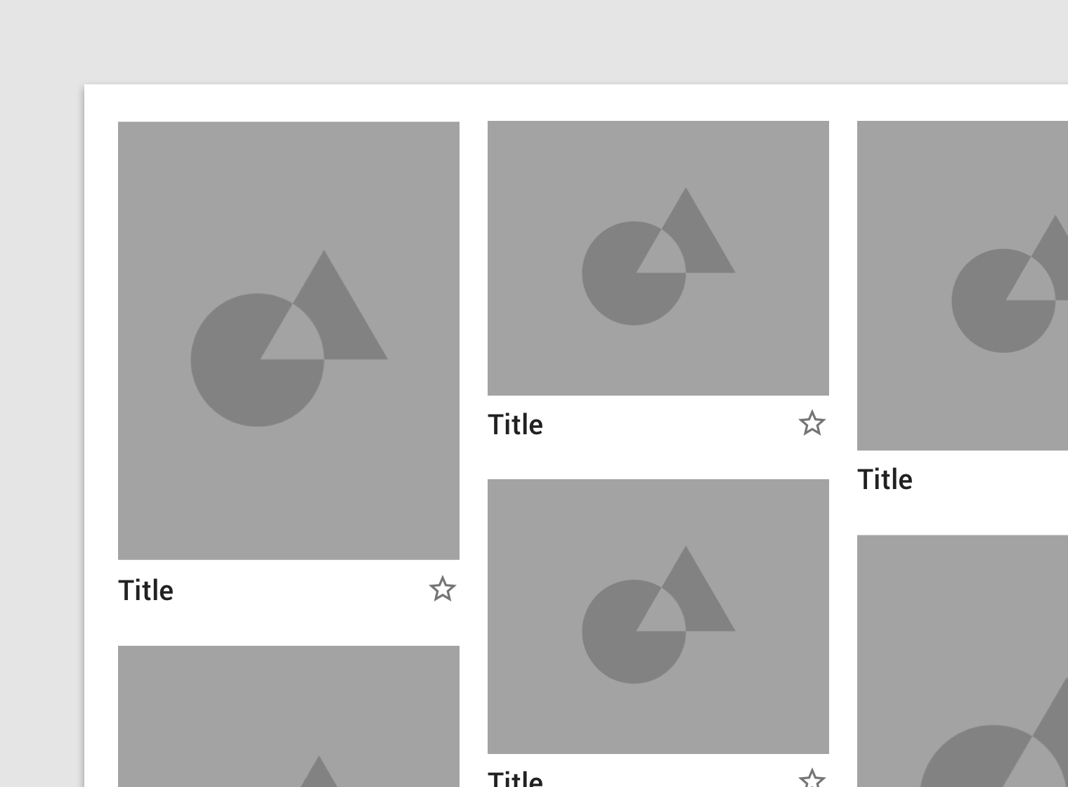
4. Masonry image lists facilitate the browsing of uncropped peer content. Container heights are sized based on the image size.

Anatomy ​

Image lists are comprised of containers that are set at a certain aspect ratio. Each item in an image list can display optional text and iconography below or above the image container.
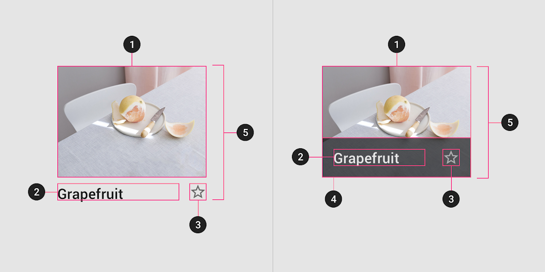
The image container displays an image list item’s image or illustration
1. Image container
The image container displays an image list item’s image or illustration.

2. Text labels (optional)
Text labels display one line of text related to an image list item.

3. Actionable iconography (optional)
Actionable iconography can represent related actions.

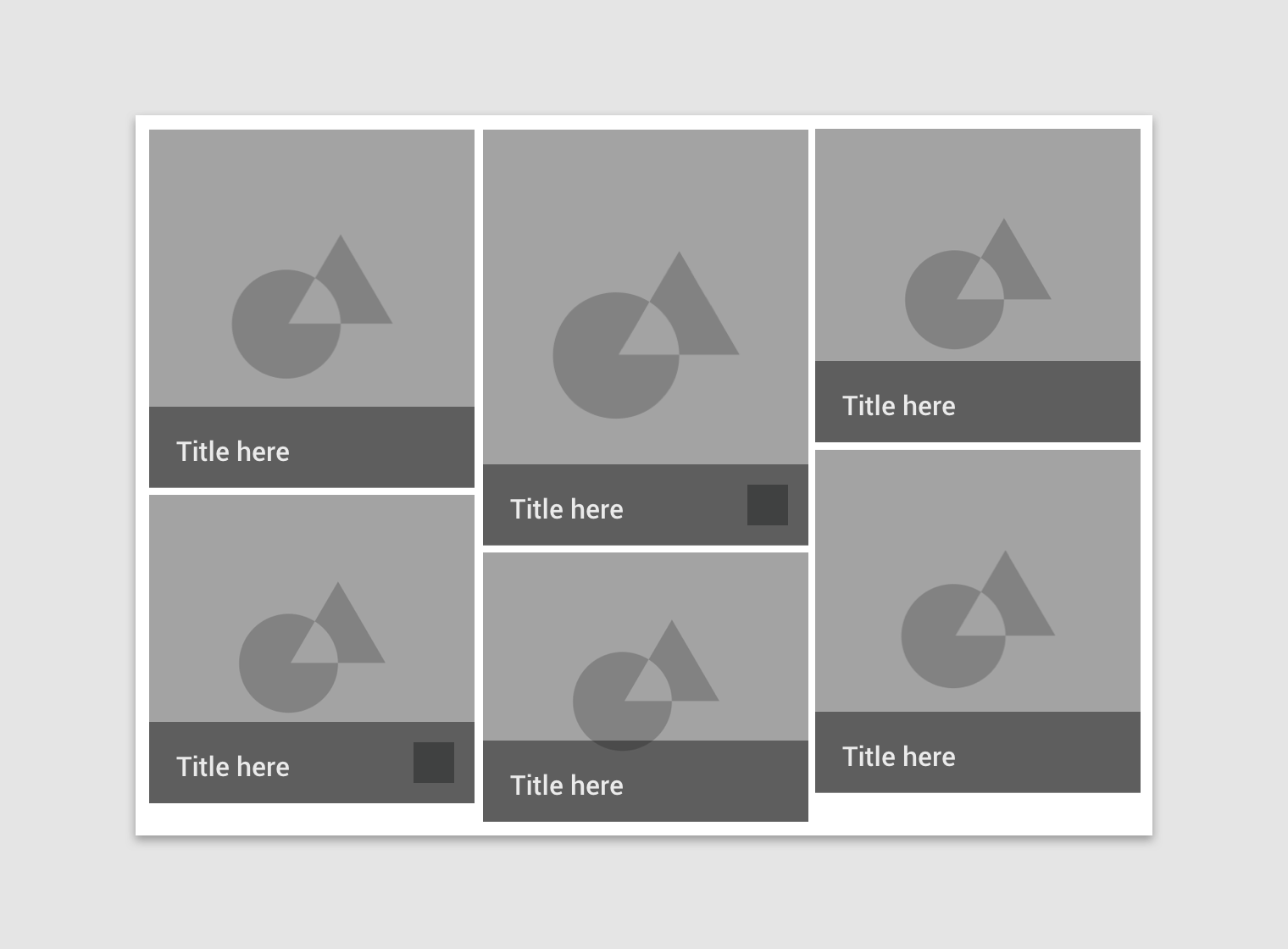
4. Text protection (optional)
Text protection is a semi-opaque scrim placed in front of imagery to keep text above it legible.

5. Image list item
Image list items represent individual items in an image list.

Padding ​

Padding can vary between images in an image list. The following padding values are recommended: 1, 2, 4, 8, 16, 20, 24, 32 dp.

Behavior ​

Actions ​

Image lists items may be tapped, dragged, filtered, or sorted.

Tapping an image list item displays more detail about that item.
Image list content can be filtered or sorted by date, file size, alphabetical order, or other parameters.

Caution

You can drag an image list item to reorder it, but this interaction should be disabled if images are sorted or filtered.

Don't

Don’t allow swipe gestures on individual image list items. Image lists should be perceived as a group.

Layout grid ​

Defined layout ​

Image list column structures don’t need to align to the layout grid. Only the perimeter of the image list itself needs to align to the layout grid.
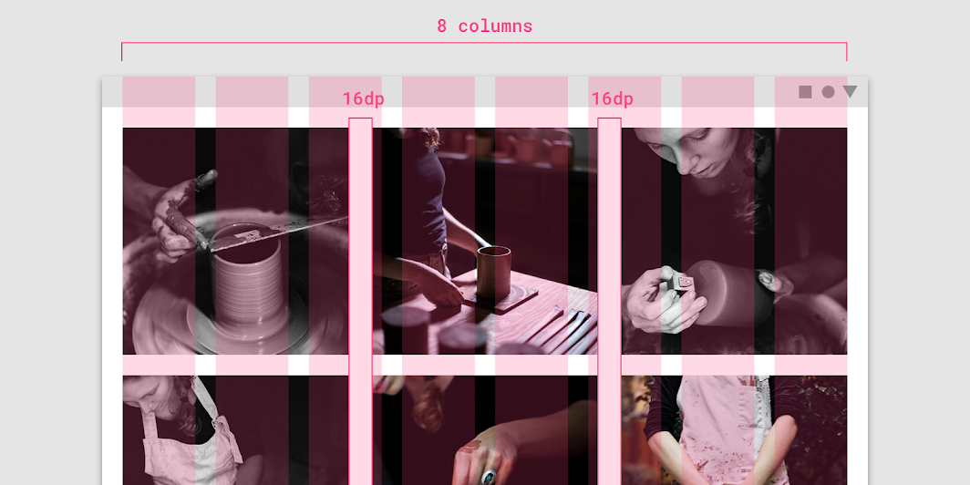
An image list spanning eight columns of the layout grid, with 16dp padding

Alignment with other components ​

Image lists can be placed adjacent to other components in the layout grid.
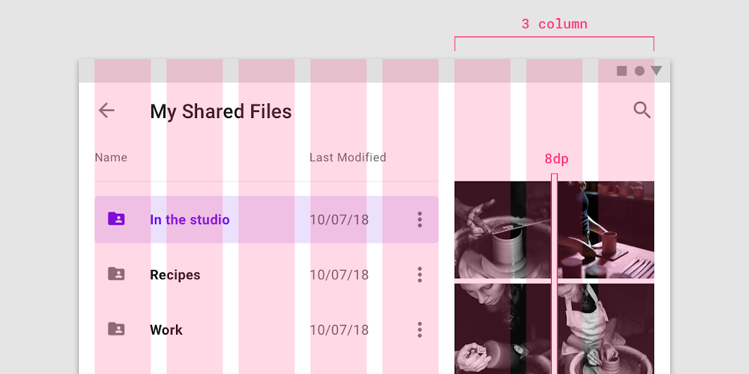
An image list spanning three columns of the layout grid, with 8dp padding

Responsive ​

Image lists inherit the responsive behavior of the layout grid.

Image lists respond to the responsive layout grid.

Image lists are fixed to the layout grid.

Reflow

When a container increases in size, the content inside of it should also increase, or reflow, to fit the new container size appropriately. In some circumstances, the expanding container can also create space for more elements to appear.

A reflow transition can use a shared transformation to reinforce the relationship between elements. A shared transformation groups elements together and transforms them as a single unit, rather than animating each element independently. This creates a smoother visual experience and avoids the possibility of multiple transformations overlapping and competing for attention.

Grouped elements can use any of the following fading types: Fade, cross-fade, or fade through.
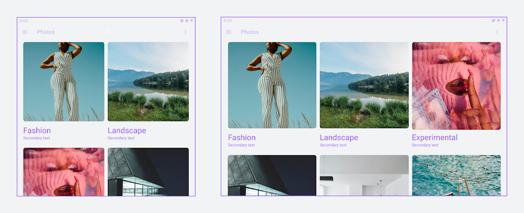
Elements inside a container should reflow as the container size changes
Elements inside a container should reflow as the container size changes.

Scrolling ​

Image lists can scroll vertically or horizontally. All items in an image list must scroll together as a collection. Image cropping can be used to indicate scroll direction.

Image list items scroll together.
Image lists can scroll horizontally.

Scaling and adaptation ​

As screen sizes increase, there are more opportunities for variation in text and image composition. Large screens can create more space for images and text by swapping lists for image lists.
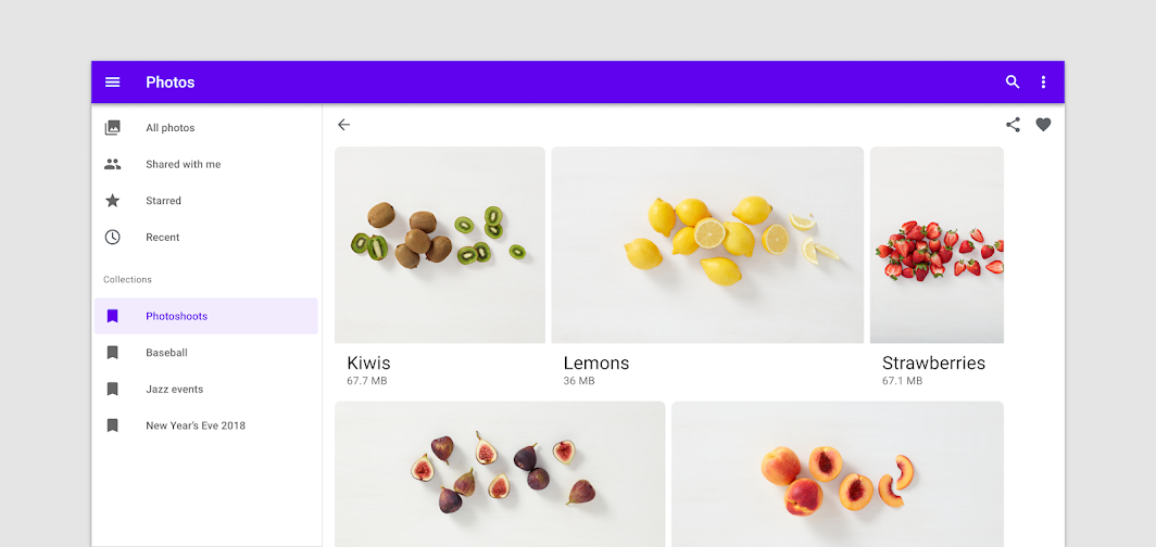
Example of list of items after expanding into a large image list
Example of list of items after expanding into a large image list. Large screen layouts can accommodate more immersive imagery and expressive typography.

Types ​

Standard image list ​

Standard image lists are best for items of equal importance. They have a uniform container size, ratio, and padding.
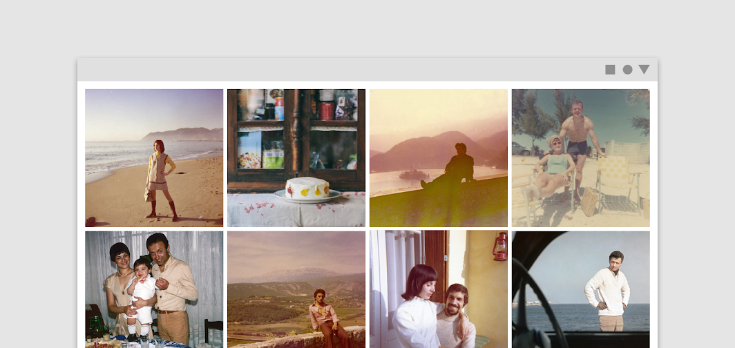
Standard image list

Standard image lists can be displayed with or without text labels
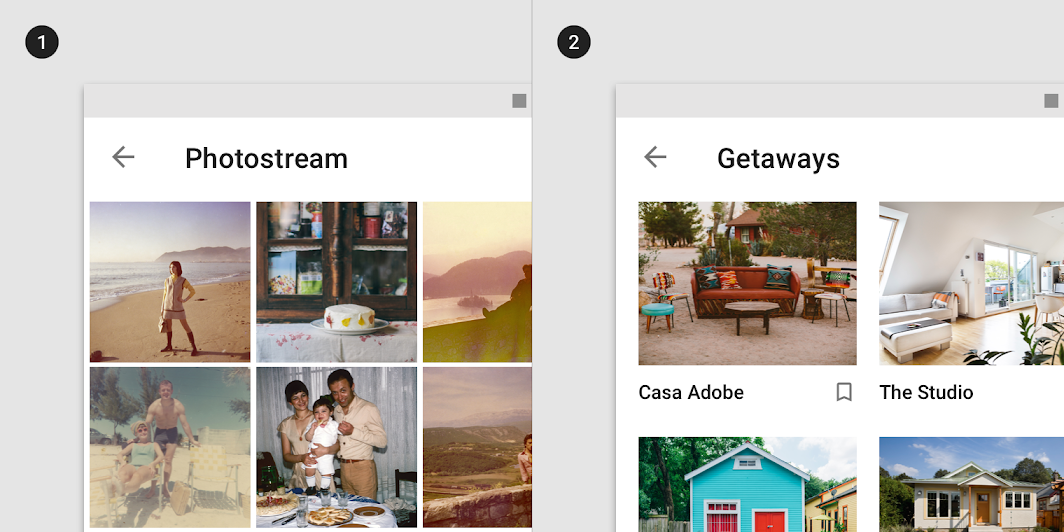
Standard image lists can be displayed with or without text labels.
1. image list with images only
2. image list with images and text labels
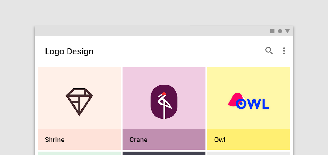
In compact layouts, labels can appear above the image container using an image treatment that provides text protection
In compact layouts, labels can appear above the image container using an image treatment that provides text protection to ensure legibility.

Quilted image list ​

Quilted image lists emphasize certain items over others in a collection. They use varied container sizes and ratios to create hierarchy across images.
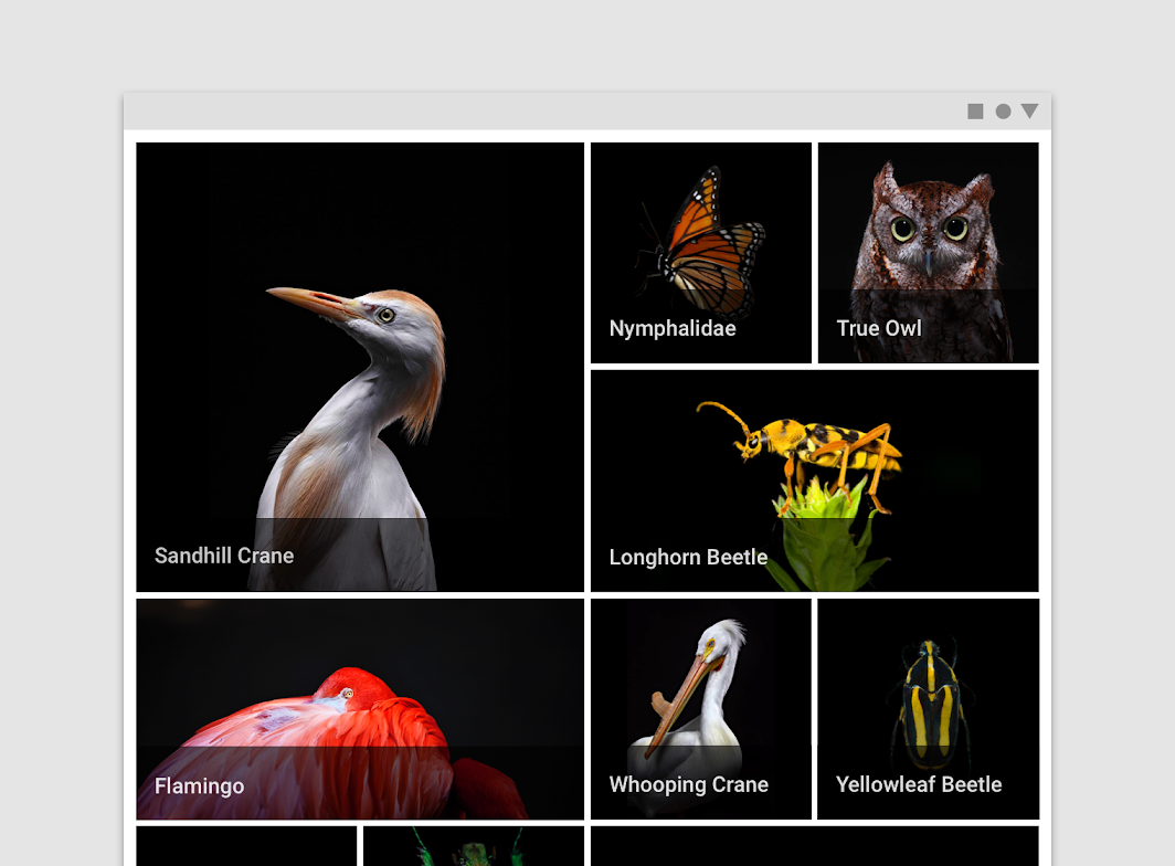
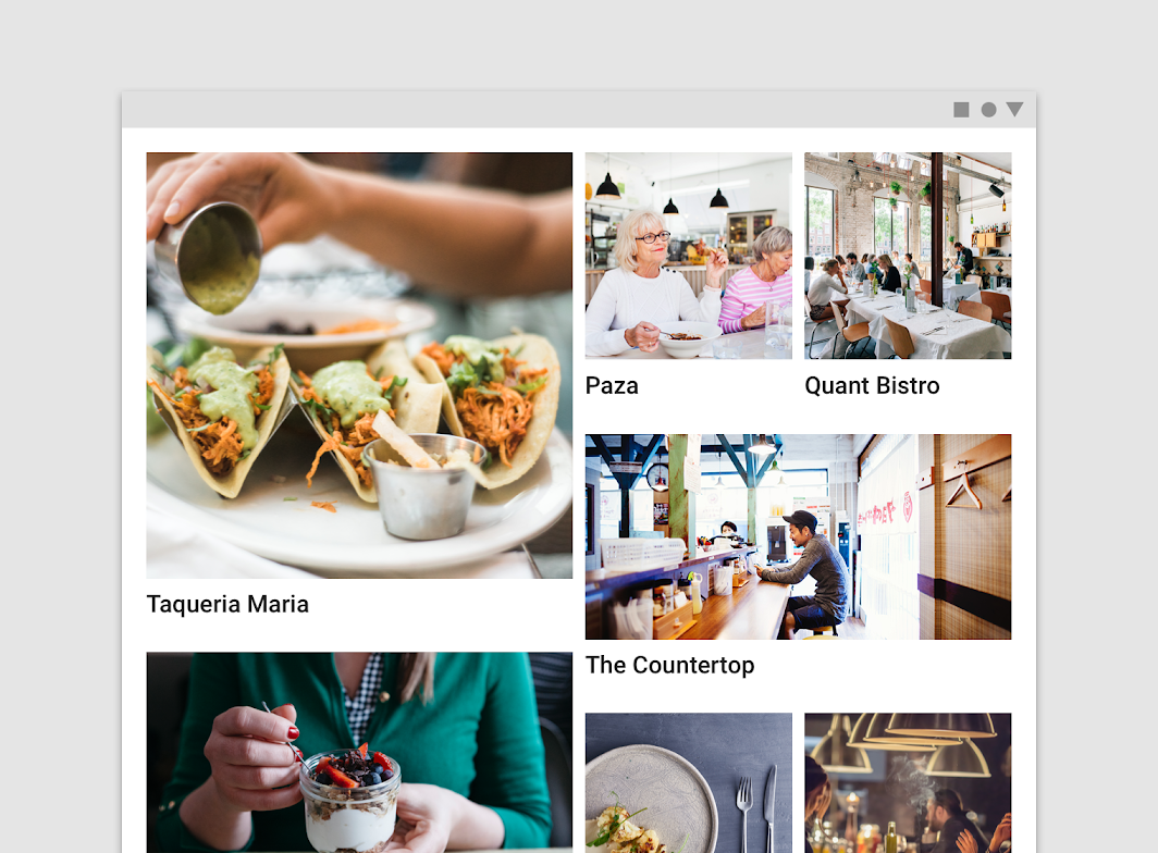
Quilted image list

Don't: quilted image lists shouldn’t display text below the image container, as it disrupts the layout

Don't

Quilted image lists shouldn’t display text below the image container, as it disrupts the layout.

Woven image list ​

Woven image lists use alternating container ratios to create a rhythmic layout. A woven image list is best for browsing peer content.
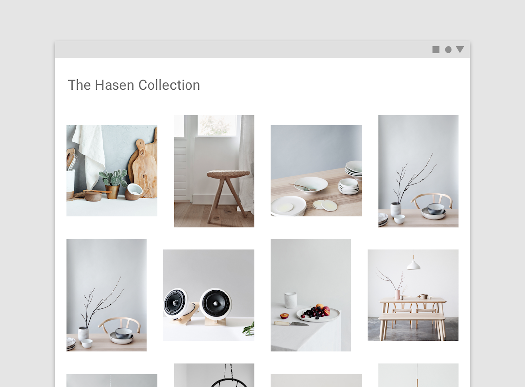
Woven image list

Masonry image list ​

Masonry image lists use dynamically sized container heights that reflect the aspect ratio of each image. This image list is best used for browsing uncropped peer content.
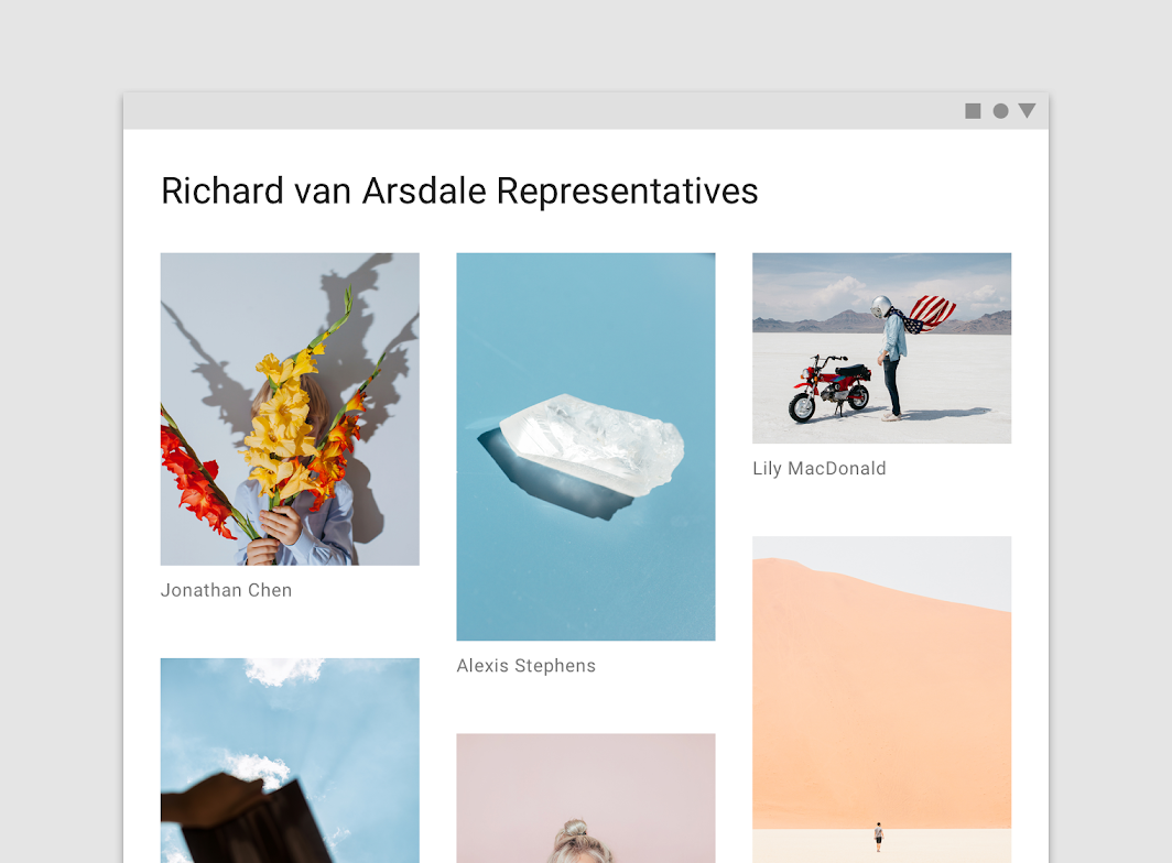
Masonry image list

Theming ​

Crane Material Theme ​

This travel app’s image lists have been customized using Material Theming. Areas of customization include color, typography, and shape.
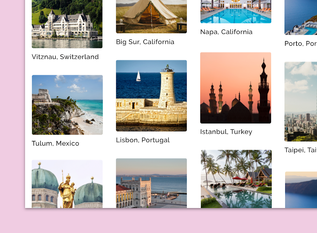
Crane's customized image list

Crane

A travel app that uses Material Design components and Material Theming to create a personalized on-brand experience.

Related link

The color system

Create a color theme that reflects your brand or style

Related article

Applying color to UI

In a UI, color has a variety of roles: from containing meaning, to expressing a look and feel.

Related article

Color ​

Crane’s image list text uses custom color.
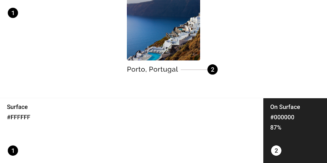
Crane Material theme: color
ElementCategoryAttributeValue
SurfaceSurfaceColor
Opacity
#FFFFFF
100%
TextOn SurfaceColor
Opacity
#000000
87%

Understanding typography

Typography is critical in establishing hierarchy and expressing brand presence that supports an effective digital experience.

Related article

Typography ​

Crane’s image list text uses custom typography.
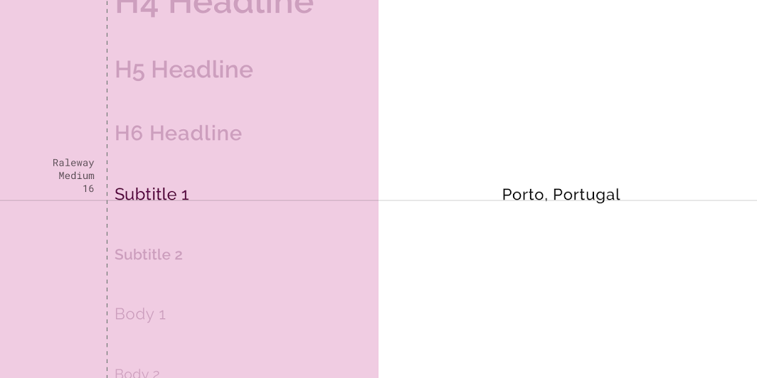
Crane Material theme: typography
ElementCategoryAttributeValue
TextSubtitle 1Typeface
Font
Size
Case
Raleway
Medium
16
Title case

About shape

Direct attention, identify components, communicate state, and express brand

Related link

Shape ​

Crane’s image lists have custom corner shapes on image containers.
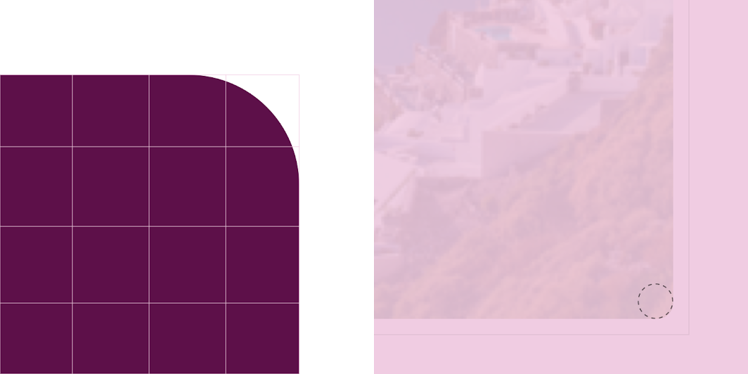
Crane Material theme: shape
ElementCategoryAttributeValue
ContainerMedium componentFamily
Size
Round
16;16;16;16dp

Owl Material Theme ​

This education app’s image list text has been customized using Material Theming.
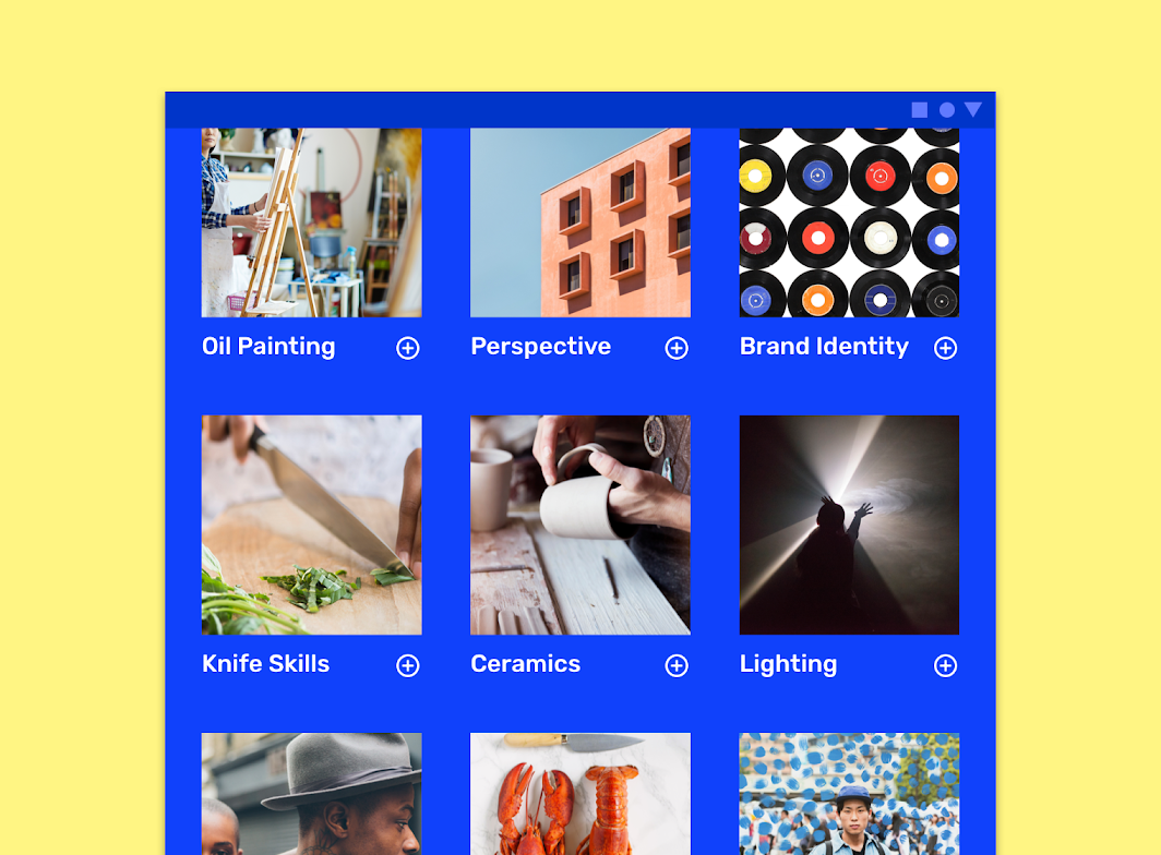
Owl's customized image list
Owl's customized image list.

Owl

Owl is an educational app that provides courses for people who want to explore and learn new skills.

Related article

Understanding typography

Typography is critical in establishing hierarchy and expressing brand presence that supports an effective digital experience.

Related article

Typography ​

Owl’s image list text uses custom typography.
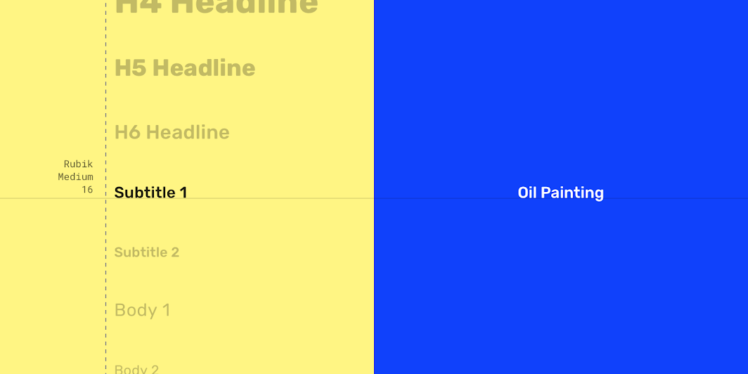
Owl Material theme: typography
ElementCategoryAttributeValue
TextSubtitle 1Typeface
Font
Size
Case
Rubik
Medium
16
Title case

Shape ​

Owl’s image lists have custom corner shapes on image containers.
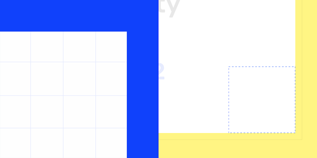
Owl Material theme: shape
ElementCategoryAttributeValue
ContainerMedium componentFamily
Size
Round
0;0;0;0dp

Shrine Material Theme ​

This retail app’s image lists have been customized using Material Theming. Areas of customization include color and typography.
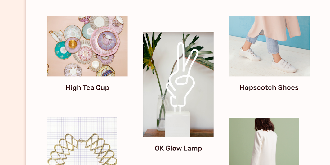
Shrine's customized image list

Shrine

Shrine is a lifestyle and fashion brand that demonstrates how Material Design can be used in e-commerce.

Related article

The color system

Create a color theme that reflects your brand or style

Related article

Applying color to UI

In a UI, color has a variety of roles: from containing meaning, to expressing a look and feel.

Related article

Color ​

Shrine’s image list text uses custom color.
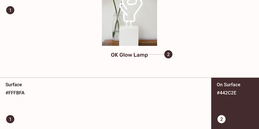
Shrine Material theme: color
ElementCategoryAttributeValue
SurfaceSurfaceColor
Opacity
#FFFBFA
100%
TextOn SurfaceColor
Opacity
#442C2E
100%

Understanding typography

Typography is critical in establishing hierarchy and expressing brand presence that supports an effective digital experience.

Related article

Typography ​

Shrine’s image list text uses custom typography.
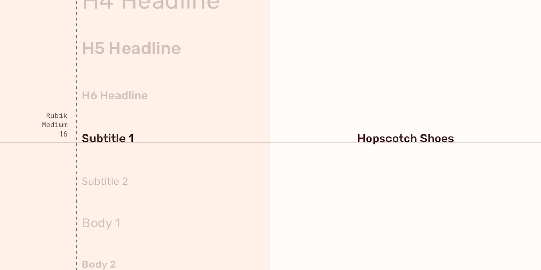
Shrine Material theme: typography
ElementCategoryAttributeValue
TextSubtitle 1Typeface
Font
Size
Case
Raleway
Medium
16
Title case

Shape ​

Shrine's image lists have custom corner shapes on image containers.
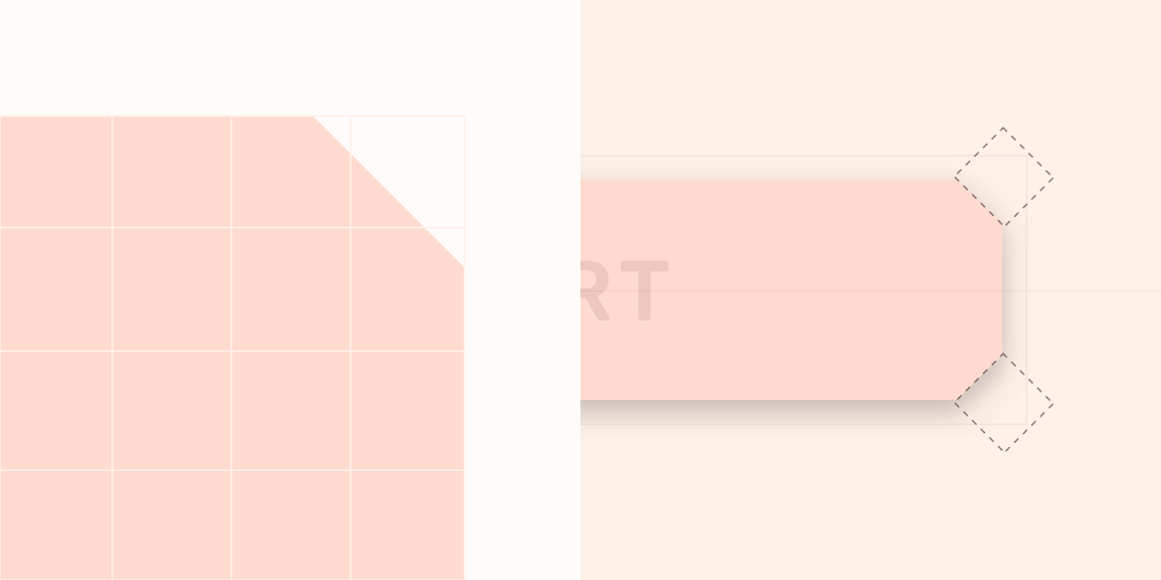
Shrine Material theme: shape
ElementCategoryAttributeValue
ContainerMedium componentFamily
Size
Cut
16;16;16;16dp

Specs ​

Standard ​


4441x1

Quilted ​


441x12x11x1

Masonry—mobile ​


44444174x224

Masonry—desktop ​


44

2832824x24

Masonry—tablet ​


4444C244812121248192x246

Woven ​


242424281x15x7
Pager
Previous pageDividers
Next pageLists

Released under the Apache-2.0

Copyright © 2018-Present Google

https://m2.material.io/components/image-lists

Released under the Apache-2.0

Copyright © 2018-Present Google