Skip to content
Material Design 2
Main Navigation
v3
v2
v1

English

简体中文
繁體中文
Español
Français
Русский
Português – Brasil
Deutsch
日本語
한국어
Italiano
Polski
Türkçe
čeština
magyar

English

简体中文
繁體中文
Español
Français
Русский
Português – Brasil
Deutsch
日本語
한국어
Italiano
Polski
Türkçe
čeština
magyar

Appearance

Sidebar Navigation

Material System

Introduction

Material studies

About our Material studies

Basil

Crane

Fortnightly

Owl

Rally

Reply

Shrine

Material Foundation

Environment

Surfaces

Elevation

Light and shadows

Layout

Understanding layout

Pixel density

Responsive layout grid

Spacing methods

Component behavior

Applying density

Navigation

Understanding navigation

Navigation transitions

Search

Color

The color system

Applying color to UI

Color usage

Text legibility

Dark theme

Typography

The type system

Understanding typography

Language support

Sound

About sound

Applying sound to UI

Sound attributes

Sound choreography

Iconography

Product icons

System icons

Animated icons

Shape

About shape

Shape and hierarchy

Shape as expression

Shape and motion

Applying shape to UI

Motion

Understanding motion

The motion system

Speed

Choreography

Customization

Interaction

Gestures

Selection

States

Communication

Confirmation & acknowledgement

Data formats

Data visualization

Empty states

Help & feedback

Imagery

Launch screen

Onboarding

Offline states

Writing

Machine learning

Machine learning patterns

Object detection: live camera

Object detection: static image

Barcode Scanning

Material Guidelines

Material Theming

Overview

Implementing your theme

Usability

Accessibility

Bidirectionality

Platform guidance

Android bars

Android fingerprint

Android haptics

Android icons

Android navigating between apps

Android notifications

Android permissions

Android slices

Android split-screen

Android swipe-to-refresh

Android text selection toolbar

Android widget

Cross-platform adaptation

Components

App bars: bottom

App bars: top

Backdrop

Banners

Bottom navigation

Buttons

Buttons: floating action button

Cards

Checkboxes

Chips

Data tables

Date pickers

Dialogs

Dividers

Image lists

Lists

Menus

Navigation drawer

Navigation rail

Progress indicators

Radio buttons

Sheets: bottom

Sheets: side

Sliders

Snackbars

Switches

Tabs

Text fields

Time pickers

Tooltips

On this page

Color usage ​

Color helps express hierarchy, establish brand presence, give meaning, and indicate element states.

Hierarchy ​

In Material Design, color draws attention to specific elements on-screen. When an element’s color contrasts with its surroundings, that element stands out, so users can tell it’s important. Because color themes vary – from bold and bright, to monochromatic or muted – there are different ways to indicate which elements have greater importance.

For example, black icons stand out when they are placed against a white background. Multicolored cards draw attention to themselves when placed next to monochromatic colors.

Surface contrast

To bring attention to important events, use stronger color contrasts between elements.
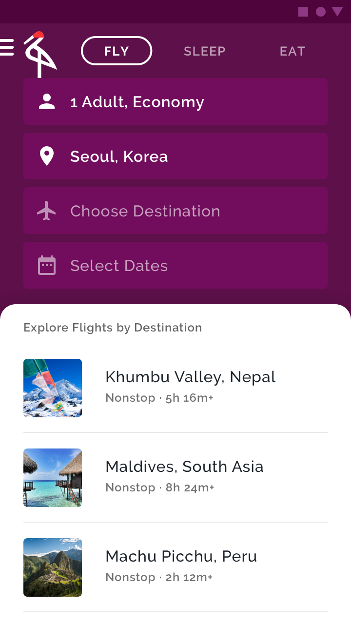
The purple background has a high contrast with the white surface
The purple background has a high contrast with the white surface, bringing emphasis to the list item choices – the main point of this travel app.

Color and shape

Visual emphasis is given to an element that changes both color and shape at the same time. Use this kind of emphasis to indicate something has been selected or requires immediate attention.
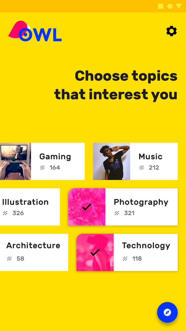
The chips with curved, pink left corners indicate they have been selected by the user
The chips with curved, pink left corners indicate they have been selected by the user.

Crane

Crane is a travel app that uses Material Design components and Material Theming to create a personalized, on-brand experience.

Related article

Owl

Owl is an educational app that uses Material Design components and Material Theming to create an energetic, motivational brand experience.

Related article

Limiting color ​


By limiting the use of color in your app, the areas that do receive color gain more attention, such as text, images, and individual elements like buttons.

Because the content of this product is multicolored, a black floating action button contrasts greatly with the bright colors, making it more visible.
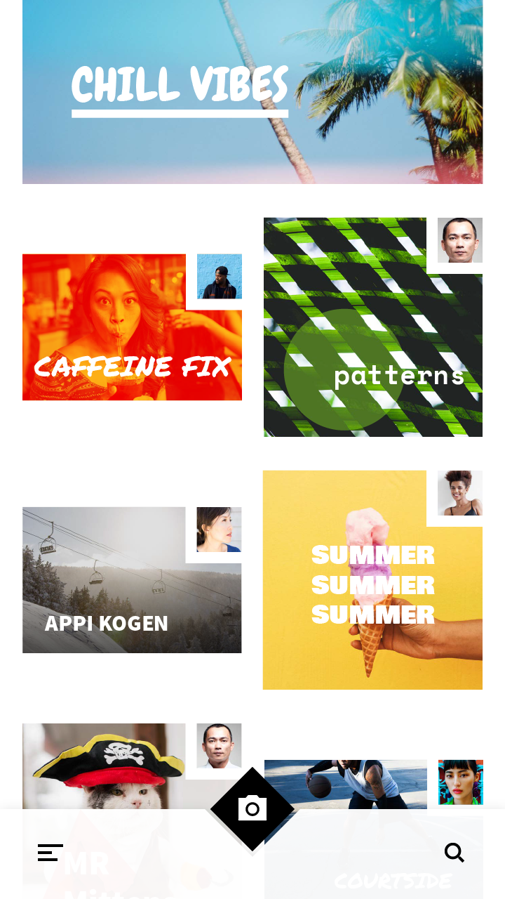
Limiting color: FAB

A grayscale color palette is best for allowing photography and text to stand out.
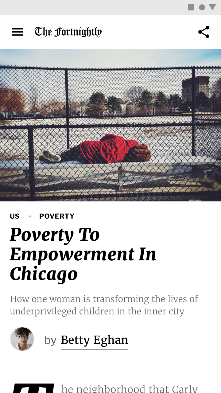
Limiting color: grayscale

Fortnightly

Fortnightly is a news app that uses Material Design components and Material Theming to create an on-brand, content-focused experience.

Related article

Brand ​

Your brand can use color to emphasize its presence. Brand colors can be used in key moments, in ways that associate those colors with specific actions and information.

Brand color application can be bold and brash, subtle and sophisticated, or anywhere in between. Your brand’s personal approach to color should be reflected in your app.

Bold use of color ​

Brands that wish to convey a sense of energy and excitement often use color in bold ways. Their apps should reflect that same approach, while preserving content legibility and overall usability.
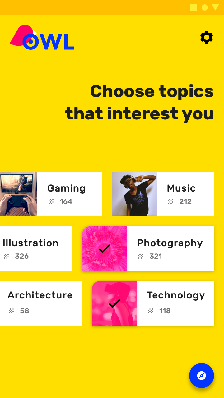
This educational app uses bold, saturated brand colors
This educational app uses bold, saturated brand colors (yellow, blue, magenta) in a vibrant way that matches the spirit of the brand.
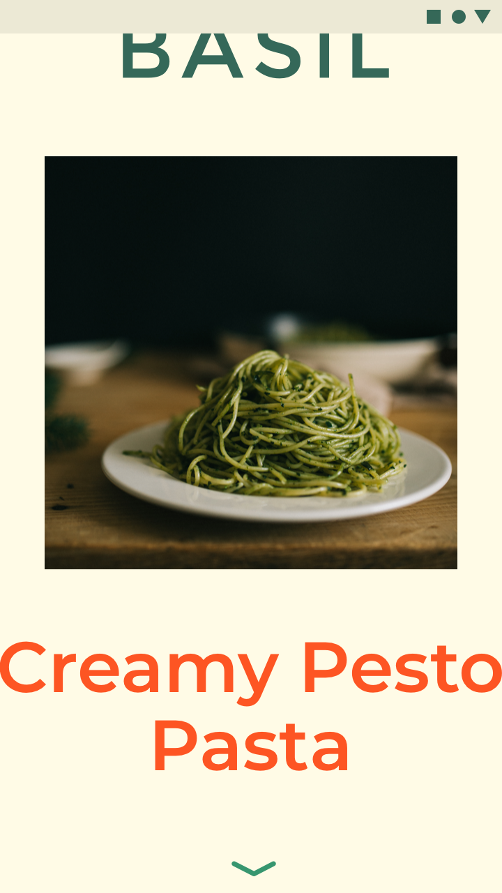
This cooking app’s bold approach to color and typography infuses energy and excitement while remaining legible
This cooking app’s bold approach to color and typography infuses energy and excitement while remaining legible and usable.

Even brands with more subtle color approaches can use color in bold, celebratory ways.

Launch screens

Launch screens can be celebratory moments that use color in bold ways.
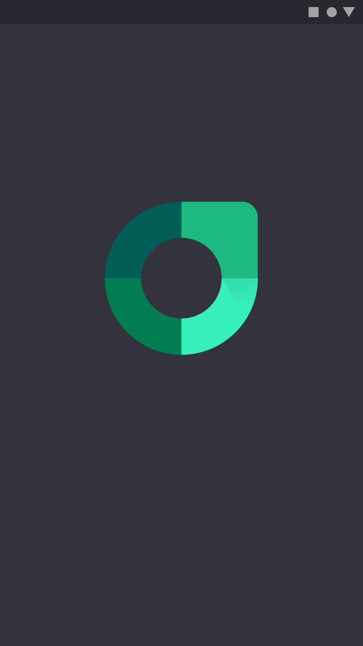
Bold use of color: launch screens

Onboarding

Color used during onboarding can connect content to branding.
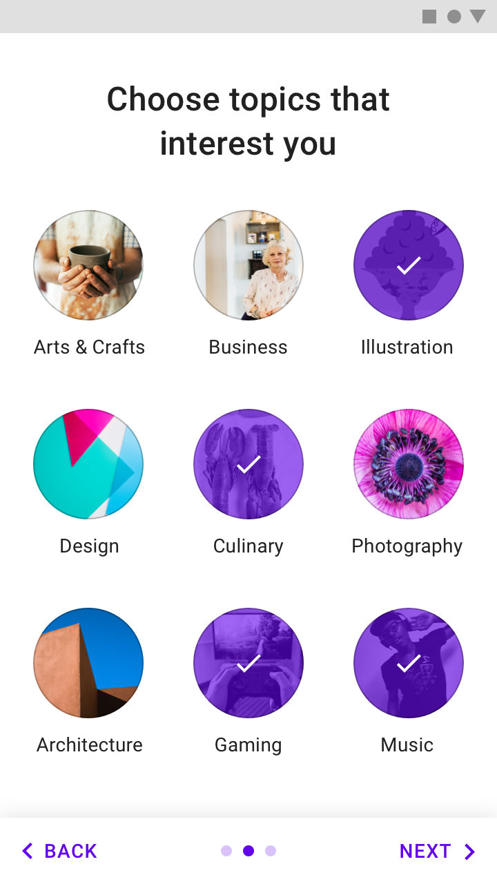
Bold use of color: onboarding

Feature discovery

New features can be highlighted to ensure the user sees them by using color to guide user focus.
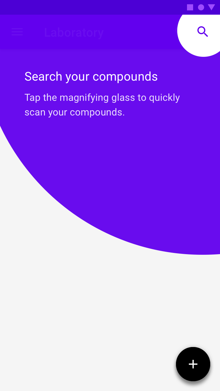
Bold use of color: feature discovery

Owl

Owl is an educational app that uses Material Design components and Material Theming to create an energetic, motivational brand experience.

Related article

Basil

Basil is a recipe app that uses Material Design components and Material Theming to create an on-brand experience that is exciting and easy to explore.

Related article

Subtle use of color ​

Brands can use color in subtle ways, whether that means conveying sophistication, emphasizing content, or suiting content in some other way. When using color with subtlety, ensure that interactive areas and state changes remain identifiable and easily seen.
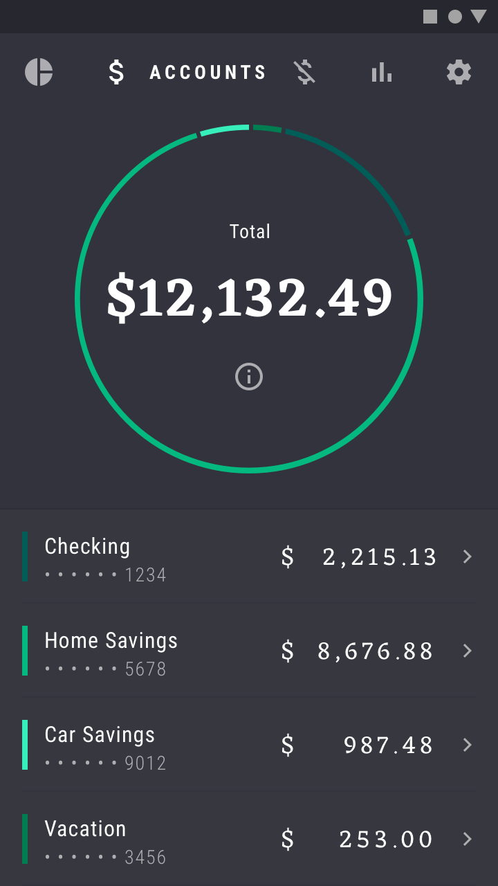
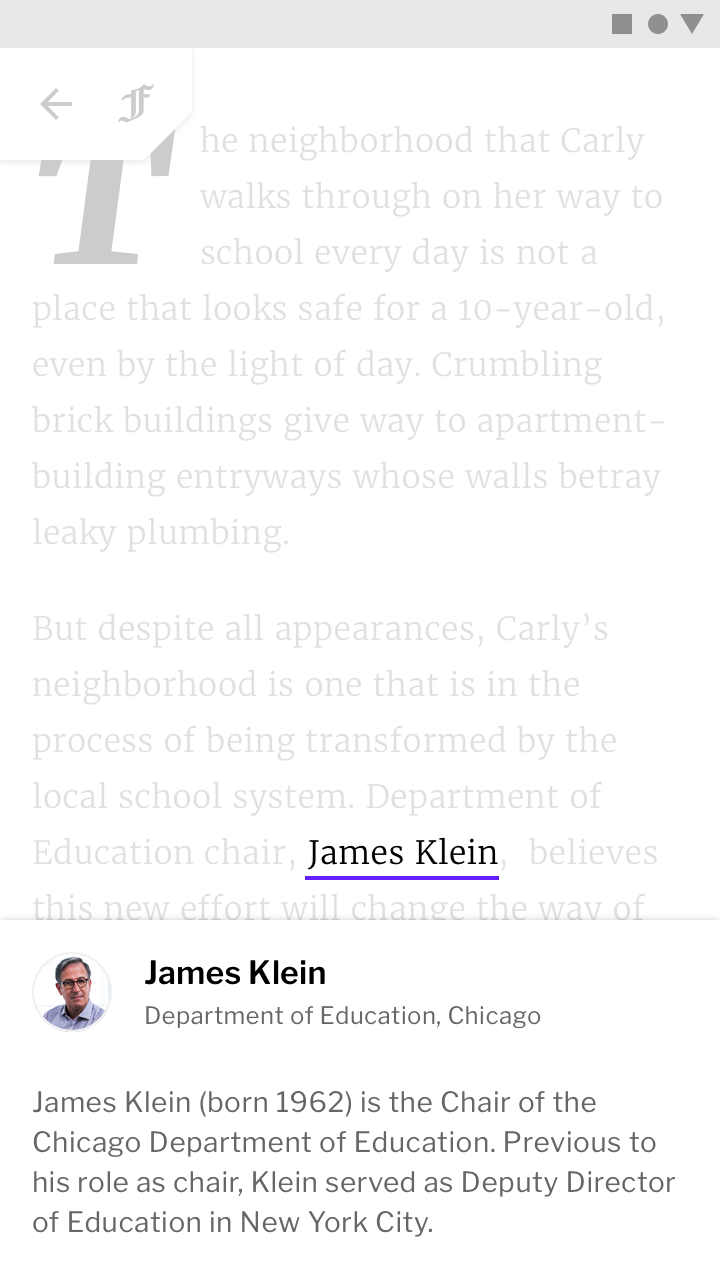
This financial app uses small amounts of color to display information, such as data in graphs
This financial app uses small amounts of color to display information, such as data in graphs. Using color in this way connects information to brand colors.
This news app uses its secondary color (purple) sparingly
This news app uses its secondary color (purple) sparingly. By doing so, it stands out in the places it is used. Using color in this way makes content the most important element on the page.

Brand presence can be maintained subtly by incorporating brand colors into moments like loading a placeholder UI, showing progress indicators, or expressing state changes.

Placeholder UI

A placeholder UI is displayed while screen content loads. Including a brand color here assures users that they are still in the app as it loads.


Progress indicators

Progress indicators are a subtle but powerful place to incorporate brand color, as they tie the function of the app to the brand.
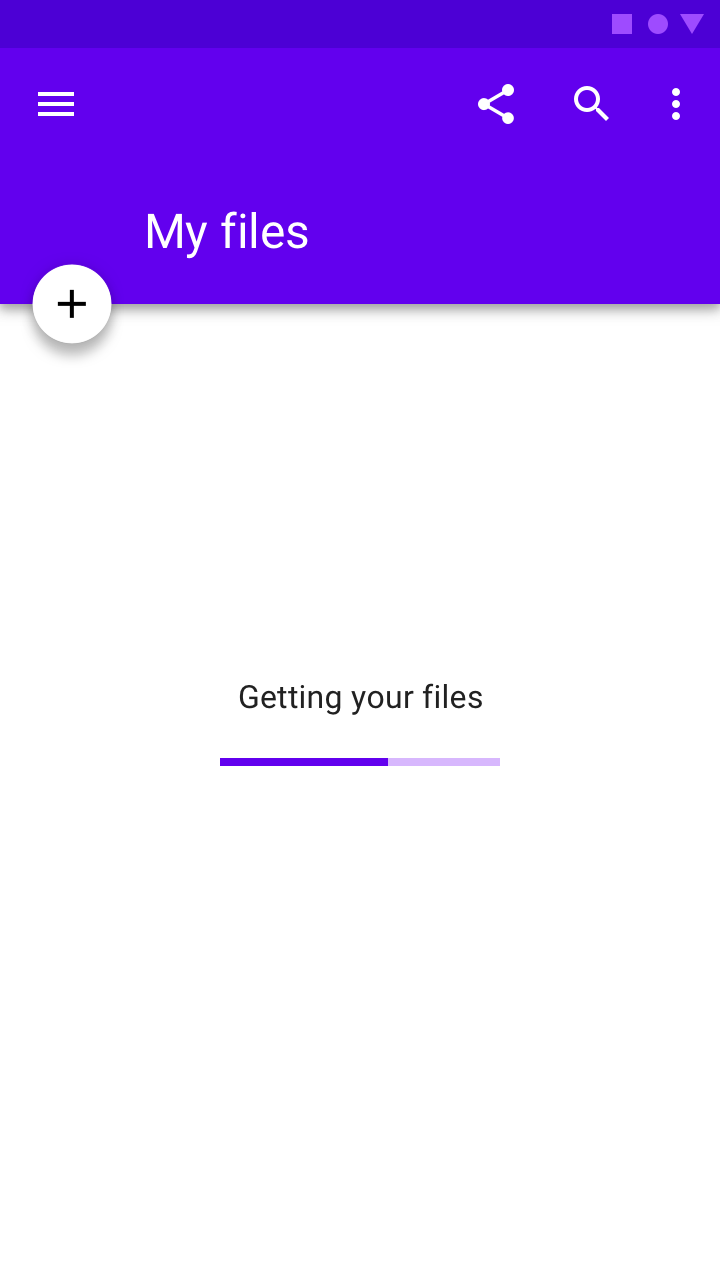
Subtle use of color: progress indicators

State changes

State changes can subtly reinforce brand presence.
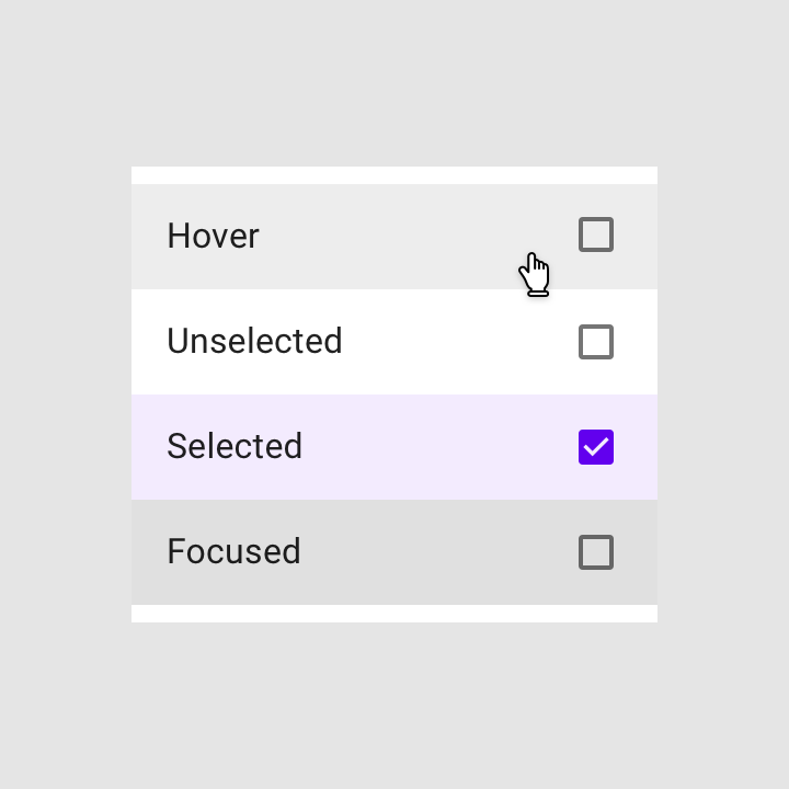
Subtle use of color: changes

Rally

Rally is a personal finance app that uses Material Design components and Material Theming to create an on-brand experience with a data-driven aesthetic.

Related article

Fortnightly

Fortnightly is a news app that uses Material Design components and Material Theming to create an on-brand, content-focused experience.

Related article

Progress & activity

Progress indicators express an unspecified wait time or display the length of a process.

Related article

Meaning ​

Color can communicate the meaning of different UI elements. For example, a weather app may display colors indicating current weather conditions, and a navigation app may display color showing traffic conditions, with roads colored red or green
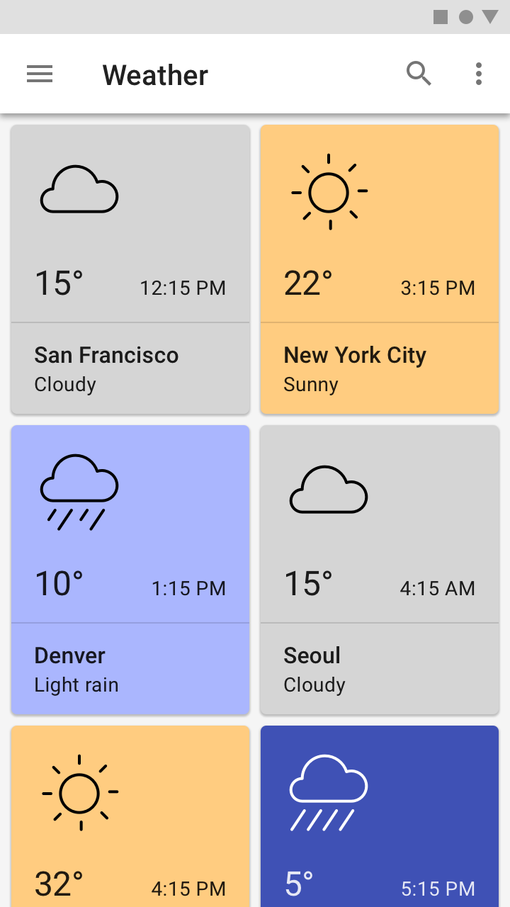
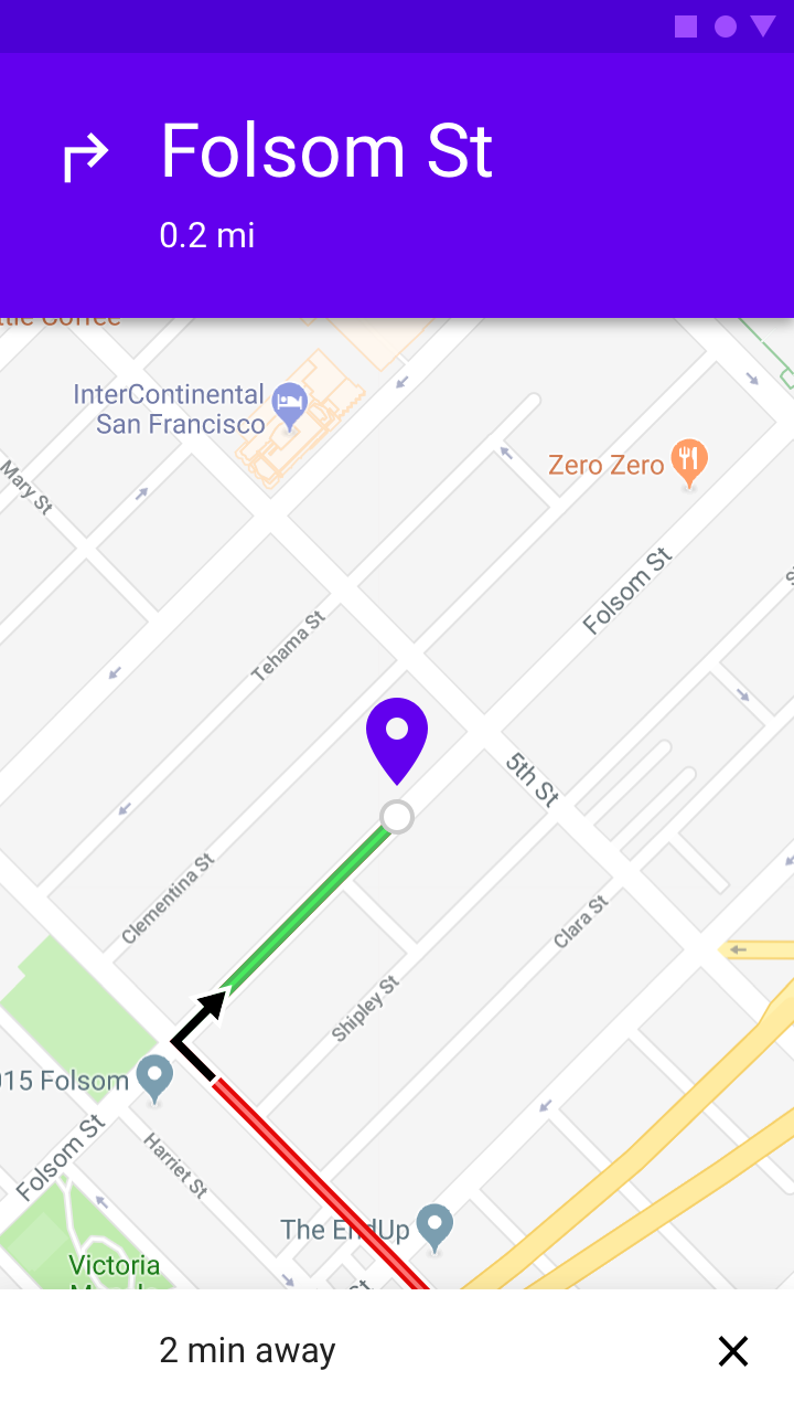
This weather app pairs color with weather conditions
This weather app pairs color with weather conditions.
A navigation app uses color to signal traffic conditions
A navigation app uses color to signal traffic conditions.

Consistency and context ​


Color should be used consistently in a product, so that certain colors always mean the same thing, even if the context changes. Attention should also be given to colors with local or cultural significance. For example, alerts may typically be colored red in some cultures, but not in others.
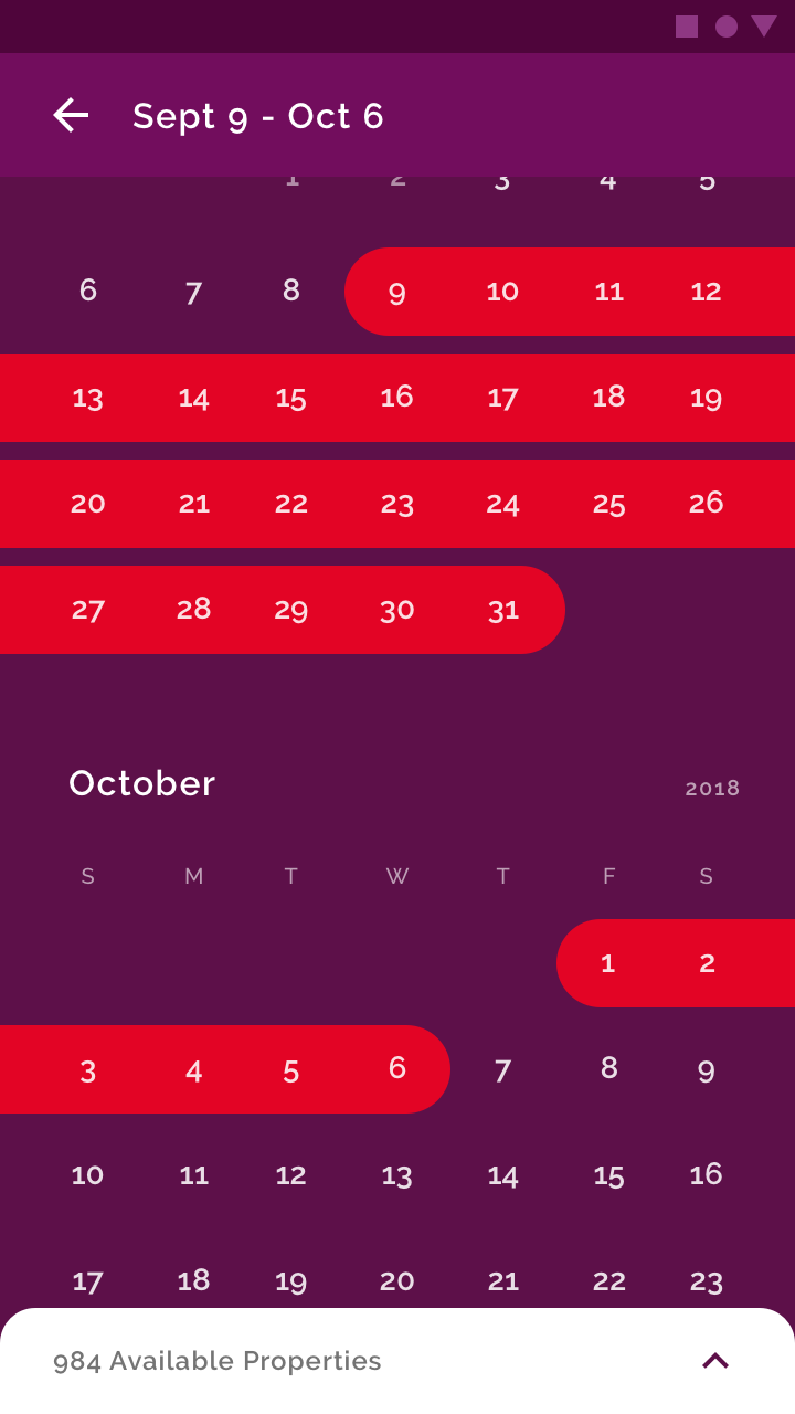
Date selection is shown in red against a purple background
Date selection is shown in red against a purple background, associating the brand’s primary color (red) with choosing travel dates.

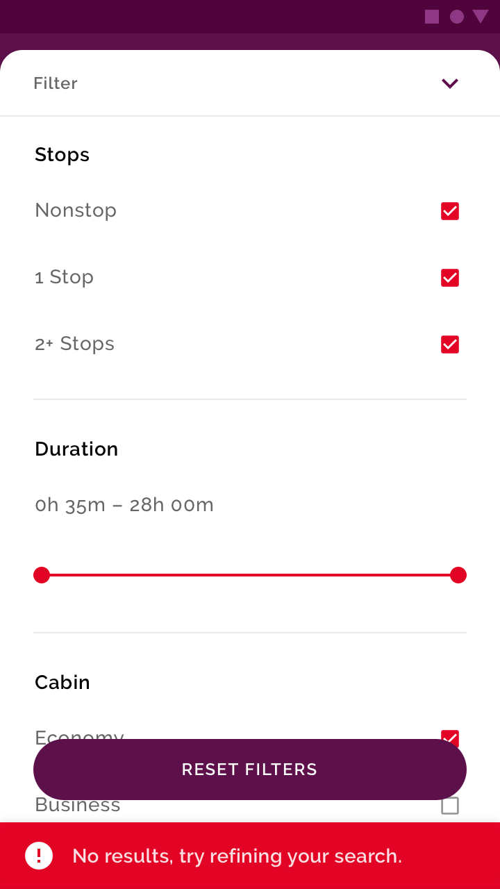
Don't: since red is a brand color, don’t also use it to convey an error state

Don't

Since red is a brand color, don’t also use it to convey an error state.
Do: choose alternative alert colors that don’t use brand coloring

Do

Choose alternative alert colors that don’t use brand coloring.

State ​

Color can provide information about the state of an app, its components, and elements. This includes:

  • Current state of an element or component, such as whether a button is enabled or disabled
  • Changes in state to an app, component, or element

Color should be noticeable when indicating state changes, as subtle differences in color may be missed. It’s best to indicate a change of state in more than one way, such as by displaying an icon or moving the location of an element.

Indicating interaction ​


To emphasize a specific interaction, use strong color contrasts on content that a user has interacted with, relative to content a user hasn’t.
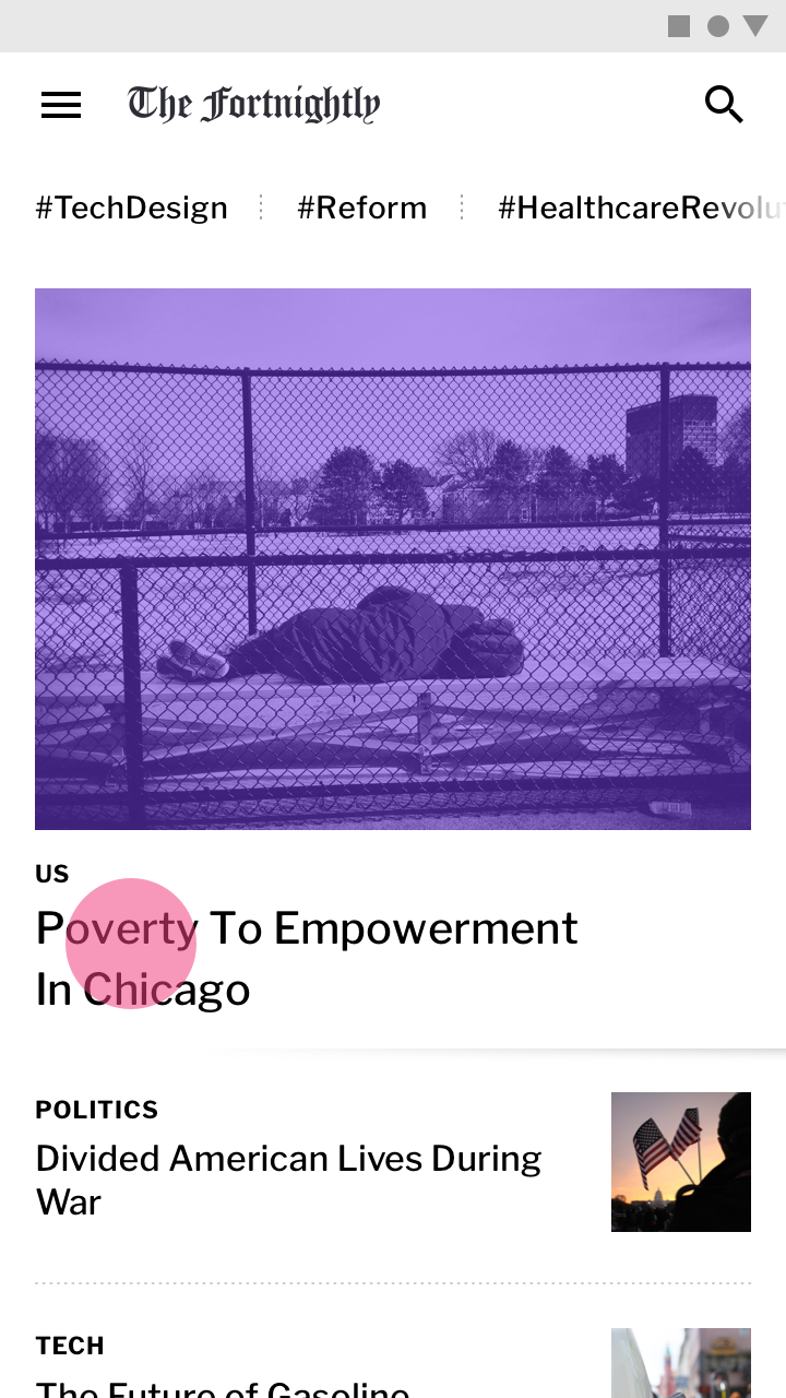
This image has a color treatment that indicates the user is interacting with it
This image has a color treatment that indicates the user is interacting with it.

Indicating selection ​


To emphasize selected elements, use strong color contrasts on those elements.
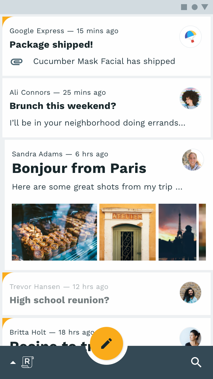
The emails in this list use brand colors to indicate those which are selected, using a colored corner shape
The emails in this list use brand colors to indicate those which are selected, using a colored corner shape.
Pager
Previous pageApplying color to UI
Next pageText legibility

Released under the Apache-2.0

Copyright © 2018-Present Google

https://m2.material.io/design/color/color-usage.html

Released under the Apache-2.0

Copyright © 2018-Present Google