Skip to content
Material Design 2
Main Navigation
v3
v2
v1

English

简体中文
繁體中文
Español
Français
Русский
Português – Brasil
Deutsch
日本語
한국어
Italiano
Polski
Türkçe
čeština
magyar

English

简体中文
繁體中文
Español
Français
Русский
Português – Brasil
Deutsch
日本語
한국어
Italiano
Polski
Türkçe
čeština
magyar

Appearance

Sidebar Navigation

Material System

Introduction

Material studies

About our Material studies

Basil

Crane

Fortnightly

Owl

Rally

Reply

Shrine

Material Foundation

Environment

Surfaces

Elevation

Light and shadows

Layout

Understanding layout

Pixel density

Responsive layout grid

Spacing methods

Component behavior

Applying density

Navigation

Understanding navigation

Navigation transitions

Search

Color

The color system

Applying color to UI

Color usage

Text legibility

Dark theme

Typography

The type system

Understanding typography

Language support

Sound

About sound

Applying sound to UI

Sound attributes

Sound choreography

Iconography

Product icons

System icons

Animated icons

Shape

About shape

Shape and hierarchy

Shape as expression

Shape and motion

Applying shape to UI

Motion

Understanding motion

The motion system

Speed

Choreography

Customization

Interaction

Gestures

Selection

States

Communication

Confirmation & acknowledgement

Data formats

Data visualization

Empty states

Help & feedback

Imagery

Launch screen

Onboarding

Offline states

Writing

Machine learning

Machine learning patterns

Object detection: live camera

Object detection: static image

Barcode Scanning

Material Guidelines

Material Theming

Overview

Implementing your theme

Usability

Accessibility

Bidirectionality

Platform guidance

Android bars

Android fingerprint

Android haptics

Android icons

Android navigating between apps

Android notifications

Android permissions

Android slices

Android split-screen

Android swipe-to-refresh

Android text selection toolbar

Android widget

Cross-platform adaptation

Components

App bars: bottom

App bars: top

Backdrop

Banners

Bottom navigation

Buttons

Buttons: floating action button

Cards

Checkboxes

Chips

Data tables

Date pickers

Dialogs

Dividers

Image lists

Lists

Menus

Navigation drawer

Navigation rail

Progress indicators

Radio buttons

Sheets: bottom

Sheets: side

Sliders

Snackbars

Switches

Tabs

Text fields

Time pickers

Tooltips

On this page

Reply ​

Reply is an email app that uses Material Design components and Material Theming to create an on-brand communication experience.
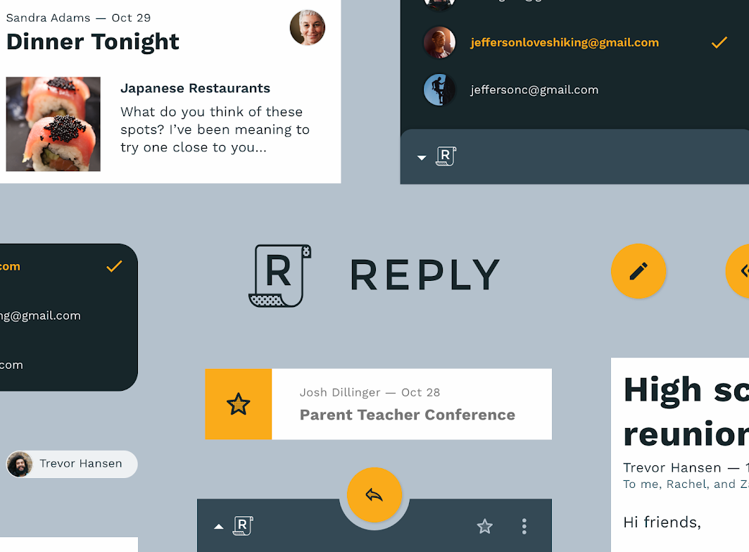
Reply hero image

About Reply ​

Reply is an app that helps individuals and groups communicate. It’s designed for clarity, legibility, intuition, and ease-of-use.

Reply’s brand projects friendliness, competence, and a hint of quirkiness.
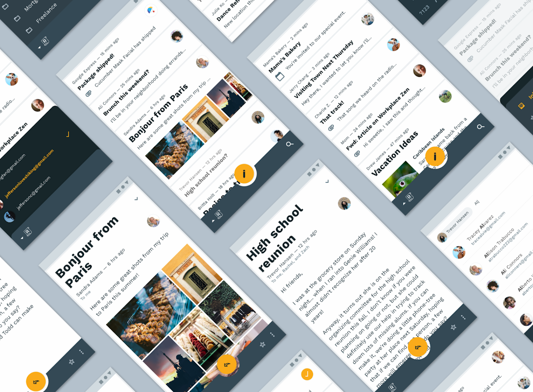
About Reply

Functional aesthetic ​

Reply’s brand emphasizes communication. As a result, the design of the app prioritizes functional qualities, placing ease-of-use over design elements that don’t have a functional purpose.

Reply’s branding is often paired with user actions, such as the navigation drawer being accessed from the brand logo.

Product architecture ​

Reply uses a product architecture similar to other email apps: an inbox that contains new and archived messages, and a UI structured around organizing and taking actions related to those messages. Messages can be starred, sent, deleted, marked as spam, or organized in custom ways set up by the user.

A focus on user tasks ​

Because user tasks mostly involve content generation and consumption, screen space is dedicated to content over other UI elements. To ensure there is enough space for both content and navigation, Reply uses different navigation patterns for desktop, tablet, and mobile.
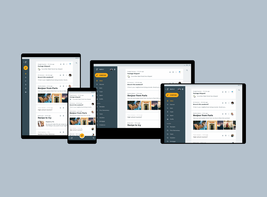
Reply uses different navigation patterns on tablet (rail), mobile (bottom app bar), and desktop (navigation drawer)
Reply uses different navigation patterns on tablet (rail), mobile (bottom app bar), and desktop (navigation drawer).

Navigation drawer ​

On desktop, Reply uses a standard navigation drawer.

Drawer organization ​

Drawer destinations are represented using both icons and text. The top of the navigation drawer incorporates settings, an account switcher, and a caret (or arrow) paired with the Reply logo.

Drawer interactions ​

When tapped, the logo collapses the drawer into a rail.
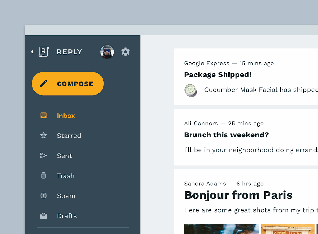
Reply’s standard navigation drawer gives access to navigation items, an account switcher, and settings
Reply’s standard navigation drawer gives access to navigation items, an account switcher, and settings. When the Reply logo is tapped, the drawer collapses into a rail.

Bottom app bar ​

On mobile, Reply uses a bottom app bar to launch navigation.

Bottom app bar interactions ​

When the Reply logo is tapped, it reveals a bottom navigation drawer with a settings icon and account avatar (which can be tapped to switch accounts).

When the Reply logo is tapped again, the navigation closes and the bottom app bar returns to its default state.
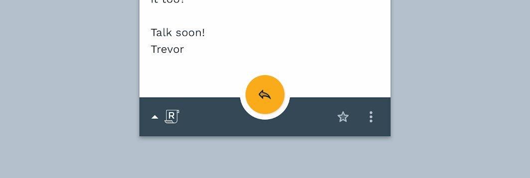
Reply’s bottom app bar
Navigation drawer

Navigation drawers provide access to destinations in your app.

Related article

Floating Action Button

A floating action button (FAB) represents the primary action of a screen.

Related article

Bottom app bars

A bottom app bar displays navigation and key actions at the bottom of mobile screens.

Related article

Rail navigation ​

On tablet, Reply uses rail navigation, in which each destination is represented by an icon.

Rail interactions ​

The rail can open to a standard navigation drawer by tapping the Reply logo. An arrow displayed next to the logo makes it clear that the logo is interactive.

Rail navigation is ideal for use on tablet because it can show a large number of destinations while taking up very little space. Customized folders are shown when the rail navigation has been opened, allowing the user to read the folder title text.

When collapsed, the rail doesn’t include customized folders created by the user. This is because customized folders all use the same icon, so they can’t be distinguished by icon alone.
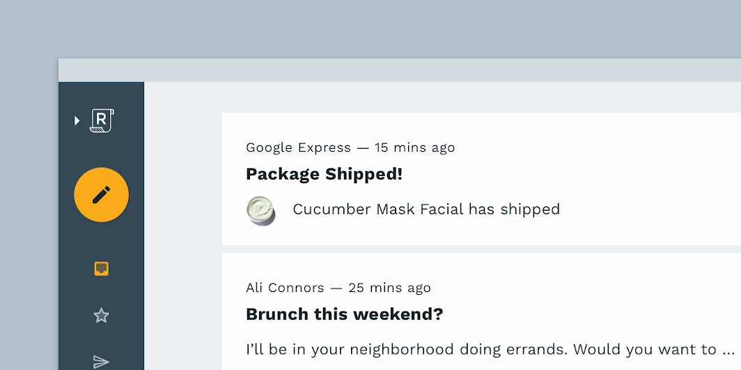
Reply’s rail navigation reveals a navigation drawer upon tapping the Reply logo
Reply’s rail navigation reveals a navigation drawer upon tapping the Reply logo.

Layout ​

Grid system ​

Reply uses a responsive grid, allowing padding and column size to change across mobile, tablet, and desktop. Content is placed in a column, where messages expand and contract upon interaction.

Reply’s grid system, scaled down to 50%

Layout Grid

Material Design's responsive layout grid adapts to screen size and orientation, ensuring consistency across layouts.

Related article

Cards

Cards contain content and actions about a single subject.

Related article

Component behavior

This page describes how components behave in a layout, both in relationship to the grid as well as breakpoints.

Related article

Elevation ​


Reply uses color to create distinction between components. For example, the container of a card is visible because cards have a white surface color, while the app background is grey.

Denser layout

Because Reply sometimes displays dense content, removing shadows helps decrease visual complexity. It also allows items to have smaller padding between each other, leaving more space for content.
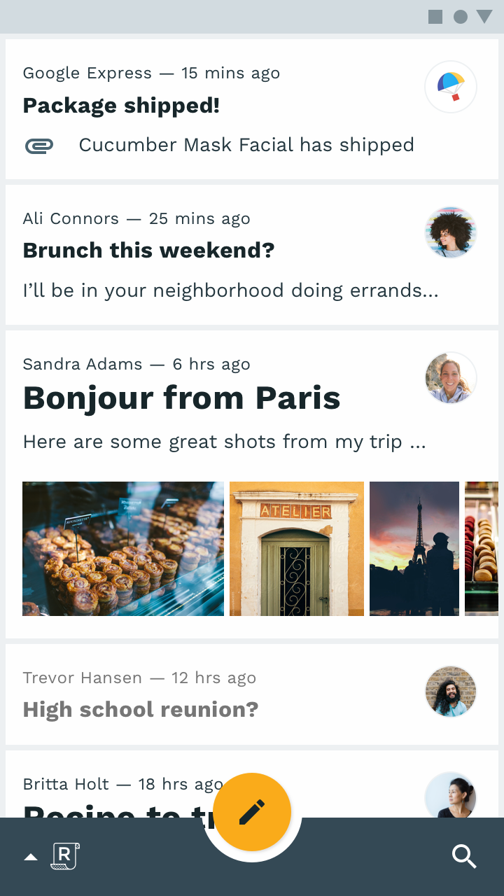
The containers of cards in Reply have white surfaces, which stand out against the grey background of the app
The containers of cards in Reply have white surfaces, which stand out against the grey background of the app.

Color ​

Color theme ​

Reply’s color theme uses a primary color (dark blue-grey) and a secondary color (orange).

Because the secondary color is rarely used, Reply’s UI is often monochromatic, using variations of its primary color. This subtle color theme allows content to be easily read without distraction, and photographic avatars to be easily seen.

Whenever Reply’s secondary color is used, it has a pronounced impact.
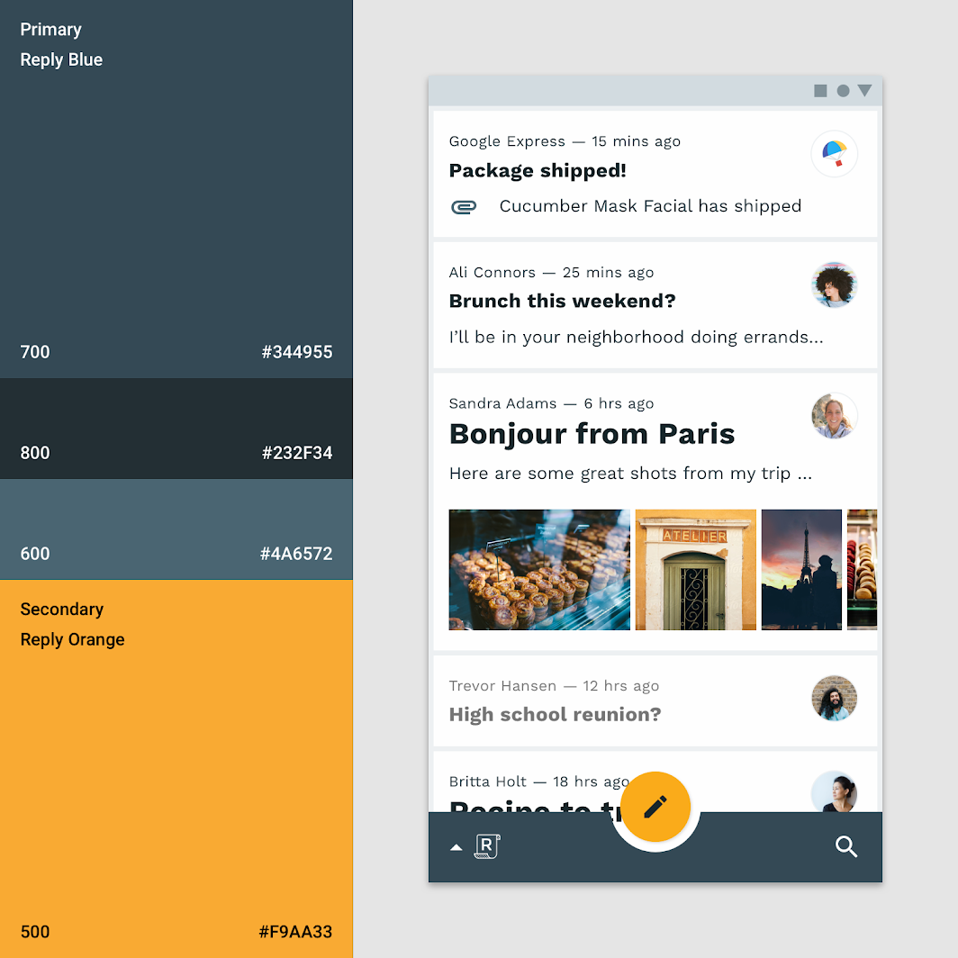
Color theme
Color theme

Typography ​

Type scale ​

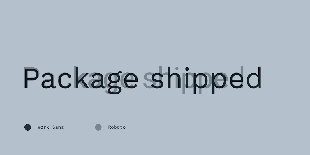
Reply’s uses Work Sans as the typeface. All items in the type scale provide the typographic variety necessary for Reply’s content.

The type scale makes use of the variety of weights available by using six weights of Work Sans: Light, Regular, Medium, SemiBold, and Bold.
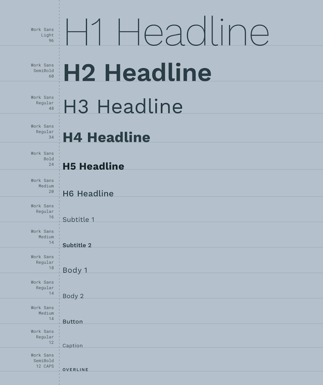
Reply’s type scale
Reply’s type scale

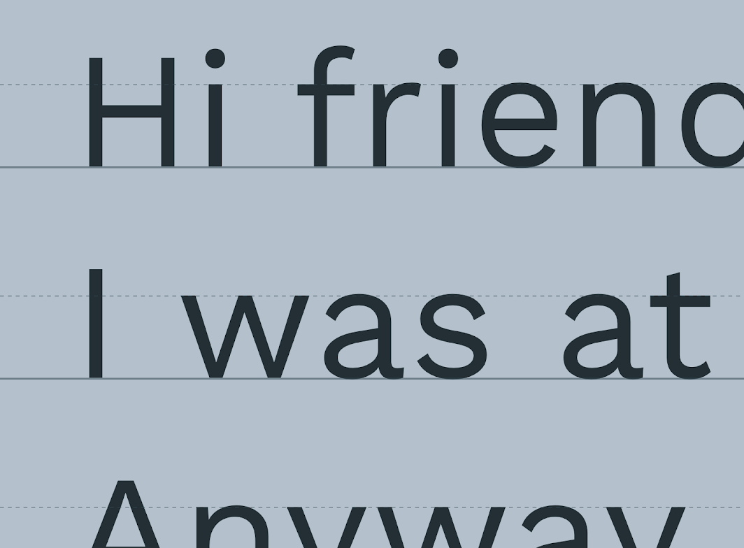
Type scale: work Sans’ letterforms
Work Sans’ letterforms

Work Sans compared to Roboto

The type system

Use typography to present your design and content as clearly and efficiently as possible.

Related article

Understanding typography

Typography expresses hierarchy and brand presence.

Related article

Work Sans

A typeface available on Google Fonts.

Related link

Iconography ​

Reply’s iconography has subtle styling, which expresses brand while focusing on icon recognition and functionality.
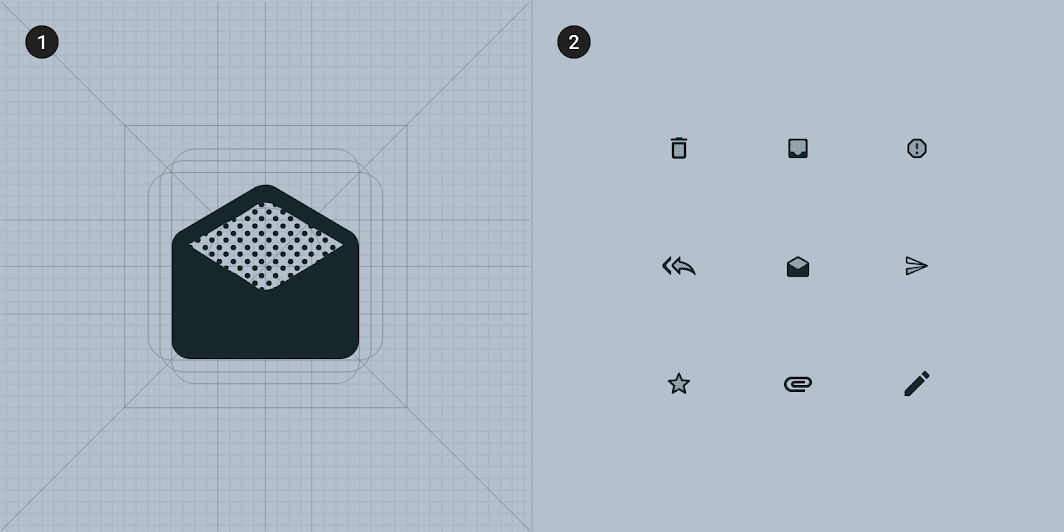
To create consistency, all of Reply’s icons share the same underlying grid structure
1. To create consistency, all of Reply’s icons share the same underlying grid structure
2. A collection of Reply’s icons

Shape ​

Categories ​

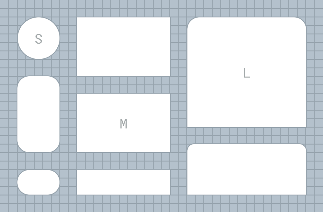
Components are grouped into shape categories based on their size. Shape categories let you set multiple component values at once. Shape categories include:

  • Small components
  • Medium components
  • Large components
Reply’s shape categories

Diagram of small components, medium components, large components
1. Small components
2. Medium components
3. Large components

Small components ​

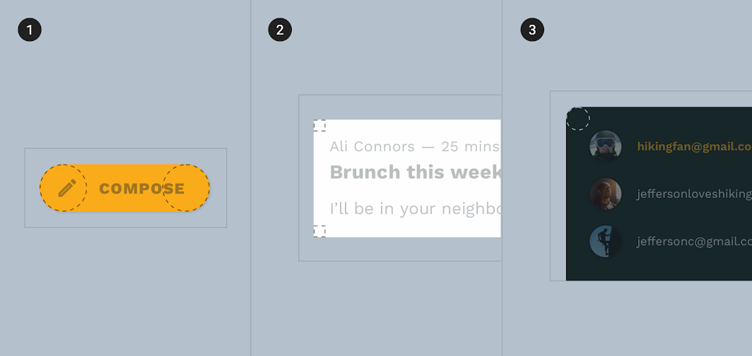
Extended floating action buttons have rounded corners with a 50% corner radius.
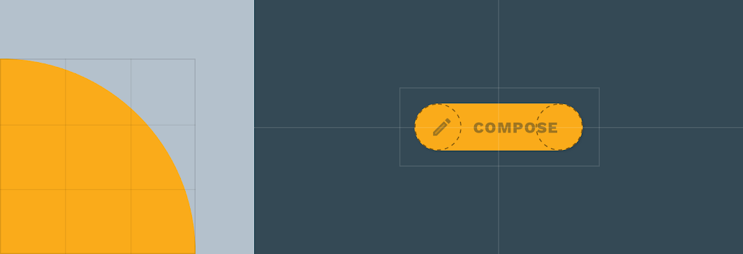
Small components: extended FAB
ComponentCategoryAttributeValue
Extended FABSmall componentsFamily
Size
Rounded
50%

Medium components ​

Cards have rounded corners with a 0dp corner radius.
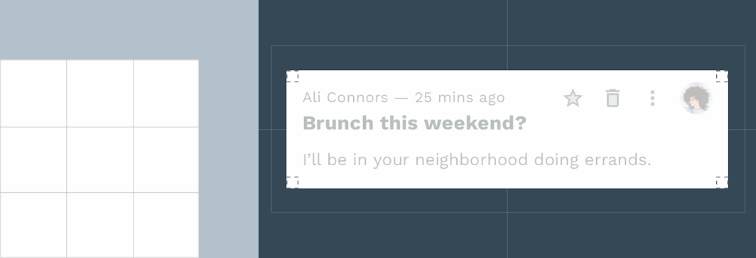
Medium components: cards
ComponentCategoryAttributeValue
CardsMedium componentsFamily
Size
Rounded
0dp;0dp;0dp;0dp

Large components ​

Bottom sheets have rounded corners with a 12dp corner radius.
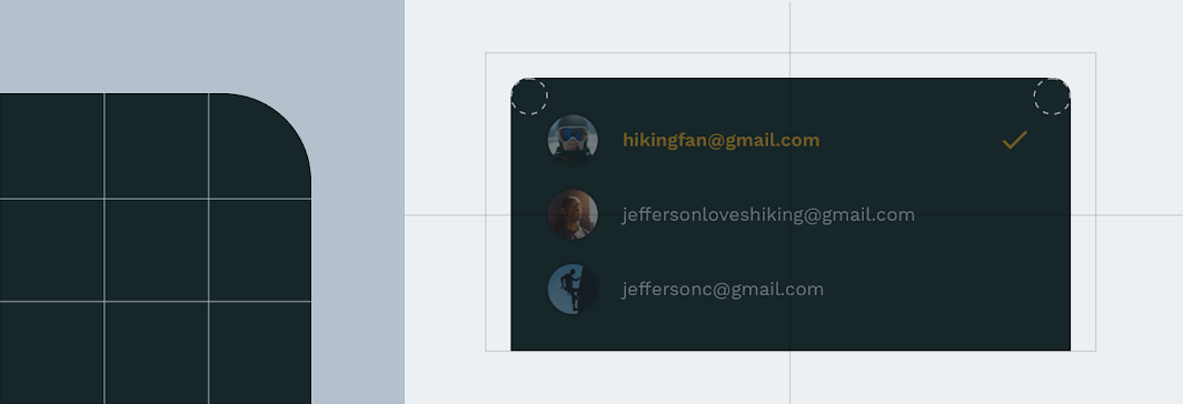
Large components: bottom sheet
ComponentCategoryAttributeValue
Bottom sheetsLarge componentsFamily
Size
Rounded
12dp;12dp;n/a;n/a*

*Bottom sheets can only shape the top-left and top-right corners.

Components ​
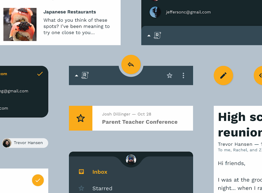
Shape hero image

Floating action button ​

On mobile, Reply nests a custom FAB in a bottom app bar.
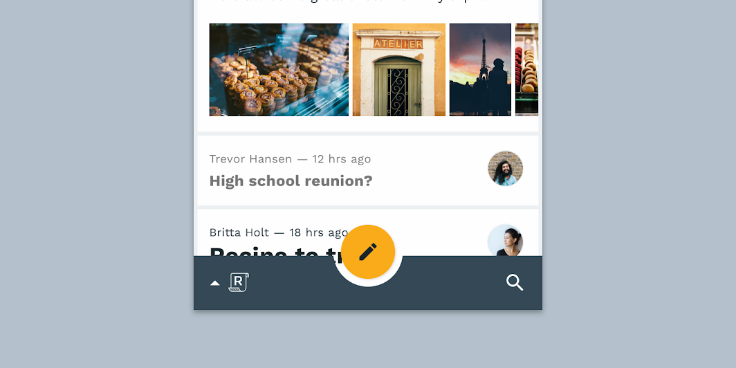
Reply’s custom FAB nested in a bottom app bar

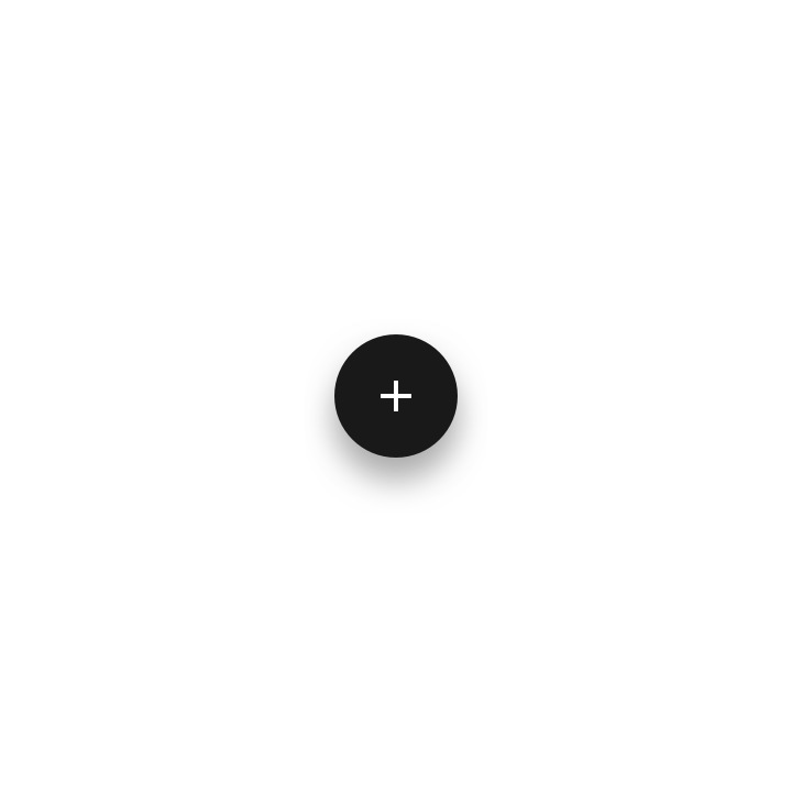
A FAB that hasn’t been customized
Reply’s FAB uses custom color and iconography
Reply’s FAB uses custom color and iconography.

Extended FAB ​

On desktop and tablet, Reply uses a custom extended FAB that is paired with a navigation drawer.
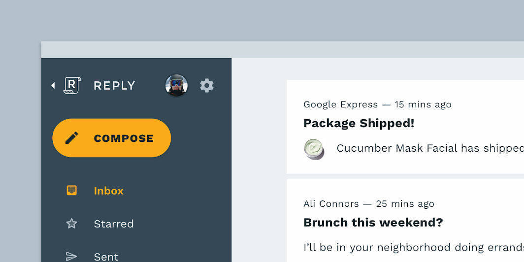
Reply’s custom extended FAB inside a navigation drawer

An extended FAB that hasn’t been customized
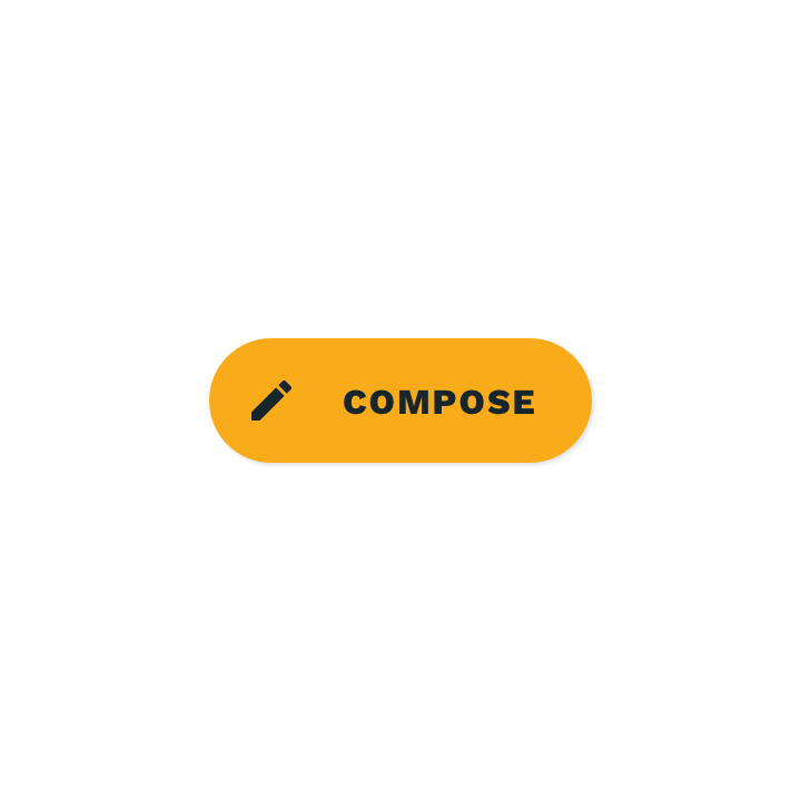
Reply’s extended FAB uses custom color and typography
Reply’s extended FAB uses custom color and typography.

Bottom app bar, bottom sheet ​

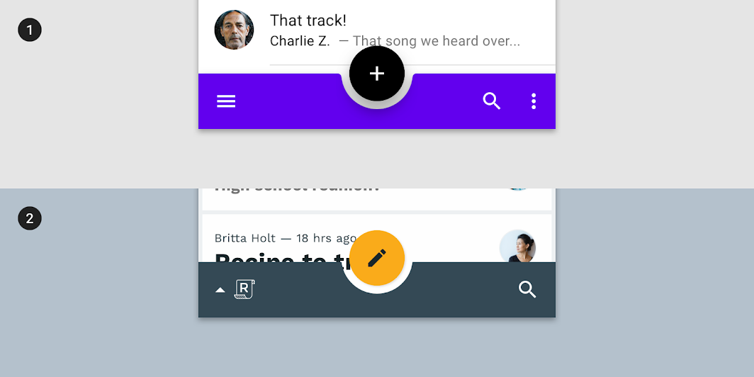
On mobile, Reply uses a custom bottom app bar for navigation and important actions.
Bottom app bar, bottom sheet: default bottom app bar
1. Default bottom app bar
2. Reply’s bottom app bar uses custom iconography, color, and shape. The Reply logo is incorporated into the component, functioning as the menu icon. A custom shape in the bar holds the floating action button.
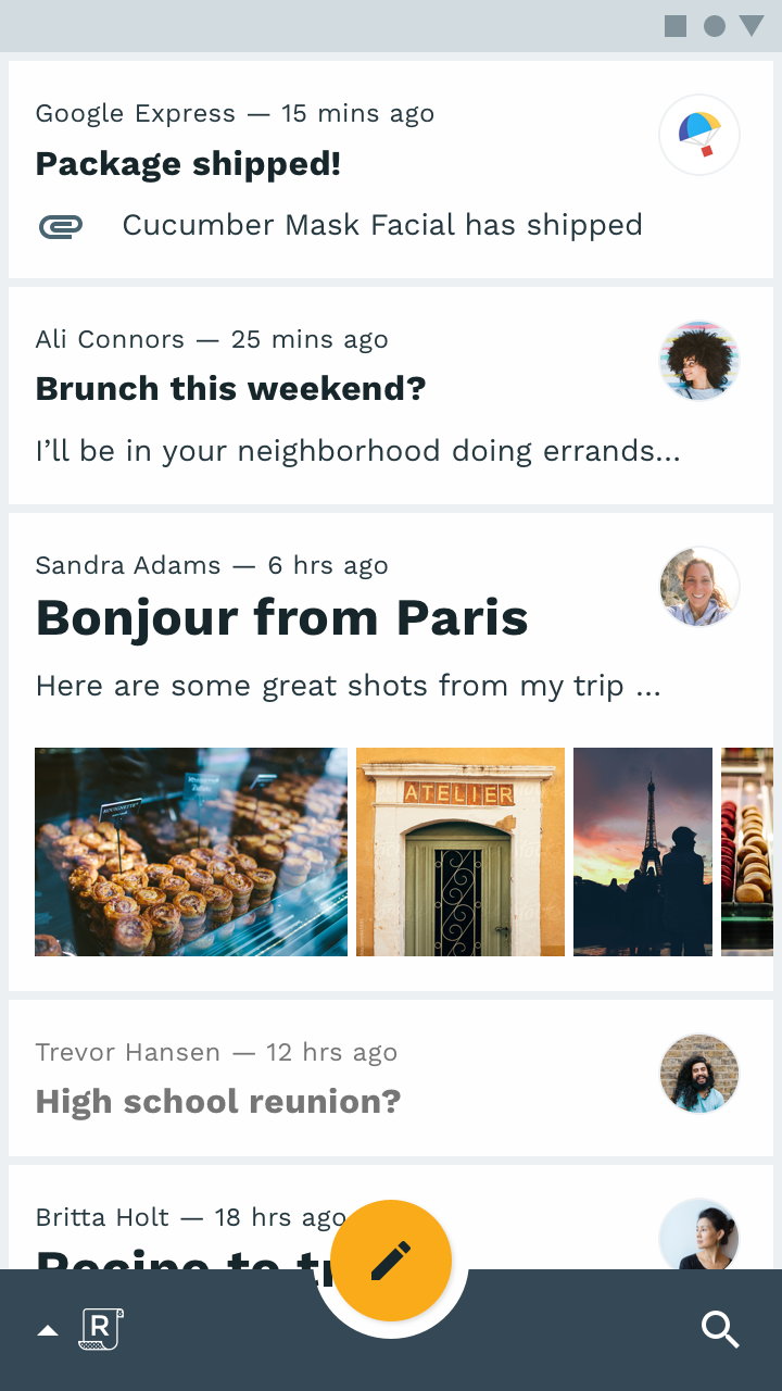
Bottom app bar, bottom sheet: bottom app bar

Bottom app bar

On mobile, Reply’s bottom app bar is the primary way to perform navigation and actions.
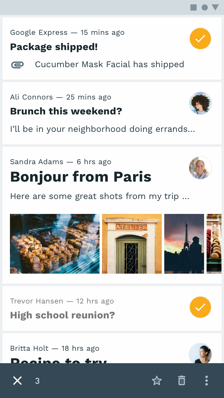
Bottom app bar, bottom sheet: contextual action bar

Contextual action bar

When the user wishes to select and apply actions to multiple items, the bottom action bar transforms into a contextual action bar.
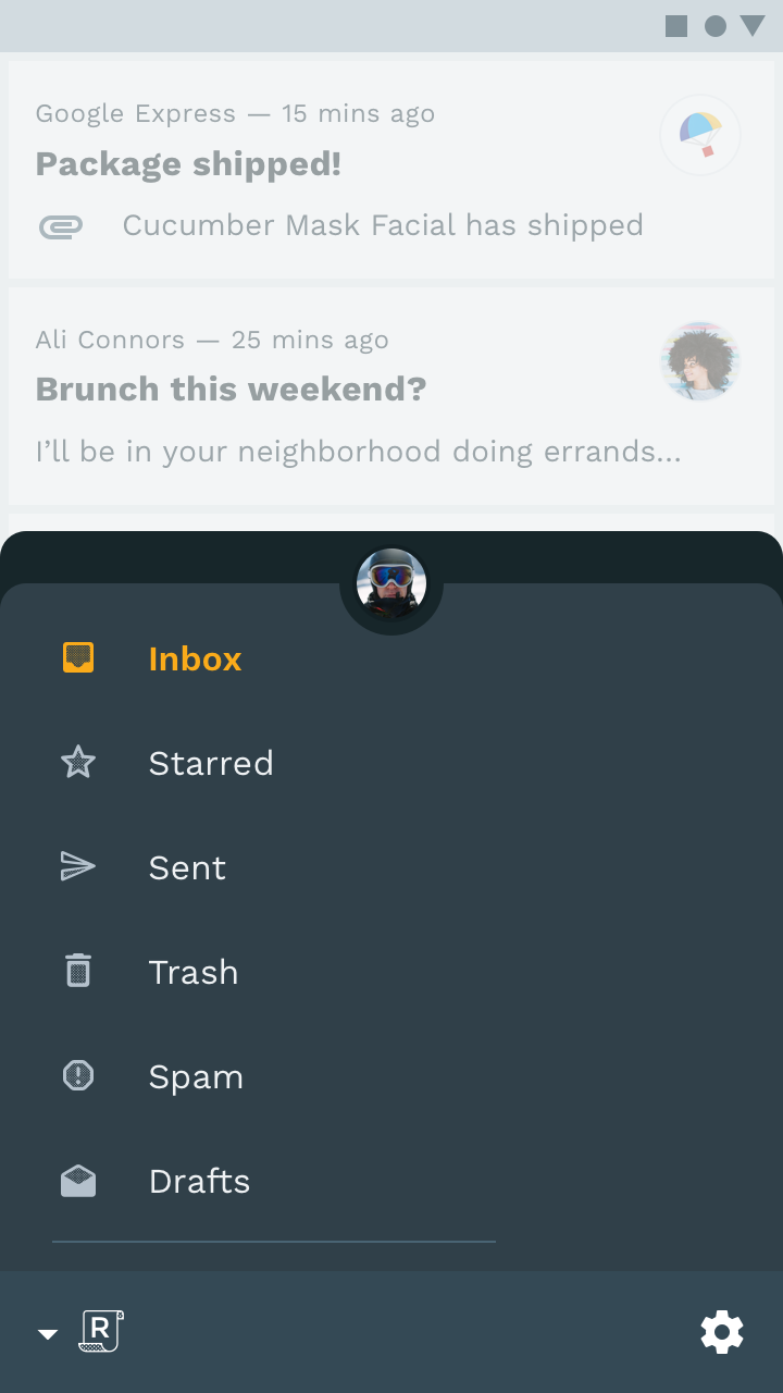

Bottom app bar, bottom sheet: bottom navigation drawer

Bottom navigation drawer

Upon pressing the Reply logo, the bottom app bar reveals a bottom navigation drawer that holds navigation items and an account switcher.
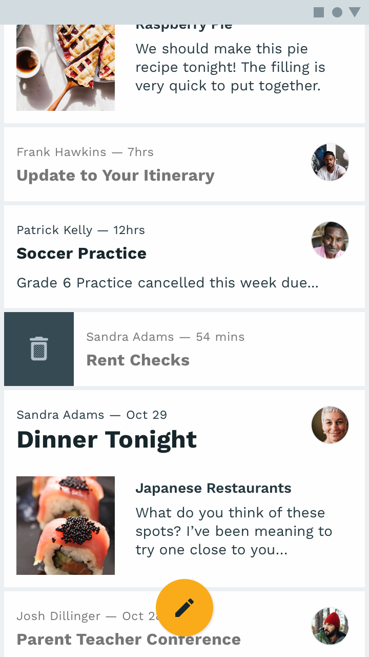
Bottom app bar, bottom sheet: floating action button

Floating action button

The bottom app bar moves off-screen on scroll, though the FAB remains.

Floating Action Button

A floating action button (FAB) represents the primary action of a screen.

Related article

Bottom app bars

A bottom app bar displays navigation and key actions at the bottom of mobile screens.

Related article

Contextual action bar

The top app bar displays information and actions relating to the current screen.

Related article

Cards ​

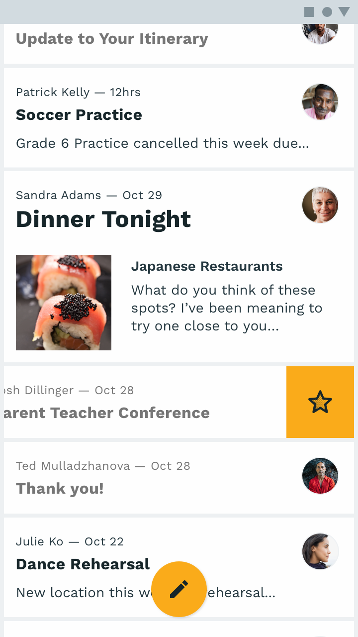
Reply displays emails on cards that have been customized with square corners. Padding between the cards is very small because color indicates boundaries of each card (no indication of elevation is given).

This small padding allows more content to fit on-screen.
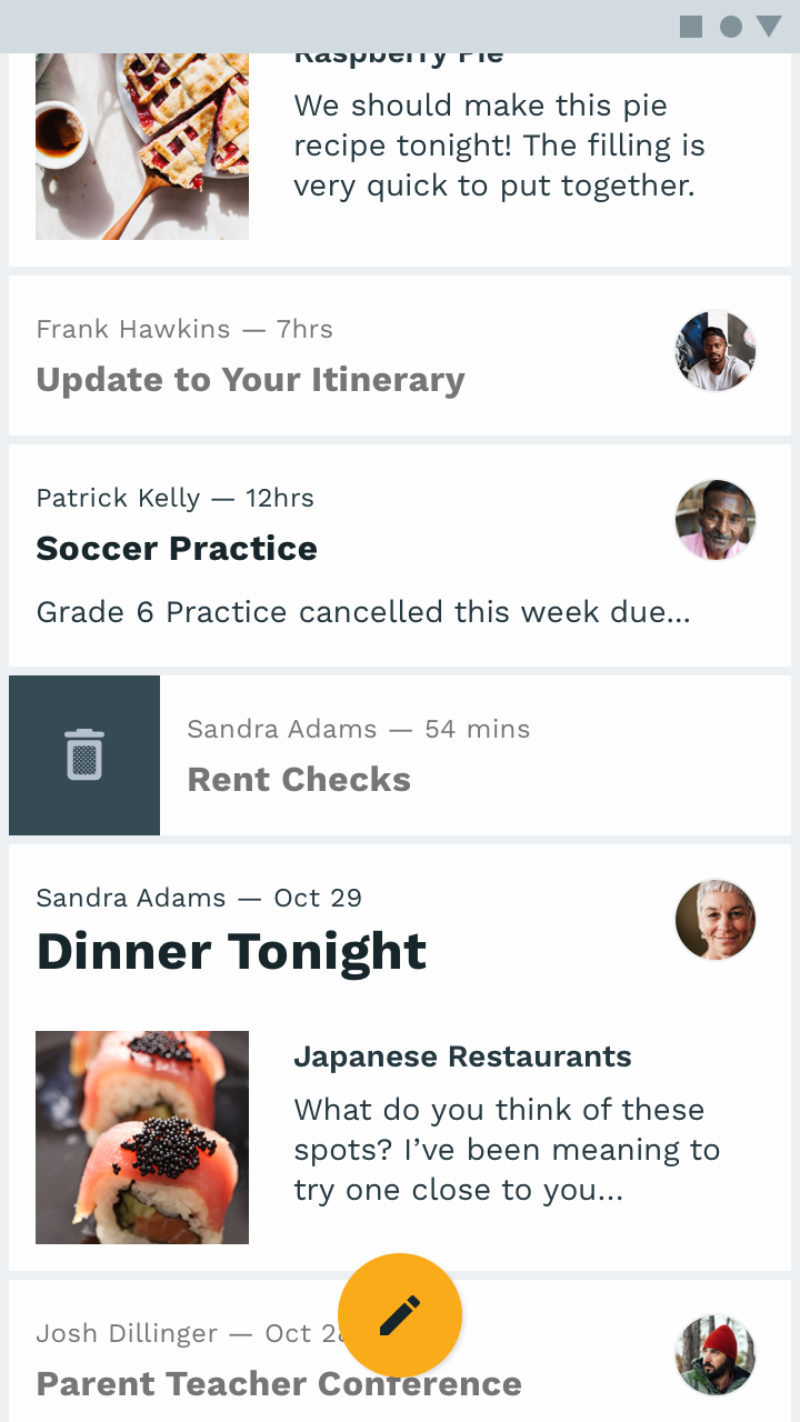
When a card is swiped to the right, it reveals the action of deleting an email
When a card is swiped to the right, it reveals the action of deleting an email.
When a card is swiped to the left, it reveals the action of highlighting an email
When a card is swiped to the left, it reveals the action of highlighting an email.

Chips ​

Reply entry chips apply customized typography, color, and image sizing.
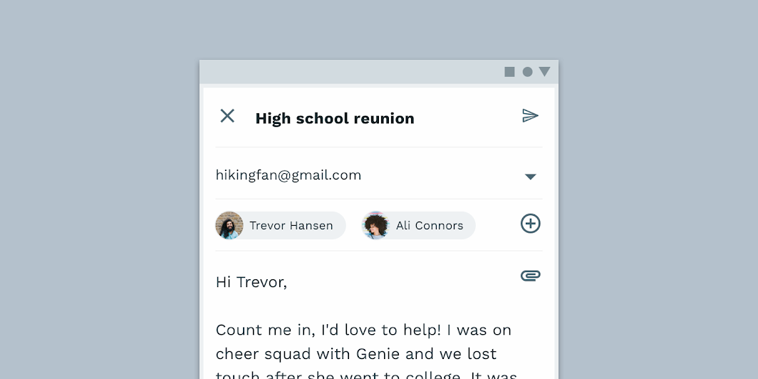
Adjustments to the layout, typography, and color help the chip component feel visually similar to Reply’s brand
Adjustments to the layout, typography, and color help the chip component feel visually similar to Reply’s brand.

A default entry chip
Reply’s entry chips use custom color and typography
Reply’s entry chips use custom color and typography. The avatar imagery is customized to be larger, completing the chip shape instead of being inset.

Cards

Cards contain content and actions about a single subject.

Related article

Chips

Chips are compact elements that represent an input, attribute, or action.

Related article

Gestures

Gestures let users interact with screen elements using touch.

Related article

Motion ​

Launch screen ​

Reply’s logo animation traces a path that’s inspired by a curling piece of paper.

Launching Reply for the first time displays an animated launch screen.

Navigation transitions ​

Reply uses shorter durations and standard easing to focus on efficiency.

These navigation transitions use 250ms instead of the standard 300ms.

Icons & illustrations ​

Animated illustrations create a connection at key points in a user journey, such as finishing every item in one’s inbox.

The two remaining emails are archived, triggering a celebratory animation.

Reply’s logo animation loops during a pull to refresh the loading sequence.
Pager
Previous pageRally
Next pageShrine

Released under the Apache-2.0

Copyright © 2018-Present Google

https://m2.material.io/design/material-studies/reply.html

Released under the Apache-2.0

Copyright © 2018-Present Google