Skip to content
Material Design 2
Main Navigation
v3
v2
v1

English

简体中文
繁體中文
Español
Français
Русский
Português – Brasil
Deutsch
日本語
한국어
Italiano
Polski
Türkçe
čeština
magyar

English

简体中文
繁體中文
Español
Français
Русский
Português – Brasil
Deutsch
日本語
한국어
Italiano
Polski
Türkçe
čeština
magyar

Appearance

Sidebar Navigation

Material System

Introduction

Material studies

About our Material studies

Basil

Crane

Fortnightly

Owl

Rally

Reply

Shrine

Material Foundation

Environment

Surfaces

Elevation

Light and shadows

Layout

Understanding layout

Pixel density

Responsive layout grid

Spacing methods

Component behavior

Applying density

Navigation

Understanding navigation

Navigation transitions

Search

Color

The color system

Applying color to UI

Color usage

Text legibility

Dark theme

Typography

The type system

Understanding typography

Language support

Sound

About sound

Applying sound to UI

Sound attributes

Sound choreography

Iconography

Product icons

System icons

Animated icons

Shape

About shape

Shape and hierarchy

Shape as expression

Shape and motion

Applying shape to UI

Motion

Understanding motion

The motion system

Speed

Choreography

Customization

Interaction

Gestures

Selection

States

Communication

Confirmation & acknowledgement

Data formats

Data visualization

Empty states

Help & feedback

Imagery

Launch screen

Onboarding

Offline states

Writing

Machine learning

Machine learning patterns

Object detection: live camera

Object detection: static image

Barcode Scanning

Material Guidelines

Material Theming

Overview

Implementing your theme

Usability

Accessibility

Bidirectionality

Platform guidance

Android bars

Android fingerprint

Android haptics

Android icons

Android navigating between apps

Android notifications

Android permissions

Android slices

Android split-screen

Android swipe-to-refresh

Android text selection toolbar

Android widget

Cross-platform adaptation

Components

App bars: bottom

App bars: top

Backdrop

Banners

Bottom navigation

Buttons

Buttons: floating action button

Cards

Checkboxes

Chips

Data tables

Date pickers

Dialogs

Dividers

Image lists

Lists

Menus

Navigation drawer

Navigation rail

Progress indicators

Radio buttons

Sheets: bottom

Sheets: side

Sliders

Snackbars

Switches

Tabs

Text fields

Time pickers

Tooltips

On this page

Overview ​

Material Theming refers to the customization of your Material Design app to better reflect your product’s brand.

Material Theming ​

What is Material Theming? ​

Material Theming is the ability to systematically customize Material Design to better reflect your product’s brand.

When you begin changing aspects of your UI, such as color and typography, Material Theming tools apply your design vision throughout your user experience. These tools allow easy switching between design and code workflows by providing specific values for all customizable attributes. Customizing these values creates a Material Theme for your product.

Using Material Theming ​

Material Theming consists of three main actions: customizing your theme, applying it across your design mocks, and using it in code.

Material Design comes designed with a built-in, baseline theme that can be used as-is, straight out of the proverbial box. You can then customize it as little, or as much, as you like to make Material work for your product.

Using Material Theming ​

Theming in practice ​

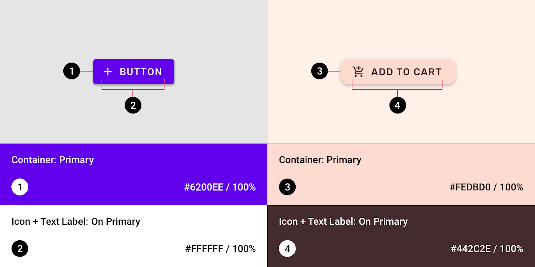
Theming affects your entire UI, including individual components, like a button. This example shows how a button component’s out-of-the-box values can be customized.

Customization: before and after ​

A contained button is assigned values for a specific color, shape, and type family. By default, contained buttons have the following default values:

  • The color is #6200EE
  • The text is 14pt, Roboto, Medium, and all caps
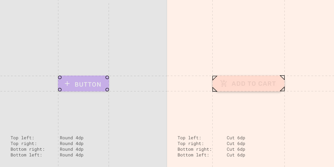
  • The corners have a rounded radius of 4dp

You can adjust the default color, type, and shape of this contained button to suit your app’s style.

On the left, a Material button shows the default styles. On the right, these values have been altered to create a button that is entirely customized.
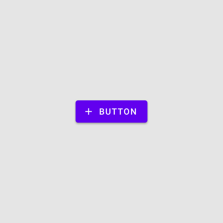
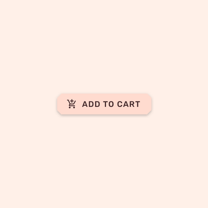
A baseline Material button
That same Material button, but customized

Default and customized values ​

Buttons have the following attributes and default values, with customizations for this example indicated in bold.

Typography ​
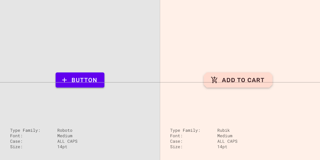

Using Material Theming: typography
ElementCategoryAttributeDefault valuesCustom values
Text LabelBUTTONType Family
Font
Case
Size
Roboto
Medium
All Caps
14pt
Rubik
Medium
All Caps
14pt

Color ​


Using Material Theming: color
ElementCategoryAttributeDefault valuesCustom values
ContainerPrimaryColor
Opacity
#6200EE
100%
#FEDBD0
100%
Text LabelOn PrimaryColor
Opacity
#FFFFFFF
100%
#442C2E
100%
IconOn PrimaryColor
Opacity
#FFFFFFF
100%
#442C2E
100%

Iconography ​


Iconography: values
ElementCategoryAttributeDefault valuesCustom values
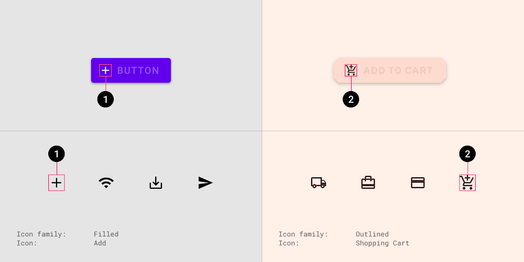
IconIcon SetIcon Family
Icon
Filled
Add
Outlined
Shopping Cart

Shape ​


Customization: before and after: shape
ElementCategoryAttributeDefault valuesCustom values
ContainerSmall componentTop Left Corner
Top Right Corner
Bottom Right Corner
Bottom Left Corner
Rounded 4dp
Rounded 4dp
Rounded 4dp
Rounded 4dp
Cut 6dp
Cut 6dp
Cut 6dp
Cut 6dp

Bold values indicate values that have been customized from the defaults.


Applying color to UI

In a UI, color has a variety of roles: from containing meaning, to expressing a look and feel.

Related article

Understanding typography

Typography is critical in establishing hierarchy and expressing brand presence that supports an effective digital experience.

Related article

Buttons

Buttons allow users to take actions with a single tap.

Related article

System icons

System icons symbolize common actions, files, devices, and directories.

Related article

Shape as expression

Shape can communicate an element’s state or contribute to developing a brand.

Related article

Pager
Previous pageBarcode Scanning
Next pageImplementing your theme

Released under the Apache-2.0

Copyright © 2018-Present Google

https://m2.material.io/design/material-theming/overview.html

Released under the Apache-2.0

Copyright © 2018-Present Google