Skip to content
Material Design 2
Main Navigation
v3
v2
v1

English

简体中文
繁體中文
Español
Français
Русский
Português – Brasil
Deutsch
日本語
한국어
Italiano
Polski
Türkçe
čeština
magyar

English

简体中文
繁體中文
Español
Français
Русский
Português – Brasil
Deutsch
日本語
한국어
Italiano
Polski
Türkçe
čeština
magyar

Appearance

Sidebar Navigation

Material System

Introduction

Material studies

About our Material studies

Basil

Crane

Fortnightly

Owl

Rally

Reply

Shrine

Material Foundation

Environment

Surfaces

Elevation

Light and shadows

Layout

Understanding layout

Pixel density

Responsive layout grid

Spacing methods

Component behavior

Applying density

Navigation

Understanding navigation

Navigation transitions

Search

Color

The color system

Applying color to UI

Color usage

Text legibility

Dark theme

Typography

The type system

Understanding typography

Language support

Sound

About sound

Applying sound to UI

Sound attributes

Sound choreography

Iconography

Product icons

System icons

Animated icons

Shape

About shape

Shape and hierarchy

Shape as expression

Shape and motion

Applying shape to UI

Motion

Understanding motion

The motion system

Speed

Choreography

Customization

Interaction

Gestures

Selection

States

Communication

Confirmation & acknowledgement

Data formats

Data visualization

Empty states

Help & feedback

Imagery

Launch screen

Onboarding

Offline states

Writing

Machine learning

Machine learning patterns

Object detection: live camera

Object detection: static image

Barcode Scanning

Material Guidelines

Material Theming

Overview

Implementing your theme

Usability

Accessibility

Bidirectionality

Platform guidance

Android bars

Android fingerprint

Android haptics

Android icons

Android navigating between apps

Android notifications

Android permissions

Android slices

Android split-screen

Android swipe-to-refresh

Android text selection toolbar

Android widget

Cross-platform adaptation

Components

App bars: bottom

App bars: top

Backdrop

Banners

Bottom navigation

Buttons

Buttons: floating action button

Cards

Checkboxes

Chips

Data tables

Date pickers

Dialogs

Dividers

Image lists

Lists

Menus

Navigation drawer

Navigation rail

Progress indicators

Radio buttons

Sheets: bottom

Sheets: side

Sliders

Snackbars

Switches

Tabs

Text fields

Time pickers

Tooltips

On this page

App bars: bottom ​

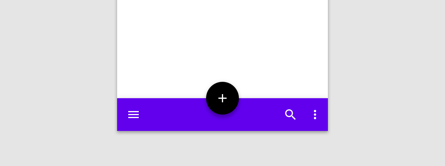
A bottom app bar displays navigation and key actions at the bottom of mobile screens.
App bars: bottom hero image

Usage ​

Bottom app bars provide access to a bottom navigation drawer and up to four actions, including the floating action button.


Navigation drawer

Navigation drawers provide access to the navigation destinations of your app.

Related article

Floating Action Button

A floating action button (FAB) represents the primary action for a screen.

Related article

Top app bar

The top app bar displays information and actions relating to the current view.

Related article

Bottom navigation

Allow movement between primary destinations in an app.

Related article

Principles ​


App bars: bottom principle: actionable

Actionable

Bottom app bars highlight important screen actions and raise awareness of the floating action button.
App bars: bottom principle: flexible

Flexible

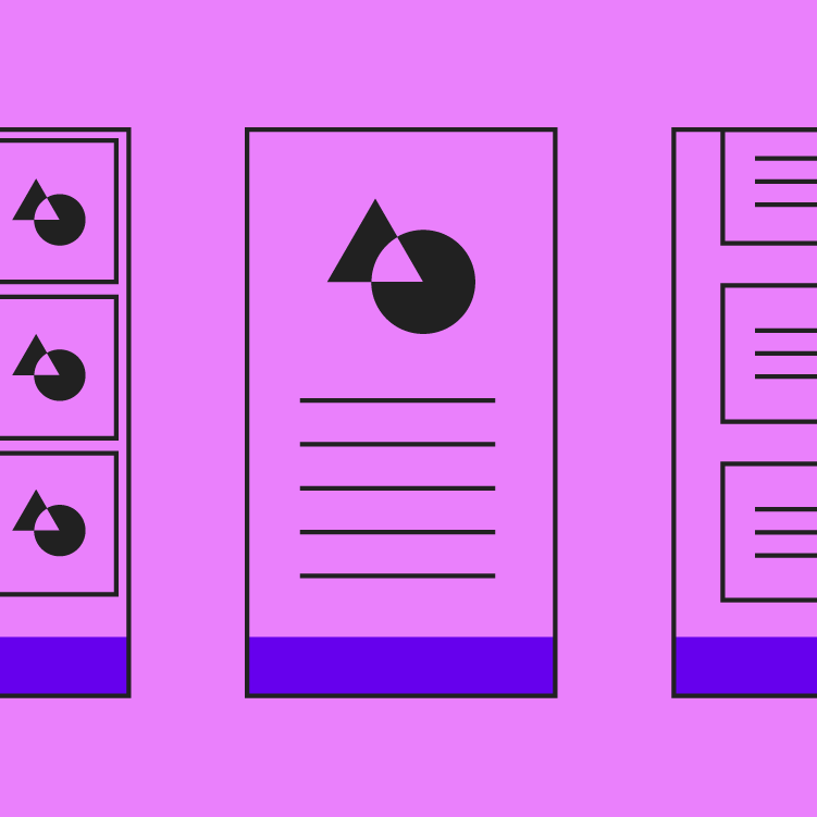
A bottom app bar's layout and actions change based on the needs of the screen.
App bars: bottom principle: ergonomic

Ergonomic

The bottom app bar is easy to reach from a handheld position on a mobile device.

When to use ​

Bottom app bars should be used for:

  • Mobile devices only
  • Access to a bottom navigation drawer
  • Screens with two to five actions

Bottom app bars shouldn't be used for:

  • Apps with a bottom navigation bar
  • Screens with one or no actions

Do: use a bottom app bar to provide convenient access to actions

Do

Use a bottom app bar to provide convenient access to actions.
Don't use a bottom app bar on screens with one or no actions (other than a FAB)

Don't

Don't use a bottom app bar on screens with one or no actions (other than a FAB).

Anatomy ​

Bottom app bars can contain actions that apply to the context of the current screen. They include a navigation menu control on the far left and a floating action button (when one is present). If included in a bottom app bar, an overflow menu control is placed at the end of other actions.
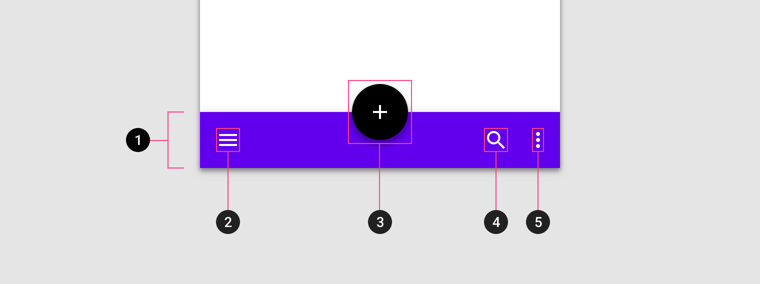
Diagram of container, navigation drawer control, floating action button, action icon, overflow menu control
1. Container
2. Navigation drawer control
3. Floating action button (FAB)
4. Action icon
5. Overflow menu control

Positioning ​

Bottom app bars have three different layouts based on the presence of a FAB and its position in the bar. These layouts dictate the number of actions that can be included in the bar.

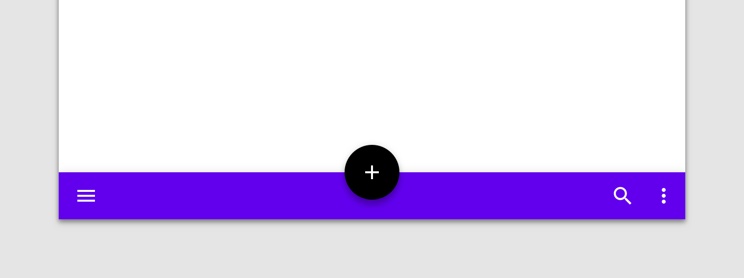
Centered FAB ​
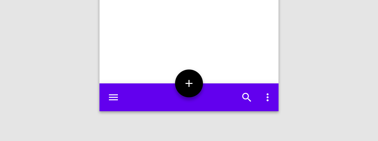

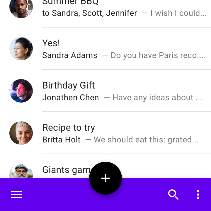
Do: use bottom app bars on home screens that feature a navigation menu control and a prominent action (such as a FAB)

Do

Use bottom app bars on home screens that feature a navigation menu control and a prominent action (such as a FAB). A minimum of one and a maximum of two additional actions can be placed on the opposite side of the bar.

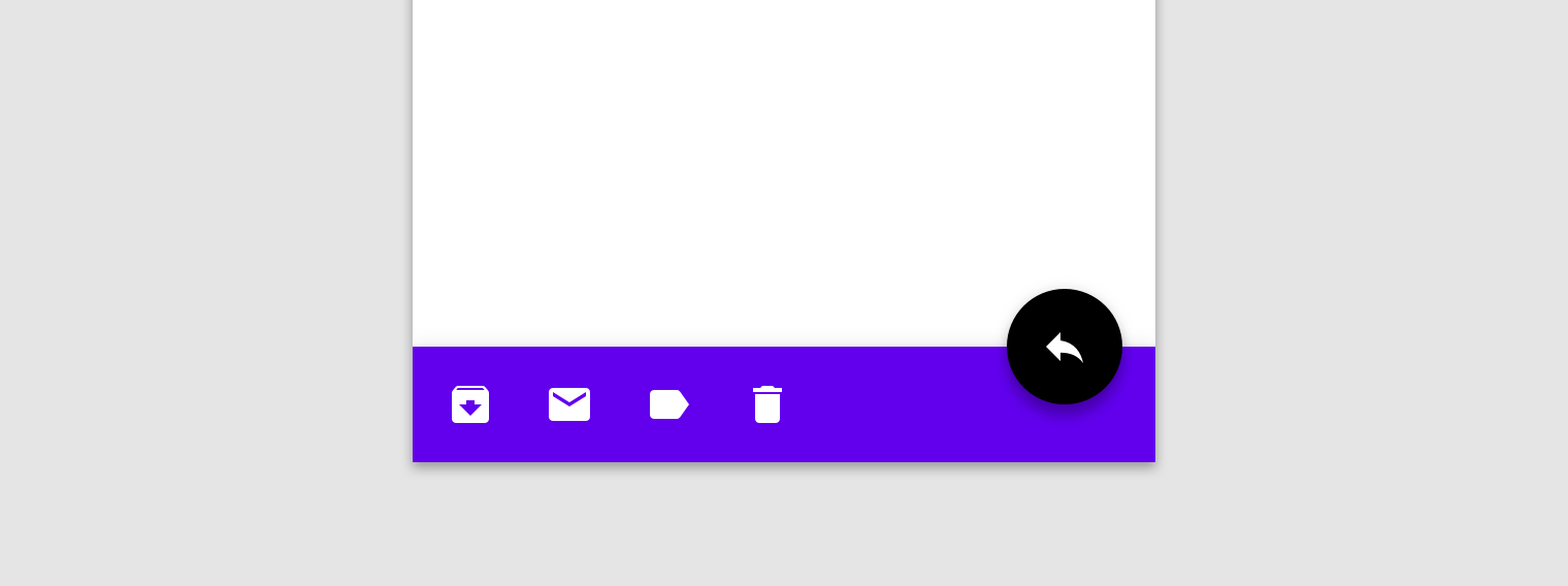
End FAB ​


Do: use a FAB on secondary screens that require a floating action button and three to four additional actions

Do

Use a FAB on secondary screens that require a floating action button and three to four additional actions.

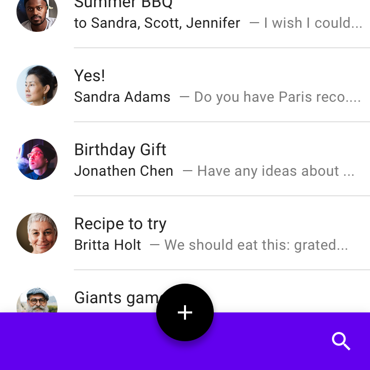
No FAB ​


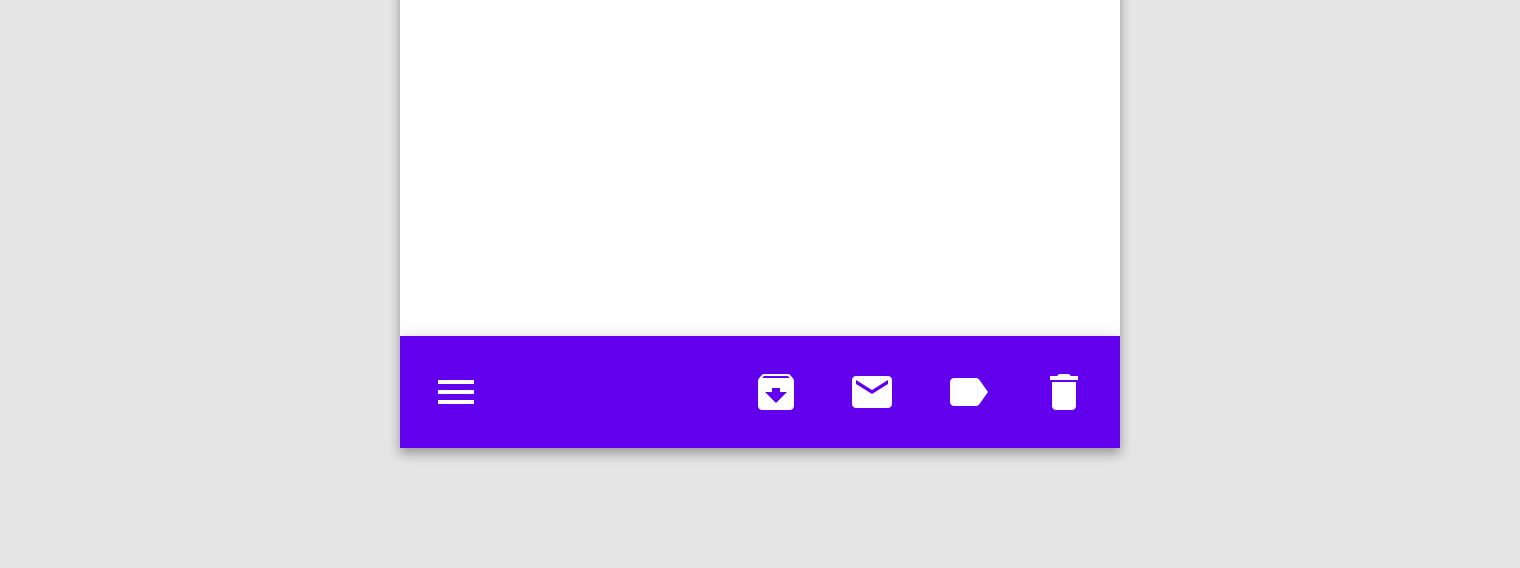
Do: the bottom app bar can accommodate a navigation menu icon and up to four actions aligned on the opposing edge

Do

When no floating action button is needed, the bottom app bar can accommodate a navigation menu icon and up to four actions aligned on the opposing edge.

Landscape ​


Do: in landscape orientation, actions remain aligned to screen edges for easy handheld access

Do

In landscape orientation, actions remain aligned to screen edges for easy handheld access

Floating Action Button ​

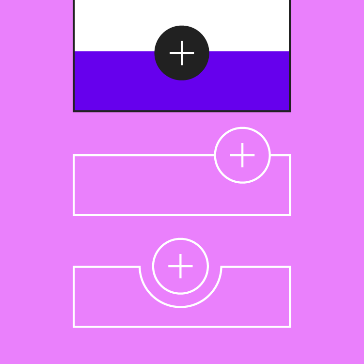
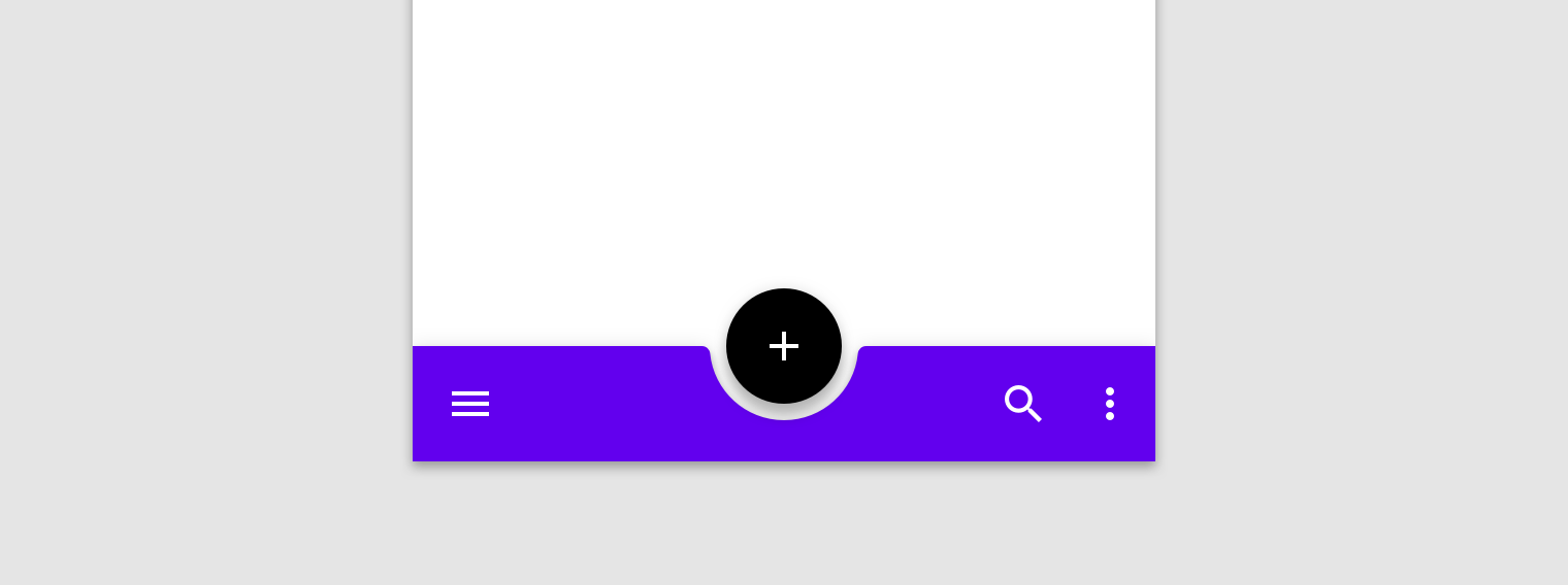
When present, floating action buttons (FABs) are displayed on bottom app bars in one of two ways:

  1. Overlap: The FAB is at a higher elevation than the bottom app bar, and has no effect on the bar's shape.
  2. Inset: The FAB is at the same elevation as the bottom app bar, and the bar shape transforms to let the FAB dock in a notch carved into the bottom app bar.

Use an inset to increase the visual prominence of a FAB or accentuate customized element shapes. Refer to the Theming section for more guidance on inset FAB's in a bottom app bar.
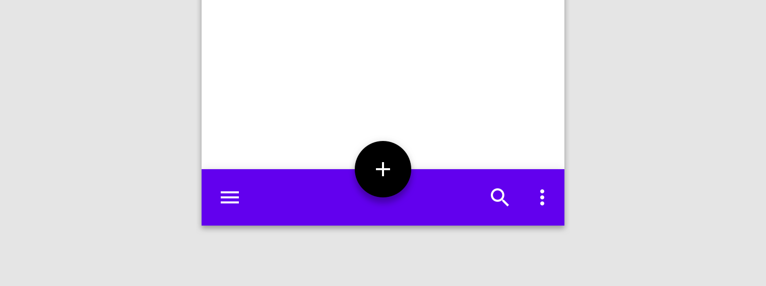
Floating Action Button: overlapping FAB
Overlapping FAB

Floating Action Button: inset FAB
Inset FAB

Do not place a FAB outside of a bottom app bar, as it makes it harder to reach

Don't

Do not place a FAB outside of a bottom app bar, as it makes it harder to reach.

Behavior ​

Layout ​

To support the intent of different sections of an app, the layout and actions of a bottom app bar can be changed to suit each screen.

For example, screens can display more or fewer actions according to what suits the screen content best.

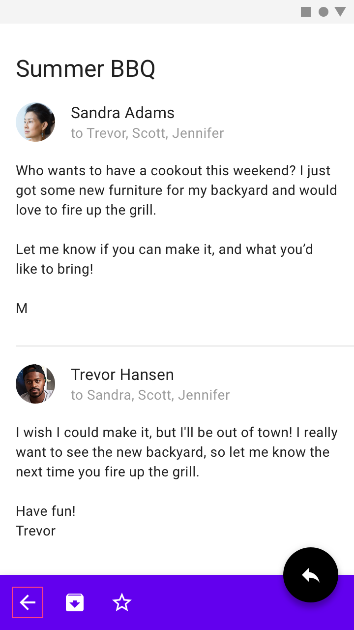
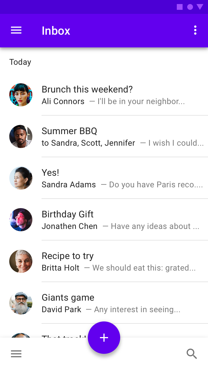
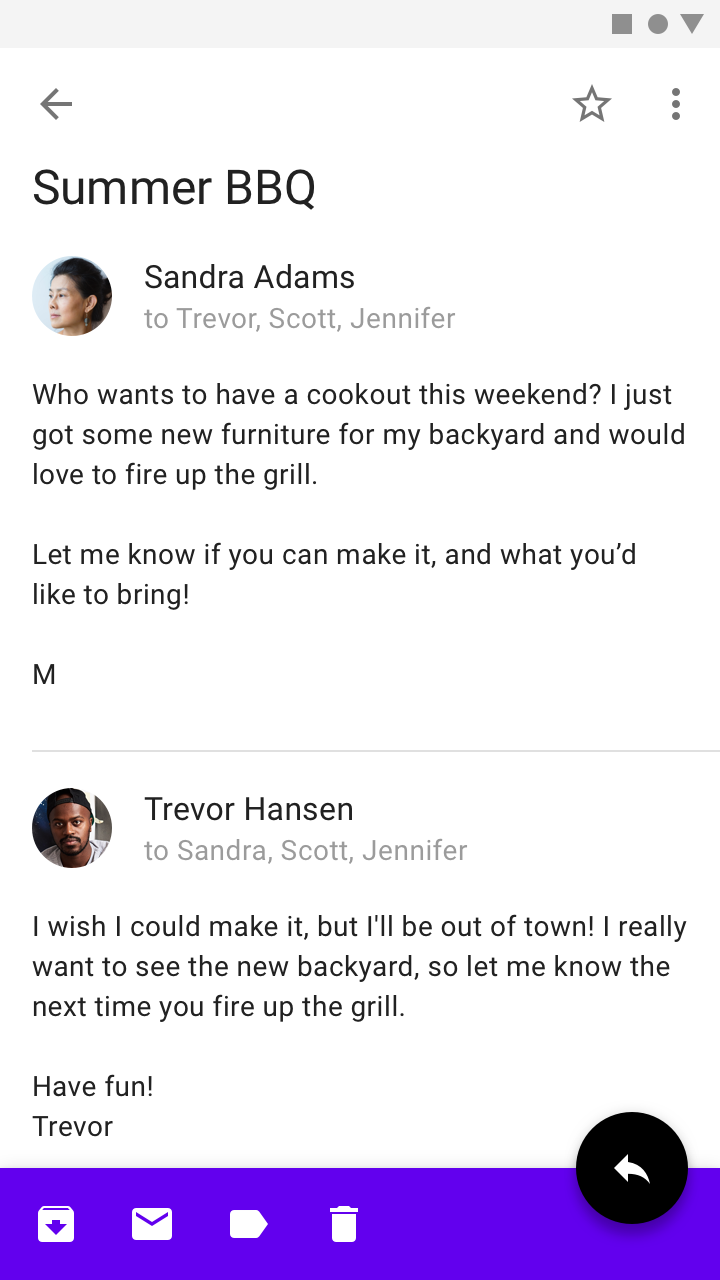
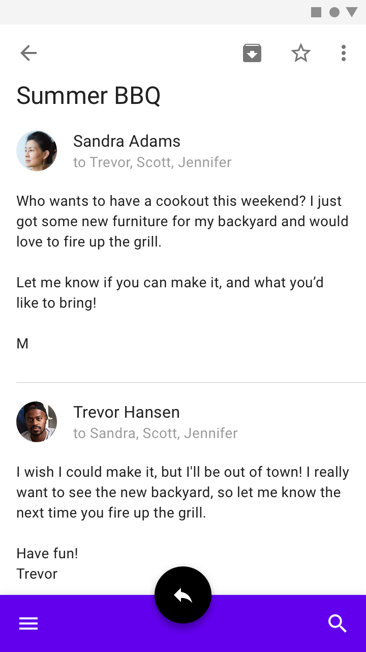
To showcase a primary action, this bottom app bar uses the centered FAB layout on its home screen. When viewing a message, the bottom app bar layout changes to the "End FAB" layout to accommodate additional contextual actions.

Scrolling ​

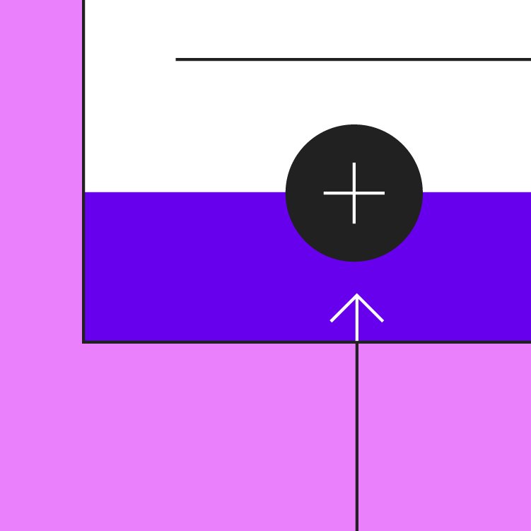
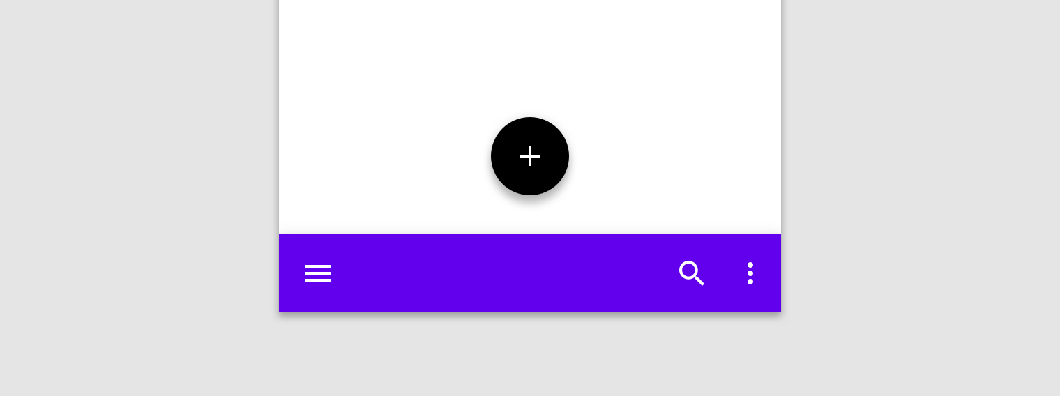
Upon scroll, the bottom app bar can appear or disappear:

  • Scrolling downward hides the bottom app bar. If a FAB is present, it detaches from the bar and remains on screen.
  • Scrolling upward reveals the bottom app bar, and reattaches to a FAB if one is present.

A bottom app bar can contain a shape, such as a notch, along its edge to accommodate the FAB. As the bar detaches from the FAB, the bar returns to its default shape. Upon returning to the screen and reattaching to the FAB, the bar regains its notched shape.

A FAB can remain on screen, even as a bottom app bar hides when scrolled off-screen.

Elevation ​

The bottom app bar has an elevation of 8dp. When paired with a FAB, the FAB's resting and raised heights should be increased to remain visible above the bottom app bar.
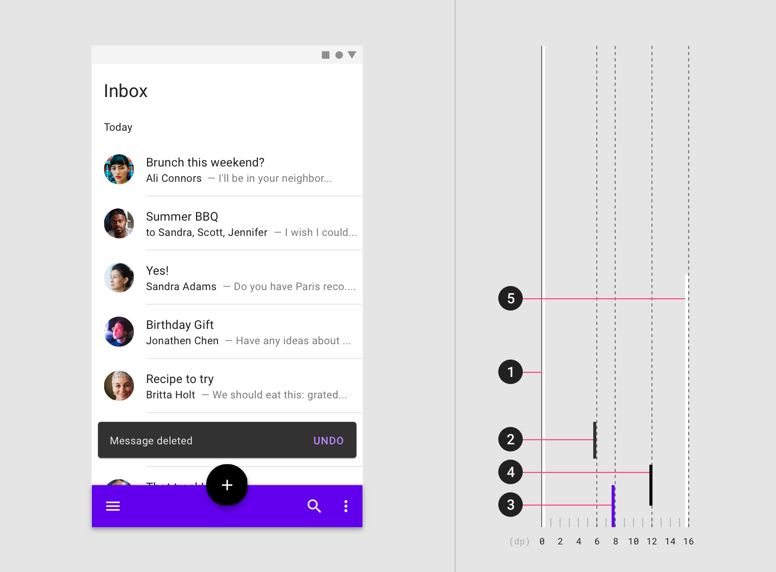
Diagram of content, snackbar, bottom app bar, floating action button, bottom navigation drawer
1. Content (0dp)
2. Snackbar (6dp)
3. Bottom app bar (8dp)
4. Floating action button (12dp resting)
5. Bottom navigation drawer (16dp)

Menus that are generated by the bottom app bar (such as a bottom navigation drawer or overflow menu) open as bottom sheets at a higher elevation than the bar.

This bottom navigation drawer opens from a bottom app bar. The drawer opens in front of the bottom app bar, and displays a top app bar to close the drawer when it reaches full height.

Elements that cover the bottom app bar ​

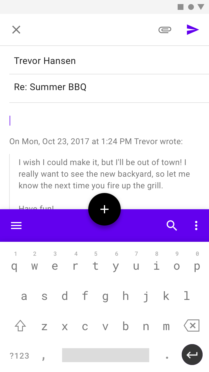
The bottom app bar can be covered by keyboards and other temporary surfaces. If your app requires frequent obstruction of the bar, another component should be used instead.
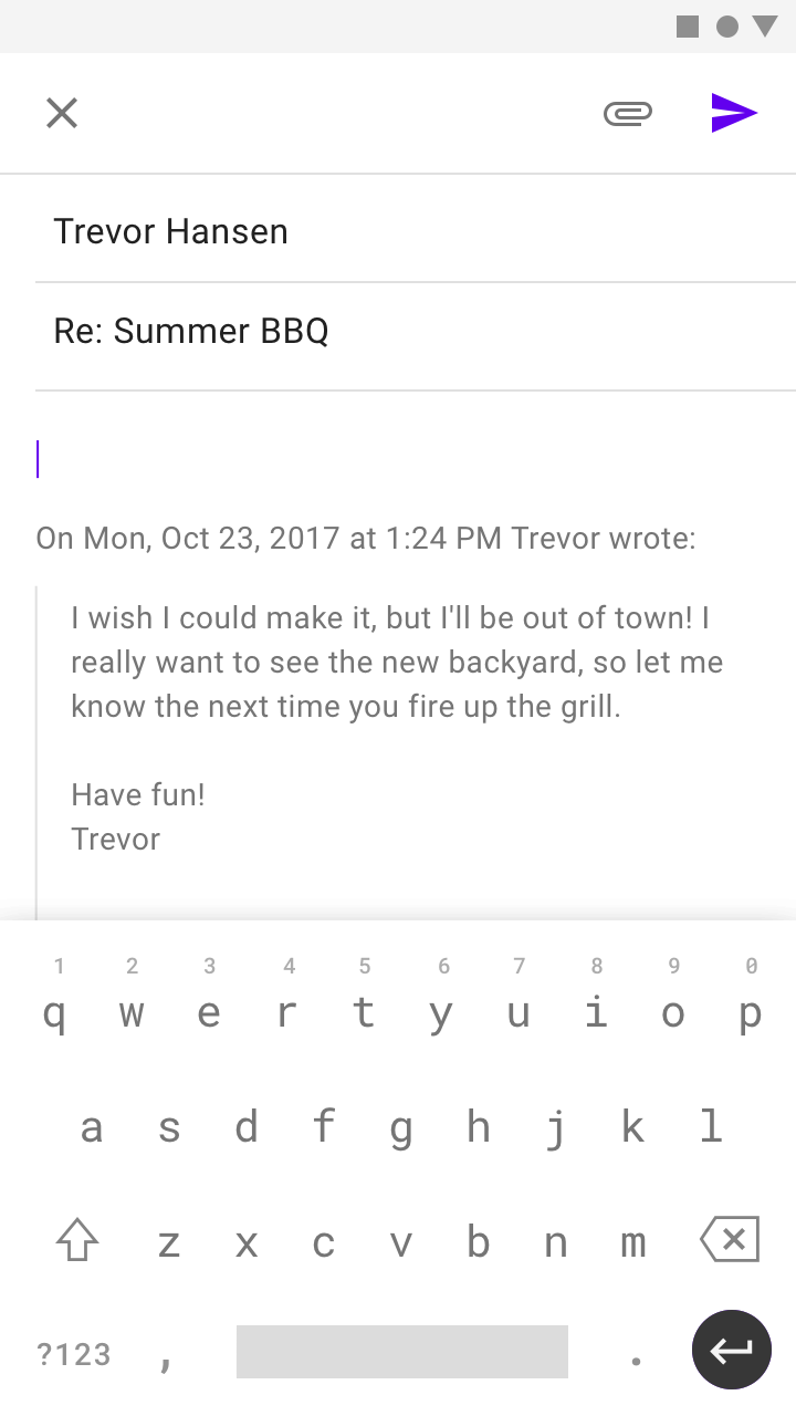
Do: a keyboard can temporarily cover a bottom app bar

Do

A keyboard can temporarily cover a bottom app bar.
Don't attach a bottom app bar to the top of the keyboard

Don't

Don't attach a bottom app bar to the top of the keyboard.

Placement ​

Navigation ​

A bottom app bar can display a navigation menu icon to open a bottom navigation drawer, but the bar doesn't contain any navigation actions itself (such as Up navigation to a home screen or a close icon). App navigation should be placed in another component such as a top app bar, or embedded on-screen.
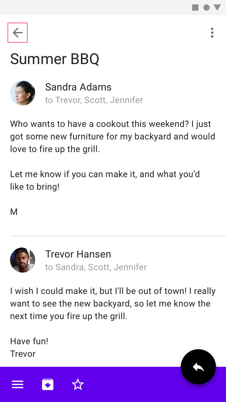
Do: provide navigation outside of a bottom app bar that allows users to return to the previous app screen

Do

Provide navigation outside of a bottom app bar that allows users to return to the previous app screen.
Don't place navigation actions in a bottom app bar, as they can be covered by temporary surfaces

Don't

Don't place navigation actions in a bottom app bar, as they can be covered by temporary surfaces.

Pairing with a top app bar ​

When used with a bottom app bar, top app bars can provide upwards navigation and additional actions. Throughout an app, actions should be organized and divided consistently across both bars.

The following items benefit from specific placement:

  • Place a single navigation menu control in a bottom app bar (for reachability)
  • Place a single overflow menu control as the trailing action
  • Place actions, like Search, in a consistent location throughout the app
  • Place destructive actions, such as "Delete," in the top app bar
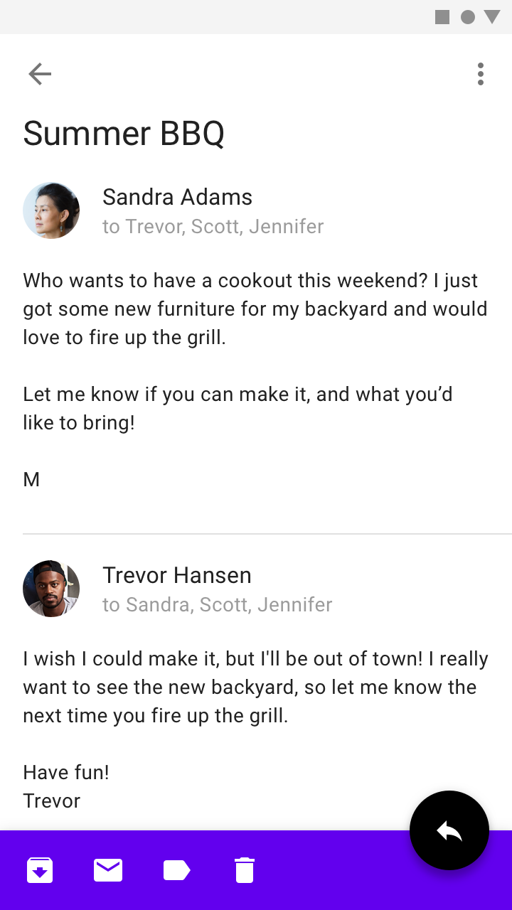
Do: use a top app bar as a container for upwards navigation on secondary screens

Do

Use a top app bar as a container for upwards navigation on secondary screens.
Don't: on a home screen, don't place a navigation menu control in both a top and bottom app bar

Don't

On a home screen, don't place a navigation menu control in both a top and bottom app bar. Only one app bar should have this control.

Do: place an overflow menu as the last action between the app bars

Do

Place an overflow menu as the last action between the app bars.
Do: a bottom app bar can provide consistent access to actions, such as navigation and search

Do

A bottom app bar can provide consistent access to actions, such as navigation and search, allowing the top app bar to hold contextual, screen-specific actions.

Snackbars ​

To avoid obstruction, snackbars and toasts should animate in place vertically above a bottom app bar. Refer to snackbars for more guidance on its layout and positioning.

Do

Inset a snackbar or toast above a bottom app bar and FAB.

Don't

Don't place a snackbar in front of a bottom app bar or FAB.

Snackbars

Provide brief feedback about an operation through a message at the bottom of the screen.

Related article

Theming ​

Posivibes Material Theme ​

This social media app's bottom app bar has been customized using Material Theming. Areas of customization include color and shape.
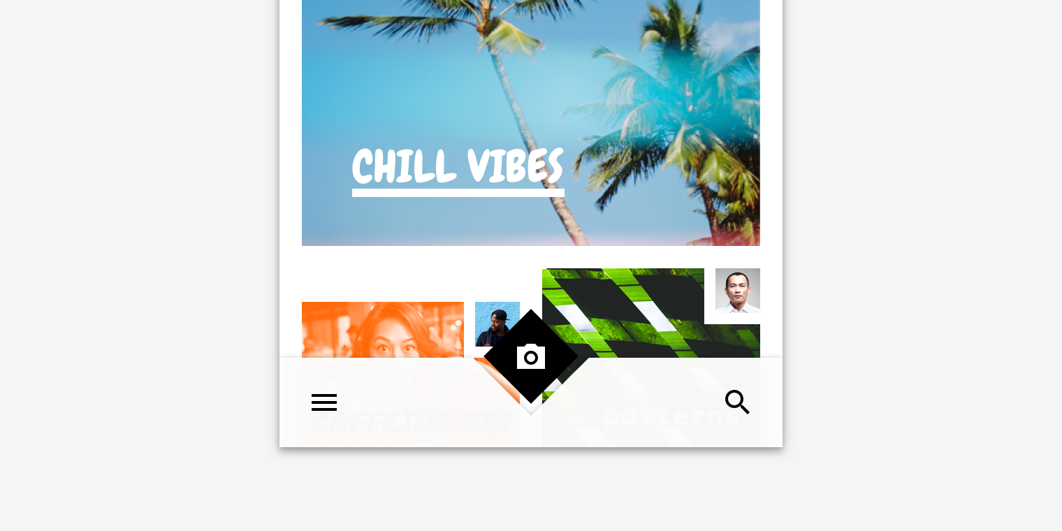
Posivibe's customized bottom app bar

The color system

Create a color theme that reflects your brand or style

Related article

Applying color to UI

In a UI, color has a variety of roles: from containing meaning, to expressing a look and feel.

Related article

Color ​

Posivibes' bottom app bar uses custom color on two elements: the container and icons.
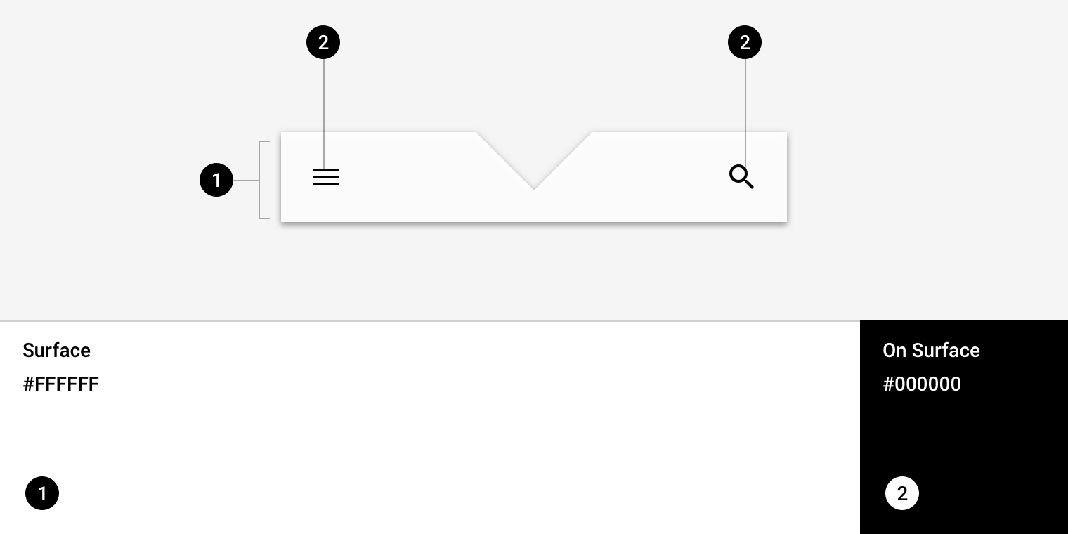
Posivibes Material theme: color
ElementCategoryAttributeValue
ContainerSurfaceColor
Opacity
#FFFFFF
100%
IconsOn SurfaceColor
Opacity
#000000
100%

About shape

Direct attention, identify components, communicate state, and express brand

Related link

Shape ​

Posivibes' bottom app bar uses a custom shape on the top edge of the container.
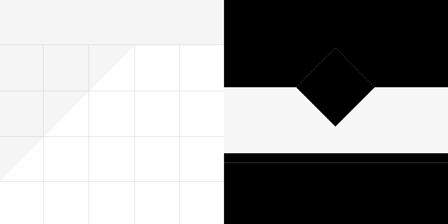
Posivibes Material theme: shape
ElementAttributeValue
ContainerTop edgeTriangleEdge SVG
Path data: "l 42 42 l 42 -42"

SVG paths - W3C

Syntax guidance

Related link

Specs ​

Mobile portrait ​

Bottom app bars are a mobile-only component and are not applicable for tablet or desktop use.

Minimum 1, maximum of 2 actions aligned to opposite edge of navigation menu

FAB Center ​
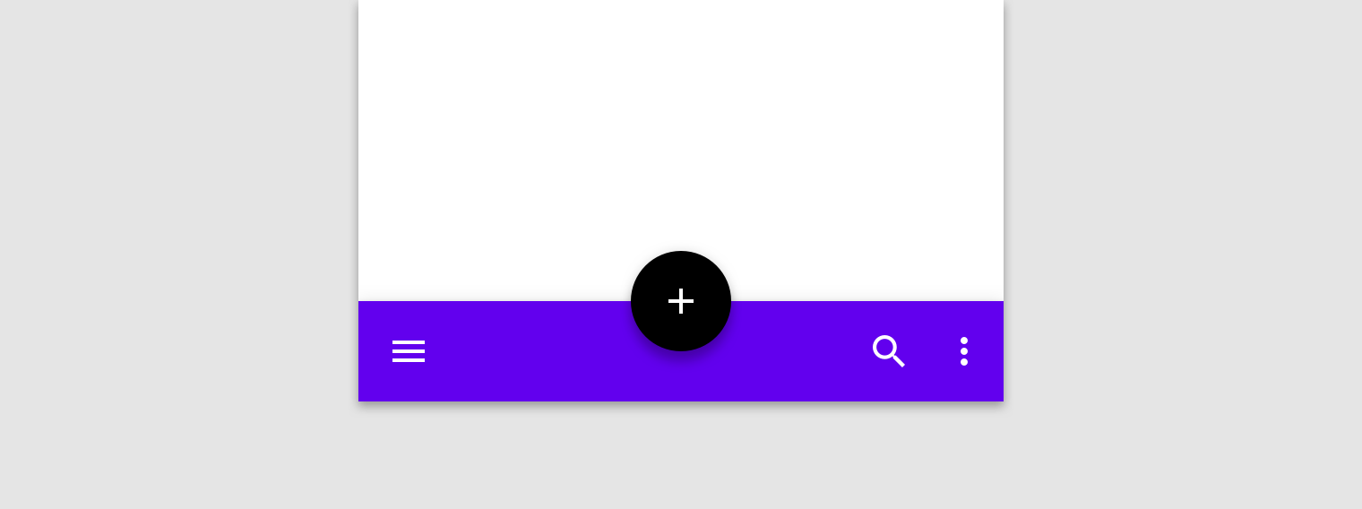

5616162416162456

FAB Center cut ​


16162416165624856

FAB End ​

Minimum 2, maximum of 4 actions aligned to opposite edge of the FAB
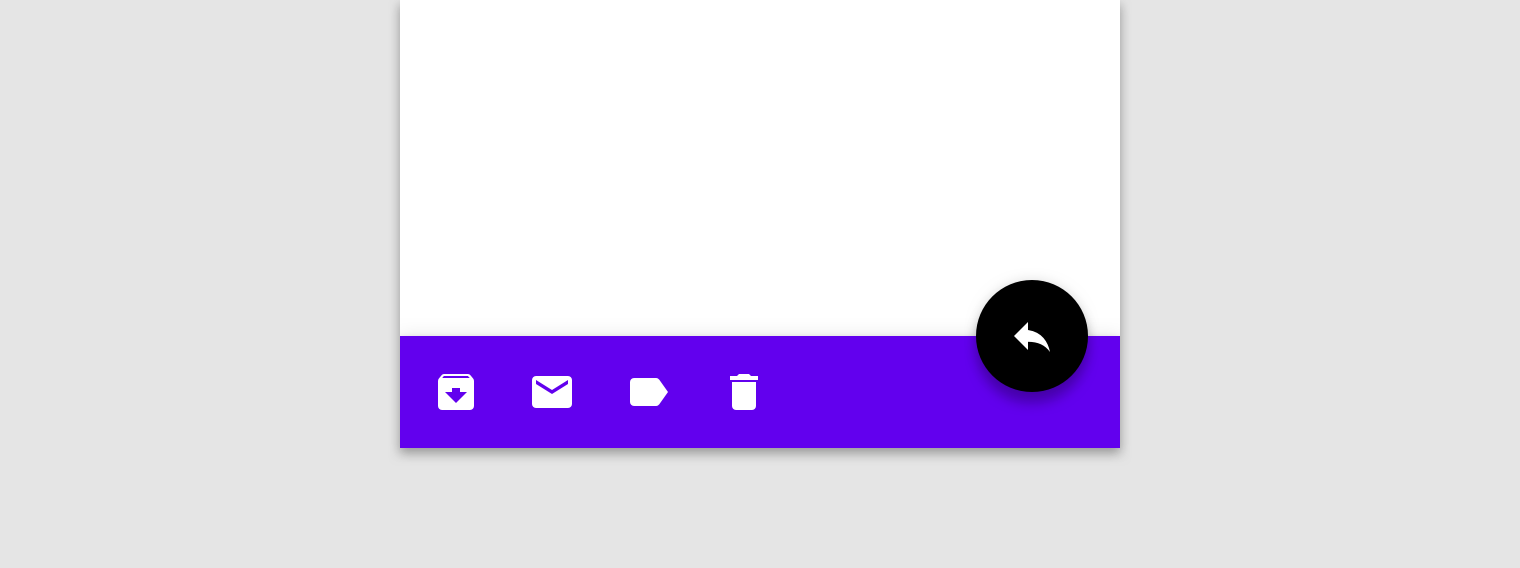
5624162424241616162856

No FAB ​

Minimum 2, maximum of 4 actions aligned on opposite edge of navigation menu
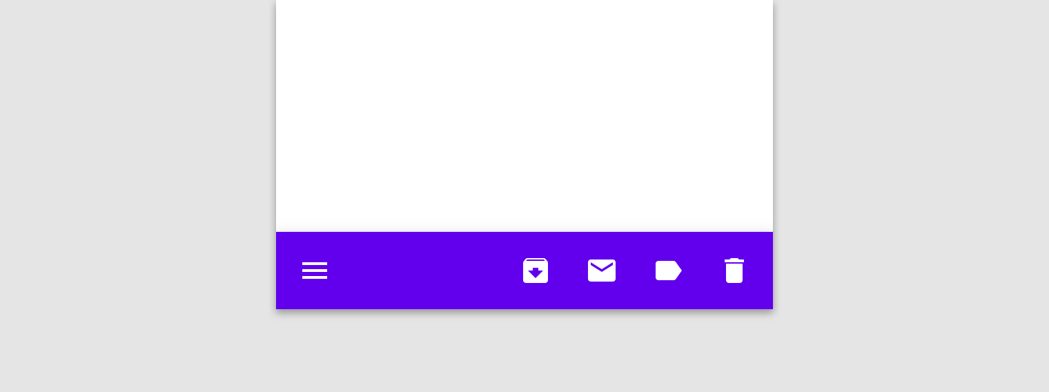
56

Mobile landscape ​

Bottom app bars are a mobile-only component and are not applicable for tablet or desktop use.

Minimum 1, maximum of 2 actions aligned to opposite edge of navigation menu
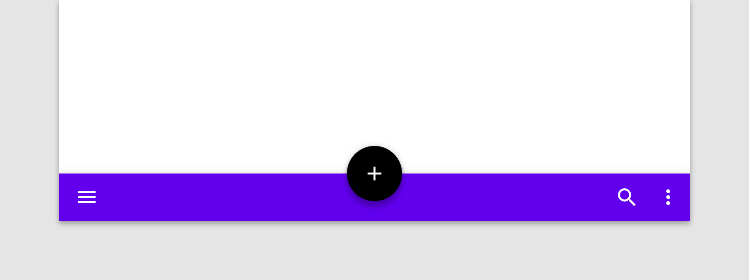
4824161624121256
Pager
Previous pageCross-platform adaptation
Next pageApp bars: top

Released under the Apache-2.0

Copyright © 2018-Present Google

https://m2.material.io/components/app-bars-bottom

Released under the Apache-2.0

Copyright © 2018-Present Google