Skip to content
Material Design 2
Main Navigation
v3
v2
v1

English

简体中文
繁體中文
Español
Français
Русский
Português – Brasil
Deutsch
日本語
한국어
Italiano
Polski
Türkçe
čeština
magyar

English

简体中文
繁體中文
Español
Français
Русский
Português – Brasil
Deutsch
日本語
한국어
Italiano
Polski
Türkçe
čeština
magyar

Appearance

Sidebar Navigation

Material System

Introduction

Material studies

About our Material studies

Basil

Crane

Fortnightly

Owl

Rally

Reply

Shrine

Material Foundation

Environment

Surfaces

Elevation

Light and shadows

Layout

Understanding layout

Pixel density

Responsive layout grid

Spacing methods

Component behavior

Applying density

Navigation

Understanding navigation

Navigation transitions

Search

Color

The color system

Applying color to UI

Color usage

Text legibility

Dark theme

Typography

The type system

Understanding typography

Language support

Sound

About sound

Applying sound to UI

Sound attributes

Sound choreography

Iconography

Product icons

System icons

Animated icons

Shape

About shape

Shape and hierarchy

Shape as expression

Shape and motion

Applying shape to UI

Motion

Understanding motion

The motion system

Speed

Choreography

Customization

Interaction

Gestures

Selection

States

Communication

Confirmation & acknowledgement

Data formats

Data visualization

Empty states

Help & feedback

Imagery

Launch screen

Onboarding

Offline states

Writing

Machine learning

Machine learning patterns

Object detection: live camera

Object detection: static image

Barcode Scanning

Material Guidelines

Material Theming

Overview

Implementing your theme

Usability

Accessibility

Bidirectionality

Platform guidance

Android bars

Android fingerprint

Android haptics

Android icons

Android navigating between apps

Android notifications

Android permissions

Android slices

Android split-screen

Android swipe-to-refresh

Android text selection toolbar

Android widget

Cross-platform adaptation

Components

App bars: bottom

App bars: top

Backdrop

Banners

Bottom navigation

Buttons

Buttons: floating action button

Cards

Checkboxes

Chips

Data tables

Date pickers

Dialogs

Dividers

Image lists

Lists

Menus

Navigation drawer

Navigation rail

Progress indicators

Radio buttons

Sheets: bottom

Sheets: side

Sliders

Snackbars

Switches

Tabs

Text fields

Time pickers

Tooltips

On this page

Basil ​

Basil is a recipe app that uses Material Design components and Material Theming to create an on-brand experience that is exciting and easy to explore.
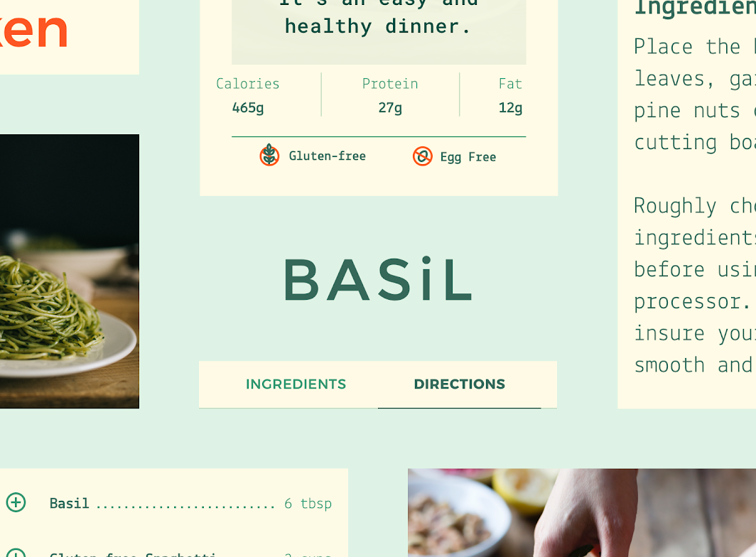
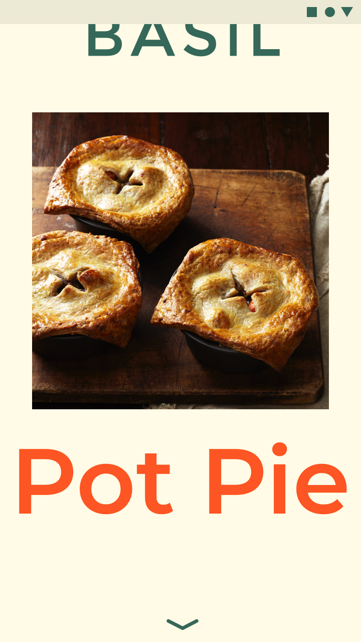
Basil hero image

About Basil ​

Basil allows users to browse recipes curated by a group of chefs and bartenders. Its brand and app are designed to be approachable, direct, and delightfully surprising.
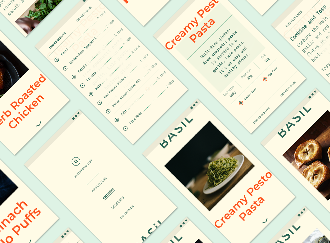
About Basil

Funky but functional aesthetic ​

Basil’s bold typography and color are paired with a simple approach to content, creating an app that is exciting to explore, and easy to understand.

Product architecture ​

The Basil app’s information architecture has a catalog structure. A catalog contains categorized, hierarchical data, with a top level consisting of peers which may each contain subordinate data.

Four top-level sections ​

Basil’s app is divided into four top-level sections that cover different types of recipes: appetizers, entrées, desserts, and cocktails. Each of these contains a number of recipes, which contain two sub-sections: ingredients and directions.

A novel approach to navigation ​

While navigation drawers are often used for catalog structures, Basil’s interaction model uses a number of components to create an experience that is novel and sometimes surprising.
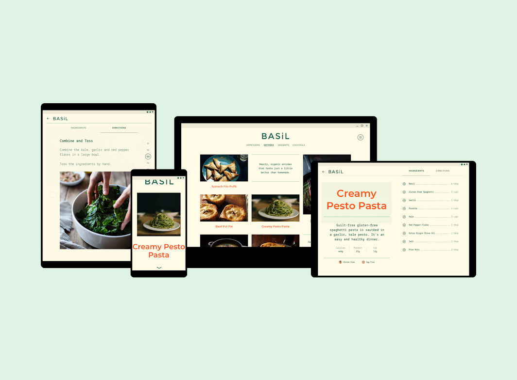
Basil seen on tablet, mobile, and desktop

Desktop and tablet navigation ​

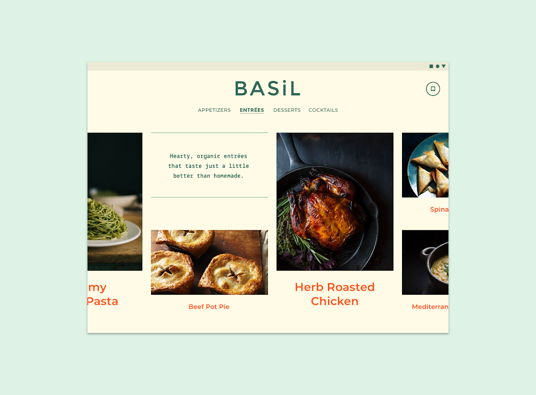
On desktop and tablet, Basil’s main sections are accessible through persistent tabs. Vertically scroll each section to browse recipes on desktop, and horizontally scroll to browse on tablet.
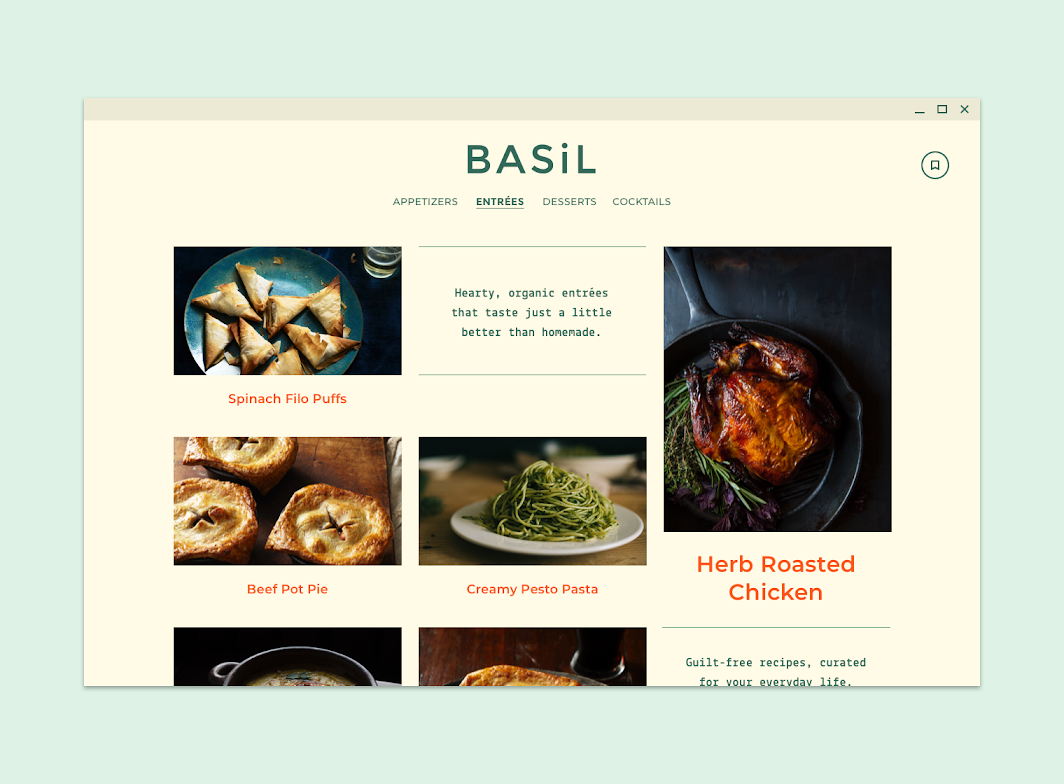
On desktop, Basil’s entrée section scrolls vertically
On desktop, Basil’s entrée section scrolls vertically. Scaled down to 50%.

On tablet, Basil’s entrée section is browsed by scrolling horizontally
On tablet, Basil’s entrée section is browsed by scrolling horizontally. Scaled down to 50%.

When a recipe is selected, tabs are used to toggle between ingredients and directions. Directions are displayed using a customized stepper component.
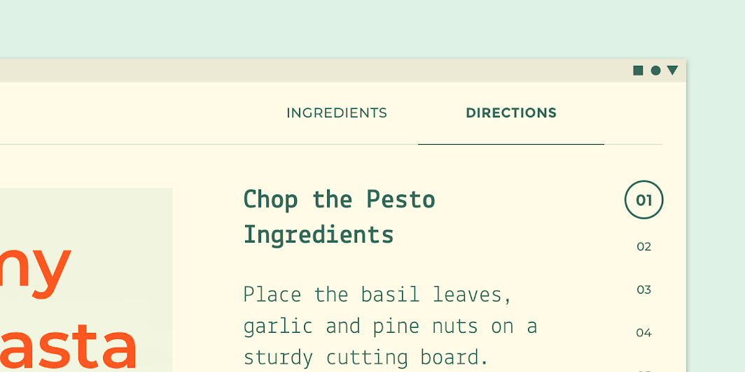
On tablet, this Basil detailed recipe screen uses tabs and steppers
On tablet, this Basil detailed recipe screen uses tabs and steppers.

Tabs

Tabs organize high level content in an app content, such as switching between views, data sets, or functional aspects of an app.

Related article

Mobile navigation ​


On mobile, Basil’s main sections can be accessed by swiping down to reveal a navigation drawer.

Basil’s navigation drawer

After a section is selected, horizontally scroll to browse the recipes within it.


When a recipe is selected, tabs at the bottom provide access to ingredients and directions.

When one of the tabs is selected, a bottom sheet animates up to fill the screen with selected content. In that sheet users can toggle between ingredients and directions on this sheet, or swipe down to move it off-screen.

On mobile, a specific recipe’s ingredients and directions can be found in a bottom sheet.

Navigation drawer

Navigation drawers provide access to the navigation destinations of your app.

Related article

Tabs

Tabs organize high level content in an app content, such as switching between views, data sets, or functional aspects of an app.

Related article

Bottom sheets

Surfaces containing supplementary content that are anchored to the bottom of the screen.

Related article

Layout ​

Grid system ​

Basil uses a responsive grid system, which has flexible columns and padding that can resize depending on the screen width (such as mobile, tablet, or desktop).

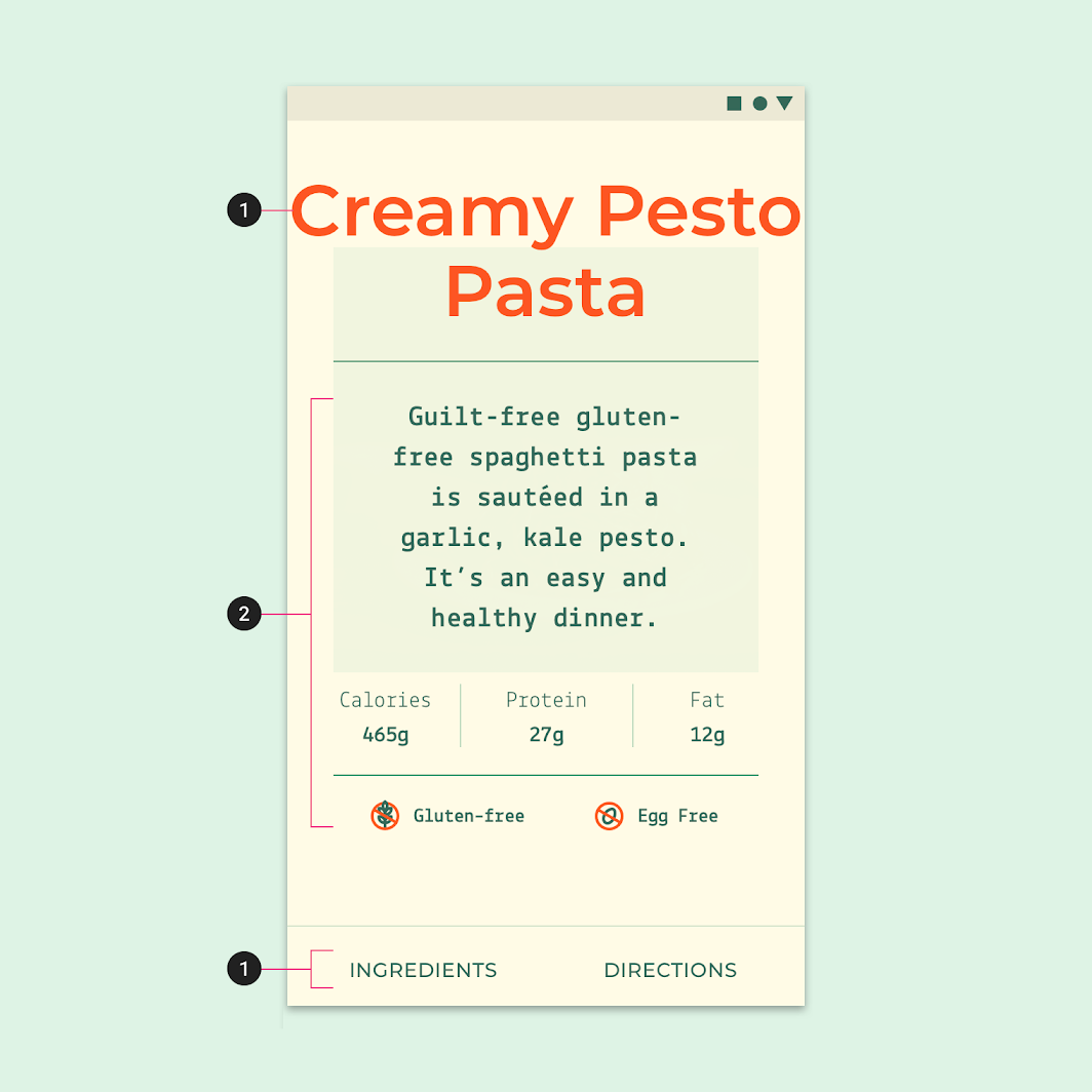
Basil center-aligns type to sections of its layout grid.

Basil’s grid system, scaled down to 50%

Basil’s headline responsively changes type size to fill the width of the screen on mobile.
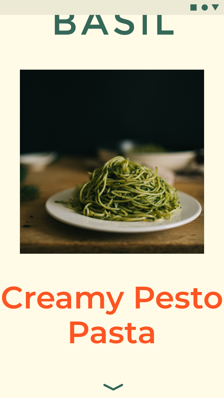
The type size of the recipe title dynamically changes to fill the width of the screen
The type size of the recipe title dynamically changes to fill the width of the screen.
The type size of the recipe title dynamically changes to fill the width of the screen
The type size of the recipe title dynamically changes to fill the width of the screen.

Layout Grid

Material Design's responsive layout grid adapts to screen size and orientation, ensuring consistency across layouts.

Related article

Image lists

Image lists display a collection of images in an organized grid.

Related article

Component behavior

This page describes how components behave in a layout, both in relationship to the grid as well as breakpoints.

Related article

Elevation ​

Basil doesn’t use shadow to show elevation between UI elements. Instead, content is placed at different elevations which are distinguished using parallax motion and opacity.

These three layers look different from one another, and can be distinguished through parallax motion.

Basil expresses elevation differences by using transparency to show stacked layers of UI elements.

This slightly transparent bottom sheet animates on-screen, allowing the user to see the main recipe screen beneath it. These stacked layers show the user that they have not navigated to a new screen, but are instead interacting with a sheet above the content they were just viewing.

When text scrolls above imagery, a duotone image treatment ensures text remains legible.

Duotone image treatment

Elevation

Elevation is the relative distance between two surfaces along the z-axis.

Related article

Bottom sheets

Bottom sheets are surfaces containing supplementary content that are anchored to the bottom of the screen.

Related article

Tabs

Tabs organize content across different screens, data sets, and other interactions.

Related article

Color ​

Color theme ​

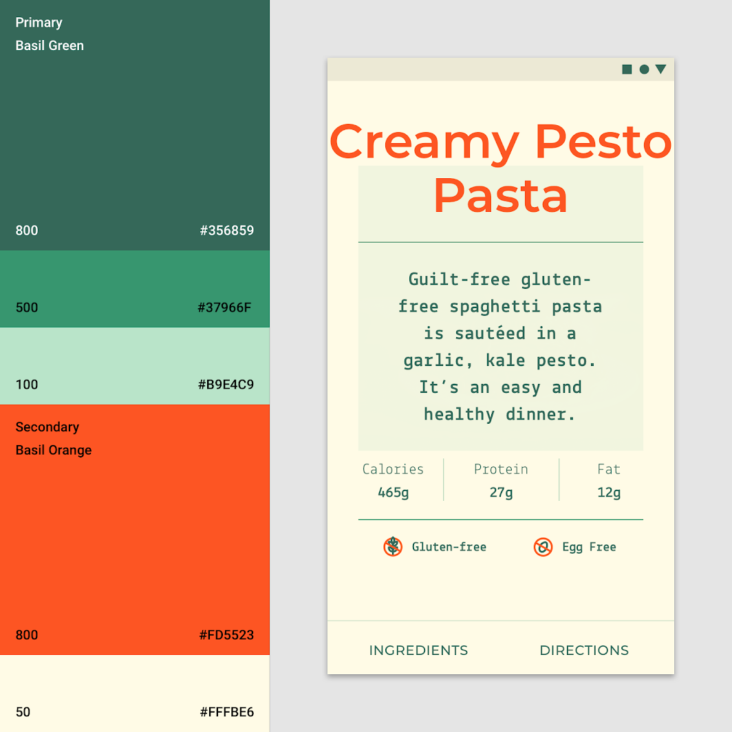
Basil uses a color theme inspired by the deep and rich colors from fruits and vegetables:

  • Basil’s primary color is olive green
  • Basil’s secondary color is orange
Basil’s color theme
Basil’s color theme

The color system

The Material Design color system can help you create a color theme that reflects your brand or style.

Related article

Applying color to UI

Color is applied to UI elements and components in consistent and meaningful ways.

Related article

Typography ​

Typefaces ​


Diagram of montserrat, lekton
1. Montserrat
2. Lekton

Type scale ​

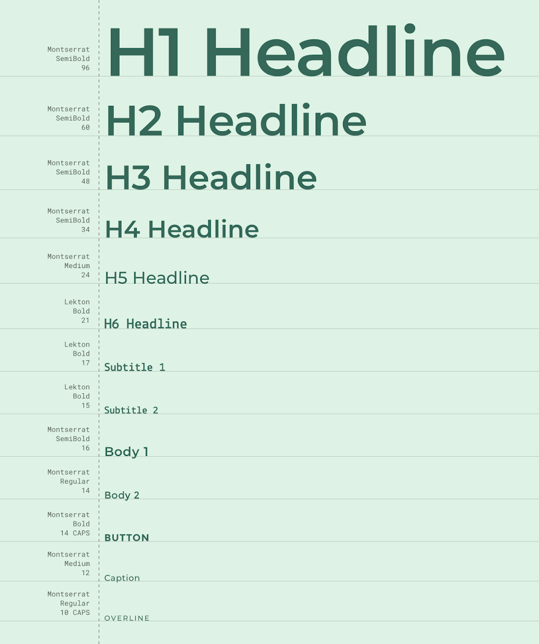
Basil’s type scale uses two typefaces: Montserrat, and Lekton. The two typefaces make a quirky pair, adding to the character of Basil.
Basil’s type scale
Basil’s type scale

The type system

Use typography to present your design and content as clearly and efficiently as possible.

Related article

Montserrat

A typeface available on Google Fonts.

Related link

Understanding typography

Typography expresses hierarchy and brand presence.

Related article

Montserrat ​

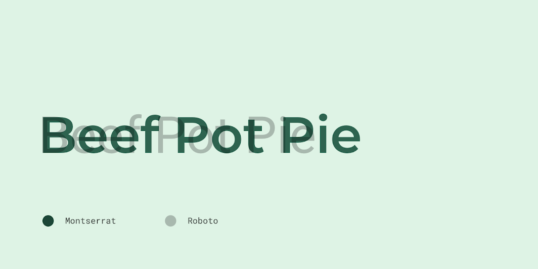
Montserrat is a sans serif font with wide letterforms. Basil uses it as a display typeface, as well as for body, caption, and button text.
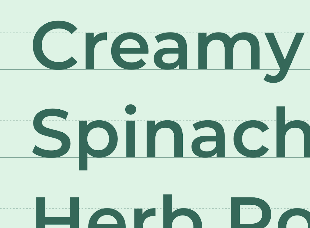
Montserrat’s letterforms

Montserrat compared to Roboto

The type system

Use typography to present your design and content as clearly and efficiently as possible.

Related article

Lekton

A typeface available on Google Fonts.

Related link

Understanding typography

Typography expresses hierarchy and brand presence.

Related article

Lekton ​

Lekton is inspired by some of the typefaces used in Olivetti typewriters. The glyphs are ‘trispaced,’ meaning they are all built using the same three modular units. The typeface has a predictable vertical alignment of characters, similar to a monospace font. Lekton is used for Basil’s smaller headlines, and subtitles.
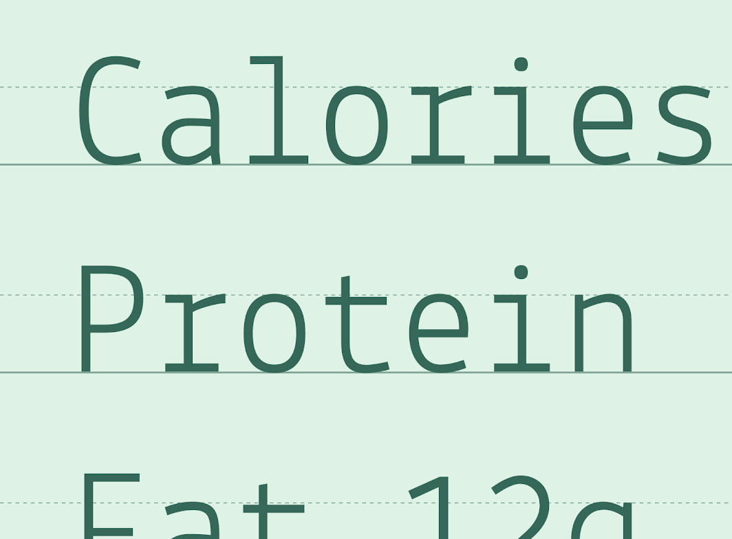
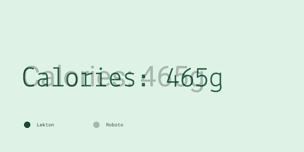
Lekton’s letterforms

Lekton compared to Roboto

Iconography ​

Basil’s custom icons are designed with a simple, whimsical quality to help make content feel approachable.
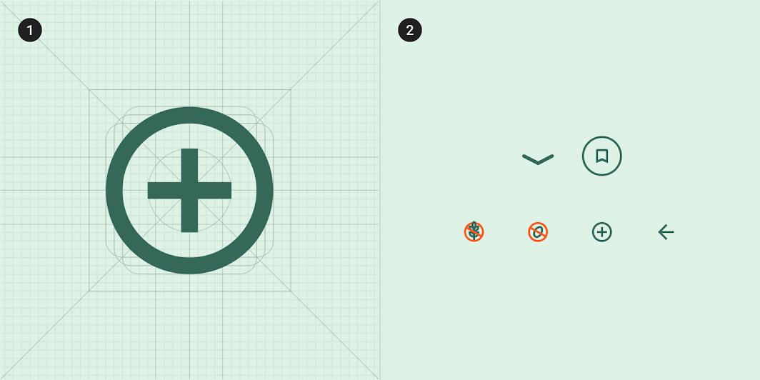
To create consistency, all of Basil’s icons share the same underlying grid structure
1. To create consistency, all of Basil’s icons share the same underlying grid structure.
2. A collection of Basil’s icons

Basil’s icons use its primary color (olive green). Basil’s secondary color (orange) is used on iconography to indicate if a food type is not included (such as gluten or dairy).
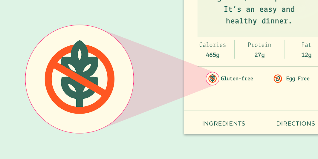
Basil’s secondary color (orange) is used to indicate the recipe is gluten and egg free
Basil’s secondary color (orange) is used to indicate the recipe is gluten and egg free.

Shape ​

Categories ​

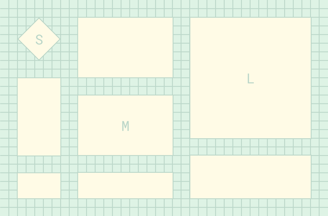
Components are grouped into shape categories based on their size. These categories let you set multiple component values at once. Shape categories include:

  • Small components
  • Medium components
  • Large components
Basil’s shape categories

Diagram of small components, medium components, large components
1. Small components
2. Medium components
3. Large components

Small components ​

The tooltip component has square corners with a 0dp corner radius.
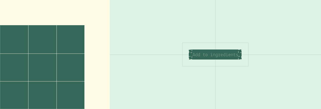
Small components: tooltip
ComponentCategoryAttributeValue
TooltipSmall componentsFamily
Size
Rounded
0dp;0dp;0dp;0dp

Medium components ​

The menu component has rounded corners with a 0dp corner radius.
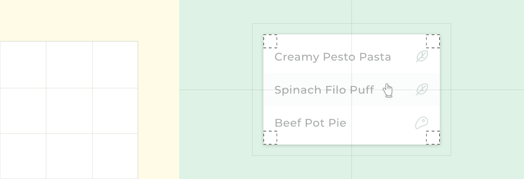
Medium components: menu
ComponentCategoryAttributeValue
MenuMedium componentsFamily
Size
Rounded
0dp;0dp;0dp;0dp

Large components ​

Standard bottom sheets (in their collapsed state) have rounded top corners with a 0dp corner radius.
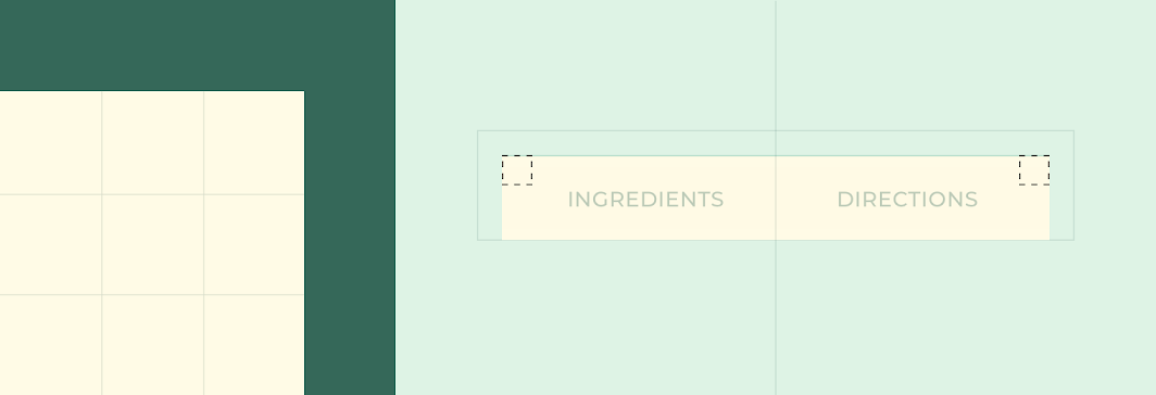
Large components: bottom sheet
ComponentCategoryAttributeValue
Standard bottom sheetLarge componentsFamily
Size
Rounded
0dp;0dp;n/a;n/a*

*Bottom sheets can only shape their top-left and top-right corners.

Components ​

Lists ​

Basil displays ingredients for each recipe using the list component. Each list uses Basil’s typography and iconography, customized with a line of dots that connect each ingredient to a quantity.
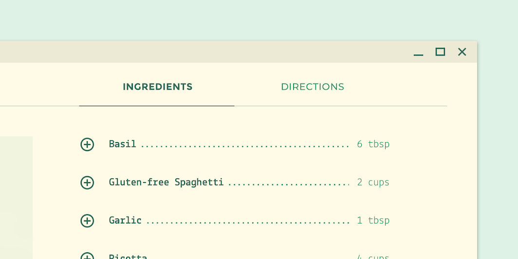
Lists: basil’s customized list
Basil’s customized list.

Bottom sheet ​


On mobile, Basil uses an expanding bottom sheet to provide recipe ingredients and directions.

Upon tapping a tab, a full-screen sheet appears in front of the content. The user can toggle between recipe ingredients and directions on this sheet.

The sheet’s background has a slight transparency to let the user know the sheet is above the screen that generated it, and that the user can dismiss the sheet at any time.

Basil’s expanding bottom sheet

Lists

Lists are continuous, vertical indexes of text or images.

Related article

Bottom sheets

Bottom sheets are surfaces containing supplementary content that are anchored to the bottom of the screen.

Related article

Tabs

Tabs organize content across different screens, data sets, and other interactions.

Related article

Tabs ​

On desktop and tablet, Basil uses tabs to navigate between sections. The tabs are distributed equally across a fixed width region, which is aligned to the center of the screen.
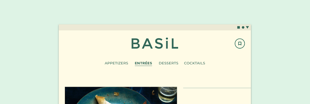
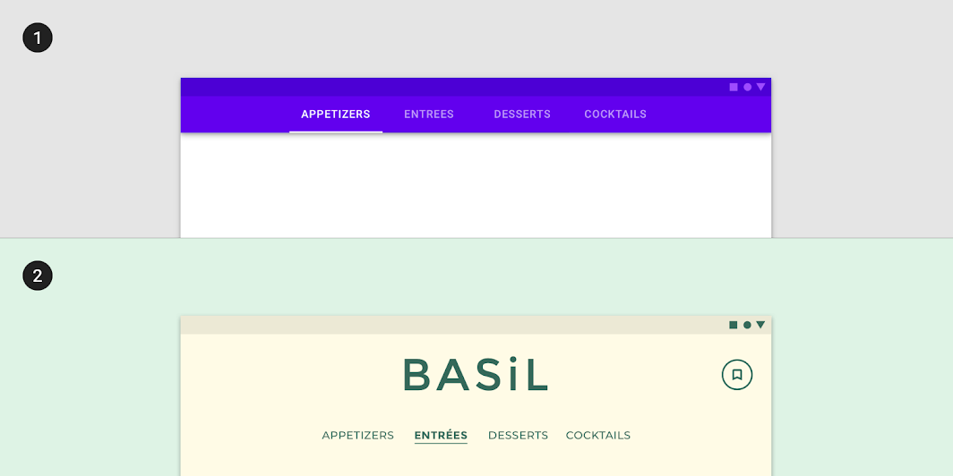
Basil uses custom tabs for navigation on desktop and tablet, scaled down to 62.5%

Tabs: a baseline tab
1. A baseline tab
2. Basil’s desktop and tablet navigation tabs use custom typography, color, and states. The custom selected state changes text to a heavier font weight. (Scaled down to 62.5%)

On mobile, tabs allow users to toggle between recipe ingredients and directions. By default, these tabs are displayed at the bottom of a recipe screen. Upon selection, they move to the top of the screen and attach to a surface that allows users to toggle between them.
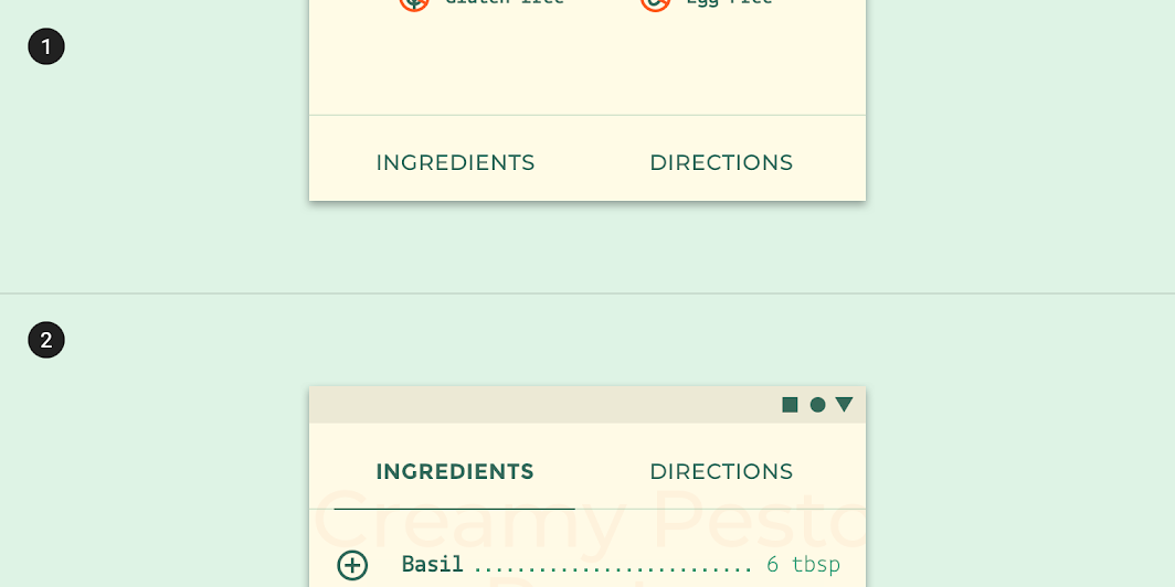
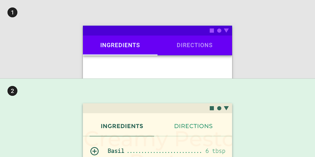
Recipe detail tabs are displayed first at the bottom of the screen (1)
Recipe detail tabs are displayed first at the bottom of the screen (1). When tapped, they move to the top of the screen, allowing the user to toggle between them (2).

Tabs: a baseline tab
1. A baseline tab
2. Basil’s recipe tabs use custom typography, color, and states. The custom selected state includes a stroke under the selected tab text, which also changes to a heavier font weight.

Steppers ​

Basil uses non-linear steppers for recipe directions, so users can move between the different steps in any order they want. Steppers use Basil’s typography and color scheme, with customized vertical spacing.
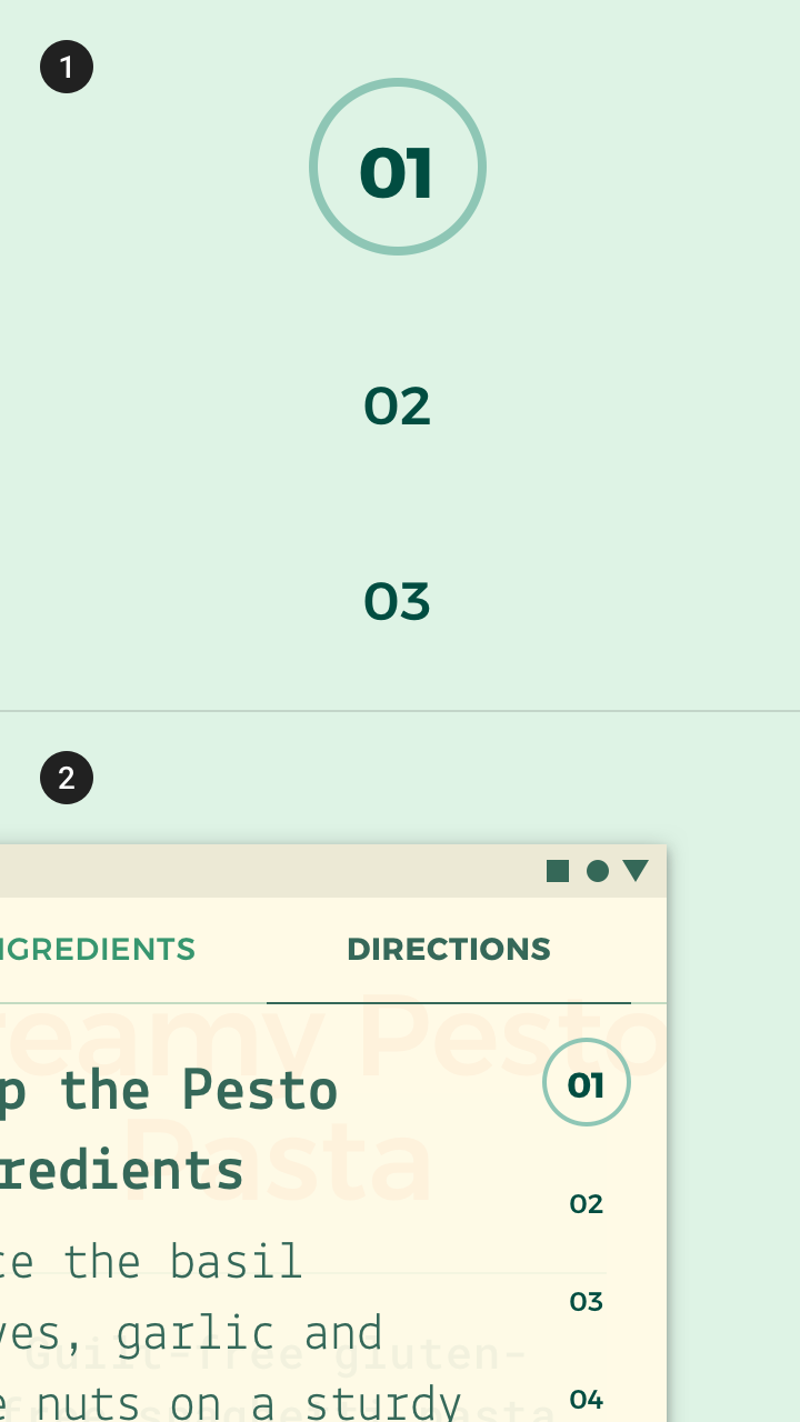
Basil uses magnification to focus on the activated stepper, scaled up to 200%
(1) Basil uses magnification to focus on the activated stepper, scaled up to 200%
(2) Basil’s stepper appears on the right side of the screen.
Basil’s use of stretch motion on steppers demonstrates an elastic style.

Motion ​

Launch screen ​

Basil’s logo animation plays off the use of parallax throughout the app. The subtle overshoot on the bottom arrow encourages the user to navigate vertically and explore.

When launching Basil, a logo animation is displayed.

Customization

Motion can be customized to express your brand's style.

Related article

Navigation transitions

Navigational transitions occur when users move between screens, such as from a home screen to a detail screen.

Related article

Understanding motion

Motion helps make a UI expressive and easy to use.

Related article

Navigation transitions ​

Basil makes use of emphasized easing, parallax, and condensed transitions when navigating the app.

Mobile ​

Parallax is used to indicate the elevation between elements and to add visual interest during transitions.

Navigation transitions on mobile make use of parallax.

Tablet and desktop ​

On tablet and desktop, Basil uses condensed transitions to keep the transitions simple and clean. A translation in the z-axis is combined with a fade-through animation to create the condensed transition.

Parent-child transitions on tablet and desktop are condensed when clicking on a recipe.

Stretch ​

Components like steppers use stretch motion to add an unexpected and delightful tone to simple interactions.

The stepper indicator uses elasticity when transitioning between steps.
Pager
Previous pageAbout our Material studies
Next pageCrane

Released under the Apache-2.0

Copyright © 2018-Present Google

https://m2.material.io/design/material-studies/basil.html

Released under the Apache-2.0

Copyright © 2018-Present Google