Skip to content
Material Design 2
Main Navigation
v3
v2
v1

English

简体中文
繁體中文
Español
Français
Русский
Português – Brasil
Deutsch
日本語
한국어
Italiano
Polski
Türkçe
čeština
magyar

English

简体中文
繁體中文
Español
Français
Русский
Português – Brasil
Deutsch
日本語
한국어
Italiano
Polski
Türkçe
čeština
magyar

Appearance

Sidebar Navigation

Material System

Introduction

Material studies

About our Material studies

Basil

Crane

Fortnightly

Owl

Rally

Reply

Shrine

Material Foundation

Environment

Surfaces

Elevation

Light and shadows

Layout

Understanding layout

Pixel density

Responsive layout grid

Spacing methods

Component behavior

Applying density

Navigation

Understanding navigation

Navigation transitions

Search

Color

The color system

Applying color to UI

Color usage

Text legibility

Dark theme

Typography

The type system

Understanding typography

Language support

Sound

About sound

Applying sound to UI

Sound attributes

Sound choreography

Iconography

Product icons

System icons

Animated icons

Shape

About shape

Shape and hierarchy

Shape as expression

Shape and motion

Applying shape to UI

Motion

Understanding motion

The motion system

Speed

Choreography

Customization

Interaction

Gestures

Selection

States

Communication

Confirmation & acknowledgement

Data formats

Data visualization

Empty states

Help & feedback

Imagery

Launch screen

Onboarding

Offline states

Writing

Machine learning

Machine learning patterns

Object detection: live camera

Object detection: static image

Barcode Scanning

Material Guidelines

Material Theming

Overview

Implementing your theme

Usability

Accessibility

Bidirectionality

Platform guidance

Android bars

Android fingerprint

Android haptics

Android icons

Android navigating between apps

Android notifications

Android permissions

Android slices

Android split-screen

Android swipe-to-refresh

Android text selection toolbar

Android widget

Cross-platform adaptation

Components

App bars: bottom

App bars: top

Backdrop

Banners

Bottom navigation

Buttons

Buttons: floating action button

Cards

Checkboxes

Chips

Data tables

Date pickers

Dialogs

Dividers

Image lists

Lists

Menus

Navigation drawer

Navigation rail

Progress indicators

Radio buttons

Sheets: bottom

Sheets: side

Sliders

Snackbars

Switches

Tabs

Text fields

Time pickers

Tooltips

On this page

Sheets: side ​

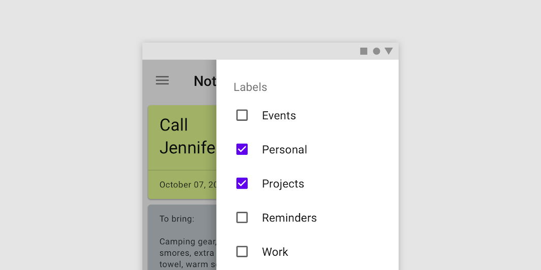
Side sheets are supplementary surfaces containing content that are anchored to the left or right edge of the screen.
Sheets: side hero image

Usage ​

Side sheets are supplementary surfaces primarily used on tablet and desktop. They come in two types:


Standard side sheets

Standard side sheets display content that complements the screen’s primary content. They remain visible while users interact with primary content.

Common uses include:

  • Displaying a list of actions that affect the screen’s primary content, such as filters
  • Displaying supplemental content and features

Modal side sheets

Modal side sheets are used on mobile instead of standard side sheets, due to limited screen size. They can display the same types of content as standard side sheets, but must be dismissed in order to interact with the underlying content.
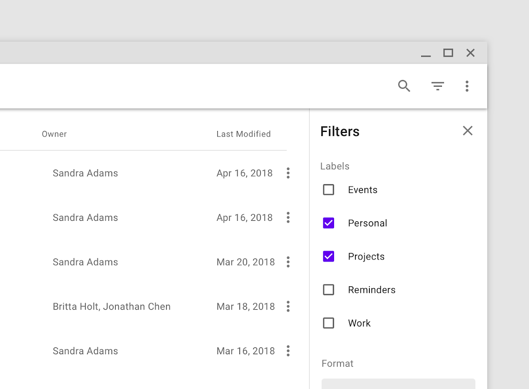
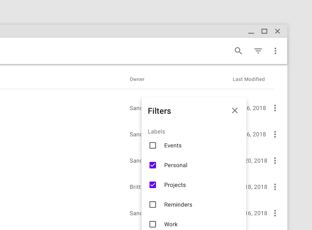
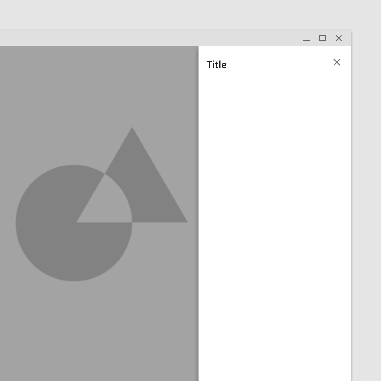
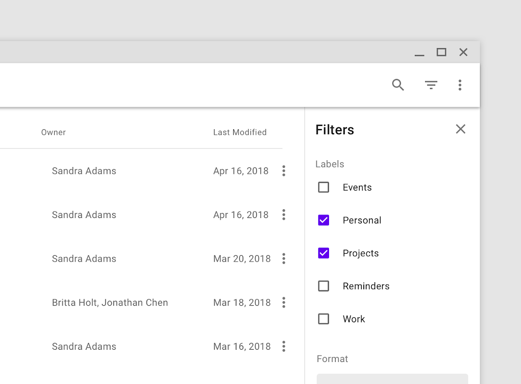
This standard side sheet on desktop contains filters that control the files shown in the primary UI region
This standard side sheet on desktop contains filters that control the files shown in the primary UI region.

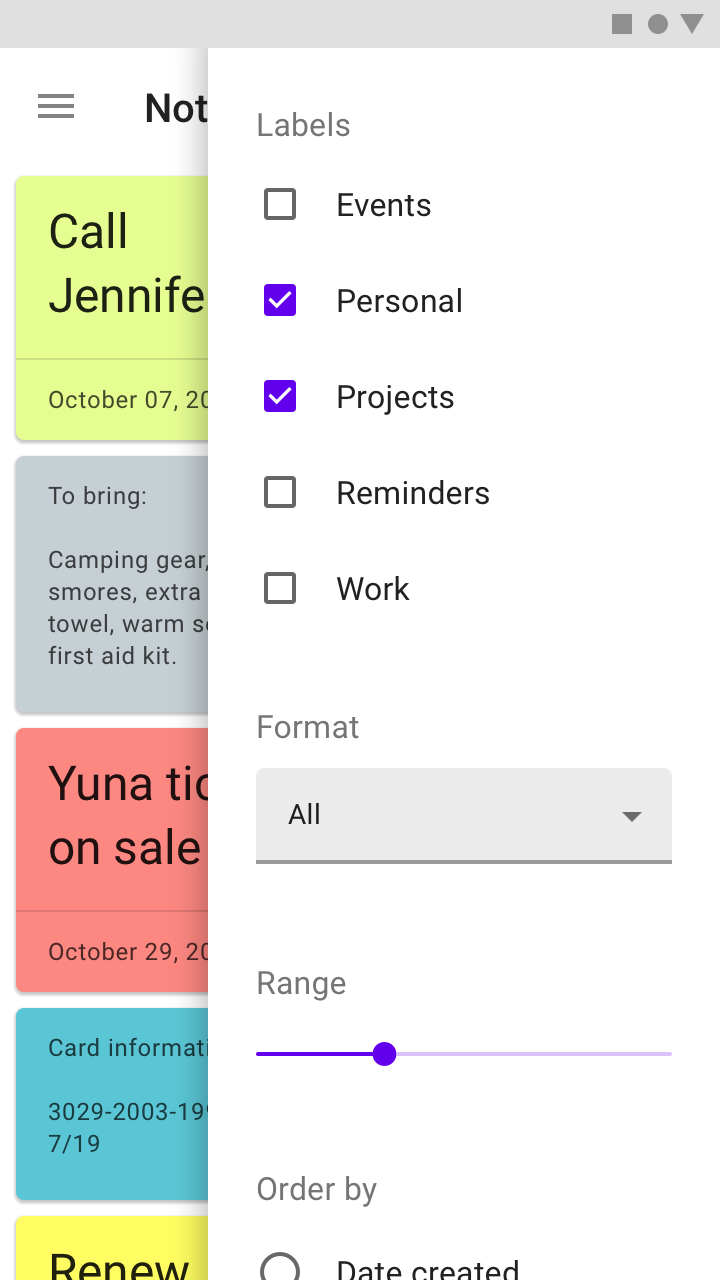
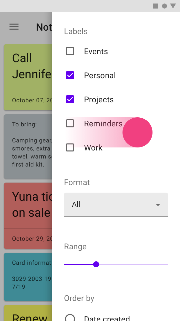
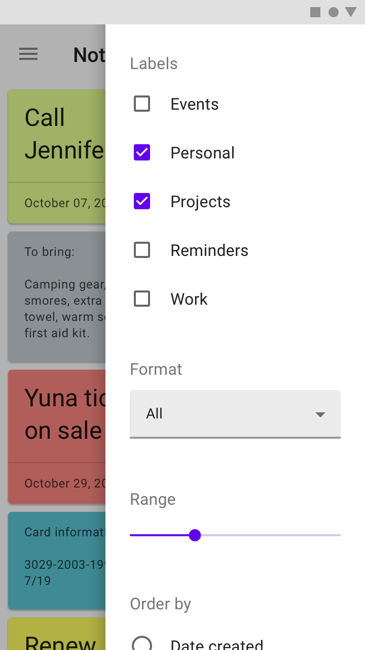
A modal side sheet on mobile is used instead of a standard side sheet, because of the limited screen space
A modal side sheet on mobile is used instead of a standard side sheet, because of the limited screen space.

Cards

Containing content & links on a single subject

Related article

Dialogs

Dialogs inform users about a specific task and may contain critical information, require decisions, or involve multiple tasks. They remain until dismissed or a required action has been taken.

Related article

Bottom sheets

Surfaces containing supplementary content that are anchored to the bottom of the screen.

Related article

Principles ​


Sheets: side principle: supporting

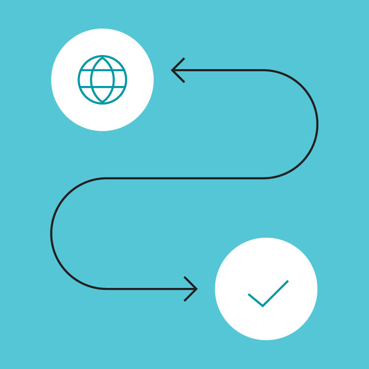
Supporting

Side sheets contain content that supplements the screen’s primary UI region.
Sheets: side principle: flexible

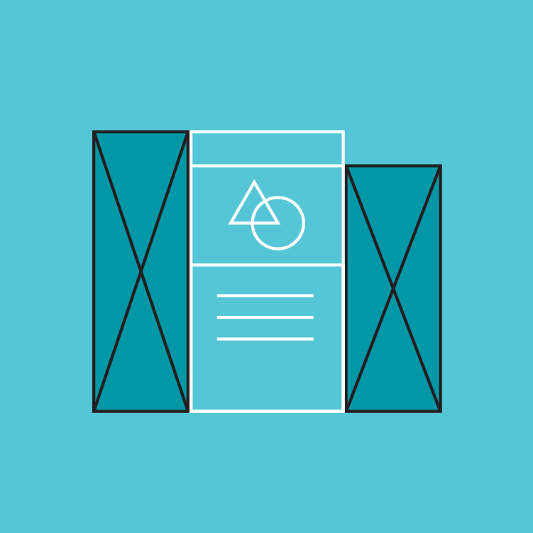
Flexible

Side sheets display a wide variety of content and layouts.
Sheets: side principle: contextual

Contextual

Side sheets can be visible or hidden based on screen size or user need, and they often become bottom sheets on mobile.

Anatomy ​
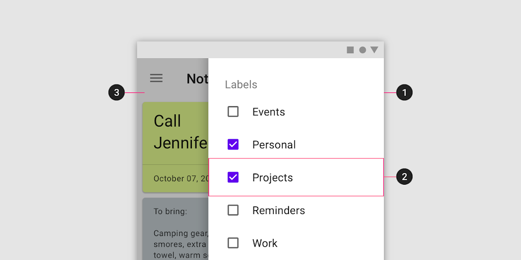
Diagram of sheet, content, scrim
1. Sheet
2. Content
3. Scrim (Modal only)

Sheet ​

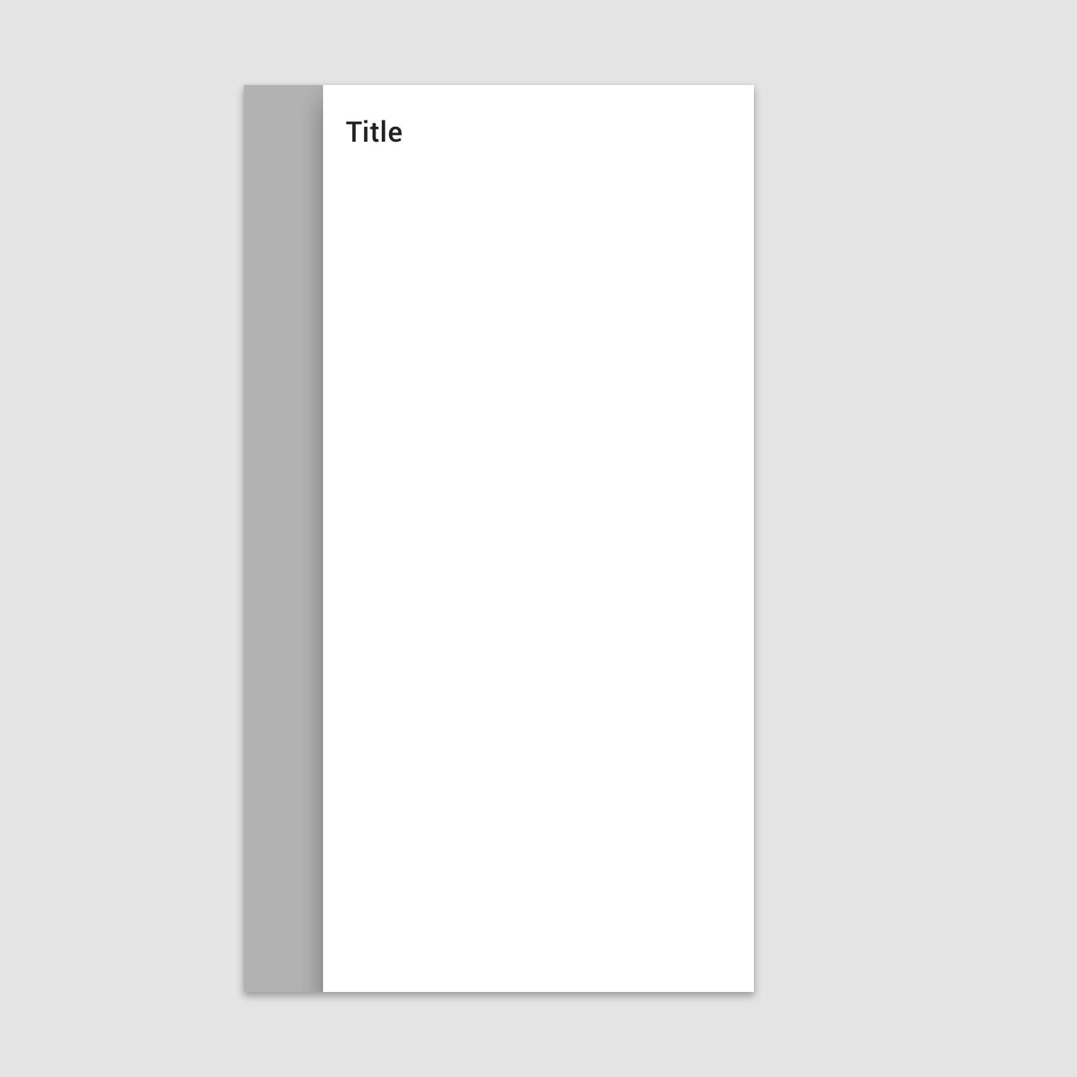
Side sheets are anchored to the left or right edge of the screen. They are a fixed width and typically span the height of the screen. Their dimensions depend on how the app’s layout is subdivided into UI regions.
Do: place side sheets along the left or right edge of the screen

Do

Place side sheets along the left or right edge of the screen.

Don’t fully inset a side sheet from the screen edges

Don't

Don’t fully inset a side sheet from the screen edges. This makes the sheet’s position and scroll behavior unclear, while obscuring primary content.

Contents ​

Side sheets can display a wide variety of content and layouts, ranging from a list of actions to supplemental content in a tabular layout.
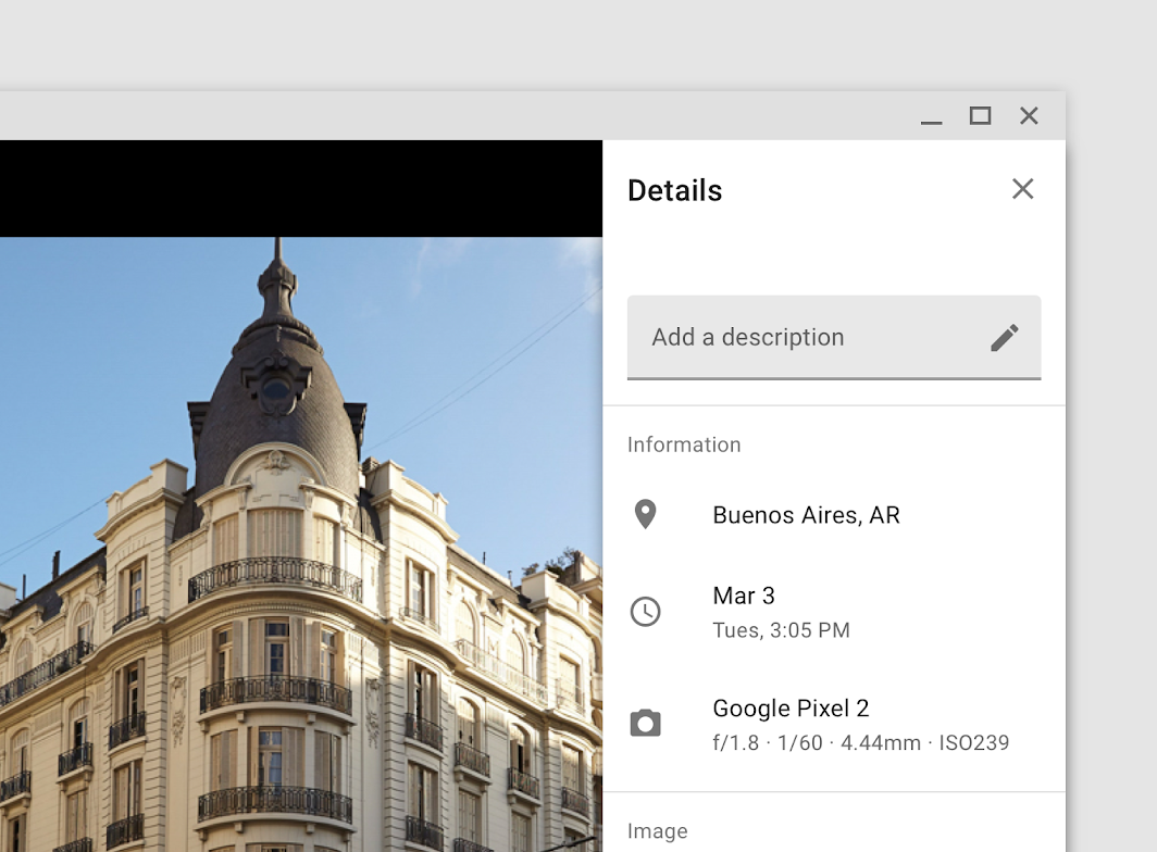
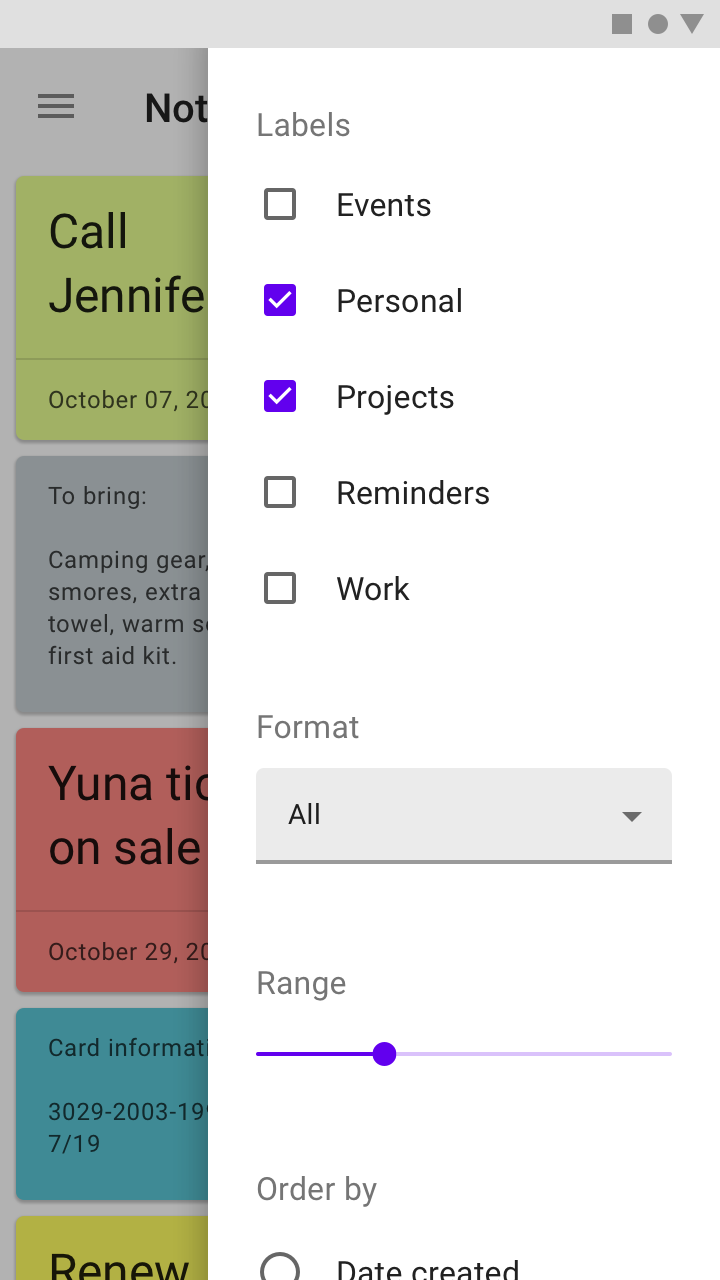
Metadata about a photo in a standard side sheet

A list of filters in a modal side sheet

Behavior ​

Scrolling ​

Side sheets can be vertically scrolled independent of the rest of the UI. This allows their scroll position and contents to persist while the page is scrolled, and vice versa.

Side sheets cannot be horizontally scrolled.

Do
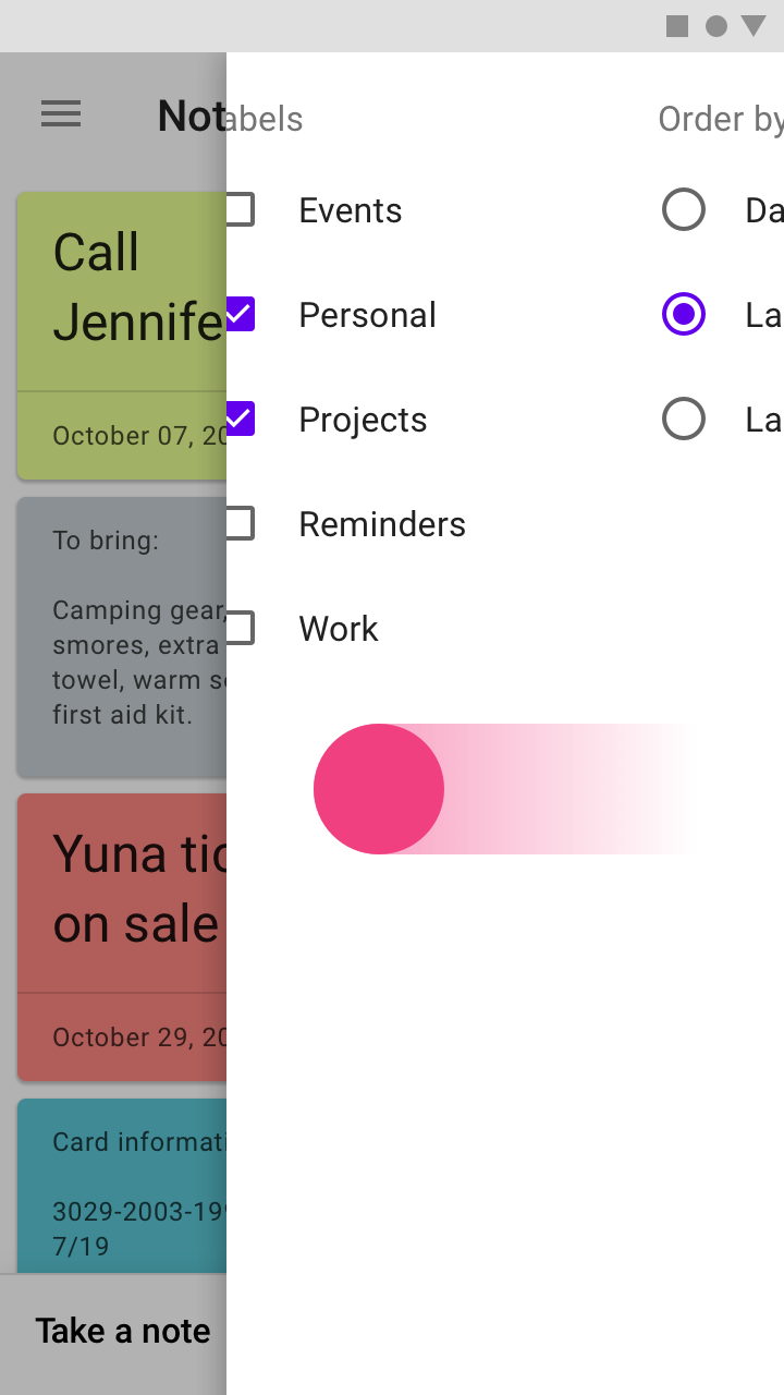
Side sheets can vertically scroll internally when their content exceeds the screen height.
Don’t allow horizontal scrolling in a side sheet or layout in a way that suggests horizontal scrolling

Don't

Don’t allow horizontal scrolling in a side sheet or layout in a way that suggests horizontal scrolling. A side sheet’s narrow width leaves limited space to fully view items.

Scaling and adaptation ​

A side sheet can be used to show and hide additional content. A side sheet is not fixed in size when aligned to the trailing edge of a layout.

Adjust the body to fit the side sheet ​

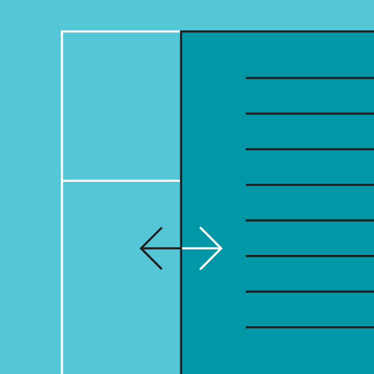
When the side sheet opens, the body area shrinks to accommodate the sheet’s width while maintaining a 48dp margin on the body’s trailing edge.
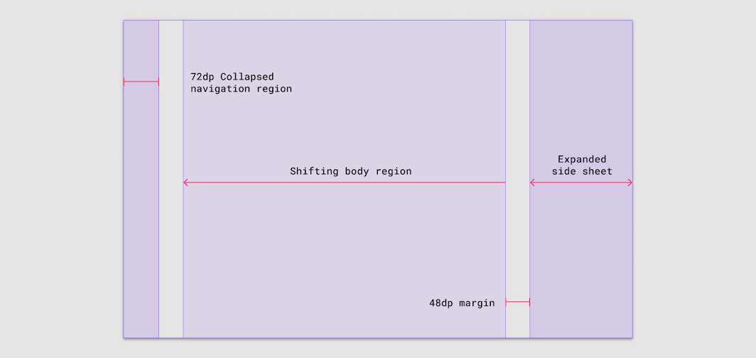
The body region and right margin respond to accommodate the size of the expanding side sheet
The body region and right margin respond to accommodate the size of the expanding side sheet.

When adapting layouts for larger screens, bottom sheets can be swapped for side sheets to reduce the amount of space occupied on larger screens.
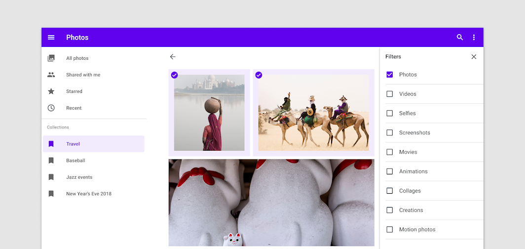
Do: switch the bottom sheet to a side sheet for landscape layouts

Do

Switch the bottom sheet to a side sheet for landscape layouts.

Placement ​

Screen size ​

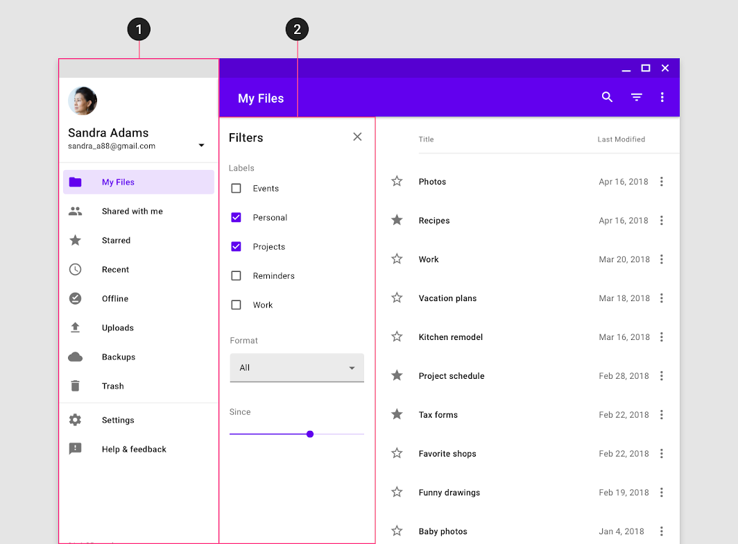
Side sheets that are modal on mobile, due to limited screen width, can become standard side sheets on tablet and desktop. The reverse is also true.
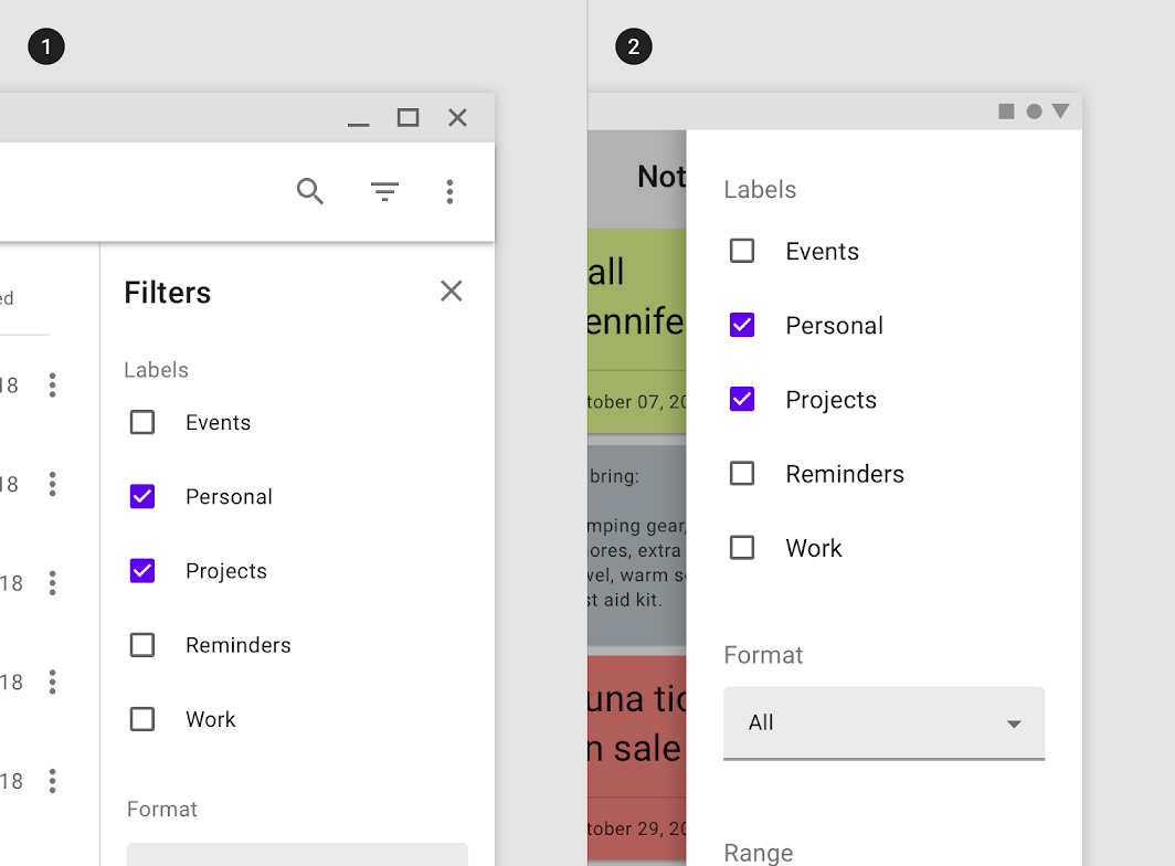
Do: the filters for this app are placed in a standard side sheet on desktop (1) and become modal on mobile due to limited

Do

The filters for this app are placed in a standard side sheet on desktop (1) and become modal on mobile due to limited screen width (2).

Pairing with navigation drawers ​

Side sheets should be placed on the opposite side of a side navigation drawer to avoid obstructing the UI or causing confusion about the sheet’s functionality.

Navigation drawers are anchored to the left screen edge in left-to-right languages, and on the right for right-to-left languages.
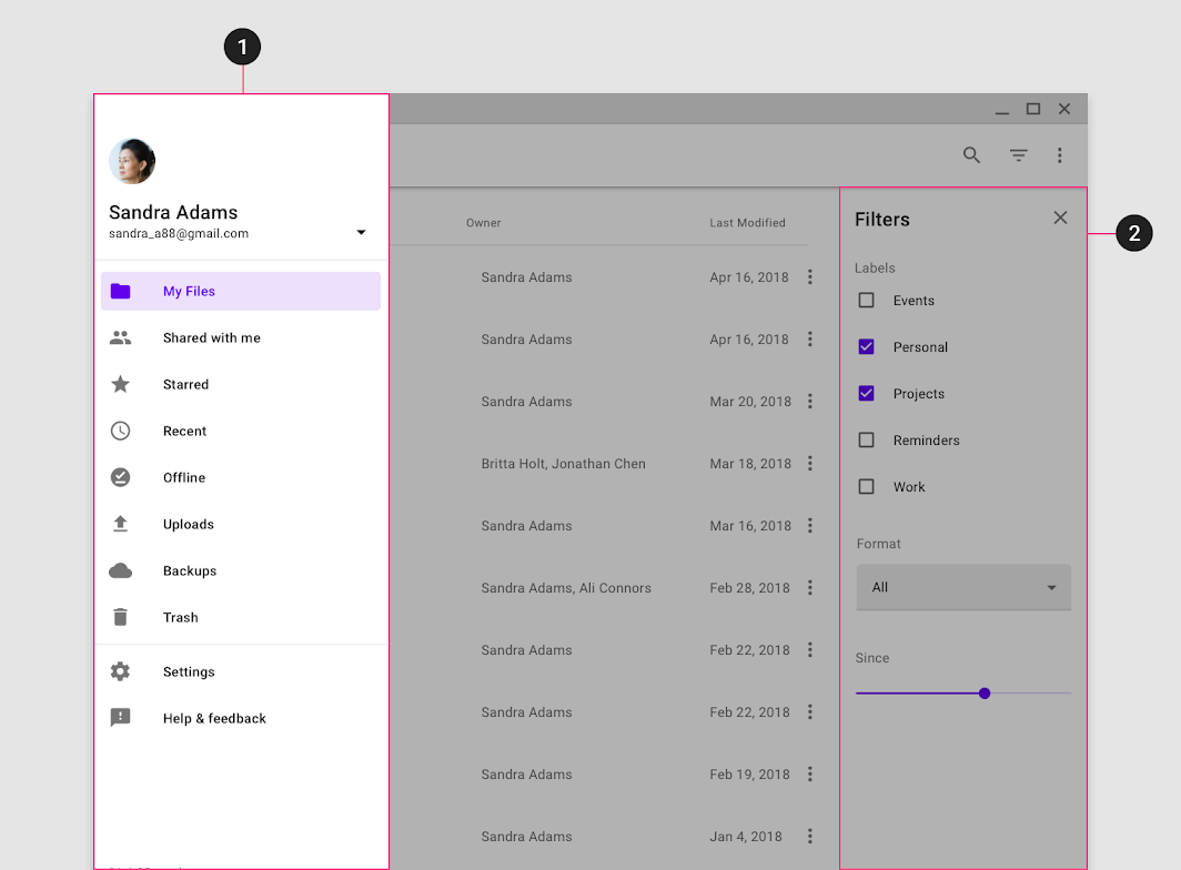
Do: place a side sheet on the opposite edge of a navigation drawer

Do

Place a side sheet on the opposite edge of a navigation drawer. This app uses a left-to-right layout, so the navigation drawer is placed on its left edge (1) and a standard side sheet is anchored to the right edge (2).

Don’t place a side sheet (2) along the same screen edge as a navigation drawer (1)

Don't

Don’t place a side sheet (2) along the same screen edge as a navigation drawer (1), as the sheet may get covered frequently by an elevated navigation drawer (or be confused for navigation itself).

Navigation drawer

Navigation drawers provide access to the navigation destinations of your app.

Related article

Standard side sheet ​

Usage ​

Standard side sheets co-exist with the screen’s primary UI region, which allows viewing and interaction with both surfaces. They are used only on tablet and desktop.

Standard side sheets are commonly used for:

  • Keeping a feature or content on-screen, if the primary UI region is frequently scrolled or panned
  • Contextual actions that affect the primary region, such as filters
  • Supporting information or metadata, such as location or photo details
  • Short tasks that can be accomplished in a single screen, such as configuring options or specifying item details before making a purchase

Behavior ​

Opening and closing ​

Standard side sheets that aren’t permanent should include affordances to open and close the sheet.

Common open affordances include action icons in top app bars or buttons in the screen layout. While a single affordance can be used to toggle the visibility of the sheet on or off, a separate close affordance within the sheet is recommended.


UI regions

The Material Design responsive layout grid adapts to screen size and orientation. This UI guidance includes a flexible grid that ensures consistency across layouts.

Related article

Placement ​

Elevation ​

Standard side sheets can be set at the same elevation as the main content or placed above it, at 8dp.

Their elevation can be used to indicate their hierarchical relationship to content or affect its behavior in the layout grid.

Coplanar elevation

Coplanar elevation places the sheet at the same elevation as content, indicating the two surfaces are related and of equal importance. Coplanar sheets affect the layout grid and shrink the available area for content.

Above content

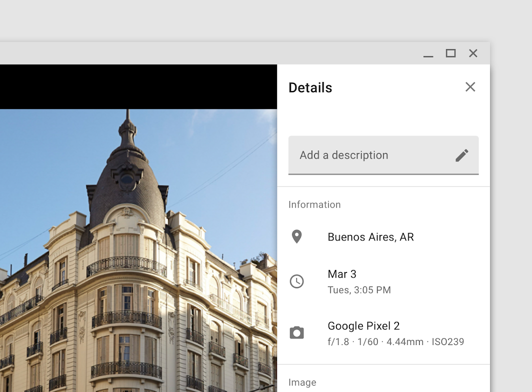
When the standard side sheet is elevated above content, it can indicate hierarchical meaning or simply be for layout purposes. Surfaces elevated in front of others often convey more importance or control over those behind them. They don’t affect the layout grid, and should only be used for temporarily visible sheets since they obscure content.
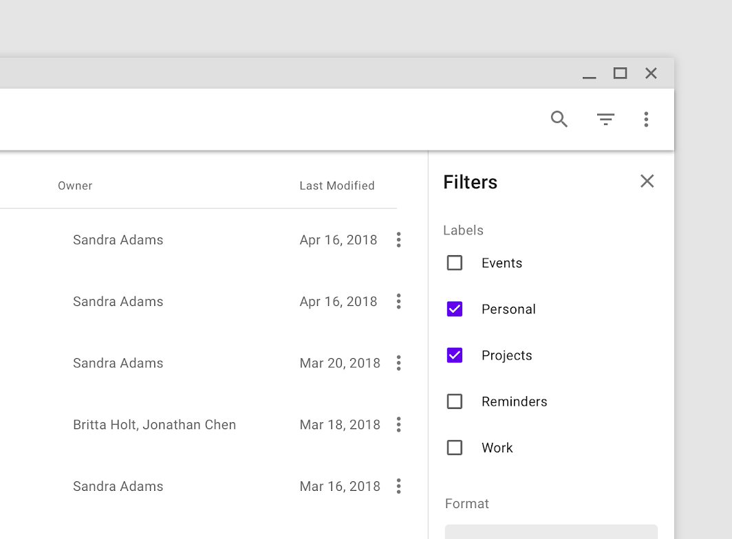
This filter sheet is coplanar with the main UI region
This filter sheet is coplanar with the main UI region, indicating its connection to content and allowing both regions to be fully visible.

The metadata for this photo is elevated above it to avoid resizing the image as the sheet opens and closes
The metadata for this photo is elevated above it to avoid resizing the image as the sheet opens and closes.

Elevation hierarchy

Elevation is the relative distance between two surfaces along the z-axis.

Related article

Modal side sheet ​

Usage ​

Modal side sheets present content while blocking interaction with the rest of the screen.

On mobile, they are used instead of standard side sheets. On larger screens, they can help focus a user’s attention on a key flow, such as making a purchase.

Behavior ​

Elevation and scrim ​

Modal side sheets have a default elevation of 16dp. This elevation allows them to appear over all UI elements.

A modal side sheet places all content and UI elements behind a scrim, which indicates that they will not respond to user interaction. Tapping the scrim dismisses both the modal side sheet and scrim from view.
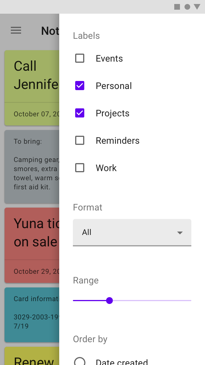
Do: a visible scrim informs users they cannot interact with the rest of the screen

Do

A visible scrim informs users they cannot interact with the rest of the screen.
Don’t use an invisible scrim

Don't

Don’t use an invisible scrim. This can mislead users about their ability to interact with the rest of the screen.

Control ​

Modal side sheets appear when triggered by a user action, such as tapping a button or action icon in a top app bar. They can be dismissed by:

  • Tapping the scrim
  • Swiping towards the sheet’s anchoring edge (left or right)
  • Using a close affordance within the side sheet’s header, if available
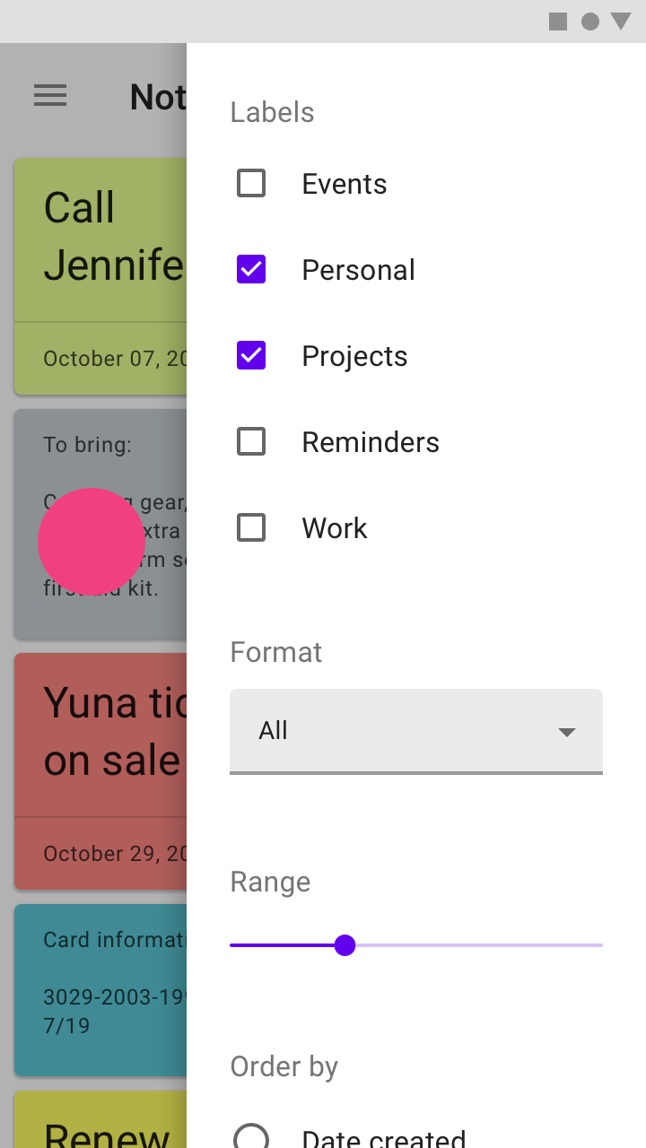
Tapping the scrim will dismiss a modal side sheet
Tapping the scrim will dismiss a modal side sheet.
A modal side sheet can be dismissed by swiping towards the sheet’s anchoring edge
A modal side sheet can be dismissed by swiping towards the sheet’s anchoring edge.

Theming ​

Crane Material Theme ​

This travel app’s side sheets have been customized using Material Theming, specifically using customized color.
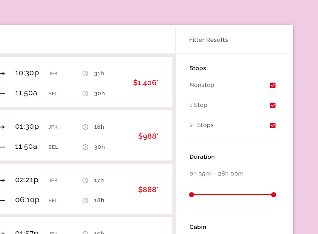
Crane’s customized side sheets

Crane

A travel app that uses Material Design components and Material Theming to create a personalized on-brand experience.

Related link

Color ​

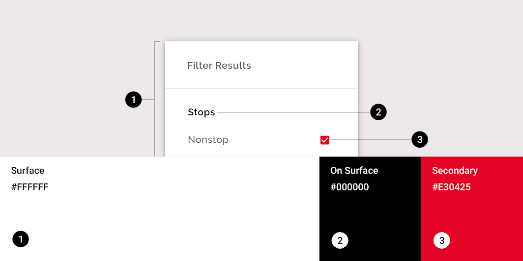
Crane’s side sheets use custom color on three elements: the container, text, and selection controls.
Crane Material theme: color
ElementCategoryAttributeValue
ContainerSurfaceColor
Opacity
#FFFFFF
100%
TextOn SurfaceColor
Opacity
#000000
100%
Selection controlsSecondaryColor
Opacity
#E30425
100%

The color system

Create a color theme that reflects your brand or style

Related article

Applying color to UI

In a UI, color has a variety of roles: from containing meaning, to expressing a look and feel.

Related article

Specs ​

Modal side sheet (Mobile) ​


40165656

Standard side sheet (Desktop) ​


32044201664162424
Pager
Previous pageSheets: bottom
Next pageSliders

Released under the Apache-2.0

Copyright © 2018-Present Google

https://m2.material.io/components/sheets-side

Released under the Apache-2.0

Copyright © 2018-Present Google