

Language support
Language size and display style vary based on whether a character set is English-like, tall, or dense.
Language considerations
Glyphs
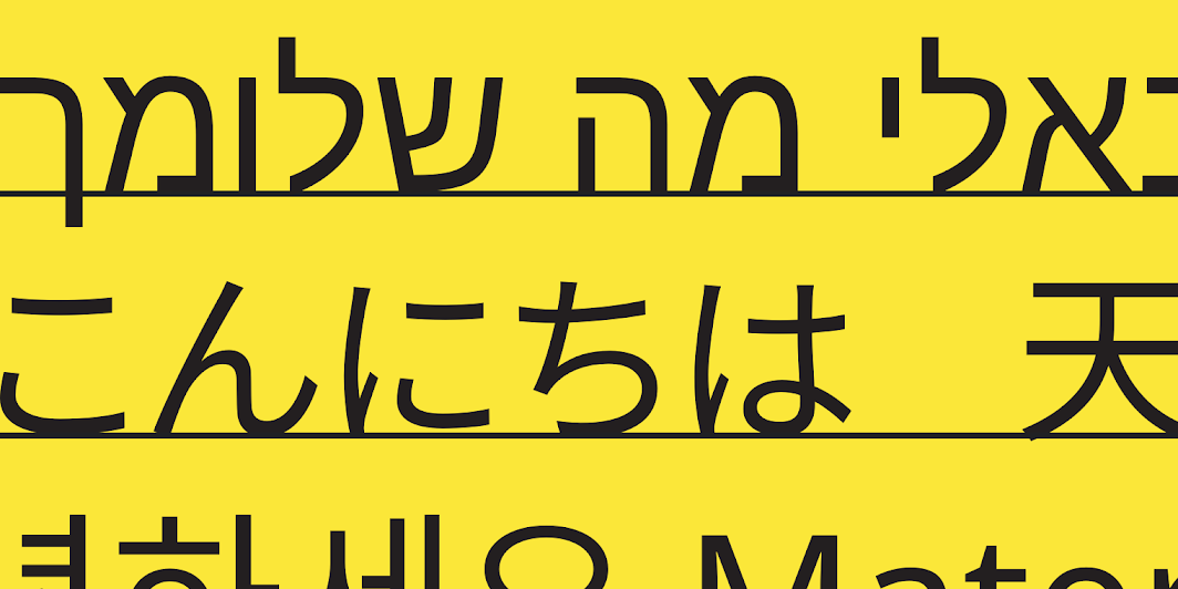
Each written language uses its own set of characters called glyphs.
If your UI uses multiple languages, then your typography layout should vary depending on the language. Languages have different average word lengths and heights, affecting how it appears across UIs.
Length
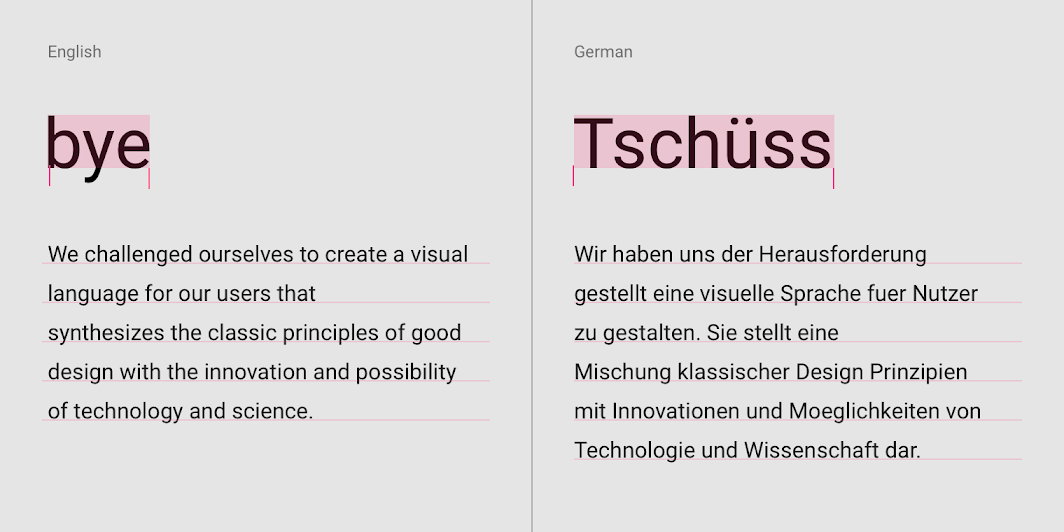
Word length can vary greatly across languages, even those that use similar glyphs, such as English and German.
Alignment
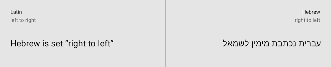
Some writing systems, like Arabic and Hebrew, are displayed with characters appearing from right to left. Those fonts may appear smaller than Latin ones at the same font-size, requiring adjustments to line spacing and alignment so that the typography works well in that UI for all languages.
Height
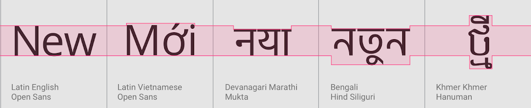
Many writing systems require more vertical space than English, so your UI should provide sufficient vertical space for these different systems.
Vertical typesetting
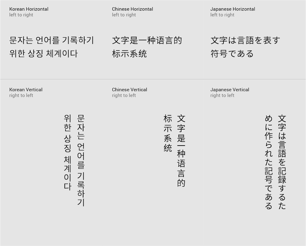
Vertical typesetting, though rarely used, can display characters vertically instead of horizontally.
The typography of China, Japan, and Korea is typically monospaced, which means each letter occupies the same amount of space as other letters. It is often set left-to-right, top-to-bottom. It can also be set vertically: top-to-bottom and right-to-left.
Language options
More than one typeface may need to be used in the same UI to display multilingual content, when each language uses a different writing system.
Writing systems can be grouped into three categories:
- English-like
- Tall
- Dense
English-like typefaces
The languages of Western, Central, and Eastern Europe and much of Africa are typically written in the Latin alphabet. Vietnamese is a notable exception in that, while it uses a localized form of the Latin writing system, its accented glyphs can be much taller than those found in Western European languages. The Greek and Cyrillic writing systems are very similar to Latin.
Tall typefaces
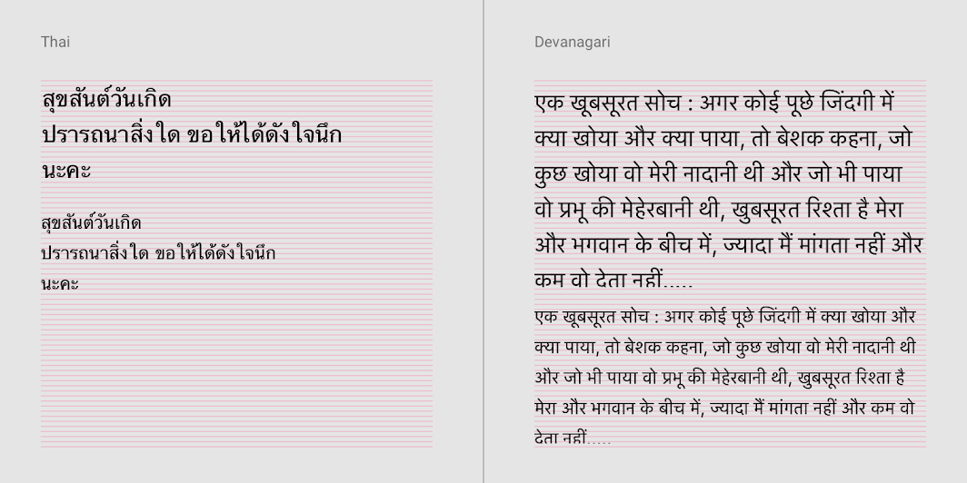
Language scripts that require extra line height to accommodate larger glyphs, including South and Southeast Asian and Middle-Eastern languages, like Arabic, Hindi, Telugu, Thai, and Vietnamese.
Dense typefaces
Language scripts that require extra line height to accommodate larger glyphs, including Chinese, Japanese, and Korean.
Noto guidance
Noto is the default typeface for all languages not covered by Roboto. Derived from Droid, it’s designed to be visually harmonious across languages and scripts with compatible heights and stroke thicknesses.
The family has 93 scripts defined in Unicode version 6.0.
Dense script considerations
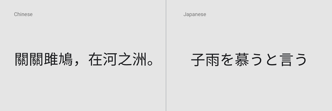
Noto Chinese, Japanese, and Korean (CJK) have seven weights that match Roboto, with the same weight settings as English.
Type sizes smaller than title styles should make adjustments to the Latin type scale.
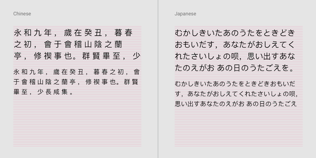
Line height is slightly larger than Latin-based characters.
Tall script considerations
Noto supports tall scripts used in South and Southeast Asian and Middle Eastern languages, including Arabic, Hindi, and Thai. Use regular weight, as medium weight is unavailable in Noto. Avoid using the bold weight, as bold is too heavy.
Type sizes smaller than title styles should make adjustments to the Latin type scale.
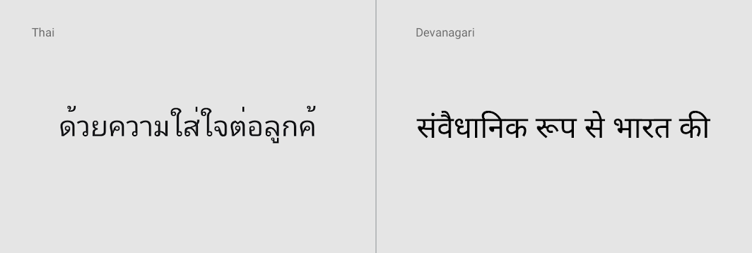
Tall script line height is slightly larger than Latin-based characters.
Language categories reference
Language categories reference
For ease of internationalization, Google has categorized languages into three categories: English-like, tall, and dense.
English-like: Latin (except Vietnamese), Greek, Cyrillic, Hebrew, Armenian, and Georgian.
Tall: Language scripts that require extra line height to accommodate larger glyphs, including South and Southeast Asian and Middle Eastern languages, like Arabic, Hindi, Telugu, Thai, and Vietnamese.
Dense: Language scripts that require extra line height to accommodate larger glyphs but have different metrics from tall scripts. Includes Chinese, Japanese, and Korean.
| Code | Description | Category |
|---|---|---|
| af | Afrikaans | English-like |
| am | Amharic | English-like |
| ar | Arabic (Modern Standard) | Tall |
| az | Azerbaijani | English-like |
| bg | Bulgarian | English-like |
| bn | Bengali | Tall |
| ca | Catalan | English-like |
| cs | Czech | English-like |
| cy | Welsh | English-like |
| da | Danish | English-like |
| de | German | English-like |
| el | Greek | English-like |
| en | English (US) | English-like |
| en-GB | English (UK) | English-like |
| es | Spanish (European) | English-like |
| es-419 | Spanish (Latin American) | English-like |
| et | Estonian | English-like |
| eu | Basque | English-like |
| fa | Persian | Tall |
| fi | Finnish | English-like |
| fil | Filipino | English-like |
| fr | French (European) | English-like |
| fr-CA | French (Canadian) | English-like |
| gl | Galician | English-like |
| gu | Gujarati | Tall |
| hi | Hindi | Tall |
| hr | Croatian | English-like |
| hu | Hungarian | English-like |
| hy | Armenian | English-like |
| id | Indonesian | English-like |
| is | Icelandic | English-like |
| it | Italian | English-like |
| iw | Hebrew | English-like |
| ja | Japanese | Dense |
| ka | Georgian | English-like |
| kk | Kazakh | English-like |
| km | Khmer | Tall |
| kn | Kannada | Tall |
| ko | Korean | Dense |
| ky | Kirghiz | English-like |
| lo | Lao | English-like |
| lt | Lithuanian | English-like |
| lv | Latvian | English-like |
| mk | Macedonian | English-like |
| ml | Malayalam | Tall |
| mn | Mongolian | English-like |
| mr | Marathi | Tall |
| ms | Malay | English-like |
| my | Burmese (Myanmar) | Tall |
| ne | Nepali | Tall |
| nl | Dutch | English-like |
| no | Norwegian (Bokmål) | English-like |
| pa | Punjabi | Tall |
| pl | Polish | English-like |
| pt | Portuguese (Brazilian) | English-like |
| pt-PT | Portuguese (European) | English-like |
| ro | Romanian | English-like |
| ru | Russian | English-like |
| si | Sinhala | Tall |
| sk | Slovak | English-like |
| sl | Slovenian | English-like |
| sq | Albanian | English-like |
| sr | Serbian (Cyrillic) | English-like |
| sr-Latn | Serbian (Latin) | English-like |
| sv | Swedish | English-like |
| sw | Swahili | English-like |
| ta | Tamil | Tall |
| te | Telugu | Tall |
| th | Thai | Tall |
| tr | Turkish | English-like |
| uk | Ukrainian | English-like |
| ur | Urdu | Tall |
| uz | Uzbek | English-like |
| vi | Vietnamese | Tall |
| zh-Hans | Chinese (Simplified) | Dense |
| zh-Hant | Chinese (Traditional) | Dense |
| zu | Zulu | English-like |