

Time pickers
Time pickers help users select and set a specific time.
Usage
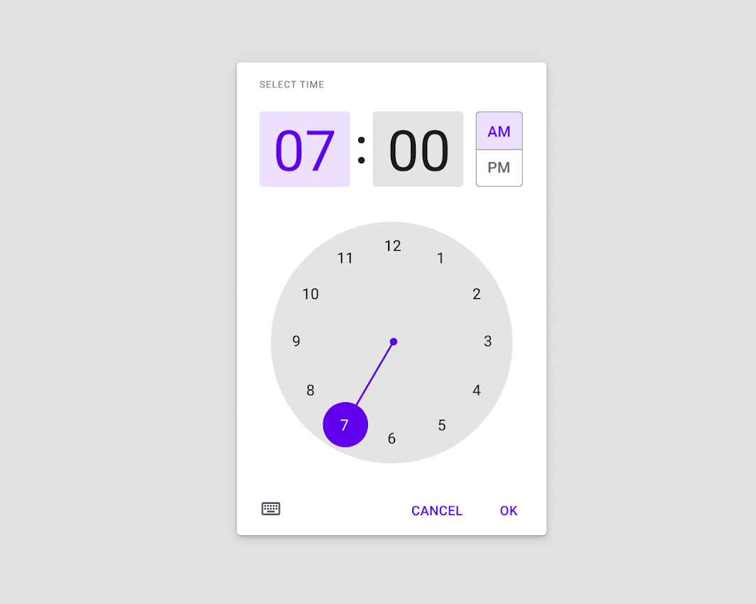
Time pickers allow users to enter a specific time value. They can be used for a wide range of scenarios.
Common use cases include:
- Setting an alarm
- Scheduling a meeting
Mobile time pickers are displayed in dialogs and can be used to select hours, minutes, and a period of time.
Principles
Familiar
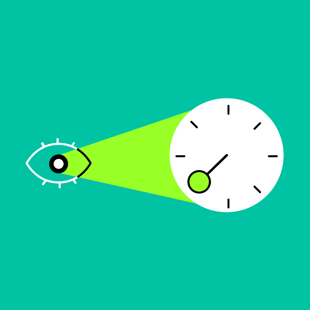
The analog clock face option provides an added level of assurance and confirmation when picking times.
Flexible
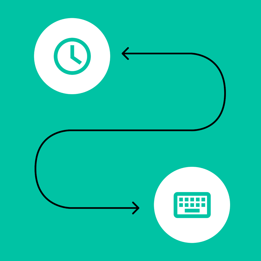
Input types are flexible in order to account for a range of use cases and contexts.
Ergonomic
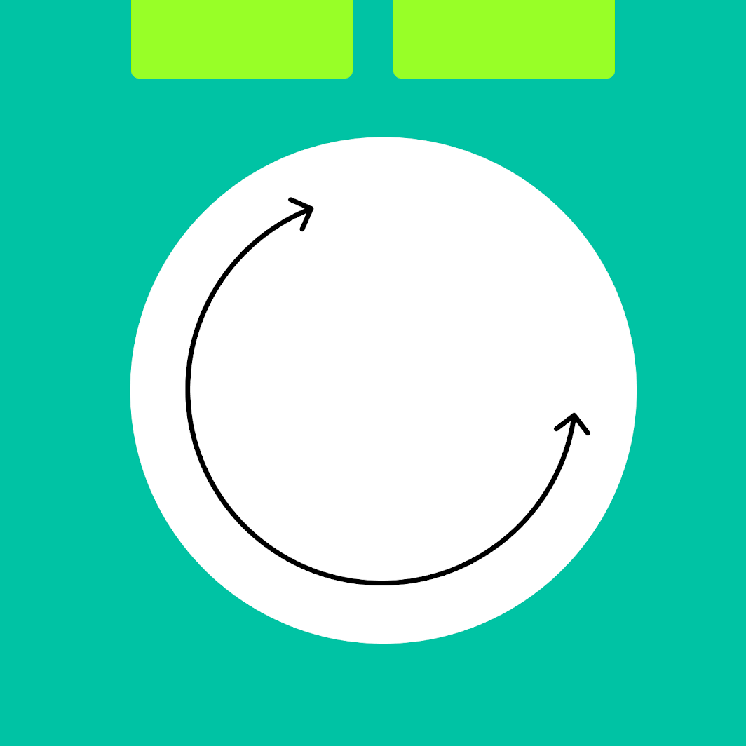
Time can be selected without significant adjustment of one’s hand position on a mobile device.
Anatomy
Time pickers can appear in an immersive dialog, or inline and compact.
Mobile time picker
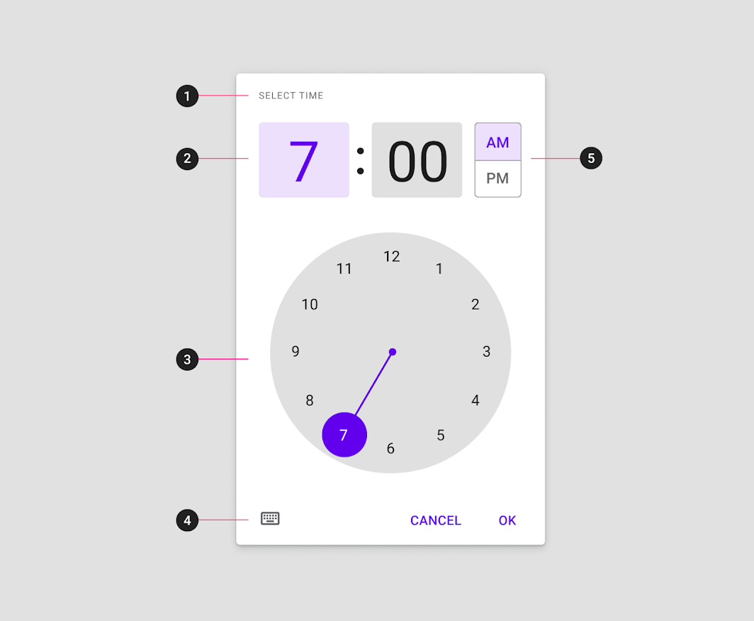
2. Interactive display and time input for hour and minutes
3. Clock dial
4. Icon button to switch to time input
5. AM/PM selector
Mobile time input
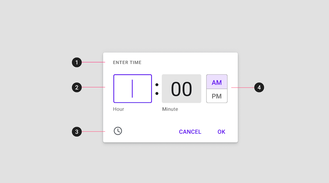
2. Hour and minute input field
3. Icon button to switch to dial entry
4. AM/PM selector
Behavior
There are two primary methods for selecting time with the mobile time picker. Users can:
- Type in a specific value in the hour and minute fields.
- Select the hour or minute field from the text input and adjust the clock dial below to simultaneously change the corresponding time field above.
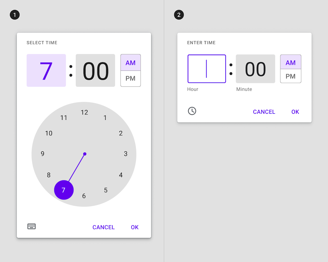
1. Time picker
2. Time input
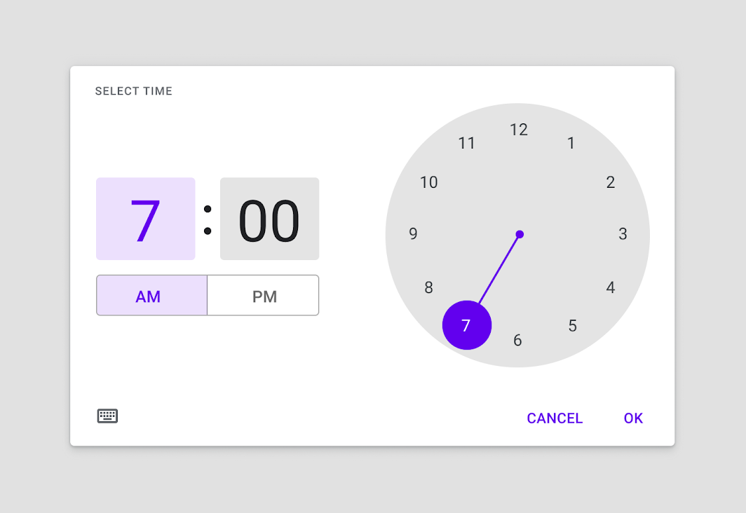
The clock dial interface adapts to a device’s orientation. In landscape mode the stacked input and selection options are positioned side-by-side.
Accessibility
On mobile devices, time pickers should allow manual time entry through text input, rather than exclusive use of the dial picker. The text input picker should be an available option that’s accessed from the dial picker when a user selects the keyboard icon. This interaction allows multiple input methods and makes the time picker accessible to assistive technology users.
Targets
Targets for mobile time pickers should be as large as possible filling the available space.
Theming
Crane Material Theme
This app's time pickers are customized to express Crane's brand identity by adjusting typography, shape, and colors.
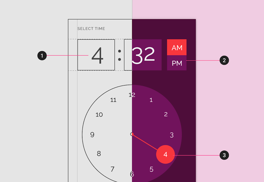
2. Shape
3. Color
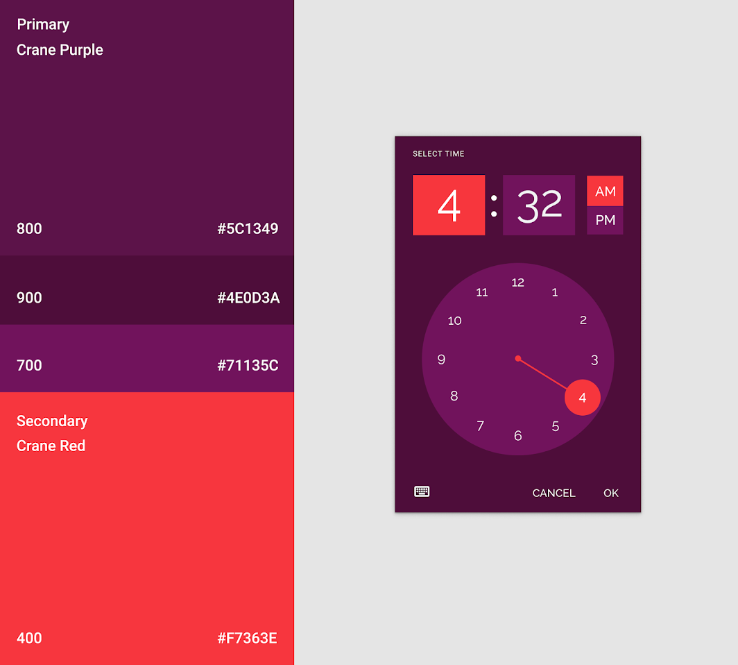
Color
Color can be used to create bold visual moments in a time picker.
Shape
The shape of the time picker can be customized to align with your brand's style.
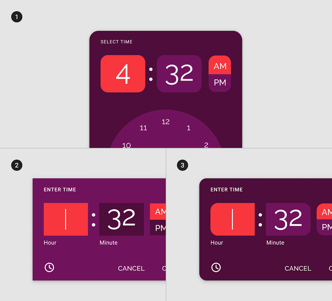
2. Custom color and shape
3. Custom shape for time fields creates a visual pairing between hours and minutes
Specs
Mobile dial picker
The mobile time picker is a standard dialog.
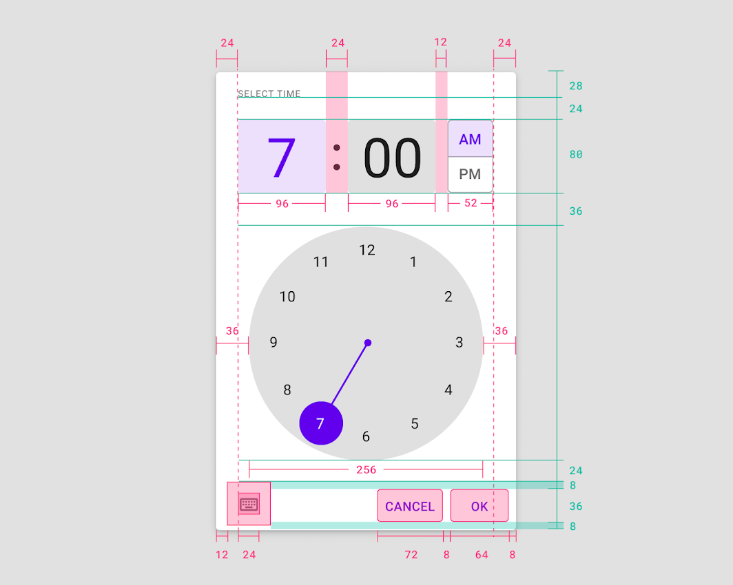
• Input entry icon: 24 x 24dp
• First baseline: 28dp from top
• Dial width: 256dp
• Dial padding left and right: 36dp
• Numeric field: 24dp from bottom of title
• Numeric field height: 80dp
Mobile time input
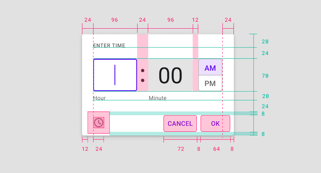
• Right padding: 24dp
• Dial view icon: 24 x 24dp
• First baseline: 28dp from top
• Numeric field: 24dp from bottom of title
• Numeric field height: 70dp
• Numeric field width: 96dp
• Button right margin: 8dp
• Button bottom margin: 8dp
Landscape
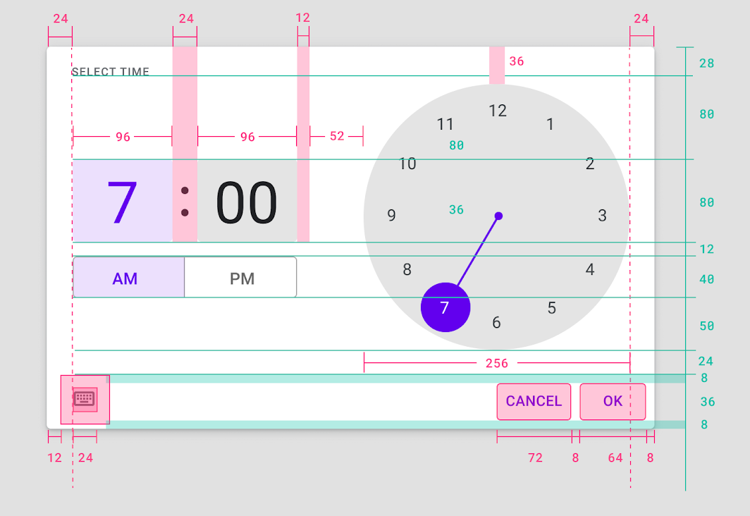
• Left padding: 24dp
• Right padding: 24dp
• Input entry icon: 24 x 24dp
• First baseline: 28dp from top
• Numeric field: 80dp from bottom of title
• Numeric field height: 80dp
• Numeric field width: 96dp
• Dial top margin: 36dp
• Dial width: 256dp
• Button right margin: 8dp
• Button bottom margin: 8dp