Skip to content
Material Design 2
Main Navigation
v3
v2
v1

English

简体中文
繁體中文
Español
Français
Русский
Português – Brasil
Deutsch
日本語
한국어
Italiano
Polski
Türkçe
čeština
magyar

English

简体中文
繁體中文
Español
Français
Русский
Português – Brasil
Deutsch
日本語
한국어
Italiano
Polski
Türkçe
čeština
magyar

Appearance

Sidebar Navigation

Material System

Introduction

Material studies

About our Material studies

Basil

Crane

Fortnightly

Owl

Rally

Reply

Shrine

Material Foundation

Environment

Surfaces

Elevation

Light and shadows

Layout

Understanding layout

Pixel density

Responsive layout grid

Spacing methods

Component behavior

Applying density

Navigation

Understanding navigation

Navigation transitions

Search

Color

The color system

Applying color to UI

Color usage

Text legibility

Dark theme

Typography

The type system

Understanding typography

Language support

Sound

About sound

Applying sound to UI

Sound attributes

Sound choreography

Iconography

Product icons

System icons

Animated icons

Shape

About shape

Shape and hierarchy

Shape as expression

Shape and motion

Applying shape to UI

Motion

Understanding motion

The motion system

Speed

Choreography

Customization

Interaction

Gestures

Selection

States

Communication

Confirmation & acknowledgement

Data formats

Data visualization

Empty states

Help & feedback

Imagery

Launch screen

Onboarding

Offline states

Writing

Machine learning

Machine learning patterns

Object detection: live camera

Object detection: static image

Barcode Scanning

Material Guidelines

Material Theming

Overview

Implementing your theme

Usability

Accessibility

Bidirectionality

Platform guidance

Android bars

Android fingerprint

Android haptics

Android icons

Android navigating between apps

Android notifications

Android permissions

Android slices

Android split-screen

Android swipe-to-refresh

Android text selection toolbar

Android widget

Cross-platform adaptation

Components

App bars: bottom

App bars: top

Backdrop

Banners

Bottom navigation

Buttons

Buttons: floating action button

Cards

Checkboxes

Chips

Data tables

Date pickers

Dialogs

Dividers

Image lists

Lists

Menus

Navigation drawer

Navigation rail

Progress indicators

Radio buttons

Sheets: bottom

Sheets: side

Sliders

Snackbars

Switches

Tabs

Text fields

Time pickers

Tooltips

On this page

Shape and motion ​

Elements can change shape in response to content changes or user interaction.

Usage ​

Morphing is the act of changing one shape into another. Shapes can morph in response to changes in state or content, or as a result of user interaction. For example, when rotating a mobile device from portrait to landscape, surfaces can respond by changing size, which can cause shapes to morph.

Shapes can morph for various reasons, such as to remain consistent with a visual language as surface dimensions change, or to indicate when items are added to a selected set.

Morphing can cause changes to:

  • Element prominence
  • Element ergonomics
  • The meaning of a particular shape
  • How well a surface expresses a brand’s visual language
  • Relationships between elements

Do

A shape can morph in response to changes in the UI. This bottom app bar morphs upon the entrance of a floating action button.

Do

A surface can reflect state changes by changing its dimensions. The corner of this surface maintains its curve while the edge grows.

Morphing shape ​

Morphing shape ​

As a surface changes size, its shape can maintain its original position or dimensions, it can stretch, or it can shrink. A shape can also morph between two different shapes.

Dimensions ​


Do

Shape can maintain its original dimensions and position when morphing. This shape (B) retains its original dimensions and position relative to one side (A) of the surface, while the other side (C) stretches.

Do

A surface may change its dimensions to retain its shape. The height (A) of this portion of the surface changes as its width changes in order to maintain its angled slope.

Stretching and shrinking ​

A shape can stretch or shrink in response to changes in surface dimensions. Morphing a shape should preserve the proportions of distinctive shapes.

Do

As this surface stretches, its shape remains recognizable because its distinctive rounded corners keep the same proportions even as portions of the surface change dimensions.

Don't

Avoid distorting shapes when stretching or shrinking a surface. This surface’s proportions and rounded corners change as the surface stretches, creating a disconnect between its beginning and end states.

Resizing shape ​

Maintain the aspect ratio of distinctive shapes when resizing them to avoid shape distortion.

The corner radius maintains its original aspect ratio when it moves and resizes, supporting a consistent visual language.

Transforming shape ​

A shape can transform into a different shape.

Caution

Transforming between similar shapes produces smoother transitions. Transformations between different shapes can display awkward states during a transition.

Displaying content ​

Content visibility ​

All content on a surface should be visible while the surface morphs, without clipping content.

Do
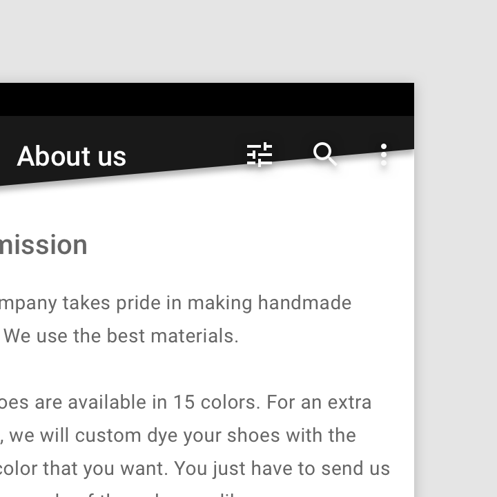
A shaped component should change its dimensions to accommodate content changes, while maintaining that component's shape.
Don't separate a surface from its content when morphing

Don't

Don't separate a surface from its content when morphing. The shape of this top app bar causes these action icons to appear separate from the surface.

Default shape ​

By default, Material surfaces are rectangular. They can transform from rectangular shapes into other shapes, and vice versa. For example, a round floating action button can become a rectangular menu, and then return to its original round shape.

Rectangular shapes maximize the space available for scrollable content and blend in with other rectangular surfaces. As a result, content receives emphasis.

When using the default rectangular shape, you can add a cue (such as a collapse or expand icon) to indicate how to transform the surface.

Maximize space ​

Rectangular shapes maximize space for scrollable content.

Do

A round floating action button transitions into a rectangular menu to maximize space for content.

Don't

Choose shapes for expanded surfaces that are optimized for the content they display. This circular menu does not effectively display its content because it maintains the circular shape of the FAB.

Space is maximized to display list content when this curved expanding sheet transforms into the default rectangular shape.

Focus attention ​

Rectangular surfaces blend in with other rectangular surfaces, allowing content to receive emphasis.

When the backdrop's back layer is active, the default shape of the front layer reduces its prominence and focuses user attention on the filter options behind it.
Pager
Previous pageShape as expression
Next pageApplying shape to UI

Released under the Apache-2.0

Copyright © 2018-Present Google

https://m2.material.io/design/shape/shape-motion.html

Released under the Apache-2.0

Copyright © 2018-Present Google