Skip to content
Material Design 2
Main Navigation
v3
v2
v1

English

简体中文
繁體中文
Español
Français
Русский
Português – Brasil
Deutsch
日本語
한국어
Italiano
Polski
Türkçe
čeština
magyar

English

简体中文
繁體中文
Español
Français
Русский
Português – Brasil
Deutsch
日本語
한국어
Italiano
Polski
Türkçe
čeština
magyar

Appearance

Sidebar Navigation

Material System

Introduction

Material studies

About our Material studies

Basil

Crane

Fortnightly

Owl

Rally

Reply

Shrine

Material Foundation

Environment

Surfaces

Elevation

Light and shadows

Layout

Understanding layout

Pixel density

Responsive layout grid

Spacing methods

Component behavior

Applying density

Navigation

Understanding navigation

Navigation transitions

Search

Color

The color system

Applying color to UI

Color usage

Text legibility

Dark theme

Typography

The type system

Understanding typography

Language support

Sound

About sound

Applying sound to UI

Sound attributes

Sound choreography

Iconography

Product icons

System icons

Animated icons

Shape

About shape

Shape and hierarchy

Shape as expression

Shape and motion

Applying shape to UI

Motion

Understanding motion

The motion system

Speed

Choreography

Customization

Interaction

Gestures

Selection

States

Communication

Confirmation & acknowledgement

Data formats

Data visualization

Empty states

Help & feedback

Imagery

Launch screen

Onboarding

Offline states

Writing

Machine learning

Machine learning patterns

Object detection: live camera

Object detection: static image

Barcode Scanning

Material Guidelines

Material Theming

Overview

Implementing your theme

Usability

Accessibility

Bidirectionality

Platform guidance

Android bars

Android fingerprint

Android haptics

Android icons

Android navigating between apps

Android notifications

Android permissions

Android slices

Android split-screen

Android swipe-to-refresh

Android text selection toolbar

Android widget

Cross-platform adaptation

Components

App bars: bottom

App bars: top

Backdrop

Banners

Bottom navigation

Buttons

Buttons: floating action button

Cards

Checkboxes

Chips

Data tables

Date pickers

Dialogs

Dividers

Image lists

Lists

Menus

Navigation drawer

Navigation rail

Progress indicators

Radio buttons

Sheets: bottom

Sheets: side

Sliders

Snackbars

Switches

Tabs

Text fields

Time pickers

Tooltips

On this page

Banners ​

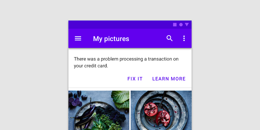
A banner displays a prominent message and related optional actions.
Banners hero image

Usage ​

A banner displays an important, succinct message, and provides actions for users to address (or dismiss the banner). It requires a user action to be dismissed.

Banners should be displayed at the top of the screen, below a top app bar. They’re persistent and nonmodal, allowing the user to either ignore them or interact with them at any time. Only one banner should be shown at a time.

ComponentPriorityUser action
SnackbarLow priorityOptional: Snackbars disappear automatically
BannerProminent, medium priorityOptional: Banners remain until dismissed by the user, or if the state that caused the banner is resolved
DialogHighest priorityRequired: Dialogs block app usage until the user takes a dialog action or exits the dialog (if available)

Snackbars

Provide brief feedback about an operation through a message at the bottom of the screen.

Related article

Dialogs

Dialogs inform users about a specific task and may contain critical information, require decisions, or involve multiple tasks. They remain until dismissed or a required action has been taken.

Related article

Backdrop

Displaying contextual & actionable content behind other surfaces

Related article

Principles ​


Banner principle: appropriately interruptive

Appropriately interruptive

Banners are interruptive, but their level of interruption should match the information they contain and the context in which they appear.
Banner principle: clear

Clear

Banners communicate a succinct message and what will happen if users interact with them.
Banner principle: focused

Focused

Banners contain a single message and specific actions a user can take.

Anatomy ​
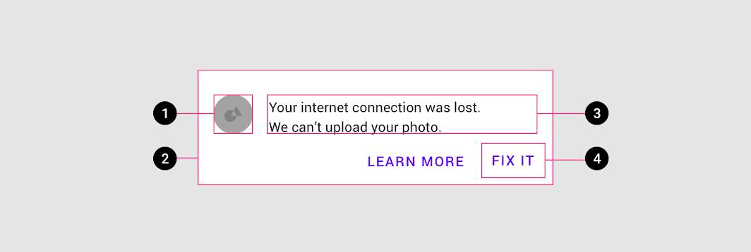
Diagram of supporting illustration, container, text, buttons
1. Supporting illustration (optional)
2. Container
3. Text
4. Buttons

Banner container ​

A banner container is rectangular, extending the full width of a layout. The container should be placed in a consistent and prominent location throughout an app, sharing the same elevation as screen content.
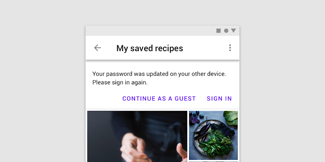
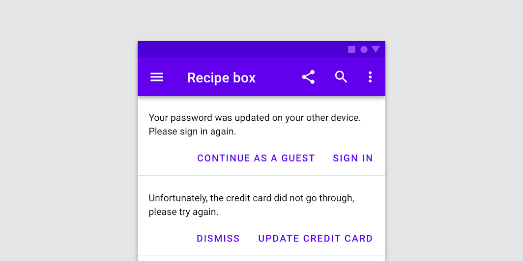
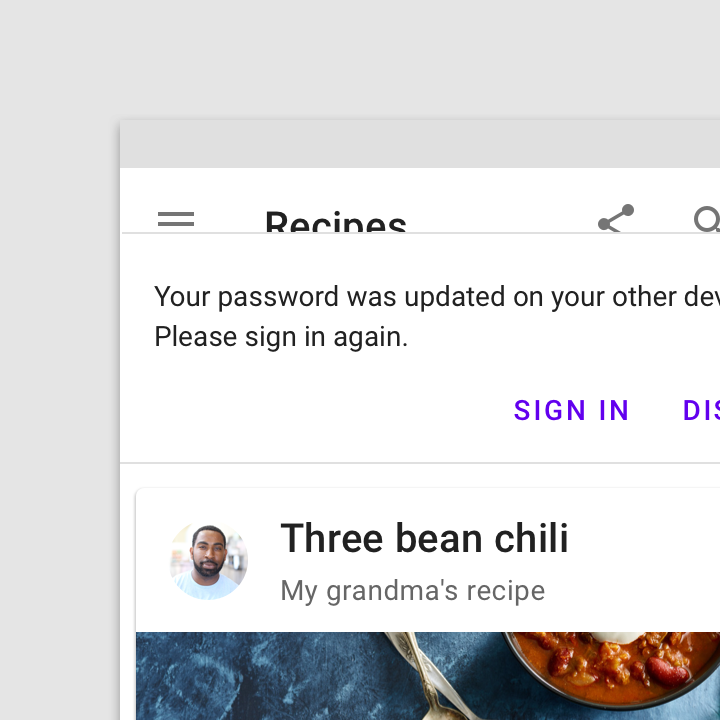
A banner appears above content and below a top app bar
A banner appears above content and below a top app bar.

Don't: only one banner should be shown at a time

Don't

Only one banner should be shown at a time.

Banner message ​

The banner message communicates a change or error within an app.

Banners should be considered as part of your overall in-app messaging strategy.

Buttons ​

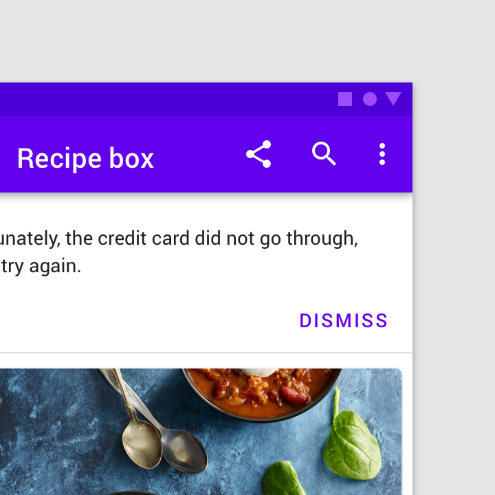
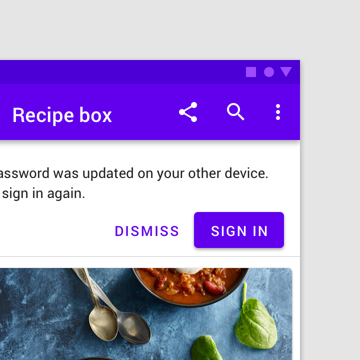
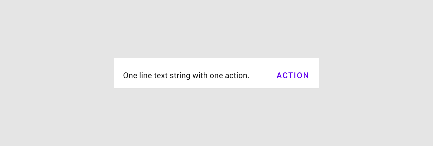
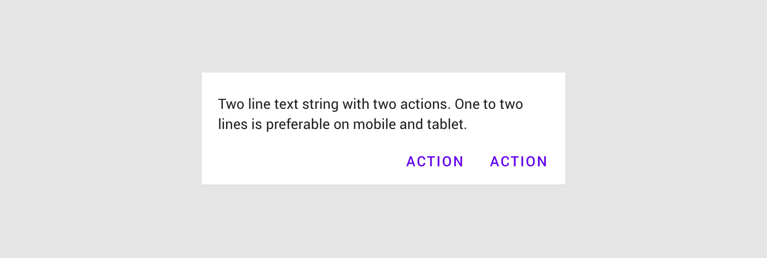
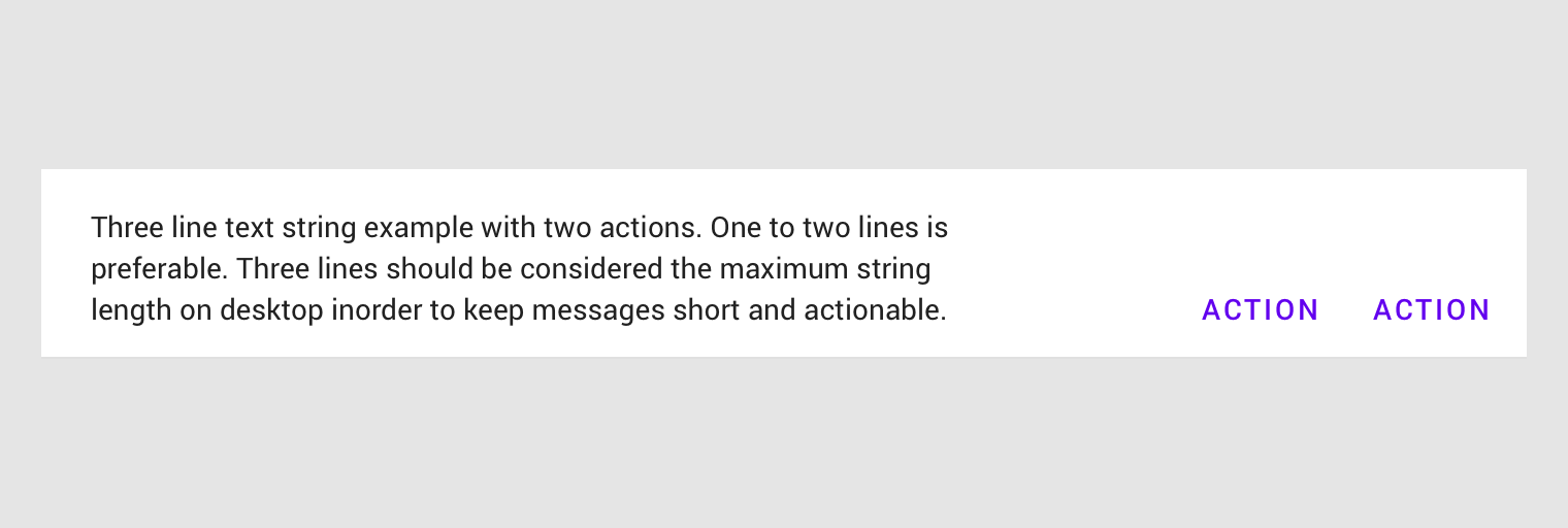
Buttons in banners should directly relate to a banner’s message and clearly represent the banner’s action. Buttons must be labelled with text, not icons, for clarity. Banners can contain up to two text buttons, with the dismissive action placed on the left and the confirming action on the right.

Place buttons under the banner message, or on the same line if there is enough room to fit both.
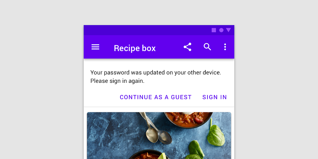
Do: banners may have one or two low-emphasis text buttons

Do

Banners may have one or two low-emphasis text buttons.

Caution: avoid using a single button as a way to acknowledge a banner and dismiss it

Caution

Avoid using a single button as a way to acknowledge a banner and dismiss it. A button to dismiss a banner should be paired with an action to address its message.
Caution: banners are intended to be minimally interruptive

Caution

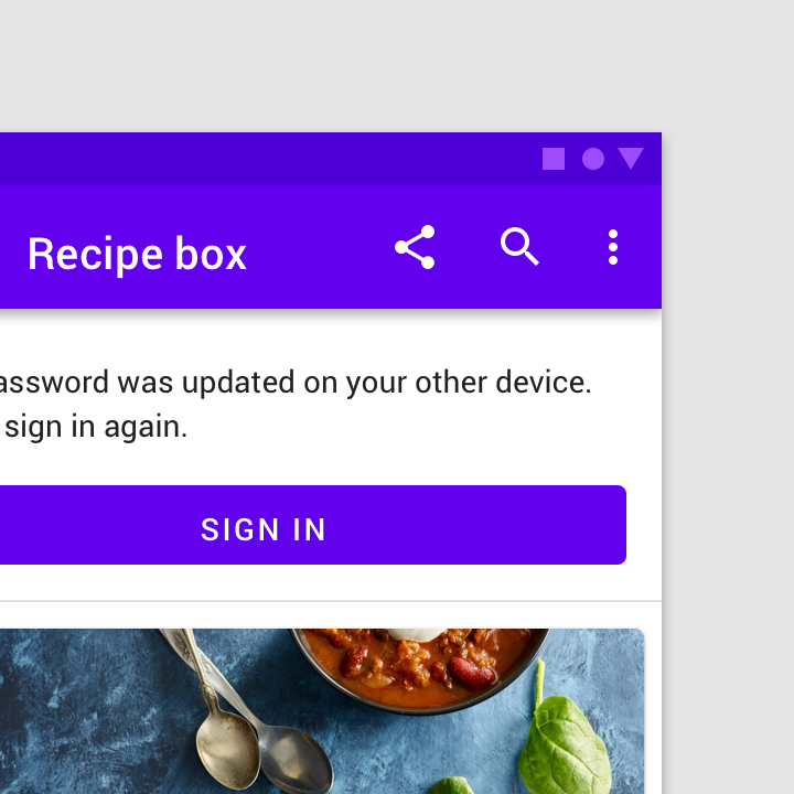
Banners are intended to be minimally interruptive. If a button in a banner requires extra emphasis, a contained, full-width button can be used for a single, prominent action (though its prominence may be distracting).

Don’t include links in a banner message

Don't

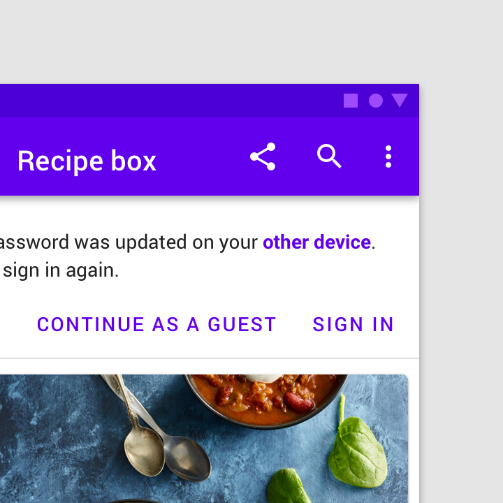
Don’t include links in a banner message. All available actions should be represented as buttons.
Don’t combine buttons with different emphasis levels, which could appear to promote one action over another

Don't

Don’t combine buttons with different emphasis levels, which could appear to promote one action over another.

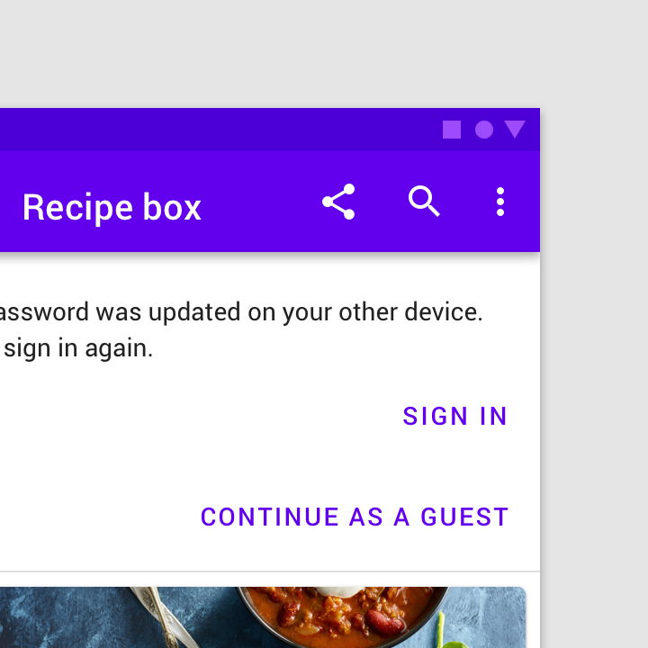
Don’t stack buttons unless there isn’t sufficient room to display them side by side

Caution

Don’t stack buttons unless there isn’t sufficient room to display them side by side.
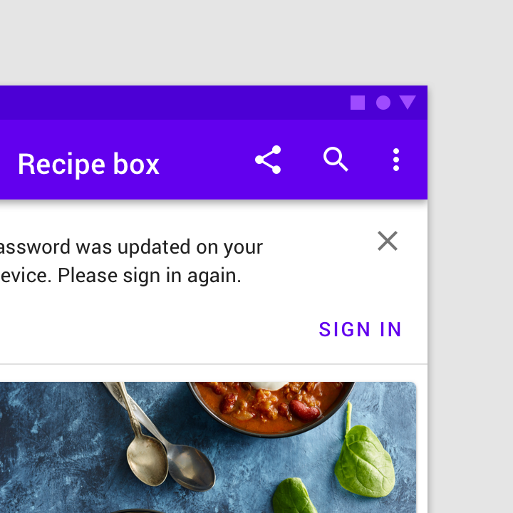
Don’t use a close affordance icon as the only method of dismissing a banner

Don't

Don’t use a close affordance icon as the only method of dismissing a banner. All actions should be shown as text buttons.

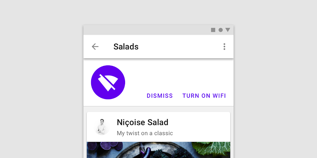
Supporting illustration ​

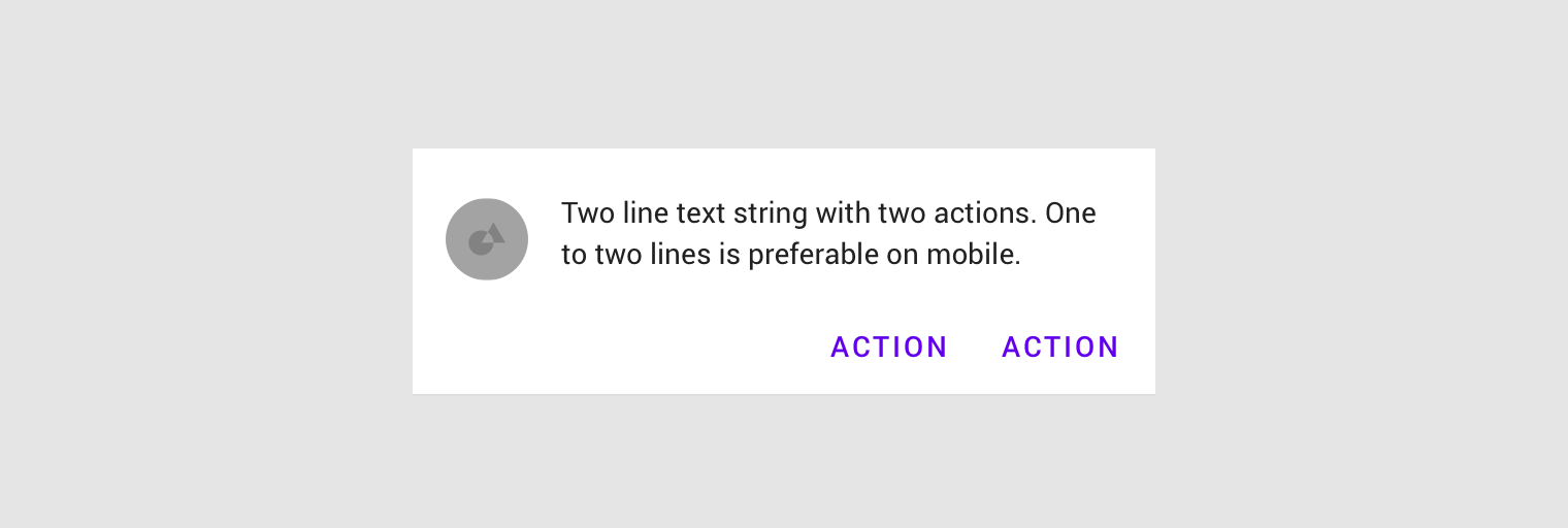
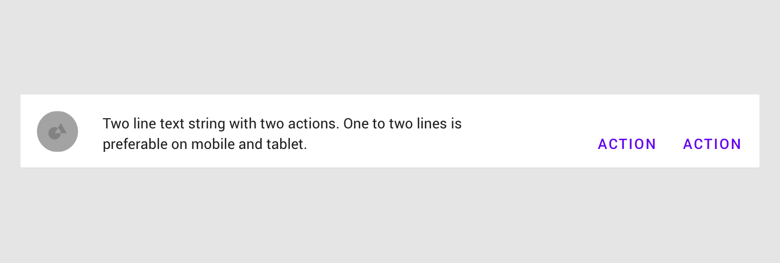
Banners can supplement their message using a supporting illustration.
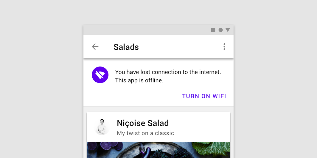
Do: icons can help communicate a banner’s message

Do

Icons can help communicate a banner’s message.

Don't: an icon used as an illustration can be ambiguous and make a banner too prominent in a layout

Don't

An icon used as an illustration can be ambiguous and make a banner too prominent in a layout. Illustrations support the banner message and aren’t the primary method of communication.

Placement ​

Banners should be placed at the top of a layout or screen. When scrolling, banners typically move with content and scroll off the screen.

Banners and top bars ​

Banners are placed at the top of the screen below the top app bar. They can be fixed, or scroll with content, depending on the environment:

  • On mobile, they scroll off-screen with content, at the same elevation as app content.
  • On desktop, they remain fixed at the top of the screen, at the same elevation as the top app bar.
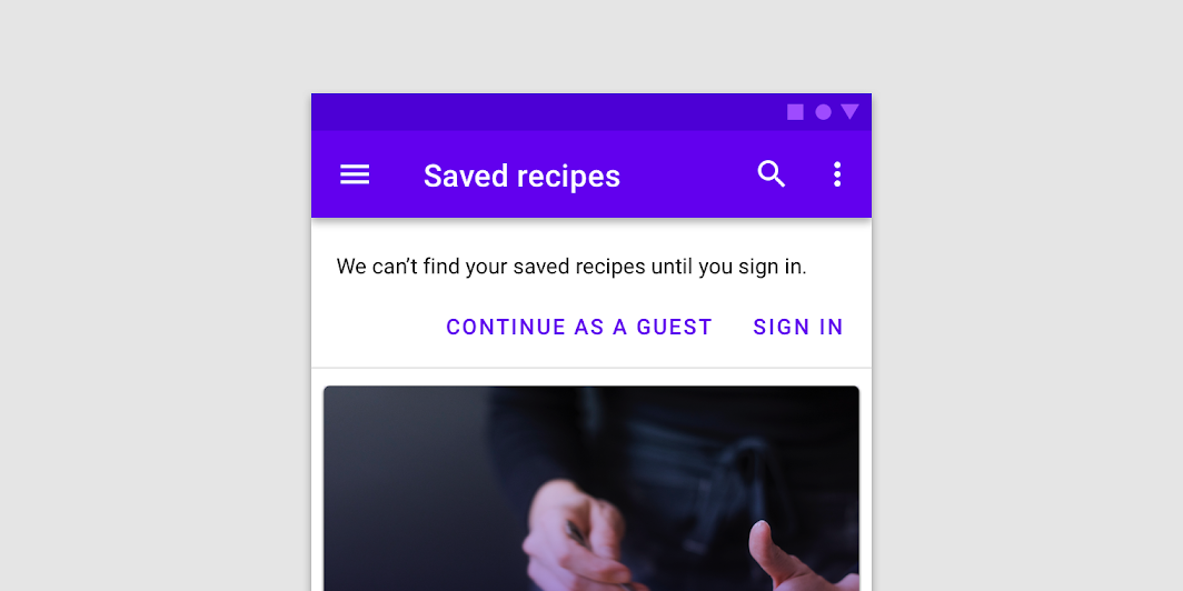
Banner and a top bar

Don't: the surface containing a banner should be clearly distinguished from the top app bar surface

Don't

The surface containing a banner should be clearly distinguished from the top app bar surface.
Don't: banners shouldn’t appear in front of the top bar

Don't

Banners shouldn’t appear in front of the top bar.

Top app bar

The top app bar displays information and actions relating to the current view.

Related article

Banners and persistent search ​

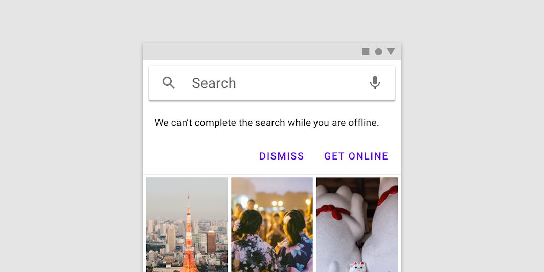
When a banner appears with a persistent search bar, it’s placed below the search bar.

A banner appears below a persistent search bar
A banner appears below a persistent search bar.

Banners and bottom navigation ​

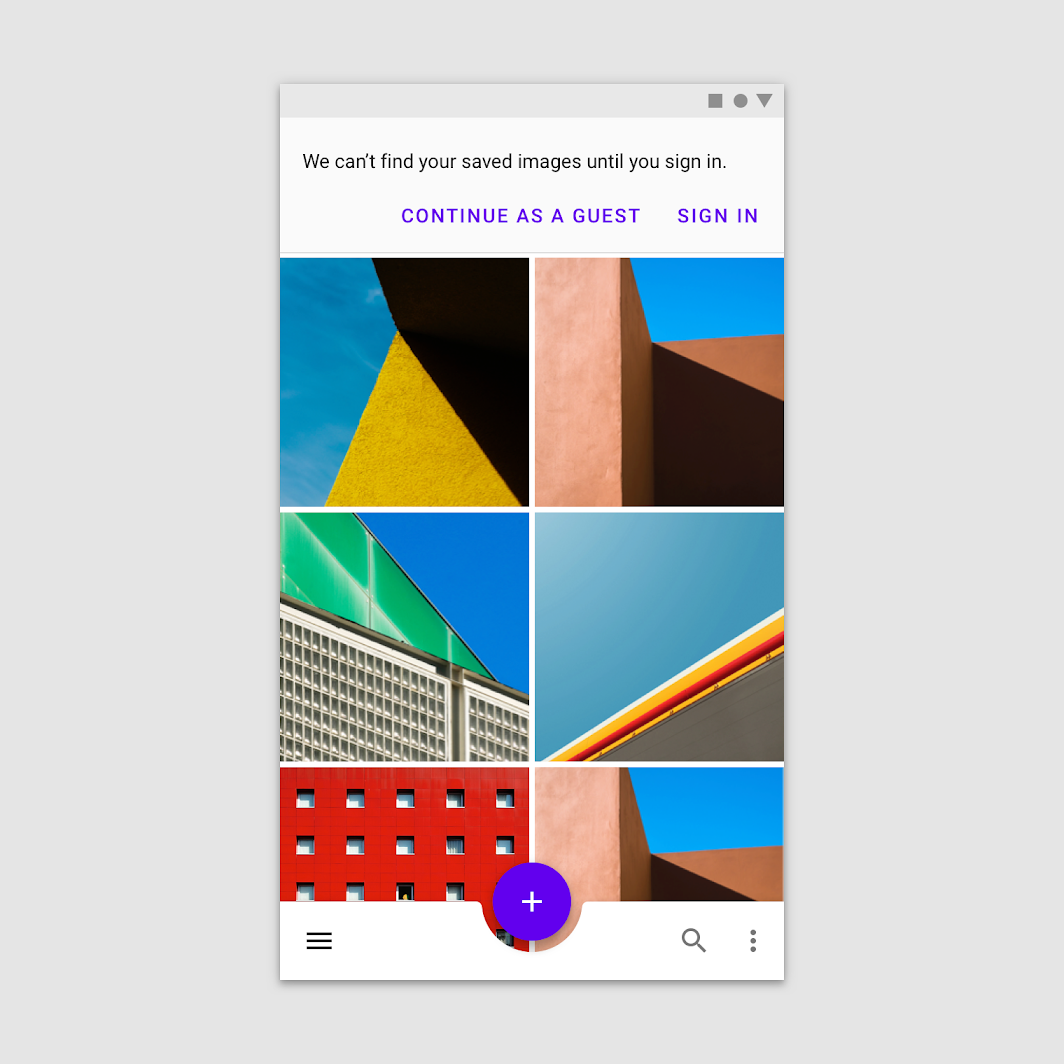
When bottom navigation is present, banners should remain at the top of the screen.

Banners appear at the top of the screen when bottom navigation is present
Banners appear at the top of the screen when bottom navigation is present.

Bottom navigation

Allow movement between primary destinations in an app.

Related article

Banners in wide layouts ​

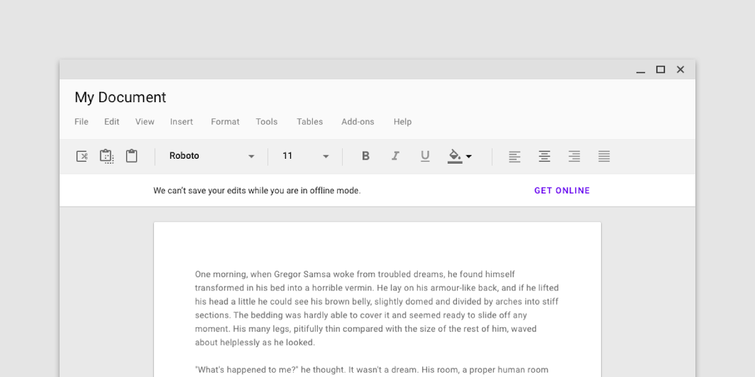
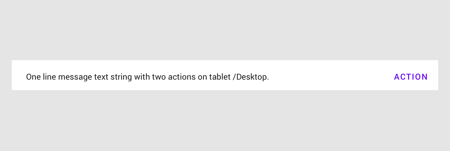
Banners in wide layouts span the entire width of the screen. They appear at the same elevation as the top app bar and remain on screen while content scrolls.

A banner in a wide layout appears at the same elevation as the top app bar
A banner in a wide layout appears at the same elevation as the top app bar.
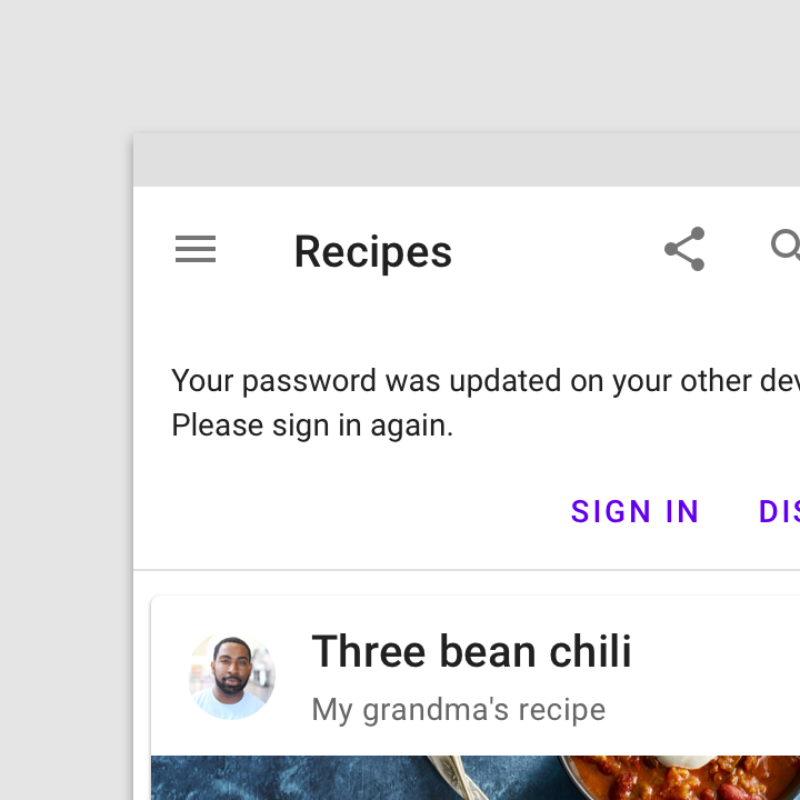
When vertical navigation is present, banners can appear above content rather than across the full width of the screen.
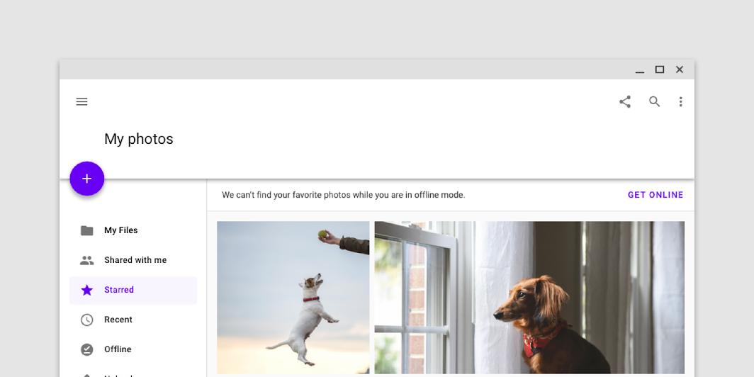
A banner on a screen with a navigation drawer appears slightly above just the content (on the y-axis)
A banner on a screen with a navigation drawer appears slightly above just the content (on the y-axis), at the same elevation as that content.

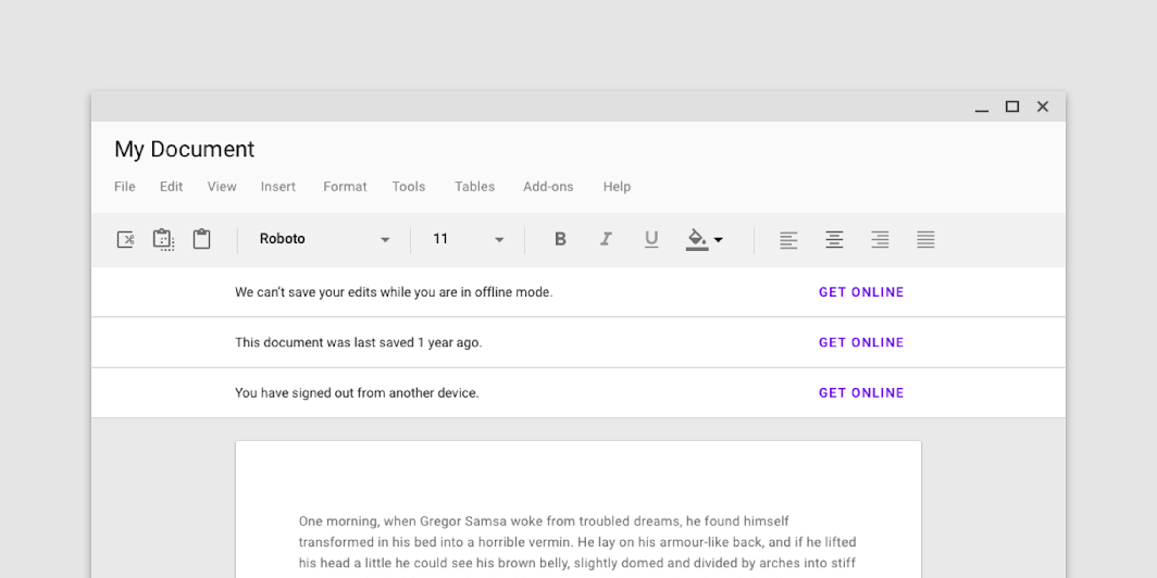
Don't: avoid stacking multiple banners

Don't

Avoid stacking multiple banners.

Banners and pannable content ​

Banners remain on screen when scrolling pannable content.
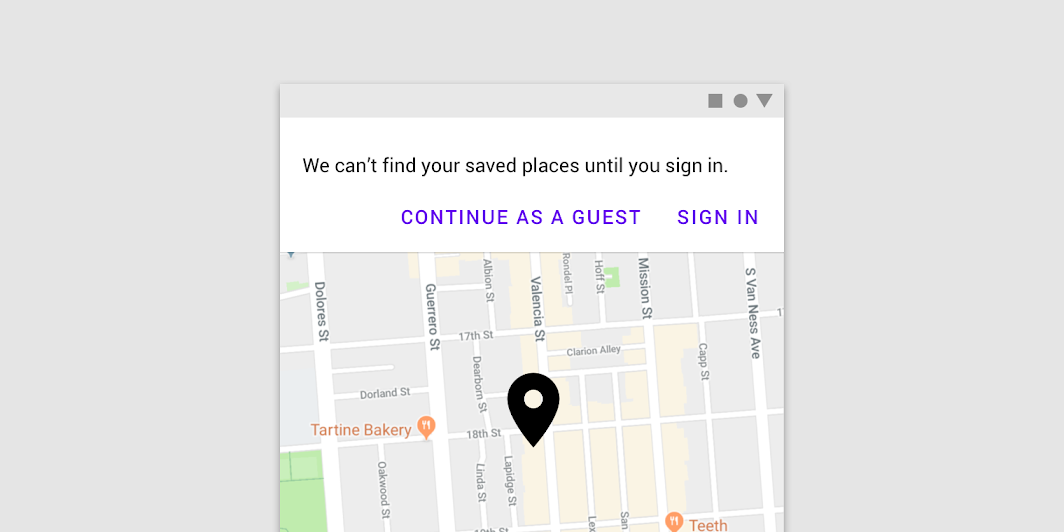
Banners remain on screen when scrolling pannable content, such as a map
Banners remain on screen when scrolling pannable content, such as a map.

Behavior ​

Appearing ​

Banners typically appear when a screen loads content.

Banners that appear after a screen loads should animate on screen from the top of a layout. If the banner is at the same elevation as content, it pushes content downwards.

Banners at the same elevation as content push content downward as they enter from the top of a layout.

Dismissing banners ​

Banners must remain on screen until dismissed by the user.

Banners can be dismissed by the user.

Do

Banners persist until the user acts on them or dismisses them.

Snackbars

Provide brief feedback about an operation through a message at the bottom of the screen.

Related article

Theming ​

Basil Material theme ​

This recipe app’s banner has been customized using Material Theming. Areas of customization include color and typography.
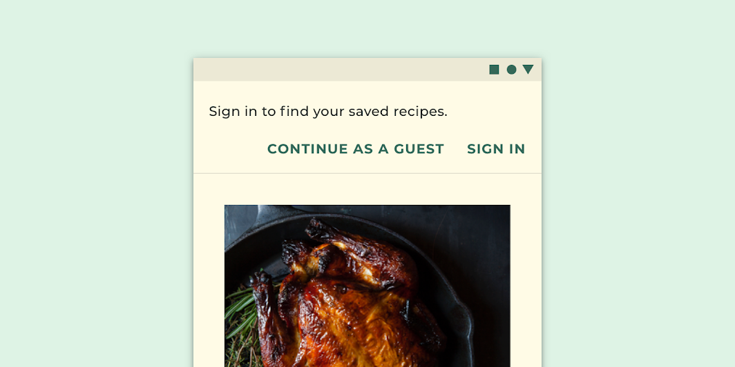
Basil’s customized banner

Basil

Basil is a recipe app that uses Material Design components and Material Theming to create an on-brand experience that is exciting and easy to explore.

Related link

The color system

Create a color theme that reflects your brand or style

Related article

Applying color to UI

In a UI, color has a variety of roles: from containing meaning, to expressing a look and feel.

Related article

Color ​

Basil’s banner uses custom color on four elements: the container, message, button, and divider.
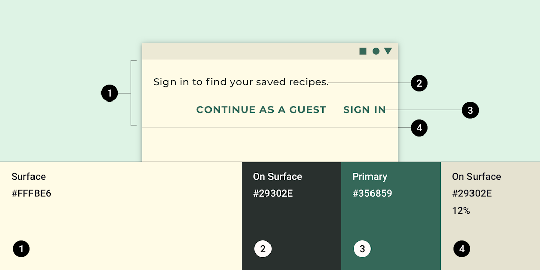
Basil Material theme: color
ElementCategoryAttributeValue
ContainerSurfaceColor
Opacity
#FFFBE6
100%
TextOn SurfaceColor
Opacity
#29302E
100%
ButtonPrimaryColor
Opacity
#356859
100%
DividerOn SurfaceColor
Opacity
#29302E
12%

Understanding typography

Typography is critical in establishing hierarchy and expressing brand presence that supports an effective digital experience.

Related article

Typography ​

Basil’s banner uses custom typography for message and button text.
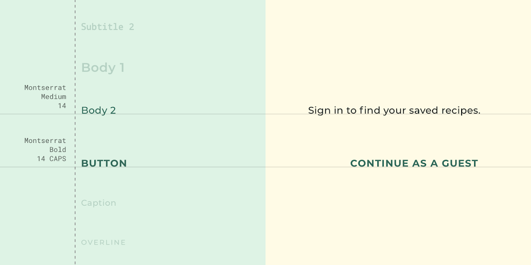
Basil Material theme: typography
ElementCategoryAttributeValue
TextBody 2Typeface
Font
Size
Case
Montserrat
Medium
14
Sentence case
ButtonButtonTypeface
Font
Size
Case
Montserrat
Bold
14
All caps

Posivibes Material theme ​

This social media app’s banner has been customized using Material Theming. Areas of customization include color and typography.
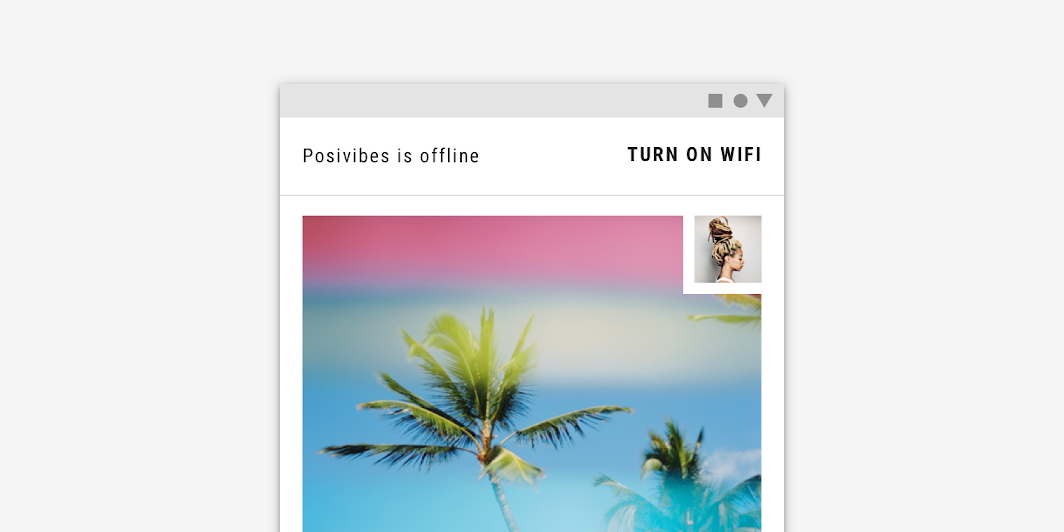
Posivibes Material theme: posivibe’s customized banner
Posivibe’s customized banner

The color system

Create a color theme that reflects your brand or style

Related article

Applying color to UI

In a UI, color has a variety of roles: from containing meaning, to expressing a look and feel.

Related article

Color ​

Posivibe’s banner uses custom color on four elements: the container, message, button, and divider.
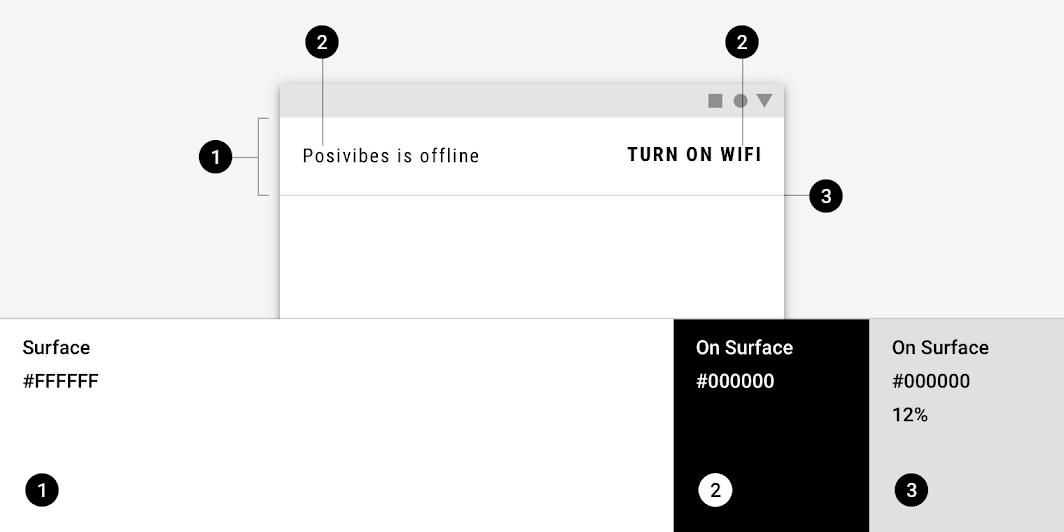
Posivibes Material theme: color
ElementCategoryAttributeValue
ContainerSurfaceColor
Opacity
#FFFFFF
100%
TextOn SurfaceColor
Opacity
#000000
100%
ButtonOn SurfaceColor
Opacity
#000000
100%
DividerOn SurfaceColor
Opacity
#000000
12%

Understanding typography

Typography is critical in establishing hierarchy and expressing brand presence that supports an effective digital experience.

Related article

Typography ​

Posivibe’s banner uses custom typography for message and button text.
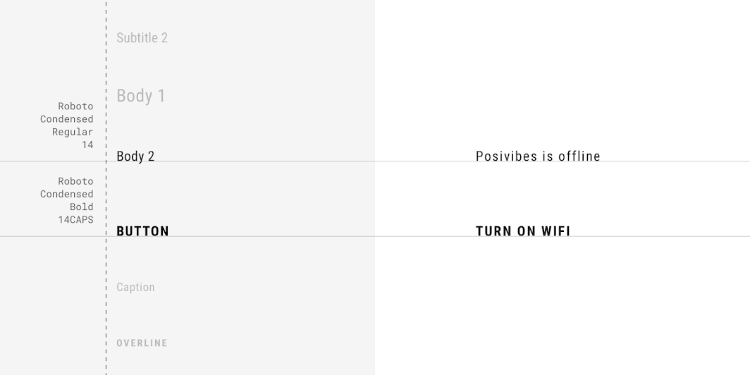
Posivibes Material theme: typography
ElementCategoryAttributeValue
TextBody 2Typeface
Font
Size
Case
Roboto Condensed
Regular
14
Sentence case
ButtonButtonTypeface
Font
Size
Case
Roboto Condensed
Bold
14
All caps

Specs ​

Mobile ​


5416368810360C

1121616888360362012

12016161683608824362040

Desktop ​


5224888720C

908890248302022720

721624908883220201672040
Pager
Previous pageBackdrop
Next pageBottom navigation

Released under the Apache-2.0

Copyright © 2018-Present Google

https://m2.material.io/components/banners

Released under the Apache-2.0

Copyright © 2018-Present Google