Skip to content
Material Design 2
Main Navigation
v3
v2
v1

English

简体中文
繁體中文
Español
Français
Русский
Português – Brasil
Deutsch
日本語
한국어
Italiano
Polski
Türkçe
čeština
magyar

English

简体中文
繁體中文
Español
Français
Русский
Português – Brasil
Deutsch
日本語
한국어
Italiano
Polski
Türkçe
čeština
magyar

Appearance

Sidebar Navigation

Material System

Introduction

Material studies

About our Material studies

Basil

Crane

Fortnightly

Owl

Rally

Reply

Shrine

Material Foundation

Environment

Surfaces

Elevation

Light and shadows

Layout

Understanding layout

Pixel density

Responsive layout grid

Spacing methods

Component behavior

Applying density

Navigation

Understanding navigation

Navigation transitions

Search

Color

The color system

Applying color to UI

Color usage

Text legibility

Dark theme

Typography

The type system

Understanding typography

Language support

Sound

About sound

Applying sound to UI

Sound attributes

Sound choreography

Iconography

Product icons

System icons

Animated icons

Shape

About shape

Shape and hierarchy

Shape as expression

Shape and motion

Applying shape to UI

Motion

Understanding motion

The motion system

Speed

Choreography

Customization

Interaction

Gestures

Selection

States

Communication

Confirmation & acknowledgement

Data formats

Data visualization

Empty states

Help & feedback

Imagery

Launch screen

Onboarding

Offline states

Writing

Machine learning

Machine learning patterns

Object detection: live camera

Object detection: static image

Barcode Scanning

Material Guidelines

Material Theming

Overview

Implementing your theme

Usability

Accessibility

Bidirectionality

Platform guidance

Android bars

Android fingerprint

Android haptics

Android icons

Android navigating between apps

Android notifications

Android permissions

Android slices

Android split-screen

Android swipe-to-refresh

Android text selection toolbar

Android widget

Cross-platform adaptation

Components

App bars: bottom

App bars: top

Backdrop

Banners

Bottom navigation

Buttons

Buttons: floating action button

Cards

Checkboxes

Chips

Data tables

Date pickers

Dialogs

Dividers

Image lists

Lists

Menus

Navigation drawer

Navigation rail

Progress indicators

Radio buttons

Sheets: bottom

Sheets: side

Sliders

Snackbars

Switches

Tabs

Text fields

Time pickers

Tooltips

On this page

Help & feedback ​

Help content provides answers to user questions and concerns.

Use & placement ​

Using help content ​

Help content provides answers to common questions about your app. Users can submit comments, report bugs, and ask questions that are not already answered by the help content.

Common locations ​

Help content should be easy for users to find. It can be placed in various points in your navigation. It usually appears in a navigation drawer or overflow menu under the label “Help” or “Send feedback.”
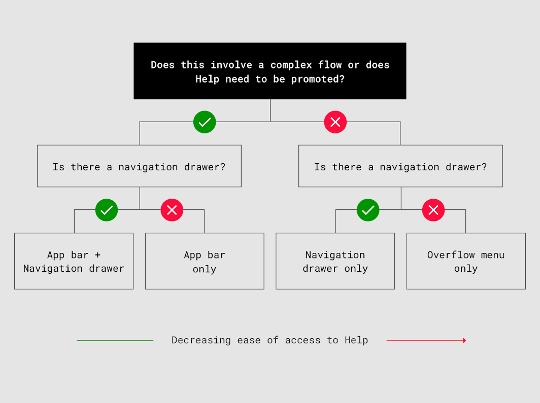
Common locations

Placement ​

It is easier to find Help content in both the navigation drawer and app bar or only in the app bar. It is less easy to find Help content when it is only in the navigation drawer or overflow menu.

  • If your app is complex and has a navigation drawer, place a link to “Help” both in the navigation drawer and the app bar.
  • If your app is complex and does not have a navigation drawer, place a link to “Help” in the app bar.
  • If your app is not complex, place “Help” in a navigation drawer or overflow menu only.

Navigation Drawer ​


“Help” should be the last item in the navigation drawer, with “Send feedback” directly above it.

Anytime “Sign out” appears in a navigation drawer, it should be the last item in the list.
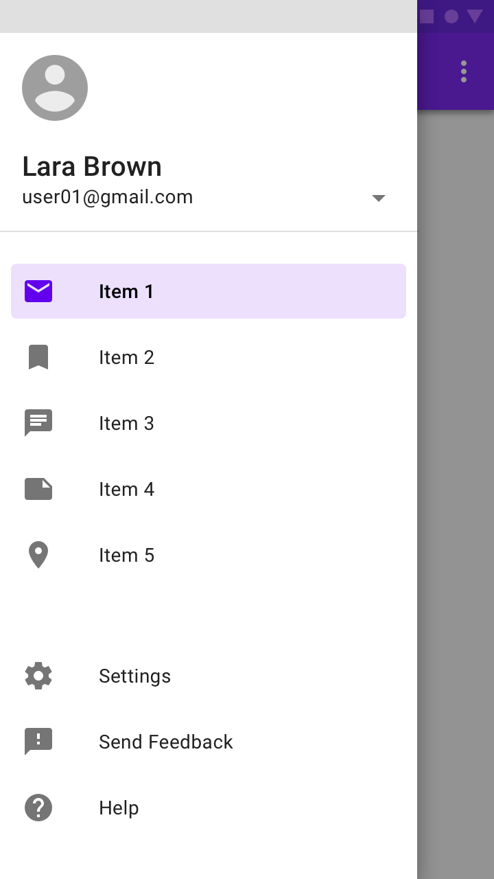
The navigation drawer showing “Help” and “Send feedback”

Overflow menu

“Help” and “Feedback” (or “Send feedback”) should be placed in the overflow menu when there is no navigation drawer.
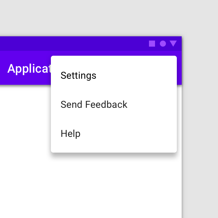
Do: overflow menu showing “Help” and “Send feedback”

Do

Overflow menu showing “Help” and “Send feedback”

Navigation drawer

Navigation drawers provide access to the navigation destinations of your app.

Related article

App bar ​

To provide help for urgent issues, such as payments and refunds, place a Help icon in the app bar. Desktop apps may also place a Help icon in the app bar, as there is more space in the desktop UI.
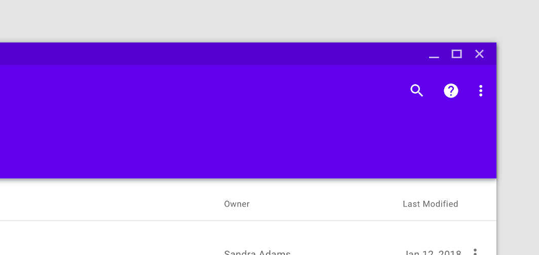
Help icon promoted in the app bar

Top app bar

The top app bar displays information and actions relating to the current view.

Related article

Bottom app bars

Provide reachable access to a bottom navigation drawer and actions on mobile devices.

Related article

Help screen ​


The help screen can include a “Send feedback” button for users to report issues or send comments.

Content viewed less often (such as “About,” “Privacy,” and “Terms of service”) may be placed in an action overflow menu.
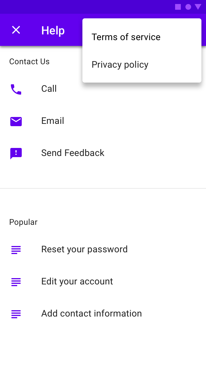
A help screen with frequently asked questions and answers and an action button to send feedback

Icons ​

Help ​

Do: to indicate Help content, use the icon for Help

Do

To indicate Help content, use the icon for Help.
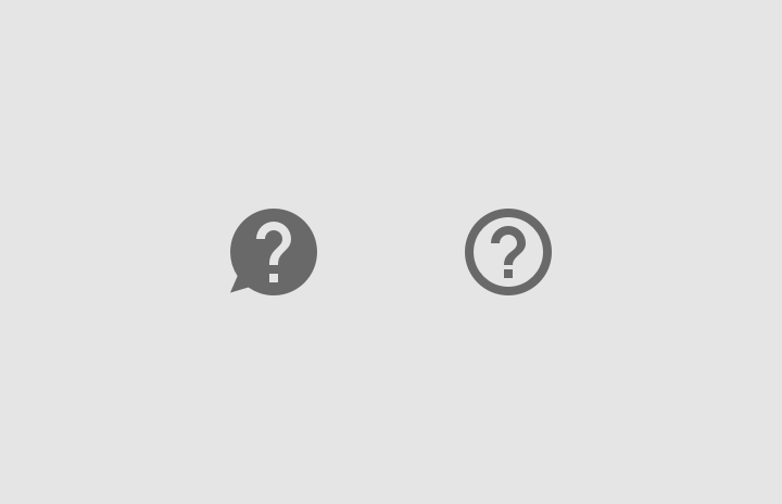
Don’t use icon variations, such as those with speech bubbles or outlines

Don't

Don’t use icon variations, such as those with speech bubbles or outlines.

Send feedback ​

Do: to indicate where users can send feedback, use the Material Design icon for feedback

Do

To indicate where users can send feedback, use the Material Design icon for feedback.
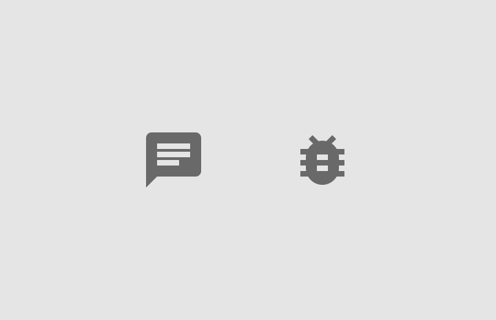
Don’t use icon variations, such as chat or bug icons

Don't

Don’t use icon variations, such as chat or bug icons.

Help Tooltips ​

When a brief description can help provide context, you can display a help tooltip. Help icons provide helper text on hover, tap, or click.

Do: to indicate a help tooltip is available, use the Material Design help outline icon

Do

To indicate a help tooltip is available, use the Material Design help outline icon.
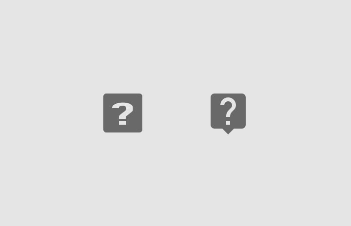
Don’t use icon variations or icons with speech bubbles or outlines

Don't

Don’t use icon variations or icons with speech bubbles or outlines.

Writing ​

Make it easy to read ​

Make content clear and easy to scan by formatting text with bold headings, lists, tables, and space between paragraphs.

When referring to elements that users need to select, such as buttons or links, you can bold their names when referring to them.
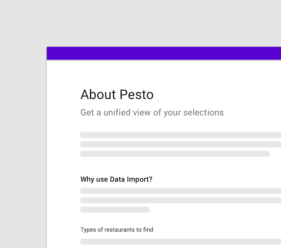
Headings help organize an article’s content
Headings help organize an article’s content. They help readers scan the page to quickly find the information they need.

Give key information ​

Keep explanations as short as possible, without giving details that aren’t relevant to typical usage.

Use simple language ​

Avoid using technical terms in help content where possible.

Show images ​

When providing step-by-step instructions, show relevant images or icons to explain what the user needs to do.

Pager
Previous pageEmpty states
Next pageImagery

Released under the Apache-2.0

Copyright © 2018-Present Google

https://m2.material.io/design/communication/help-feedback.html

Released under the Apache-2.0

Copyright © 2018-Present Google