Skip to content
Material Design 2
Main Navigation
v3
v2
v1

English

简体中文
繁體中文
Español
Français
Русский
Português – Brasil
Deutsch
日本語
한국어
Italiano
Polski
Türkçe
čeština
magyar

English

简体中文
繁體中文
Español
Français
Русский
Português – Brasil
Deutsch
日本語
한국어
Italiano
Polski
Türkçe
čeština
magyar

Appearance

Sidebar Navigation

Material System

Introduction

Material studies

About our Material studies

Basil

Crane

Fortnightly

Owl

Rally

Reply

Shrine

Material Foundation

Environment

Surfaces

Elevation

Light and shadows

Layout

Understanding layout

Pixel density

Responsive layout grid

Spacing methods

Component behavior

Applying density

Navigation

Understanding navigation

Navigation transitions

Search

Color

The color system

Applying color to UI

Color usage

Text legibility

Dark theme

Typography

The type system

Understanding typography

Language support

Sound

About sound

Applying sound to UI

Sound attributes

Sound choreography

Iconography

Product icons

System icons

Animated icons

Shape

About shape

Shape and hierarchy

Shape as expression

Shape and motion

Applying shape to UI

Motion

Understanding motion

The motion system

Speed

Choreography

Customization

Interaction

Gestures

Selection

States

Communication

Confirmation & acknowledgement

Data formats

Data visualization

Empty states

Help & feedback

Imagery

Launch screen

Onboarding

Offline states

Writing

Machine learning

Machine learning patterns

Object detection: live camera

Object detection: static image

Barcode Scanning

Material Guidelines

Material Theming

Overview

Implementing your theme

Usability

Accessibility

Bidirectionality

Platform guidance

Android bars

Android fingerprint

Android haptics

Android icons

Android navigating between apps

Android notifications

Android permissions

Android slices

Android split-screen

Android swipe-to-refresh

Android text selection toolbar

Android widget

Cross-platform adaptation

Components

App bars: bottom

App bars: top

Backdrop

Banners

Bottom navigation

Buttons

Buttons: floating action button

Cards

Checkboxes

Chips

Data tables

Date pickers

Dialogs

Dividers

Image lists

Lists

Menus

Navigation drawer

Navigation rail

Progress indicators

Radio buttons

Sheets: bottom

Sheets: side

Sliders

Snackbars

Switches

Tabs

Text fields

Time pickers

Tooltips

On this page

Imagery ​

Imagery communicates and differentiates a product through visuals.
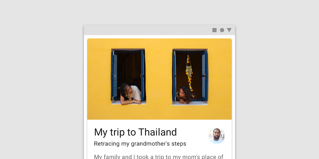
Imagery hero image

Principles ​

Imagery can both enhance the user experience and express a brand’s visual language. Images help tell a story, clarify complex messages that are difficult to express with words, and to show users how to perform an action.
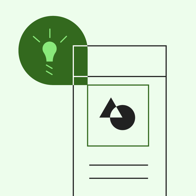
Imagery principle: informative

Informative

Imagery assists with comprehension and helps convey a clear message.
Imagery principle: delightful

Delightful

Imagery portrays context in a way that adds user delight.

Imagery principle: intentional

Intentional

Imagery should be used intentionally in order to create a clear story.


Onboarding

A virtual unboxing experience to help users get started

Related article

Usage ​

Images should be selected for their ability to express your message and reflect your product’s style. Whether you use user-generated photography, professional photography, or different styles of illustration, they should all lend a look and feel that reflects your product. Images should be related to one another by sharing a common function, style, and intention.

Use multiple mediums ​

Both illustration and photography can live within the same product.
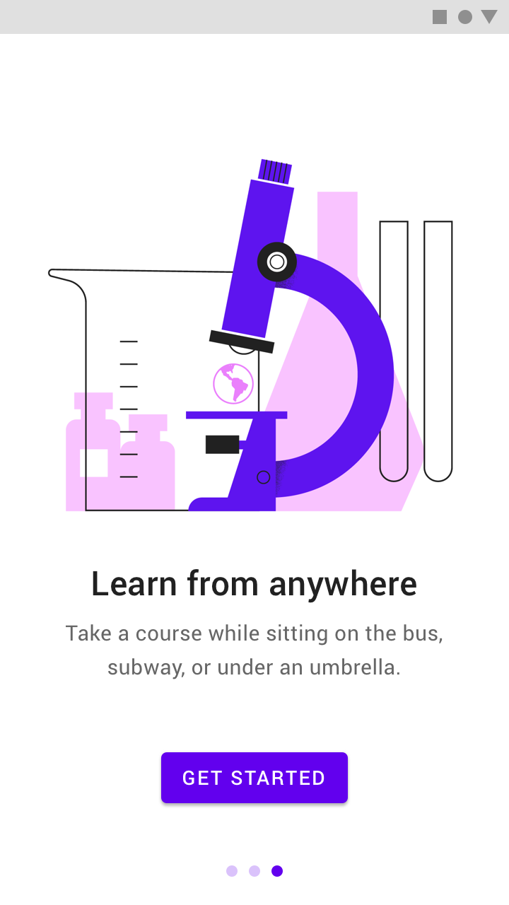
Illustration helps describe abstract concepts
Illustration helps describe abstract concepts.
Photographs better represent specific concepts
Photographs better represent specific concepts.

Have a focal point ​

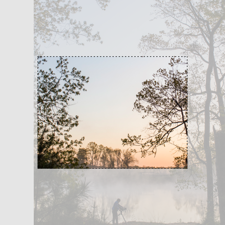
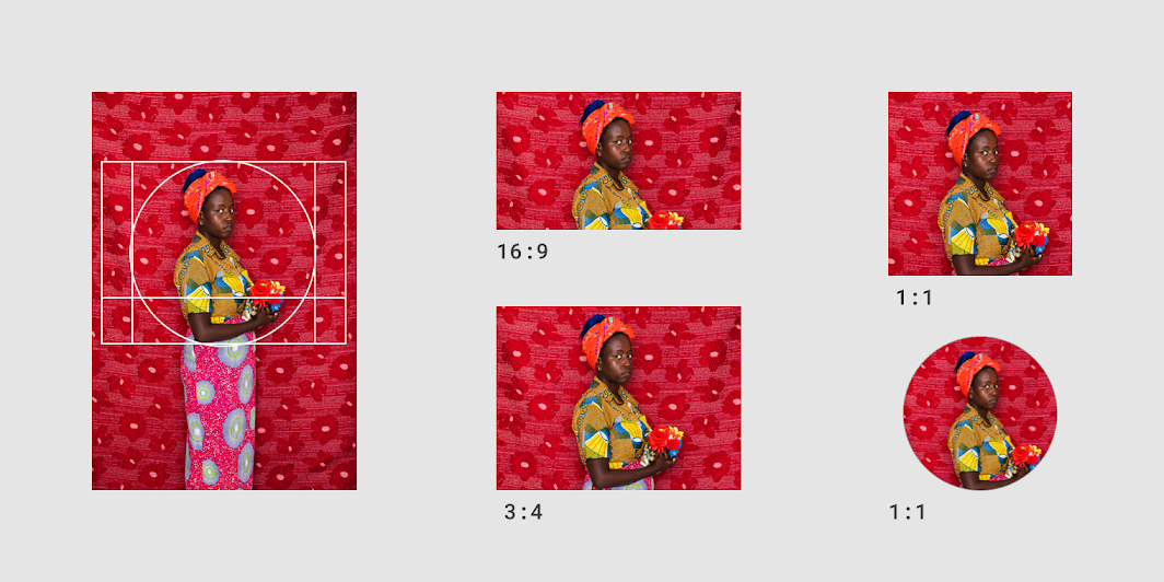
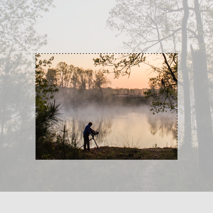
Have an iconic focal point in your imagery, as it impacts how it should be cropped for different sizes. A focal point can be anything embodied in anything from a single entity to an overall composition. Clearly convey concepts in a memorable way.
Have a focal point

Do: establish a clear focal point when cropping an image

Do

Establish a clear focal point when cropping an image.
Don’t crop an image in a way that doesn’t show a clear focal point

Don't

Don’t crop an image in a way that doesn’t show a clear focal point.

Containers and aspect ratios

Using keylines, padding, incremental spacing, ratios, and touch targets.

Related article

Size appropriately ​

To best display images of different sizes and types, appropriately size images for different displays and platforms. Resolution is the most important factor in how quickly imagery will load. To preserve network bandwidth, keep resolution low where possible.

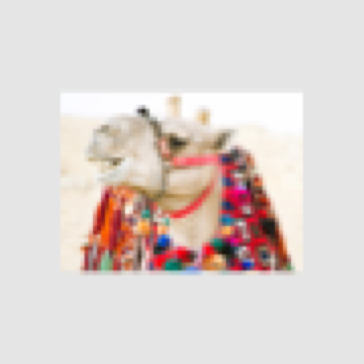
Test appropriate resolution sizes for specific ratios and devices, ensuring that assets don’t appear pixelated.
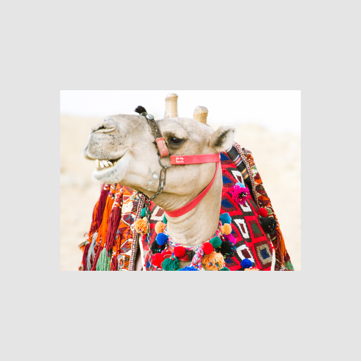
Do: export images at the lowest file size possible without compromising quality

Do

Export images at the lowest file size possible without compromising quality.
Don't: avoid using small file sizes that may result in pixelation of the image

Don't

Avoid using small file sizes that may result in pixelation of the image.

Be accessible ​


Alternative text

To ensure accessibility, imagery should include alternative text (or a caption) to be read by screen readers for users with visual impairments. Without alternative text, screen reader users just hear the word “image,” without any visual details.

Don't: this image doesn’t have a caption or alt text

Don't

This image doesn’t have a caption or alt text. Screen readers will just read out “image” with no explanation of what the image is about.

Ways to use imagery ​

Create an immersive story and a sense of context in your app by using visuals.
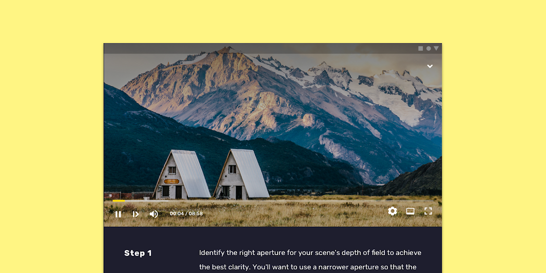
Scaled down to 62.5%

Educate users ​

When giving instructions to users, step-by-step imagery allows users to move through a sequence of steps at their own pace.
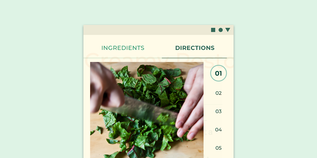
This cooking app shows the how-to’s of cooking through step by step photographs
This cooking app shows the how-to’s of cooking through step by step photographs.

When users interact with an app for the first time, imagery helps them identify what content is for.
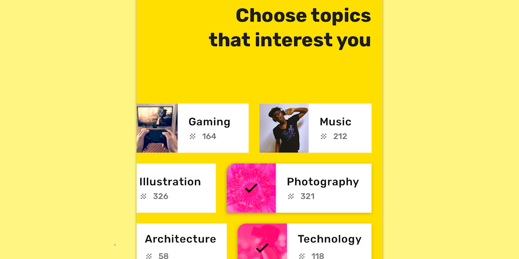
Imagery helps users choose categories, or topics of interest
Imagery helps users choose categories, or topics of interest, to better personalize the content they experience in the app.

Allow users to compare similar items ​

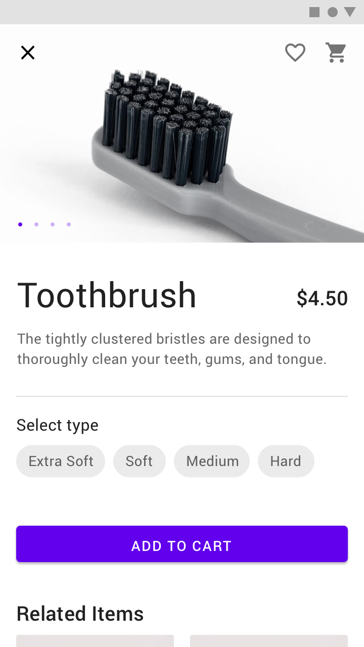
Photography with a common style can help users quickly browse and make a decision.
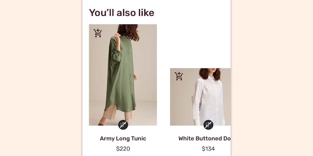
When used across an app, still life photography expresses a unified style, letting users compare products easily
When used across an app, still life photography expresses a unified style, letting users compare products easily.

Delight ​

Imagery can be used to delight users when they reach a confusing or frustrating point in the user experience journey, such as an error screen.
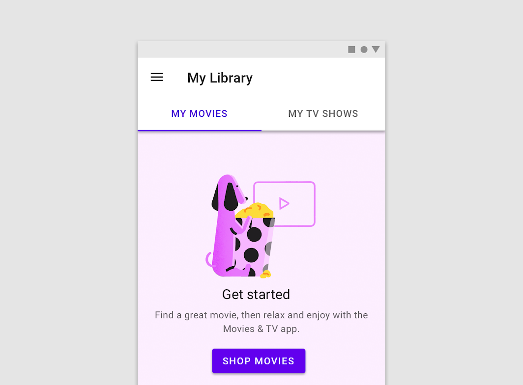
This app uses illustration to help users get started using the app
This app uses illustration to help users get started using the app.

Provide context ​

Imagery can help users understand the intent and context of associated text.
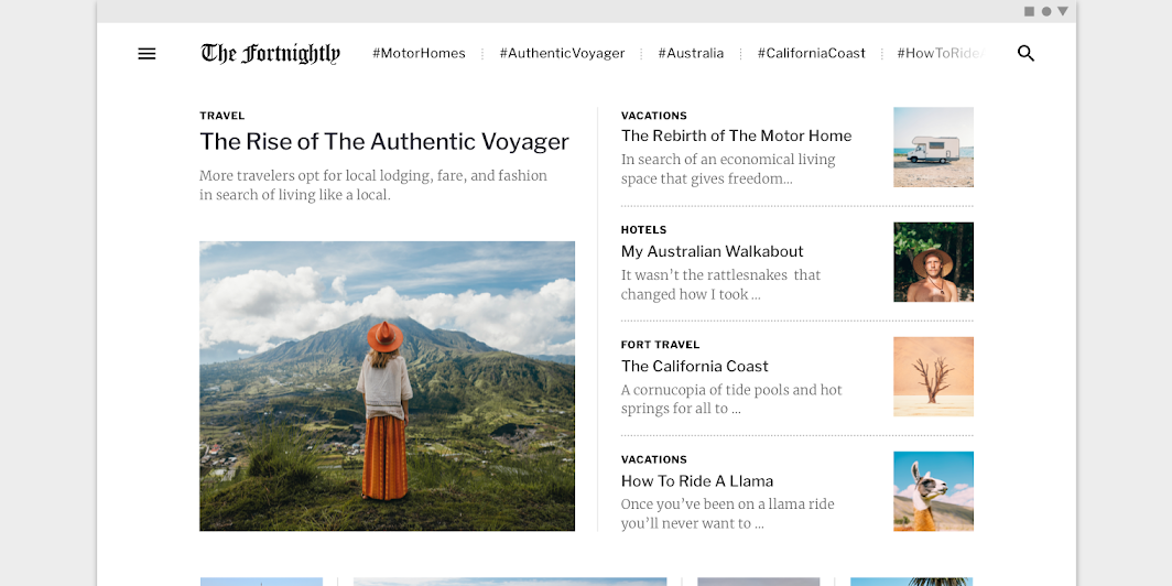
This app uses imagery to communicate the context of an article
This app uses imagery to communicate the context of an article. Scaled down to 62.5%.

Hero images ​

Usage ​

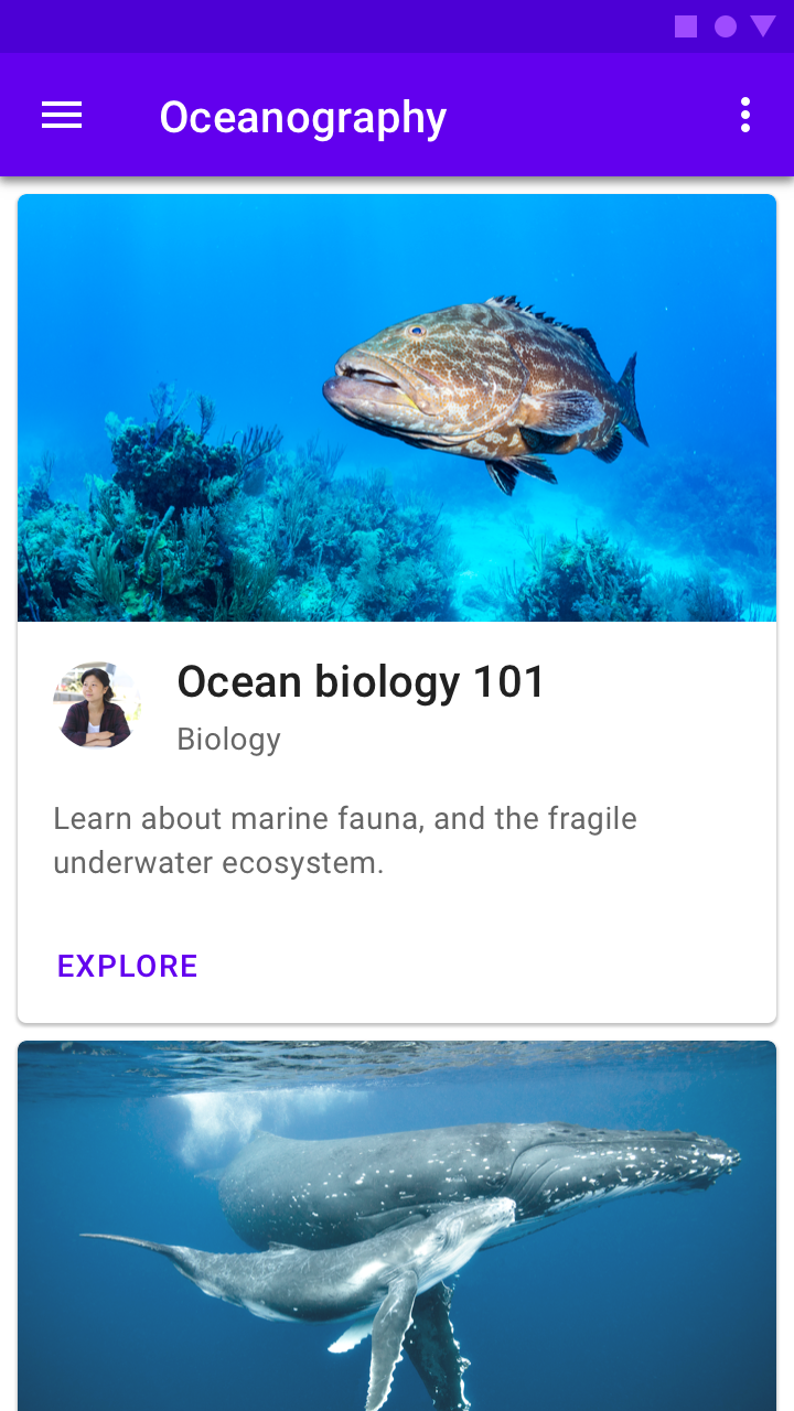
Hero images help draw attention, provide context about content, or reinforce a brand.
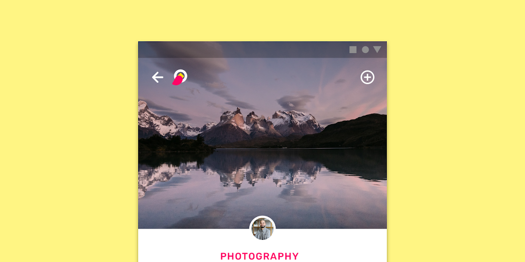
Educate users hero image

Placement ​

Hero images are anchored in the most prominent position, such as the top of the screen.
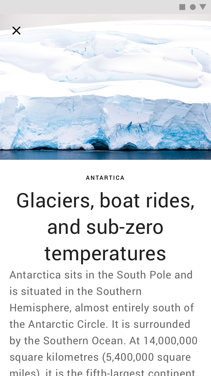
Do: use a single hero image to introduce text content

Do

Use a single hero image to introduce text content.
Do: display hero images in a carousel

Do

Display hero images in a carousel.

Thumbnails ​

Usage ​

Thumbnails are small images that represent information in tight spaces. They typically act as tap targets that lead to primary content, appearing within components like cards or lists.

Thumbnails are used to:

  • Allude to more information
  • Provide a peek at content on other screens
  • Assist in navigation
Thumbnails usage

Thumbnails can be cropped in different shapes.
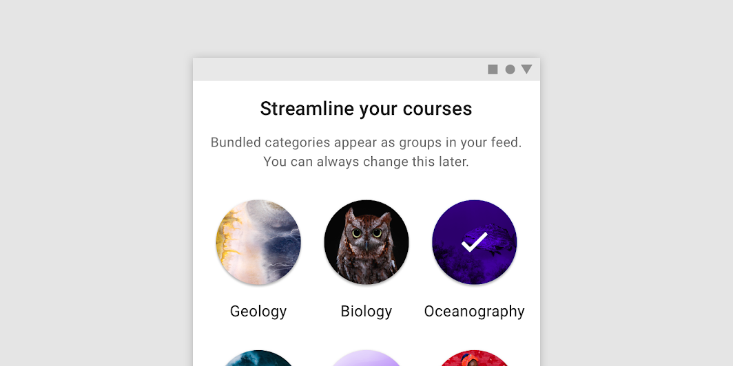
These circular thumbnails represent categories in an app
These circular thumbnails represent categories in an app.

Placement ​

Elements like text or actions may be placed above a thumbnail in components like cards.
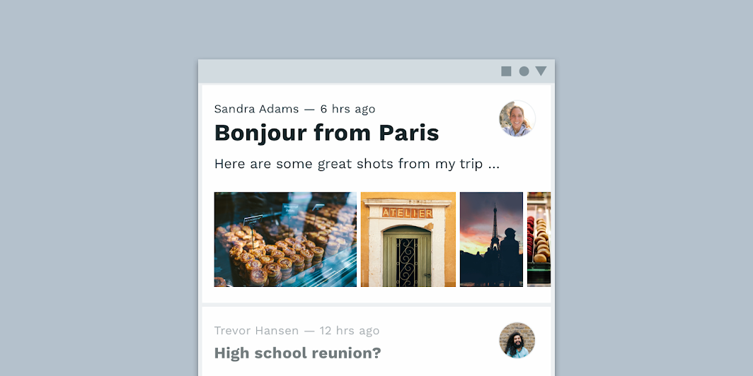
A row of thumbnails inside a list item
A row of thumbnails inside a list item.

Display thumbnails at multiple scales to express varied levels of visual importance.
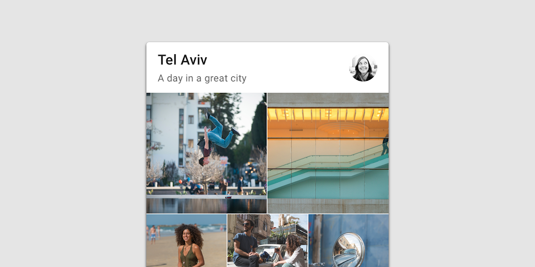
Multiple thumbnails with different proportions in a card
Multiple thumbnails with different proportions in a card.

Informational imagery ​

Usage ​

Informational imagery assists users in understanding content, without being the focal point in a UI. It can take the form of icons, diagrams, and avatars that represent entities or content, either literally or conceptually. They occupy minimal space.

Avatars ​

Avatars should focus on a subject, using a simple background. They can represent a user or a brand (with a logo or branded graphic).
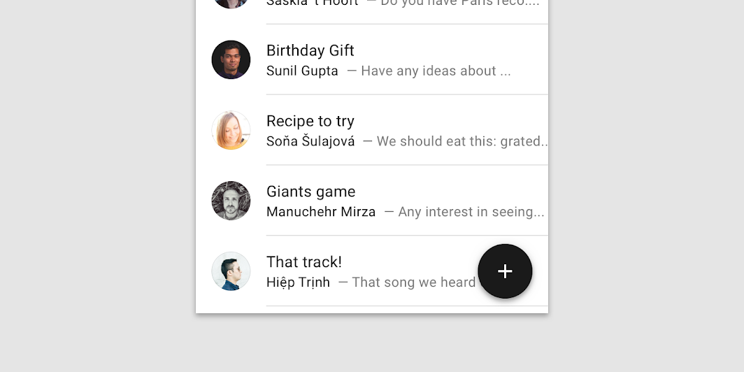

Avatars

Avatars can represent users
Avatars can represent users.
Avatars can represent brands
Avatars can represent brands.

Avatars can be placed inside multiple components, shaped in any form.
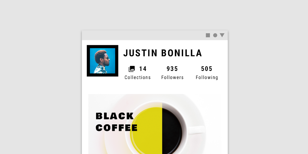
An avatar in a square shape
An avatar in a square shape.

Diagrams ​

Diagrams can display numeric values.

Pie charts illustrate the relationship between a single numeric value and a total numeric value
Pie charts illustrate the relationship between a single numeric value and a total numeric value.

Icons ​

Icons can help users understand content.
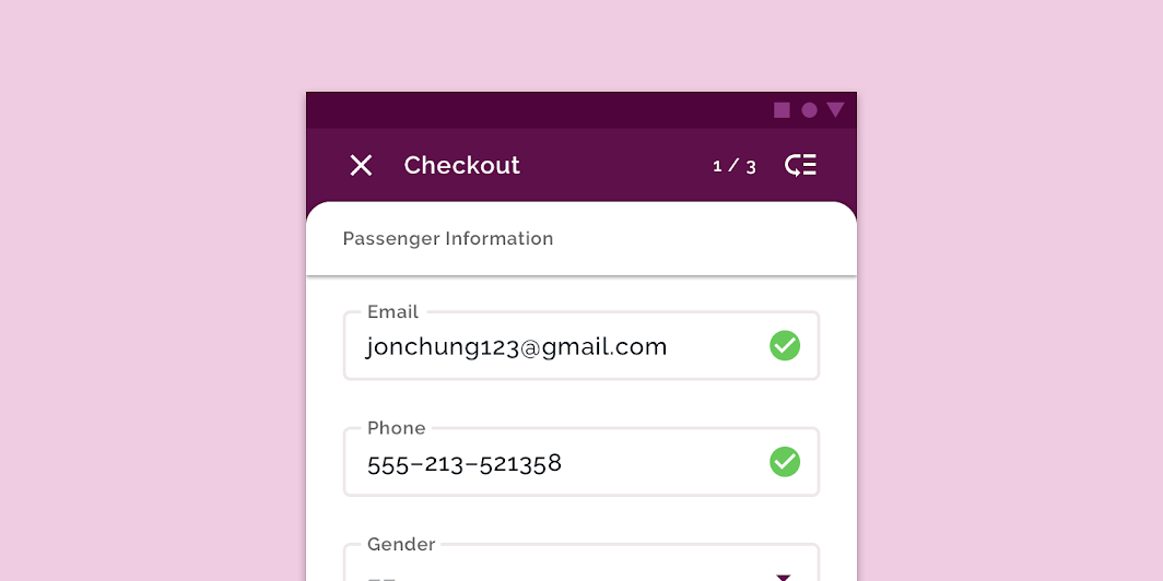
The green check circle icon lets users know that the action has been completed successfully
The green check circle icon lets users know that the action has been completed successfully.
Pager
Previous pageHelp & feedback
Next pageLaunch screen

Released under the Apache-2.0

Copyright © 2018-Present Google

https://m2.material.io/design/communication/imagery.html

Released under the Apache-2.0

Copyright © 2018-Present Google