

Object detection: live camera
A device’s live camera can be used to detect objects in an environment using machine learning.

Usage
The live feed of a camera can be used to identify objects in the physical world. Using the “streaming” mode of ML Kit’s Object Detection & Tracking API, a camera feed can detect objects and use them as input to perform a visual search (a search query that uses an image as input) with your app’s own image classification model.
Searching with a live camera can help users learn more about objects around them, whether it’s an artifact at a museum or an item for purchase.
These guidelines cover the detection of a single object at a time.
Principles
Design for this feature is based on the following principles:
Navigate with a device camera
Instead of typing a search term, the device camera is used as a “remote control” to search for visual content.
To educate users about how to search with their camera, provide onboarding and persistent instructions.
Keep the camera clear and legible
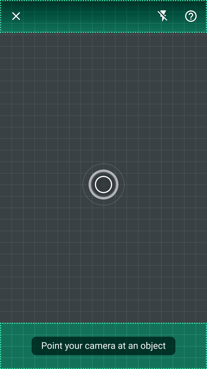
To maximize the camera’s viewable area, align the app’s UI components to the top and bottom edges of the screen, ensuring that text and icons remain legible when placed in front of the camera’s live feed.
Any non-actionable elements displayed in front of the live camera feed should be translucent to minimize obstructing the camera.
Provide feedback
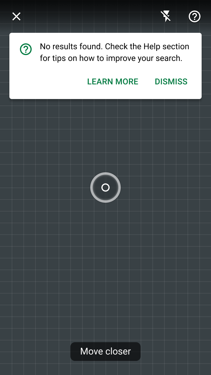
Using a camera as a search tool introduces unique usage requirements. Image quality needs to be adequate, and users need to be aware of how to fix image issues caused by lighting or too much distance from an object.
Error states should:
- Indicate errors using multiple design cues (such as components and motion)
- Include explanations of how users can improve their search
Components
The live camera object detection feature uses both existing Material Design components and new elements specific to camera interaction. For code samples and demos of new elements (such as the reticle), check out the ML Kit Material Design showcase apps’ source code for Android and iOS.
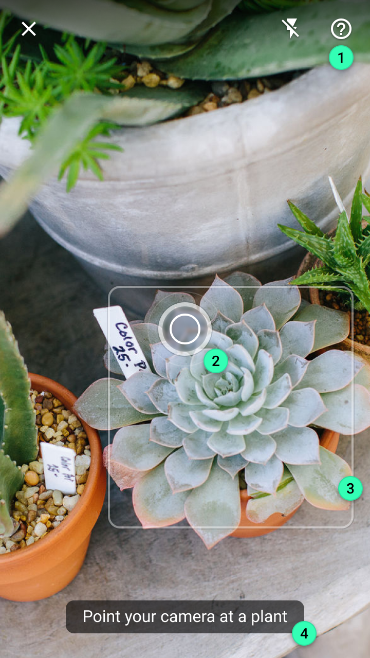
1. Top app bar
2. Reticle
3. Object marker
4. Tooltip
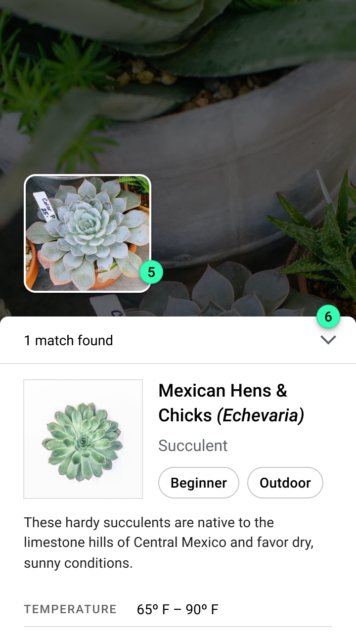
5. Detected image
6. Modal bottom sheet
Top app bar
The top app bar provides persistent access to the following actions:
- A button to exit the search experience
- A toggle to improve brightness (using the camera’s flash)
- A Help section for troubleshooting search issues

Do
Reticle
The reticle is a visual indicator that provides a target for users to focus on when detecting objects with a camera (its name is inspired by camera viewfinders). It uses a pulsing animation to inform the user when the camera is actively looking for objects.
When the live camera is pointed at an object, the reticle transforms into a determinate progress indicator to indicate that a visual search has begun.
1. Sensing uses a pulsing animation to indicate the app is looking for objects
2. Starting a search happens after a preset delay (set by the developer), expressed with a determinate progress indicator
3. The need to move closer to an object is expressed through the reticle’s center circle shrinking in size until the minimum detected size is reached
4. Any detected errors change the reticle’s border from a continuous stroke to dotted stroke
Object marker
ML Kit’s Object Detection & Tracking API contains an option to detect a “prominent object.” This option detects and tracks the single largest object near the center of the camera. Once detected, you should mark the object with a continuous rectangular border.
If your app requires a minimum image size for detected objects, the object marker should change to show a partial rectangular border (displaying only the border’s corners). This expresses that an object has been detected but cannot be searched until the user moves closer.
Tooltip
Tooltips display informative text to users. They express both states (such as with a message that says “Searching…”) and prompt the user to the next step (such as a message that says, “Point your camera at a plant”).
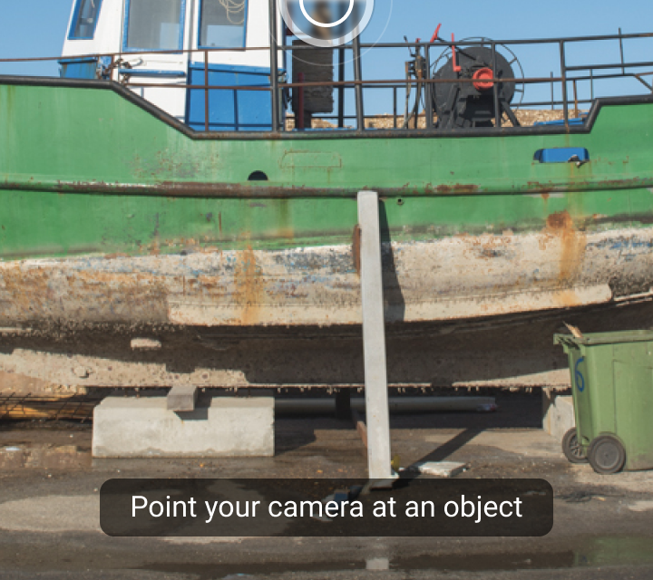
Do
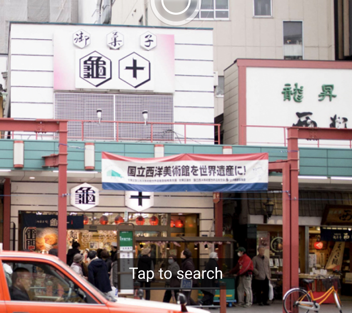
Don't

Don't
Detected image
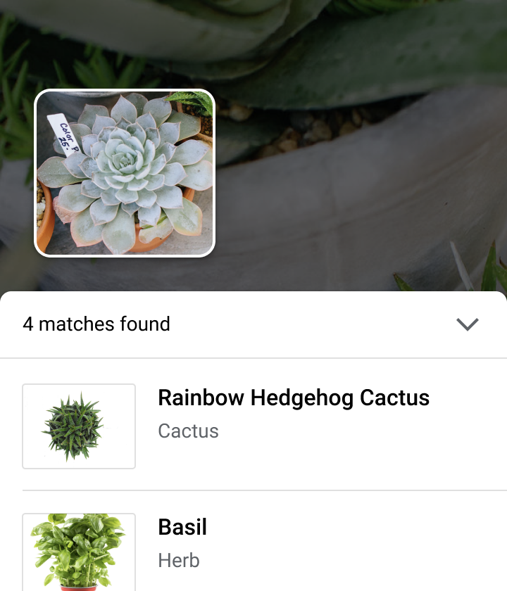
Upon detecting an object, ML Kit’s Object Detection & Tracking API creates a cropped version of the image, which is used to run a visual search using your image classification model.
The cropped image is displayed to:
- Confirm the object detected
- Compare to images of search results
- Explain any errors related to the image (such as if it’s low quality or contains multiple objects)
Modal bottom sheet
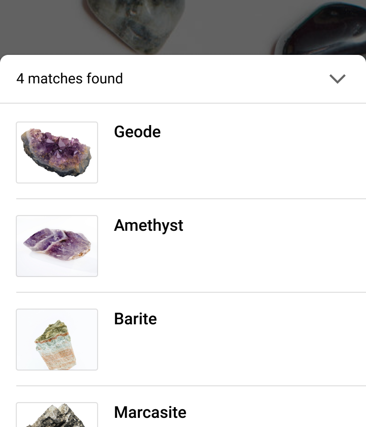
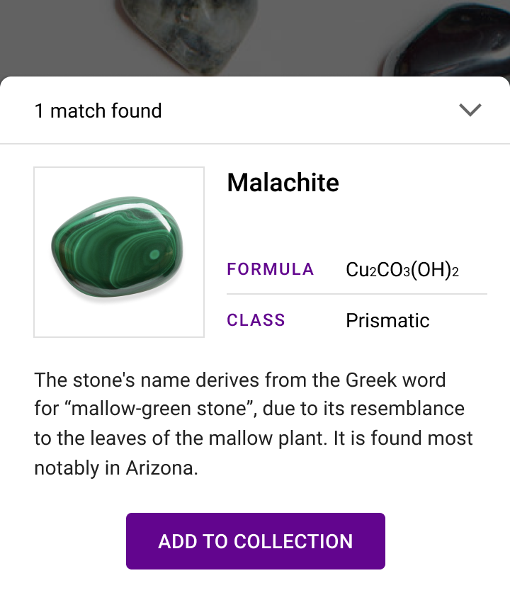
Modal bottom sheets provide access to visual search results. Their layout and content depend on your app’s use case, the number of results, and the confidence level of those results.
Experience
Live camera visual search happens in three phases:
- Sense: Use the camera to look for input
- Recognize: Detect and identify an object
- Communicate: If a matching object is found, communicate that to the user
Sense
Object detection begins when the visual search feature is opened. “Sensing” refers to the camera looking for objects in the live camera feed. During this phase, the app should:
- Describe how the feature works
- Communicate the app’s actions
- Guide how the user controls the camera and suggest adjustments
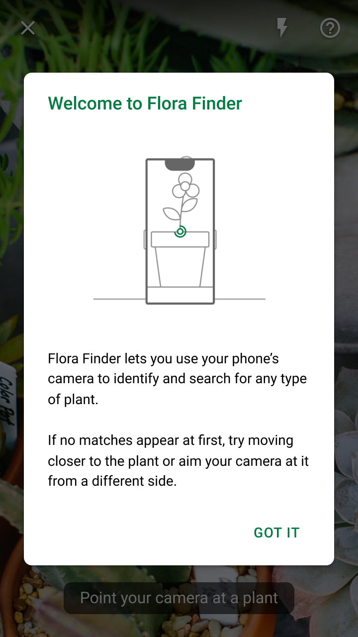
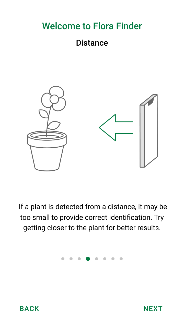
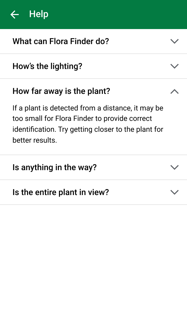
Describe how the feature works
Provide users with instructions for using the camera as a “remote control” to search for objects in the environment, describing the experience through onboarding and help content.
Do
Don't
Do
Communicate the app’s actions
While the camera searches, the reticle pulses to indicate the camera is “looking” and a tooltip prompts the user to point the camera at objects.
Do
Guide adjustments
Sometimes environmental conditions make it difficult to detect an object, such as locations that:
- Are too bright or dark to identify an object against its background
- Have overlapping objects that are difficult to distinguish from one another
If significant time has passed before an object has been detected, stop the reticle animation and direct the user to help documentation.
Recognize
When an object has been detected by the camera, the app should:
- Mark the detected object
- Display a prompt for the user to start a search
- Display search progress
Identify the detected object
To indicate when the camera has found an object, stop the reticle’s animation and mark the detected object with a border.
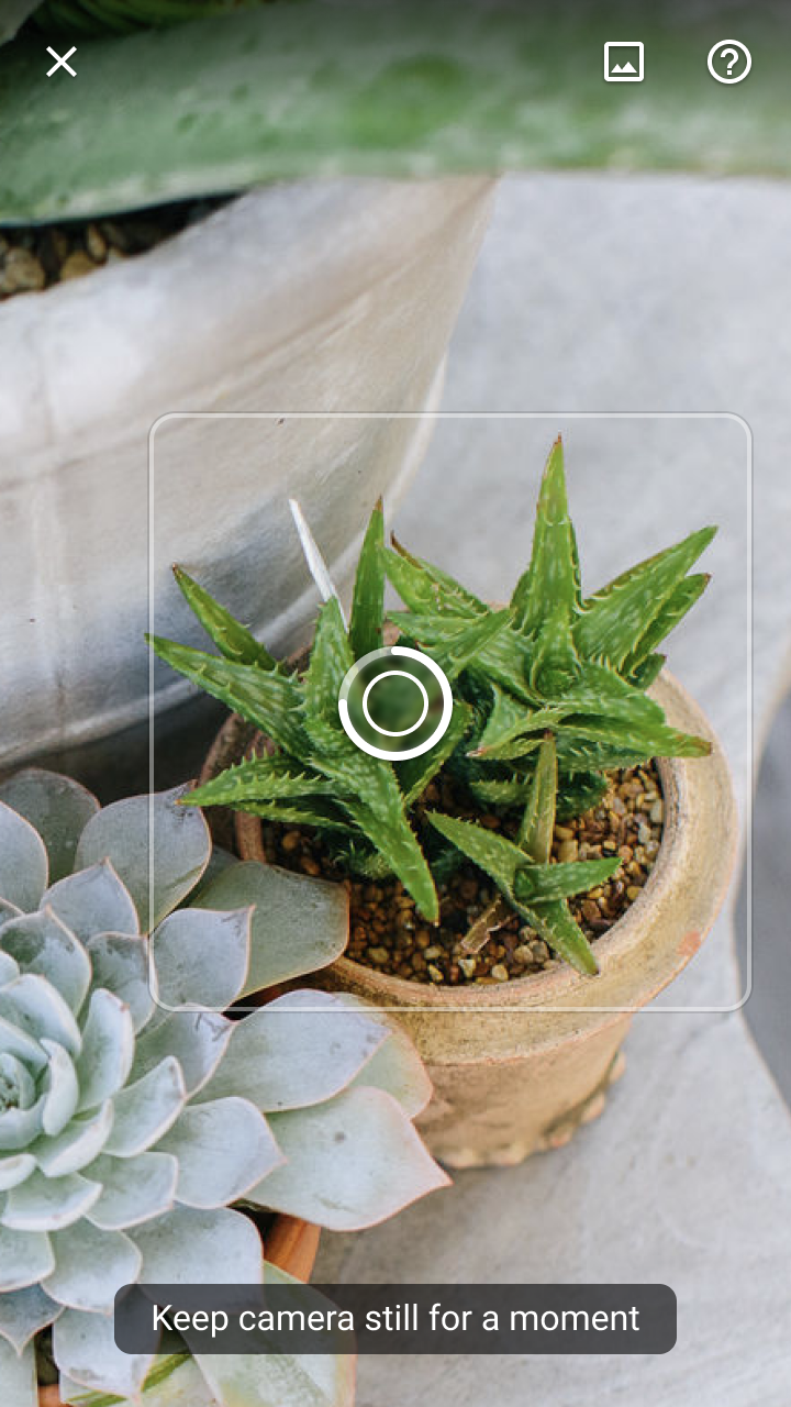
Prompt to search
Instruct the user to keep the detected object in the center of the camera. Before starting the search, add a short time delay, accompanied by a determinate progress indicator in the reticle. This gives the user time to either:
- Confirm intent to search (users keep the device camera still)
- Cancel the search (users move the camera away from the object)
You can customize the length of the delay.
Display search progress
Once a search begins, object detection stops and the live camera feed pauses. This prevents new searches (and allows the user to shift their device to a more comfortable position).
Search progress is indicated by an indeterminate progress indicator and tooltip message.
Make corrections
During the recognition stage, two issues can affect search result quality:
Small image size: If a detected object is too far from the camera, it won’t produce a high-quality image (determined by what you’ve set as your minimum image size).
To indicate that detection isn’t finished, display a partial border around the object (instead of a complete border) and show a tooltip message to prompt the user to move closer.
Network connection: A stable network connection is required if your image classification model is in the cloud. If the internet connection fails, display a banner indicating that they need an internet connection to proceed.
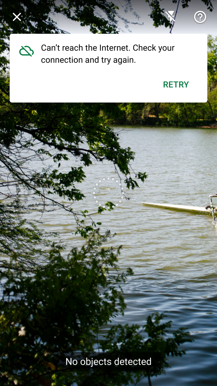
Communicate
Results from a visual search are displayed in a modal bottom sheet. During this phase, the app should:
- Display the results
- Display the detected object
- Provide fast navigation
Your app should set a confidence threshold for displaying visual search results. “Confidence” refers to an ML model’s evaluation of how accurate a prediction is. For visual search, the confidence level of each result indicates how similar the model believes it is to the provided image.
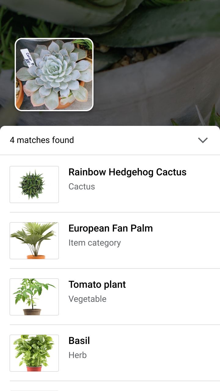
Do
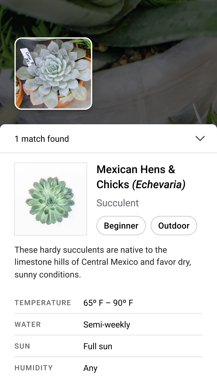
Do
Display the detected object
To allow comparison between the detected object and search results, display a thumbnail of the detected object above the modal bottom sheet.
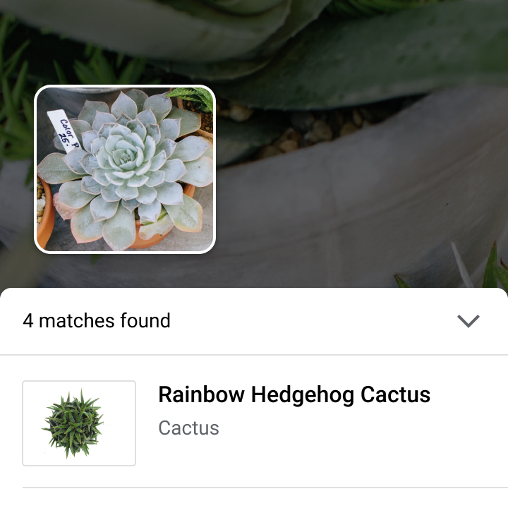
Do
Provide fast navigation
After viewing results, users may take different actions:
- To return to the camera, users can tap on the scrim or the modal bottom sheet’s header.
- To exit the camera, a user can interact with a result, navigate elsewhere in the app, or close the camera and return to the app by tapping the “X” button.
Evaluating search results
In some cases, visual search results may not meet user expectations, such as in the following scenarios:
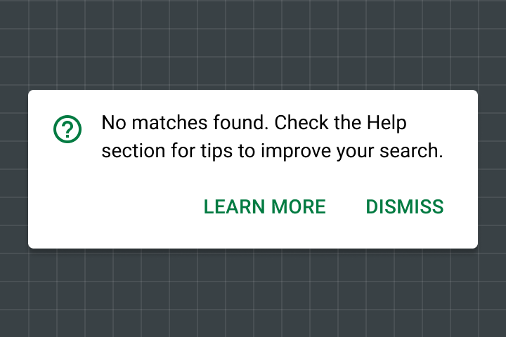
No results found
A search can return without matches for several reasons, including:
- An object isn’t a part of, or similar to, the known set of objects
- An object was detected from an unrecognized angle
- An image can be low quality, making key details of the object hard to recognize
Display a banner to explain if there are no results and guide users to a Help section for information on how to improve their search.
Poor results
If a search returns results with only low-confidence scores, you can ask the user to search again (with tips on improving their search).

Do
Theming
Shrine Material theme
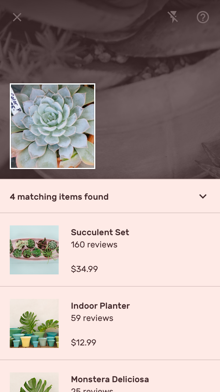
Live camera visual search is used in the Shrine app’s purchase flow.

Reticle
Shrine’s reticle uses a diamond shape to reflect Shrine’s shape style (which uses angled cuts).
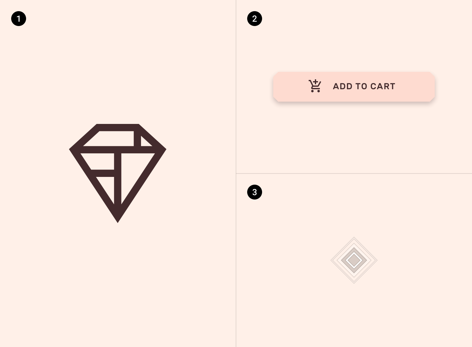
2. A button with 4dp cut corners
3. A reticle with a diamond shape
Shrine’s tooltip is emphasized by using custom colors, typography, and placement.
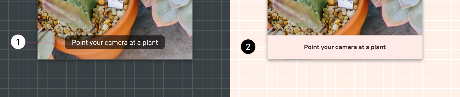
2. Shrine’s tooltip uses custom colors, typography, and extends its container to the edges of the screen.