Skip to content
Material Design 2
Main Navigation
v3
v2
v1

English

简体中文
繁體中文
Español
Français
Русский
Português – Brasil
Deutsch
日本語
한국어
Italiano
Polski
Türkçe
čeština
magyar

English

简体中文
繁體中文
Español
Français
Русский
Português – Brasil
Deutsch
日本語
한국어
Italiano
Polski
Türkçe
čeština
magyar

Appearance

Sidebar Navigation

Material System

Introduction

Material studies

About our Material studies

Basil

Crane

Fortnightly

Owl

Rally

Reply

Shrine

Material Foundation

Environment

Surfaces

Elevation

Light and shadows

Layout

Understanding layout

Pixel density

Responsive layout grid

Spacing methods

Component behavior

Applying density

Navigation

Understanding navigation

Navigation transitions

Search

Color

The color system

Applying color to UI

Color usage

Text legibility

Dark theme

Typography

The type system

Understanding typography

Language support

Sound

About sound

Applying sound to UI

Sound attributes

Sound choreography

Iconography

Product icons

System icons

Animated icons

Shape

About shape

Shape and hierarchy

Shape as expression

Shape and motion

Applying shape to UI

Motion

Understanding motion

The motion system

Speed

Choreography

Customization

Interaction

Gestures

Selection

States

Communication

Confirmation & acknowledgement

Data formats

Data visualization

Empty states

Help & feedback

Imagery

Launch screen

Onboarding

Offline states

Writing

Machine learning

Machine learning patterns

Object detection: live camera

Object detection: static image

Barcode Scanning

Material Guidelines

Material Theming

Overview

Implementing your theme

Usability

Accessibility

Bidirectionality

Platform guidance

Android bars

Android fingerprint

Android haptics

Android icons

Android navigating between apps

Android notifications

Android permissions

Android slices

Android split-screen

Android swipe-to-refresh

Android text selection toolbar

Android widget

Cross-platform adaptation

Components

App bars: bottom

App bars: top

Backdrop

Banners

Bottom navigation

Buttons

Buttons: floating action button

Cards

Checkboxes

Chips

Data tables

Date pickers

Dialogs

Dividers

Image lists

Lists

Menus

Navigation drawer

Navigation rail

Progress indicators

Radio buttons

Sheets: bottom

Sheets: side

Sliders

Snackbars

Switches

Tabs

Text fields

Time pickers

Tooltips

On this page

Empty states ​

Empty states occur when an item’s content can’t be shown.

Content ​

Empty states can display a wide variety of content. For example, they can include a list without list items, or a search that returns no results. Although these states aren’t typical, they should be designed to prevent confusion.

Displaying an empty state ​

The most basic empty state consists of a non-interactive image and a text tagline.

Use an image that:

  • Has a neutral or humorous tone
  • Is consistent with your brand

Include a tagline that:

  • Has a helpful message
  • Is consistent with your brand
  • Conveys the purpose of the screen, without appearing actionable
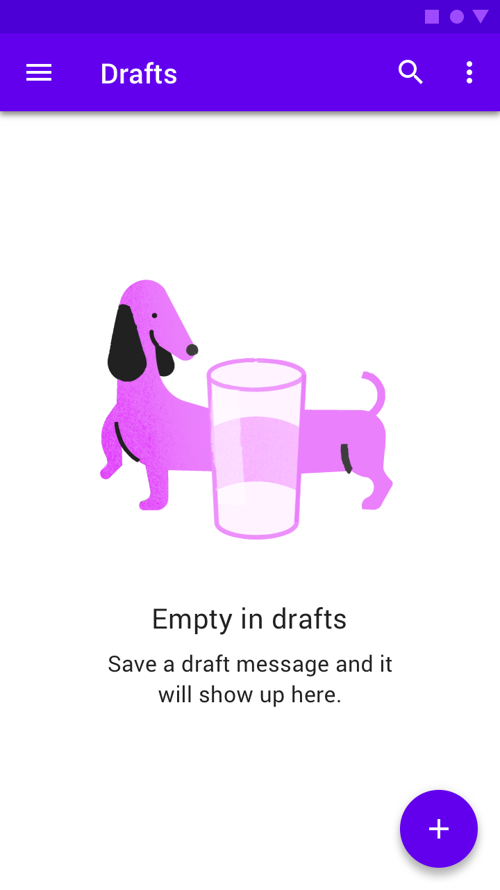
Do: you can use a humorous image and tagline that conveys the purpose of the screen, without appearing actionable

Do
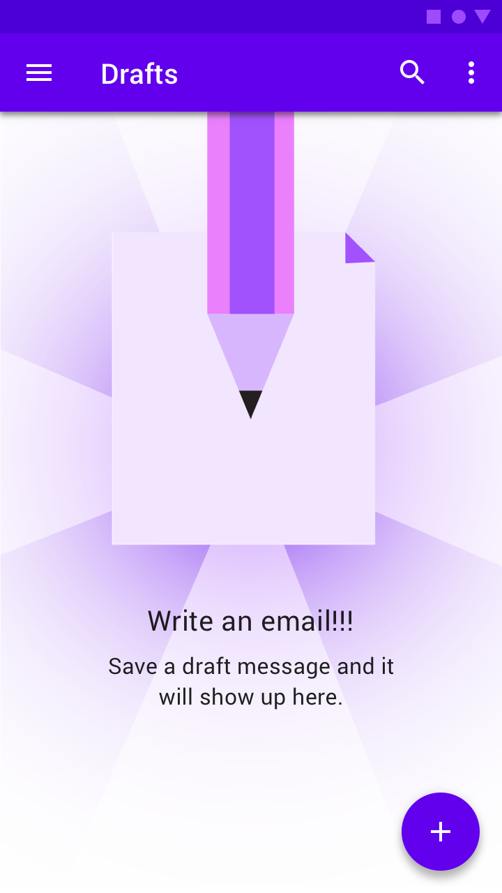
If it aligns with your brand, you can use a humorous image and tagline that conveys the purpose of the screen, without appearing actionable.
Don’t use a tagline worded like a call to action, as empty tags aren’t interactive and don’t respond when tapped

Don't

Don’t use a tagline worded like a call to action, as empty tags aren’t interactive and don’t respond when tapped. Images that express urgency or confusion should also be avoided.

Alternatives ​


Starter content

To help users new to an app or section, screens which would otherwise be empty can be populated with starter content. Starter content allows users to begin using an app right away, making it easier for them to learn about what an app has to offer.

Recommendations:

  • Starter content is best for apps that store content (such as books or music), or create templated content (such as notes or documents).
  • Use content that has broad appeal and demonstrates primary features.
  • Give users the ability to delete and replace starter content.
  • If possible, provide content that's personalized.
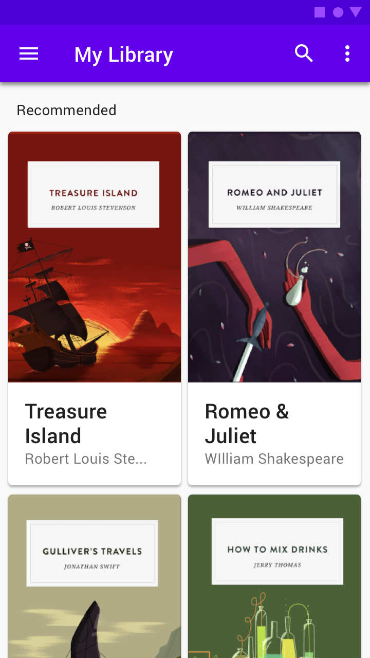
A reading app might provide all users with a few free popular books to immediately start exploring the app
A reading app might provide all users with a few free popular books to immediately start exploring the app.

Educational content

If the purpose of the screen isn't easily conveyed through an image and tagline, consider showing educational content instead. Educational content helps users understand what an app will be able to do once it has content.

Recommendations:

  • Make it possible to dismiss or skip this content.
  • Keep it brief.
  • Keep content contextual to the screen. This should not be a place to onboard the user to the entire app.
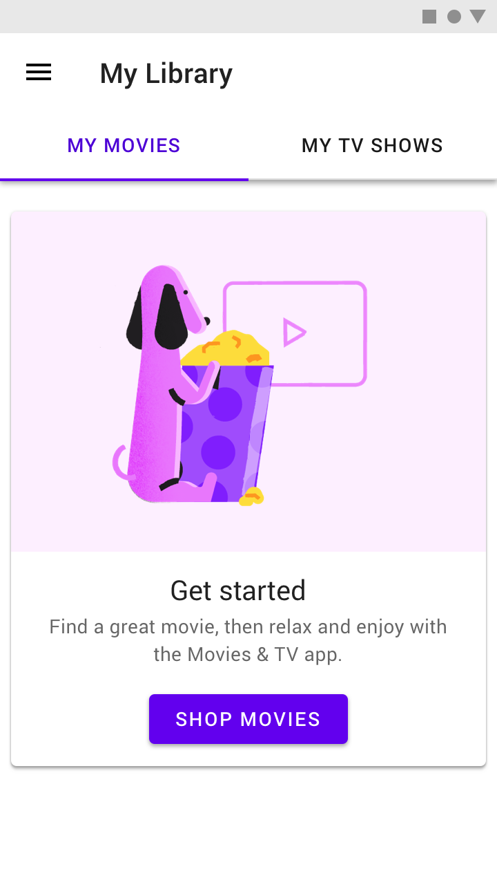
The user has no movies yet, but instead of showing an empty state
The user has no movies yet, but instead of showing an empty state, a dismissable card explains the features and benefits of the service.

Best Match ​

If nothing exactly matches a user's query, content that contains the best match to the query can be displayed, by returning results for a query spelled slightly differently. By showing these results, the user may find what they're looking for.
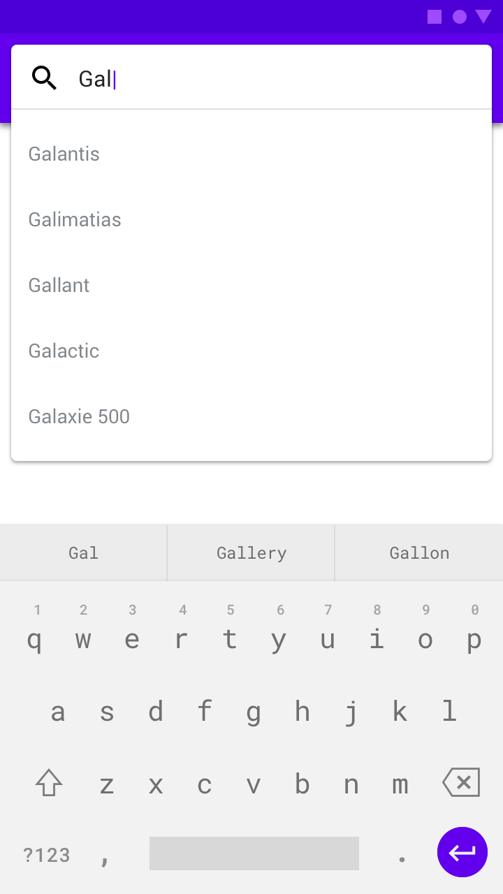
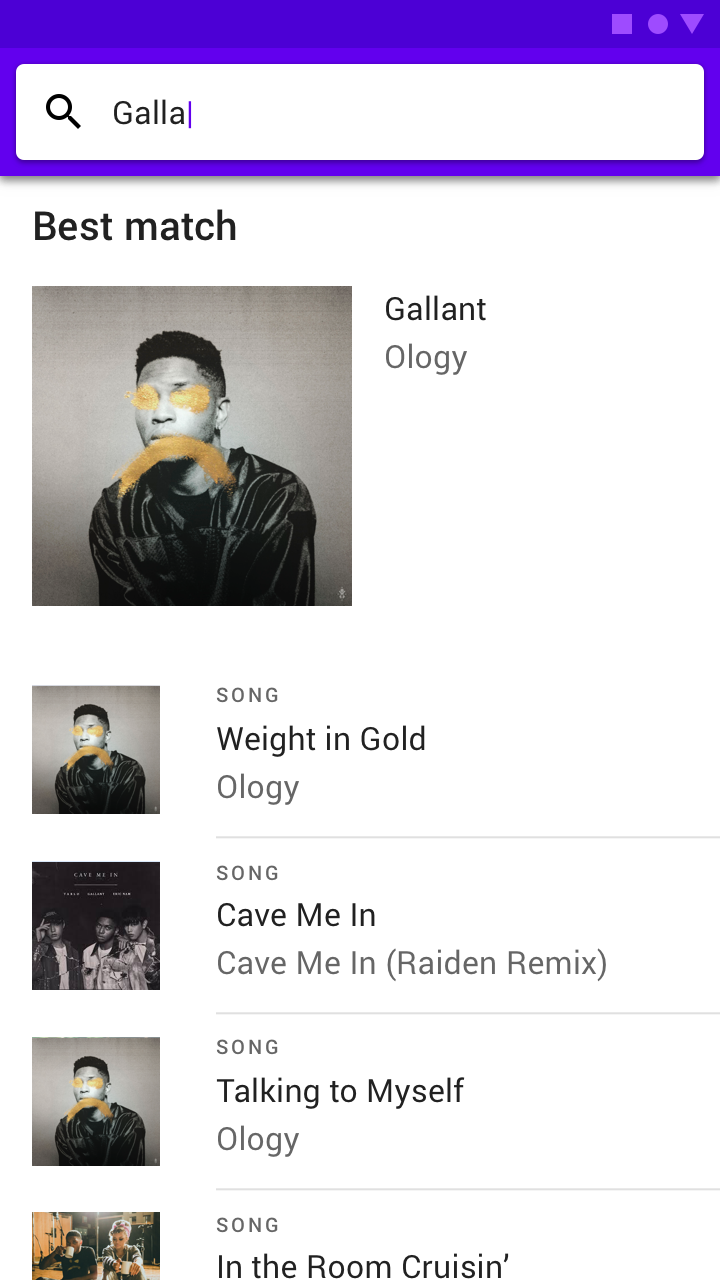
A best query match
A best query match
A heading identifies the content as best match results
A heading identifies the content as best match results.
Pager
Previous pageData visualization
Next pageHelp & feedback

Released under the Apache-2.0

Copyright © 2018-Present Google

https://m2.material.io/design/communication/empty-states.html

Released under the Apache-2.0

Copyright © 2018-Present Google