Skip to content
Material Design 2
Main Navigation
v3
v2
v1

English

简体中文
繁體中文
Español
Français
Русский
Português – Brasil
Deutsch
日本語
한국어
Italiano
Polski
Türkçe
čeština
magyar

English

简体中文
繁體中文
Español
Français
Русский
Português – Brasil
Deutsch
日本語
한국어
Italiano
Polski
Türkçe
čeština
magyar

Appearance

Sidebar Navigation

Material System

Introduction

Material studies

About our Material studies

Basil

Crane

Fortnightly

Owl

Rally

Reply

Shrine

Material Foundation

Environment

Surfaces

Elevation

Light and shadows

Layout

Understanding layout

Pixel density

Responsive layout grid

Spacing methods

Component behavior

Applying density

Navigation

Understanding navigation

Navigation transitions

Search

Color

The color system

Applying color to UI

Color usage

Text legibility

Dark theme

Typography

The type system

Understanding typography

Language support

Sound

About sound

Applying sound to UI

Sound attributes

Sound choreography

Iconography

Product icons

System icons

Animated icons

Shape

About shape

Shape and hierarchy

Shape as expression

Shape and motion

Applying shape to UI

Motion

Understanding motion

The motion system

Speed

Choreography

Customization

Interaction

Gestures

Selection

States

Communication

Confirmation & acknowledgement

Data formats

Data visualization

Empty states

Help & feedback

Imagery

Launch screen

Onboarding

Offline states

Writing

Machine learning

Machine learning patterns

Object detection: live camera

Object detection: static image

Barcode Scanning

Material Guidelines

Material Theming

Overview

Implementing your theme

Usability

Accessibility

Bidirectionality

Platform guidance

Android bars

Android fingerprint

Android haptics

Android icons

Android navigating between apps

Android notifications

Android permissions

Android slices

Android split-screen

Android swipe-to-refresh

Android text selection toolbar

Android widget

Cross-platform adaptation

Components

App bars: bottom

App bars: top

Backdrop

Banners

Bottom navigation

Buttons

Buttons: floating action button

Cards

Checkboxes

Chips

Data tables

Date pickers

Dialogs

Dividers

Image lists

Lists

Menus

Navigation drawer

Navigation rail

Progress indicators

Radio buttons

Sheets: bottom

Sheets: side

Sliders

Snackbars

Switches

Tabs

Text fields

Time pickers

Tooltips

On this page

Android swipe to refresh ​

Swipe to refresh manually refreshes screen content with a user action or gesture.

Usage ​

Swipe to refresh is a swipe gesture available at the beginning of lists, grid lists, and card collections where the most recent content appears (Index 0).

It’s best to use this gesture with dynamic content that has frequent updates surfacing from a consistent location, where users have a high probability of seeing new content after initiating the gesture.

Refresh indicator ​

The refresh indicator appears only in conjunction with a refresh gesture or action. Syncing does not display a refresh indicator.

Effects

Changes may not be immediately obvious to users when this gesture is used in views that can change significantly upon refresh. For example, the refresh may non-sequentially delete, reorder, modify, and insert items or change only off-screen items.

Animation showing swipe to refresh

Swipe to refresh should not be used in the following situations:

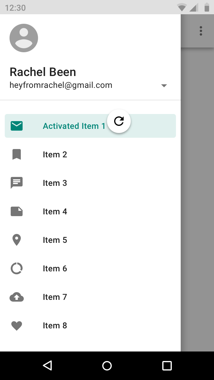
  • Navigation drawers
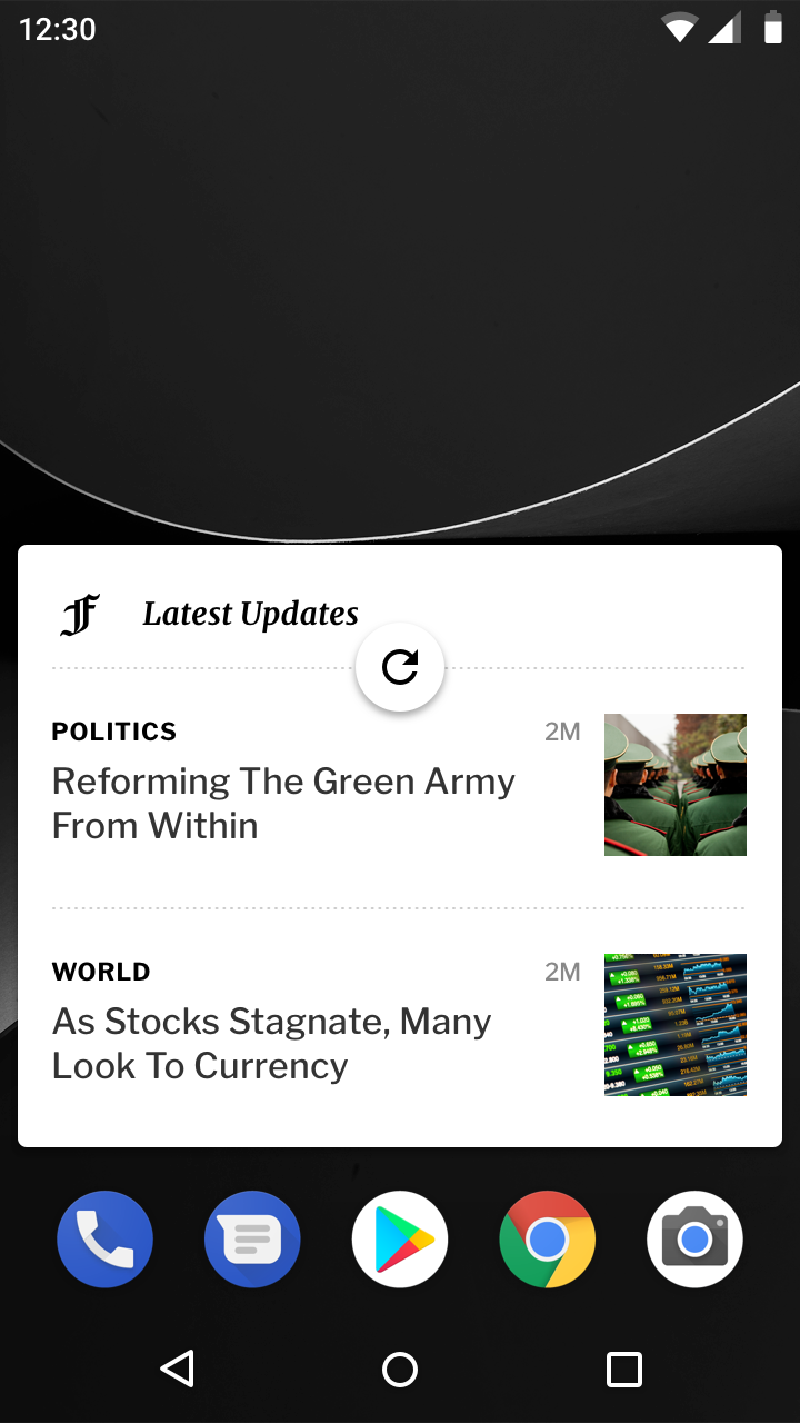
  • Home screen widgets
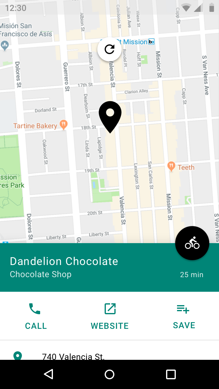
  • Pannable content
Don’t place refresh indicators in navigation drawers

Don't

Don’t place refresh indicators in navigation drawers.

Don’t display refresh indicators on regions that should update automatically, such as Home screen widgets

Don't

Don’t display refresh indicators on regions that should update automatically, such as Home screen widgets.
Don’t attach refresh indicators to pannable content, such as in maps

Don't

Don’t attach refresh indicators to pannable content, such as in maps, as the swipe gesture is already being used for other actions on those regions.

Swipe to refresh layout

Refresh the contents of a view via a vertical swipe gesture.

Related link

Behavior & placement ​

Behavior ​

As the refresh indicator scales into view, the circular spinner fades in while rotating.

The refresh indicator remains visible until the refresh activity completes and any new content is visible, or the user navigates away from the refreshing content.

Do

Keep the refresh indicator in view until the activity is completed to provide status of the refresh activity.

Don't

Don’t scroll the refresh indicator off-screen, as it hides the status of the refresh activity. It could imply that the refresh activity is associated with a specific component, such as a card, instead of the entire screen.

Refresh indicator transitions ​

When a surface is in front of the surface with refreshing content, the refresh indicator transitions from behind that surface and is clipped until fully visible.

The refresh indicator increases in size as it translates when:

  • The refreshing material is at a higher elevation than all other surfaces
  • A content refresh is initiated via an app bar or overflow menu action

Refreshing content that is coplanar with another surface.
Refreshing content that is below another surface in z-space.

Refreshing content generated by an app bar action.

Threshold requirements ​

To ensure intentional usage of the swipe to refresh gesture, the refresh indicator must pass a threshold before the app will refresh. This threshold is indicated by a number of cues:

  • The circular spinner reaches 100% opacity
  • The rotation of the circular spinner slows down
  • The rate of translation of the refresh indicator slows down

After passing the threshold, completing the gesture initiates a refresh.

Reversing the gesture past the threshold will cancel the refresh action.

Swipe to refresh in composition ​

Gesture positioning ​

Typically, the refresh gesture is available at the top of content collections, but it can also be at the bottom of the screen.

Refresh indicator (Horizontal resting position) ​

The refresh indicator, when resting, is centered horizontally relative to refreshing content.
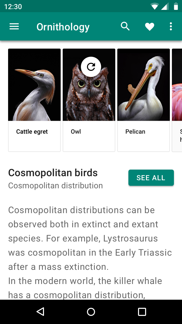
Do: horizontally center the refresh indicator over the refreshing content

Do

Horizontally center the refresh indicator over the refreshing content.
Don’t horizontally align the refresh indicator to one side of the refreshing content

Don't

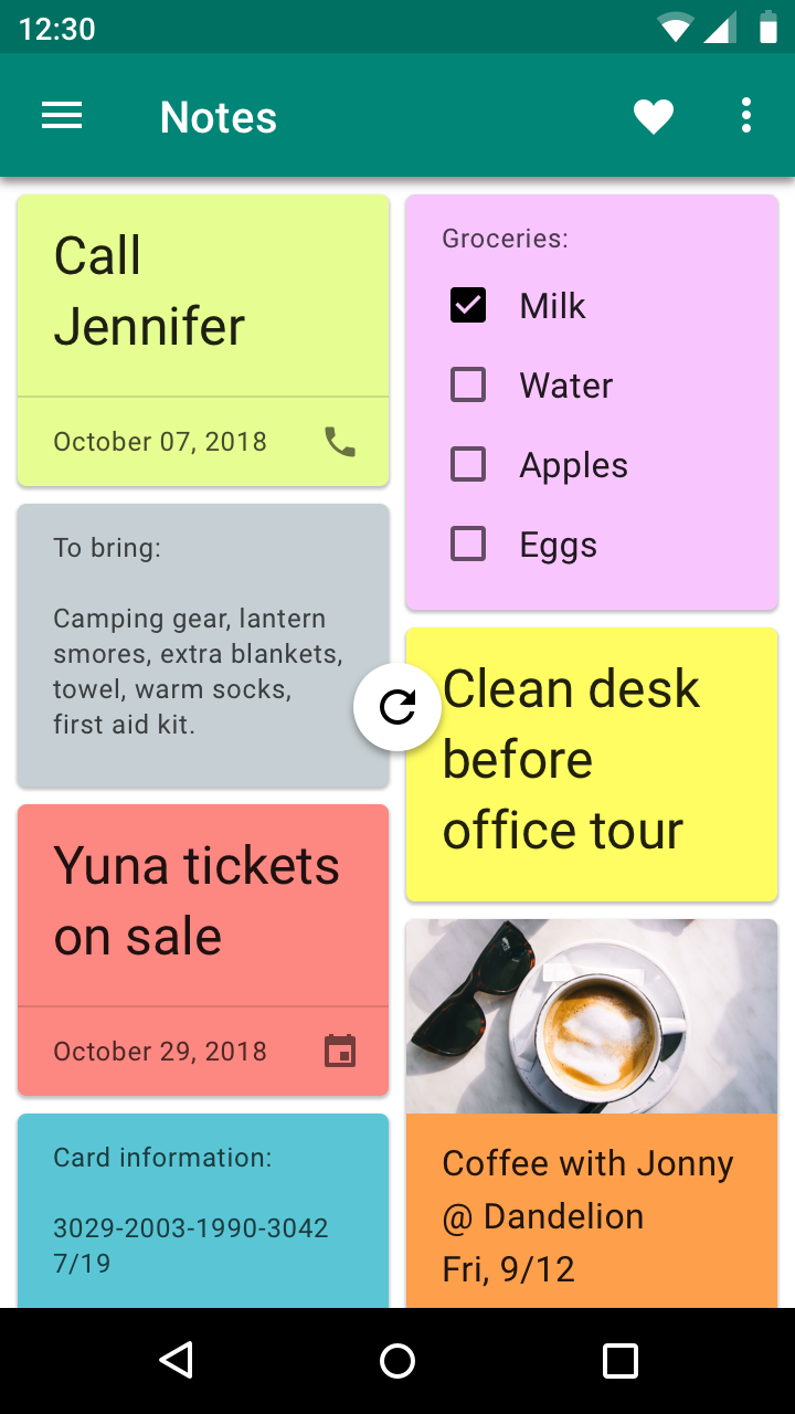
Don’t horizontally align the refresh indicator to one side of the refreshing content.

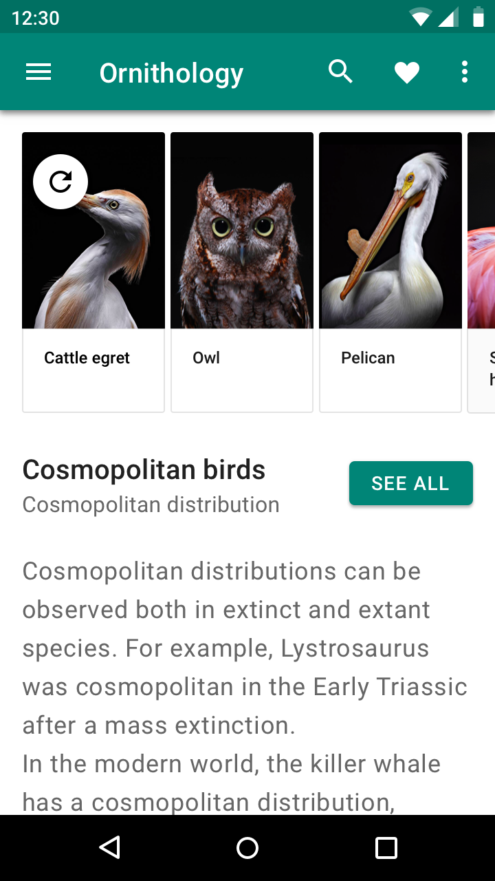
Don't: placing the refresh indicator in unexpected locations that makes its relationship to refreshing content ambiguous

Don't

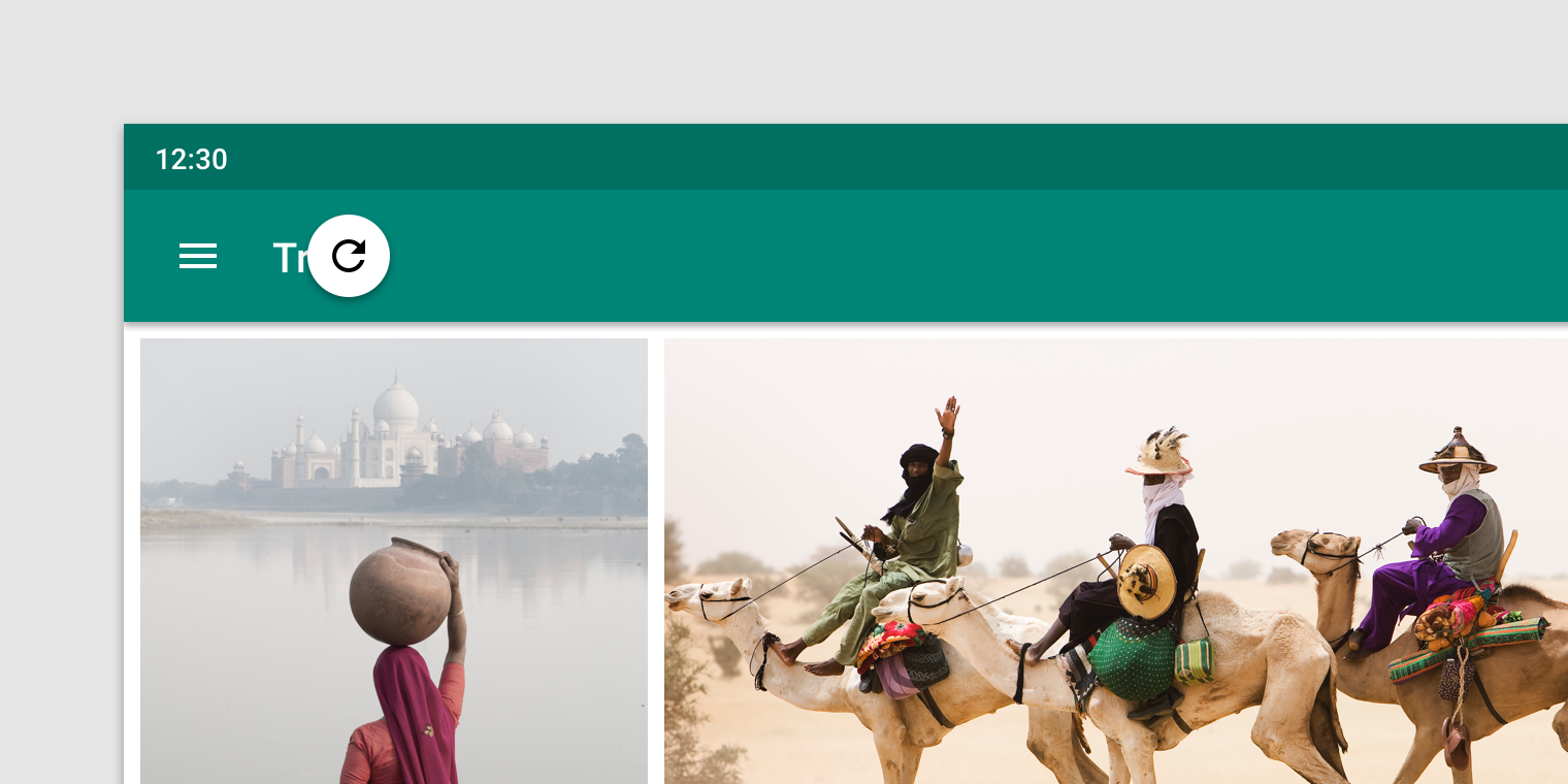
Placing the refresh indicator in unexpected locations that makes its relationship to refreshing content ambiguous.

Refresh indicator (Vertical resting position) ​

The refresh indicator is located near the top of refreshing content.

Its vertical resting position can be adjusted to improve the harmony of a layout. For example, the indicator may fall on a surface’s edge or the layout grid, as long as it’s located near the top of the refreshing content.
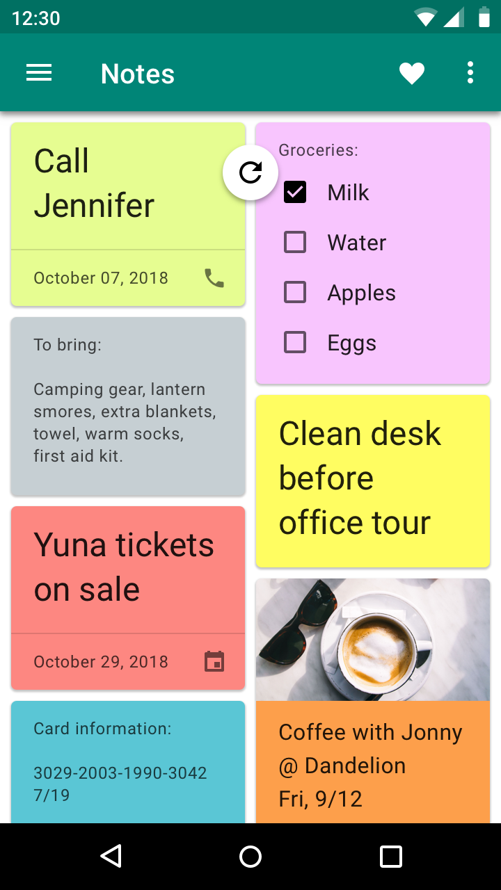
Do: position the refresh indicator near the top of refreshing content

Do

Position the refresh indicator near the top of refreshing content.
Don’t vertically position the refresh indicator where it will obstruct content

Don't

Don’t vertically position the refresh indicator where it will obstruct content.
Pager
Previous pageAndroid split-screen
Next pageAndroid text selection toolbar

Released under the Apache-2.0

Copyright © 2018-Present Google

https://m2.material.io/design/platform-guidance/android-swipe-to-refresh.html

Released under the Apache-2.0

Copyright © 2018-Present Google