Navigation drawer
Navigation drawers provide access to destinations in your app.
Usage
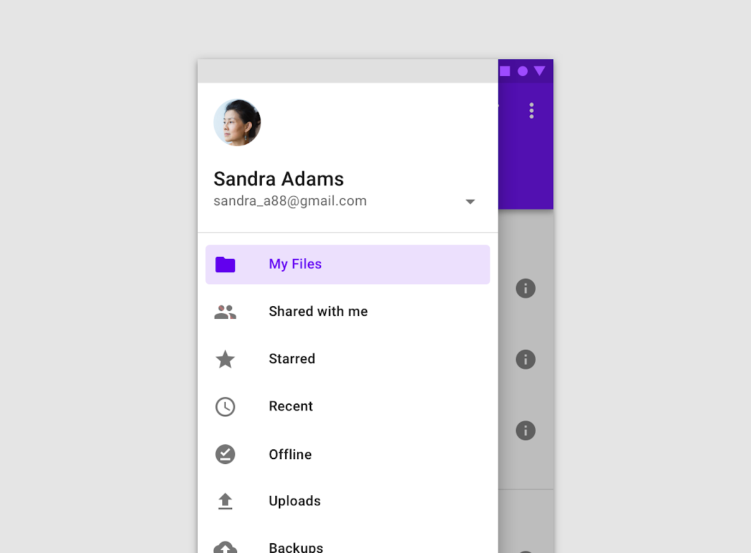
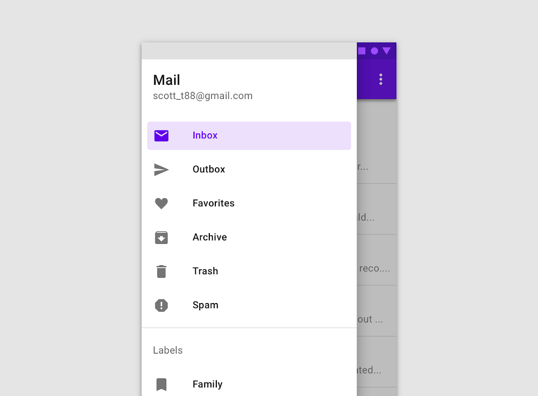
Navigation drawers provide access to destinations and app functionality, such as switching accounts. They can either be permanently on-screen or controlled by a navigation menu icon.
Navigation drawers are recommended for:
- Apps with five or more top-level destinations
- Apps with two or more levels of navigation hierarchy
- Quick navigation between unrelated destinations
Do
Caution
Principles

Identifiable
The placement and list-style content of navigation drawers clearly identify them as navigation.
Organized
Navigation drawers order destinations according to user importance, with frequent destinations first and related ones grouped together.
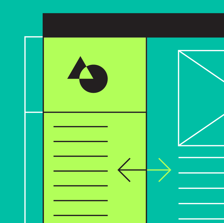
Contextual
Navigation drawers can be shown or hidden to accommodate different app layouts.
Types
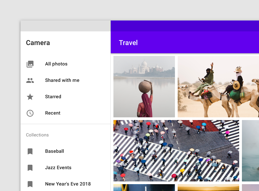
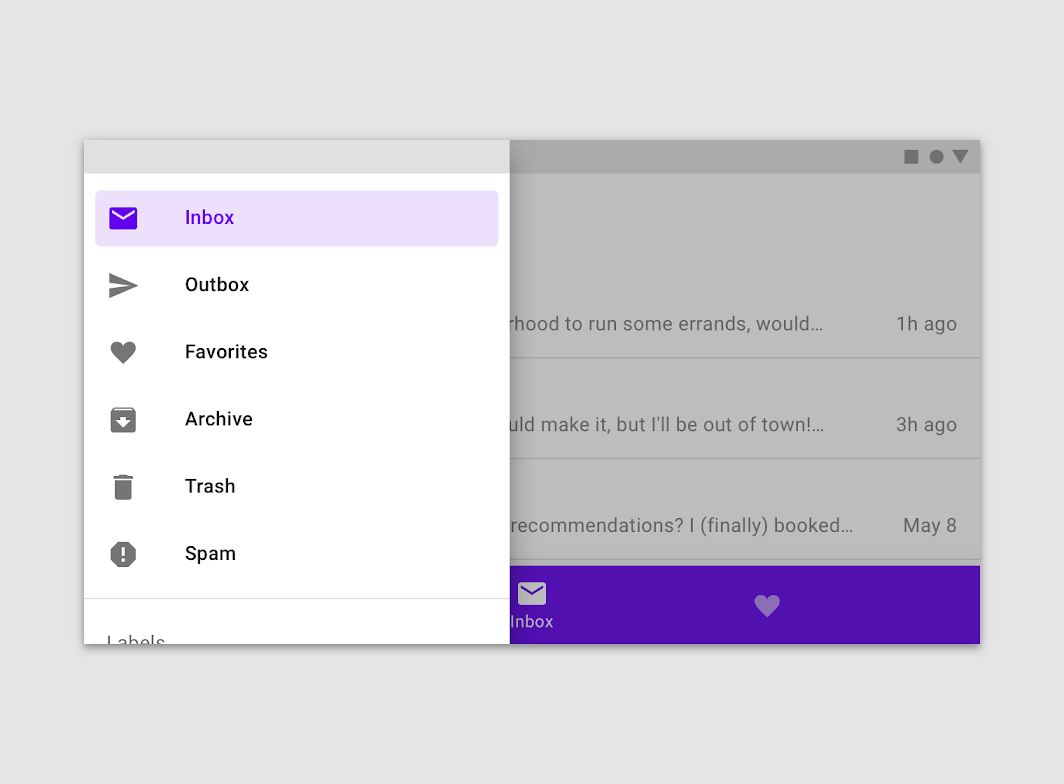
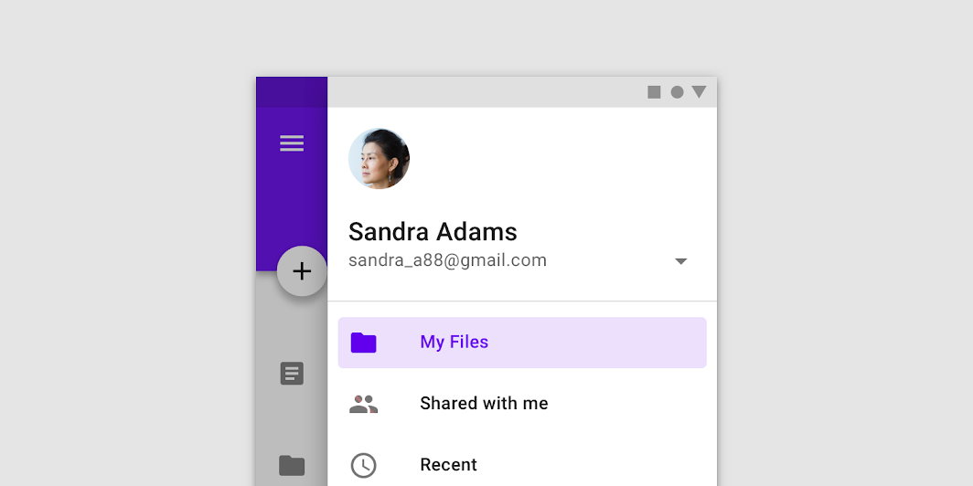
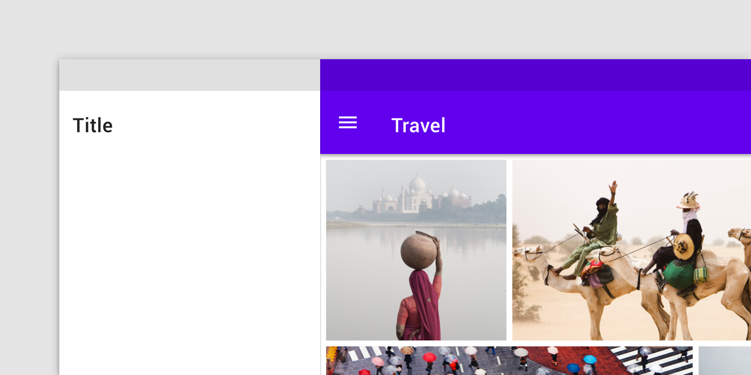
Standard navigation drawers allow users to simultaneously access drawer destinations and app content. They are often co-planar with app content and affect the screen's layout grid.
Standard drawers can be permanently visible or opened and closed by tapping a navigation menu icon. They can be used on tablet and desktop only. On mobile, modal drawers are used instead.
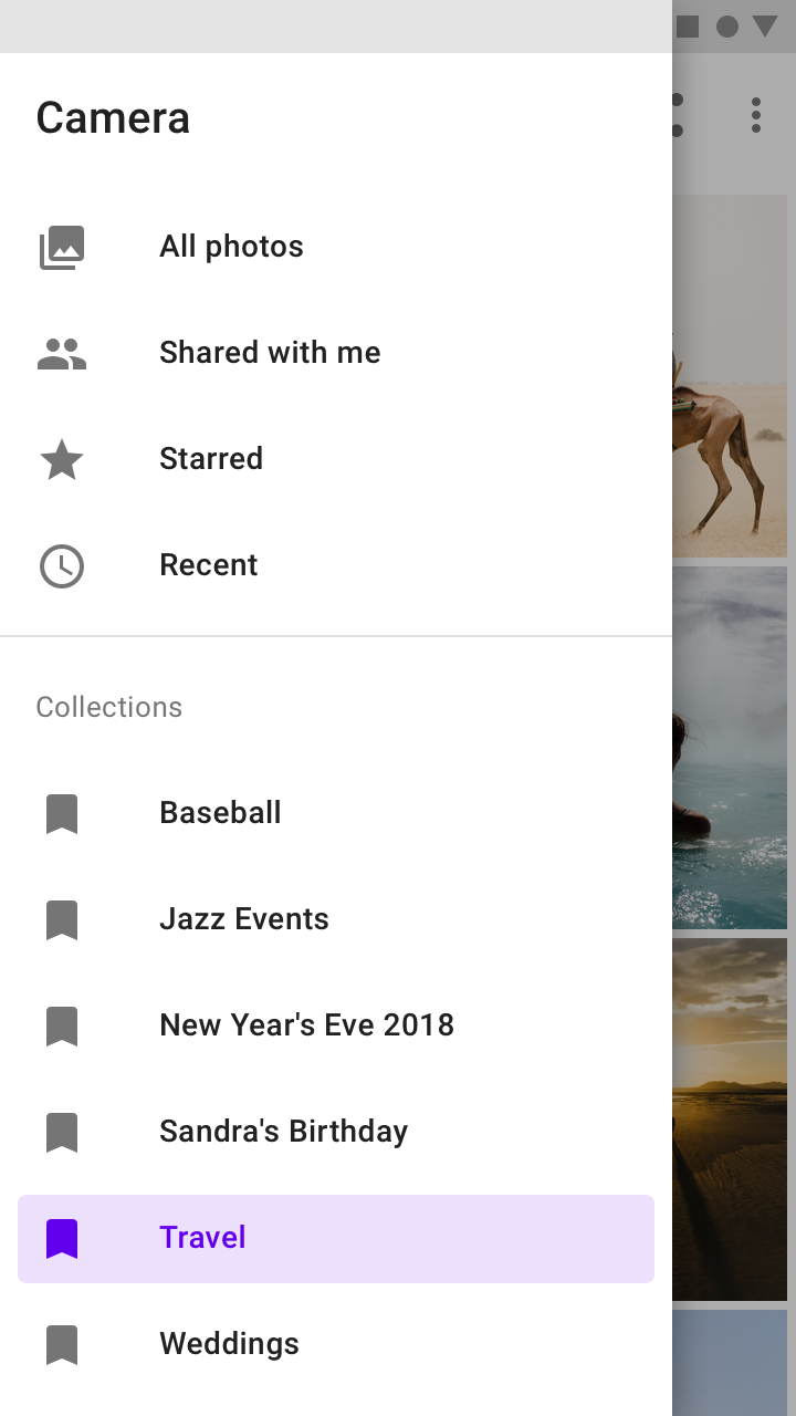
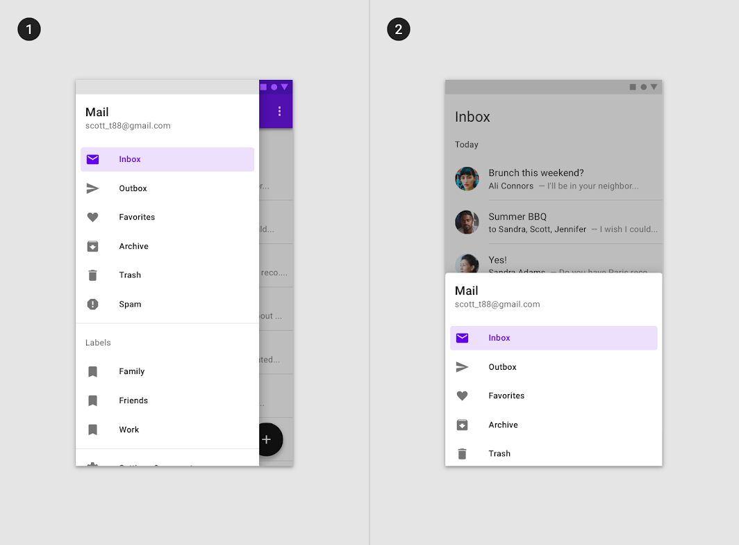
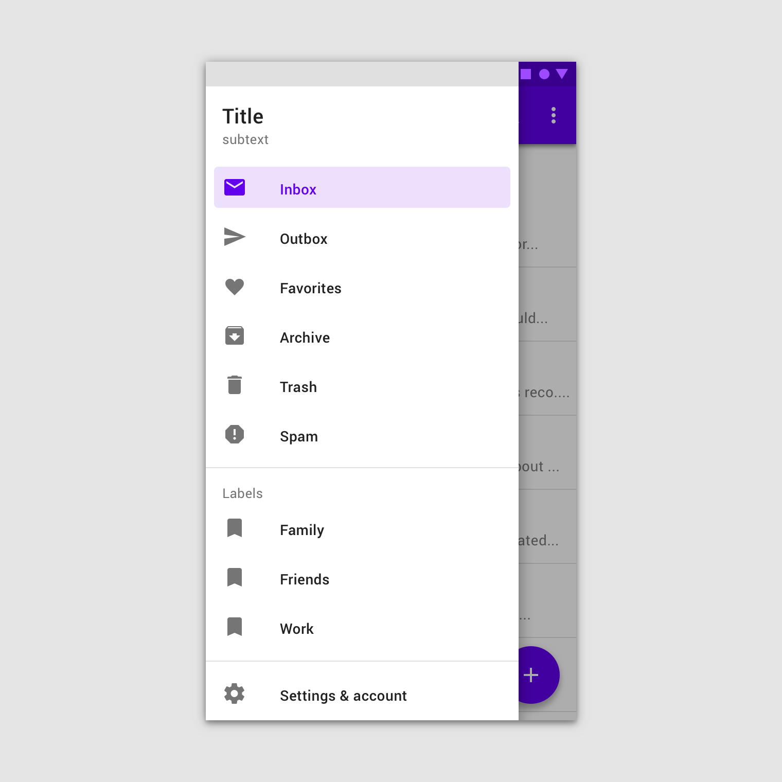
Modal navigation drawers use a scrim to block interaction with the rest of an app's content. They are elevated above most app elements and don't affect the screen's layout grid.
They are primarily for use on mobile, where screen space is limited. They can be replaced by standard drawers on tablet and desktop.
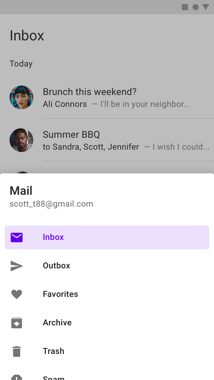
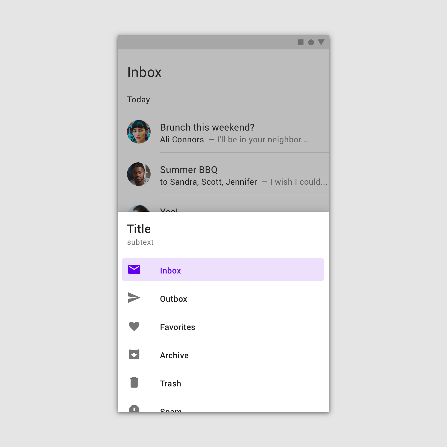
Bottom navigation drawers are a specialized type of modal drawer for use with a bottom app bar.
For increased reachability from the bottom app bar's menu icon, they open from the bottom of the screen rather than the side.
Anatomy
Navigation drawers contain a list embedded within a sheet. They can be enhanced with headers and dividers to organize longer lists.
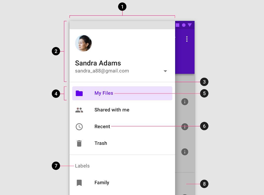
2. Header (optional)
3. Divider (optional)
4. Active text overlay
5. Active text
6. Inactive text
7. Subtitle
8. Scrim (modal only)
Sheet
The contents of a navigation drawer are contained within a side or bottom sheet. Navigation drawers that open from the side are placed on the left of the screen for left-to-right languages, and on the right of the screen for right-to-left languages.
Do
Don't
Destinations
Destinations in a navigation drawer take the form of actionable list items. Each item describes its destination using a text label and optional iconography.
Destination labels
Text labels should be clear and short enough that they aren't cut off by the sheet.
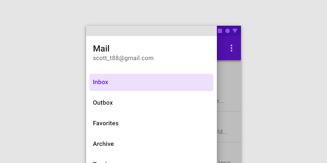
Do
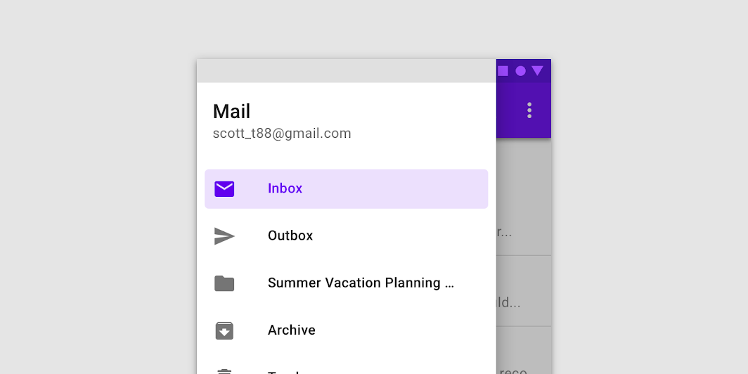
Do
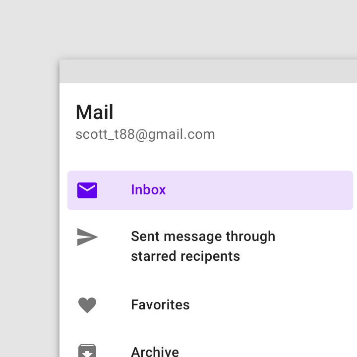
Don't
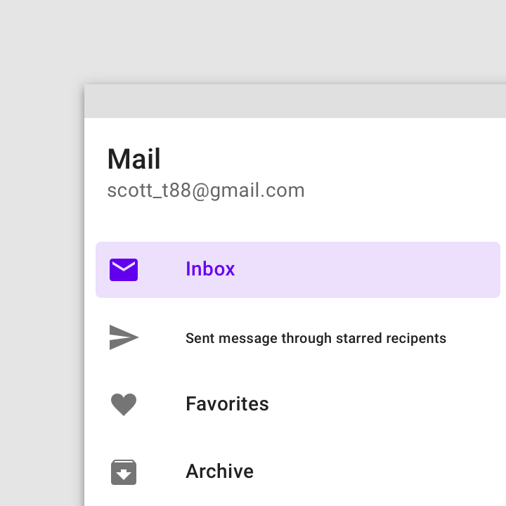
Don't
Destination iconography (optional)
Icons can supplement labels as indicators of a destination. When used, they should always be placed before text. Other app components and content should reference these icons.
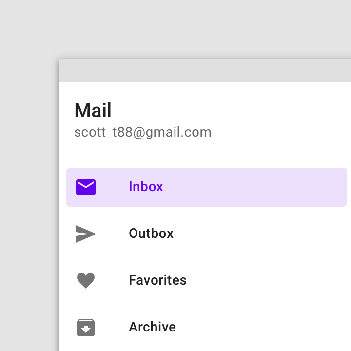
Do
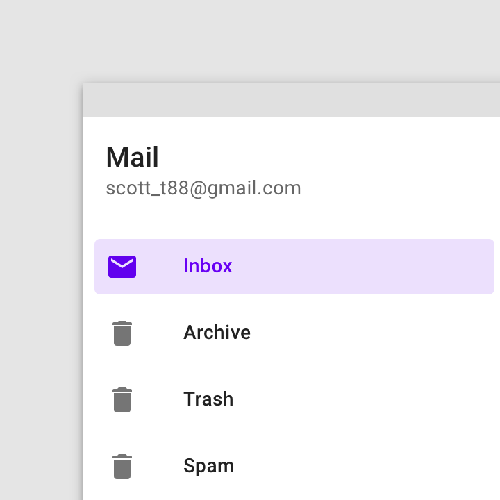
Don't
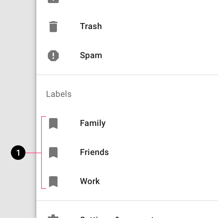
Caution
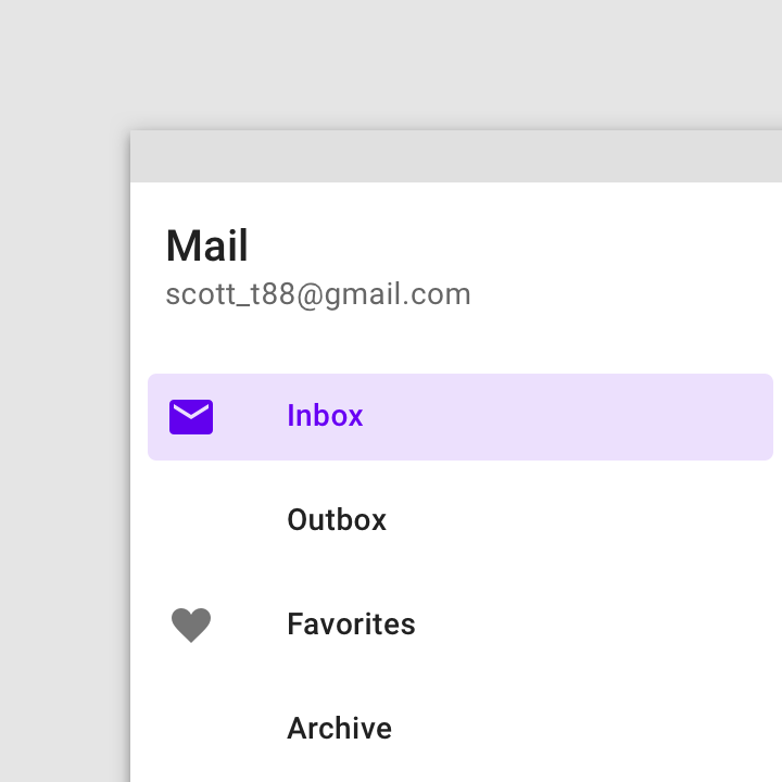
Don't
Dividers (optional)
Horizontal dividers can be used to separate groups of navigation destinations within the list. They extend across the full width of the drawer.
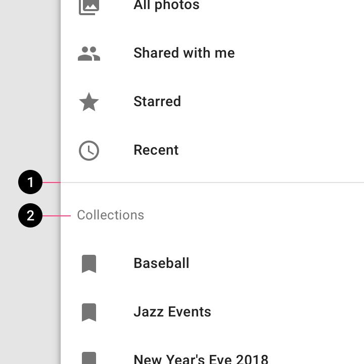
Do
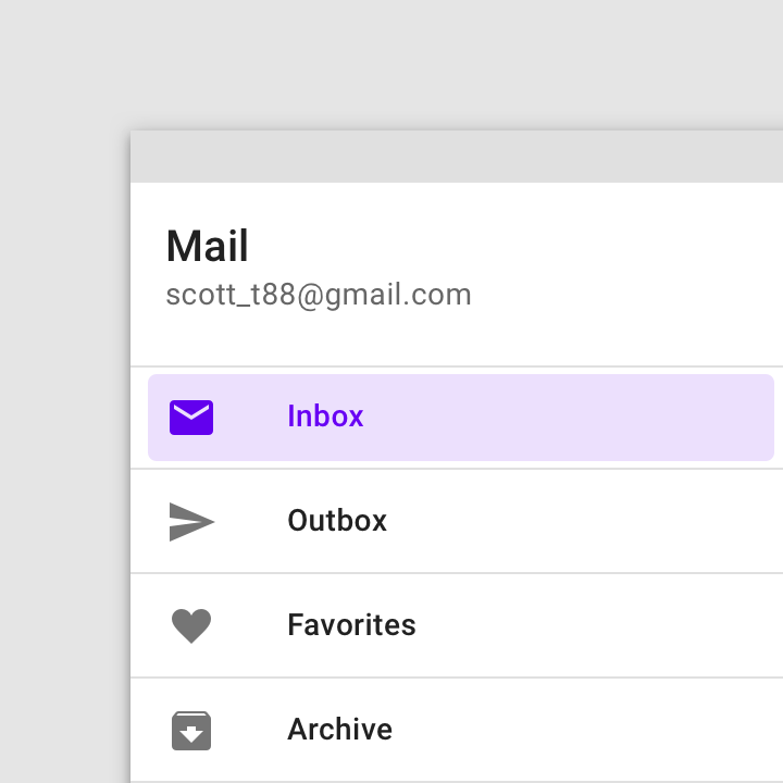
Don't
Header (optional)
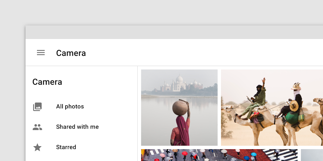
The header area of a navigation drawer is a flexible space that can be used for brand expression (such as an app title or logo), an account switcher, and more.
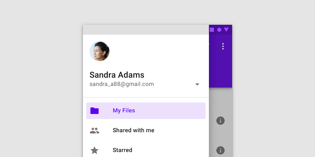
Do
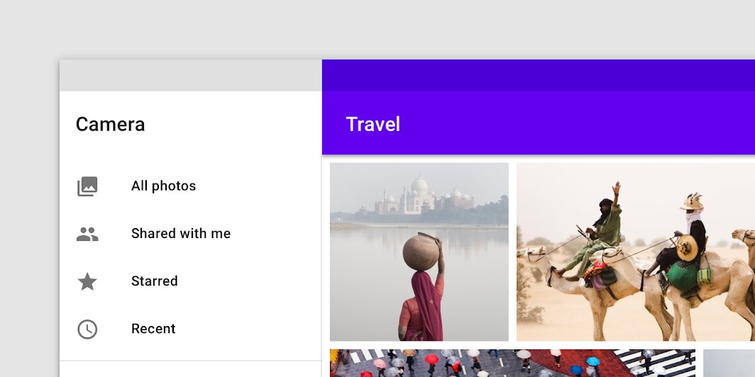
Do
Don't
Scrim (modal and bottom only)
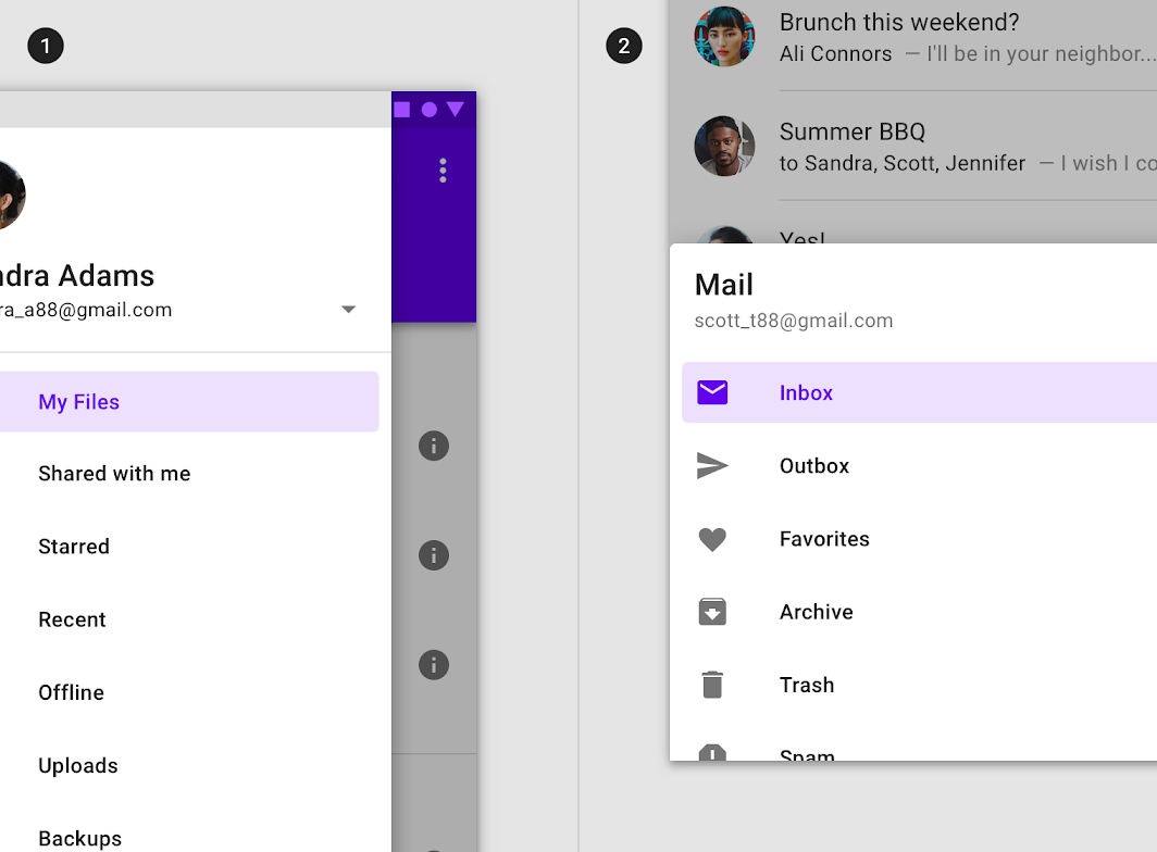
Modal navigation drawers use a scrim to block interaction with the rest of the app. The scrim is placed directly below the drawer's sheet and can be tapped or clicked to dismiss the drawer.
Behavior
Scaling and adaptation
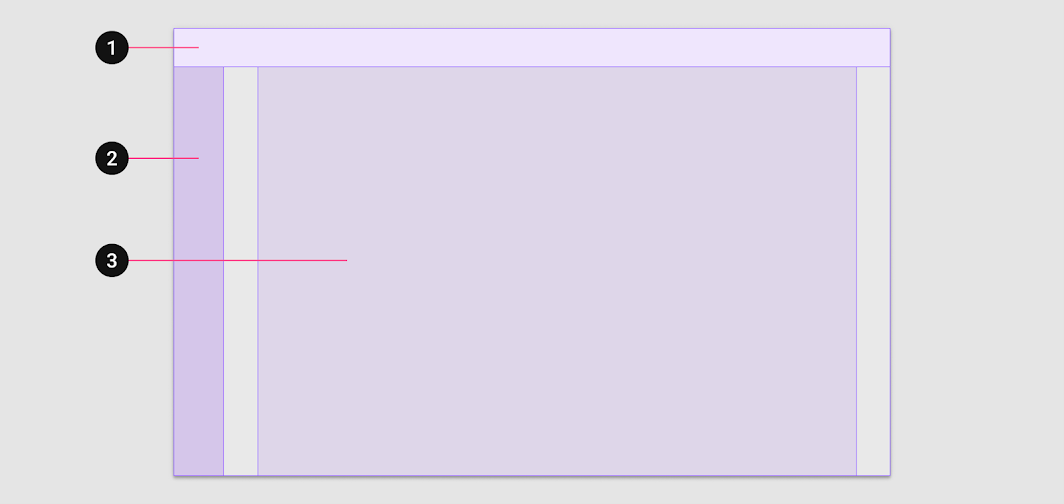
Large screen layouts include three main elements:
- App bars
- Navigation (at the leading edge)
- Body
2. Navigation
3. Body
The navigation region holds navigational components and elements. It helps users navigate between destinations and initiate key actions.
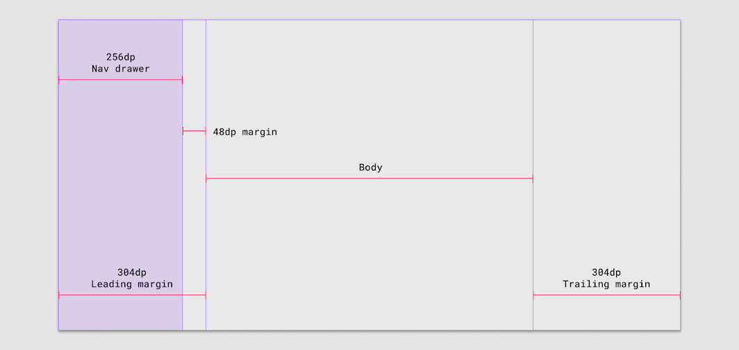
Margins greater than 304dp
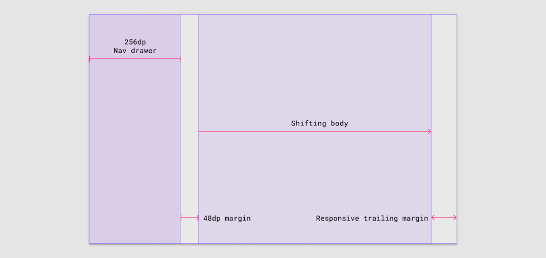
If the leading margin is 304dp, use a navigation drawer (256dp) with a 48dp margin without adjusting the body or trailing margin.
Margins greater than 48dp: Shift right
If the right margin is greater than 48dp, the body region compresses to the right to make room for the navigation region to expand.
Collapsing the navigation region
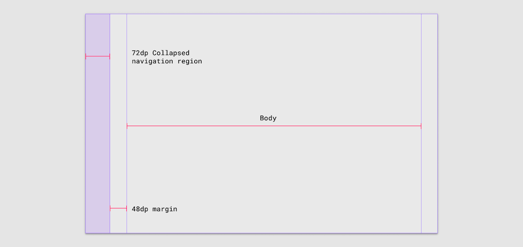
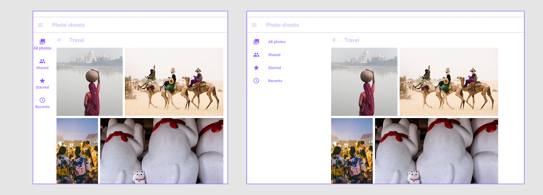
Users may want to collapse the navigation drawer into a navigation rail to increase information density and maximize available screen space. Use a 48dp margin between a navigation rail and the body region.
Component swapping
Component swapping means that components with similar functions can be swapped to make larger-scale changes to the ergonomics and function of an interface.
One example of component swapping is a bottom navigation component in a mobile view exchanging place with a navigation rail on a tablet, and this can also swap to become a navigation drawer on large screens.
Small breakpoints: 360-599dp
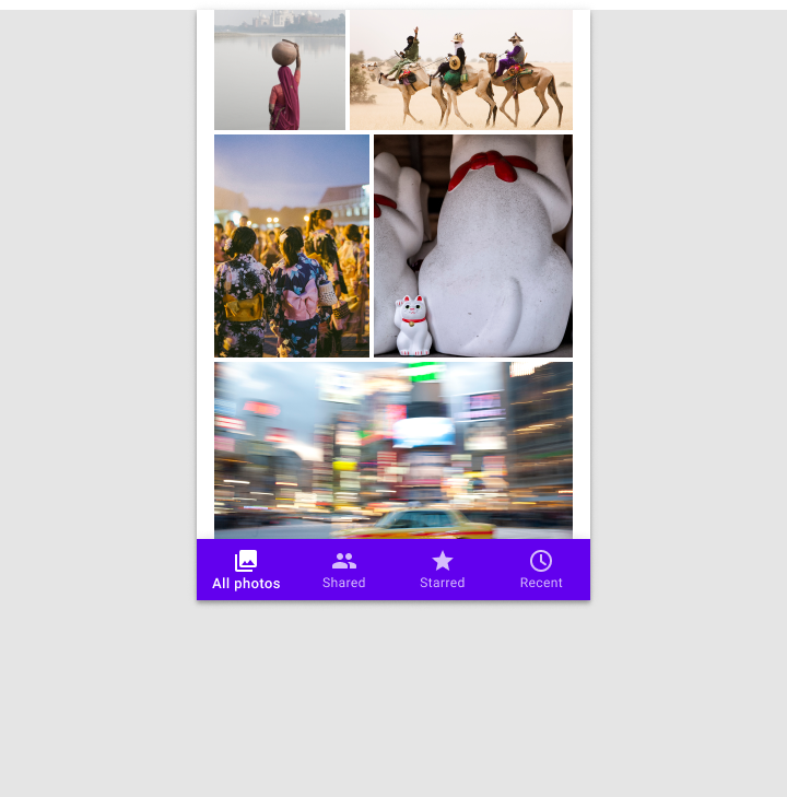
For small devices like phones, horizontal space is at a premium; the content area of an app usually spans the entire width of a screen. In this case, smaller navigation components should anchor to the top or bottom of a layout, saving space while making primary destinations accessible.
Medium breakpoints: 600-1239dp
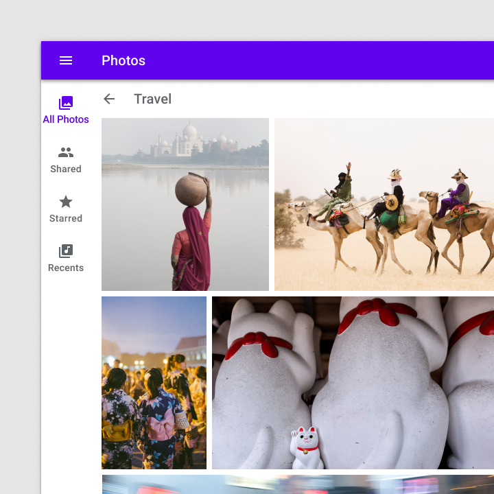
On medium-sized devices like tablets, move primary navigation elements into a navigation rail that is fixed to the leading edge of the layout.
Large breakpoints: 1240dp+
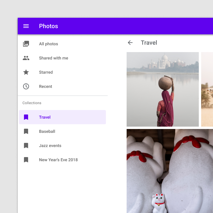
On devices with 1240dp+ widths, present destinations in a permanently visible or dismissible navigation drawer. Assign hierarchy based on how frequently or quickly a user needs to move between destinations.
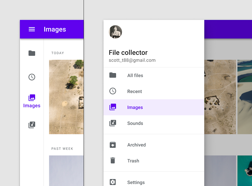
When a navigation rail and modal navigation drawer are used together, the modal drawer can repeat destinations in the navigation rail as long as the drawer offers enough visual separation between levels of the navigation hierarchy.
Component transition
Use a transition to signal the switch of an on-screen component. For example, when shifting from portrait to landscape orientations, the navigation rail should transform into a navigation drawer.
Standard drawer
Usage
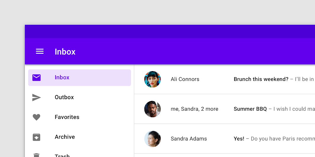
Standard navigation drawers allow interaction with both screen content and the drawer at the same time. They can be used on tablet and desktop, but they aren't suitable for mobile due to limited screen size.
Alternatives
- Modal drawer: In a responsive layout grid, at a defined minimum breakpoint of at least 600dp width, a standard drawer should be replaced with a modal drawer.
- Permanently visible drawer: When users need to switch destinations frequently (and screen size allows), a permanently visible drawer can be used.
- Dismissible drawer: A dismissible drawer can be used when users are likely to focus on screen content and require less frequent access to its navigation destinations.
Behavior
Scrolling
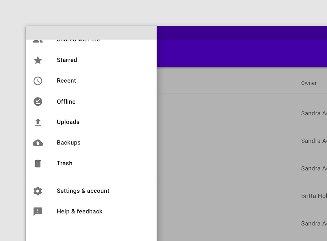
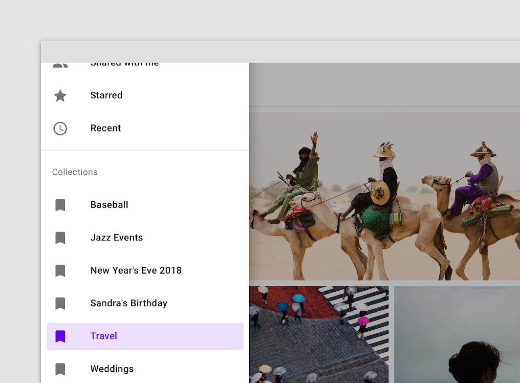
Navigation drawers can be vertically scrolled, independent of the rest of the screen's content and UI. If the list of navigation destinations is longer than the height of the drawer, the drawer's contents can be scrolled within the drawer.
Visibility
The visibility of a standard navigation drawer depends on screen size, app layout, and frequency of use.
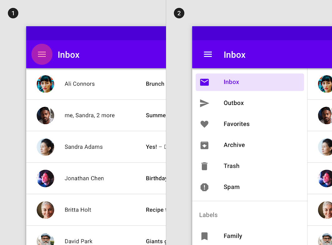
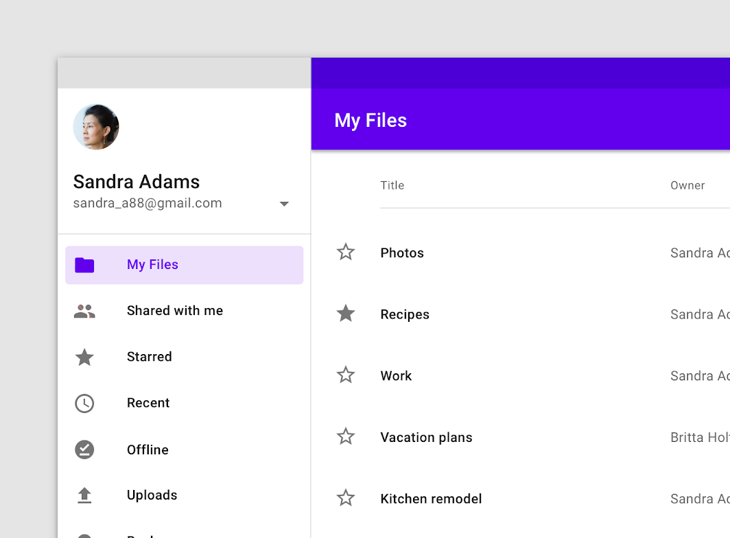
- Dismissible standard drawers can be used for layouts that prioritize content (such as a photo gallery) or for apps where users are unlikely to switch destinations often. They should use a visible navigation menu icon to open and close the drawer.
- Permanently visible standard drawers allow quick pivoting between unrelated destinations. They require a menu icon for control because they can't be dismissed by the user.
Elevation
A standard navigation drawer can use one of these elevation positions:
- At the same elevation as a top app bar (full-height)
- At a lower elevation than a top app bar (clipped)
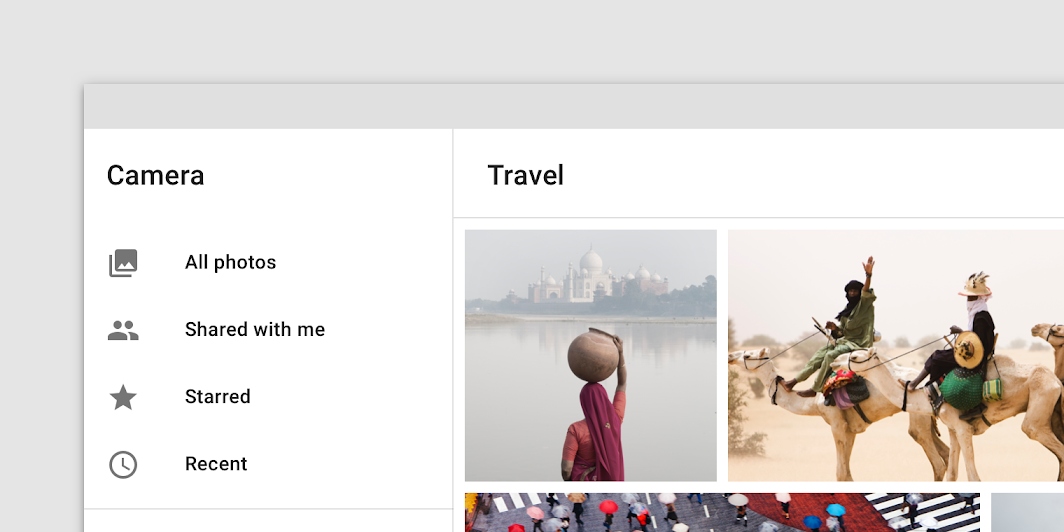
A full-height navigation drawer is at the same elevation as a top app bar.
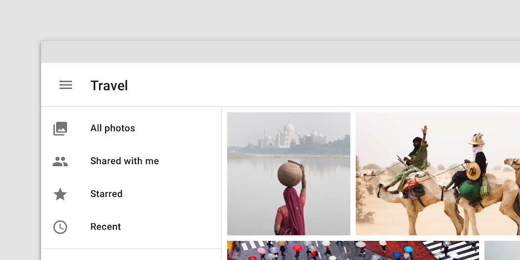
A clipped navigation drawer is at the same elevation as content that scrolls beneath a top app bar.
Modal drawer
Usage
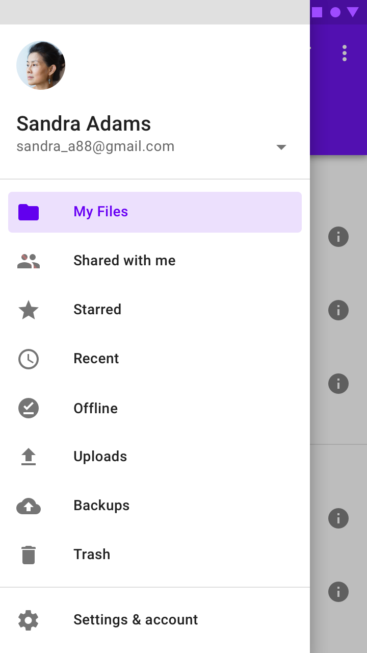
Modal navigation drawers block interaction with the rest of an app's content with a scrim. They are elevated above most of the app's UI and don't affect the screen's layout grid.
They are primarily for use on mobile where screen space is limited, and can be replaced by standard drawers on tablet and desktop.
Behavior
Opening and closing
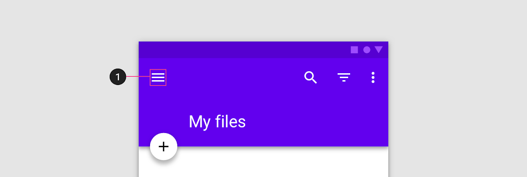
Modal navigation drawers are always opened by an affordance outside of the drawer, such as a navigation menu icon in a top app bar.
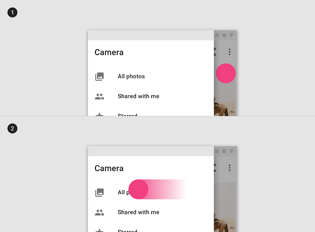
Modal drawers can be dismissed by:
- Selecting a drawer item
- Tapping the scrim
- Swiping toward the drawer's anchoring edge (e.g. swiping right-to-left for a left-aligned navigation drawer)
Do
Scrolling
If the list of navigation destinations is longer than the height of the drawer, the list can vertically scroll in the drawer.
Bottom drawer
Usage
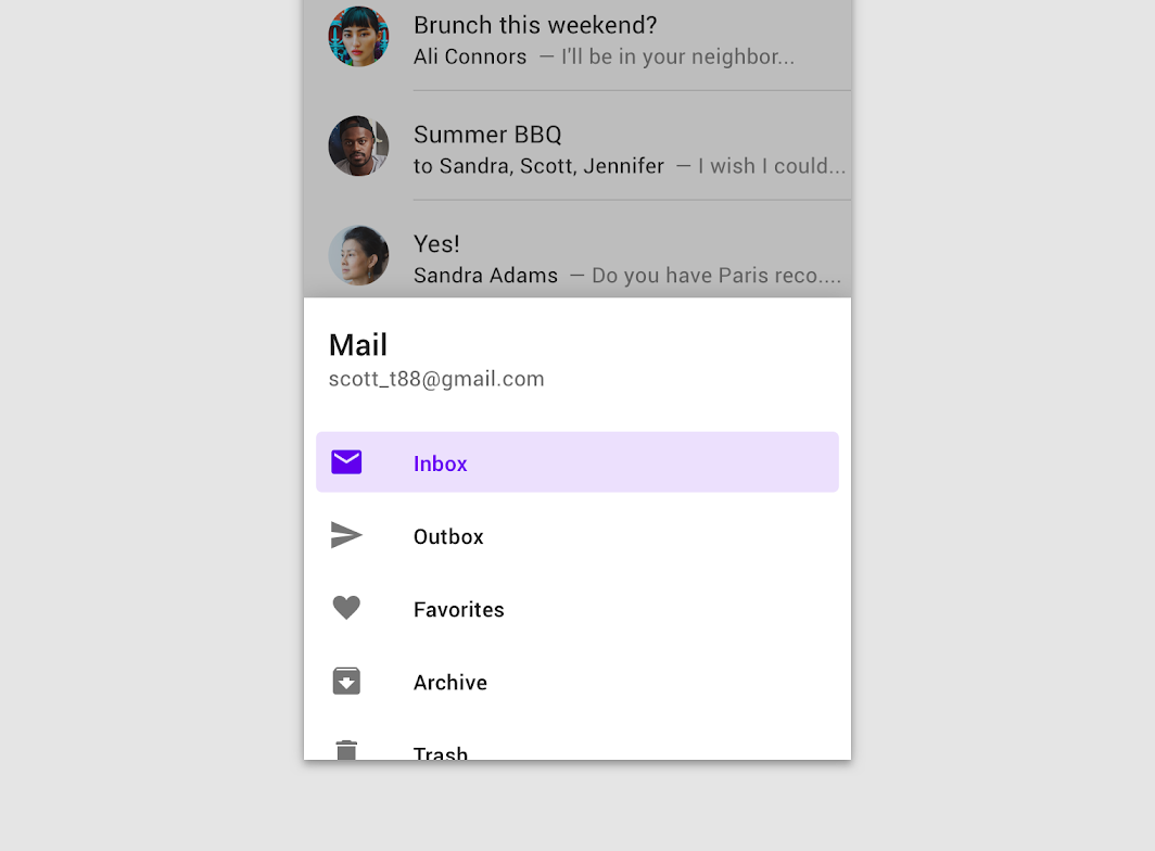
Bottom navigation drawers are modal drawers that are anchored to the bottom of the screen instead of the left or right edge. They are only used with bottom app bars.
These drawers open upon tapping the navigation menu icon in the bottom app bar. They are only for use on mobile.
Behavior
Opening on mobile (portrait orientation)
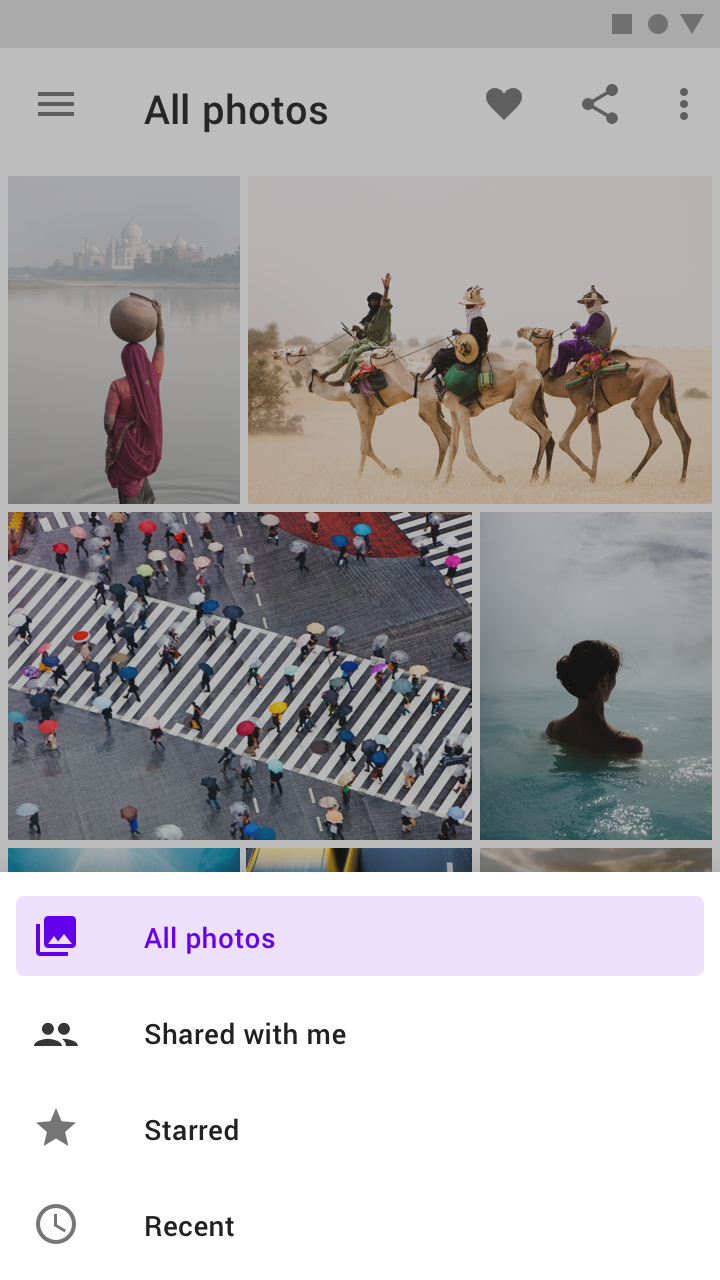
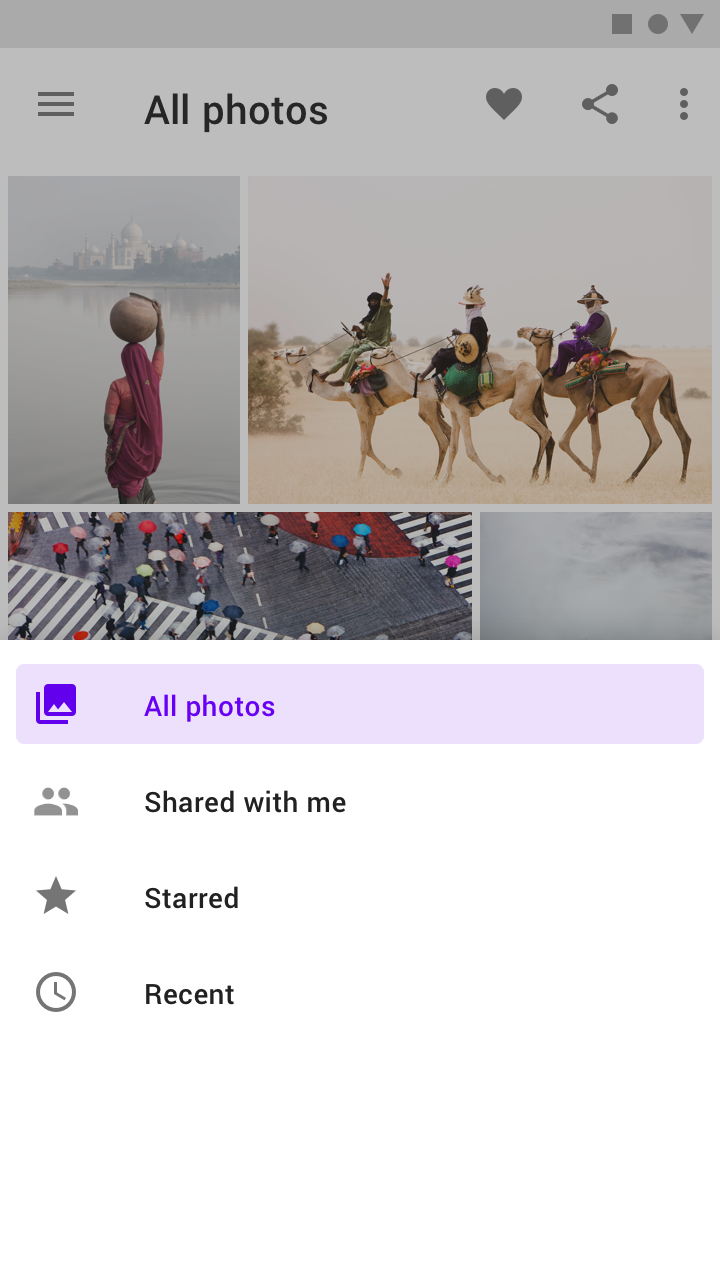
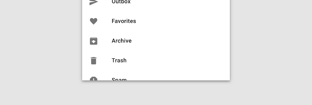
As with other modal bottom sheets, the initial vertical position of a bottom navigation drawer is based on its content and screen height. They initially cannot open above 50% of the screen's height.
- If drawer contents are under 50% of screen height, open the drawer to full height at all times
- If drawer contents are greater than 50% of screen height, open them to 50% initially, then allow a user to drag the drawer upward to its full height or screen height (whichever comes first)
Do
Don't
Do
Opening on mobile (landscape orientation)
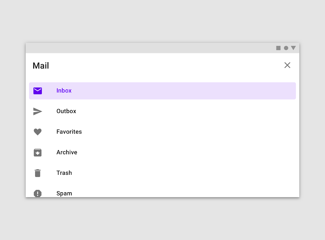
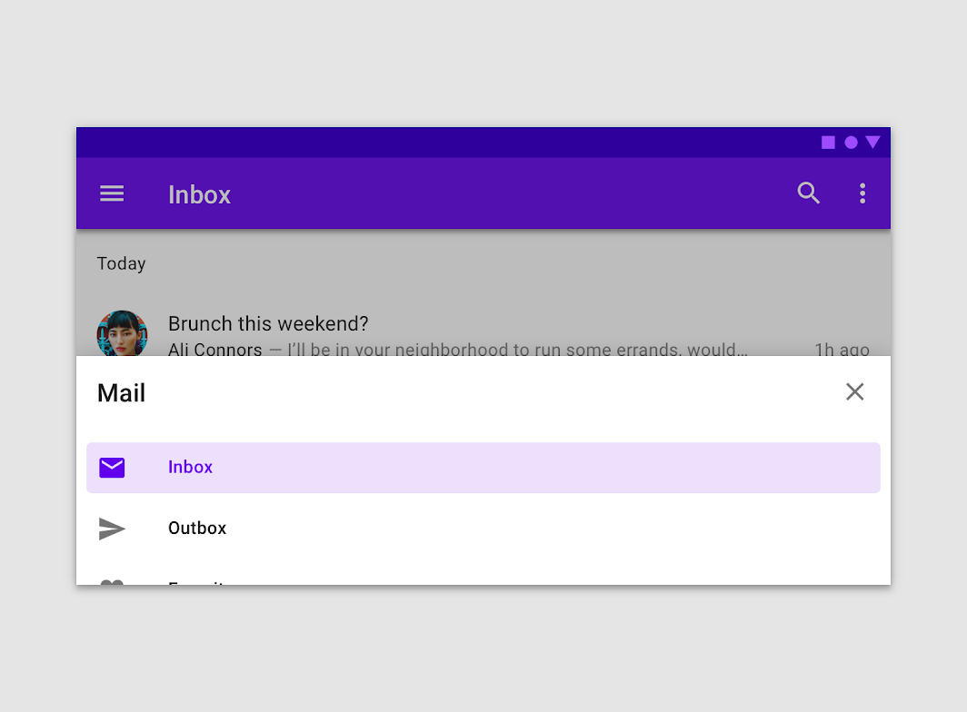
In landscape orientation on mobile, taller bottom navigation drawers automatically open to full-screen mode.
Don't
Scrolling
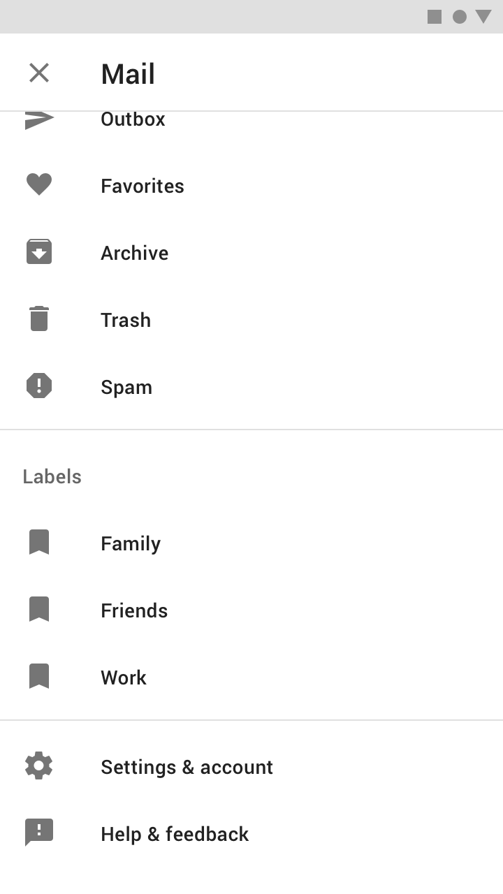
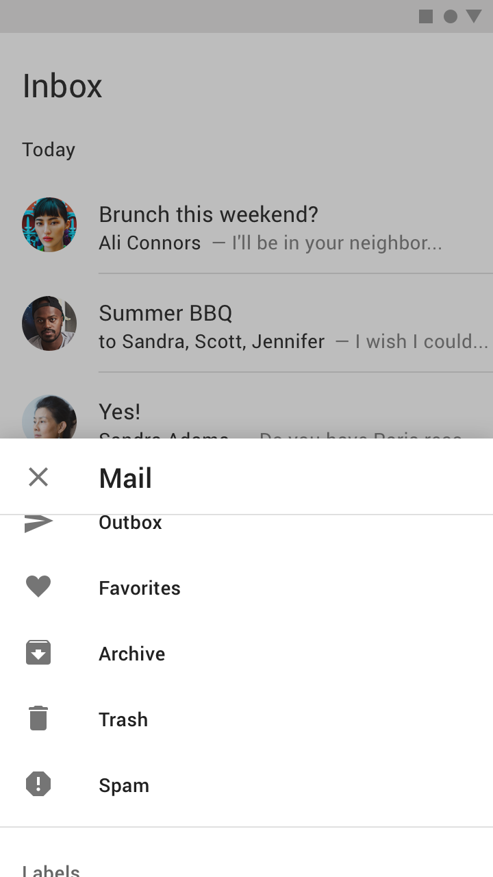
Bottom navigation drawers can be internally scrolled once they have been opened to full screen height.
When initially opened to 50% of the screen height, the drawer must be dragged to screen height before additional items are revealed. Upon scroll, the drawer's header becomes an elevated top app bar with a close affordance.
Do
Don't
Content hierarchy
Because the number of bottom navigation drawer content items aren't all visible at first, the content of the drawer should be ordered as follows:
- List items first that are most likely to be frequently accessed by users
- If an account switcher is used, place it at the top of the drawer
States
The destinations within a navigation drawer take the form of list items. Each item can be activated, inactive, focused, pressed, and hover.
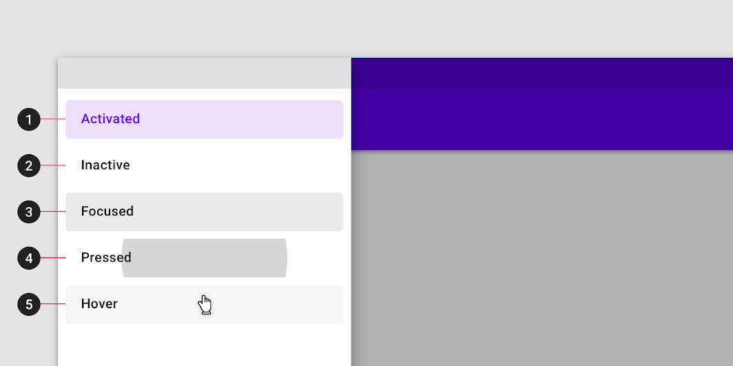
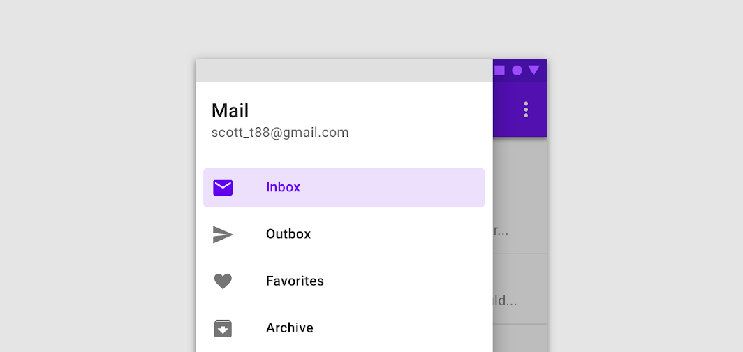
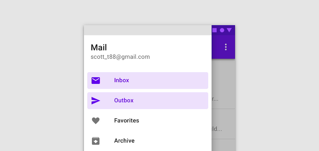
The current screen, or its parent, is represented with an activated state. Only one item in a navigation drawer can be activated at a time. This state should have strong visual contrast from unactivated items.
2. Inactive
Inactive is the default state for items in a navigation drawer.
3. Focus
4. Pressed
5. Hover
Do
Don't
Theming
Fortnightly Material Theme
This news app's modal navigation drawer has been customized using Material Theming. Areas of customization include color and typography.
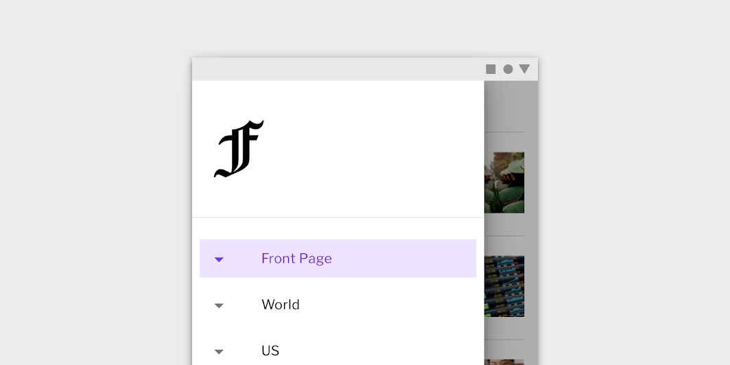
Color
Fortnightly's modal navigation drawer uses custom color on six elements: sheet, activated icon, activated text, activated overlay, navigation item, and scrim.

| Element | Category | Attribute | Value |
|---|---|---|---|
| Container | Surface | Color Opacity | #FFFFFF 100% |
| Activated icon, Activated text | Primary | Color Opacity | #661FFF 100% |
| Activated overlay | Primary | Color Opacity | #661FFF 12% |
| Inactive item | On Surface | Color Opacity | #000000 100% |
| Scrim | On Surface | Color Opacity | #000000 32% |
Typography
Fortnightly's modal navigation drawer text uses custom typography.
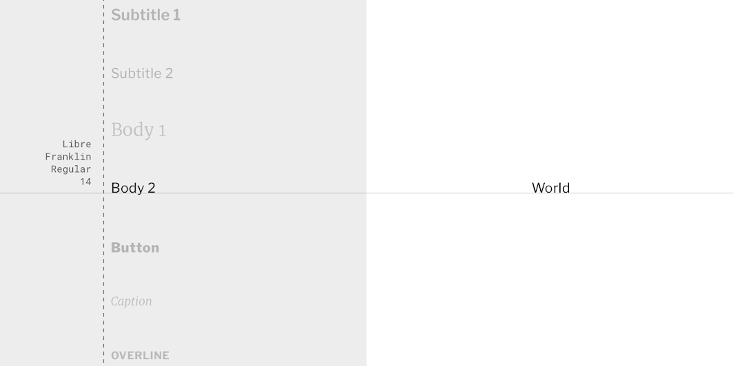
| Element | Category | Attribute | Value |
|---|---|---|---|
| Text | Body 2 | Typeface Font Size Case | Libre Franklin Regular 14 Title case |
Shape
Fortnightly's side navigation drawer container has custom corners, with cut corner shapes.
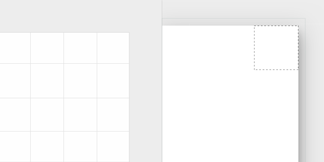
| Element | Category | Attribute | Value |
|---|---|---|---|
| Container | Large component | Family Size | Cut n/a; 0;0; n/a dp* |
Posivibes Material Theme
This social media app's bottom navigation drawer has been customized using Material Theming. Areas of customization include color and typography.
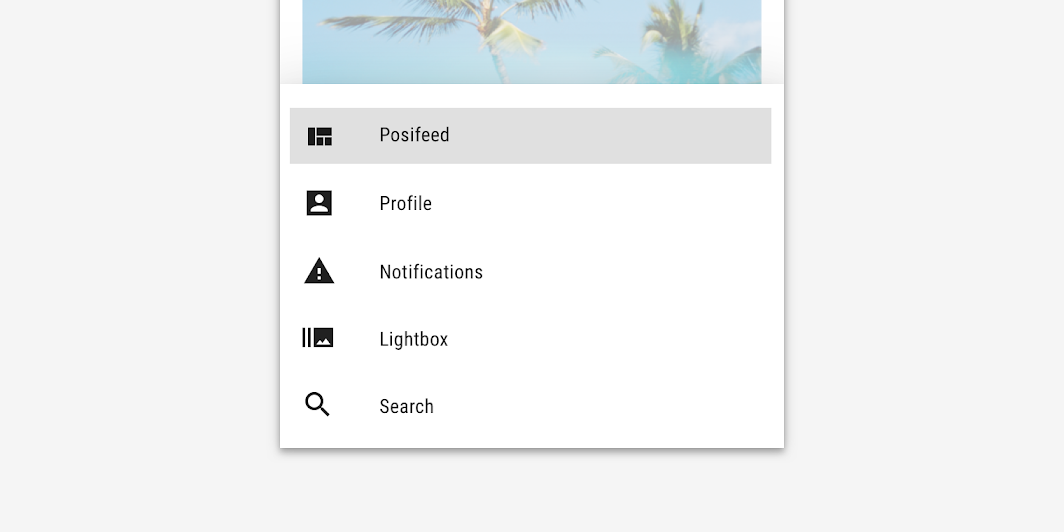
Color
Posivibes' bottom navigation drawer uses custom color on six elements: sheet, activated icon, activated text, activated overlay, navigation item, and scrim.

| Element | Category | Attribute | Value |
|---|---|---|---|
| Container | Surface | Color Opacity | #FFFFFF 100% |
| Activated icon, Activated text | Primary | Color Opacity | #000000 100% |
| Activated overlay | Primary | Color Opacity | #000000 12% |
| Inactive item | On Surface | Color Opacity | #000000 100% |
| Scrim | On Surface | Color Opacity | #FFFFFF 60% |
Typography
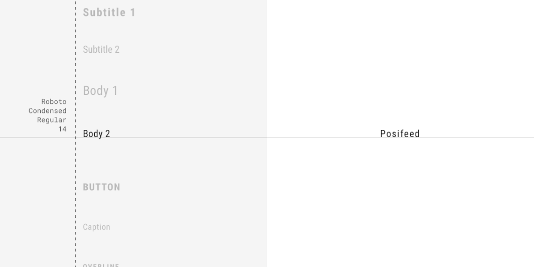
Posivibes' bottom navigation drawer text uses custom typography.
| Element | Category | Attribute | Value |
|---|---|---|---|
| Text | Body 2 | Typeface Font Size Case | Roboto Condensed Regular 14 Title case |
Shape
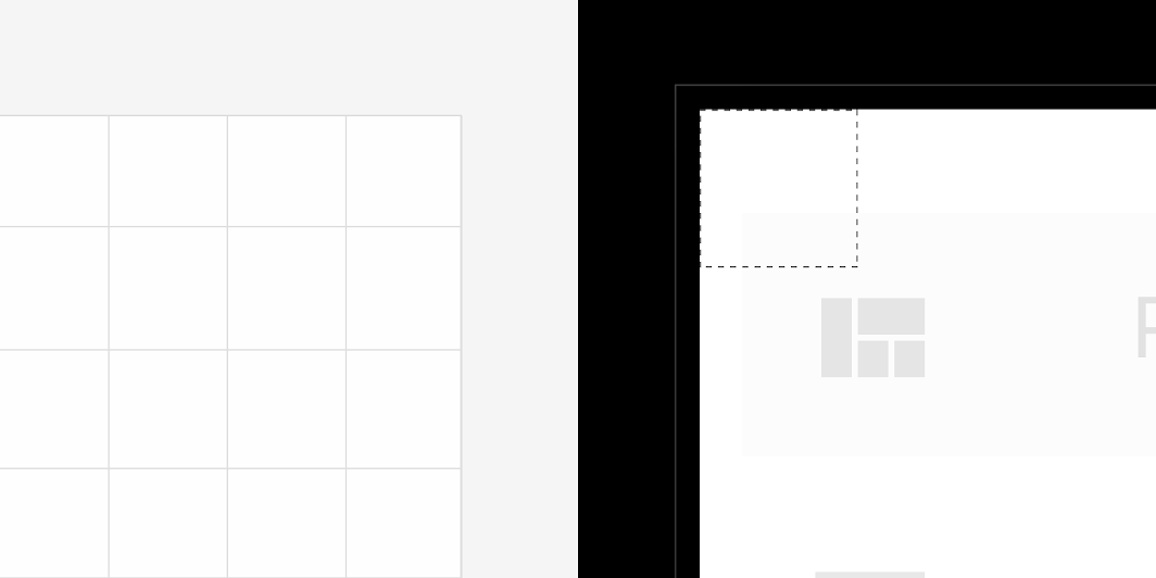
Posivibes' bottom navigation drawer container has custom corners, with cut corner shapes.
| Element | Category | Attribute | Value |
|---|---|---|---|
| Container | Large component | Family Size | Cut 0;0; n/a; n/a dp* |
Specs
Standard navigation drawer
Modal navigation drawer
Bottom navigation drawer