Skip to content
Material Design 2
Main Navigation
v3
v2
v1

English

简体中文
繁體中文
Español
Français
Русский
Português – Brasil
Deutsch
日本語
한국어
Italiano
Polski
Türkçe
čeština
magyar

English

简体中文
繁體中文
Español
Français
Русский
Português – Brasil
Deutsch
日本語
한국어
Italiano
Polski
Türkçe
čeština
magyar

Appearance

Sidebar Navigation

Material System

Introduction

Material studies

About our Material studies

Basil

Crane

Fortnightly

Owl

Rally

Reply

Shrine

Material Foundation

Environment

Surfaces

Elevation

Light and shadows

Layout

Understanding layout

Pixel density

Responsive layout grid

Spacing methods

Component behavior

Applying density

Navigation

Understanding navigation

Navigation transitions

Search

Color

The color system

Applying color to UI

Color usage

Text legibility

Dark theme

Typography

The type system

Understanding typography

Language support

Sound

About sound

Applying sound to UI

Sound attributes

Sound choreography

Iconography

Product icons

System icons

Animated icons

Shape

About shape

Shape and hierarchy

Shape as expression

Shape and motion

Applying shape to UI

Motion

Understanding motion

The motion system

Speed

Choreography

Customization

Interaction

Gestures

Selection

States

Communication

Confirmation & acknowledgement

Data formats

Data visualization

Empty states

Help & feedback

Imagery

Launch screen

Onboarding

Offline states

Writing

Machine learning

Machine learning patterns

Object detection: live camera

Object detection: static image

Barcode Scanning

Material Guidelines

Material Theming

Overview

Implementing your theme

Usability

Accessibility

Bidirectionality

Platform guidance

Android bars

Android fingerprint

Android haptics

Android icons

Android navigating between apps

Android notifications

Android permissions

Android slices

Android split-screen

Android swipe-to-refresh

Android text selection toolbar

Android widget

Cross-platform adaptation

Components

App bars: bottom

App bars: top

Backdrop

Banners

Bottom navigation

Buttons

Buttons: floating action button

Cards

Checkboxes

Chips

Data tables

Date pickers

Dialogs

Dividers

Image lists

Lists

Menus

Navigation drawer

Navigation rail

Progress indicators

Radio buttons

Sheets: bottom

Sheets: side

Sliders

Snackbars

Switches

Tabs

Text fields

Time pickers

Tooltips

On this page

Tabs ​

Tabs organize content across different screens, data sets, and other interactions.

Interactive demo ​

This demo lets you preview the tab component, its variations, and configuration options. Each tab displays a different type of tab.

Usage ​

Tabs organize and allow navigation between groups of content that are related and at the same level of hierarchy.

Tabs in a set ​

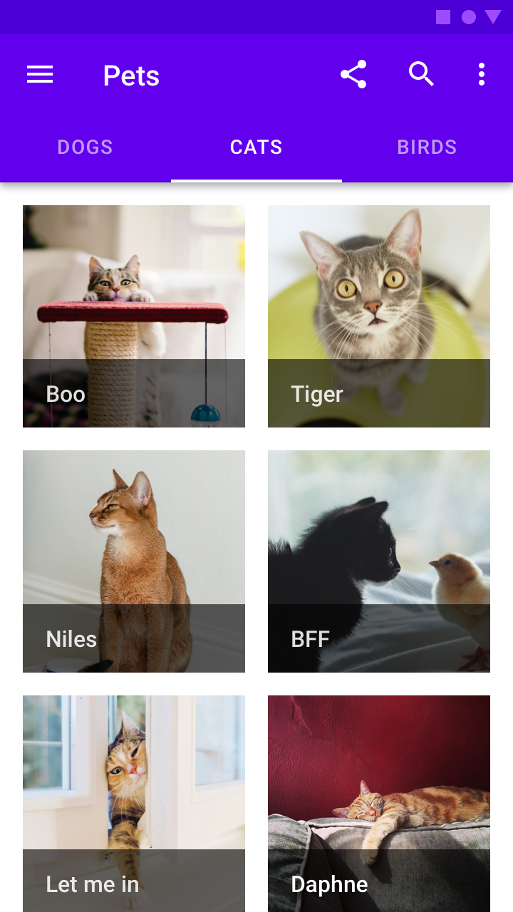
Each tab should contain content that is distinct from other tabs in a set. For example, tabs can present different sections of news, different genres of music, or different themes of documents.

Do: tab labels can include icons and text

Do

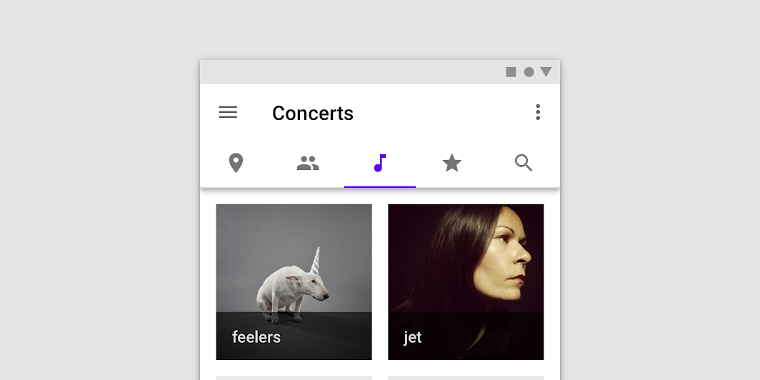
Tab labels can include icons and text. Text labels should be short.
Don’t use tabs to move through sequential content that needs to be read in a particular order

Don't

Don’t use tabs to move through sequential content that needs to be read in a particular order.

Do: present tabs as a single row above their associated content

Do

Present tabs as a single row above their associated content.
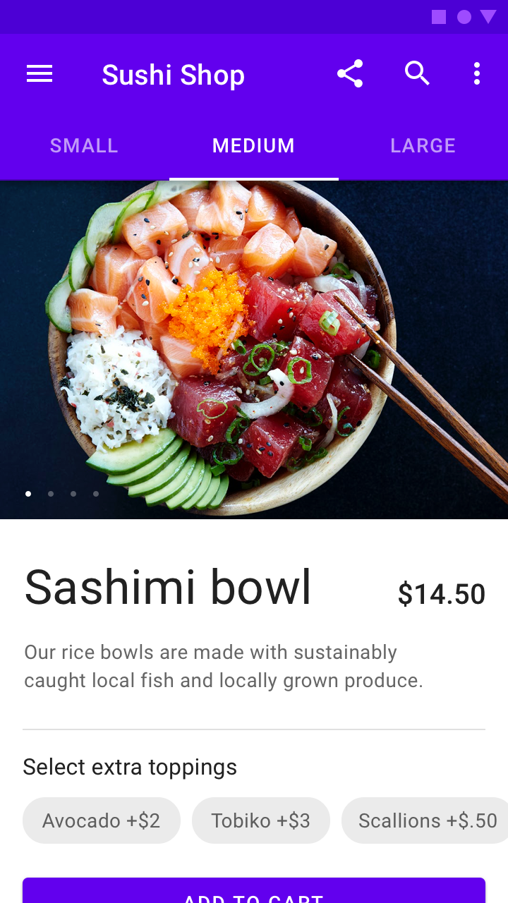
Don't: avoid using tabs for comparing content across multiple tabs, such as different sizes of the same item

Don't

Avoid using tabs for comparing content across multiple tabs, such as different sizes of the same item.

Combinations with other components ​

Tabs can be paired with components like top app bars, or nested in components like cards and sheets.


Understanding navigation

Enable users to move through an app.

Related link

Principles ​


Tab principle: scalable

Scalable

As tabs can horizontally scroll, a UI can have as many tabs as needed.
Tab principle: informative

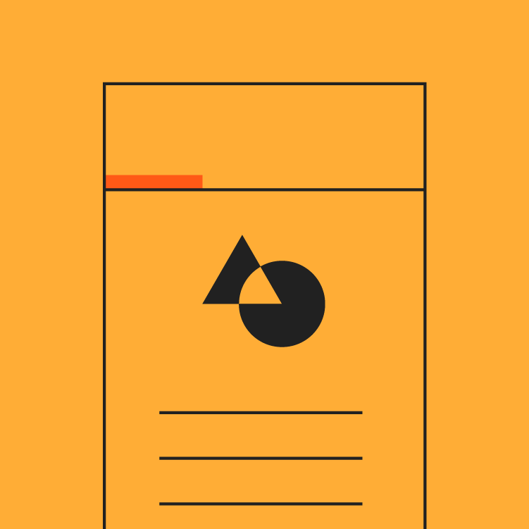
Informative

Tabs organize content into categories to help users easily find different types of information.
Tab principle: peers

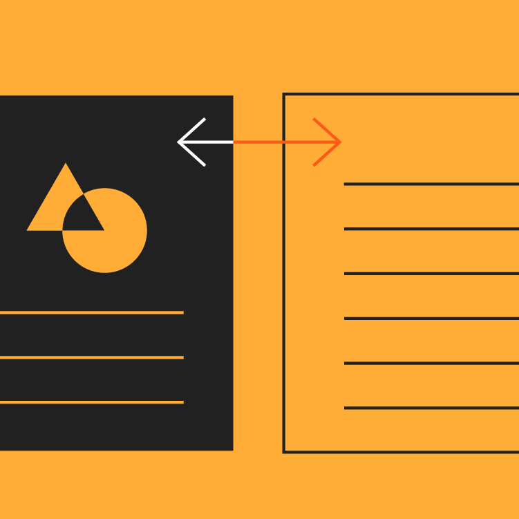
Peers

Tabs are displayed next to each other as peers, in categories of equal importance.

Types ​

Fixed tabs ​

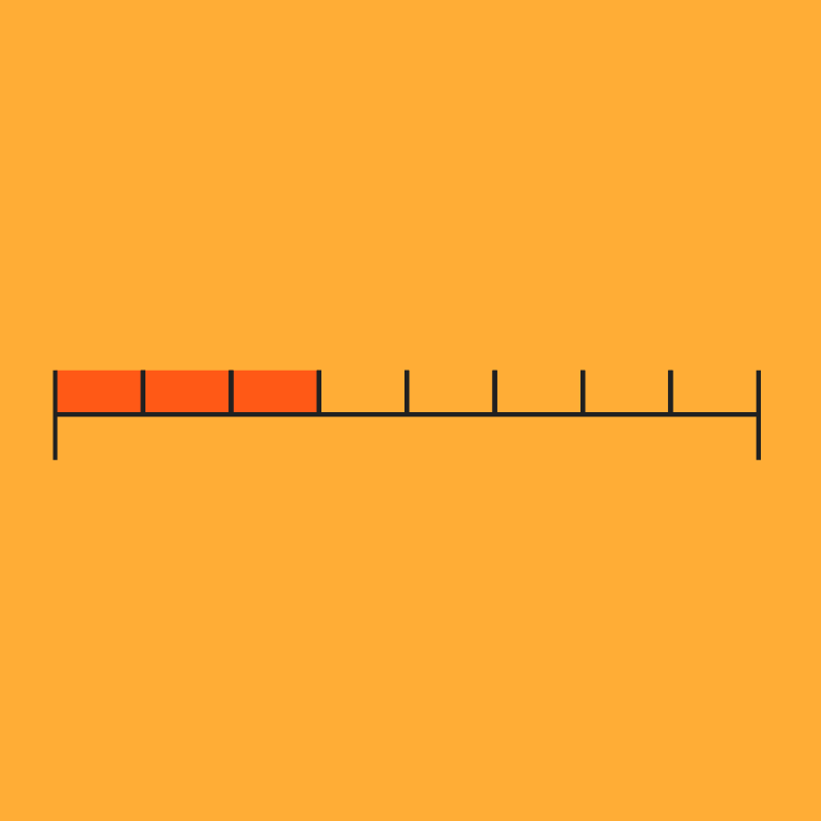
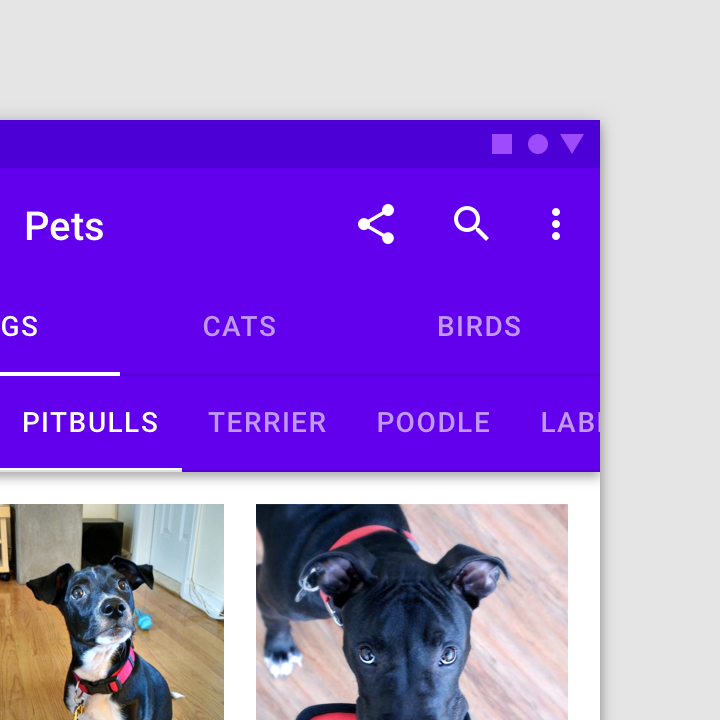
Fixed tabs display all tabs on one screen, with each tab at a fixed width. The width of each tab is determined by dividing the number of tabs by the screen width. They don’t scroll to reveal more tabs; the visible tab set represents the only tabs available.
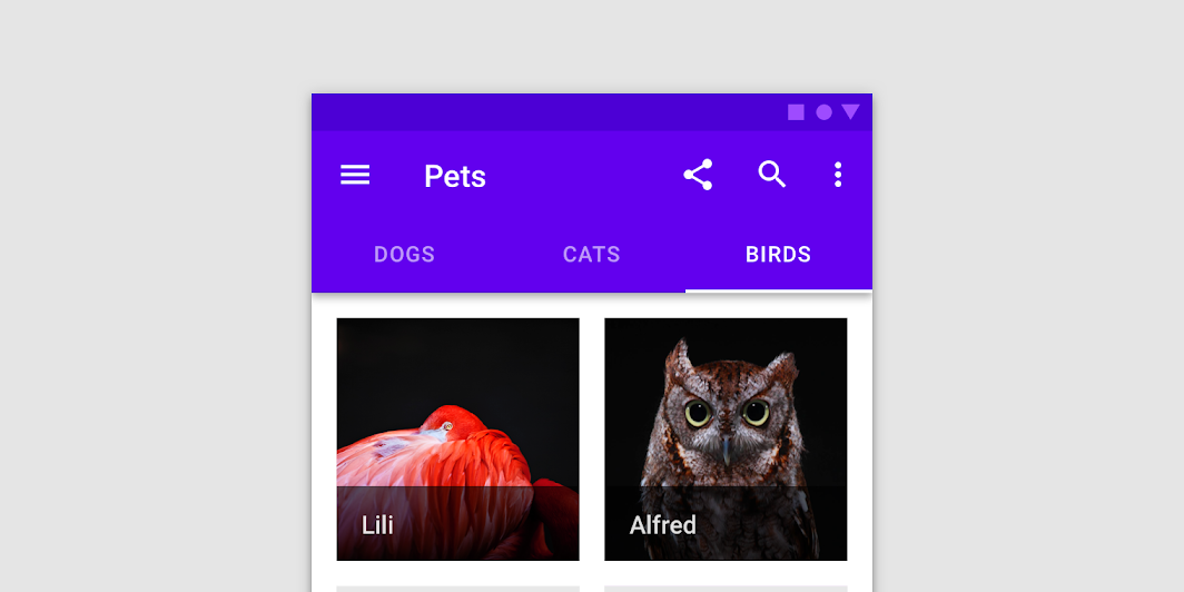
Fixed tabs

Scrollable tabs ​

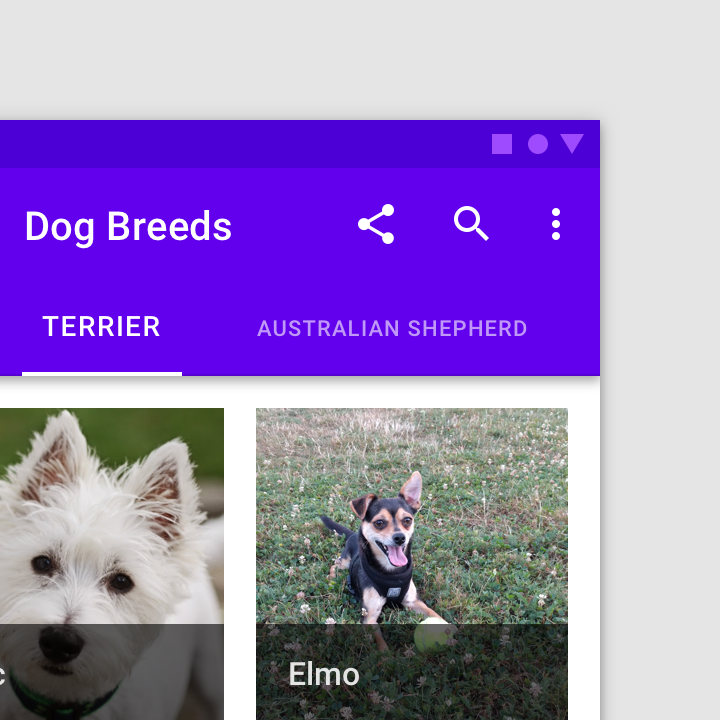
Scrollable tabs are displayed without fixed widths. They are scrollable, such that some tabs will remain off-screen until scrolled.
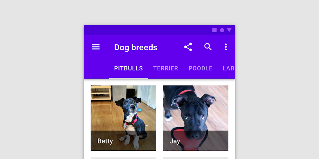
Scrollable tabs

Anatomy ​

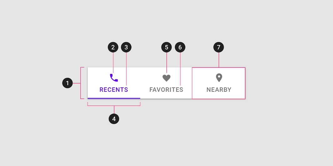
Diagram of container, active icon, active text label, active tab indicator, inactive icon, inactive text label, tab item
1.Container
2.Active icon (Optional if there’s a label)
3.Active text label (Optional if there’s an icon)
4.Active tab indicator
5.Inactive icon (Optional if there’s a label)
6.Inactive text label (Optional if there’s an icon)
7.Tab item

Text label ​

Text labels should clearly and succinctly describe the content of the tab they represent. Tab content should contain a cohesive set of items that share a common characteristic.

Tab labels appear in a single row. They can use a second line if needed, with truncated text. Alternatively, you can use scrollable tabs to allow room for longer titles.
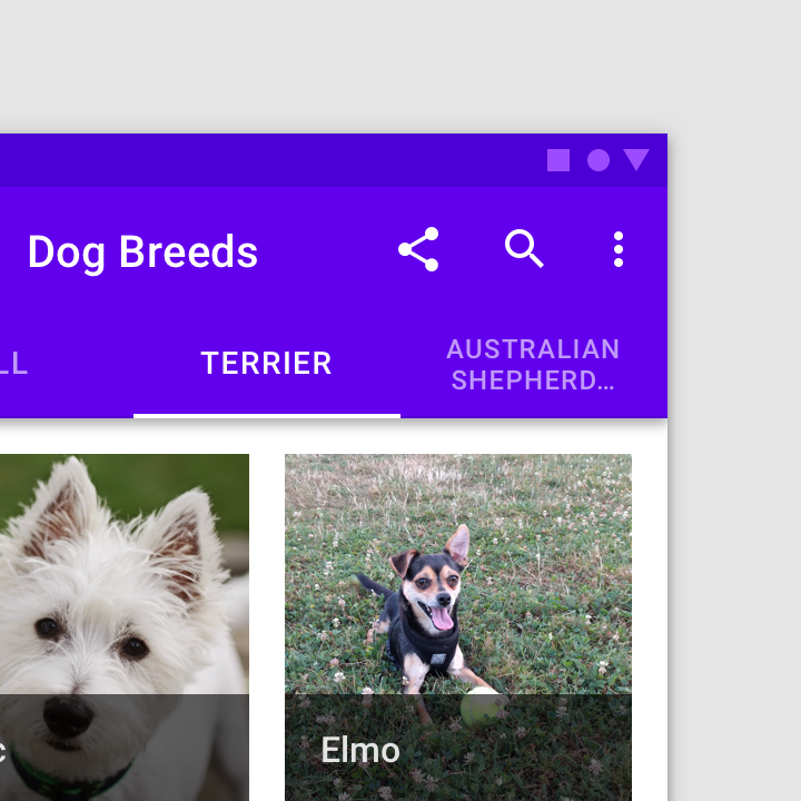
Caution: although label text can wrap to a second line, scrollable tabs confine text to a single row

Caution

Although label text can wrap to a second line, scrollable tabs confine text to a single row.
Don’t resize text labels to fit them onto a single line

Don't

Don’t resize text labels to fit them onto a single line. If labels are too long, wrap text to a second line or use scrollable tabs.

Don’t truncate labels unless required, as truncated text can impede comprehension

Don't

Don’t truncate labels unless required, as truncated text can impede comprehension.
Don’t mix tabs that contain only text, with tabs that contain only icons

Don't

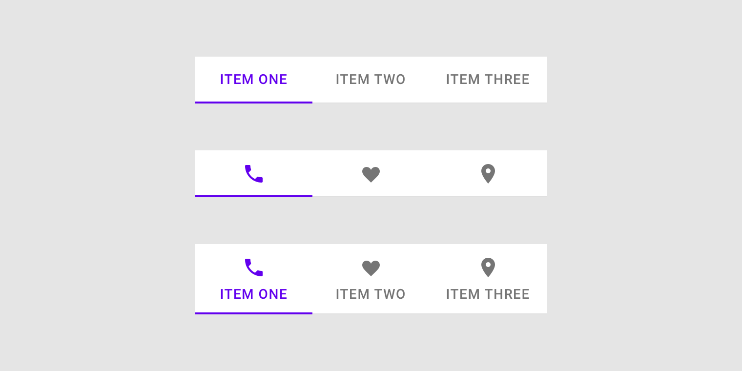
Don’t mix tabs that contain only text, with tabs that contain only icons. Use either all text labels, all icon labels, or both, across all labels.

Icons ​

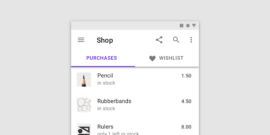
Icons communicate the type of content a tab represents in a simple, recognizable way. However, they aren’t as effective as text labels at communicating complex content.
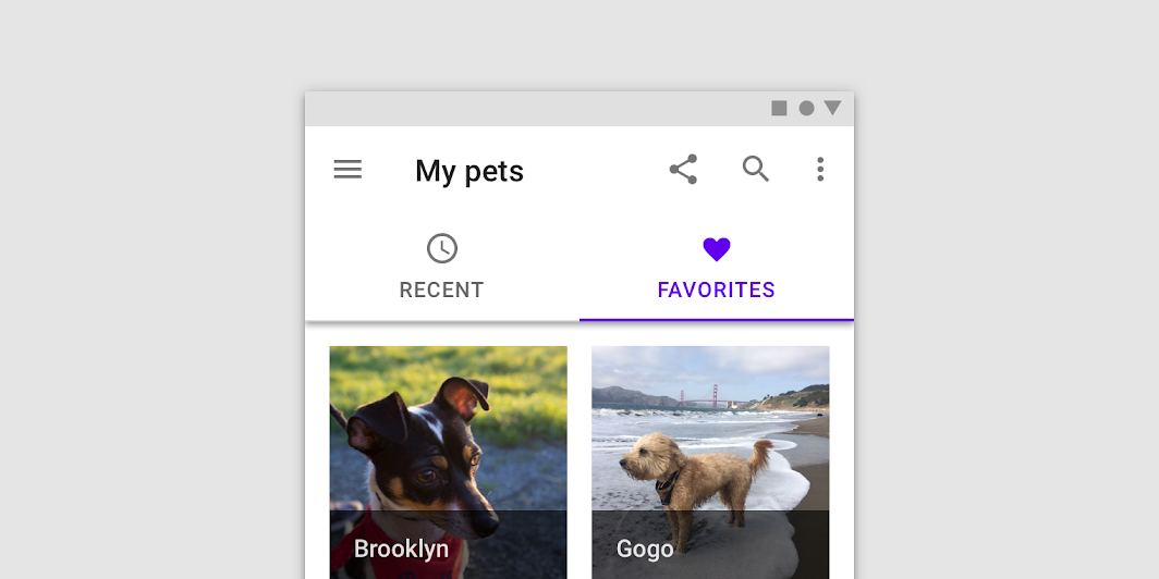
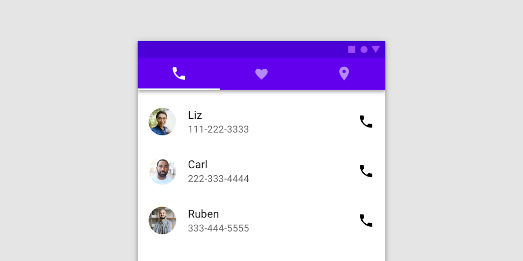
Tabs can use a combination of labels and icons
Tabs can use a combination of labels and icons.

Do: tabs can use icons to communicate content

Do

Tabs can use icons to communicate content.

Don’t use tabs with both icons and text labels on only some tabs, but not others

Don't

Don’t use tabs with both icons and text labels on only some tabs, but not others.

Caution: use caution when only representing tab content with icons, as an icon’s meaning may not be clear on every topic

Caution

Use caution when only representing tab content with icons, as an icon’s meaning may not be clear on every topic.

Active tab indicators ​

To differentiate an active tab from an inactive tab, apply an underline and color change to the active tab’s text and icon.
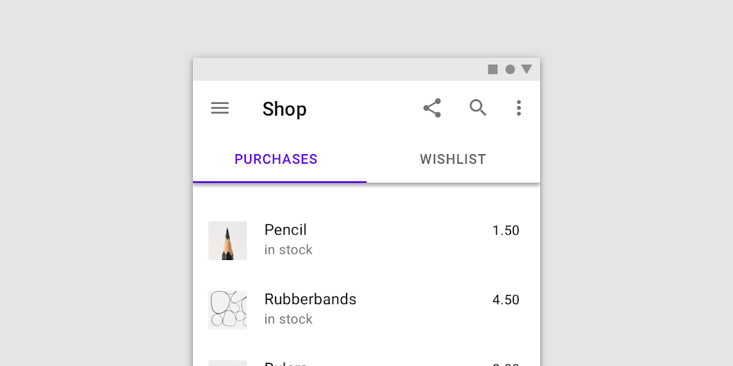
An underline and color change differentiate an active tab from the inactive ones
An underline and color change differentiate an active tab from the inactive ones.

Behavior ​

Moving between tabs ​

Users can navigate between tabs by tapping a tab, or by performing a swipe gesture over content.


Tap a tab

Navigate to a tab by tapping on it.


Swipe within the content area

To navigate between tabs, users can swipe left or right within the content area.

Use caution when placing other swipeable content (such as interactive maps or list items) in the content area.


Caution

Use caution when placing swipeable content in UIs that have tabs, as users could easily swipe the wrong component.

Don't

Avoid placing swipeable items in the content area of a UI that has tabs, as the user may mistakenly swipe the wrong component.

Scrolling ​

When a screen scrolls, tabs can either be fixed to the top of the screen, or scroll off the screen. If they scroll off the screen, they will return when the user scrolls upward.

When tabs are attached to a top app bar, they can scroll off the screen with the bar and lock in place at the top of the screen.

Tabs can scroll offscreen on scroll, and reappear when the page is scrolled up.

Don't

Don’t scroll tabs behind a top app bar. When tabs are attached to a component, they should appear and move as a single unit.

Scaling and adaptation ​

Size constraints ​

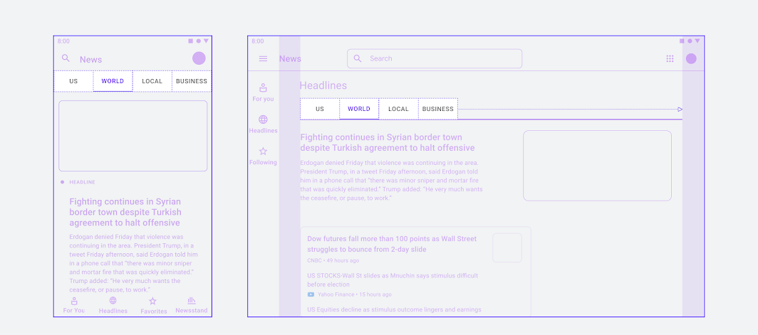
For fixed tabs, the maximum width for each tab should be determined by the width of the widest tab. The group of tabs should use a fluid margin and align to the center or leading edge of the body region.
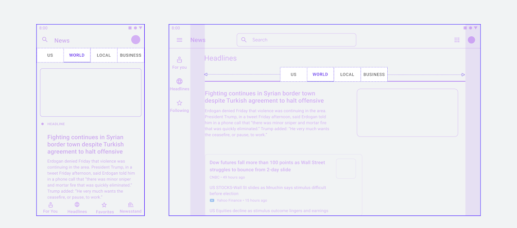
At larger breakpoints, the minimum tab width can be increased and the tab group can be positioned in the center
At larger breakpoints, the minimum tab width can be increased and the tab group can be positioned in the center.

Tab groups can also align to the leading edge of the container, as seen in the diagram of a larger layout on the right
Tab groups can also align to the leading edge of the container, as seen in the diagram of a larger layout on the right.

Placement ​

Tab layout ​

Tabs are displayed in a single row, with each tab connected to the content it represents. As a set, all tabs are unified by a shared topic.
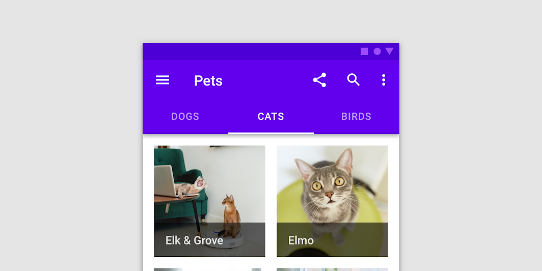
Place tabs above content
Place tabs above content.

Caution: avoid nesting a tab within another tab

Caution

Avoid nesting a tab within another tab.
Don’t place tabs below one another

Don't

Don’t place tabs below one another.

Tab placement ​

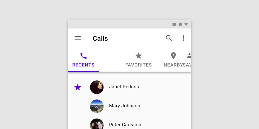
Tabs can be joined with components like top app bars, embedded in a specific UI region, or nested into components like cards and sheets. Tabs control the UI region displayed below them.
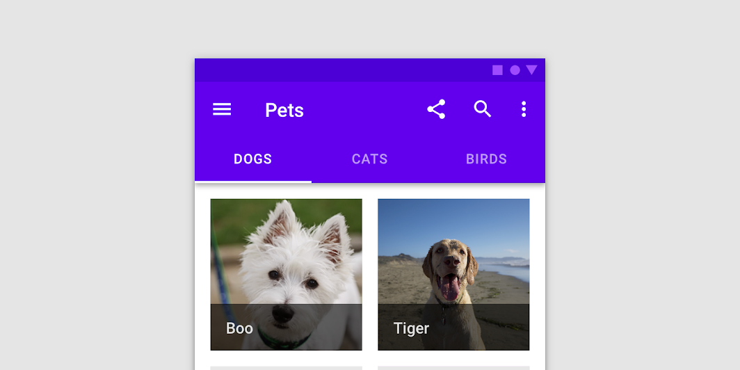
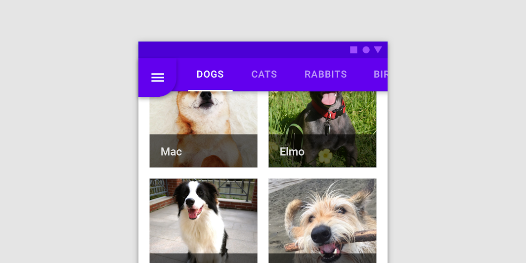
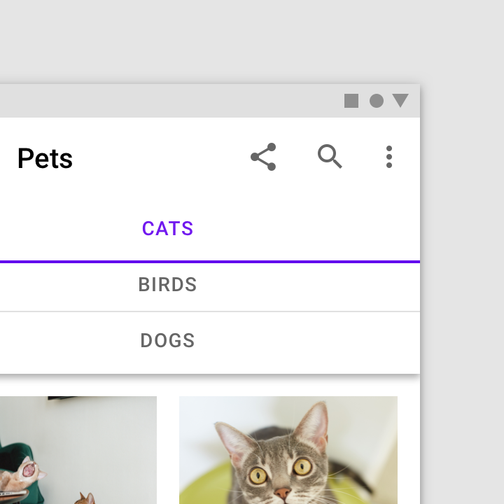
Tabs below a top app bar

Don’t use tabs with short top app bars, or top app bars that transition to short top app bars on scroll

Don't

Don’t use tabs with short top app bars, or top app bars that transition to short top app bars on scroll.

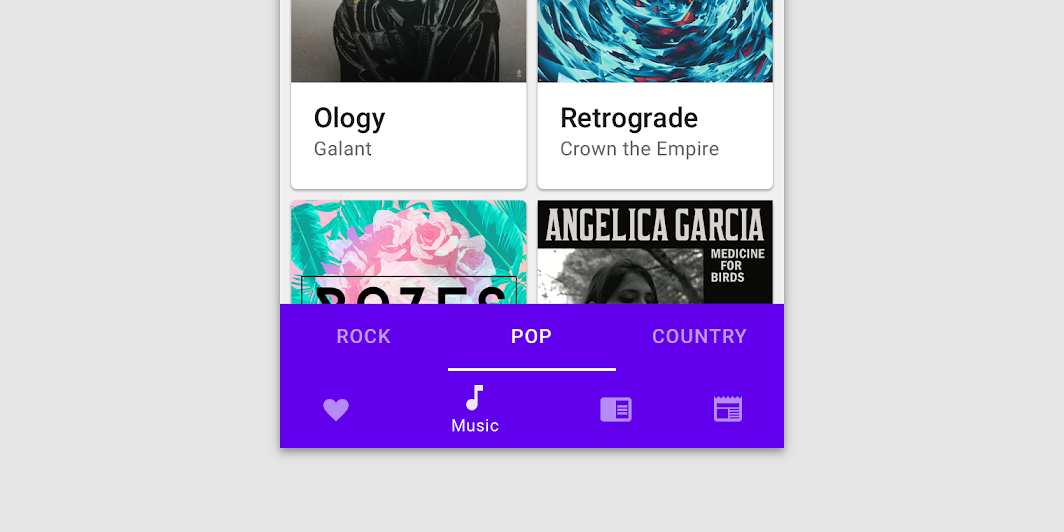
Don’t attach tabs to bottom navigation as it can cause confusion about what action or tab controls which content

Don't

Don’t attach tabs to bottom navigation as it can cause confusion about what action or tab controls which content.

Tabs can be embedded in a specific UI region in order to control the content displayed in that region.
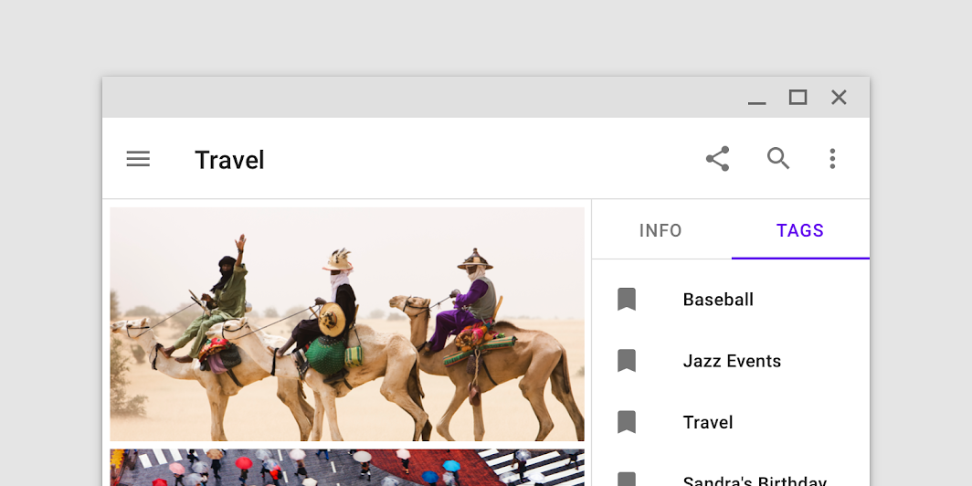
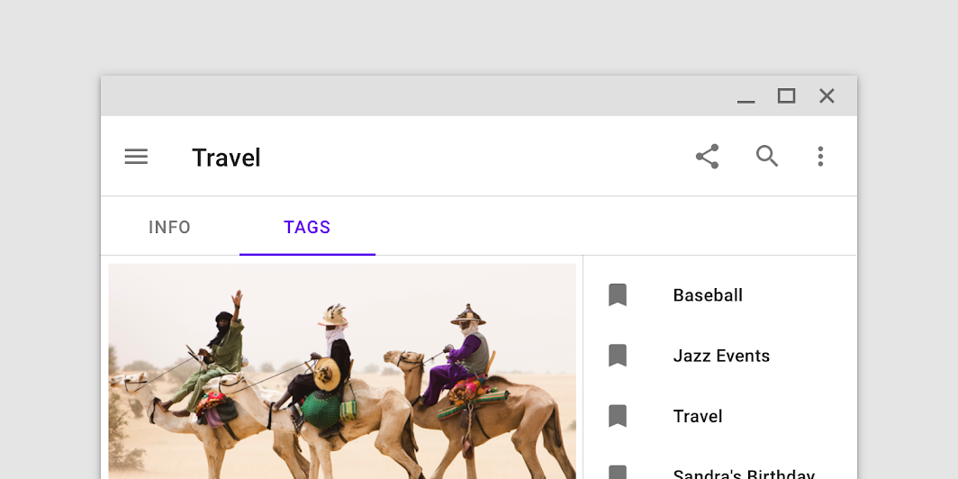
Tabs embedded in a column, the content of which they can control when tapped
Tabs embedded in a column, the content of which they can control when tapped. Scaled down to 62.5%

Don’t place tabs above content that they don’t control

Don't

Don’t place tabs above content that they don’t control. If tabs only change a section of the UI, embed them within that section. Scaled down to 62.5%

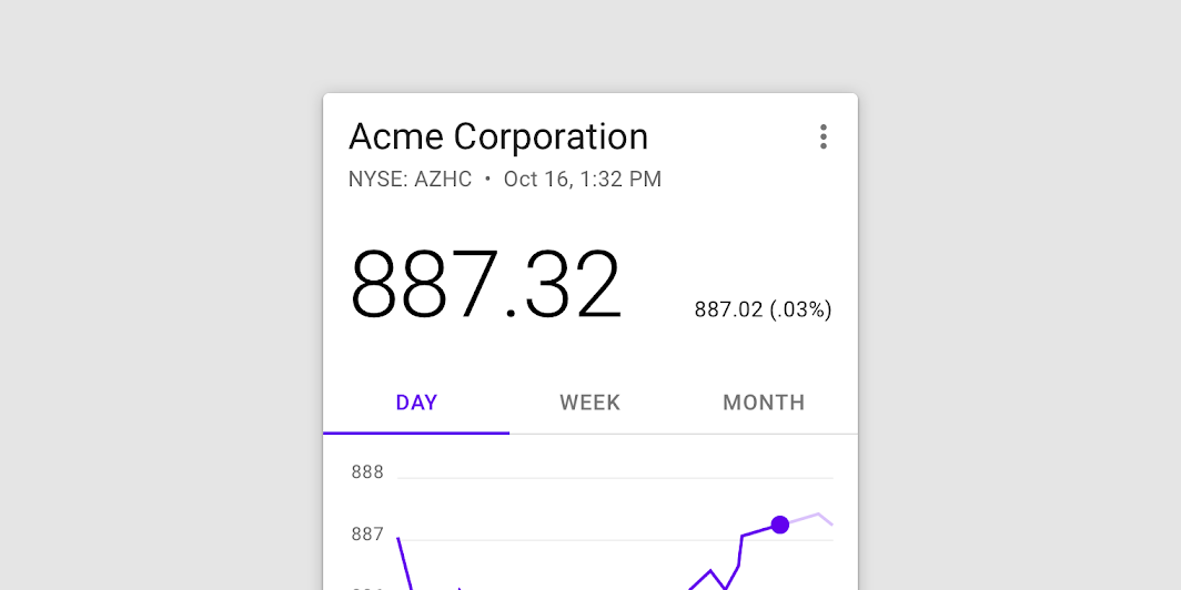
Tabs nested in a card

Tabs nested in a sheet

Top app bar

The top app bar displays information and actions relating to the current view.

Related article

Cards

Containing content & links on a single subject

Related article

Side sheets

Surfaces containing supplementary content that are anchored to the left or right edge of the screen.

Related article

Fixed tabs ​

Usage ​

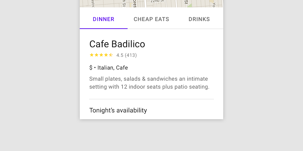
Fixed tabs display all tabs in a set simultaneously. They are best for switching between related content quickly, such as between transportation methods in a map. To navigate between fixed tabs, tap an individual tab, or swipe left or right in the content area.
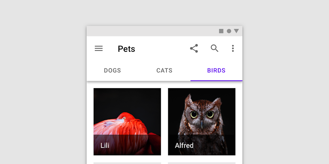
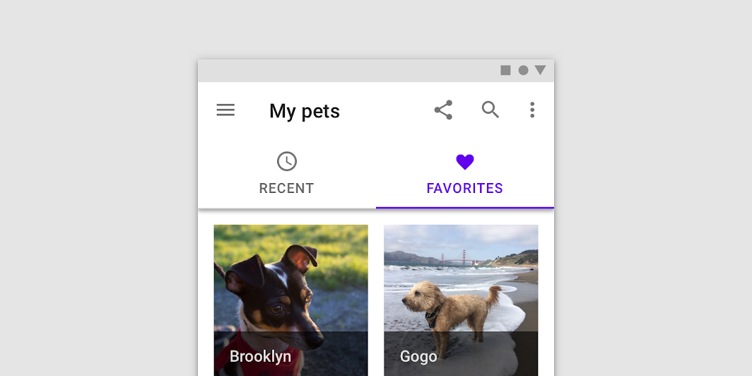
Use fixed tabs when displaying a limited number of categories
Use fixed tabs when displaying a limited number of categories.

A fixed tab bar using iconography and labels

Placement ​

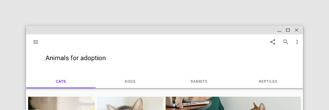
Fixed tabs have equal width, which can be calculated either as:

  • The width of the screen divided by the number of tabs
  • The width of the widest tab label

When using fixed tabs, ensure they can all be seen on mobile, without truncating their text. Don’t use more than four fixed tabs at once.
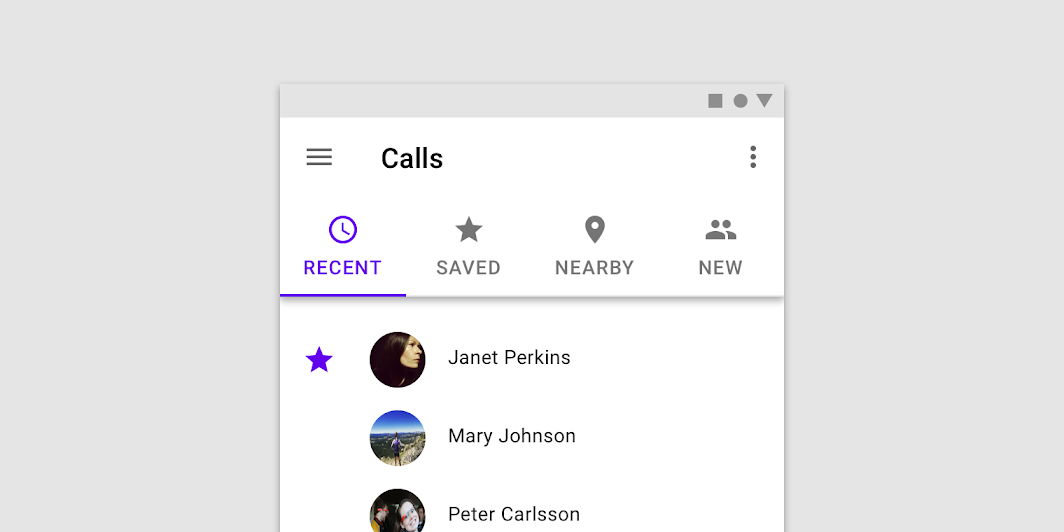
Don’t use more than four fixed tabs in a set., Reduced in size to 62.5%
Don’t use more than four fixed tabs in a set.
Reduced in size to 62.5%

On wider layouts, fixed tabs increase in width, as their tab width is determined by the width of the screen
On wider layouts, fixed tabs increase in width, as their tab width is determined by the width of the screen.
Reduced in size to 62.5%

Caution: avoid letting fixed tabs cause confusion with content

Caution

Avoid letting fixed tabs cause confusion with content. These tab widths align to closely to the columns in this layout, such that the relationship between tabs and content could be misinterpreted.

Clustered fixed tabs ​

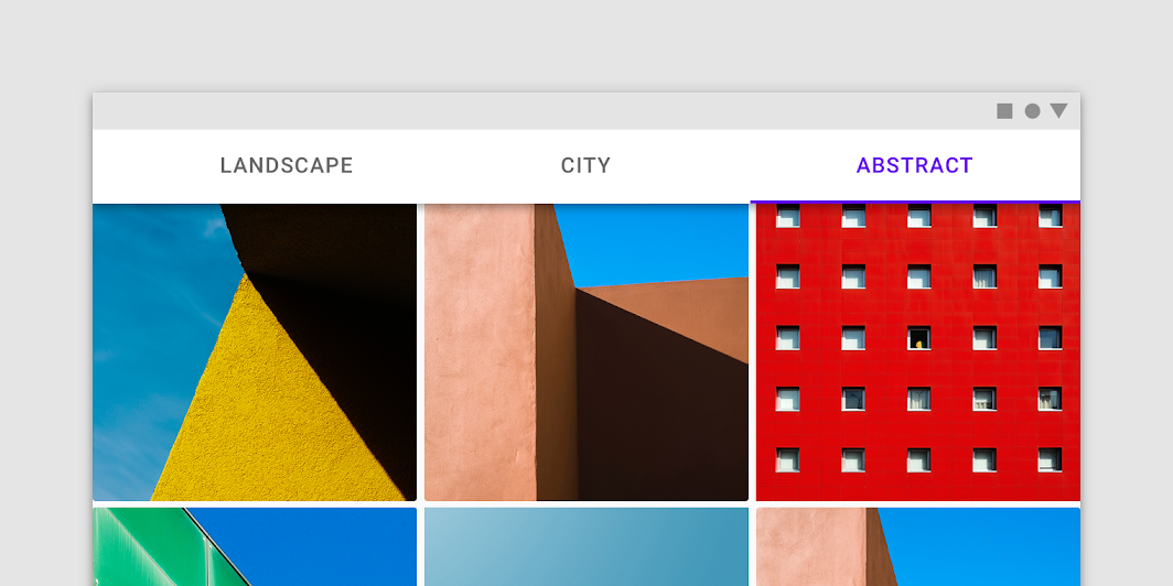
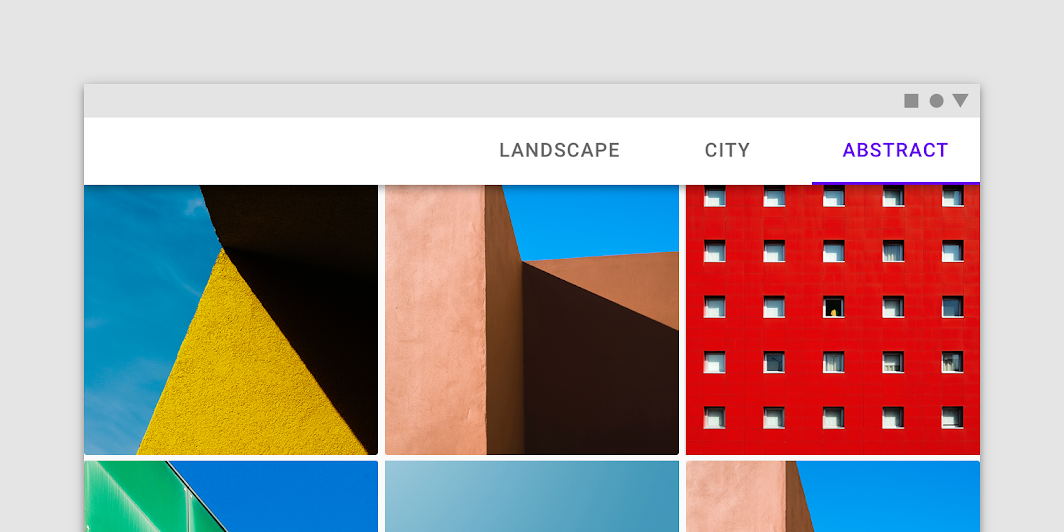
Clustered fixed tabs aren’t divided equally across the screen. The tab bar is centered, right-aligned, or left-aligned.

Clustered fixed tabs should be used in wide horizontal layouts, such as landscape mode.
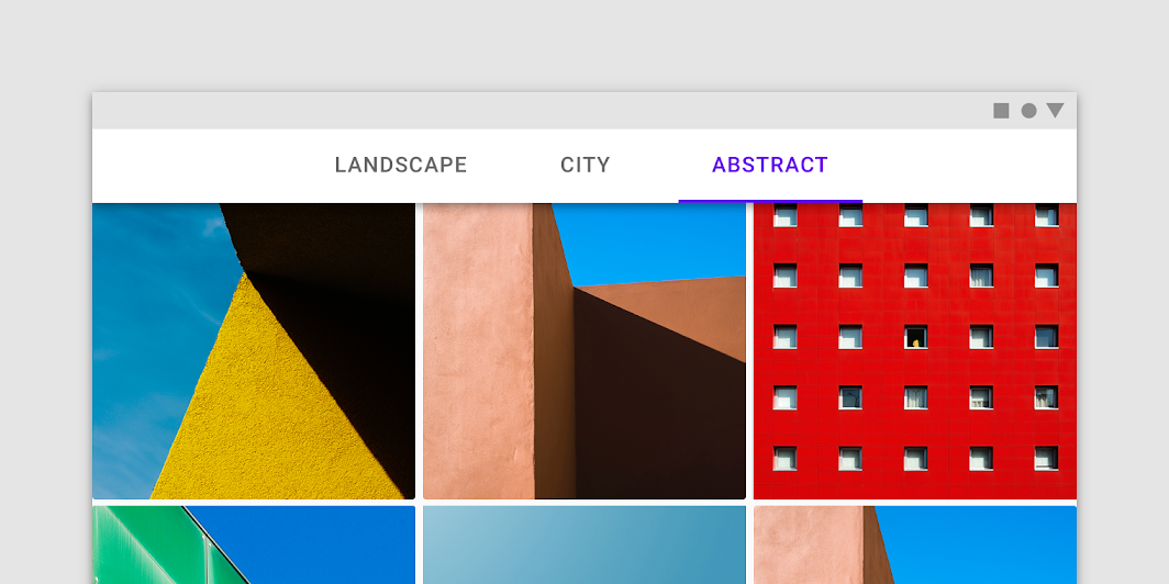
On wider layouts, tabs may be centered on the tab bar
On wider layouts, tabs may be centered on the tab bar.

Fixed tabs in a cluster can be aligned to the left or right
Fixed tabs in a cluster can be aligned to the left or right.

Scrollable tabs ​

Usage ​

When a set of tabs cannot fit on screen, use scrollable tabs. Scrollable tabs can use longer text labels and a larger number of tabs. They are best used for browsing on touch interfaces.
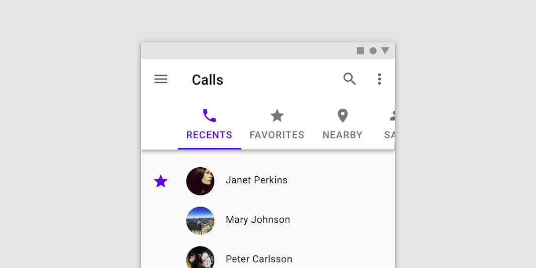
A set of scrollable tabs

Placement ​

Scrollable tabs display a subset of all tabs at once. The width of each tab is defined by the length of its text label.
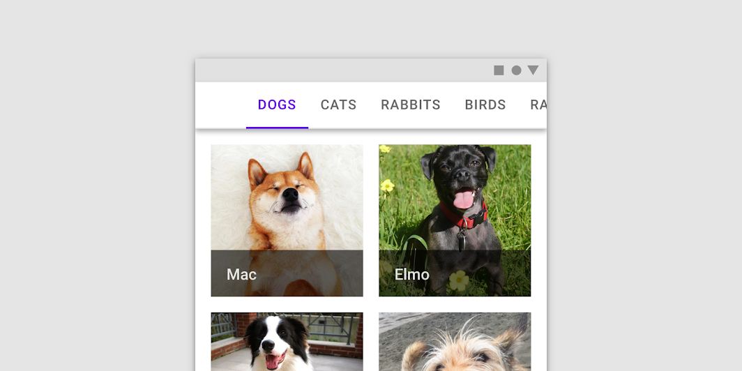
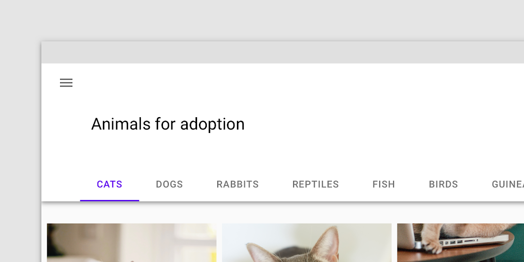
Usage: scrollable tabs

Do: on mobile and desktop, offset the first tab on the left to signal that tabs are scrollable

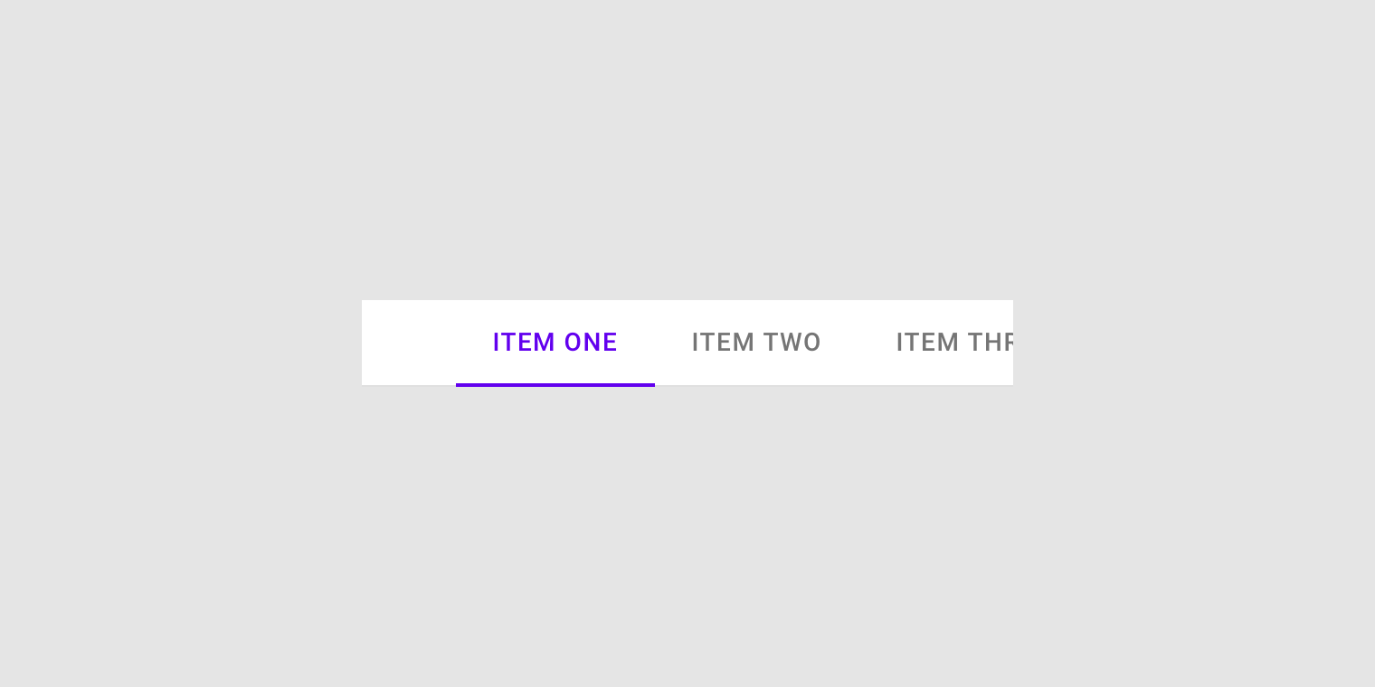
Do

On mobile and desktop, offset the first tab on the left to signal that tabs are scrollable.

Don't: avoid using inconsistent padding on each tab

Don't

Avoid using inconsistent padding on each tab.

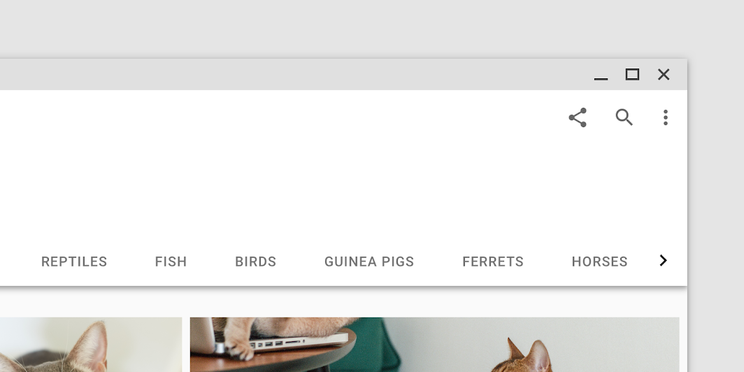
On desktop, provide a visual indicator that more tabs are available off screen
On desktop, provide a visual indicator that more tabs are available off screen.

Behavior ​

To navigate between a set of scrollable tabs, users swipe the set left or right. A tab set can be looped so when a user reaches the last tab in a set, the first tab is shown again.

To select an individual tab, tap it.

Tab placement on activation ​

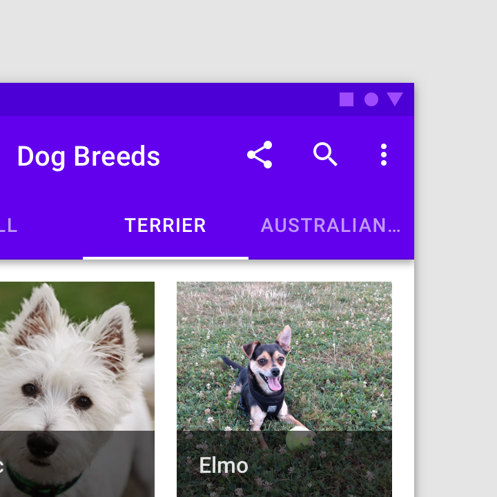
When tapped, a scrollable tab should reposition itself to become fully visible on screen.

Active tabs reposition themselves to appear fully on screen.

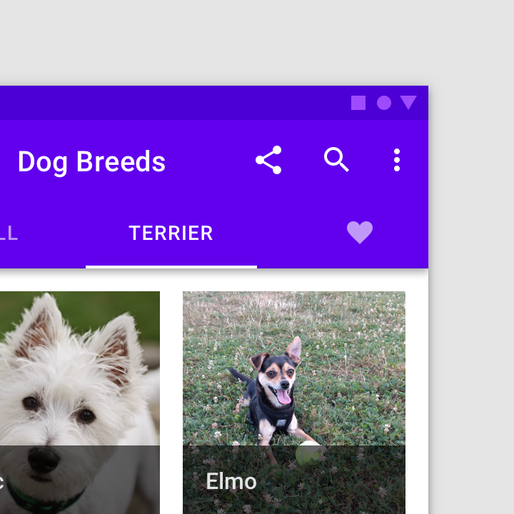
Active tabs can move to the middle of the row when they become active.

States ​

By default, tabs inherit enabled states with one active state.

The inactive state of a tab can inherit a hover, focus, and pressed state.
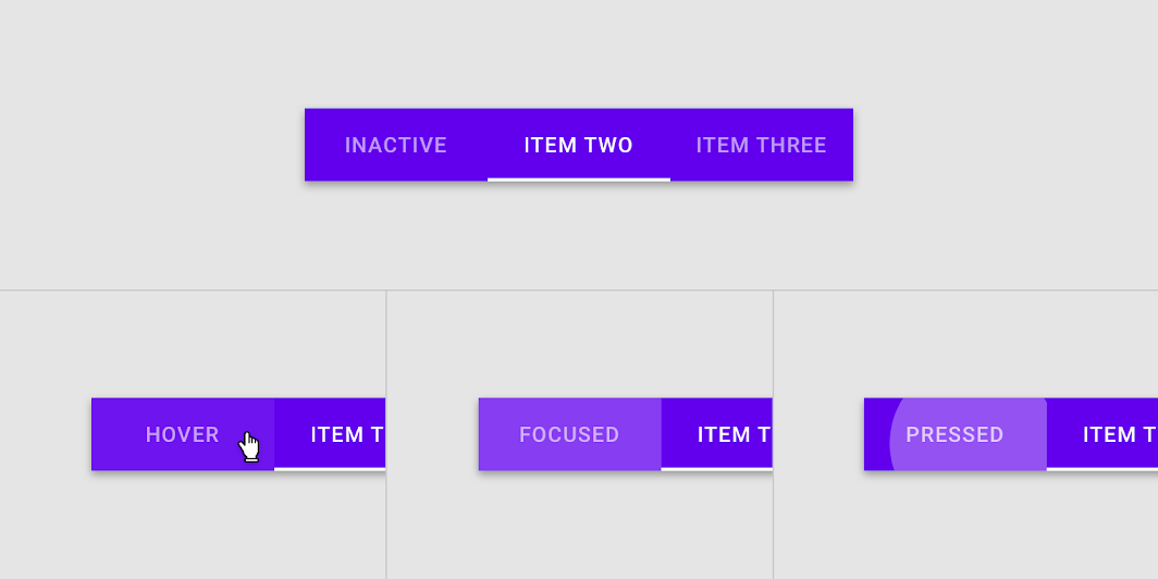
The hover, focus, and pressed states of an enabled tab

The active state of a tab can inherit a hover, focus, and pressed state.
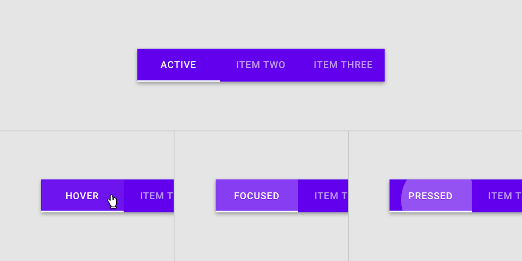
The hover, focus, and pressed states of an active tab

Theming ​

Basil Material Theme ​

This recipe app’s tabs have been customized using Material Theming. Areas of customization include color and typography.
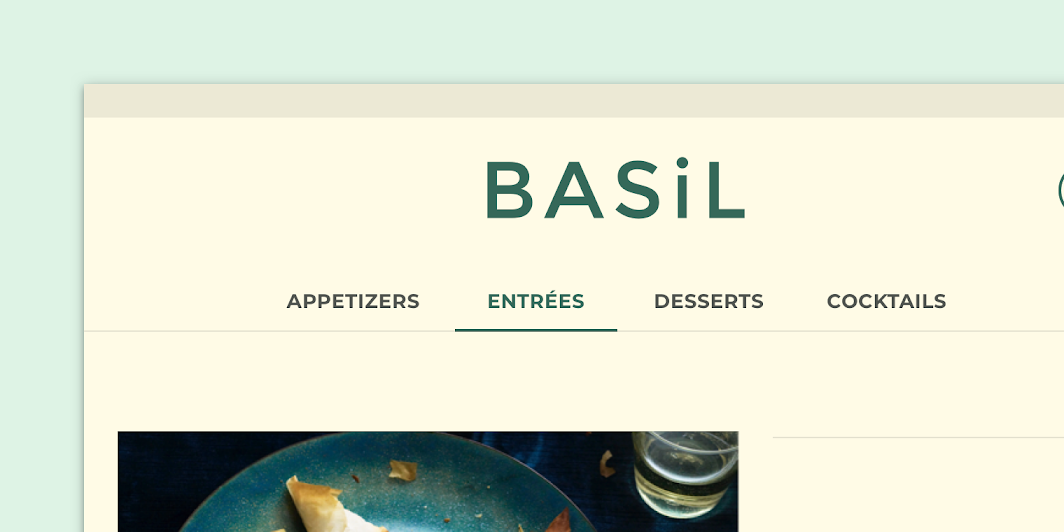
Basil’s customized tabs

Basil

Basil is a recipe app that uses Material Design components and Material Theming to create an on-brand experience that is exciting and easy to explore.

Related link

Color ​

Basil’s tabs use custom color on five elements: the container, active text label, active tab indicator, inactive text label, and divider.
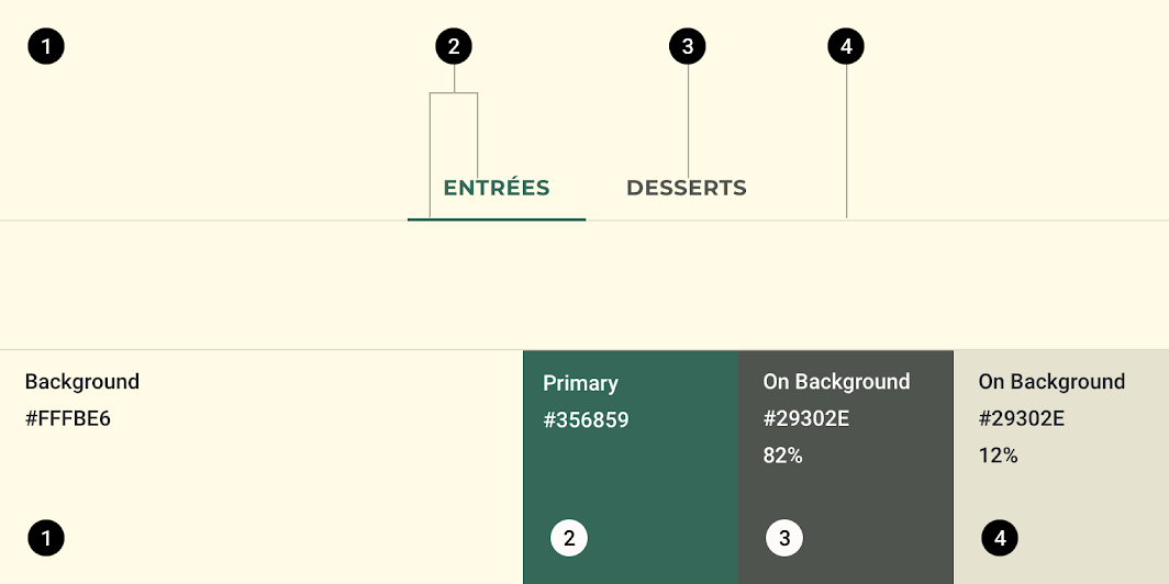
Basil Material theme: color
ElementCategoryAttributeValue
ContainerBackgroundColor
Opacity
#FFFBE6
100%
Active text label, active tab indicatorPrimaryColor
Opacity
#356859
100%
Inactive text labelOn SurfaceColor
Opacity
#29302E
82%
DividerOn SurfaceColor
Opacity
#29302E
12%

The color system

Create a color theme that reflects your brand or style

Related article

Applying color to UI

In a UI, color has a variety of roles: from containing meaning, to expressing a look and feel.

Related article

Understanding typography

Typography is critical in establishing hierarchy and expressing brand presence that supports an effective digital experience.

Related article

Typography ​

Basil’s tabs uses custom typography for message and button text.
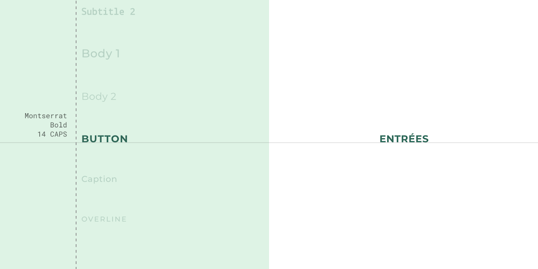
Basil Material theme: typography
ElementCategoryAttributeValue
ButtonButtonTypeface
Font
Size
Case
Montserrat
Bold
14
All caps

Specs ​

Fixed tabs ​


360484872C241616201221212

Scrollable tabs ​


4836052min-width:90dpC

Tab item minimum width ​


4836052min-width:90dpC

Tab item maximum width ​


3604821616C
Pager
Previous pageSwitches
Next pageText fields

Released under the Apache-2.0

Copyright © 2018-Present Google

https://m2.material.io/components/tabs

Released under the Apache-2.0

Copyright © 2018-Present Google