Android permissions
Permission requests should be simple, transparent, and understandable.
Usage
Android apps have limited permissions associated with them by default. If your app selected to apply “normal” permissions, the system automatically grants those without user input.
For permissions that extend beyond the scope of normal permissions, the user must explicitly grant those permissions. These are classified according to the following groups.
Permission groups
Permissions are divided into nine groups, allowing users to grant all permissions encompassed by a single action by bundling them together as a group.
For example, to provide a user with permission to view, edit, and add Contacts, it’s more efficient to group these permissions into a single permission group (called Contacts) than to request each individually.
| Permission Group | Description |
|---|---|
| Calendar | Managing calendars |
| Camera | Taking photos and recording videos |
| Contacts | Managing contacts |
| Location | Current device location |
| Microphone | Audio recording |
| Phone | Dialing and managing phone calls |
| Body Sensors | Heart rate and similar data |
| SMS | Sending and viewing messages |
| Storage | Accessing photos, media, and files |
Demonstrated intent
A user may perform an action that demonstrates clear intent, such as:
- Taking a picture
- Selecting a contact
- Starting a call or text message
In these cases, the user’s action clearly demonstrates their intent, and no permission dialog is needed or authorized.
Anatomy
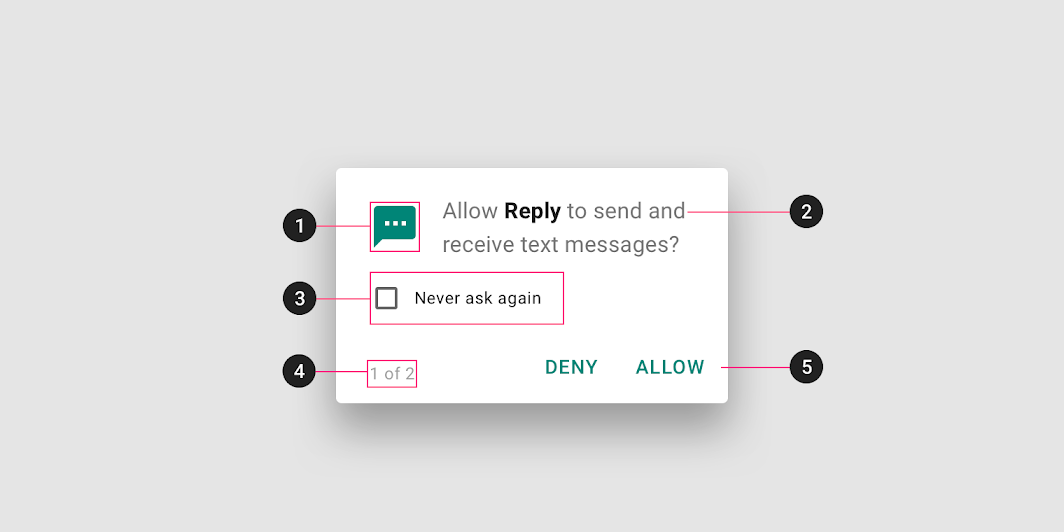
2. App name
3. “Never ask again” check box (This is displayed if a user denies a permission twice)
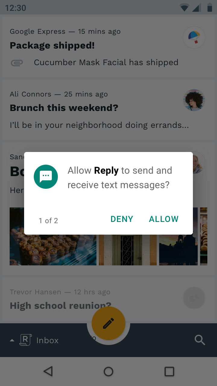
4. Indicator for multiple dialogs
5. Action
Request types
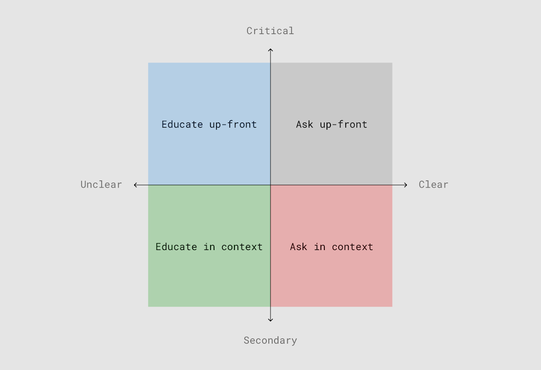
Your permissions strategy depends on the clarity and importance of the permission type you’re requesting. Each strategy offers a different way of introducing permissions to the user.
Critical permissions should be requested up-front.
Secondary permissions can be requested in context.
Permissions that are less clear should provide education about what the permission involves, whether done up-front or in context.
Educate before asking
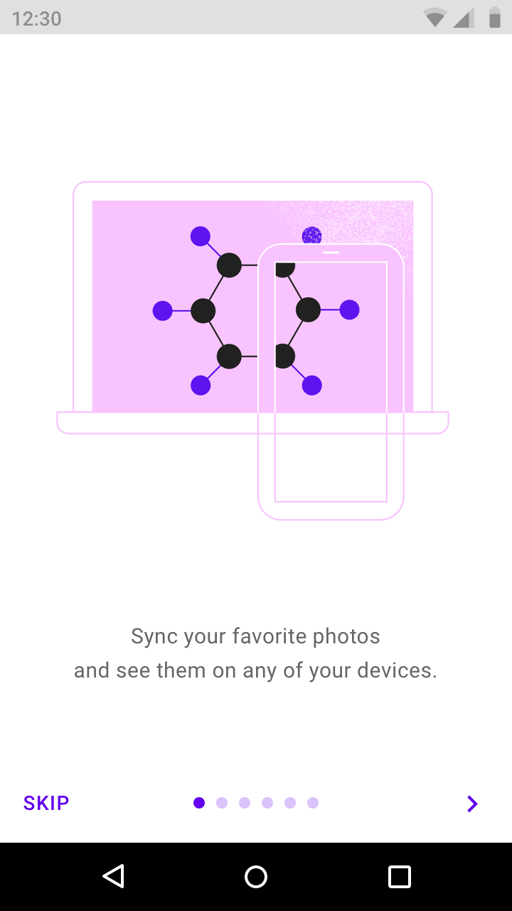
If your app has a “warm welcome,” use it to explain what your app does and why unexpected permissions will be requested.
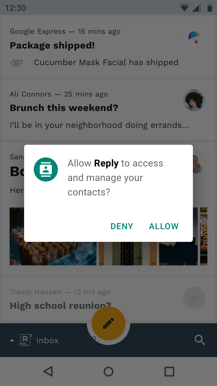
Ask up-front
Only ask for critical and obvious permissions on first launch.
Because users expect a messaging app to request SMS permissions, requesting it up-front makes sense.
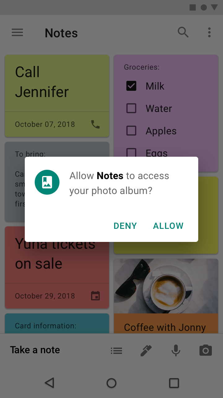
Ask in context
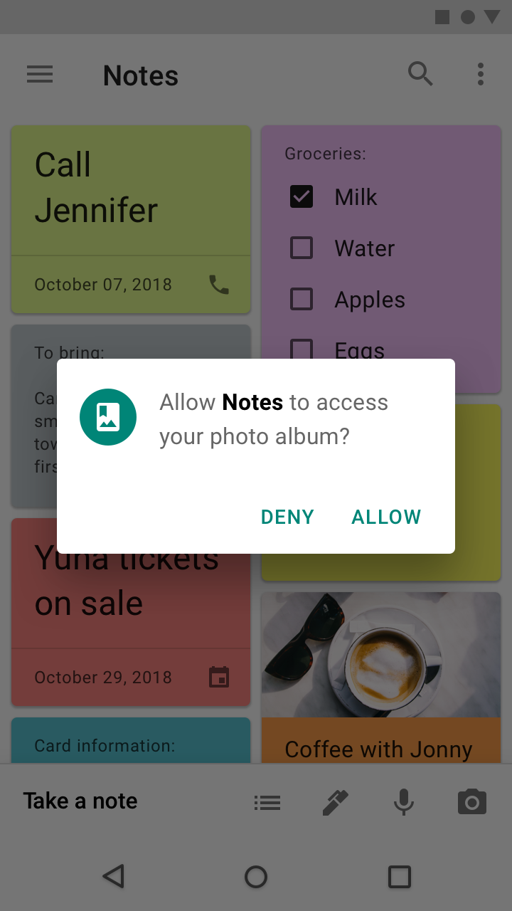
Wait until a feature is invoked to request permission.
Users are more likely to allow a permission when they want to use the feature it enables.
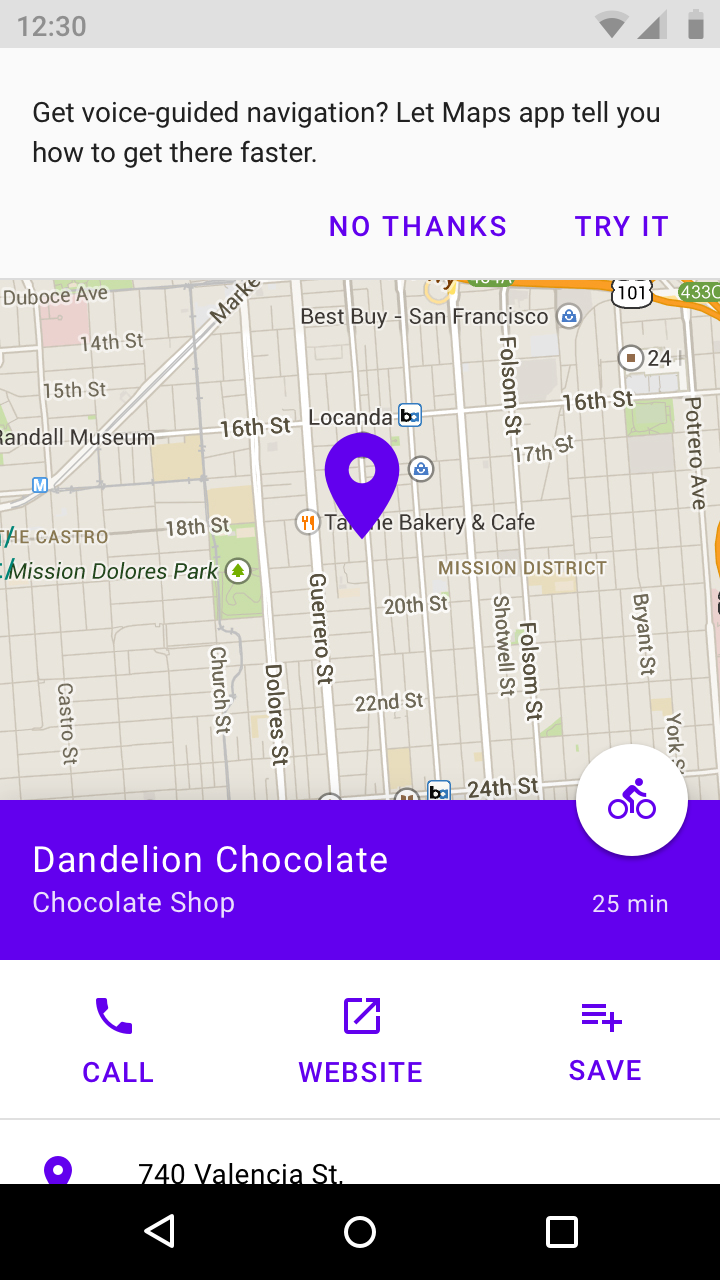
Educate in context
Explaining a permission in context helps gauge user interest and improve comprehension of the permission.
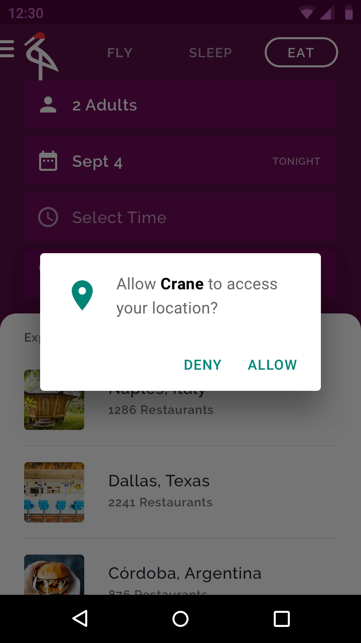
Provide an immediate benefit
Provide instant gratification to make accepting a permission feel justified.
Only ask for relevant permissions
When more than one permission is needed for a feature to work, only ask for those permissions and nothing else.
Runtime permissions
Apps may request permission to access information or use device capabilities at any time after installation. When a user needs to perform an action in an app, such as using the device camera, the app may request permission at that moment.
Users may also allow or deny the permissions of any app from Android Settings anytime after installation.
Denied permissions
Provide feedback whenever a permission is denied. Because denying permissions may prevent a feature from working as intended, whenever a permission is denied it should be explained to the user.
Permission denials occur in one of two ways:
- A permission request is denied by the user
- A permission is silently denied without warning because a user once selected “Don’t ask again” from a previous permission request
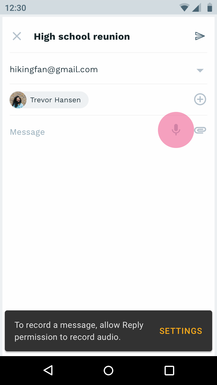
To ensure that features requiring permission always behave as intended, the app should state that permission is needed and provide a way to allow it.
Critical permissions
If the app can no longer run because a critical permission has been denied, explain why that permission must be allowed and offer a button to open Settings so the user can allow it.