Skip to content
Material Design 2
Main Navigation
v3
v2
v1

English

简体中文
繁體中文
Español
Français
Русский
Português – Brasil
Deutsch
日本語
한국어
Italiano
Polski
Türkçe
čeština
magyar

English

简体中文
繁體中文
Español
Français
Русский
Português – Brasil
Deutsch
日本語
한국어
Italiano
Polski
Türkçe
čeština
magyar

Appearance

Sidebar Navigation

Material System

Introduction

Material studies

About our Material studies

Basil

Crane

Fortnightly

Owl

Rally

Reply

Shrine

Material Foundation

Environment

Surfaces

Elevation

Light and shadows

Layout

Understanding layout

Pixel density

Responsive layout grid

Spacing methods

Component behavior

Applying density

Navigation

Understanding navigation

Navigation transitions

Search

Color

The color system

Applying color to UI

Color usage

Text legibility

Dark theme

Typography

The type system

Understanding typography

Language support

Sound

About sound

Applying sound to UI

Sound attributes

Sound choreography

Iconography

Product icons

System icons

Animated icons

Shape

About shape

Shape and hierarchy

Shape as expression

Shape and motion

Applying shape to UI

Motion

Understanding motion

The motion system

Speed

Choreography

Customization

Interaction

Gestures

Selection

States

Communication

Confirmation & acknowledgement

Data formats

Data visualization

Empty states

Help & feedback

Imagery

Launch screen

Onboarding

Offline states

Writing

Machine learning

Machine learning patterns

Object detection: live camera

Object detection: static image

Barcode Scanning

Material Guidelines

Material Theming

Overview

Implementing your theme

Usability

Accessibility

Bidirectionality

Platform guidance

Android bars

Android fingerprint

Android haptics

Android icons

Android navigating between apps

Android notifications

Android permissions

Android slices

Android split-screen

Android swipe-to-refresh

Android text selection toolbar

Android widget

Cross-platform adaptation

Components

App bars: bottom

App bars: top

Backdrop

Banners

Bottom navigation

Buttons

Buttons: floating action button

Cards

Checkboxes

Chips

Data tables

Date pickers

Dialogs

Dividers

Image lists

Lists

Menus

Navigation drawer

Navigation rail

Progress indicators

Radio buttons

Sheets: bottom

Sheets: side

Sliders

Snackbars

Switches

Tabs

Text fields

Time pickers

Tooltips

On this page

Object detection: static image ​

Using machine learning, objects can be detected from a provided image.
Object detection: static image hero image

Usage ​

Photographs can be used to detect and identify objects in the physical world by performing a visual search (a search query that uses an image as input). Using machine learning models, visual search results can tell users more information about an item – whether it’s a species of plant or an item to purchase.

ML Kit’s Object Detection & Tracking API’s “static” mode allows you to detect up to five objects in a provided image and display matching results using your own image classification model.

Searching for objects in an image allows users to browse results for multiple items.

ML Kit API docs

Developer guides for object detection

Related link

Example – Android

ML Kit showcase app for Android

Related link

Example – iOS

ML Kit showcase app for iOS

Related link

Principles ​

Design for this feature is based on the following principles:

Keep images clear and legible

Align the camera UI components to the top and bottom edges of the screen, ensuring that text and icons remain legible when placed in front of an image.

Any non-actionable elements displayed in front of the live camera feed should be translucent to minimize obstructing the camera.
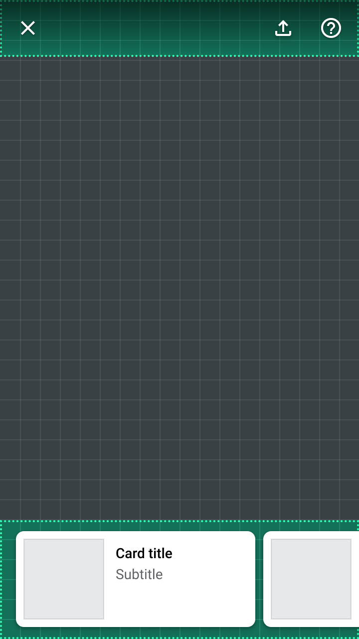
Most components are placed along the top and bottom edges of the screen to maximize viewing the image
Most components are placed along the top and bottom edges of the screen to maximize viewing the image.

Provide feedback

Using an image to search for objects introduces unique usage requirements. Overlapping or cropped objects can make it hard to identify an object.

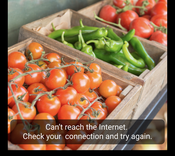
Error states should be communicated with multiple design cues (such as components and motion) and include explanations of how users can improve their search.
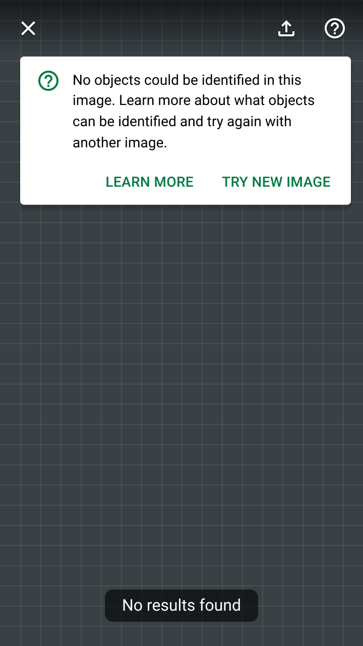
Banners provide a prominent way to let users know something went wrong with their search
Banners provide a prominent way to let users know something went wrong with their search, and room to link to a Help section for more information.

Components ​

The static image object detection features uses existing Material Design components and new elements specific to interacting with an image. For code samples and demos of new elements (such as object markers), check out the source code for the ML Kit Material Design showcase app on Android.
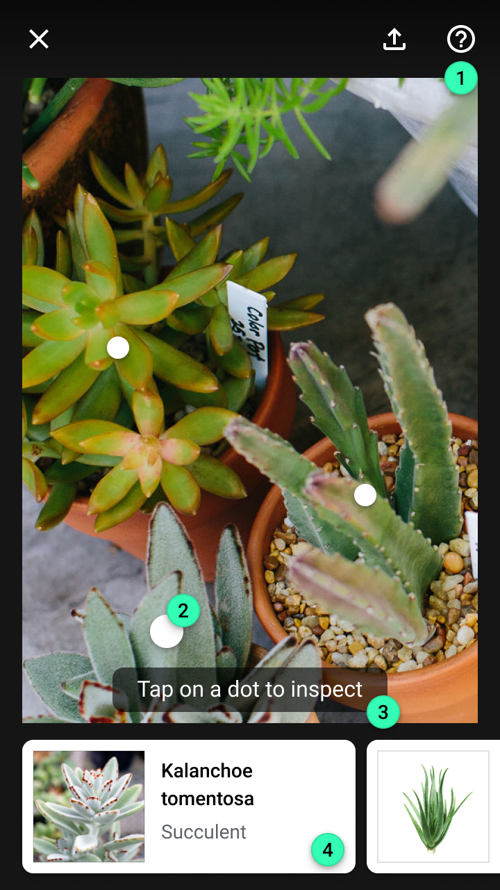
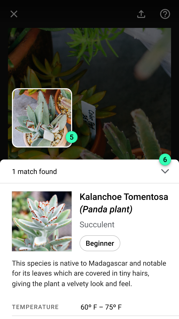
Key elements across the stages of a static image visual search experience
Key elements across the stages of a static image visual search experience:
1. Top app bar
2. Object marker
3. Tooltip
4. Cards
5. Detected image
6. Modal bottom sheet>
Components: key elements

Top app bar ​

The top app bar provides persistent access to the following actions:

  • A button to exit the search experience
  • A toggle to improve brightness (using the camera’s flash)
  • A Help section for troubleshooting search issues
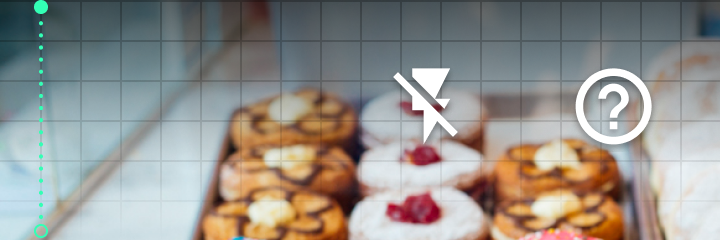
Do: use a gradient scrim or solid color for the top app bar’s container to ensure its actions are legible over a camera feed

Do

Use a gradient scrim or solid color for the top app bar’s container to ensure its actions are legible over a camera feed.

Top app bar

The top app bar displays information and actions relating to the current view.

Related article

Object markers ​

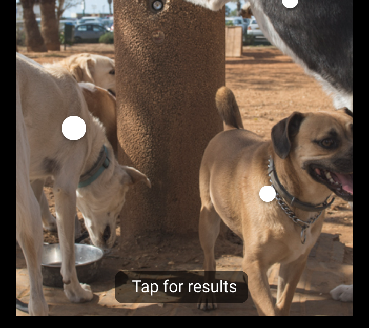
Object markers are circular, elevated indicators placed in front of the center of a detected object. Each marker is paired with a card at the bottom of the screen, which displays a preview of each object’s results. When the card is scrolled into view, the corresponding object marker increases in size.

Tapping an object marker (or its results card) opens a modal bottom sheet displaying an object’s full visual search results.

Object markers animate into view on top of the image to draw a user’s attention.

Tooltip ​

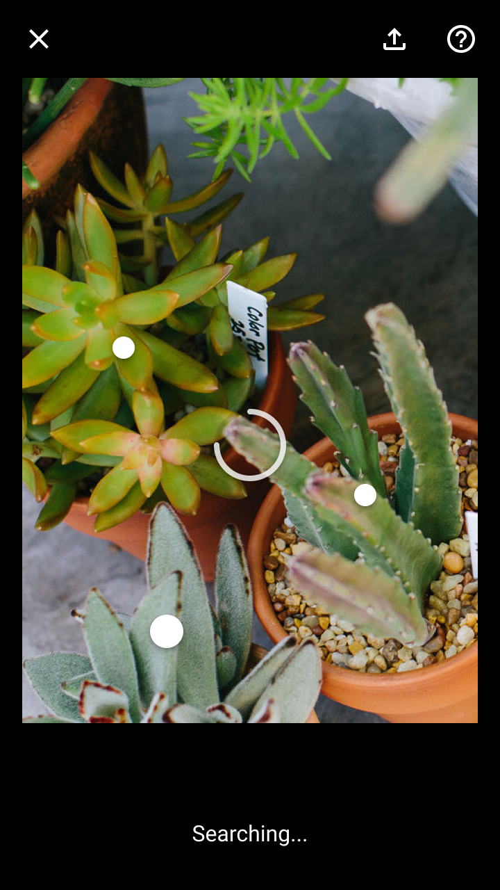
Tooltips display informative text to users. For example, they express both states (such as with a message that says “Searching…”) and prompt the user to the next step (such as a message that says, “Tap on a dot or card for results”).
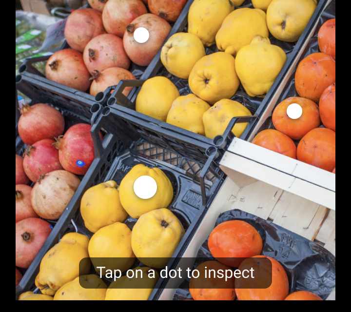
Do: write short messages using terms appropriate for your audience

Do

Write short messages using terms appropriate for your audience.
Don’t write tooltips with action verbs, such as “Tap to search,” as tooltips are not actionable

Don't

Don’t write tooltips with action verbs, such as “Tap to search,” as tooltips are not actionable.

Don’t place error messages in a tooltip

Don't

Don’t place error messages in a tooltip. Errors should be placed in a banner for increased emphasis and to provide space for displaying actions.

Tooltips

Display informative text when users hover over, focus on, or tap an element

Related article

Cards ​

Cards provide a preview of an object’s visual search results. They are arranged in a horizontally scrolling carousel, organized based on the horizontal position of each object.

Each card is paired with an object marker. When the card is scrolled into view, its related object marker increases in size. Tapping a card (or its object marker) opens a modal bottom sheet, which displays an object’s full visual search results.

Cards provide a preview of visual search results and can be tapped to open a modal bottom sheet that contains all results. Horizontally scrolling cards emphasize the corresponding object marker.

Cards

Containing content & links on a single subject

Related article

Modal bottom sheet ​

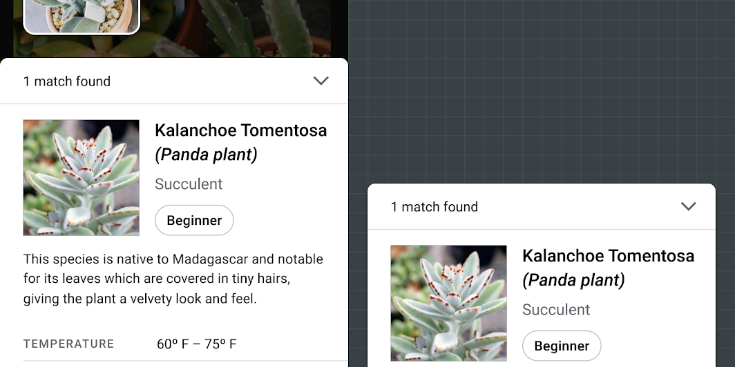
Modal bottom sheets provide access to visual search results. Their layout and content depend on your app’s use case, the number of results, and result confidence.
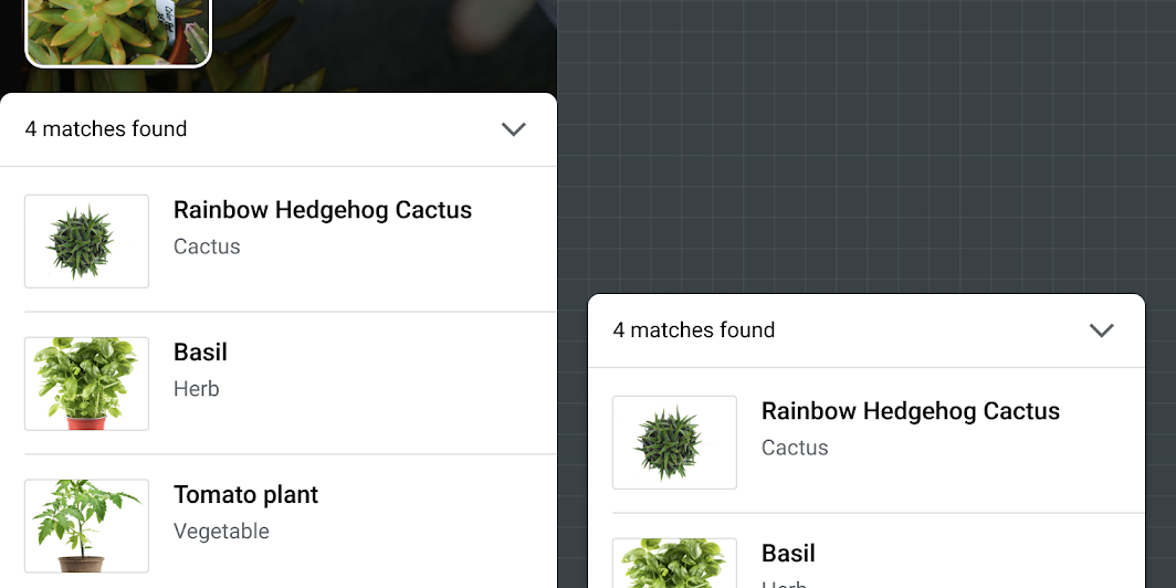
Lists or image grids can be used in a modal bottom sheet to display multiple visual search results
Lists or image grids can be used in a modal bottom sheet to display multiple visual search results. To display additional results, the sheet can be opened to the full height of the screen.

A modal bottom sheet can display a single result and adapt its layout to suit the content
A modal bottom sheet can display a single result and adapt its layout to suit the content.

Bottom sheets

Surfaces containing supplementary content that are anchored to the bottom of the screen.

Related article

Experience ​

Visual object search from an image happens in three phases:

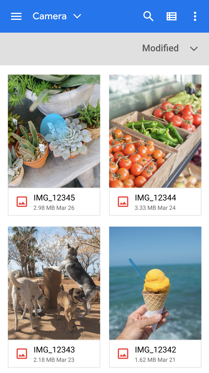
  1. Input: Select an image to search
  2. Recognize: Detect and identify objects
  3. Communicate: If matching objects are found, display results

Input ​

Visual search begins when a user selects an image. To increase the chances of a successful search, advise users on the types of images most suitable to search.
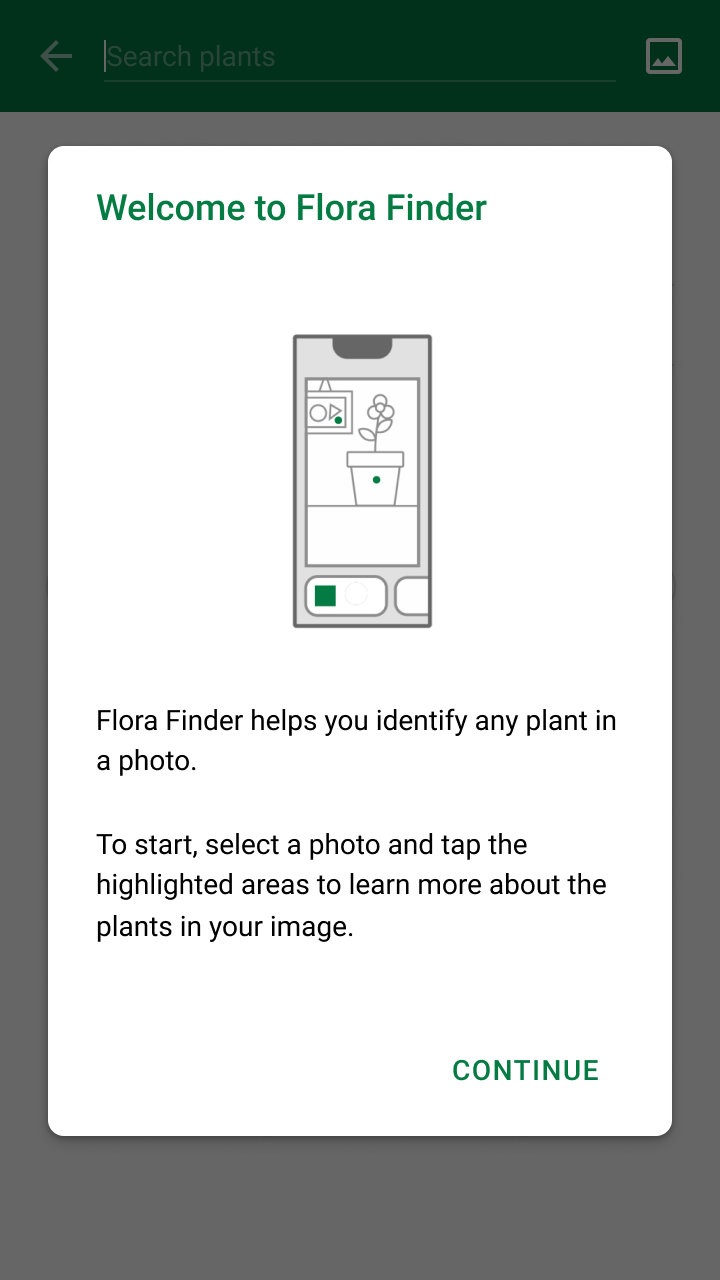
Do: provide a short explanation recommending images that are clear with items fully visible, and at a close range

Do

Provide a short explanation recommending images that are clear with items fully visible, and at a close range.
Do: use native Android and iOS selection screens to help users find photos in a familiar way

Do

Use native Android and iOS selection screens to help users find photos in a familiar way.

Recognize ​

When one or more objects have been detected from an image, the app should:

  • Communicate that the app is awaiting results
  • Display search progress

Objects detected by ML Kit Object Detection & Tracking API are then compared against a set of known images from your image classification model, which are used to find matching results.

Even if an image is detected from a photo, it doesn’t guarantee that matching results will be found. Thus, objects shouldn’t be marked as detected until valid search results are returned.
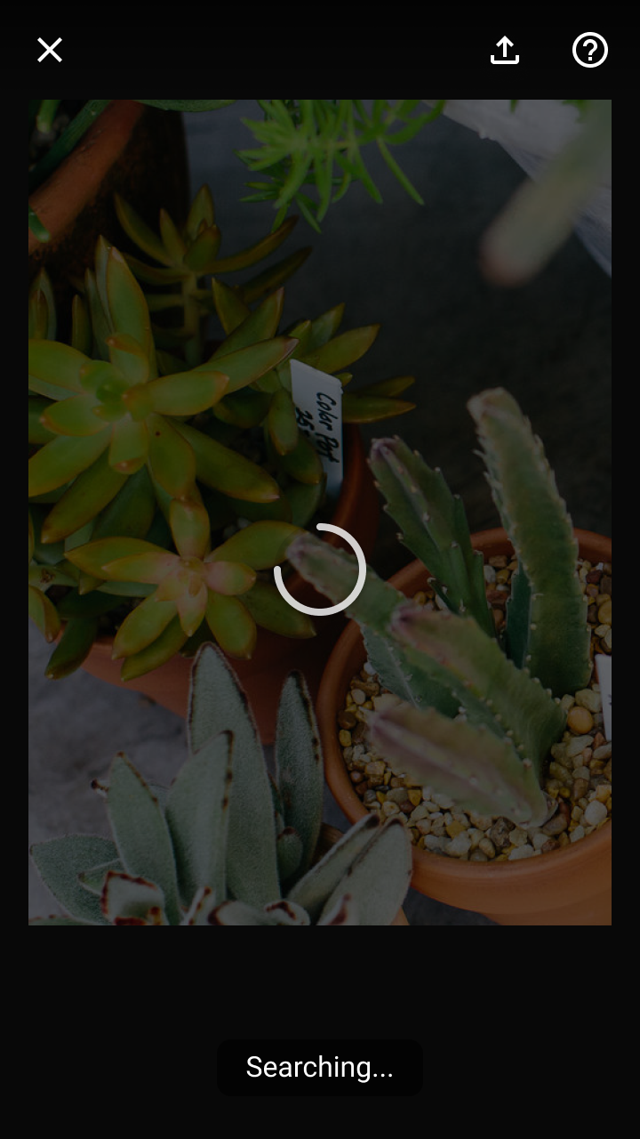
Do: use an indeterminate progress indicator and tooltip to inform the user that the app is analyzing the image for matching

Do

Use an indeterminate progress indicator and tooltip to inform the user that the app is analyzing the image for matching items. Display these items over the image to show the user’s selection and that the search has begun.
Don’t place object markers on detected objects until search results are available

Don't

Don’t place object markers on detected objects until search results are available.

Guide adjustments

The following factors can affect whether or not objects are detected and identified (this list is not exhaustive):

  • Poor image quality
  • Small object size in image
  • Low contrast between an object and its background
  • An object is shown from an unrecognizable angle
  • The network connection needed to complete the search is lost
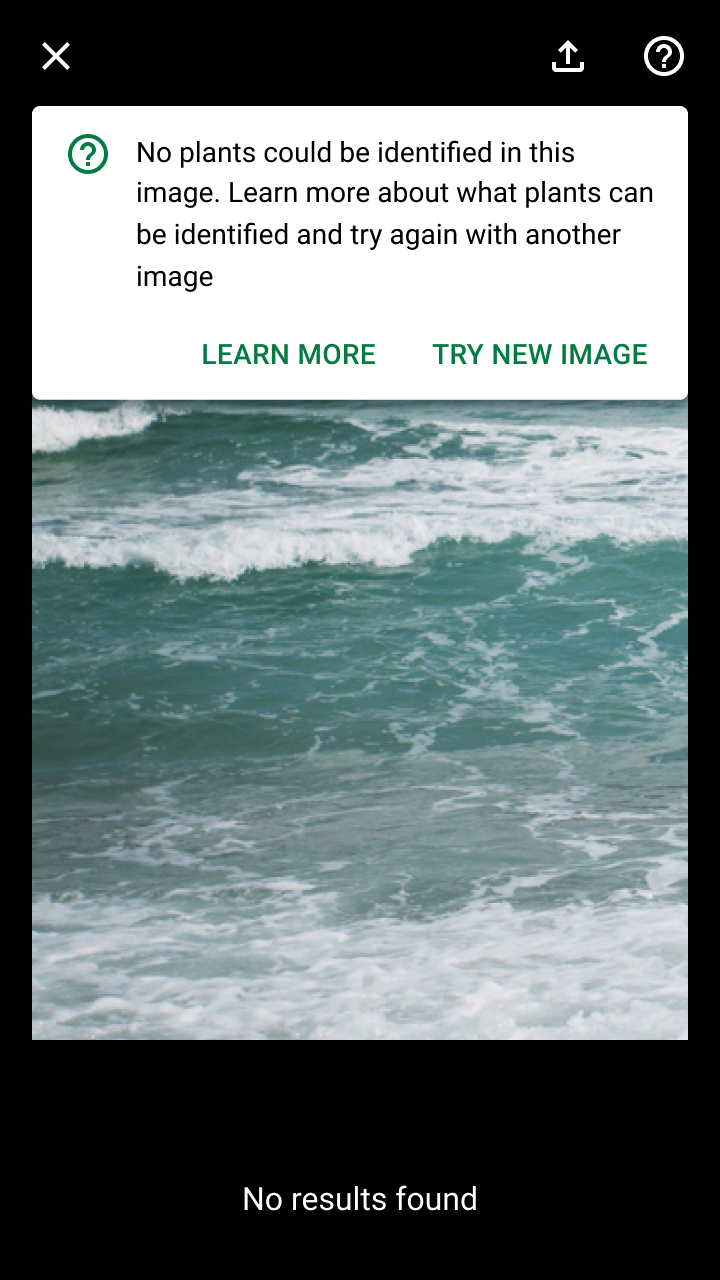
Do: use a banner to indicate if no matching objects were identified

Do

Use a banner to indicate if no matching objects were identified. Provide options to visit a dedicated Help section or retry with another image.

Communicate ​

Results for detected objects are expressed to users by:

  • Placing object markers in front of each detected object
  • Showing a preview each object’s result on a card (as part of a carousel of cards)

Your app should set a confidence threshold for displaying visual search results. “Confidence” refers to an ML model’s evaluation of how accurate a prediction is. For visual search, the confidence level of each result indicates how similar the model believes it is to the provided image.

If one or more objects in the image have search results, the app should identify those detected objects using object markers and a carousel of cards previewing each object’s results. Tapping on a marker or card opens a modal bottom sheet that shows an object’s results.

Do

Use motion to indicate the relationship between dots and cards. A stagger animation calls attention to each detected item in the image and its connection to the card below.

Do

Include the detected image of the object to compare to images of the search results.

Evaluating search results ​

In some cases, visual search results may not meet user expectations, such as in the following scenarios:

No results found

A search can return without matches for several reasons, including:

  • An object isn’t a part of, or similar to, the known set of objects
  • It was detected from an angle the visual search model doesn’t recognize
  • Poor image quality, making key details of the object hard to recognize

Display a banner to explain if there are no results and guide users to a Help section for information on how to improve their search.
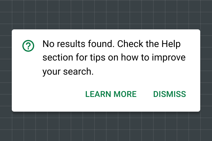
A banner provides room for explanation and a link to help content if no search results are found
A banner provides room for explanation and a link to help content if no search results are found.

Poor results

If a search returns results with only low-confidence scores, you can ask the user to search again (with tips on improving their search).
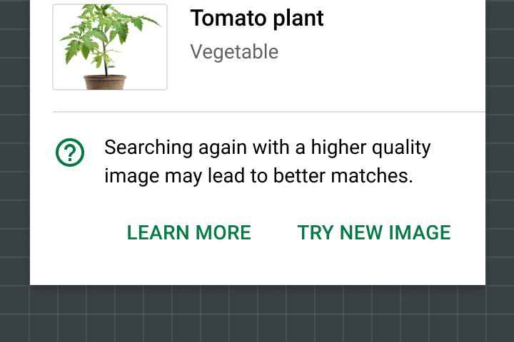
Do: link to Help content when all results have low confidence

Do

Link to Help content when all results have low confidence.

Explainability + trust

Explaining predictions, recommendations, and other AI outputs

Related link

Theming ​

Shrine Material theme ​

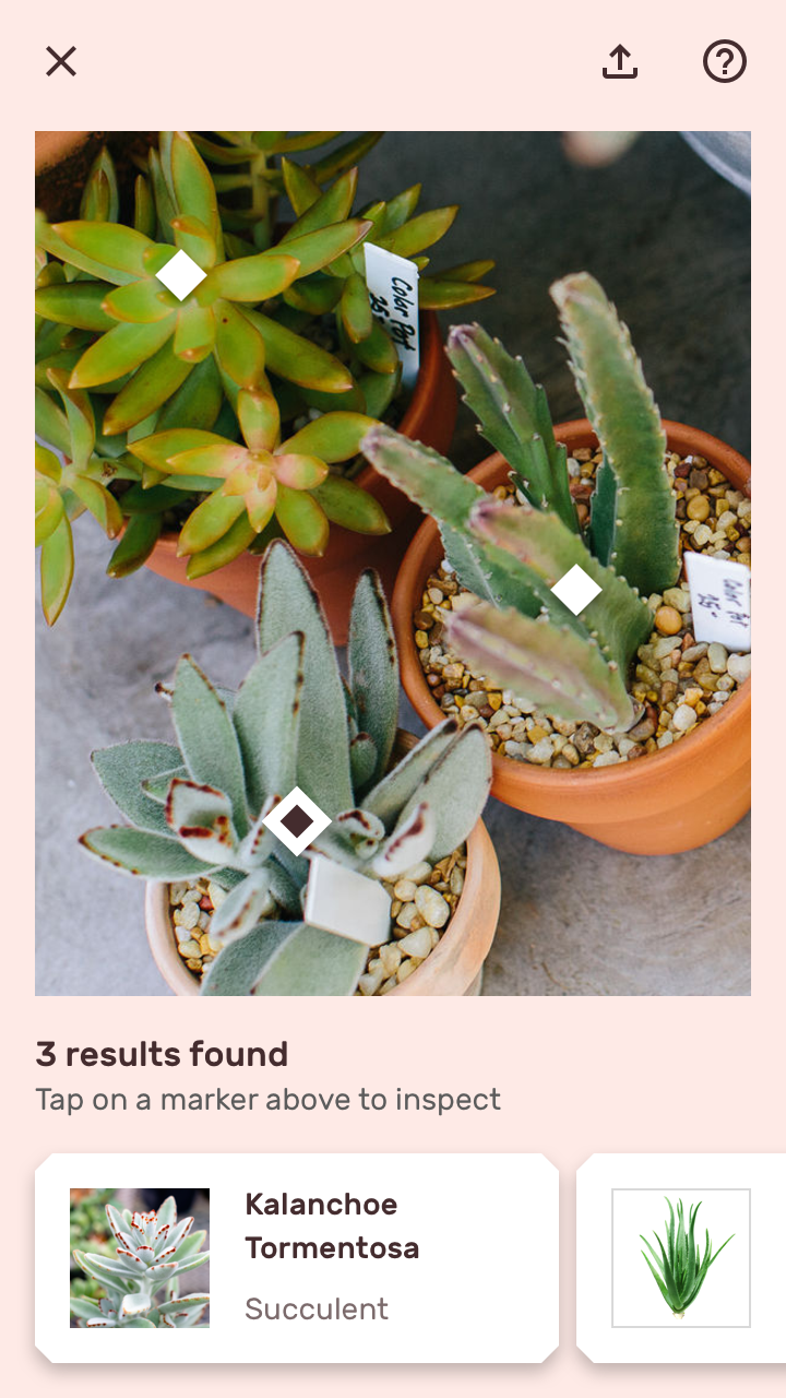
The Shrine app purchase flow lets users perform a visual search for products using a photo.
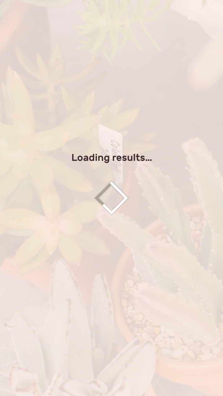
The results loading screen uses a light pink scrim and diamond-shaped loader to reflect the brand’s primary color
The results loading screen uses a light pink scrim and diamond-shaped loader to reflect the brand’s primary color and logo shape.
Shrine’s color and typography styles are applied to visual search results
Shrine’s color and typography styles are applied to visual search results.

Object markers ​

Shrine’s object markers use a diamond shape to reflect Shrine’s shape style (which uses angled cuts).
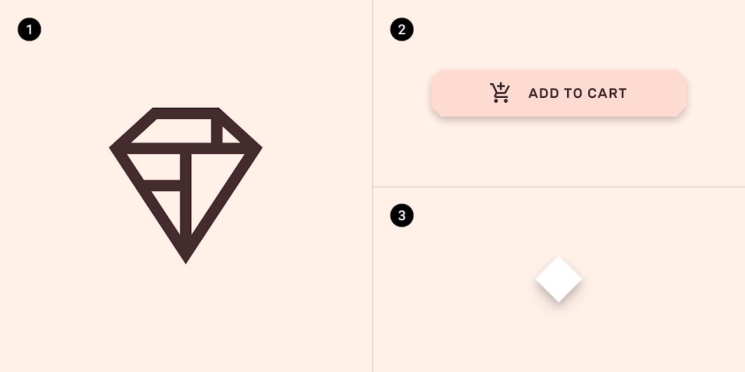
Diagram of shrine’s geometric logo, a button with 4dp cut corners, an object marker with diamond shape
1. Shrine’s geometric logo
2. A button with 4dp cut corners
3. An object marker with diamond shape

To help users match result cards with possible detected objects, object markers typically increase in size when their corresponding result card is selected in the carousel. Instead of changing the object marker’s size to emphasize it, Shrine applies custom color and border styles.
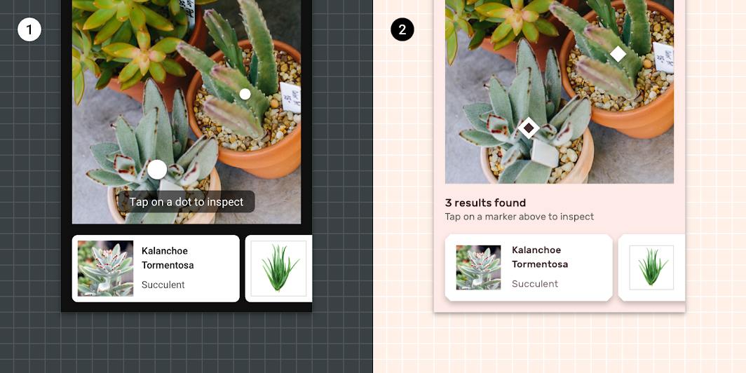
Object markers can use a difference in size to inform users which object is related to the result
1. Object markers can use a difference in size to inform users which object is related to the result card they are currently viewing.
2. Shrine’s object markers use a difference in color and border styles to indicate the current object. The marker’s container color changes from #FFFFFF to Shrine’s On Surface color (#442C2E) and receives a 6dp #FFFFFF border.

Cards ​

Shrine’s result cards use custom colors, typography, and shape styles.
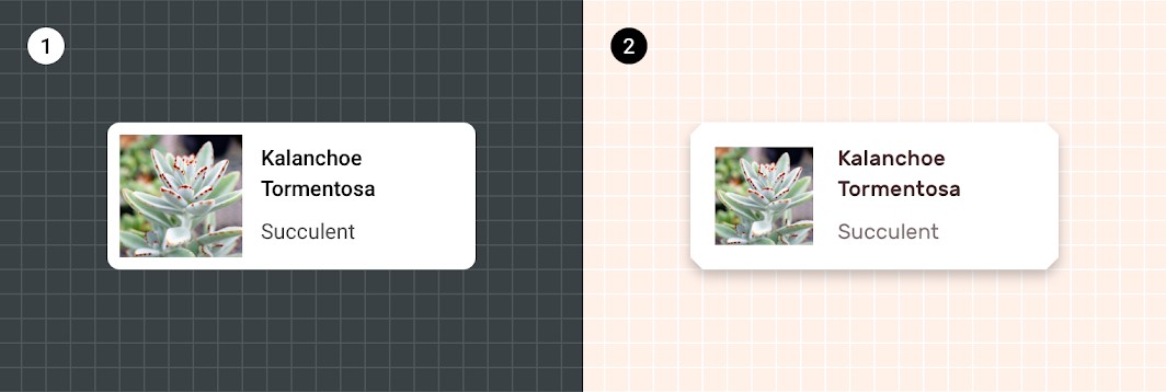
By default, cards use the font Roboto for content, #000000 as their On Surface color
1. By default, cards use the font Roboto for content, #000000 as their On Surface color, and have 4dp rounded corners.
2. Shrine’s cards use the font Rubik for content, Shrine Pink 900 (#442C2E) as their On Surface color, and have 8dp cut corners.

Shrine

Shrine is a lifestyle and fashion brand that demonstrates how Material Design can be used in e-commerce.

Related article

Pager
Previous pageObject detection: live camera
Next pageBarcode Scanning

Released under the Apache-2.0

Copyright © 2018-Present Google

https://m2.material.io/design/machine-learning/object-detection-static-image.html

Released under the Apache-2.0

Copyright © 2018-Present Google