

Fortnightly
Fortnightly is a news app that uses Material Design components and Material Theming to create an on-brand, content-focused experience.
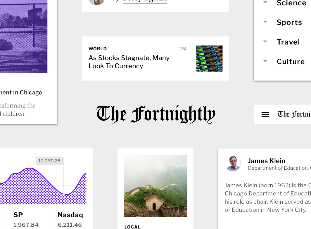
About Fortnightly
Fortnightly is an app that covers the news on a variety of topics. The app’s focus is on content, specifically article copy and photography.
Fortnightly’s brand is designed to provide a variety of content in a way that puts the content itself at the forefront of the user experience. Branding is expressed through the Fortnightly logo, typographic system, and appearances of purple (the app’s secondary color) in an otherwise grayscale app. This subtle approach ensures that brand will be noticeable when it is expressed through color or typography.
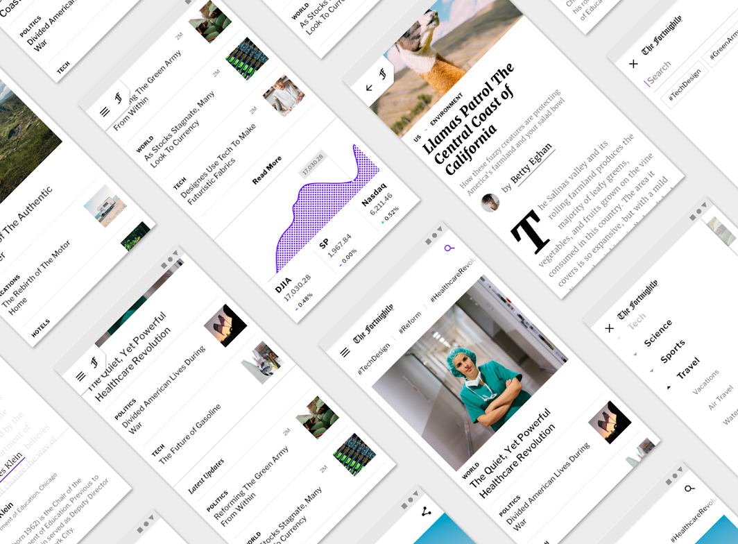
Content-focused
Fortnightly’s aesthetic puts focus on content by using a grayscale color palette to allow photography to stand out, and by using a typographic scale that makes headlines bold, and long body copy easy to read.
The app’s layout grid draws inspiration from newspapers to give the app a traditional, intuitive structure, while delivering a dense amount of content.
Product architecture
Fortnightly’s information architecture is organized into a catalog structure. A catalog contains categorized, hierarchical information, with a top level consisting of peers that may contain subordinate information. Fortnightly’s content is separated into main sections and subsections that are similar to those found in a newspaper, such as front page, world, US, politics, and business sections.
A catalog structure allows users to quickly navigate to an area of interest. Navigation drawers are ideal for navigating through catalog structures, which is why Fortnightly uses this component.
Navigation drawer
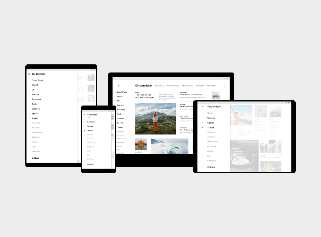
Fortnightly uses a standard navigation drawer on tablet and desktop, and a modal navigation drawer on mobile. The affordance to open the navigation drawer is a navigation icon found in the top app bar.
Navigation sections
Navigation sections only contain text. Sections with subsections have an arrow to indicate they can be opened.
Branding moment
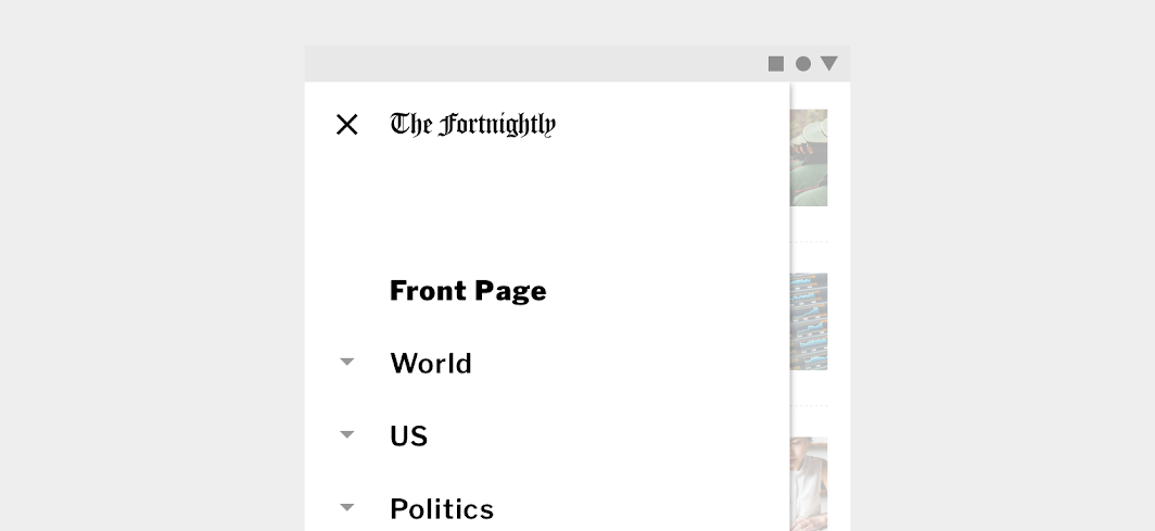
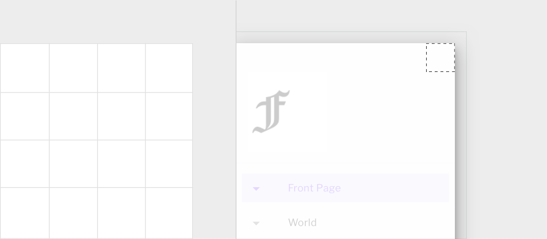
Fortnightly also uses the navigation drawer as a branding moment, placing the logo inside the drawer.
Top app bar and chips
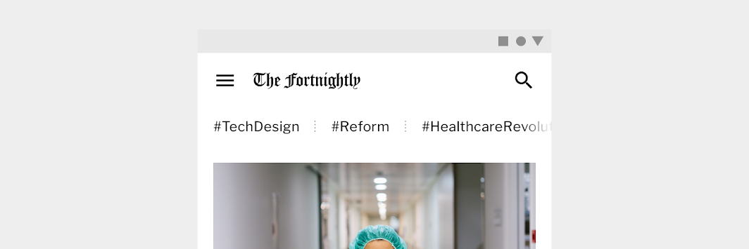
Fortnightly’s top app bar contains a navigation icon, logo, search capability, and chips. The chips present trending hashtags.
When a chip is tapped, articles related to the hashtag populate the page. This allows articles that may be in different sections to be grouped together around a shared subject or theme.
Short top app bar
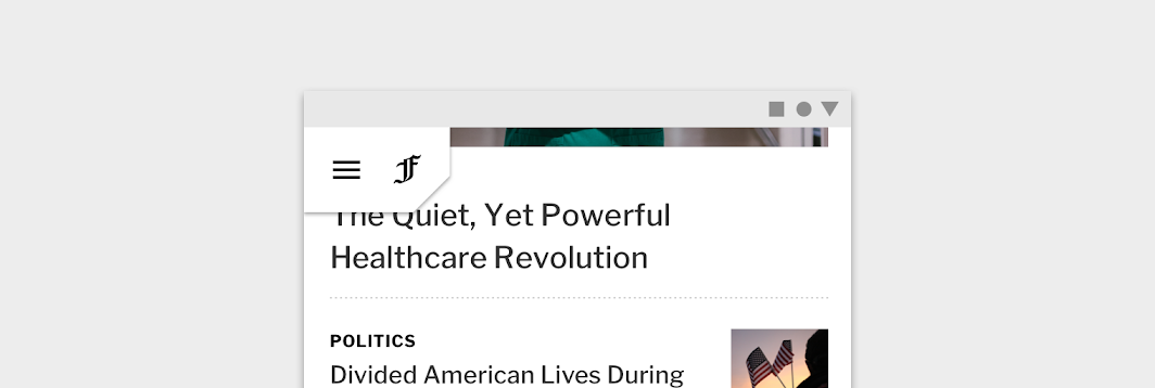
On scroll, the top app bar collapses to become a short top app bar, allowing more space for content.
The short top app bar contains two elements: the navigation icon to open the navigation drawer, and the Fortnightly logo.
Search
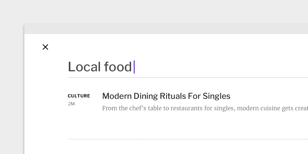
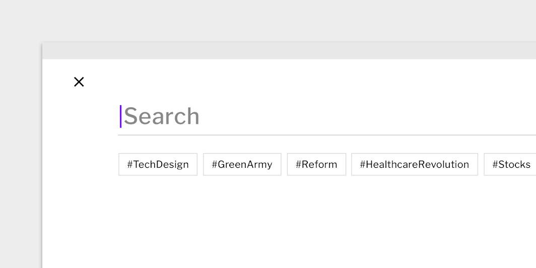
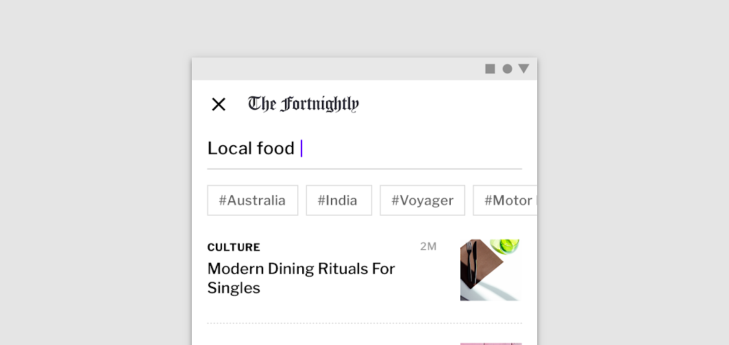
Fortnightly has a robust search capability to quickly get readers to their desired content. After the search icon is tapped, a full-screen dialog appears with a search entry field and trending hashtags. After a search term is entered, the results are shown in the full-screen dialog.
The dialog closes when a search result is selected, or the dialog close button is selected.
Layout
Grid system
Fortnightly combines a variety of information together, particularly in places such as the landing page. In other places, such as an individual article, there is generous whitespace for content. All pages use the same responsive grid, allowing content to reflow into the screen space available, after certain breakpoints are reached.
Elevation
Fortnightly uses shadows to indicate elevation.
Shadows are used sparingly, and for certain key moments. For example, the elevation of a top app bar isn’t expressed until a page is scrolling, when it transforms into a short top app bar. When articles are hovered over or tapped on, a subtle shadow treatment is applied, giving the appearance of lifting the article up. Navigation drawers always use shadows, as not to confuse the reader where the drawer begins or ends.
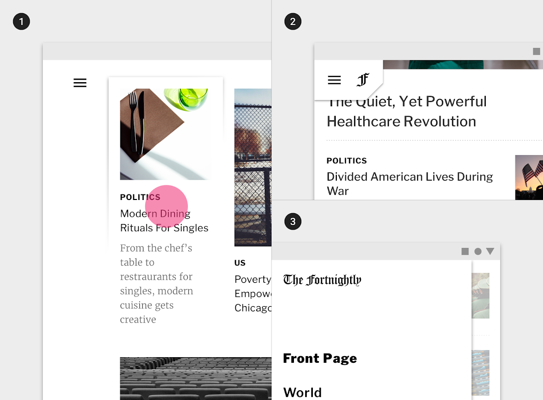
2. Short top app bar with shadow
3. Navigation drawer with shadow
Color
Color theme
Primary color
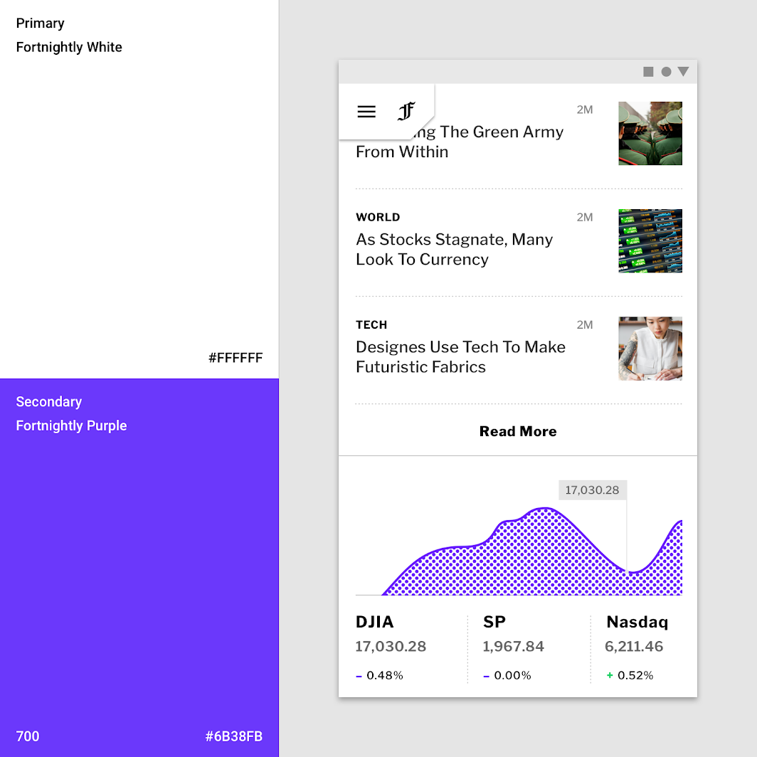
Fortnightly’s primary color is white. It uses a grayscale color palette so that photography stands out and copy is easy to read without distraction.
Secondary color
Fortnightly’s secondary color is purple. It’s used sparingly to ensure it has a high impact in the places that it appears.
Color and image
Image treatments are a subtle way of providing branded opportunities.
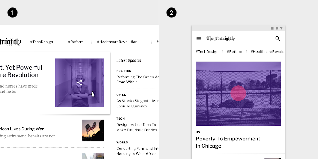
2. The pressed state of an article on mobile is expressed by applying a semi-transparent purple fill over the corresponding photo.
(Scaled down to 62.5%)
Scrim color
When navigation drawers and bottom sheets appear, Fortnightly displays a white scrim in front of the rest of app content. The scrim is opaque enough to ensure the user can distinguish between what is functional, and what is disabled.
Typography
Typefaces
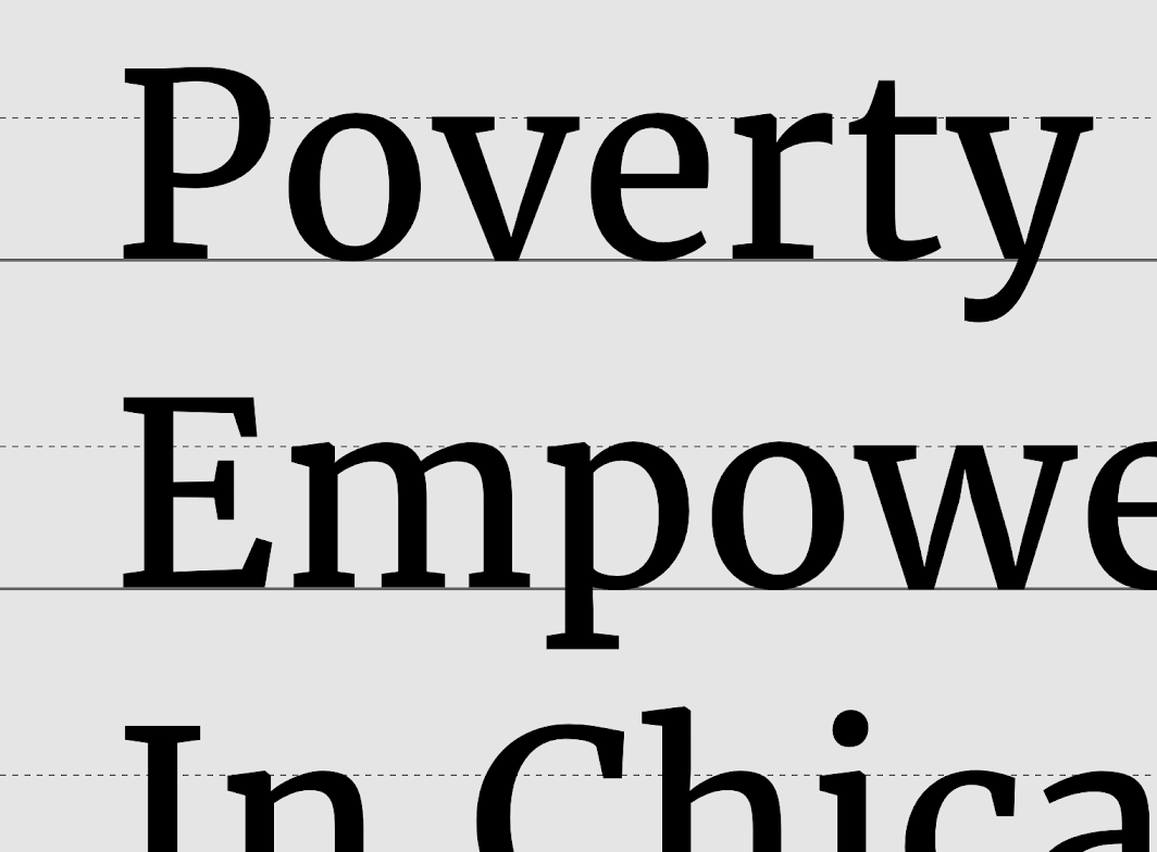
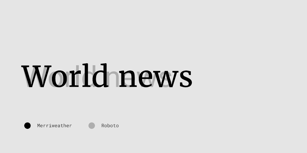
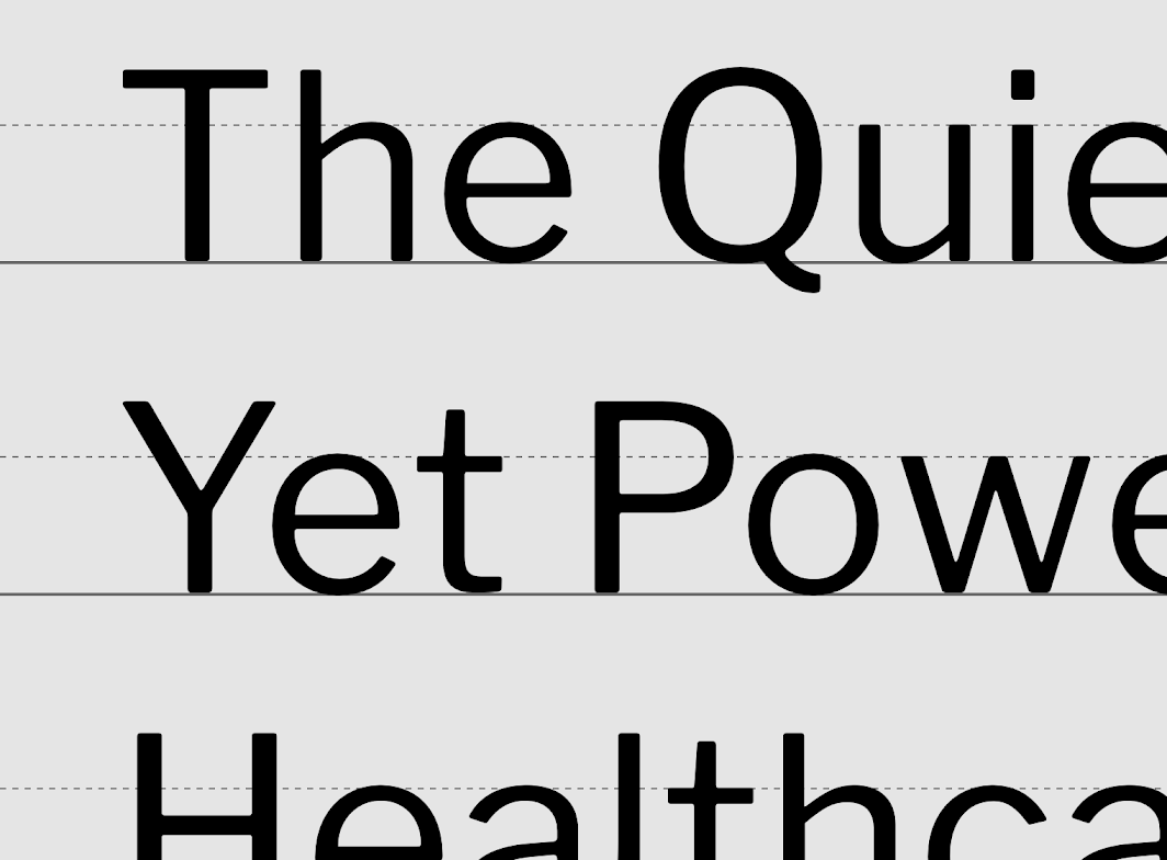
Fortnightly uses the Libre Franklin and Merriweather fonts.
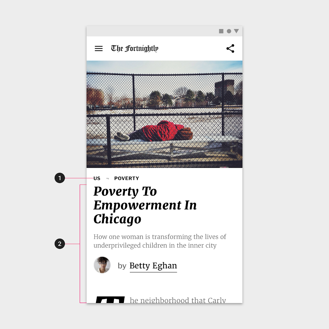
2. Merriweather
Type scale
Fortnightly’s type scale provides typographic variety through the use of two typefaces: Merriweather and Libre Franklin. Merriweather is used as a display font and body copy typeface, when reading is the main user focus. Libre Franklin is used on screens where scanning and browsing content is the main focus.
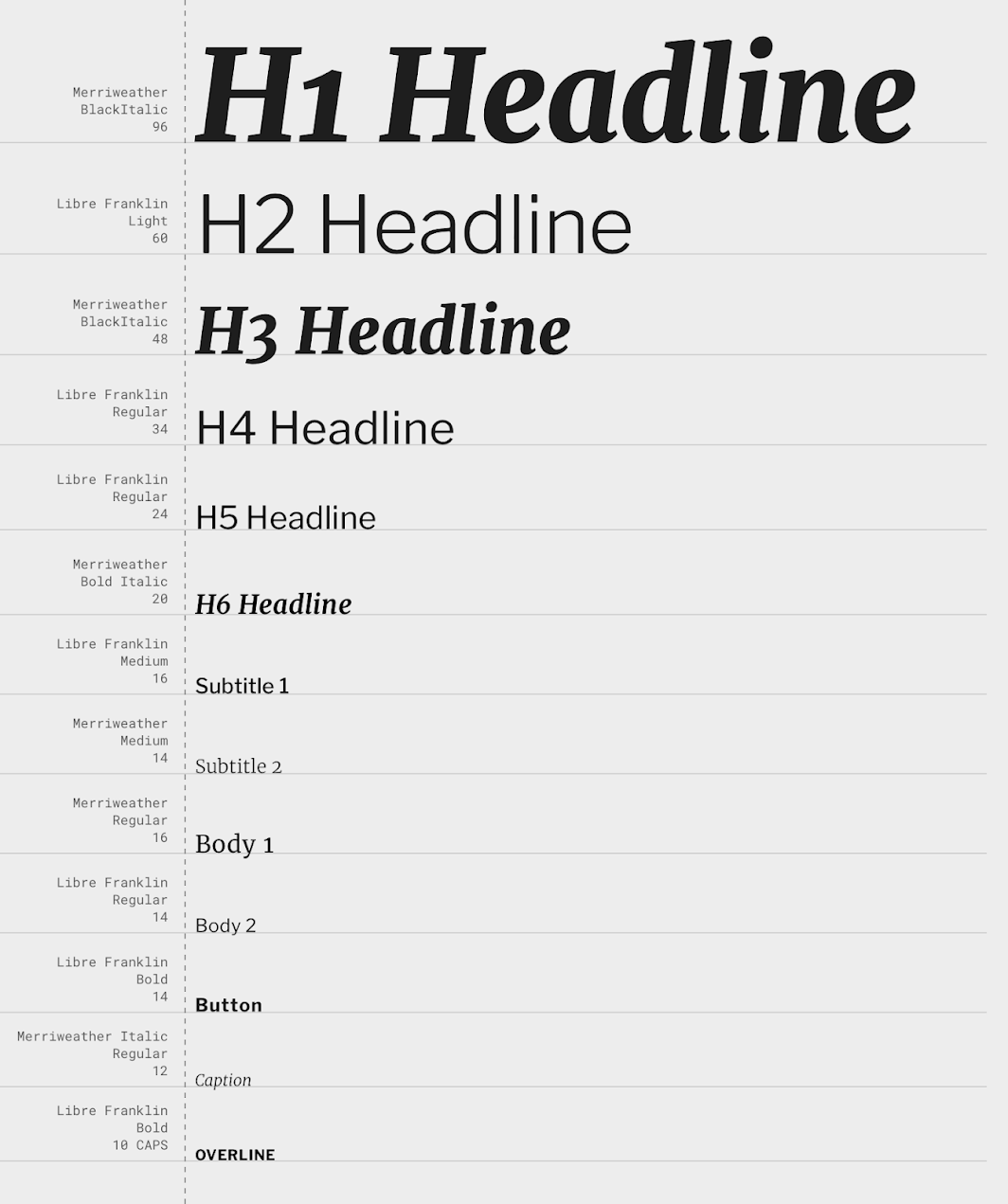
Merriweather
Merriweather was designed to be a text face that is pleasant to read on screen. It has a large x-height, slightly condensed letterforms, a mild diagonal stress, and sturdy serifs.
Libre Franklin
This sans serif typeface is an interpretation and expansion of Franklin Gothic. Although Franklin Gothic was originally cut to be used as a display face, it’s also legible when used at small sizes. It’s various weights make it easy to establish a typographic hierarchy.

Iconography
Fortnightly takes the approach of using recognizable, functional icons that don’t have customized, distinguishing characteristics or ornament. By not giving their icons branding or distinct style, they can be paired with any content of any tone and not conflict with that content’s style.
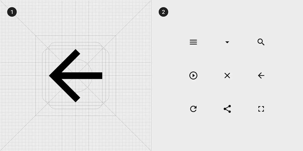
2. A collection of Fortnightly’s icons
Shape
Categories
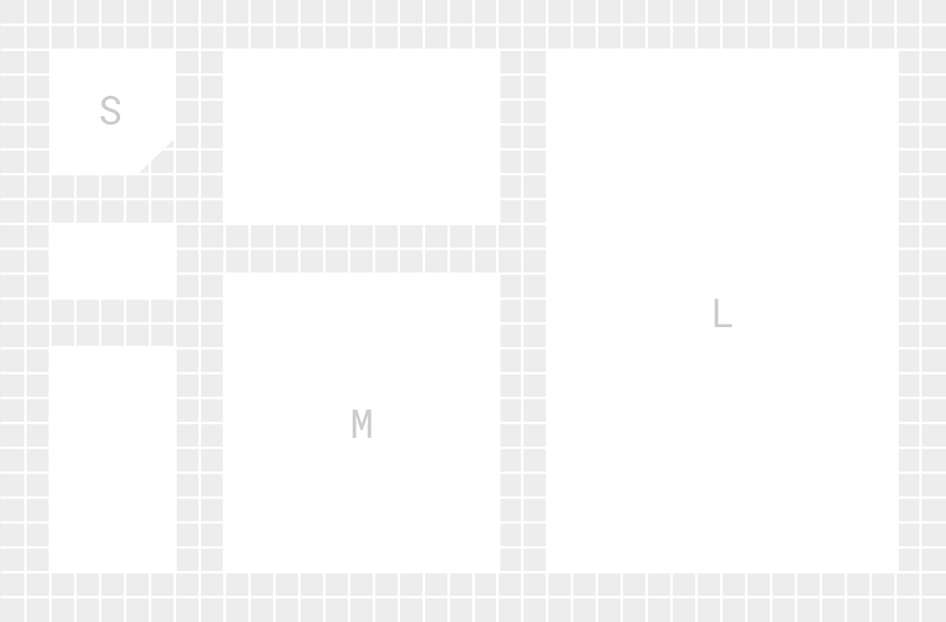
Components are grouped into shape categories based on their size. These categories let you set multiple component values at once. Shape categories include:
- Small components
- Medium components
- Large components
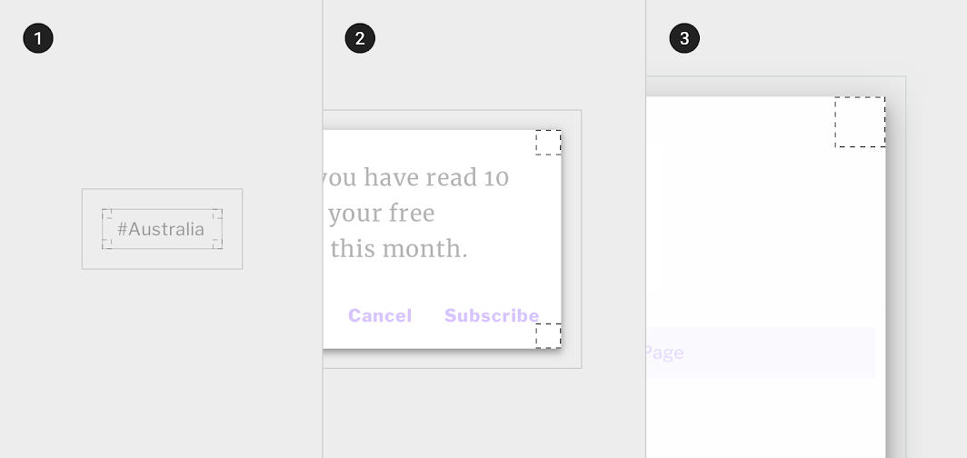
2. Medium components
3. Large components
Small components
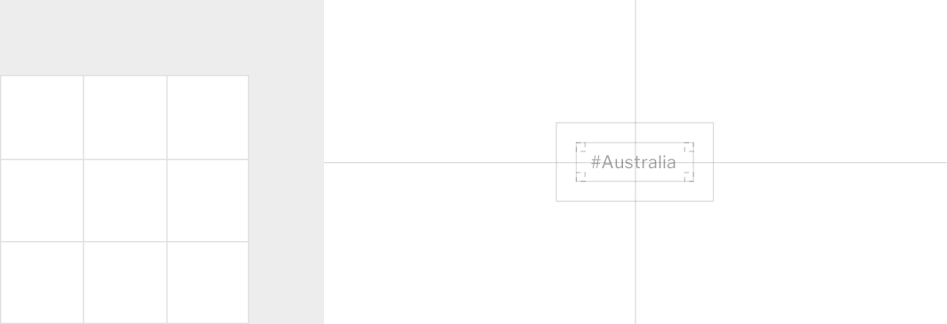
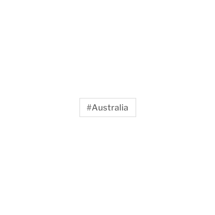
Chips have cut corners at 0dp.
| Component | Category | Attribute | Value |
|---|---|---|---|
| Chips | Small components | Family Size | Cut 0dp;0dp;0dp;0dp |
Medium components
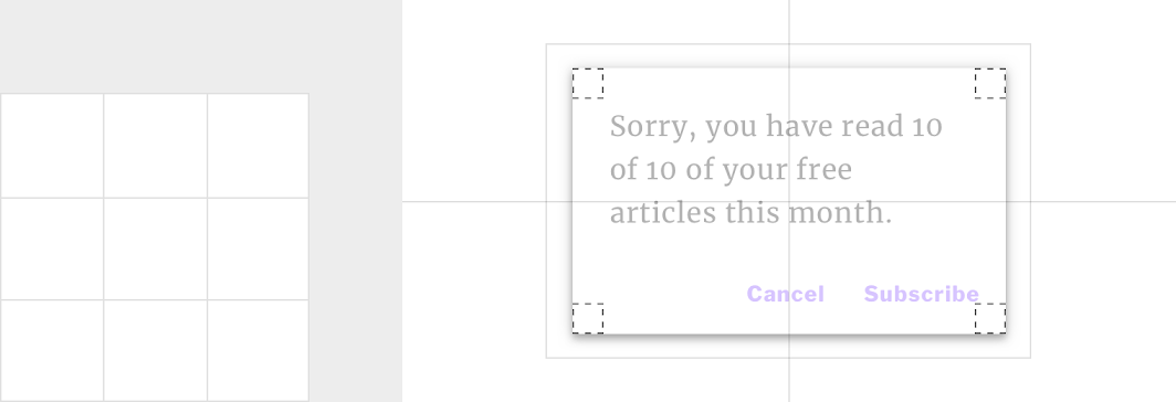
Dialogs have cut corners at 0dp.
| Component | Category | Attribute | Value |
|---|---|---|---|
| Dialog | Medium components | Family Size | Cut 0dp;0dp;0dp;0dp |
Large components
Navigation drawers have cut corners at 0dp.
| Component | Category | Attribute | Value |
|---|---|---|---|
| Navigation drawer | Large components | Family Size | Cut n/a;0dp;0dp;n/a* |
Components
Dialogs
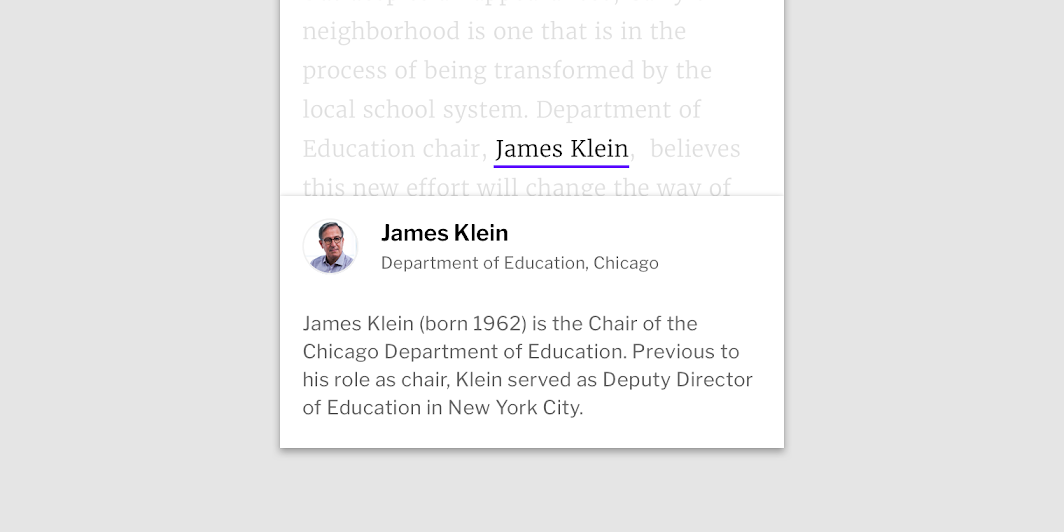
Certain content, when hovered over or tapped on, launches a dialog window to provide further information. Fortnightly uses this often to provide biographical information, allowing users to educate themselves further about people mentioned in articles.
Fortnightly uses a white scrim to indicate all app functionality is disabled while the content is on screen. On desktop, the dialog and scrim remain until the user hovers off the name; on tablet, they remain until the user taps outside of the dialog.
Text fields
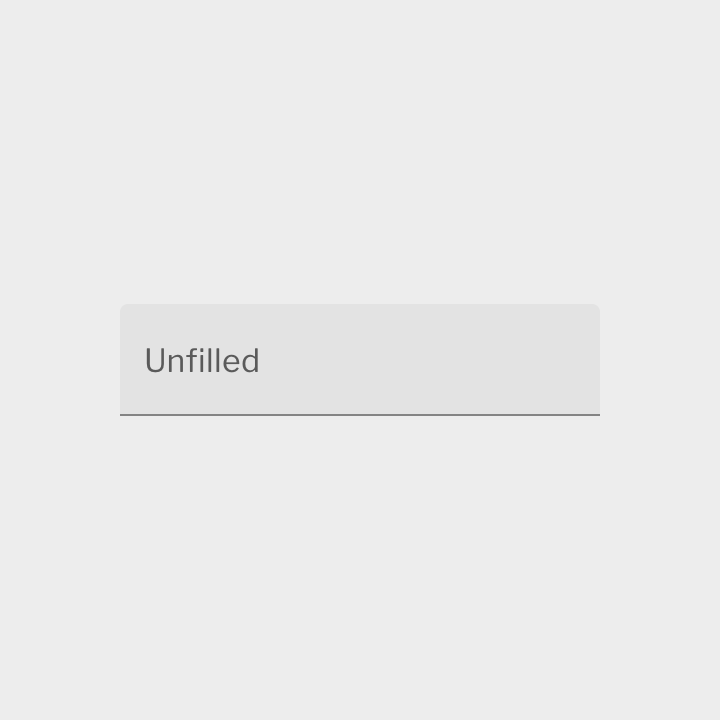
When searching is the primary action on a screen, Fortnightly uses scale to add emphasis to the search text field.

Chips
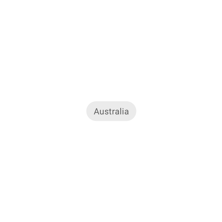
Fortnightly uses customized choice chips for a theme-based search experience.
Lists
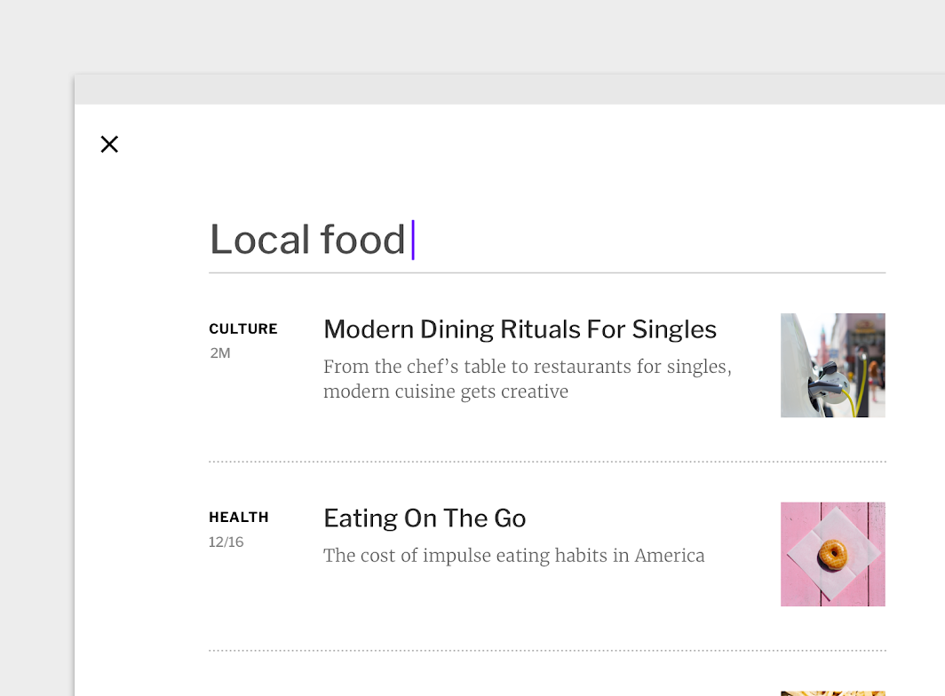
Fortnightly uses a customized list for its search results. This customized list provides generous white space around each list item and the variety of information each list item contains (such as section, date, article title, brief description, and photo). The white space allows the user to quickly scan results according to whichever information is most useful.
Steppers
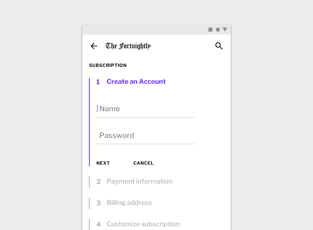
Fortnightly uses a linear stepper in its subscription process. Each step acts as an expandable drawer, with vertical lines establishing areas of focus. The Fortnightly purple accent color highlights the active step.
Motion
Product icon
Fortnightly’s logo animation reflects the calligraphic nature of its letterforms.
Navigation transitions
Fortnightly uses simple fade through and condensed transitions to complement its reserved approach to branding. The simple transition style helps balance the dense amount of content displayed.
Loading
Fortnightly uses a subtle stagger animation on placeholder elements to indicate loading without distracting from the content.