

Rally
Rally is a personal finance app that uses Material Design components and Material Theming to create an on-brand experience with a data-driven aesthetic.
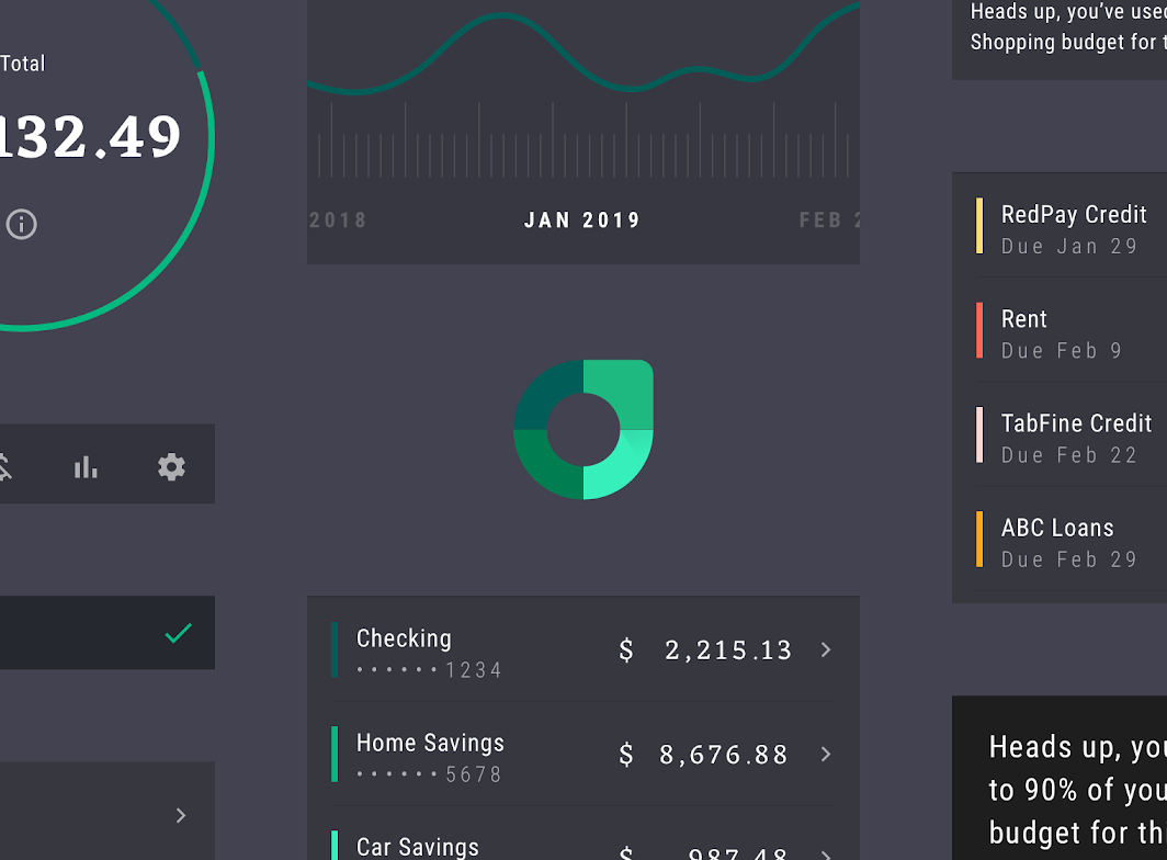
About Rally
Rally is a personal finance app that tracks spending habits, and generates insights and alerts related to your finances.
Rally is designed to display a large amount of densely organized information in a manageable way. Users are invited to identify patterns in the data presented, by cross-referencing and investigating information.
A premium style
The dark grey UI gives Rally a premium feel, while also allowing its bright accent colors that represent data to stand out against the background. The high contrast between data and the background color make it easy to read its graphs and charts.
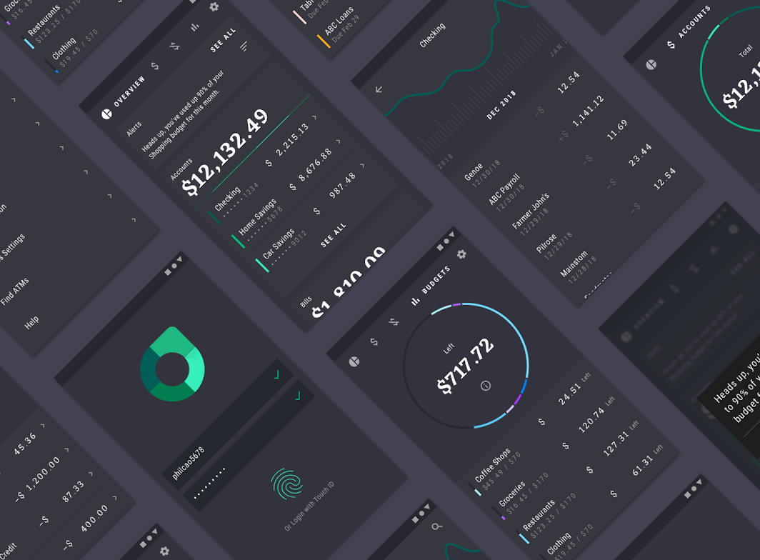
Data-driven aesthetic
Rally’s UI focuses on viewing, investigating, and understanding data. Infographics laid out in a dashboard invite the user to view a summary of their spending, including the details of a single transaction.
The UI is dense and direct, with an emphasis on typography, color, and shape.
Product architecture
Rally’s information architecture has a hierarchical structure, allowing users to look at their finances through a variety of categories. The financial overview provides the most general version of this category, with an individual transaction being the most detailed category in the structure.
Content
Content is divided into sections related to personal finance, such as accounts, budgets, and bills. Rally’s home page operates as a hub to these sections.
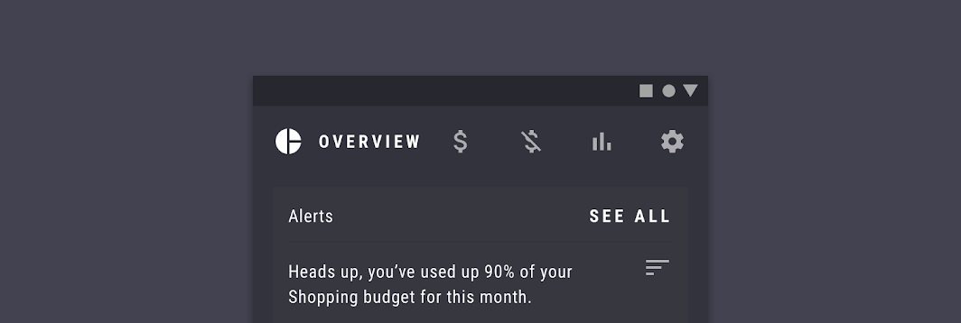
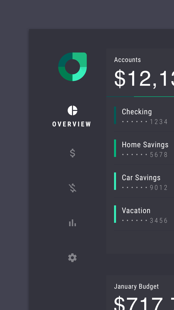
Because Rally is concentrated on presenting and describing different areas of personal finance, it’s important that users can easily move between sections. A permanent location for navigation makes it easy for users to switch sections easily. On desktop and tablet, Rally uses rail navigation. On mobile, Rally uses tabs. These navigation patterns are ideal because although they are always on-screen, they take up very little space.
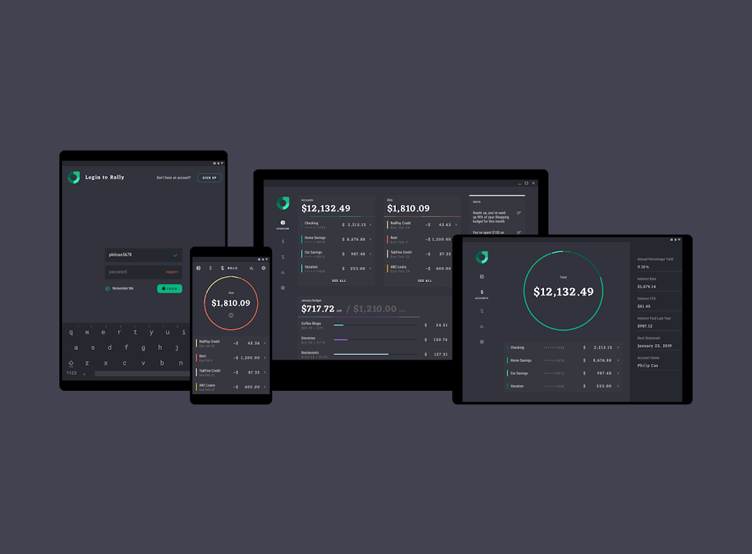
Rail navigation
On desktop and tablet, Rally uses rail navigation.
Rail navigation provides a permanent region to navigate between sections, while taking up little screen space.
In a rail, each destination is represented by a unique icon. When a section is selected, it’s icon becomes brighter and a section title is displayed.
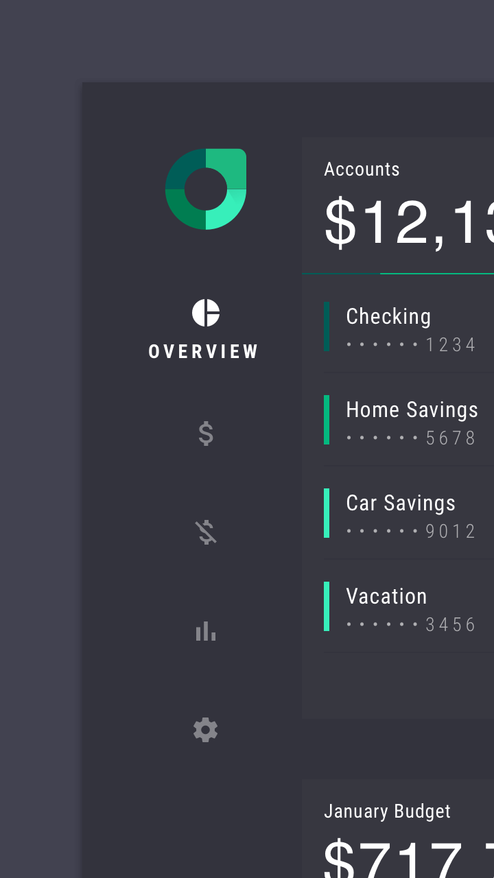
Tabs
On mobile, Rally uses customized tabs to navigate between sections.
Tab selection
Unselected tabs are represented by icons. When a tab is selected, it displays a section title adjacent to the icon. Tabs make navigation persistently available, while taking up as little space as possible.
Layout
Grid system
Rally uses a responsive grid system, which has flexible columns and padding that can resize to accommodate any screen width.
Elevation
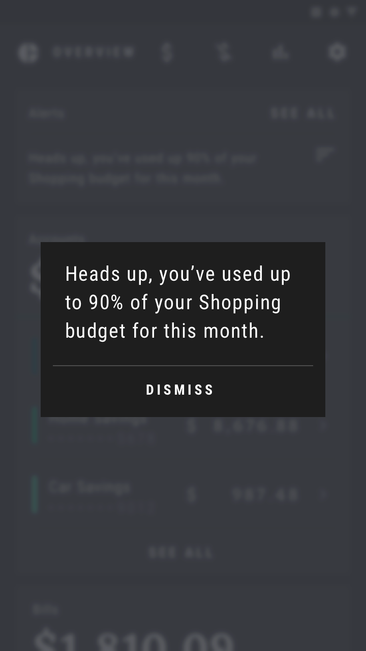
Rally expresses elevation differences between UI elements using color or a scrim.
Color
Sometimes Rally needs to show multiple infographics on a single screen, each with multiple sections. To do this, Rally has adopted a color theme with one primary color, and five additional colors. This elaborate color theme allows Rally to present readable, distinct infographics.
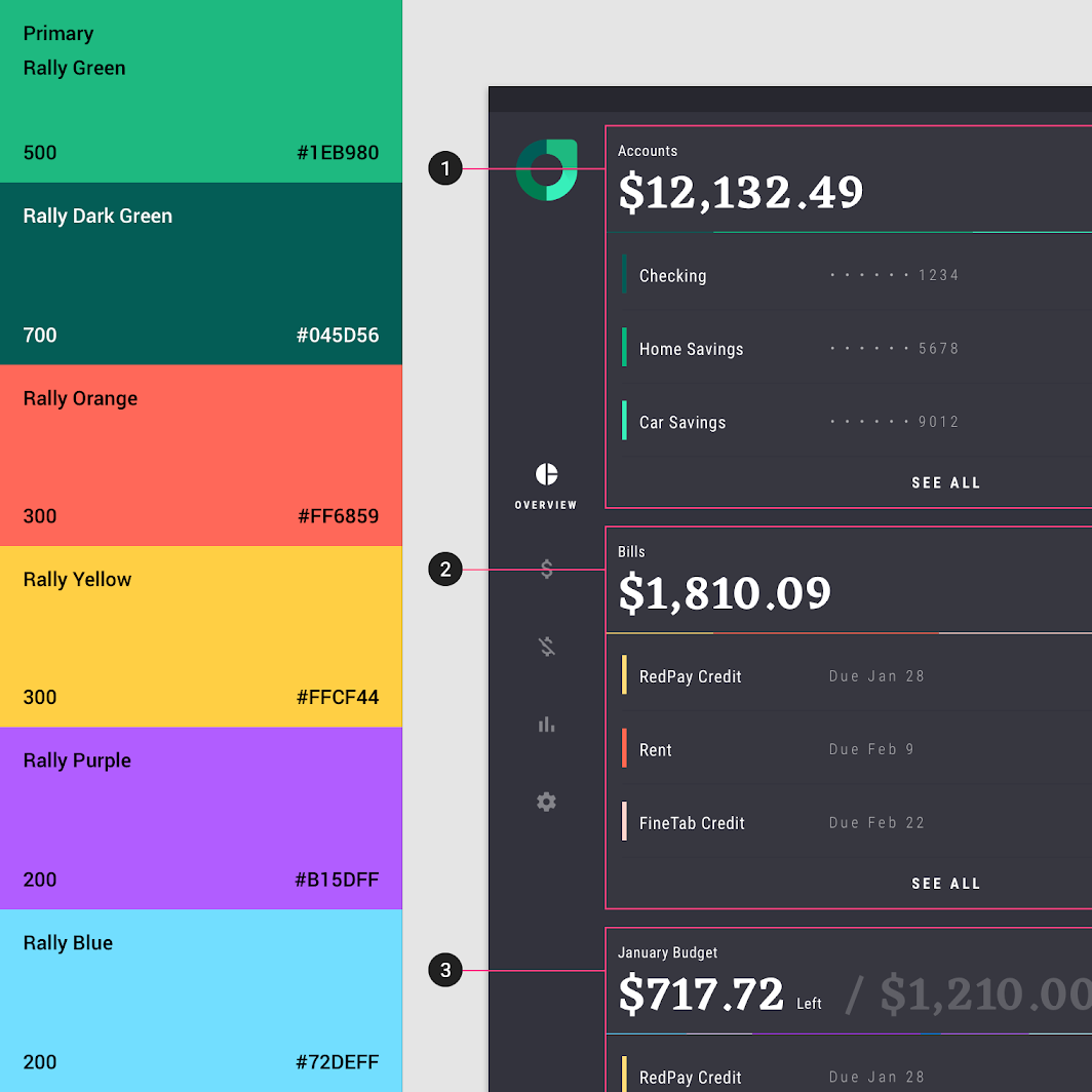
1. The first infographic uses: Primary Green and Dark Green.
2. The second infographic uses Orange and Yellow.
3. The third infographic uses: Purple and Blue.
Scaled down to 75%
Color theme
Rally’s color theme has one primary color and five additional colors. It also has an extended palette consisting of ten swatches: a swatch for the primary color (or an alternative primary color), and nine variations of that swatch.
Rally uses swatches from these extended palettes to present robust, readable infographics.
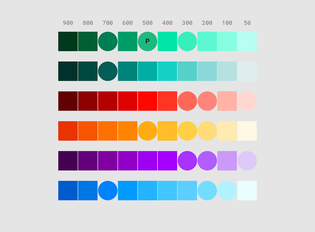
• A circle-shaped swatch indicates that the swatch is used in the app
• A circle-shaped swatch with an “P” indicates the swatch as a primary color
• A circle-shaped swatch without a letter indicates the swatch as an additional color
Typography
Typefaces
Rally uses two typefaces: Eczar and Roboto Condensed.
2. Eczar
Type scale
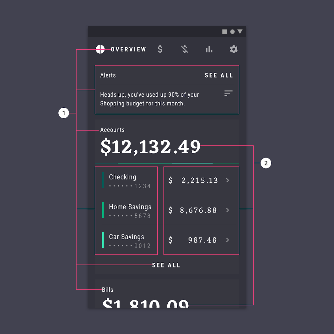
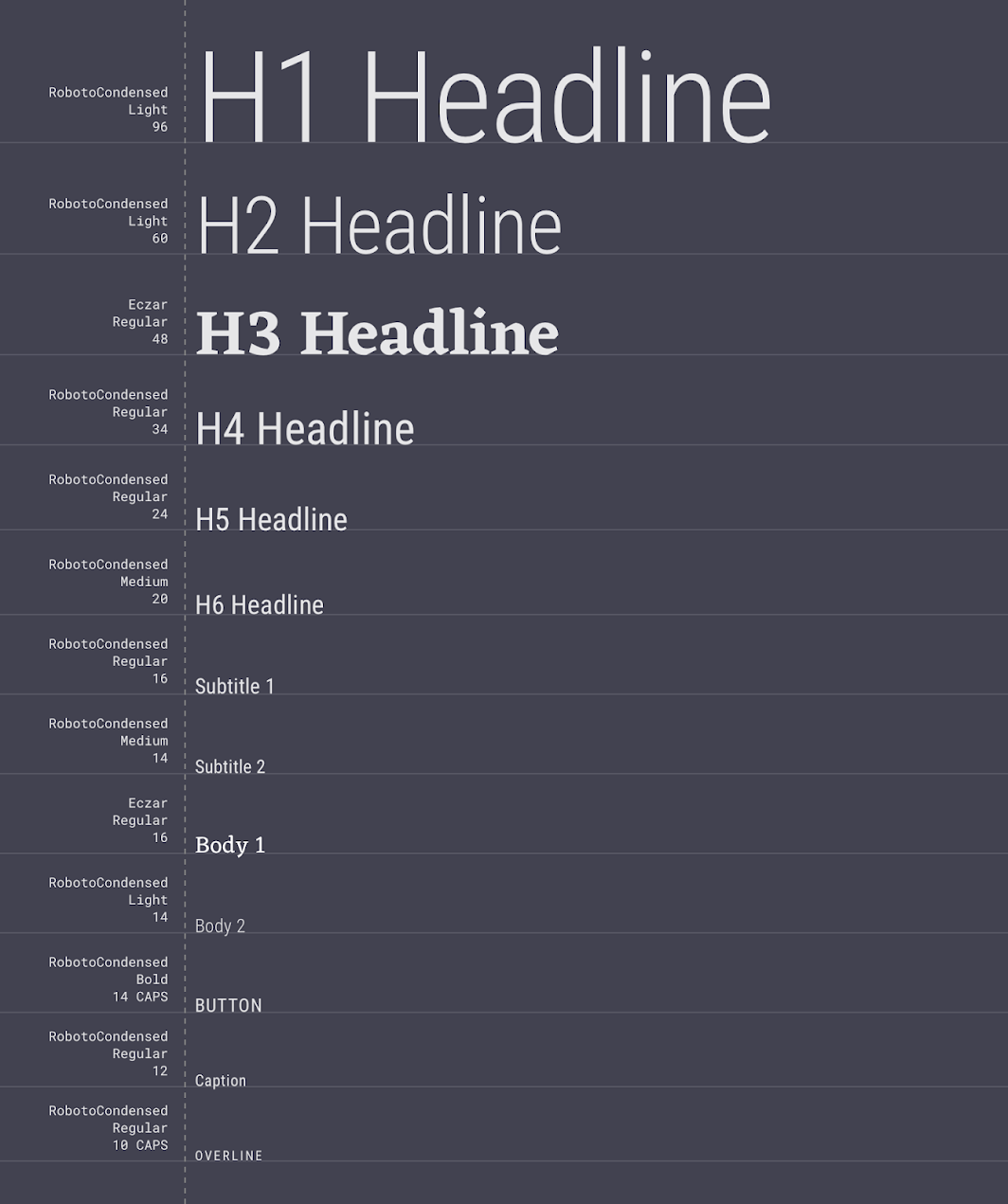
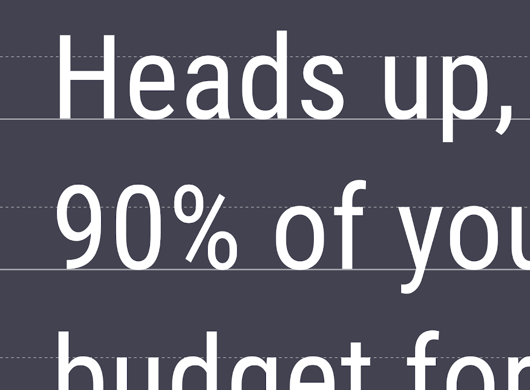
Rally’s type scale provides the typographic variety necessary for the app content. Most copy is set in Roboto Condensed, though Eczar is used for headlines and lists that only use numbers.
Eczar
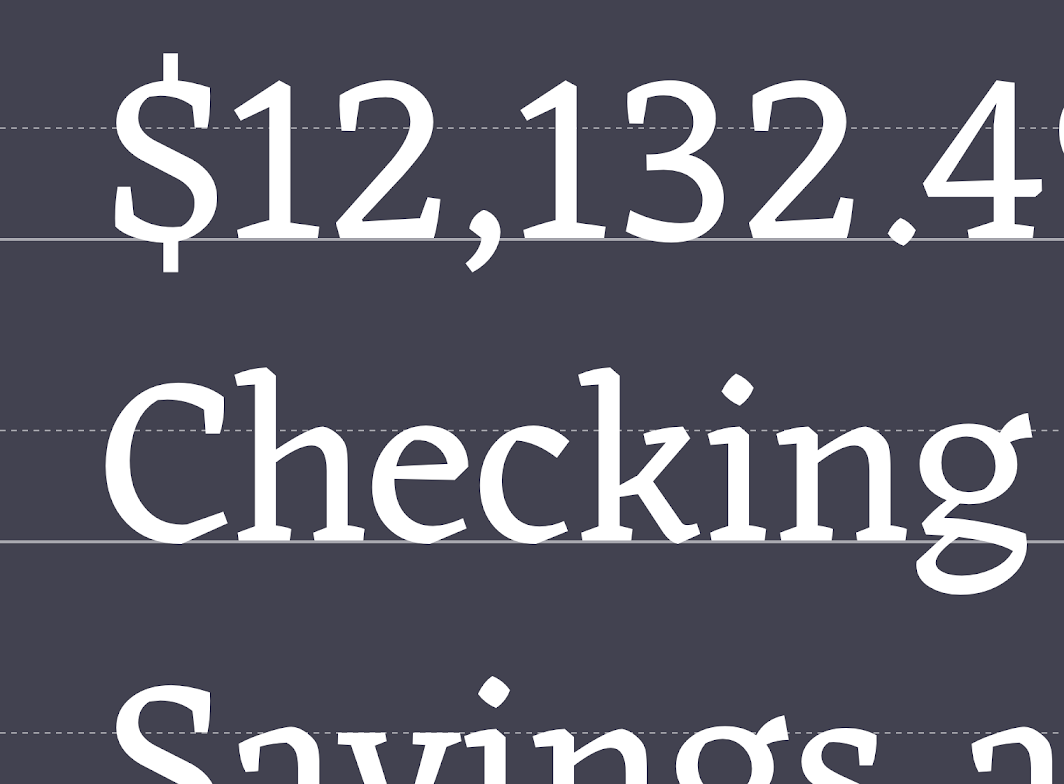
Eczar performs well as both body text and display (heading) sizes, as it uses serifs which make it easy to read at different sizes.
Eczar is a display typeface for numbers placed in the center of the infographics, as well as dollar amounts in lists.
Roboto Condensed
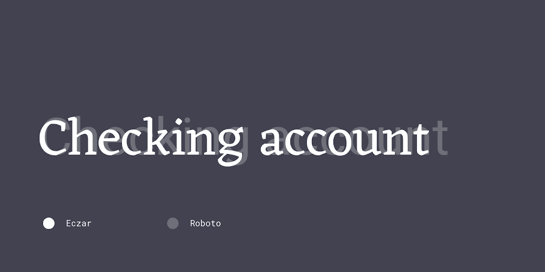
Roboto Condensed is used for all of Rally’s body copy, button text, and headline text.
This condensed sans serif remains legible onscreen, and its compact size makes it fit into Rally’s dense layout.

Iconography
Rally uses custom iconography to represent to its four main sections: Overview, Accounts, Bills, Budgets, and Settings.
The icons use curved forms and sharp corners that resemble the shape of Rally’s typography.
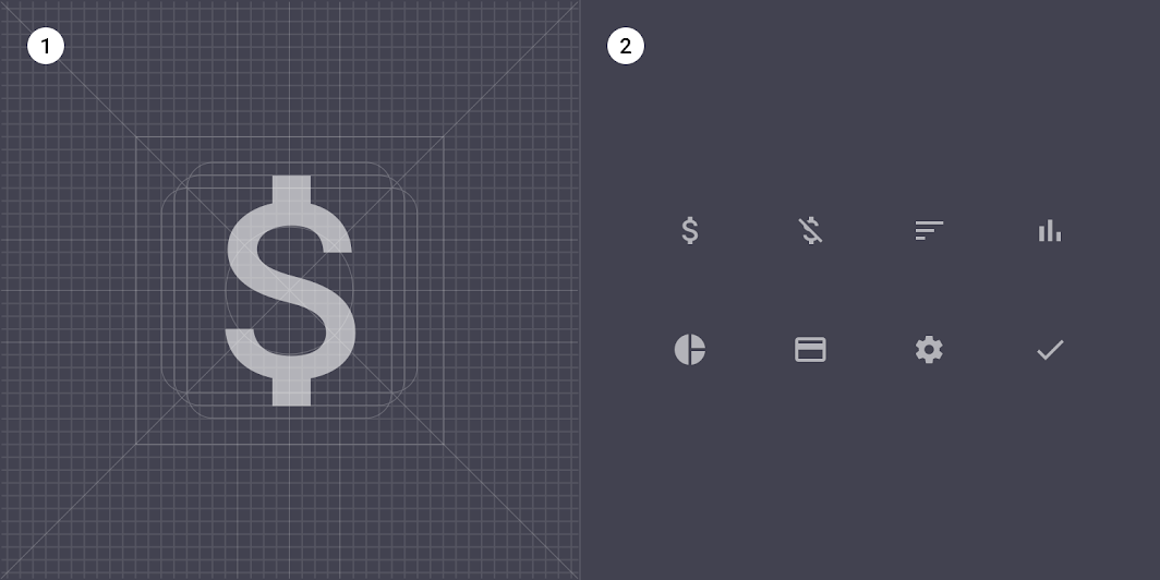
2. A collection of Rally’s icons.
Shape
Categories
Components are grouped into shape categories based on their size. Shape categories let you set multiple component values at once. Shape categories include:
- Small components
- Medium components
- Large components
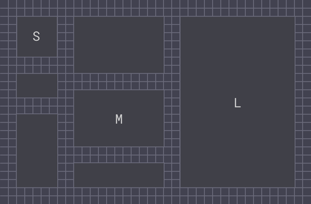
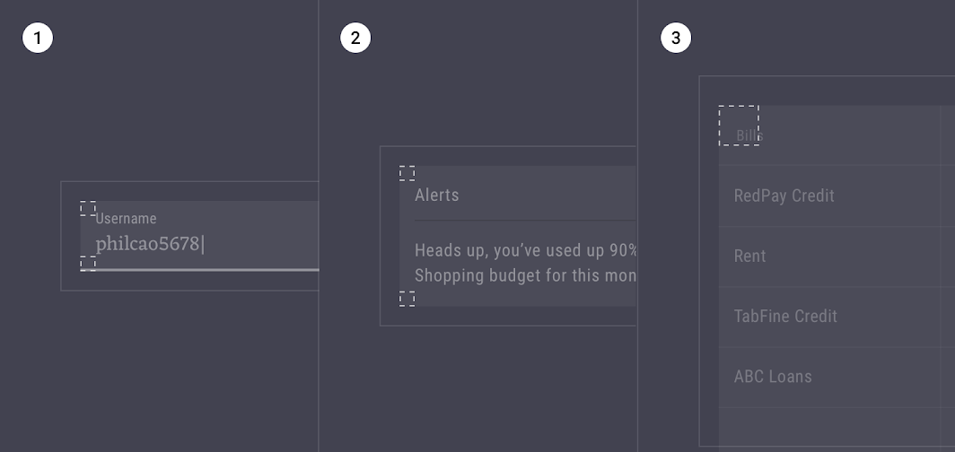
2. Medium components
3. Large components
Small components
Filled text fields have cut corners at 0dp.
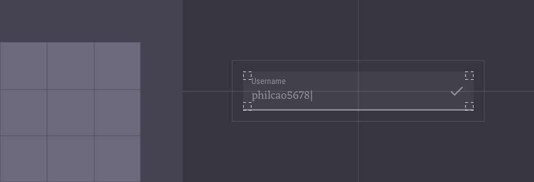
| Component | Category | Attribute | Value |
|---|---|---|---|
| Filled text fields | Small components | Family Size | Cut 0dp |
Medium components
Cards have cut corners at 0dp.
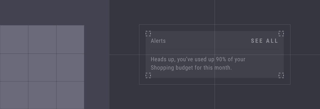
| Component | Category | Attribute | Value |
|---|---|---|---|
| Cards | Medium components | Family Size | Cut 0dp;0dp;0dp;0dp |
Large components
Data tables have cut corners at 0dp.
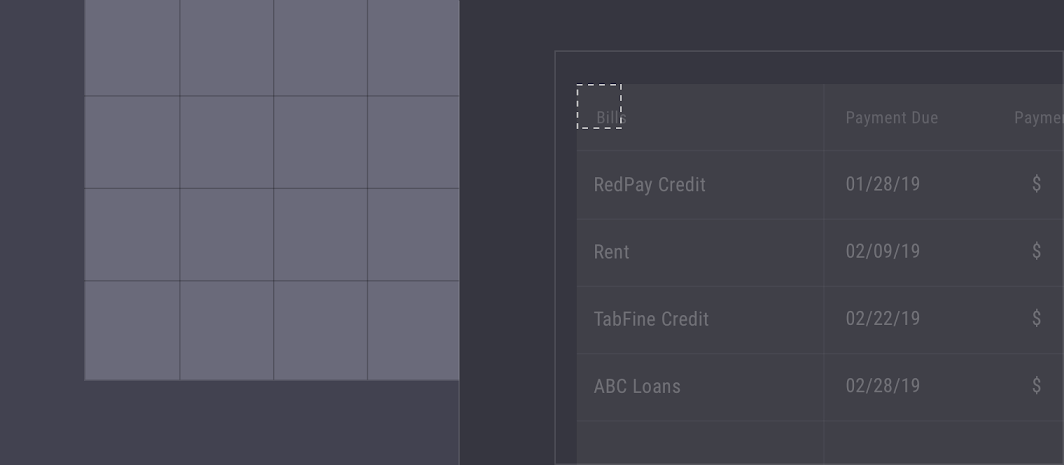
| Component | Category | Attribute | Value |
|---|---|---|---|
| Data tables | Large components | Family Size | Cut 0dp;0dp;0dp;0dp |
Components
Cards and lists
Various financial views
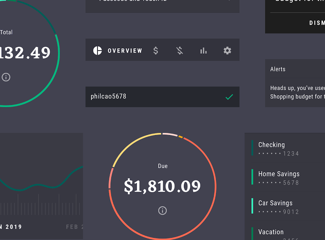
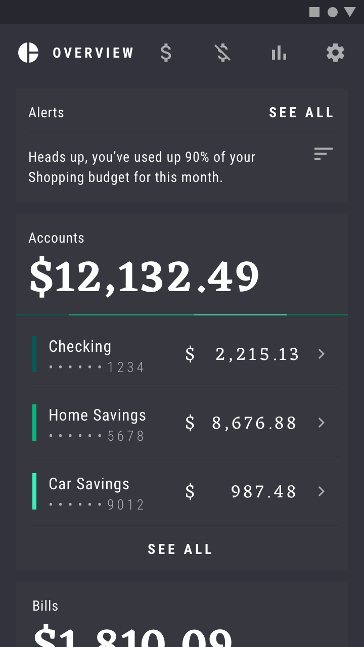
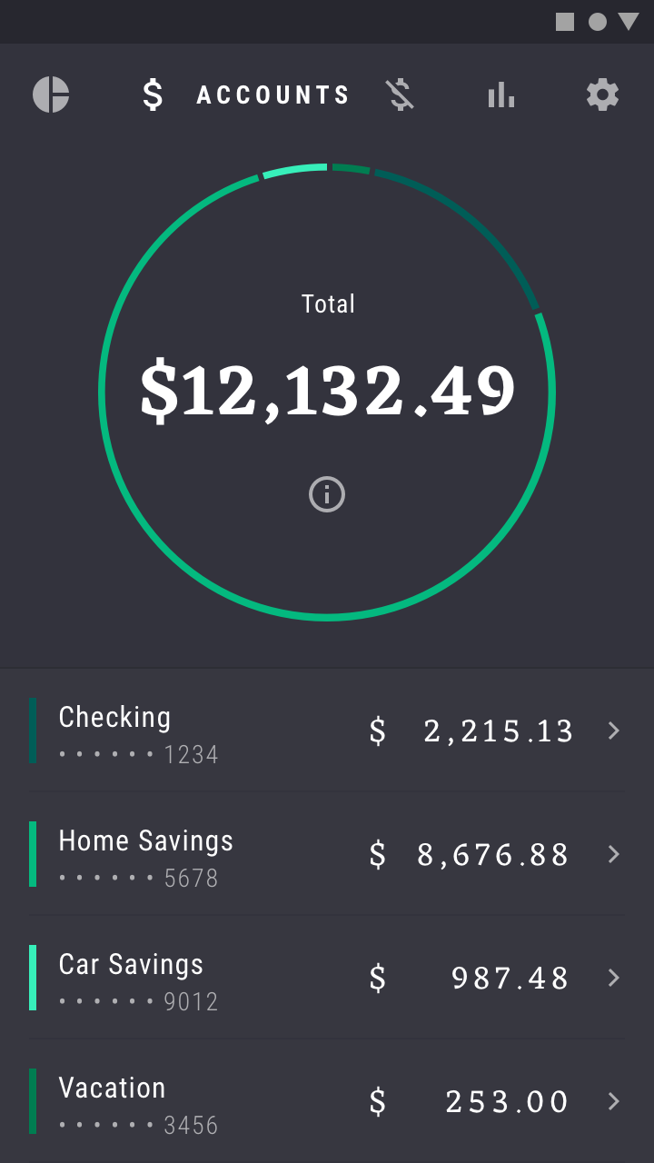
Rally provides users with an overview of their finances, providing both macro and micro views of each transaction. The card component is used for macro views in the app’s main sections. For specific itemized lists, Rally uses the list component.
These card and list components have been customized to use Rally’s color theme and typeface. List items include colors, so that users can relate each line item to the corresponding graph.
Banners, dialogs, and snackbars
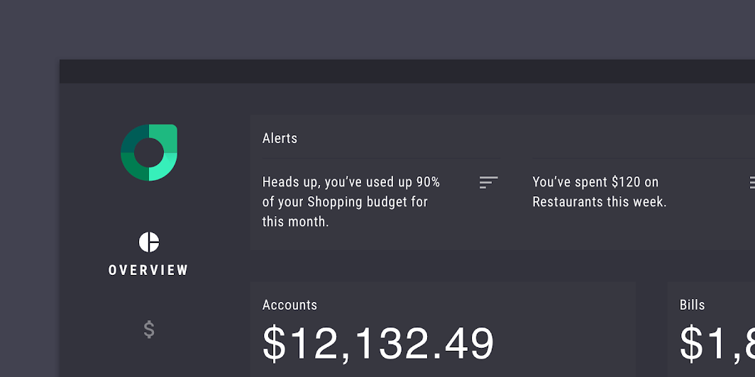
Banners
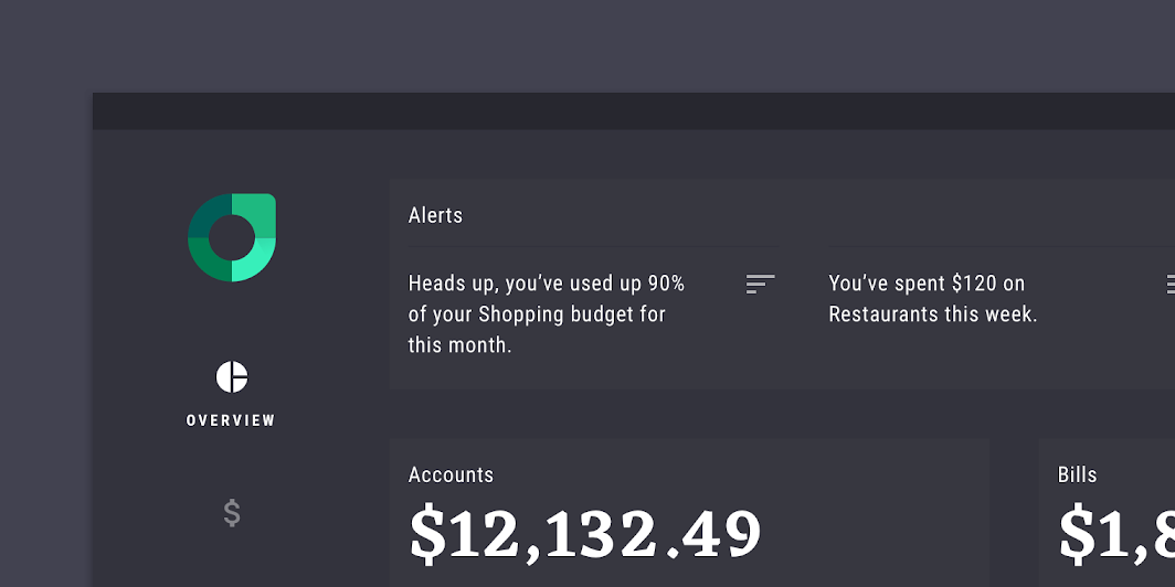
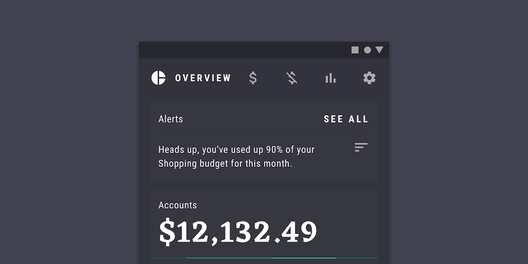
Rally uses banners to deliver low-priority messages. These banners are customized with Rally’s color and typography, and they’re often paired with an icon associated with a specific area of finance.
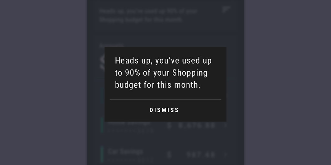
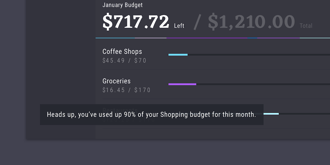
Snackbars and dialogs
Higher-priority messages that need increased visibility are communicated in snackbars or dialogs. They don’t contain icons and are customized with Rally’s color and typography.
Rail
On desktop and tablet, Rally uses rail navigation. When a section is selected, it displays a text label and a brighter color in the rail.
Tabs
On mobile, Rally uses tabs for navigation, with each tab represented by an icon. These tabs have no container, and display text only upon selection.
The tabs occupy fixed positions, without scrolling. When a new tab is tapped, they shift and redistribute themselves horizontally.
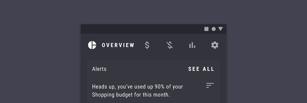
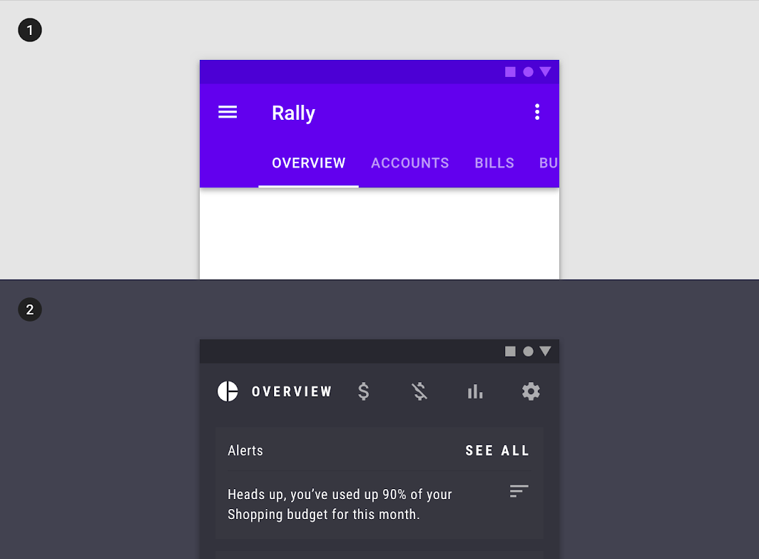
2. Rally’s tabs use custom typography, iconography, color, and states. Only selected icons have text.
Motion
Rally has a simple and reserved motion style to help balance the visual density of the UI.
Launch screen
Rally displays an animated logo on first launch to set a polished tone.
Navigation transitions
Rally uses standard easing and durations for navigational transitions to keep the motion style streamlined.
Opening an account uses a parent-child navigational transition. A subtle use of scale is used on background content to add a sense of depth.
Sequencing
Stagger is used to add polish when introducing new elements like a list. A temporal offset is used to emphasise the circular graph since it’s a prominent part of the UI.
Overshoot
Overshoot is used on important dialogs to convey a sense of urgency.