Skip to content
Material Design 2
Main Navigation
v3
v2
v1

English

简体中文
繁體中文
Español
Français
Русский
Português – Brasil
Deutsch
日本語
한국어
Italiano
Polski
Türkçe
čeština
magyar

English

简体中文
繁體中文
Español
Français
Русский
Português – Brasil
Deutsch
日本語
한국어
Italiano
Polski
Türkçe
čeština
magyar

Appearance

Sidebar Navigation

Material System

Introduction

Material studies

About our Material studies

Basil

Crane

Fortnightly

Owl

Rally

Reply

Shrine

Material Foundation

Environment

Surfaces

Elevation

Light and shadows

Layout

Understanding layout

Pixel density

Responsive layout grid

Spacing methods

Component behavior

Applying density

Navigation

Understanding navigation

Navigation transitions

Search

Color

The color system

Applying color to UI

Color usage

Text legibility

Dark theme

Typography

The type system

Understanding typography

Language support

Sound

About sound

Applying sound to UI

Sound attributes

Sound choreography

Iconography

Product icons

System icons

Animated icons

Shape

About shape

Shape and hierarchy

Shape as expression

Shape and motion

Applying shape to UI

Motion

Understanding motion

The motion system

Speed

Choreography

Customization

Interaction

Gestures

Selection

States

Communication

Confirmation & acknowledgement

Data formats

Data visualization

Empty states

Help & feedback

Imagery

Launch screen

Onboarding

Offline states

Writing

Machine learning

Machine learning patterns

Object detection: live camera

Object detection: static image

Barcode Scanning

Material Guidelines

Material Theming

Overview

Implementing your theme

Usability

Accessibility

Bidirectionality

Platform guidance

Android bars

Android fingerprint

Android haptics

Android icons

Android navigating between apps

Android notifications

Android permissions

Android slices

Android split-screen

Android swipe-to-refresh

Android text selection toolbar

Android widget

Cross-platform adaptation

Components

App bars: bottom

App bars: top

Backdrop

Banners

Bottom navigation

Buttons

Buttons: floating action button

Cards

Checkboxes

Chips

Data tables

Date pickers

Dialogs

Dividers

Image lists

Lists

Menus

Navigation drawer

Navigation rail

Progress indicators

Radio buttons

Sheets: bottom

Sheets: side

Sliders

Snackbars

Switches

Tabs

Text fields

Time pickers

Tooltips

On this page

Spacing methods ​

Spacing methods use baseline grids, keylines, padding, and incremental spacing to adjust ratios, containers, and touch targets.

Baseline grid ​

8dp grid ​

All components align to an 8dp square baseline grid for mobile, tablet, and desktop.
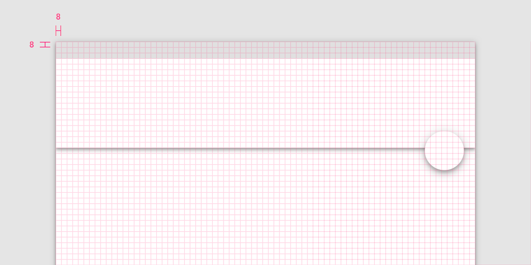
The app bar and floating action button align to the 8dp grid
The app bar and floating action button align to the 8dp grid.

4dp grid ​

Icons, type, and some elements within components can align to a 4dp grid.
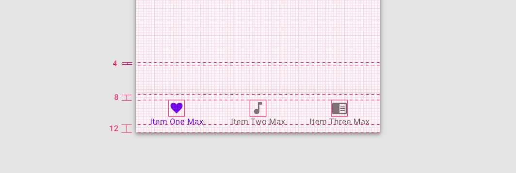
Elements of the bottom navigation bar align to the 4dp grid
Elements of the bottom navigation bar align to the 4dp grid.

4dp baseline grid ​

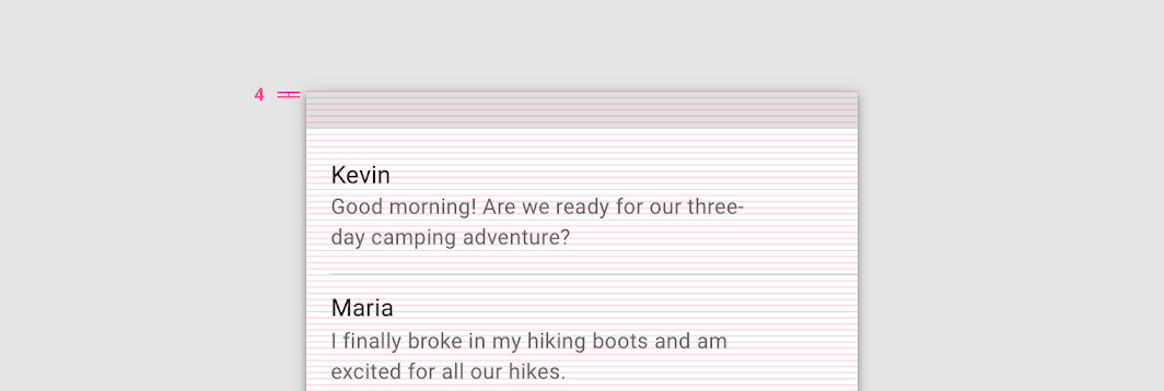
Type aligns to the 4dp baseline grid.

4dp baseline grid
4dp baseline grid

Type can be placed outside of the 4dp grid when it’s centered within a component, such as a button or list item. When placed outside of the grid but centered within a component, text can still appear vertically center-aligned.
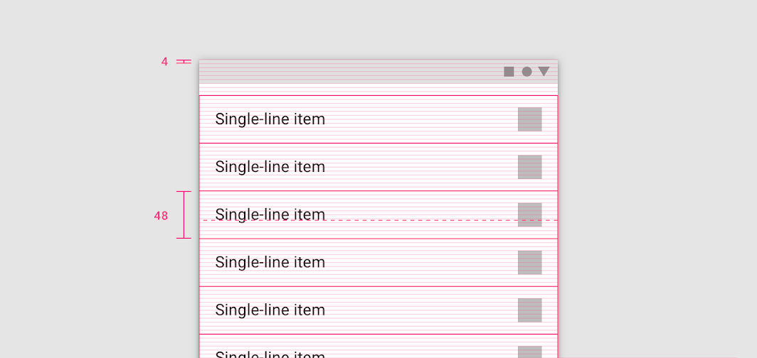
The text appears vertically aligned in the center of the list item, though the type is placed outside of the 4dp grid
The text appears vertically aligned in the center of the list item, though the type is placed outside of the 4dp grid.

Spacing ​

Spacing methods ​

Spacing methods are more granular than the responsive layout grid. Spacing methods are a set of rules around how to place elements within layouts and components.
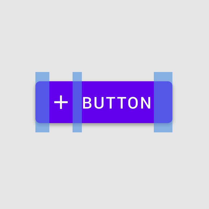
Spacing methods: padding

Padding

Padding is the space between elements within a component.
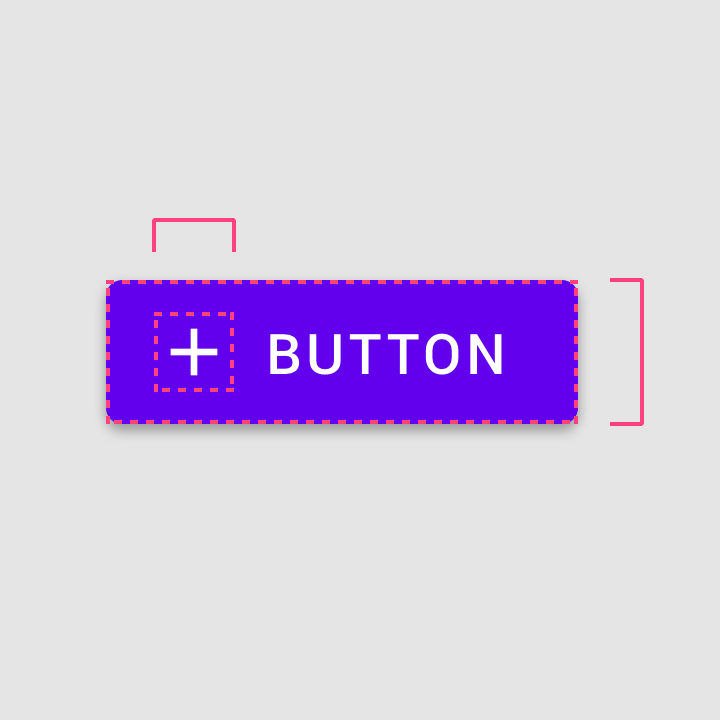
Spacing methods: dimensions

Dimensions

Dimensions describe the width and height of component elements.
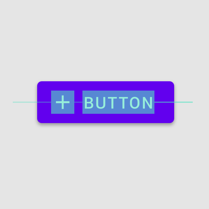
Button with plus icon and padding

Alignment

Alignment is the placement of elements within a component.

Padding ​

Padding refers to the space between UI elements. Padding is an alternative spacing method to keylines and is measured in increments of 8dp or 4dp.

Padding can be measured both vertically and horizontally and does not need to span the whole height of a layout.
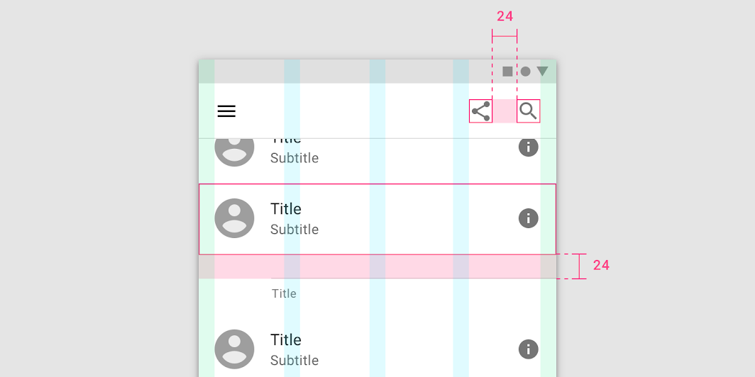
A layout with 24dp padding between components
A layout with 24dp padding between components.

Dimensions ​

Dimensions refer to the width and height of component elements.

Some components, such as an app bar or list, only outline the height of an element. The heights of these elements should align to the 8dp grid. Their widths are not specified because it’s responsive to a viewport width.
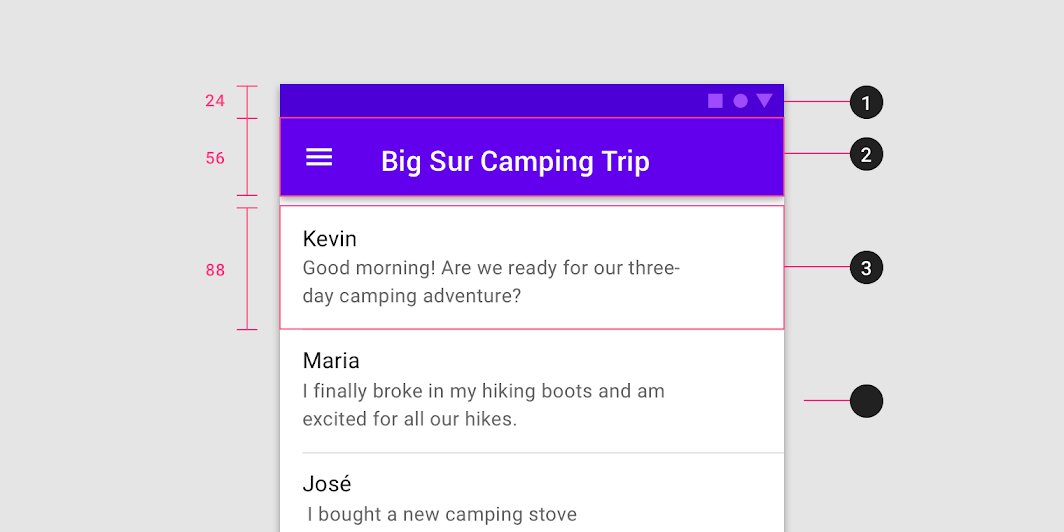
Diagram of status bar height: 24dp, app bar height: 56dp, list item height: 88dp
1. Status bar height: 24dp
2. App bar height: 56dp
3. List item height: 88dp

Alignment ​

Alignment is the placement of elements within a component.
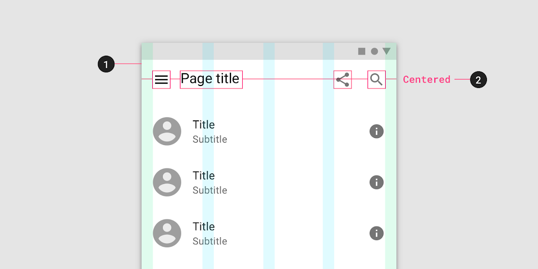
Diagram of layout Grid, alignment
1. Layout Grid
2. Alignment

Keylines ​

Keylines are an alignment tool that enables consistent placement of elements outside of the layout grid. They are vertical lines that show where elements are placed when they don’t align to the grid. Keylines are determined by each element’s distance from the edge of the screen and are measured in increments of 8dp.
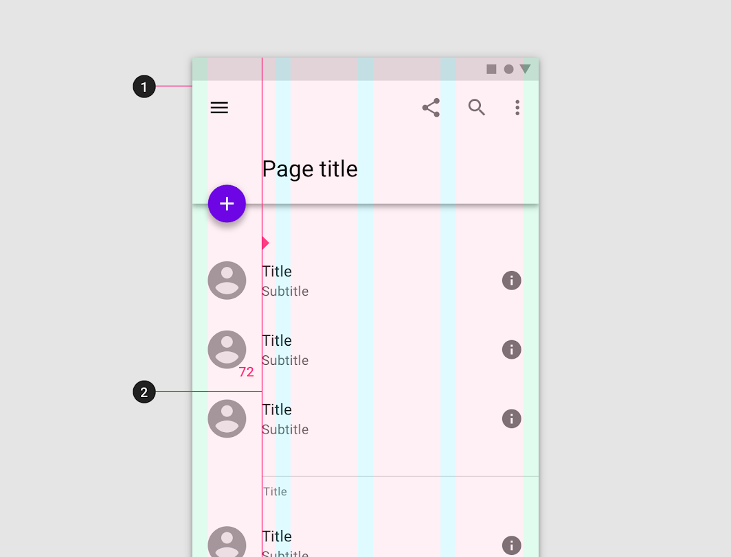
Diagram of layout Grid, keyline
1. Layout Grid
2. Keyline

Keylines can create more or less space between elements in a layout. They are adjustable per breakpoint range.
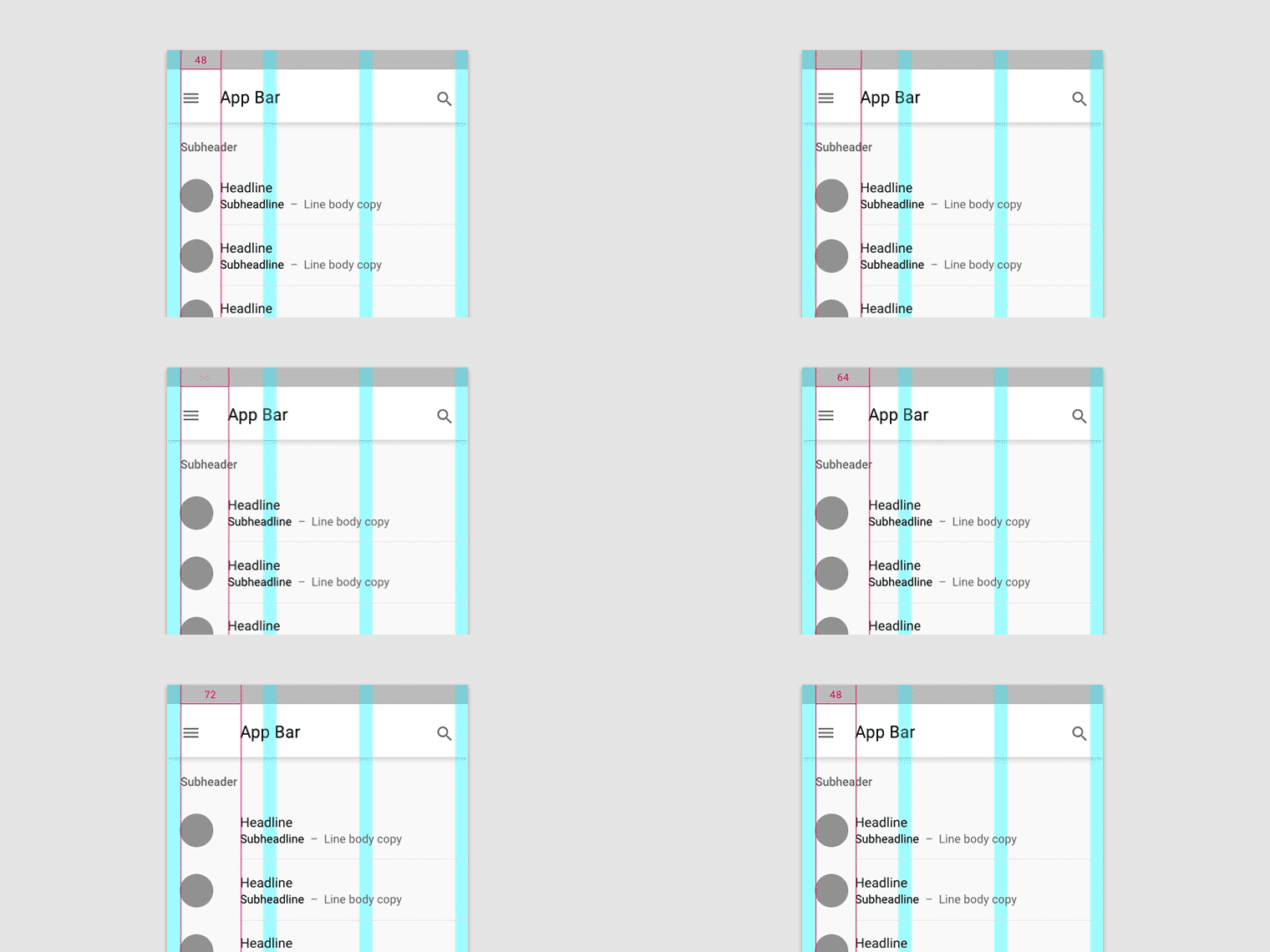
Keylines can expand or reduce the space between elements
Keylines can expand or reduce the space between elements.

Layout Grid

Material Design's responsive layout grid adapts to screen size and orientation, ensuring consistency across layouts.

Related article

Containers and ratios ​

Containers ​

A container is a shape used to represent an enclosed area. Containers can hold UI elements such as images, icons, or surfaces.
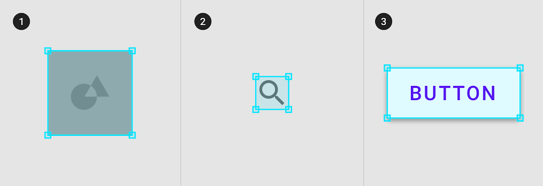
Diagram of image container, icon container, surface container
200%
1. Image container
2. Icon container
3. Surface container

Containers can be rigid and restrict the size or cropping of elements within them. Alternatively, they can be flexible and grow to support the size of the content they hold.
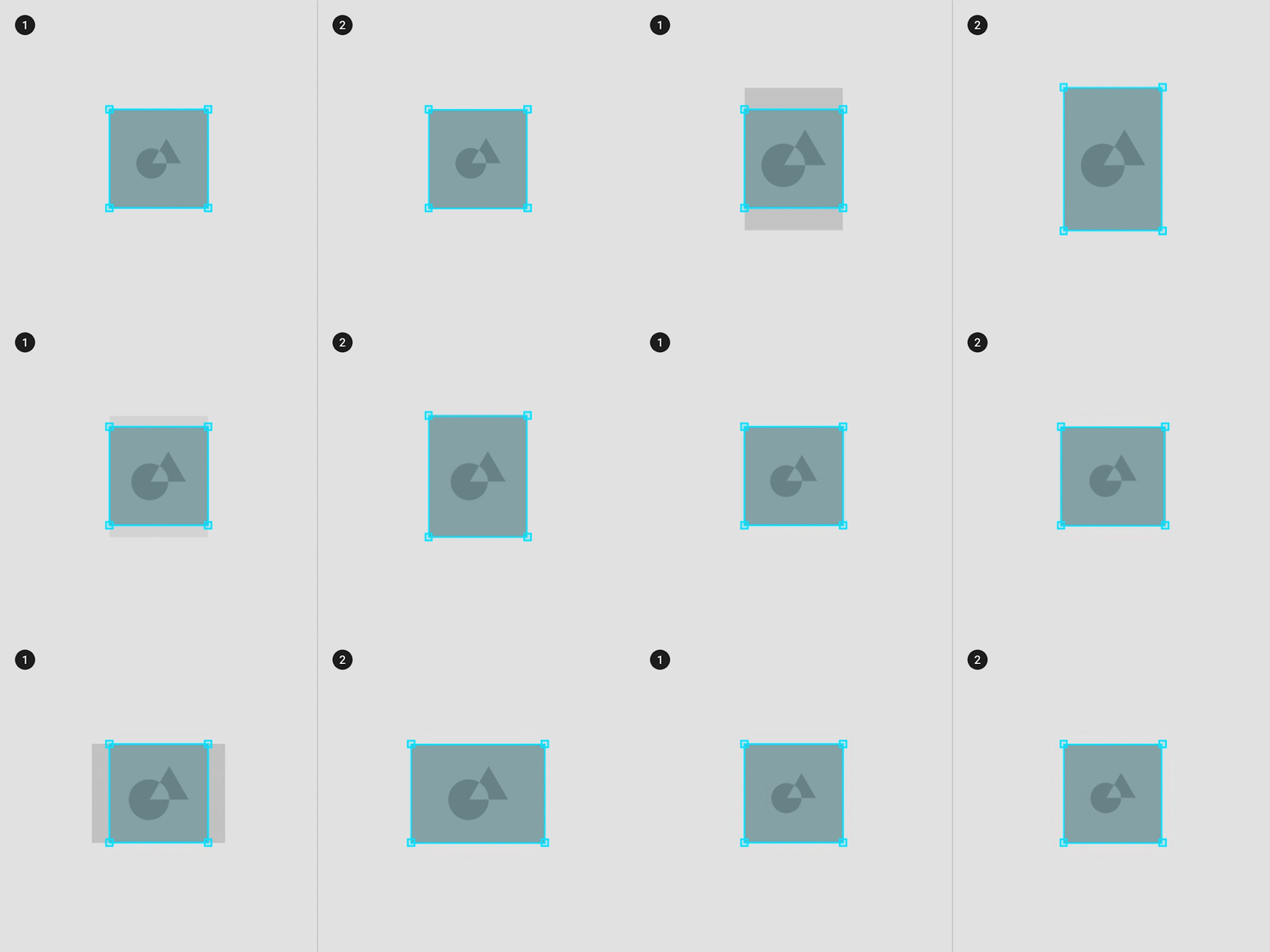
Rigid image container that crops the original image size
1. Rigid image container that crops the original image size.
2. Flexible image container that scales to hold the original image size.

Aspect ratios ​

An aspect ratio is the proportion of an element’s width to its height. Aspect ratios are written as width:height.

To maintain consistency in your layout, use a consistent aspect ratio on elements like images, surfaces, and screen size.

The following aspect ratios are recommended for use across your UI: 16:9; 3:2; 4:3; 1:1; 3:4; 2:3
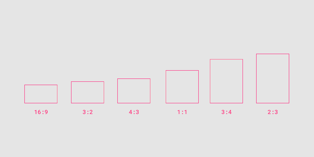
Aspect ratios

Flexible ratios ​

Flexible ratio sizing is determined by the layout grid:

  • Container width is determined by the screen layout and grows to fill the maximum space available
  • Container height is determined by the height of the image in the container

Use a flexible ratio to allow content form determine the height of the container.
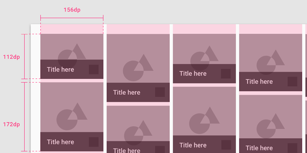
Container widths are determined by the column widths in the layout grid
Container widths are determined by the column widths in the layout grid.

Responsive cropping ​

To display images responsively, define how an image will be cropped at different breakpoint ranges. At different breakpoint ranges cropping can:

  • Maintain one fixed ratio
  • Adapt to different ratios
  • Fix image heights

Maintain one ratio ​

Image sizing can hold one fixed ratio across breakpoint ranges.
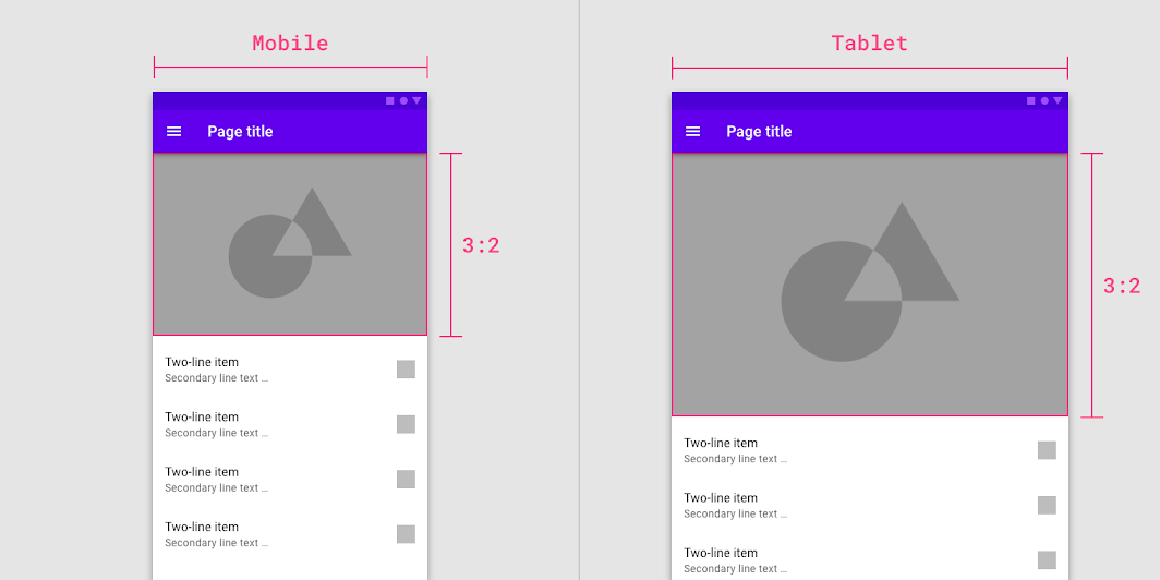
The image in the UI maintains a 3:2 ratio between breakpoints
50%
The image in the UI maintains a 3:2 ratio between breakpoints.

Adapt to different ratios ​

Image ratios can change by adapting to different breakpoint ranges.
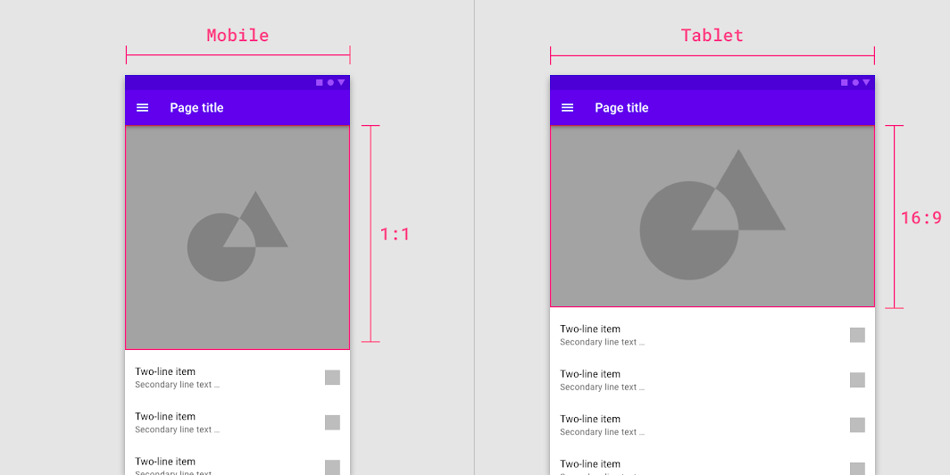
The image ratio changes from 1:1 to 16:9 between breakpoints
50%
The image ratio changes from 1:1 to 16:9 between breakpoints.

Fixed image heights ​

Image sizing can maintain a fixed height and fluid width across and within breakpoint ranges.
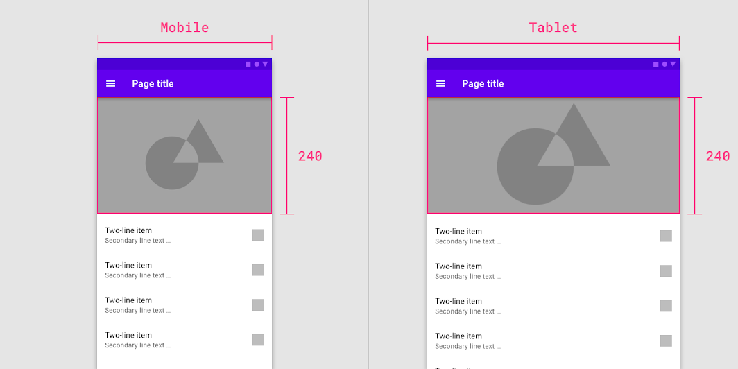
The image maintains a fixed height while the width between breakpoints is fluid
50%
The image maintains a fixed height while the width between breakpoints is fluid.

Touch targets ​

Touch targets apply to any device that receives both touch and non-touch input. To balance information density and usability, touch targets should be at least 48 x 48 dp with at least 8dp of space between targets.
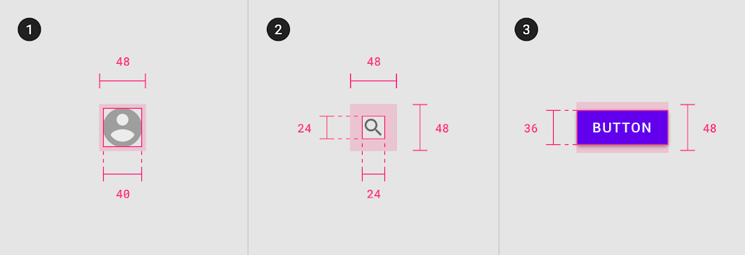
Touch target minimum of 48 x 48 dp
Pager
Previous pageResponsive layout grid
Next pageComponent behavior

Released under the Apache-2.0

Copyright © 2018-Present Google

https://m2.material.io/design/layout/spacing-methods.html

Released under the Apache-2.0

Copyright © 2018-Present Google