

About shape
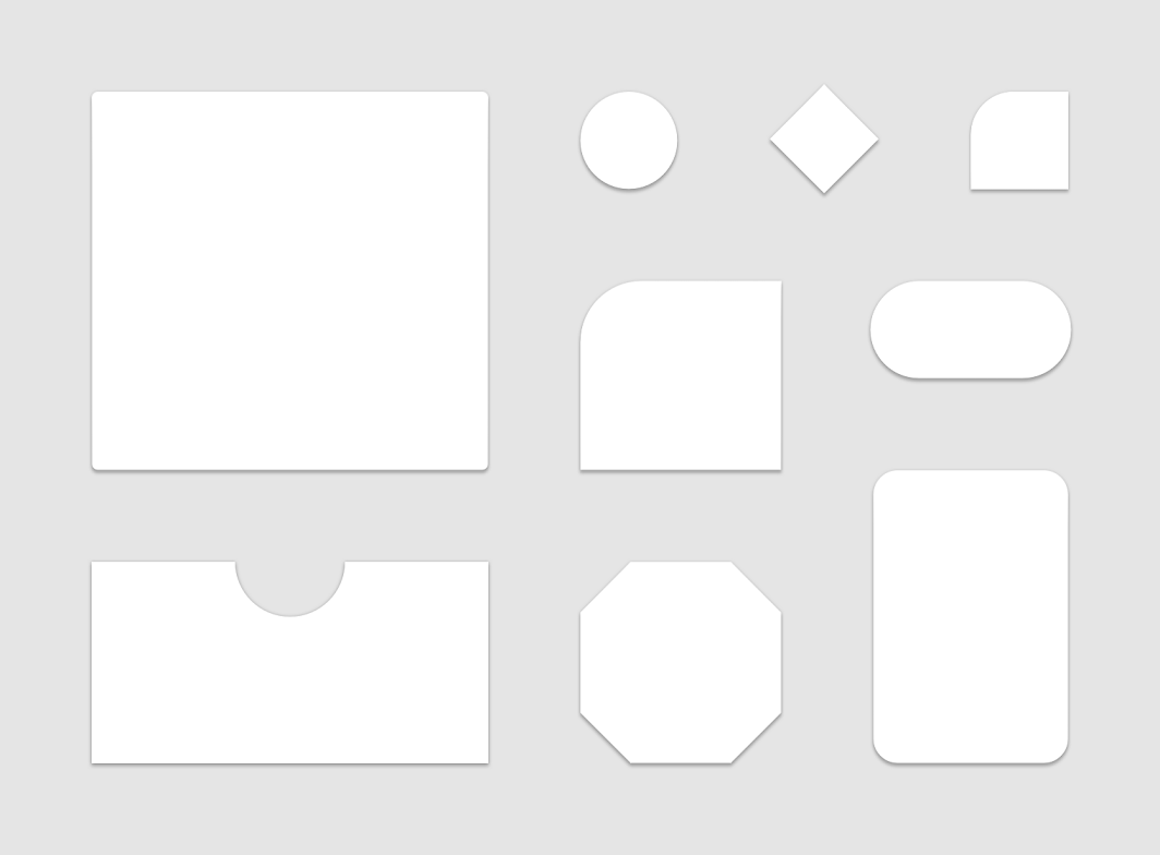
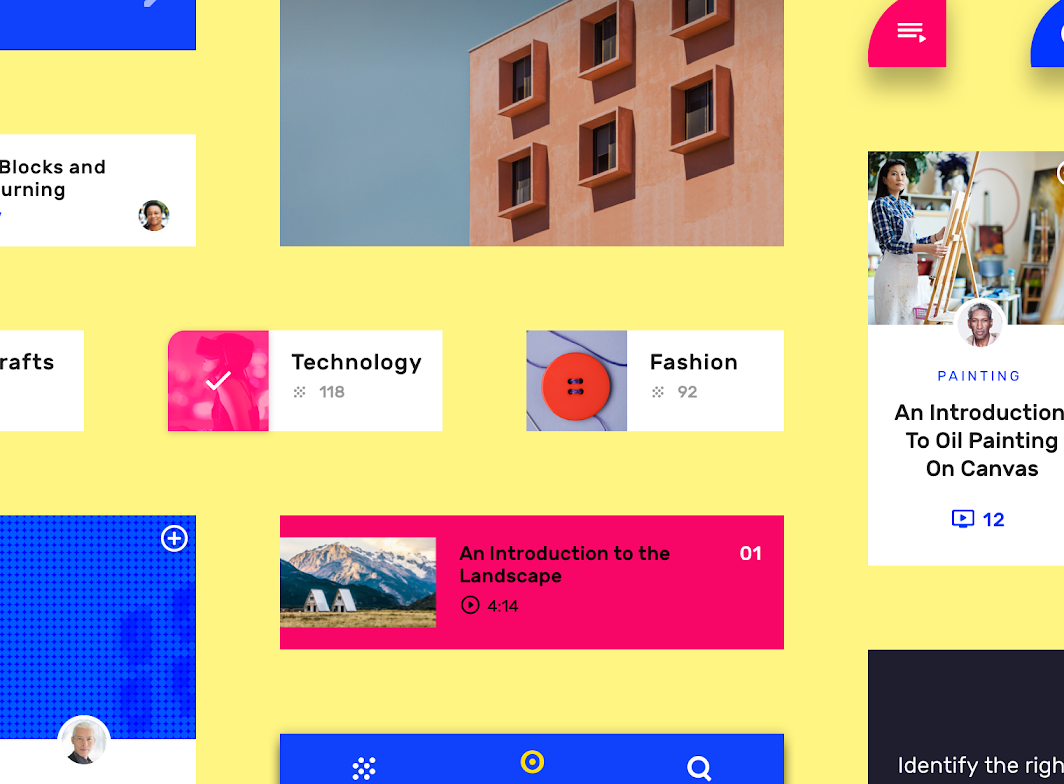
Material surfaces can be displayed in different shapes. Shapes direct attention, identify components, communicate state, and express brand.
Shaping material
About shape
Material surfaces have a rectangular shape by default, with 4dp rounded corners. Their shape can be customized by adjusting their:
- Corner angles and curves
- Edge angles and curves
The size of shape changes can be subtle or more significant.
Usage
Emphasis
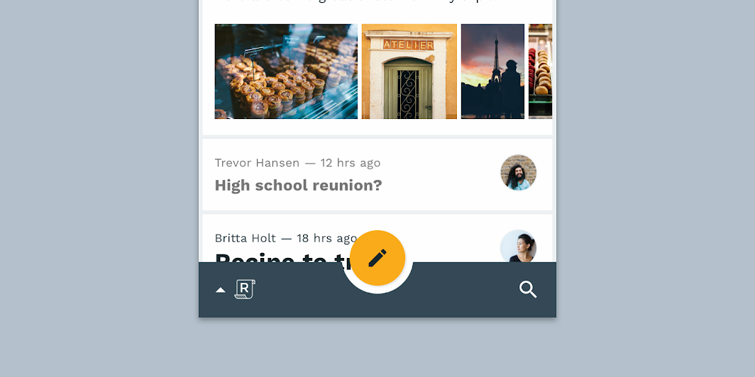
Because unique shapes stand out, they can direct attention to different parts of a screen.
Identity
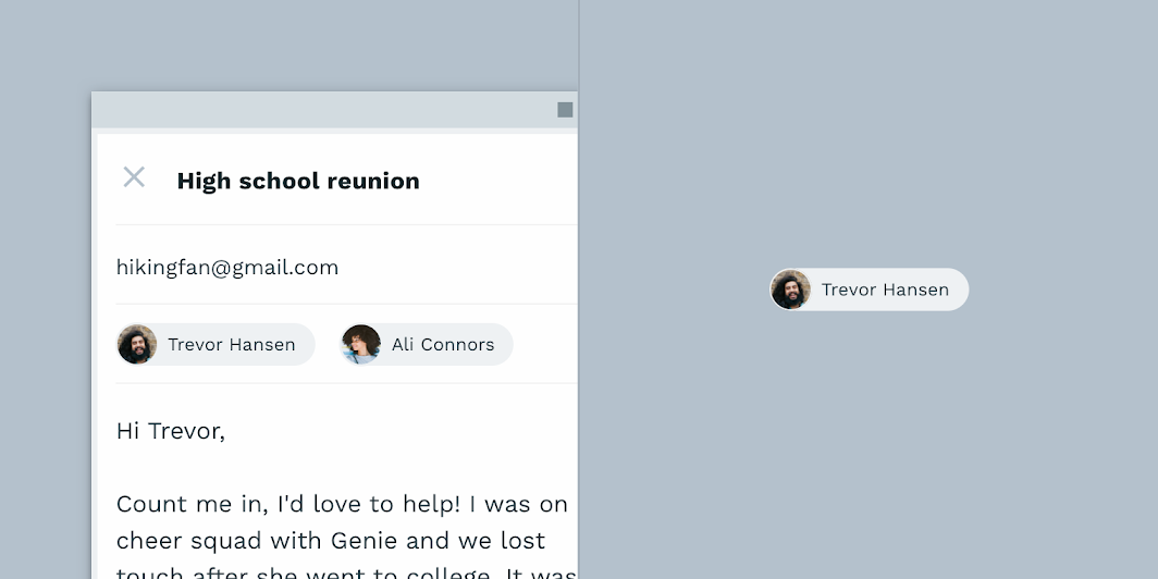
Shape provides a way for users to recognize components and identify different Material surfaces.
State
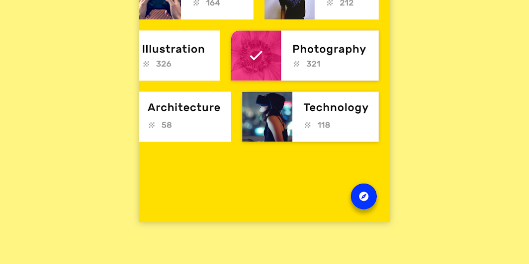
You can communicate an element’s change of state by using a different shape from the rest of the elements or surfaces in that group. When using shape to indicate a state change, use it consistently with that state, in every instance it occurs.
Branding
To express a brand’s visual language throughout an app, use shape in tandem with other customizations (like color) in consistent ways. Small adjustments to shape, applied strategically through an app, contribute to the overall impression a brand makes.
Displaying shape
Shape is made visible when surface edges have sufficient contrast against their background. By default, Material Design makes shapes noticeable by using shadows to display surfaces edges. Other methods to show surface edges and shapes can be used in combination with shadows, or on their own, such as color fills and opacity.
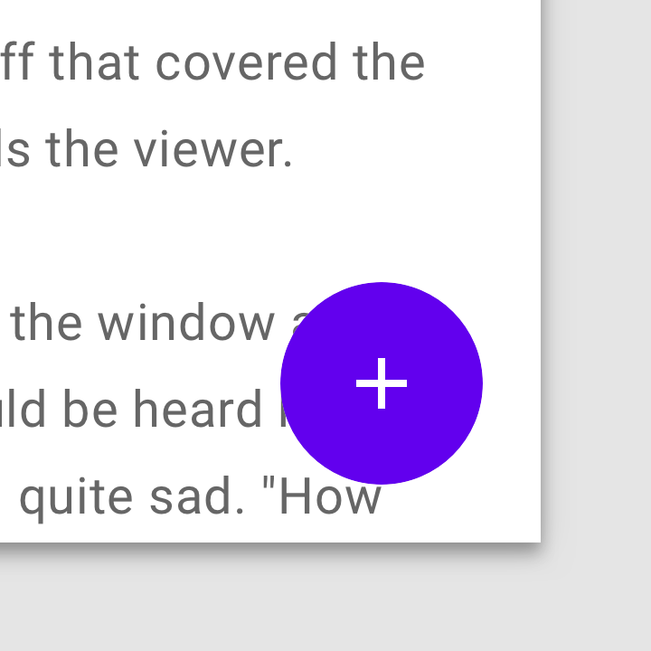
Do
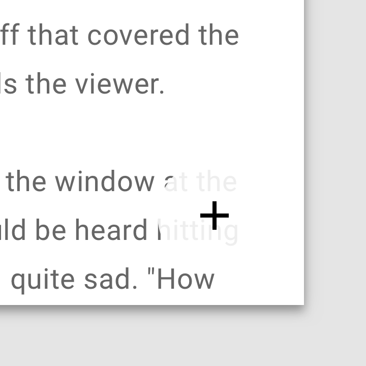
Don't
Shape and meaning
Communicating meaning
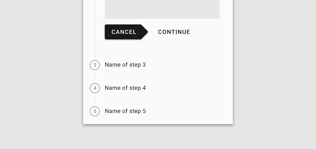
Shapes can be used to reflect a specific purpose or meaning. Text or icons can help reinforce that meaning when the shape of a surface alone could be ambiguous.
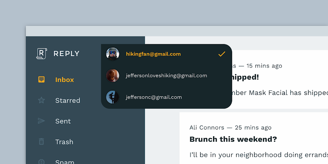
Do
Don't
Components and shape
Shaping components
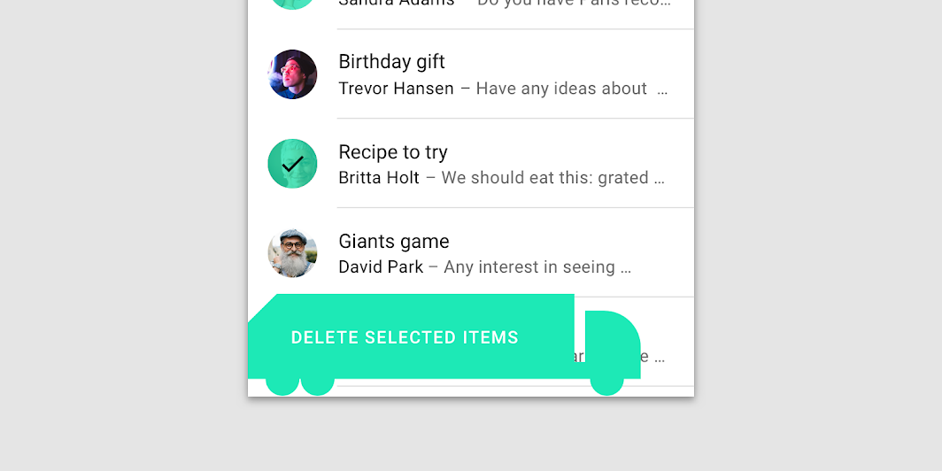
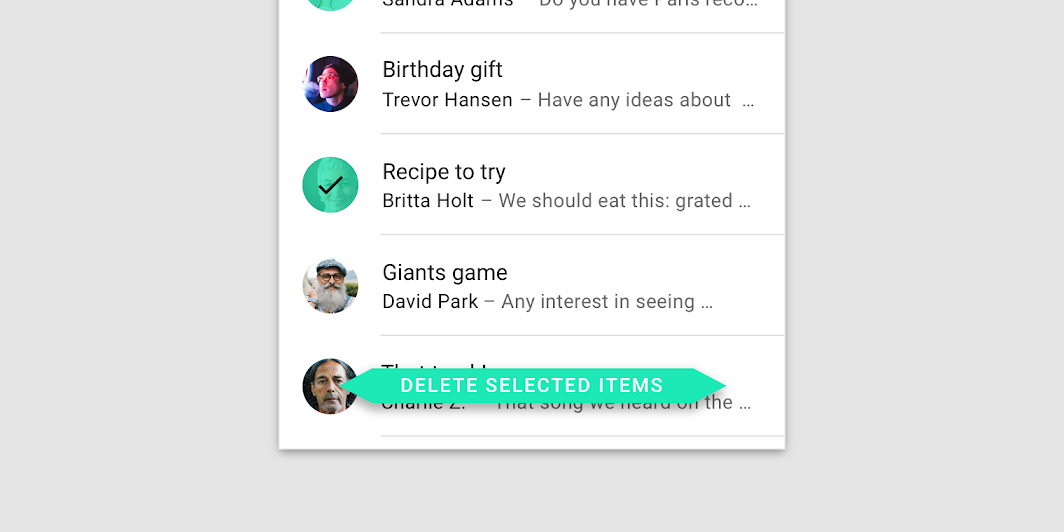
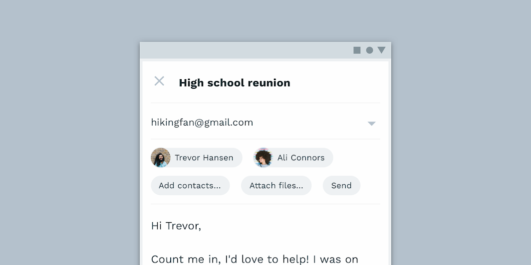
Shape both helps users identify components and affects how usable they are. The degree to which components can change their shape depends on:
- If a component relies on its shape for identification
- If it has ergonomic requirements, such as a minimum touch target size
Don't
Don't
Don't
Shape customization tool
The Material shape customization tool can be used to generate different shapes for various individual components. A table of shape value ranges indicates recommended value ranges for each component.
Components are organized into three categories, based on their relative size. Components linked to their category will inherit the shape values assigned to the category. Alternatively, individual component corners can be shaped independent of their category’s values.
https://m2.material.io/inline-tools/shape/
Implementation
Shapes implementation across supported platforms is indicated below.
| Platform | Status |
|---|---|
| Android | Available |
| iOS | Available |
| Web | Available |
| Flutter | Available |