Skip to content
Material Design 2
Main Navigation
v3
v2
v1

English

简体中文
繁體中文
Español
Français
Русский
Português – Brasil
Deutsch
日本語
한국어
Italiano
Polski
Türkçe
čeština
magyar

English

简体中文
繁體中文
Español
Français
Русский
Português – Brasil
Deutsch
日本語
한국어
Italiano
Polski
Türkçe
čeština
magyar

Appearance

Sidebar Navigation

Material System

Introduction

Material studies

About our Material studies

Basil

Crane

Fortnightly

Owl

Rally

Reply

Shrine

Material Foundation

Environment

Surfaces

Elevation

Light and shadows

Layout

Understanding layout

Pixel density

Responsive layout grid

Spacing methods

Component behavior

Applying density

Navigation

Understanding navigation

Navigation transitions

Search

Color

The color system

Applying color to UI

Color usage

Text legibility

Dark theme

Typography

The type system

Understanding typography

Language support

Sound

About sound

Applying sound to UI

Sound attributes

Sound choreography

Iconography

Product icons

System icons

Animated icons

Shape

About shape

Shape and hierarchy

Shape as expression

Shape and motion

Applying shape to UI

Motion

Understanding motion

The motion system

Speed

Choreography

Customization

Interaction

Gestures

Selection

States

Communication

Confirmation & acknowledgement

Data formats

Data visualization

Empty states

Help & feedback

Imagery

Launch screen

Onboarding

Offline states

Writing

Machine learning

Machine learning patterns

Object detection: live camera

Object detection: static image

Barcode Scanning

Material Guidelines

Material Theming

Overview

Implementing your theme

Usability

Accessibility

Bidirectionality

Platform guidance

Android bars

Android fingerprint

Android haptics

Android icons

Android navigating between apps

Android notifications

Android permissions

Android slices

Android split-screen

Android swipe-to-refresh

Android text selection toolbar

Android widget

Cross-platform adaptation

Components

App bars: bottom

App bars: top

Backdrop

Banners

Bottom navigation

Buttons

Buttons: floating action button

Cards

Checkboxes

Chips

Data tables

Date pickers

Dialogs

Dividers

Image lists

Lists

Menus

Navigation drawer

Navigation rail

Progress indicators

Radio buttons

Sheets: bottom

Sheets: side

Sliders

Snackbars

Switches

Tabs

Text fields

Time pickers

Tooltips

On this page

Snackbars ​

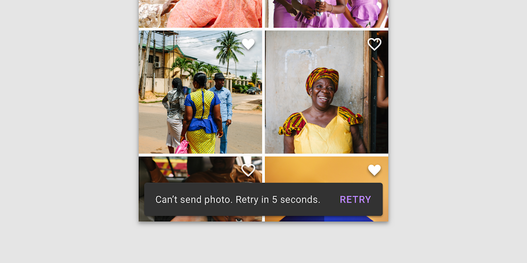
Snackbars provide brief messages about app processes at the bottom of the screen.
Snackbars hero image

Usage ​

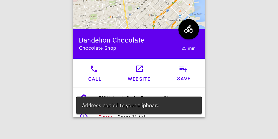
Snackbars inform users of a process that an app has performed or will perform. They appear temporarily, towards the bottom of the screen. They shouldn’t interrupt the user experience, and they don’t require user input to disappear.

Frequency ​

Only one snackbar may be displayed at a time.

Actions ​

A snackbar can contain a single action. "Dismiss" or "cancel" actions are optional.


Banners

A banner displays a prominent message and related optional actions.

Related article

Dialogs

Dialogs inform users about a specific task and may contain critical information, require decisions, or involve multiple tasks. They remain until dismissed or a required action has been taken.

Related article

Principles ​


Snackbar principle: informational

Informational

Snackbars provide updates on an app’s processes.
Snackbar principle: temporary

Temporary

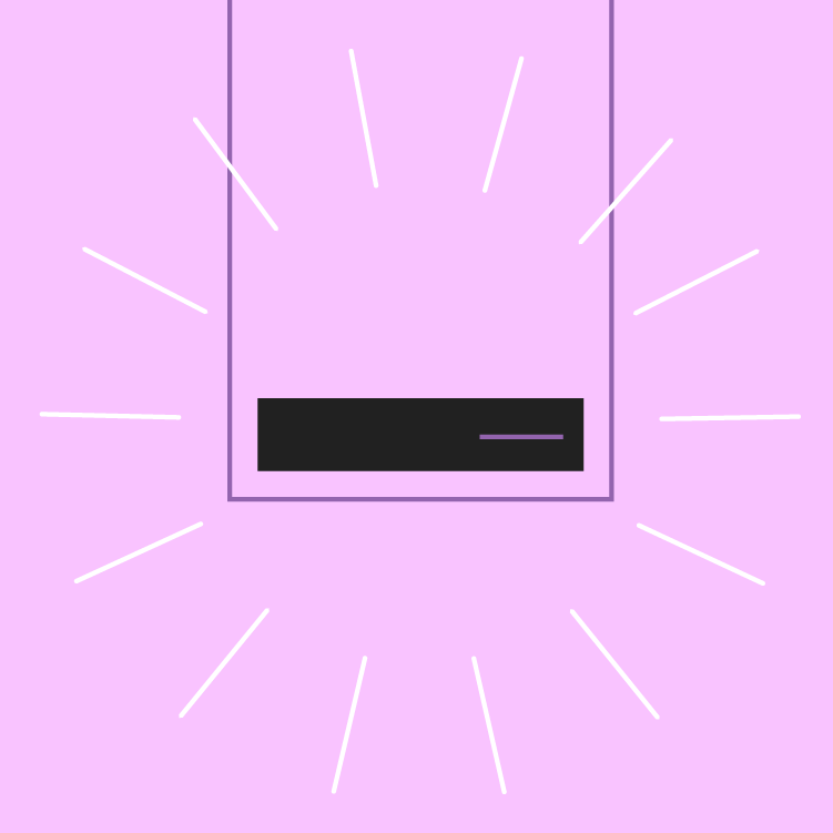
Snackbars appear temporarily, and disappear on their own without requiring user input to be dismissed.
Snackbar principle: contextual

Contextual

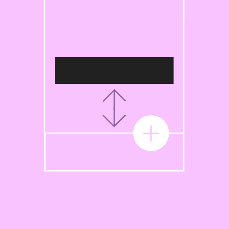
Snackbars are placed in the most suitable area of the UI.

When to use ​

Snackbars communicate messages that are minimally interruptive and don’t require user action.

ComponentPriorityUser action
SnackbarLow priorityOptional: Snackbars disappear automatically
BannerProminent, medium priorityOptional: Banners remain until dismissed by the user, or if the state that caused the banner is resolved
DialogHighest priorityRequired: Dialogs block app usage until the user takes a dialog action or exits the dialog (if available)

Anatomy ​

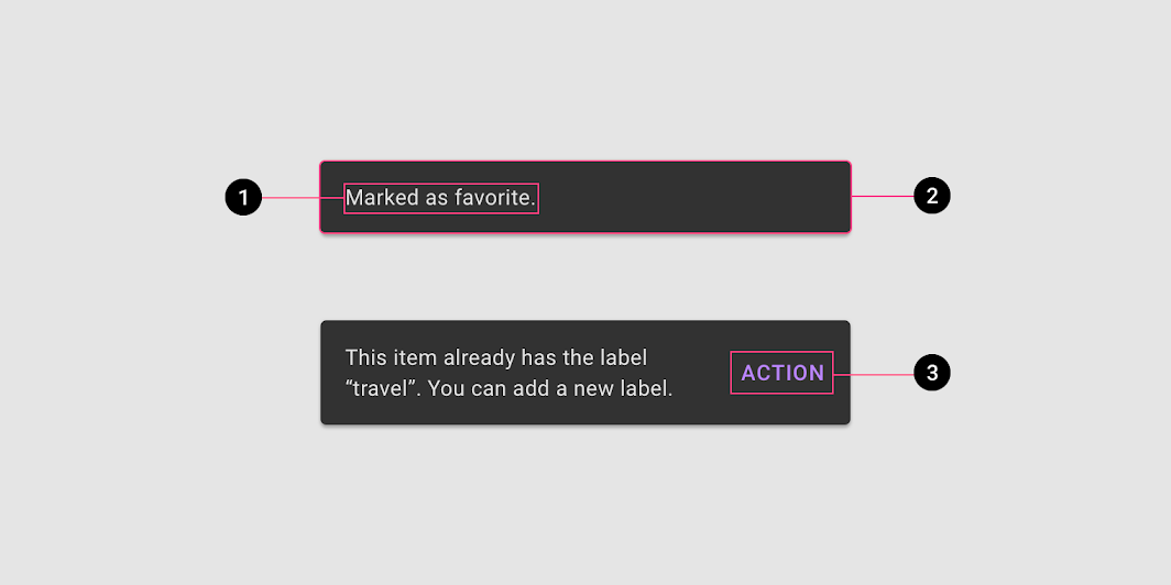
Diagram of text label, container, action
1. Text label
2. Container
3. Action (optional)

Text label ​

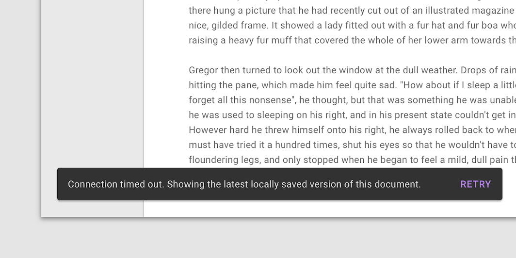
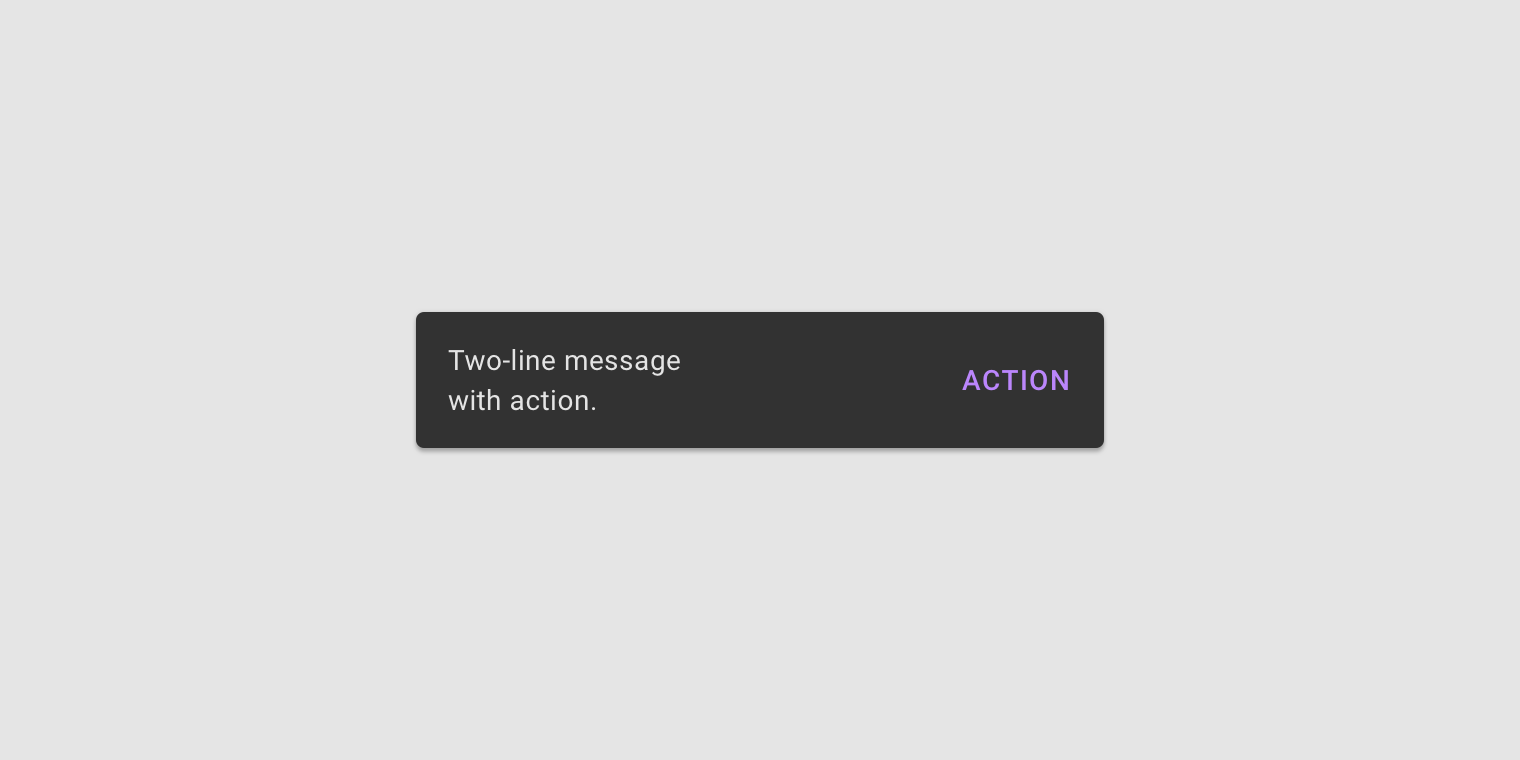
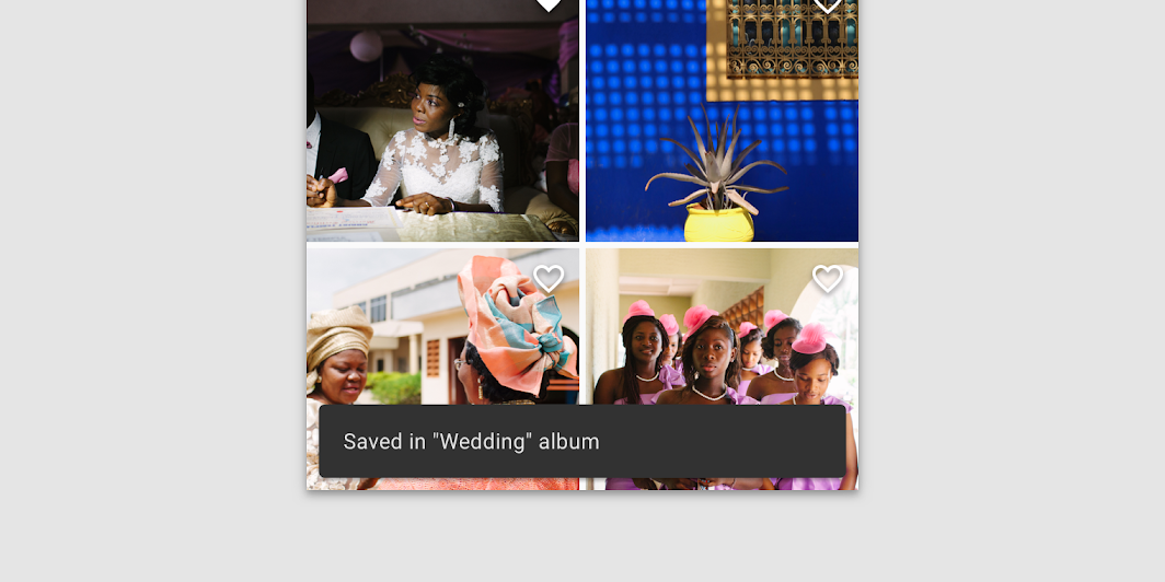
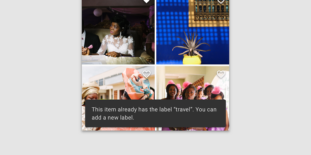
Snackbars contain a text label that directly relates to the process being performed. On mobile, the text label can contain up to two lines of text.
Text labels are short, clear updates on processes that have been performed
Text labels are short, clear updates on processes that have been performed.

Do: on mobile, use up to two lines of text to communicate the snackbar message

Do

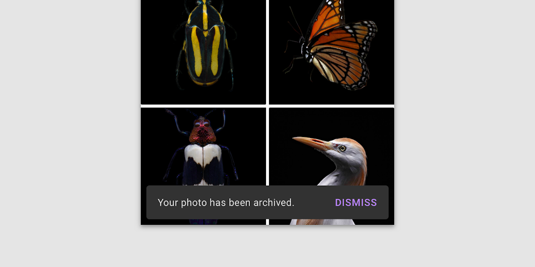
On mobile, use up to two lines of text to communicate the snackbar message.

Do: in wide UIs like desktop and tablet, snackbars should have only a single line of text

Do

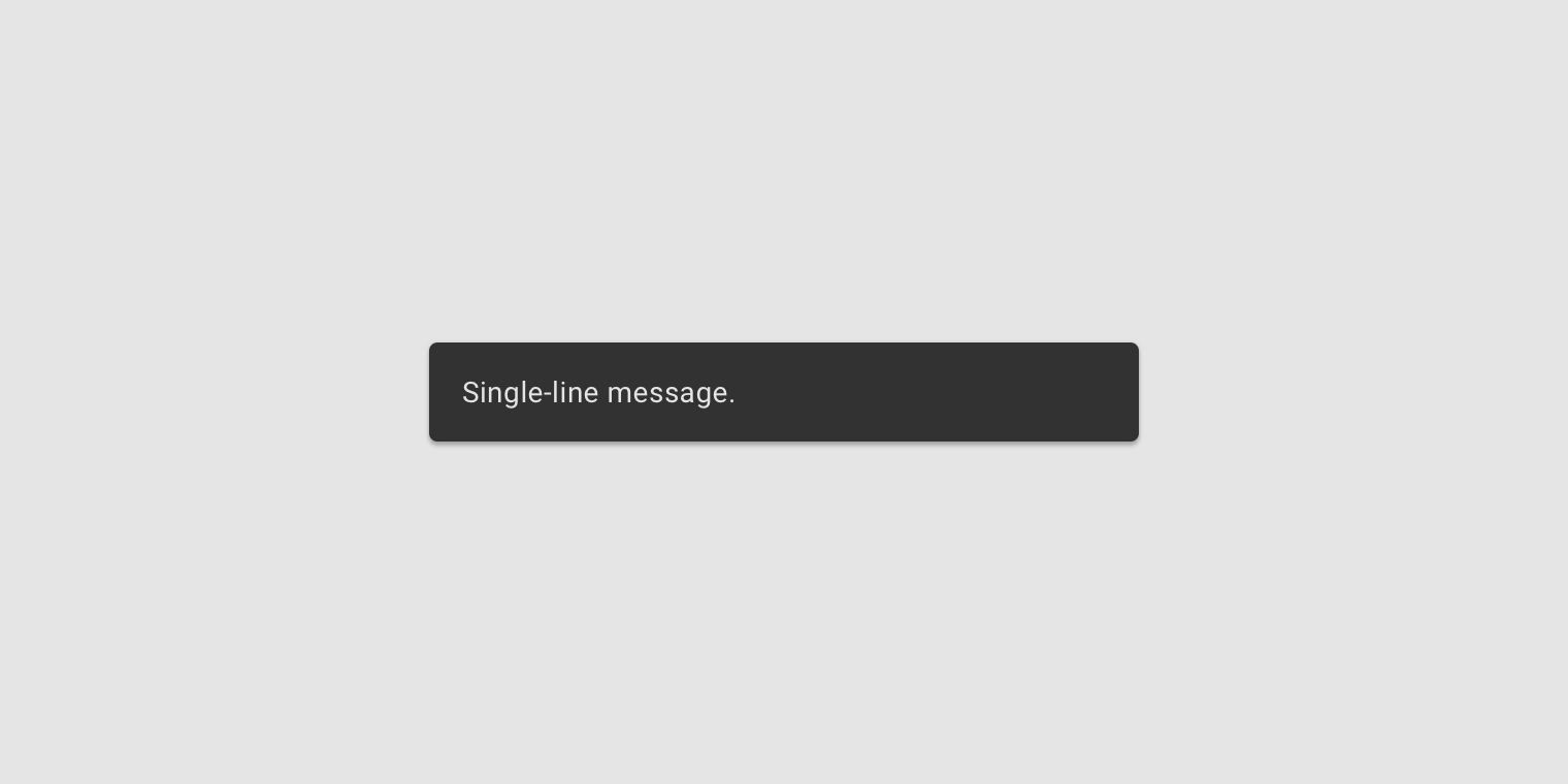
In wide UIs like desktop and tablet, snackbars should have only a single line of text.

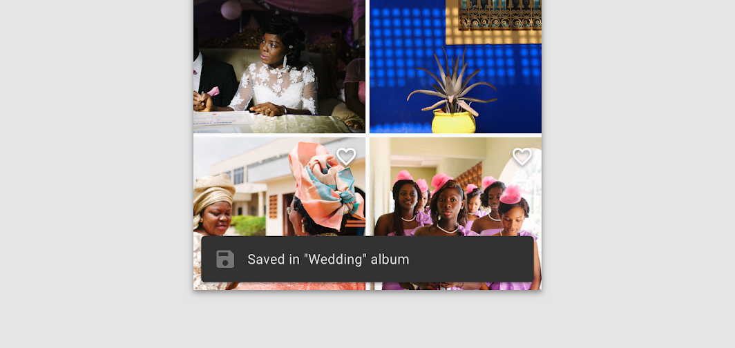
Don’t use icons in snackbars

Don't

Don’t use icons in snackbars. If your message needs an icon, consider using a different component.

Container ​

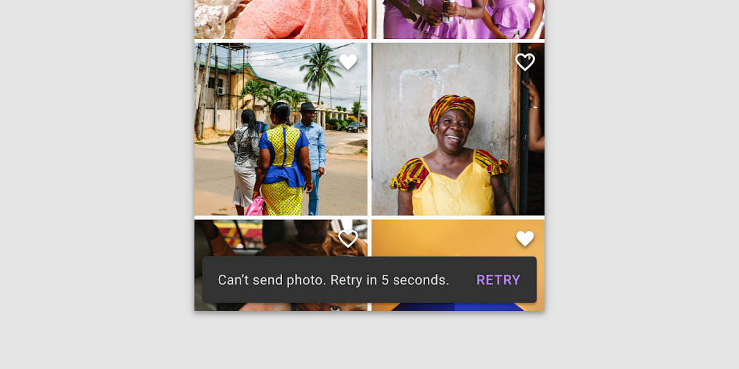
Snackbars are displayed in rectangular containers with a grey background. Containers should be completely opaque, so that text labels remain legible.
Do: snackbar containers use a solid background color with a shadow to stand out against content

Do

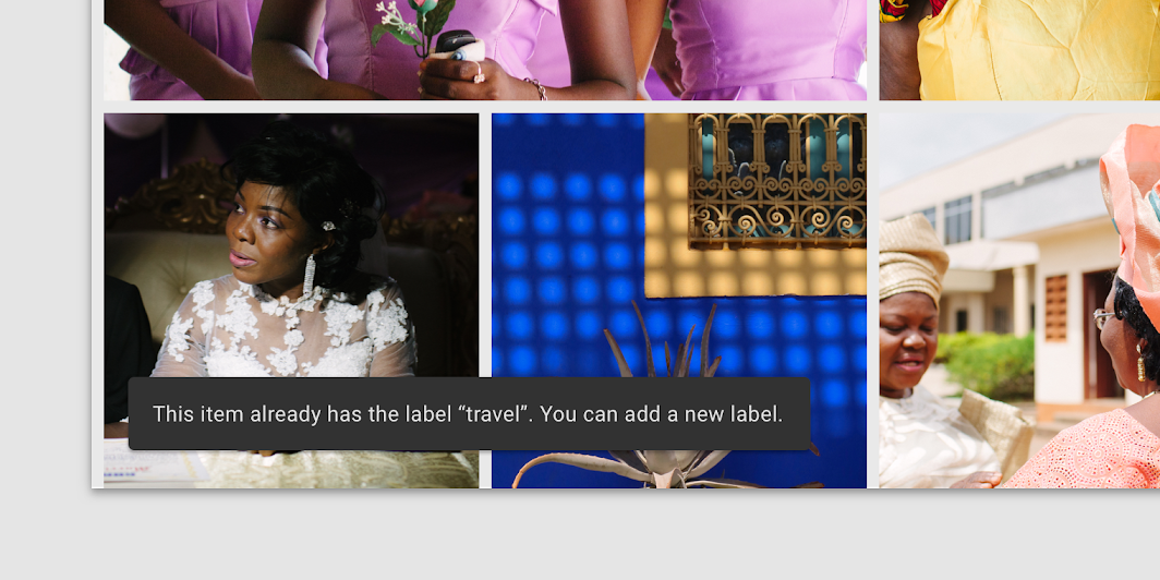
Snackbar containers use a solid background color with a shadow to stand out against content.

Do: in wide layouts, extend the container width to accommodate longer text labels

Do

In wide layouts, extend the container width to accommodate longer text labels.

Caution: an app can apply slight transparency to the container background, as long as text remains clearly legible

Caution

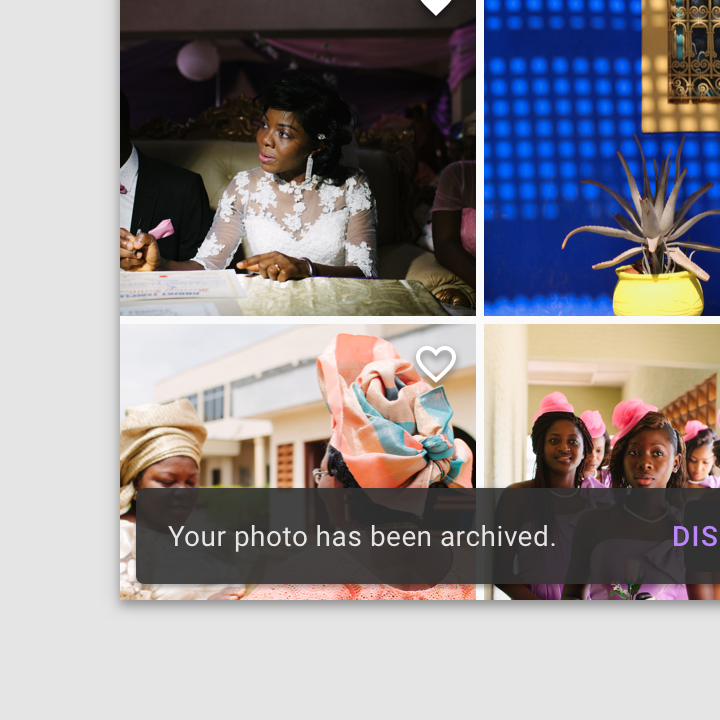
An app can apply slight transparency to the container background, as long as text remains clearly legible.
Don't: avoid significantly altering the shape of a snackbar container

Don't

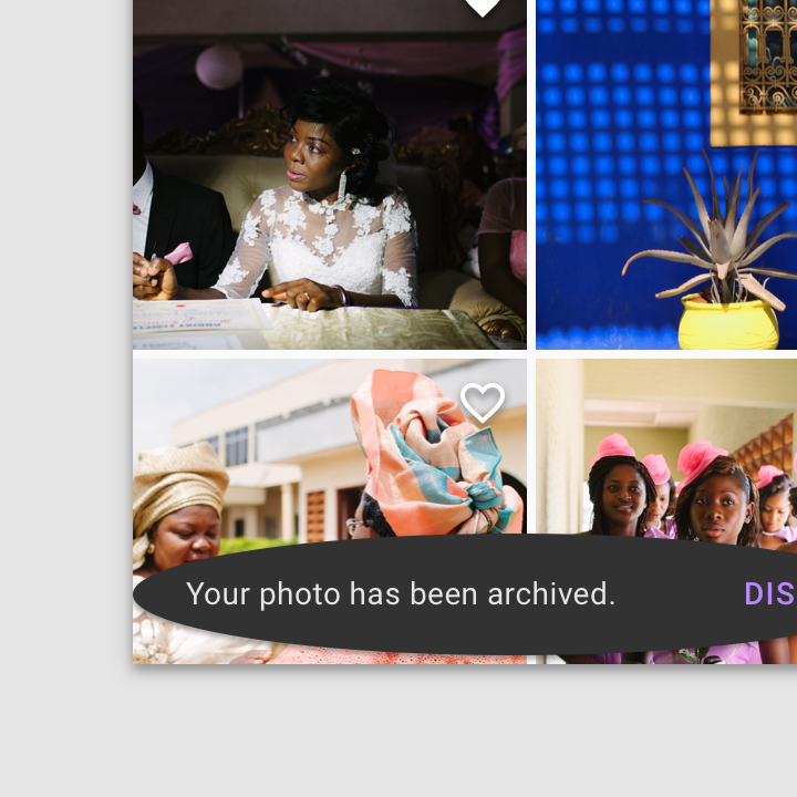
Avoid significantly altering the shape of a snackbar container.

Don't: avoid displaying a snackbar container without elevation

Don't

Avoid displaying a snackbar container without elevation.

Action ​

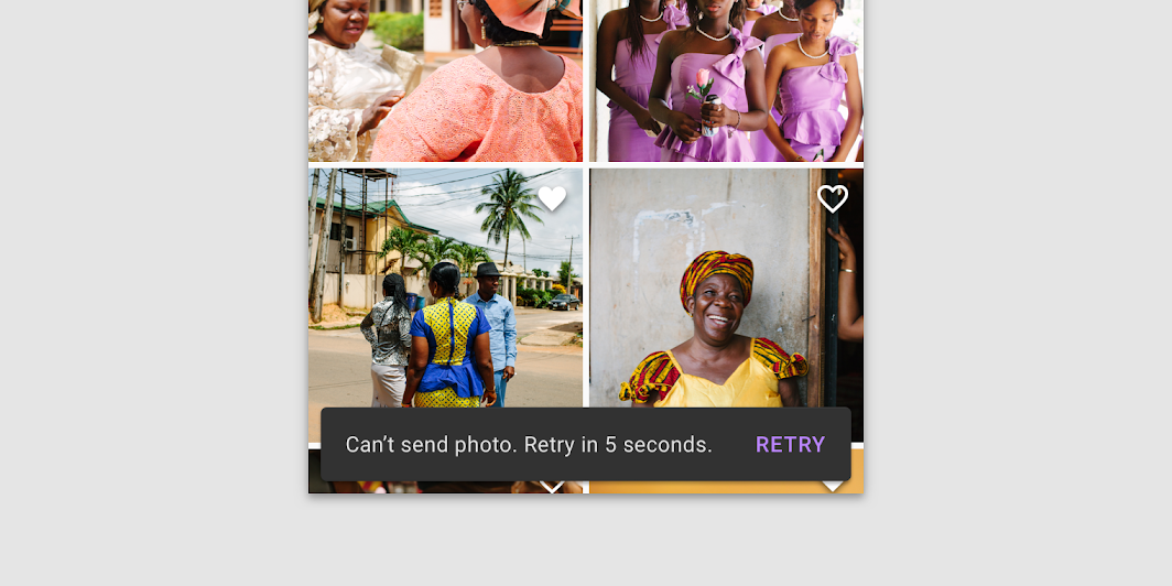
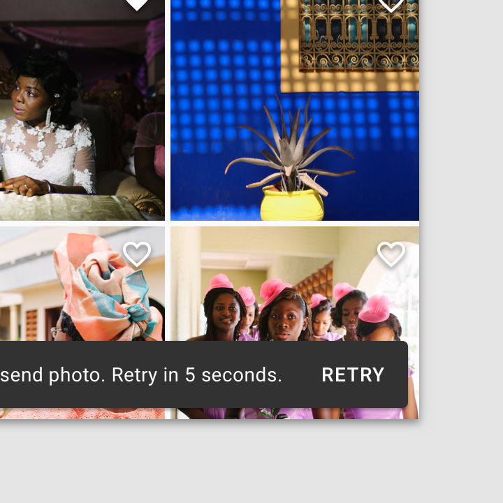
Snackbars can display a single text button that lets users take action on a process performed by the app. Snackbars shouldn’t be the only way to access a core use case, to make an app usable.
To distinguish the action from the text label, text buttons should display colored text
To distinguish the action from the text label, text buttons should display colored text.

Don't: the text label shouldn’t share the same color as the text button

Don't

The text label shouldn’t share the same color as the text button.
Don’t use a filled or elevated button in a snackbar, as it draws too much attention

Don't

Don’t use a filled or elevated button in a snackbar, as it draws too much attention.

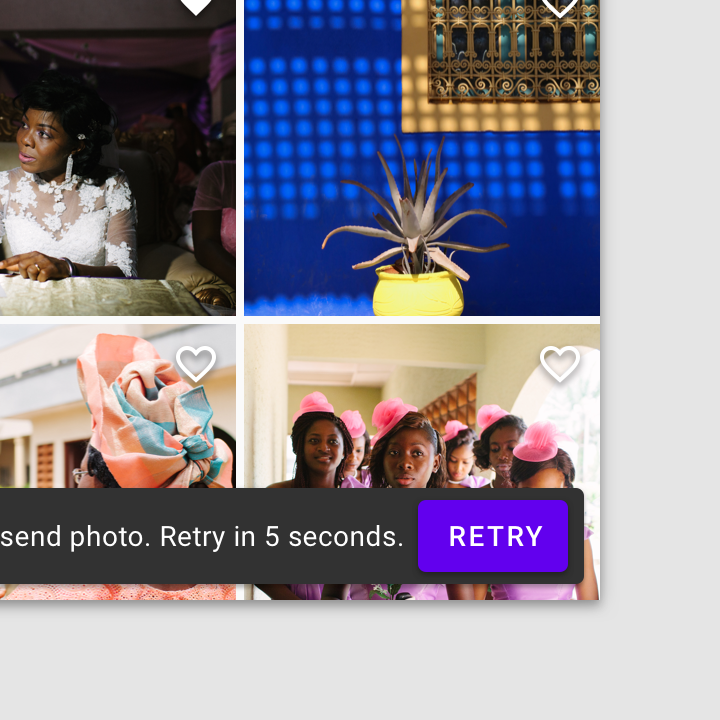
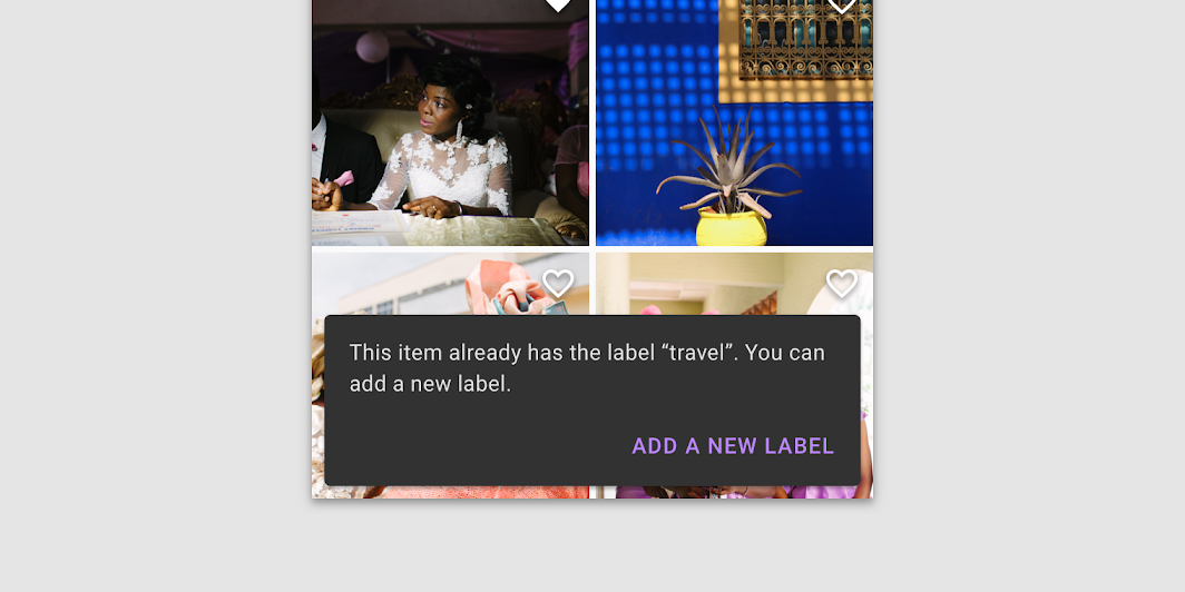
Do: if an action is long, it can be displayed on a third line

Do

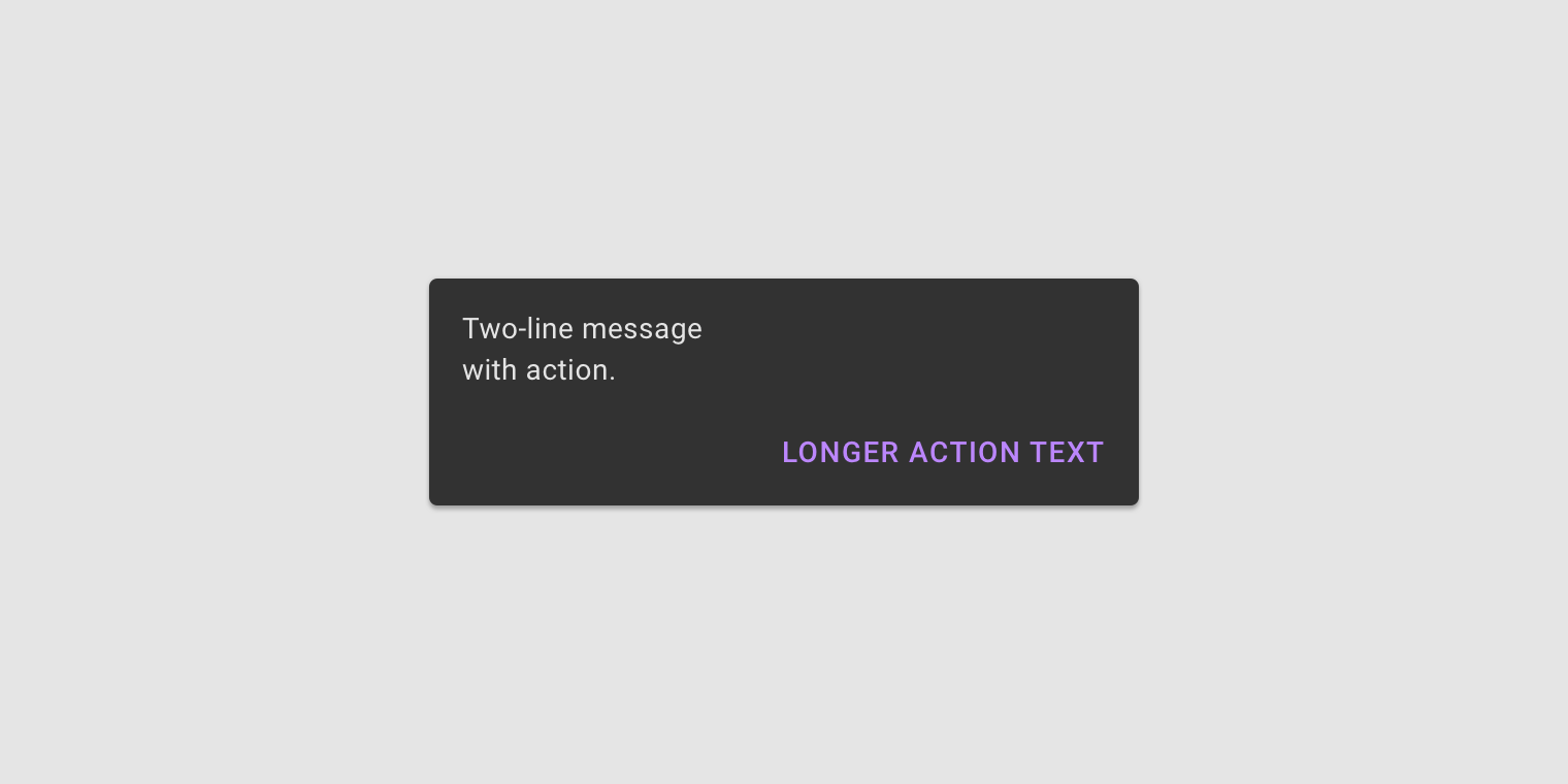
If an action is long, it can be displayed on a third line.

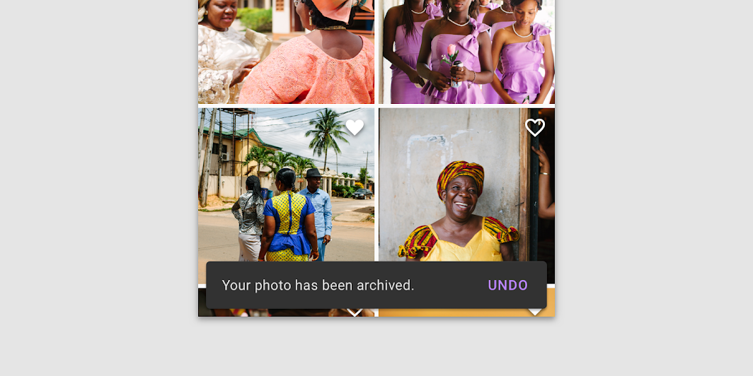
Do: to allow users to amend choices, display an "Undo" action

Do

To allow users to amend choices, display an "Undo" action.

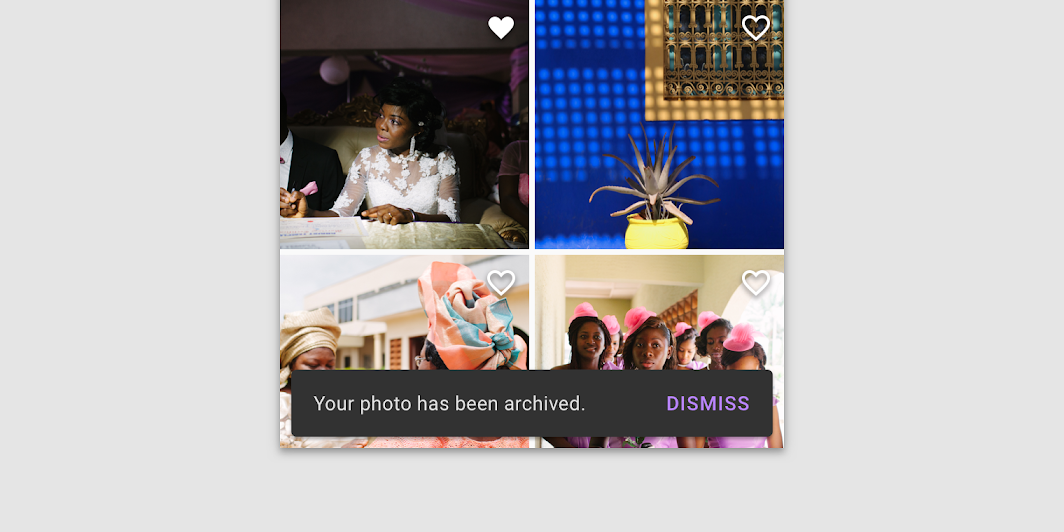
Caution: a dismiss action is unnecessary, as snackbar disappears on their own by default

Caution

A dismiss action is unnecessary, as snackbar disappears on their own by default.

Behavior ​

Appearing and disappearing ​

Snackbars appear without warning, and don't require user interaction. They automatically disappear from the screen after a minimum of four seconds, and a maximum of ten seconds.

Consecutive snackbars ​

When multiple snackbar updates are necessary, they should appear one at a time.

Consecutive snackbars should appear above persistent bottom navigation.

Don't

Avoid stacking snackbars on top of one another.

Don't

Don’t animate other components along with snackbar animations, such as the floating action button.

Scaling and adaptation ​

Size constraints ​

On small screens, snackbars should expand vertically from 48dp to 64dp to accommodate one or two lines of text, while maintaining a fixed distance from the leading, trailing, and bottom edges of the screen.

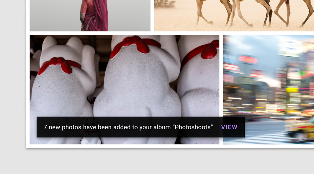
On medium and large screens, snackbars should scale horizontally to accommodate longer text strings, keeping in mind that the ideal line length for text is typically between 40-60 characters.

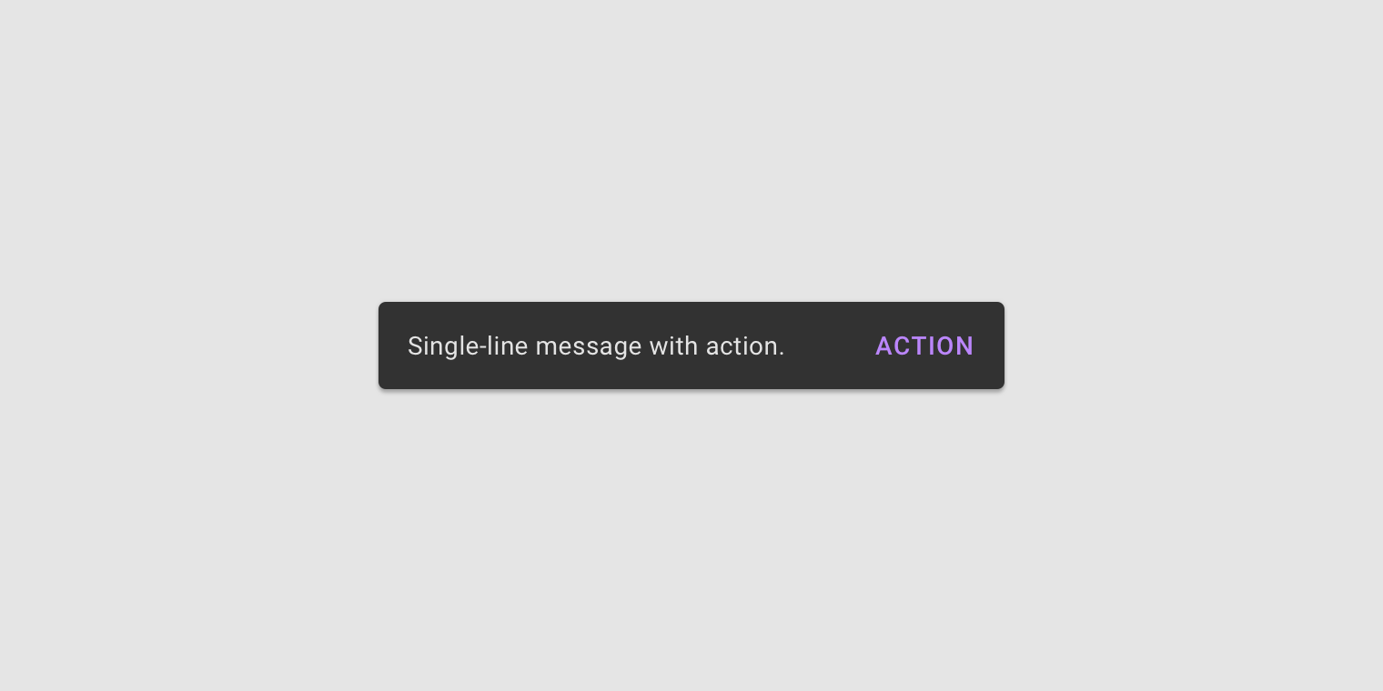
Snackbars use a flexible distance from the trailing edge of the screen. Whenever possible, snackbars on medium and large displays should aim for a single line of text with an optional button.
A single-line snackbar expanded to accommodate its content on a tablet
A single-line snackbar expanded to accommodate its content on a tablet.

Placement ​

At the bottom of the UI ​

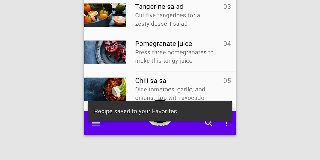
Snackbars should be placed at the bottom of a UI, in front of app content. Avoid placing a snackbar in front of frequently used touch targets or navigation.
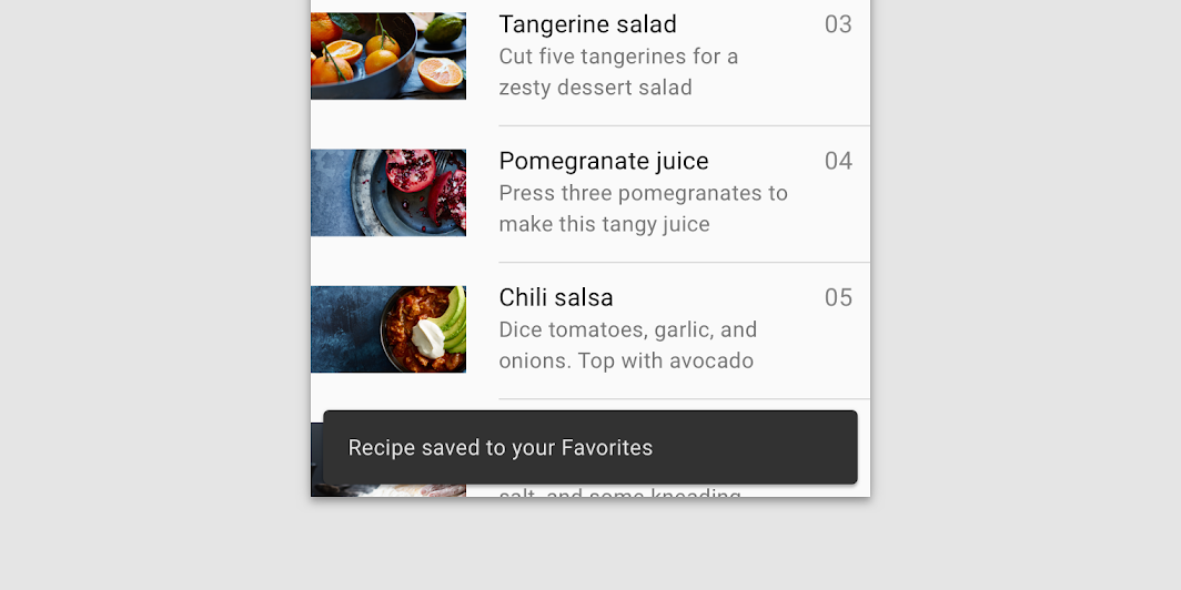
Place a snackbar in front of the content
Place a snackbar in front of the content.

Don't: avoid placing snackbars in front of navigation components

Don't

Avoid placing snackbars in front of navigation components.

Snackbars can span the entire width of the screen only when a UI does not use persistent navigation components like app bars or bottom navigation bars.

Snackbars that span the entire width of a UI can push only FABs up when they appear.
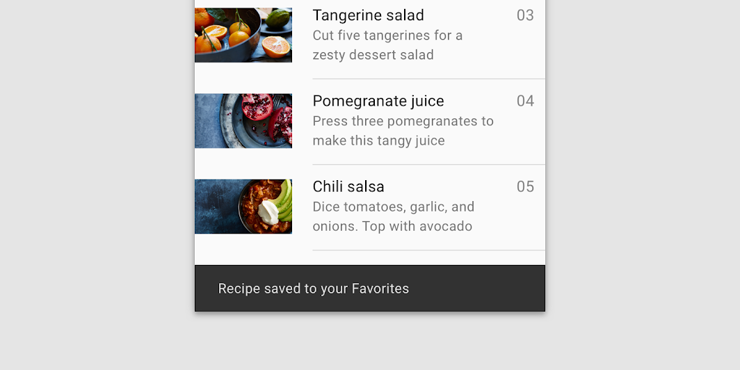
Caution: snackbars can span the entire width of a UI

Caution

Snackbars can span the entire width of a UI. However, they should not appear in front of navigation or other important UI elements like floating action buttons.

Snackbars and floating action buttons (FABs) ​

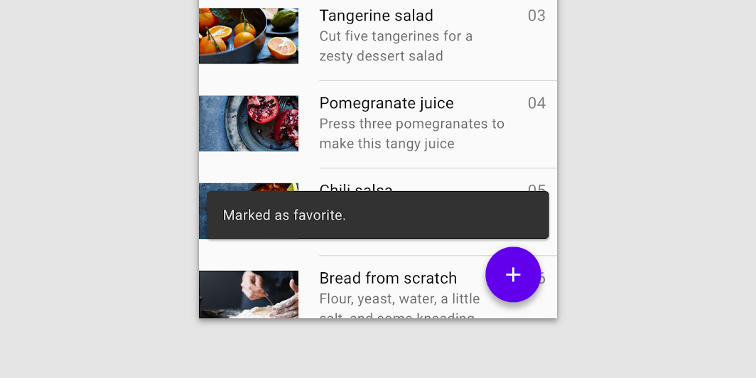
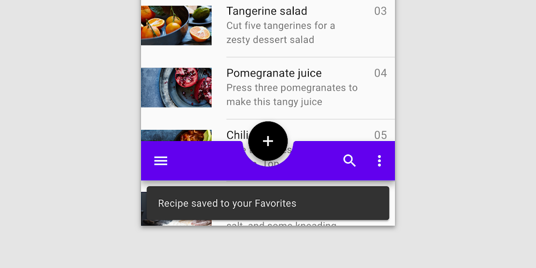
Snackbars should appear above FABs.

Snackbar above a FAB

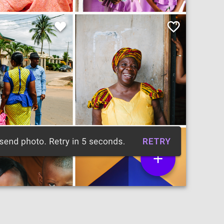
Don’t place a snackbar in front of a FAB

Don't

Don’t place a snackbar in front of a FAB.
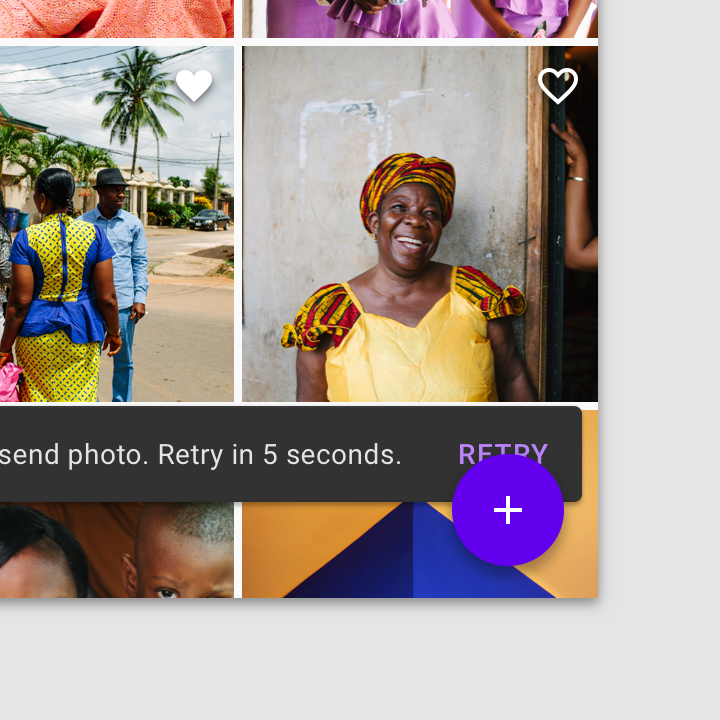
Don’t place a snackbar behind a FAB

Don't

Don’t place a snackbar behind a FAB.

Snackbars and persistent footer elements ​

Snackbars should appear directly above persistent footer elements.
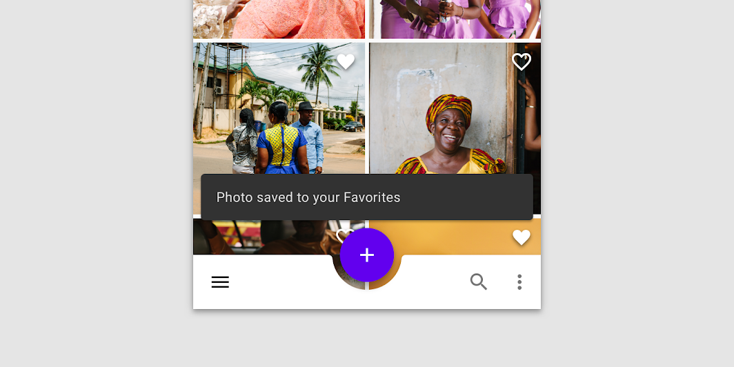
Snackbar above persistent footer elements

Do: place snackbars in front of medium extended sheets

Do

Place snackbars in front of medium extended sheets.

Don't: avoid pushing bottom persistent elements up when snackbars appear

Don't

Avoid pushing bottom persistent elements up when snackbars appear.

Snackbars in wide layouts ​

In wide layouts, snackbars can be left-aligned or center-aligned if they are consistently placed on the same spot at the bottom of the screen.
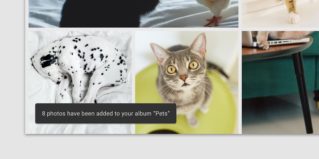
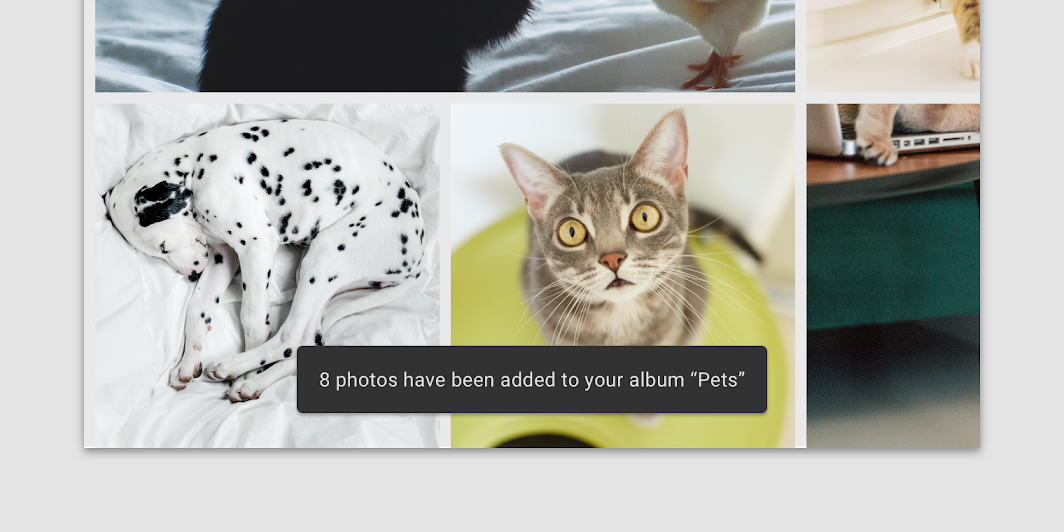
Snackbars in wide layouts: left-aligned snackbar
Left-aligned snackbar

Snackbars in wide layouts: center-aligned snackbar
Center-aligned snackbar

Don't: avoid placing snackbars flushed to one edge of the layout

Don't

Avoid placing snackbars flushed to one edge of the layout.

Don't: avoid placing consecutive snackbars side by side or next to one another

Don't

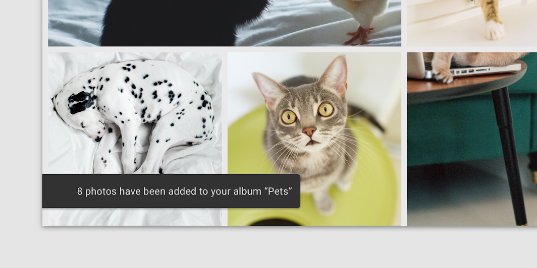
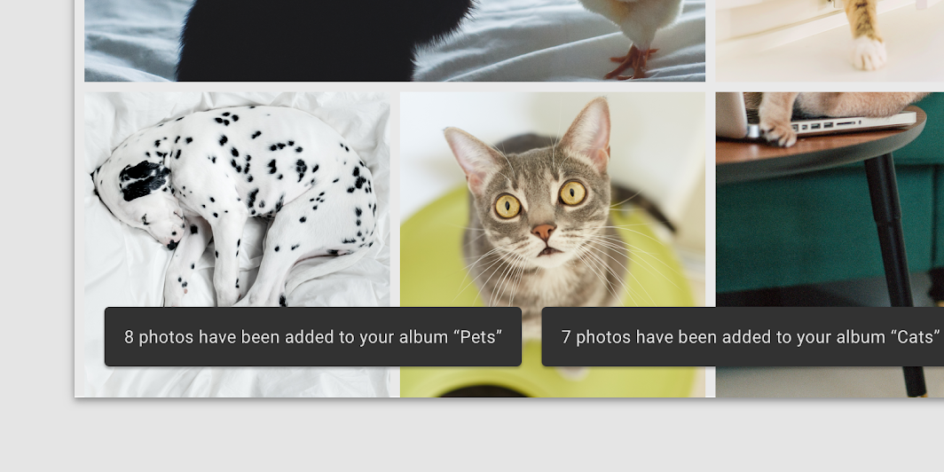
Avoid placing consecutive snackbars side by side or next to one another.

Specs ​


48C1634416

C48344881666

8816306834416

1616830818
Pager
Previous pageSliders
Next pageSwitches

Released under the Apache-2.0

Copyright © 2018-Present Google

https://m2.material.io/components/snackbars

Released under the Apache-2.0

Copyright © 2018-Present Google