Badges: Accessibility
Badges show notifications, counts, or status information on navigation items and icons
Use cases
People should be able to use assistive technology to:
- Understand the dynamic information conveyed in badges, such as counts or labels
- Address badge announcements by selecting corresponding navigation destinations
Interaction & style
Badges are most commonly used within other components, such as navigation bar, navigation rail, app bars, and tabs.
When a badge is used to indicate an unread notification, the badge gets hidden once it's selected.
Visual indicators
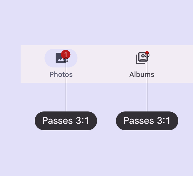
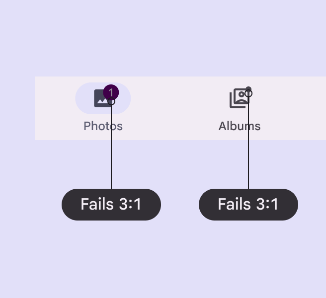
Badges use a color intended to stand out against labels, icons, and navigation elements. Use the default color mapping to avoid color conflict issues.
Labeling elements
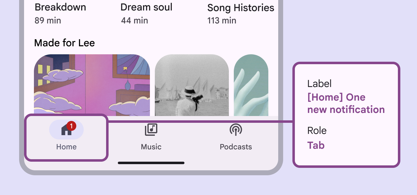
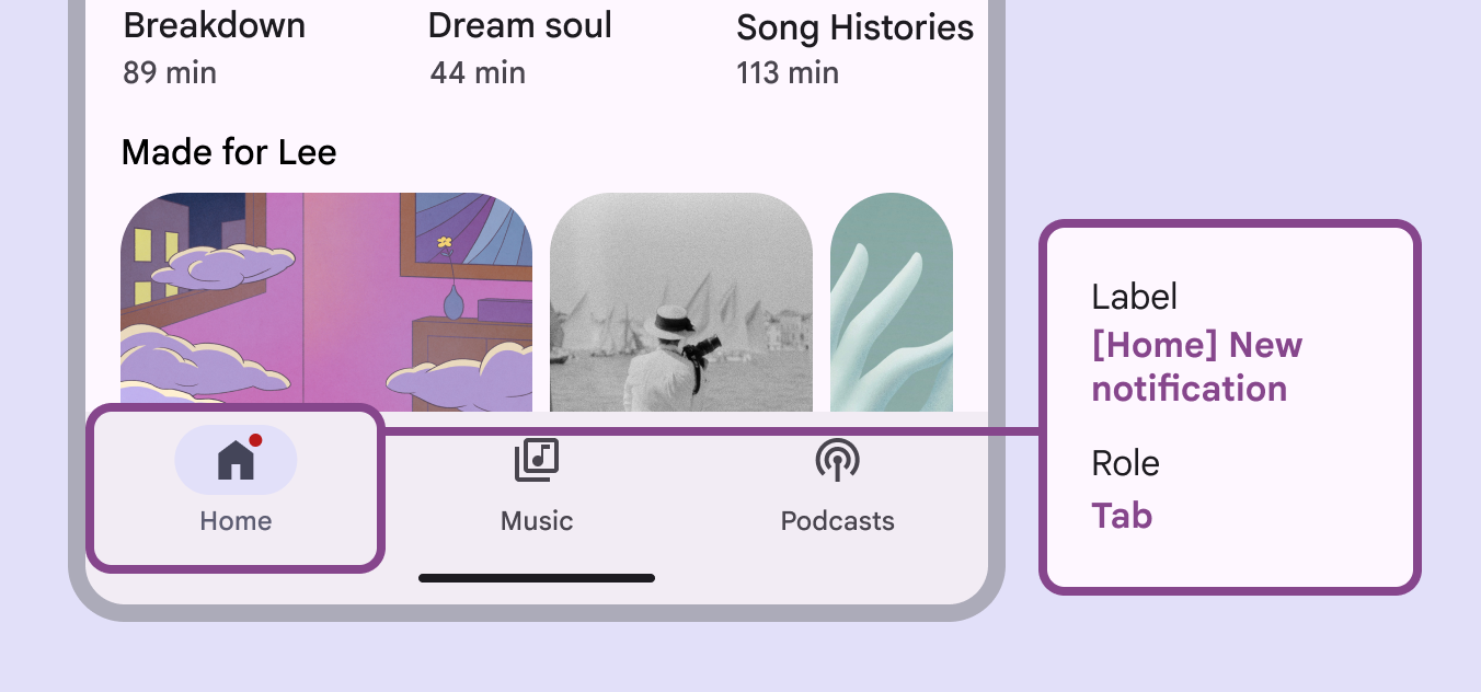
The accessibility label for a badge item will be read after its navigation destination. Any numerical badges will have their number read, while non-counting badges will simply announce New notification.