Skip to content
Material Design 3
Main Navigation
v3
v2
v1

English

简体中文
繁體中文
Español
Français
Русский
Português – Brasil
Deutsch
日本語
한국어
Italiano
Polski
Türkçe
čeština
magyar

English

简体中文
繁體中文
Español
Français
Русский
Português – Brasil
Deutsch
日本語
한국어
Italiano
Polski
Türkçe
čeština
magyar

Appearance

Sidebar Navigation

Foundations

Accessibility

Overview: Principles

Overview: Assistive technology

Designing: Overview

Designing: Color contrast

Designing: Structure

Designing: Flow

Designing: Elements

Writing and text: Best practices

Writing and text: Text truncation

Writing and text: Text resizing

Building for all: User needs

Building for all: Co-design

Content design

Overview

Alt text

Global writing: Overview

Global writing: Word choice

Notifications

Style guide: UX writing best practices

Style guide: Word choice

Style guide: Grammar and punctuation

Customizing Material

Devices

Watches: Overview

Watches: Foundations

Watches: Styles

Watches: Layout

XR

Design: Overview

Design: Interaction

Design: Layout

Design: Accessibility

Components: Overview

Components: App bars

Components: Dialogs

Components: Nav bar

Components: Nav rail

Components: Toolbars

Design tokens: Overview

Design tokens: How to use tokens

Interaction

Gestures

Inputs

Selection

States: Overview

States: State layers

States: Applying states

Layout

Overview: Overview

Overview: Parts of layout

Overview: Adaptive design

Scaffold: Overview

Scaffold: Bars

Scaffold: Rails

Scaffold: Panes

Grids & spacing: Overview

Grids & spacing: Grids

Grids & spacing: Spacing

Grids & spacing: Density

Breakpoints: Overview

Breakpoints: Compact

Breakpoints: Medium

Breakpoints: Expanded

Breakpoints: Large & extra-large

Bidirectionality & RTL

Canonical examples: Overview

Canonical examples: Feed

Canonical examples: List-detail

Canonical examples: Supporting pane

Usability: Overview

Usability: Applying M3 Expressive

Material A-Z

Styles

Color

Color system: Overview

Color system: How the system works

Color roles

Color schemes

Choosing a scheme

Static: Baseline

Static: Custom brand

Dynamic: Choosing a source

Dynamic: User-generated source

Dynamic: Content-based source

Advanced: Overview

Advanced: Apply colors

Advanced: Define new colors

Advanced: Adjust existing colors

Color resources

Elevation: Overview

Elevation: Applying elevation

Elevation: Tokens

Icons: Overview

Icons: Designing icons

Icons: Applying icons

Motion

Motion physics system: How it works

Motion physics system: Specs

Easing and duration: Applying easing and duration

Easing and duration: Tokens & specs

Transitions: Transition patterns

Transitions: Applying transitions

Shape: Overview & principles

Shape: Corner radius scale

Shape: Shape morph

Spacing: Overview

Spacing: Applying spacing

Spacing: Tokens

Typography: Overview

Typography: Fonts

Typography: Type scale & tokens

Typography: Applying type

Typography: Editorial treatments

Components

App bars: Overview

App bars: Specs

App bars: Guidelines

App bars: Accessibility

Badges: Overview

Badges: Specs

Badges: Guidelines

Badges: Accessibility

Buttons

All buttons

Button groups: Overview

Button groups: Specs

Button groups: Guidelines

Button groups: Accessibility

Buttons: Overview

Buttons: Specs

Buttons: Guidelines

Buttons: Accessibility

Extended FABs: Overview

Extended FABs: Specs

Extended FABs: Guidelines

Extended FABs: Accessibility

FAB menu: Overview

FAB menu: Specs

FAB menu: Guidelines

FAB menu: Accessibility

FABs: Overview

FABs: Specs

FABs: Guidelines

FABs: Accessibility

Icon buttons: Overview

Icon buttons: Specs

Icon buttons: Guidelines

Icon buttons: Accessibility

Segmented buttons: Overview

Segmented buttons: Specs

Segmented buttons: Guidelines

Segmented buttons: Accessibility

Split button: Overview

Split button: Specs

Split button: Guidelines

Split button: Accessibility

Cards: Overview

Cards: Specs

Cards: Guidelines

Cards: Accessibility

Carousel: Overview

Carousel: Specs

Carousel: Guidelines

Carousel: Accessibility

Checkbox: Overview

Checkbox: Specs

Checkbox: Guidelines

Checkbox: Accessibility

Chips: Overview

Chips: Specs

Chips: Guidelines

Chips: Accessibility

Date & time pickers

Date pickers: Overview

Date pickers: Specs

Date pickers: Guidelines

Date pickers: Accessibility

Time pickers: Overview

Time pickers: Specs

Time pickers: Guidelines

Time pickers: Accessibility

Dialogs: Overview

Dialogs: Specs

Dialogs: Guidelines

Dialogs: Accessibility

Divider: Overview

Divider: Specs

Divider: Guidelines

Divider: Accessibility

Lists: Overview

Lists: Specs

Lists: Guidelines

Lists: Accessibility

Loading & progress

Loading indicator: Overview

Loading indicator: Specs

Loading indicator: Guidelines

Loading indicator: Accessibility

Progress indicators: Overview

Progress indicators: Specs

Progress indicators: Guidelines

Progress indicators: Accessibility

Menus: Overview

Menus: Specs

Menus: Guidelines

Menus: Accessibility

Navigation

Navigation bar: Overview

Navigation bar: Specs

Navigation bar: Guidelines

Navigation bar: Accessibility

Navigation drawer: Overview

Navigation drawer: Specs

Navigation drawer: Guidelines

Navigation drawer: Accessibility

Navigation rail: Overview

Navigation rail: Specs

Navigation rail: Guidelines

Navigation rail: Accessibility

Radio button: Overview

Radio button: Specs

Radio button: Guidelines

Radio button: Accessibility

Search: Overview

Search: Specs

Search: Guidelines

Search: Accessibility

Sheets

Bottom sheets: Overview

Bottom sheets: Specs

Bottom sheets: Guidelines

Bottom sheets: Accessibility

Side sheets: Overview

Side sheets: Specs

Side sheets: Guidelines

Side sheets: Accessibility

Sliders: Overview

Sliders: Specs

Sliders: Guidelines

Sliders: Accessibility

Snackbar: Overview

Snackbar: Specs

Snackbar: Guidelines

Snackbar: Accessibility

Switch: Overview

Switch: Specs

Switch: Guidelines

Switch: Accessibility

Tabs: Overview

Tabs: Specs

Tabs: Guidelines

Tabs: Accessibility

Text fields: Overview

Text fields: Specs

Text fields: Guidelines

Text fields: Accessibility

Toolbars: Overview

Toolbars: Specs

Toolbars: Guidelines

Toolbars: Accessibility

Tooltips: Overview

Tooltips: Specs

Tooltips: Guidelines

Tooltips: Accessibility

On this page

FAB menu: Guidelines ​

The floating action button (FAB) menu opens from a FAB to display multiple related actions
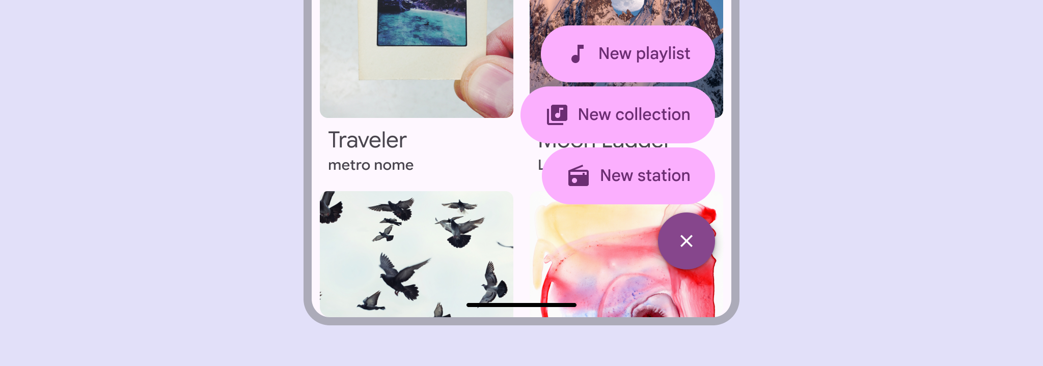

On a page of music albums, a FAB menu shows options to make a new playlist, collection, or station.
Use the FAB menu to show multiple related actions in a prominent, expressive style

Usage ​

A FAB menu opens from a FAB to show multiple related actions. It should always appear in the same place as the FAB that opened it.

This makes actions immediately accessible, and keeps the UI clean by concealing actions when they’re not needed.

Don’t open a FAB menu from an extended FABExtended floating action buttons (extended FABs) help people take primary actions.More on extended FABs or any other component.

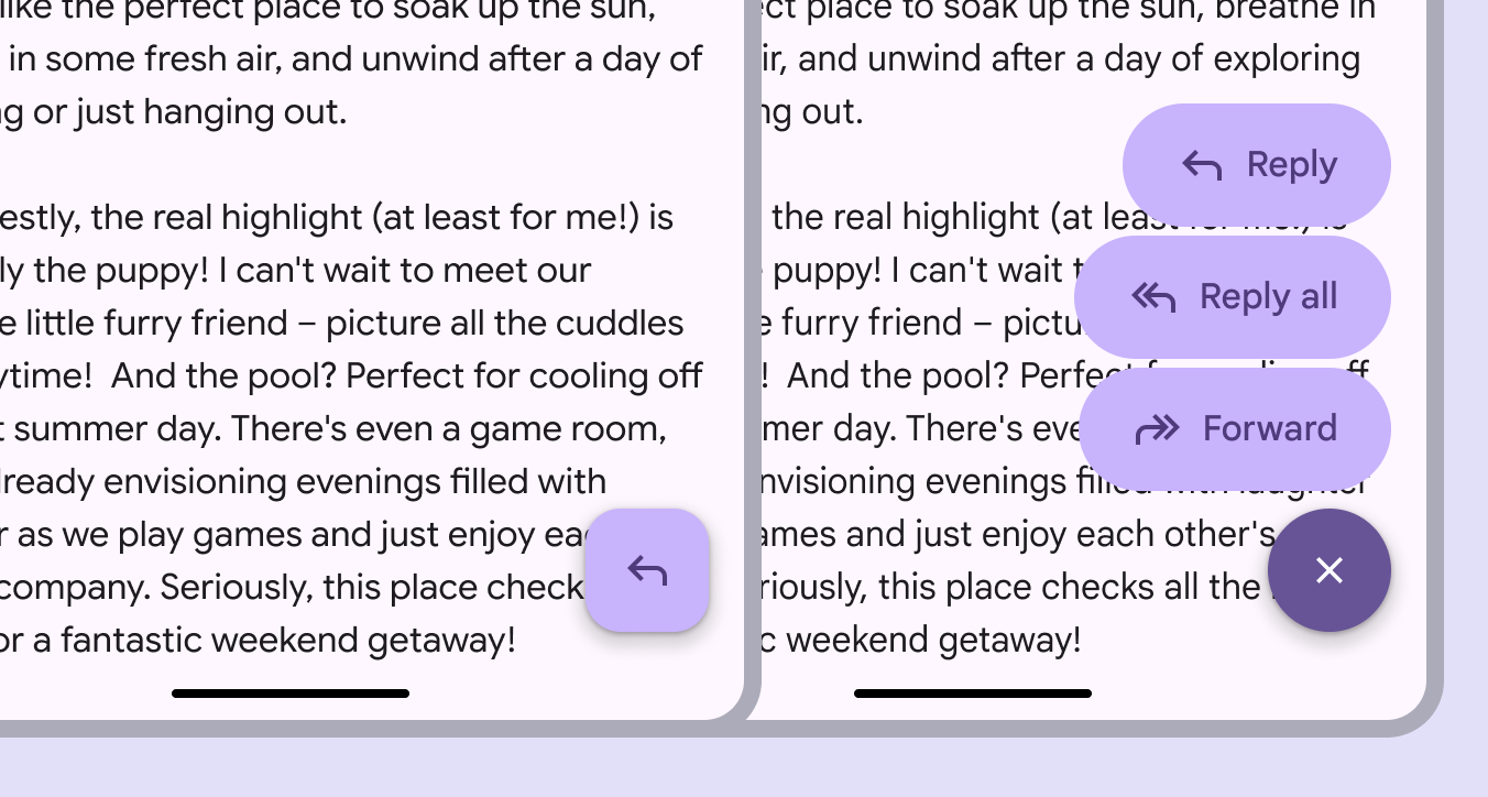
1 mobile screen with a FAB, 1 with a FAB menu. Both are right aligned.
The FAB menu should always open from a FAB

The FAB menu should be aligned to the trailing edge of the window.

In right-to-left (RTL) languages, this means the FAB and FAB menu should be aligned to the left edge, and the layout of elements should be mirrored.
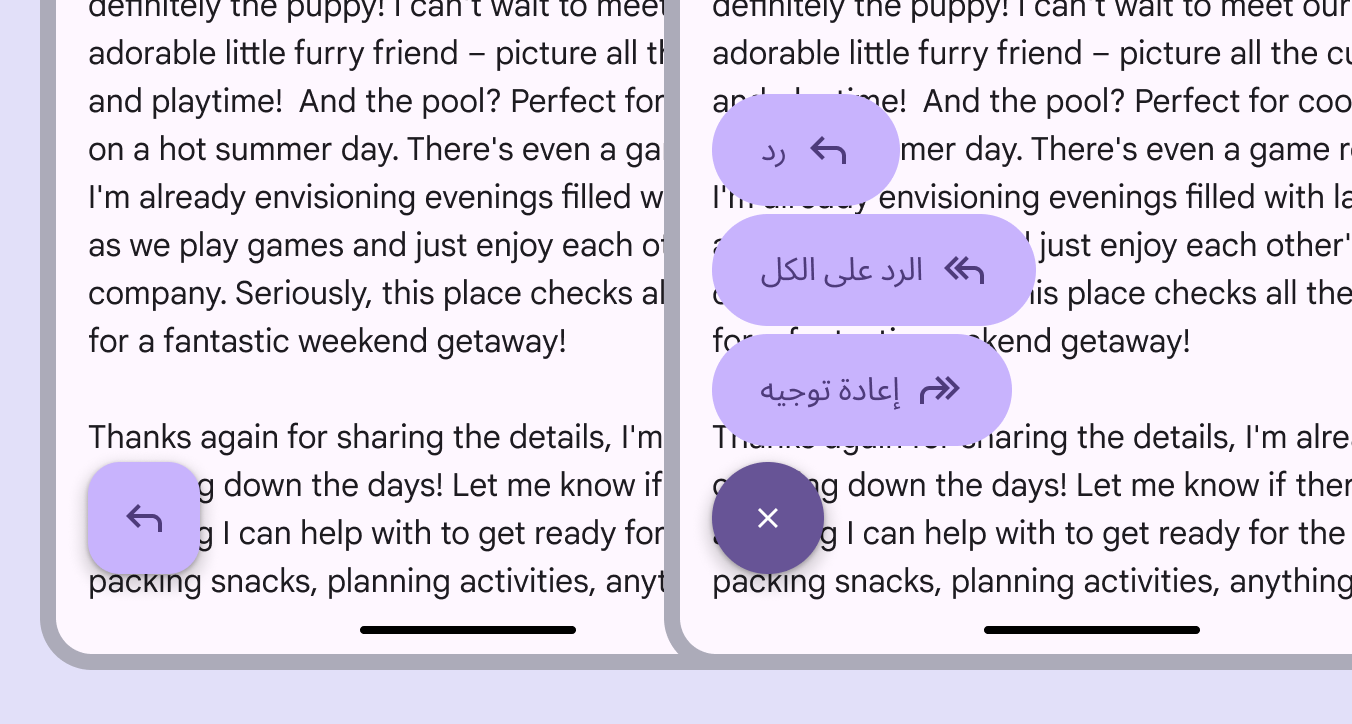
1 mobile screen with a FAB, 1 with a FAB menu. Both are left aligned and mirrored for a right-to-left language.
In RTL languages, the FAB menu should be left-aligned with the icon and text placement mirrored

FAB menus can contain 2–6 items. These should be closely related under a single action, like Share.

Avoid grouping unrelated actions in the same FAB menu.
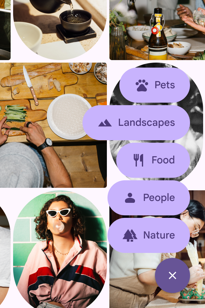
A FAB menu with 5 options on a photo gallery UI.
Do FAB menus can have 2-6 items
A FAB menu with 1 option on a photo gallery UI.
Don't Don’t use a FAB menu with one item

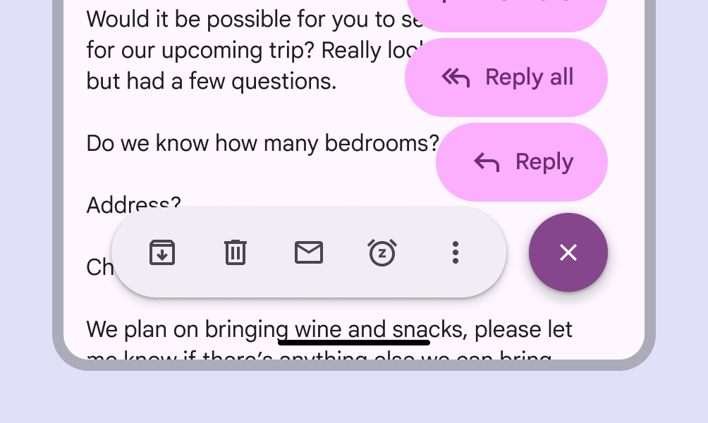
When a FAB is paired with other components, like the floating toolbarFloating toolbars float on top of page content and can provide contextual, dynamic actions.More on toolbars or navigation railNavigation rails let people switch between UI views on mid-sized devices.More on navigation rails, don’t use the FAB menu. This prevents cognitive overload and interface clutter.
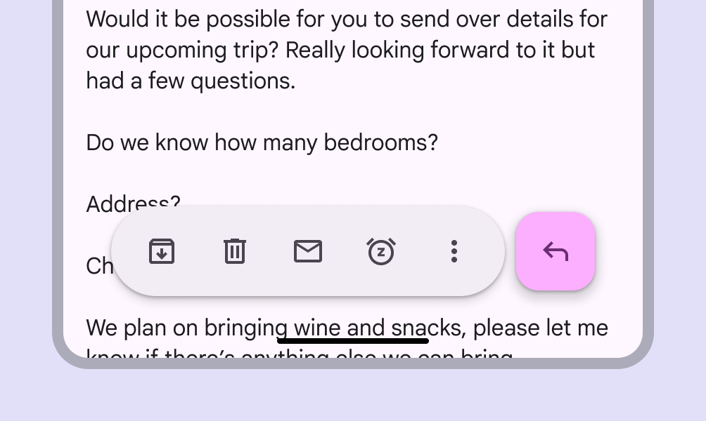
A toolbar with a FAB directly next to it.
Do FABs can be placed next to toolbars and other components
A toolbar with a FAB menu next to it.
Don't Don't use a FAB menu with a toolbar or navigation rail

Color sets

FAB menus have three color sets: primary, secondary, and tertiary. Use the color set that best matches the FAB color style.

Use the primary FAB menu color set with the primary or primary container FAB color styles.
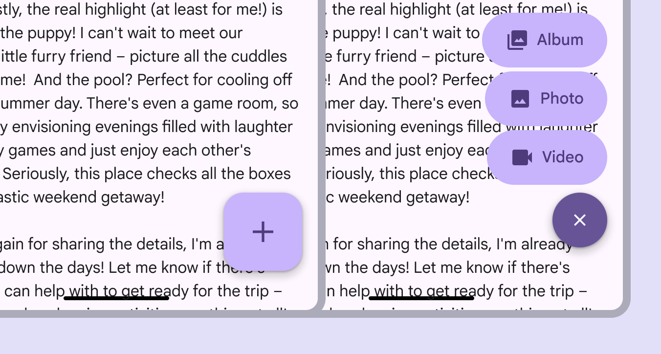
A FAB menu using the primary color set.
A primary FAB is paired with a primary FAB menu

Use the secondary FAB menu color set with the secondary or secondary container FAB color styles.
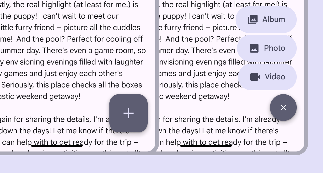
A FAB menu using the secondary color set.
A secondary FAB is paired with a secondary FAB menu

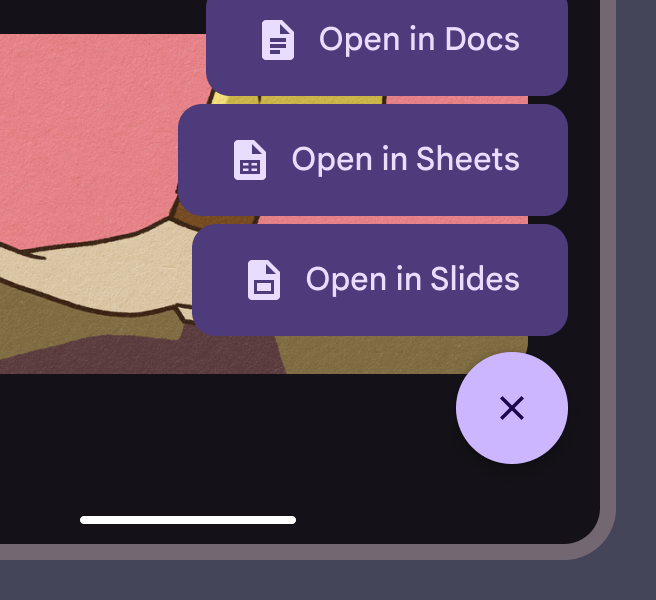
Use the tertiary FAB menu color set with the tertiary or tertiary container FAB color styles.
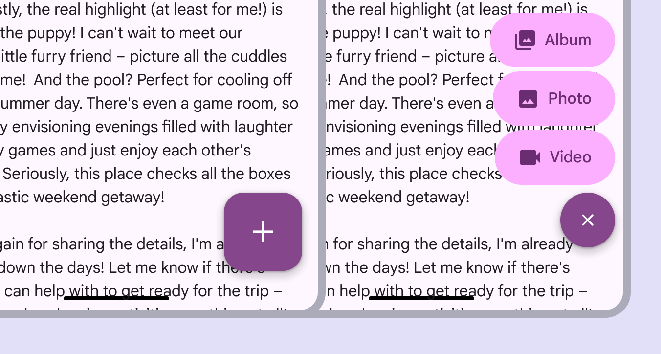
A FAB menu using the tertiary color set.
A tertiary FAB is paired with a tertiary FAB menu

Anatomy ​

2 elements of a FAB menu.
  1. Close button
  2. List item

FAB menu items should always have label text. The icons shouldn’t be removed since they make each item easy to identify.
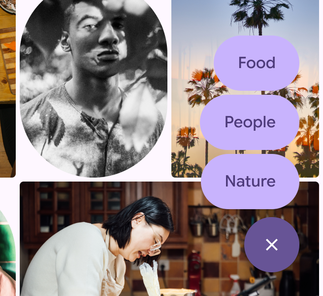

A FAB menu with 3 options for selecting Food, People, or Nature. There are no icons next to the text.
Caution Only remove the icon if necessary. The icon provides a differentiation between items.
A FAB menu with 3 options for selecting Food, People, or Nature. The options are only icons, no text.
Don't Don’t remove the label

The list item should always hug its contents and look consistent. Avoid truncating text or setting fixed widths. All FAB menu elements should be rounded.
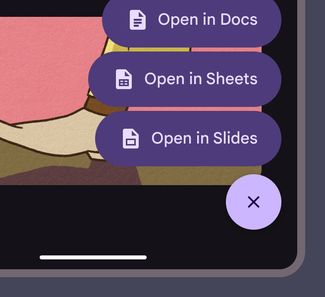
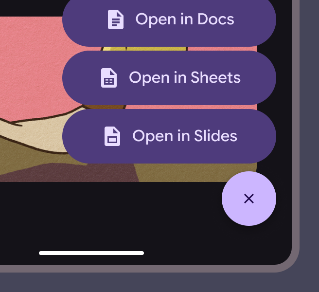
A FAB menu used out of the box with no configurations.
Do Keep the padding between the container and icon, icon and text, and text and container consistent
FAB menu items are equal width despite having different lengths of text.
Don't Don’t expand container sizes
FAB menu items are square instead of round.
Don't Don’t change FAB menu shapes

Adaptive layout ​

The FAB menu can open from any sized FABFloating action buttons (FABs) help people take primary actions.More on FABs. Use with a FAB size suitable for the window size class. For example, larger FABs are recommended for larger windows.

The FAB menu works in any window size. Pair it with the FAB suitable for that window size.

The FAB menu should remain anchored to the same corner or edge regardless of window size.

In large and extra large windows, the FAB and FAB menu margins should increase from 16dp to 24dp.
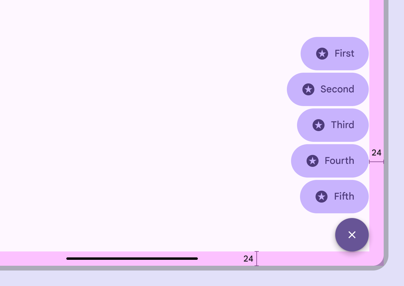
A FAB menu with 24dp margins from the edge of the window.
On desktop, use larger FABs and margins

On web, the FAB menu uses a menuMenus display a list of choices on a temporary surface.More on menus component for an experience that's consistent with other desktop apps.
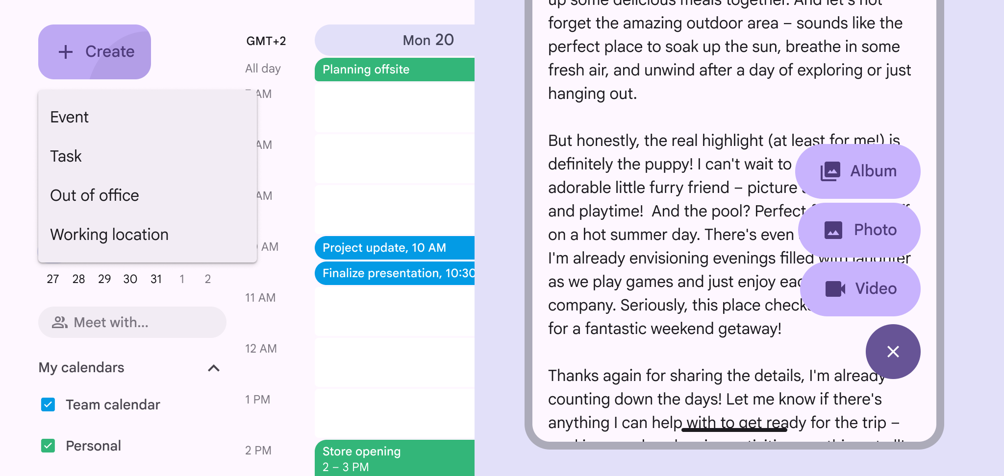
A FAB menu using menu component on web and traditional FAB menu on compact screen.
The same FAB menu options on both large window (left) and an Android compact window (right)

Behavior ​

Appearing

The FAB should transform into the close button of the FAB menu. The menu items should appear using the enter and exit transition.

Originate the transition from one of the FAB's trailing corners, preferably the top-aligned corner.

Animate FAB menus from the top-aligned corner of FABs

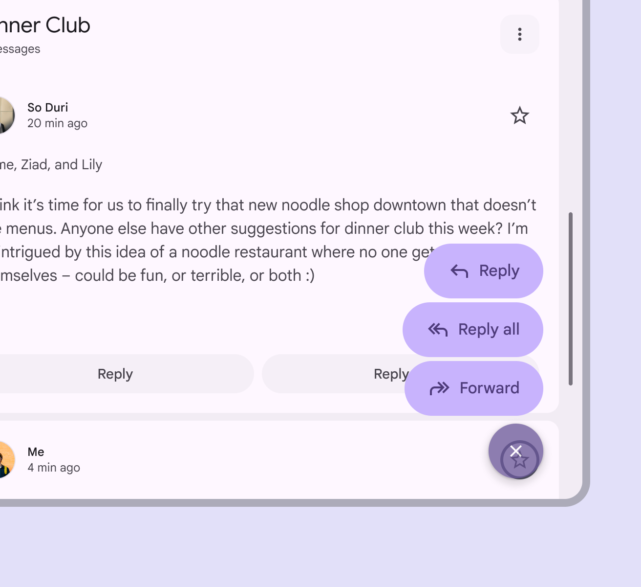
To ensure accessibility for keyboard users on the web, avoid positioning the FAB menu to completely obscure the focus indicator of an actionable element.

Partially covering the desired element is fine, as long as the focus indicator is visible.
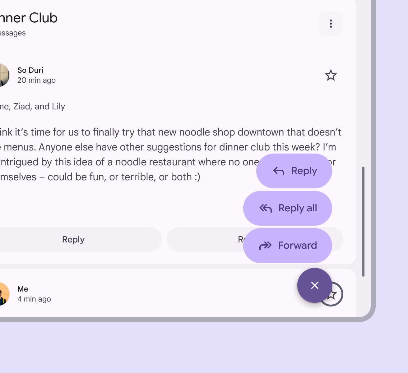
FAB menu doesn’t obscure actionable element and its focus indicator.
Do Ensure the actionable element and its focus indicator are visible behind the FAB menu
FAB menu obscures both an actionable element and its focus indicator.
Don't Don’t block an actionable element and its focus indicator completely with the FAB menu

Scrolling

When window height is limited, like when viewing phones in horizontal orientation, FAB menu items can scroll.

The items should scroll behind the close button.

FAB menus can scroll if the window height is too short to contain all the options

Expanding

Any FAB menu item can expand and adapt to any shape using a container transform transition pattern. This includes a surface that is part of the app structure, or a surface that spans the entire screen.

FAB menu items can transition into any kind of shape when selected
Pager
Previous pageFAB menu: Specs
Next pageFAB menu: Accessibility

Released under the Apache 2.0 or CC BY 4.0

Copyright © 2018-Present Google

https://m3.material.io/components/fab-menu/guidelines

Released under the Apache 2.0 or CC BY 4.0

Copyright © 2018-Present Google