Skip to content
Material Design 3
Main Navigation
v3
v2
v1

English

简体中文
繁體中文
Español
Français
Русский
Português – Brasil
Deutsch
日本語
한국어
Italiano
Polski
Türkçe
čeština
magyar

English

简体中文
繁體中文
Español
Français
Русский
Português – Brasil
Deutsch
日本語
한국어
Italiano
Polski
Türkçe
čeština
magyar

Appearance

Sidebar Navigation

Foundations

Accessibility

Overview: Principles

Overview: Assistive technology

Designing: Overview

Designing: Color contrast

Designing: Structure

Designing: Flow

Designing: Elements

Writing and text: Best practices

Writing and text: Text truncation

Writing and text: Text resizing

Building for all: User needs

Building for all: Co-design

Content design

Overview

Alt text

Global writing: Overview

Global writing: Word choice

Notifications

Style guide: UX writing best practices

Style guide: Word choice

Style guide: Grammar and punctuation

Customizing Material

Devices

Watches: Overview

Watches: Foundations

Watches: Styles

Watches: Layout

XR

Design: Overview

Design: Interaction

Design: Layout

Design: Accessibility

Components: Overview

Components: App bars

Components: Dialogs

Components: Nav bar

Components: Nav rail

Components: Toolbars

Design tokens: Overview

Design tokens: How to use tokens

Interaction

Gestures

Inputs

Selection

States: Overview

States: State layers

States: Applying states

Layout

Overview: Overview

Overview: Parts of layout

Overview: Adaptive design

Scaffold: Overview

Scaffold: Bars

Scaffold: Rails

Scaffold: Panes

Grids & spacing: Overview

Grids & spacing: Grids

Grids & spacing: Spacing

Grids & spacing: Density

Breakpoints: Overview

Breakpoints: Compact

Breakpoints: Medium

Breakpoints: Expanded

Breakpoints: Large & extra-large

Bidirectionality & RTL

Canonical examples: Overview

Canonical examples: Feed

Canonical examples: List-detail

Canonical examples: Supporting pane

Usability: Overview

Usability: Applying M3 Expressive

Material A-Z

Styles

Color

Color system: Overview

Color system: How the system works

Color roles

Color schemes

Choosing a scheme

Static: Baseline

Static: Custom brand

Dynamic: Choosing a source

Dynamic: User-generated source

Dynamic: Content-based source

Advanced: Overview

Advanced: Apply colors

Advanced: Define new colors

Advanced: Adjust existing colors

Color resources

Elevation: Overview

Elevation: Applying elevation

Elevation: Tokens

Icons: Overview

Icons: Designing icons

Icons: Applying icons

Motion

Motion physics system: How it works

Motion physics system: Specs

Easing and duration: Applying easing and duration

Easing and duration: Tokens & specs

Transitions: Transition patterns

Transitions: Applying transitions

Shape: Overview & principles

Shape: Corner radius scale

Shape: Shape morph

Spacing: Overview

Spacing: Applying spacing

Spacing: Tokens

Typography: Overview

Typography: Fonts

Typography: Type scale & tokens

Typography: Applying type

Typography: Editorial treatments

Components

App bars: Overview

App bars: Specs

App bars: Guidelines

App bars: Accessibility

Badges: Overview

Badges: Specs

Badges: Guidelines

Badges: Accessibility

Buttons

All buttons

Button groups: Overview

Button groups: Specs

Button groups: Guidelines

Button groups: Accessibility

Buttons: Overview

Buttons: Specs

Buttons: Guidelines

Buttons: Accessibility

Extended FABs: Overview

Extended FABs: Specs

Extended FABs: Guidelines

Extended FABs: Accessibility

FAB menu: Overview

FAB menu: Specs

FAB menu: Guidelines

FAB menu: Accessibility

FABs: Overview

FABs: Specs

FABs: Guidelines

FABs: Accessibility

Icon buttons: Overview

Icon buttons: Specs

Icon buttons: Guidelines

Icon buttons: Accessibility

Segmented buttons: Overview

Segmented buttons: Specs

Segmented buttons: Guidelines

Segmented buttons: Accessibility

Split button: Overview

Split button: Specs

Split button: Guidelines

Split button: Accessibility

Cards: Overview

Cards: Specs

Cards: Guidelines

Cards: Accessibility

Carousel: Overview

Carousel: Specs

Carousel: Guidelines

Carousel: Accessibility

Checkbox: Overview

Checkbox: Specs

Checkbox: Guidelines

Checkbox: Accessibility

Chips: Overview

Chips: Specs

Chips: Guidelines

Chips: Accessibility

Date & time pickers

Date pickers: Overview

Date pickers: Specs

Date pickers: Guidelines

Date pickers: Accessibility

Time pickers: Overview

Time pickers: Specs

Time pickers: Guidelines

Time pickers: Accessibility

Dialogs: Overview

Dialogs: Specs

Dialogs: Guidelines

Dialogs: Accessibility

Divider: Overview

Divider: Specs

Divider: Guidelines

Divider: Accessibility

Lists: Overview

Lists: Specs

Lists: Guidelines

Lists: Accessibility

Loading & progress

Loading indicator: Overview

Loading indicator: Specs

Loading indicator: Guidelines

Loading indicator: Accessibility

Progress indicators: Overview

Progress indicators: Specs

Progress indicators: Guidelines

Progress indicators: Accessibility

Menus: Overview

Menus: Specs

Menus: Guidelines

Menus: Accessibility

Navigation

Navigation bar: Overview

Navigation bar: Specs

Navigation bar: Guidelines

Navigation bar: Accessibility

Navigation drawer: Overview

Navigation drawer: Specs

Navigation drawer: Guidelines

Navigation drawer: Accessibility

Navigation rail: Overview

Navigation rail: Specs

Navigation rail: Guidelines

Navigation rail: Accessibility

Radio button: Overview

Radio button: Specs

Radio button: Guidelines

Radio button: Accessibility

Search: Overview

Search: Specs

Search: Guidelines

Search: Accessibility

Sheets

Bottom sheets: Overview

Bottom sheets: Specs

Bottom sheets: Guidelines

Bottom sheets: Accessibility

Side sheets: Overview

Side sheets: Specs

Side sheets: Guidelines

Side sheets: Accessibility

Sliders: Overview

Sliders: Specs

Sliders: Guidelines

Sliders: Accessibility

Snackbar: Overview

Snackbar: Specs

Snackbar: Guidelines

Snackbar: Accessibility

Switch: Overview

Switch: Specs

Switch: Guidelines

Switch: Accessibility

Tabs: Overview

Tabs: Specs

Tabs: Guidelines

Tabs: Accessibility

Text fields: Overview

Text fields: Specs

Text fields: Guidelines

Text fields: Accessibility

Toolbars: Overview

Toolbars: Specs

Toolbars: Guidelines

Toolbars: Accessibility

Tooltips: Overview

Tooltips: Specs

Tooltips: Guidelines

Tooltips: Accessibility

On this page

Grids & spacing: Grids ​

Grids and spacing organize content and actions for any layout


  • Layouts in Material are based on a grid that adapts across all breakpointsBreakpoints are opinionated window sizes where a layout changes to match available space, device conventions, and ergonomics (previously window size classes).More on breakpoints (previously window size classes)
  • Parts of the layout scaffoldA scaffold is a fundamental UI design structure that provides a standard platform for assembling key screen components.More on scaffold like rails and panes are positioned on this grid to create consistent adaptive layouts
  • The structure and spacing values used in a grid can add personality to a product’s layout

How to use grids ​

Start with placing grid columns

Grids adapt across breakpointsBreakpoints are opinionated window sizes where a layout changes to match available space, device conventions, and ergonomics (previously window size classes).More on breakpoints. As the size increases, column count, width, and spacing change as well.
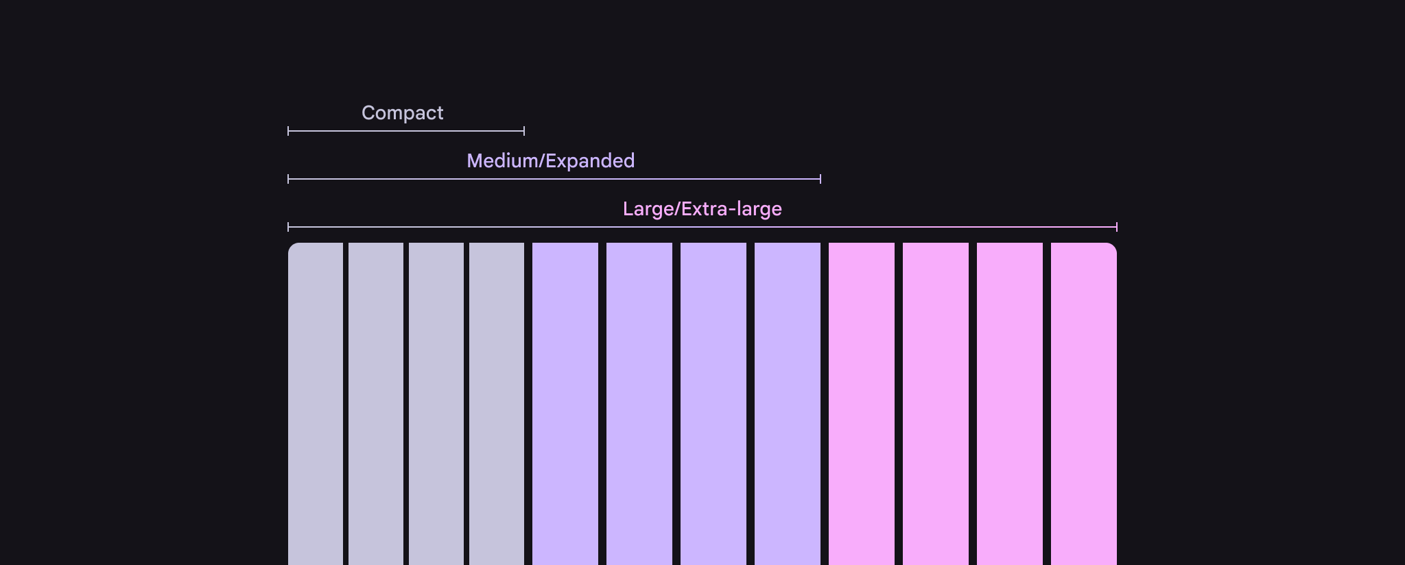
A mockup of grid columns, showing compact, medium/expanded, and large/extra-large breakpoints.
The number and size of columns changes based on breakpoints

When moving between sizes, column count may increase to show more content or controls.
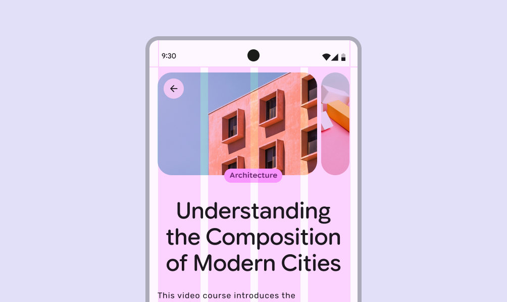
A course listing on a compact screen, with 4 columns.
On compact screens, fewer columns are used to create a focused layout
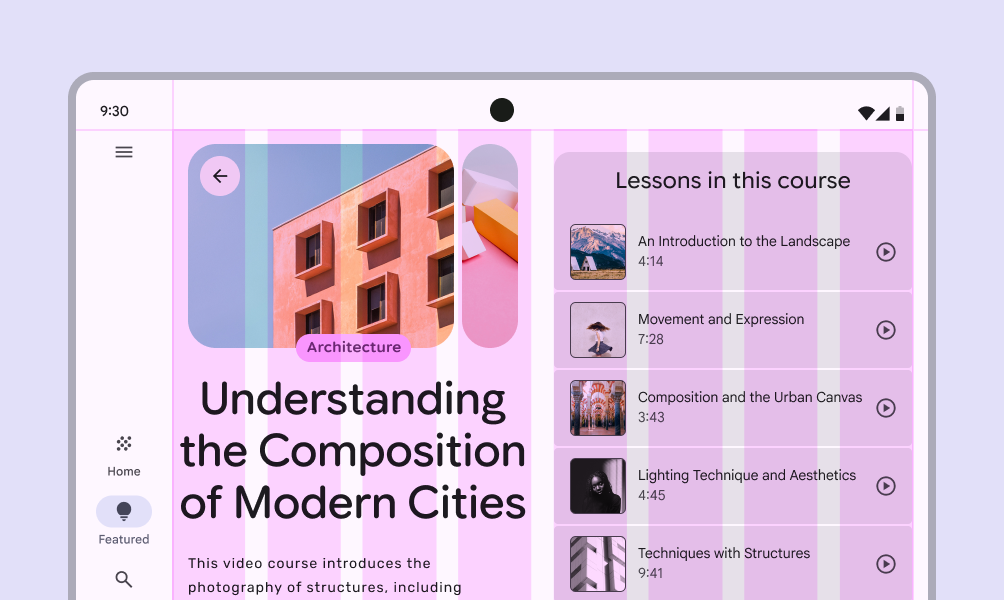
A course listing on a foldable screen, with 8 columns.
As screen size increases, for example when a foldable screen is unfolded, additional columns allow for a richer layout

Place bars & rails

Populate regions of the layout scaffoldA scaffold is a fundamental UI design structure that provides a standard platform for assembling key screen components.More on scaffold that are closest to the edges of the screen’s usable space first. This may include:

  • Bars like the navigation barNavigation bars let people switch between UI views on smaller devices.More on navigation bars and railNavigation rails let people switch between UI views on mid-sized devices.More on navigation rails
  • Components like toolbarsToolbars display frequently used actions relevant to the current page.More on toolbars and app barsApp bars contain page navigation and information at the top of a screen.More on app bars
A compact screen with a toolbar highlighted.
The bar region can contain a toolbar
A large screen with a leading navigation rail highlighted.
The rail region on larger screens usually contains a navigation rail

Place panes

Next, populate the main region of the screen with panes with content and components, based on available space and structure.

See the canonical layout examples for ideas on which panes are appropriate for a product.
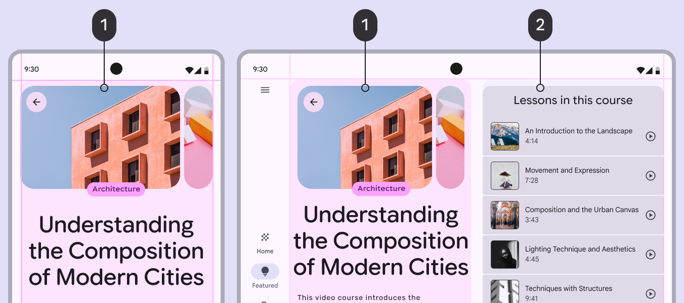
Mobile UI with 1 pane. Foldable UI with 2 panes in a supporting pane layout.
  1. Primary pane
  2. Supporting pane

Rulers & alignment ​

Rulers are a set of recommended global alignment lines that help create consistent focal points in a product, while keeping content and components consistently aligned.

How to implement rulers in Compose
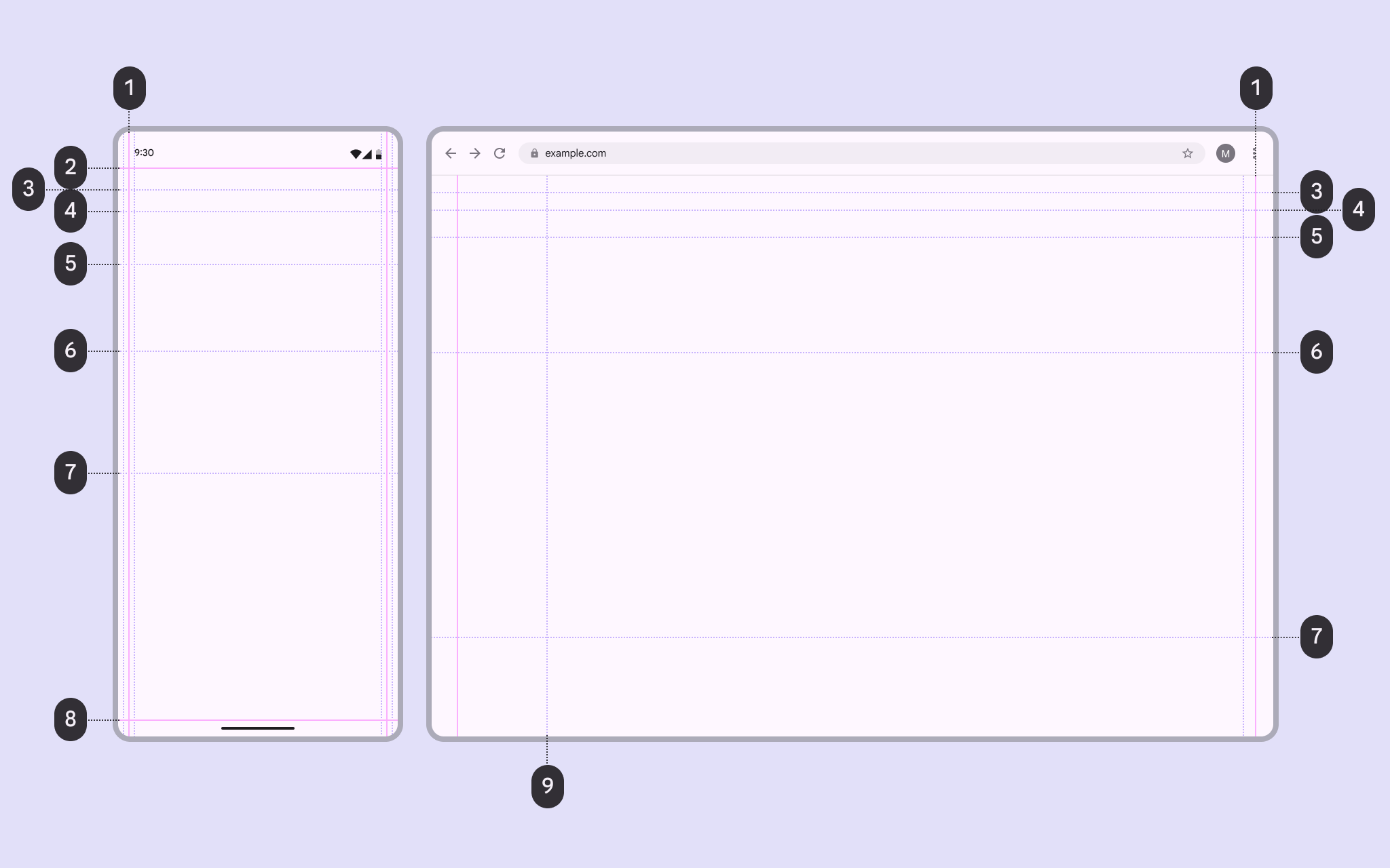
1 compact and 1 desktop UI mapping rulers.
  1. Margin
  2. Bar or safety region
  3. Title
  4. Content 1
  5. Content 2
  6. Content 3
  7. Content 4
  8. Bar or safety region
  9. Rail

Bar & safety rulers

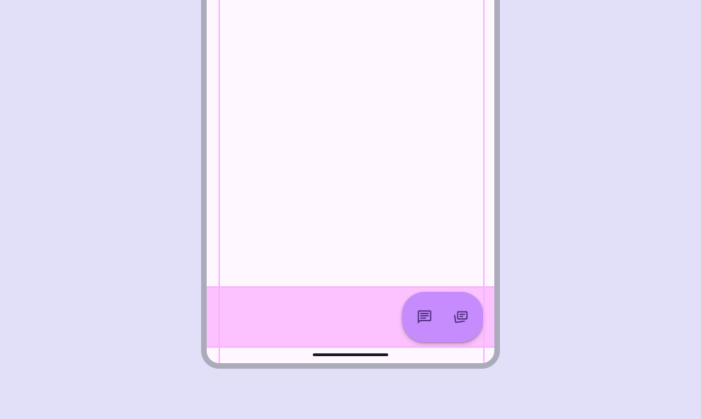
Bar and safety rulers reserve space for system UI elements like the status bar and gesture navigation.

They ensure actionable content like app barsApp bars contain page navigation and information at the top of a screen.More on app bars aren’t covered by system UI.

2 mobile UIs showing bar and safety rulers at the top and bottom.
Bar and safety rulers align to the edges of a screen’s usable space, providing a reference for where system UI like the status bar or gesture navigation appear

Title rulers

The title ruler creates consistency for the screen’s title, aligning the text, icons, and other components in an app bar.
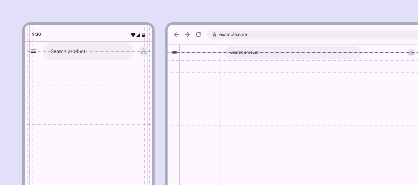
1 mobile and 1 desktop UI showing title rulers.
The title ruler aligns with the title in an app bar

Content rulers

Use content rulers to align and anchor key content, such as headlines and carouselsCarousels show a collection of items that can be scrolled on and off the screen.More on carousels.

  • First content ruler: Emphasizes major blocks like hero images, headlines, or primary components
  • Secondary rulers: Determine where supplementary text or actions begin
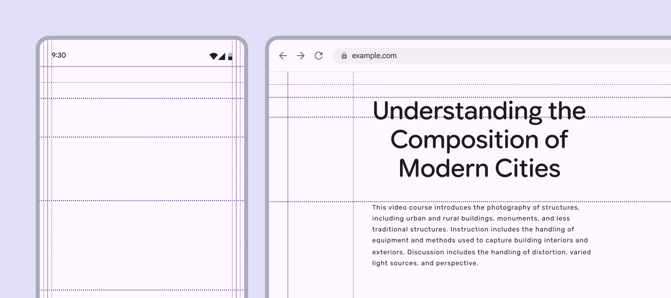
1 mobile and 1 desktop UI showing content rulers.
Content rulers offer flexible alignment options to help create a consistent layout across a product
Realigning primary components or content to a content ruler can create strong hierarchy and visual rhythm across a product

Ruler options

Margin rulers come with some wiggle room to determine how tight or loose a product’s content feels on-screen. The standard ruler can be adjusted to the left or right.

Choosing a narrower or wider margin can create or remove negative space, or create expressive moments in a content-forward product.

Margin rulers can adjust to create more or less negative space

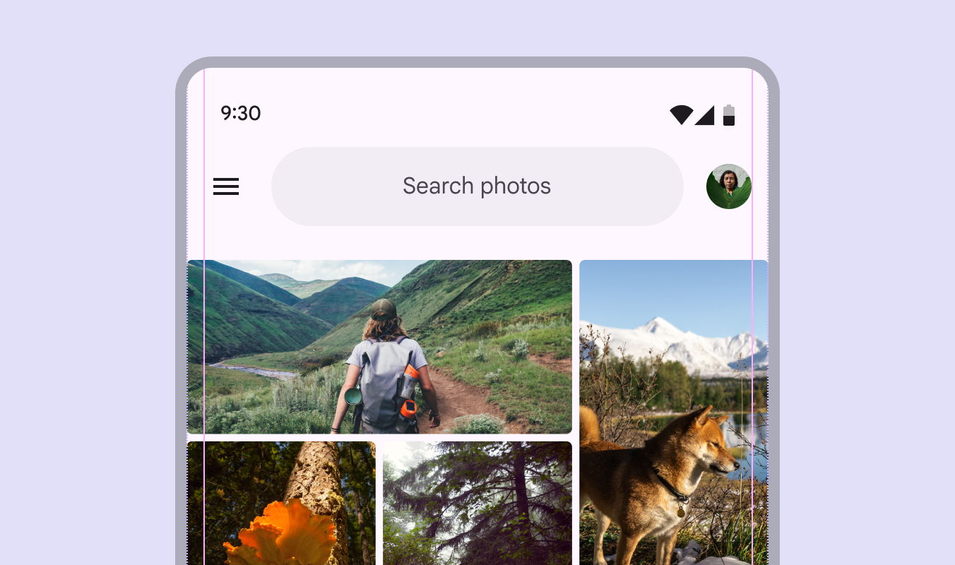
Rulers can also be used to create more immersive experiences. For example, a photo grid can take the full width of the screen, while components like searchSearch lets people enter a keyword or phrase to get relevant information.More on search use wider margins.

Mobile UI for a photo app showing a full-width image grid and a search bar with wide margins.
Rulers allow components and media to use different margin widths
Pager
Previous pageGrids & spacing: Overview
Next pageGrids & spacing: Spacing

Released under the Apache 2.0 or CC BY 4.0

Copyright © 2018-Present Google

https://m3.material.io/foundations/layout/grids-spacing/grids

Released under the Apache 2.0 or CC BY 4.0

Copyright © 2018-Present Google