Skip to content
Material Design 3
Main Navigation
v3
v2
v1

English

简体中文
繁體中文
Español
Français
Русский
Português – Brasil
Deutsch
日本語
한국어
Italiano
Polski
Türkçe
čeština
magyar

English

简体中文
繁體中文
Español
Français
Русский
Português – Brasil
Deutsch
日本語
한국어
Italiano
Polski
Türkçe
čeština
magyar

Appearance

Sidebar Navigation

Foundations

Accessibility

Overview: Principles

Overview: Assistive technology

Designing: Overview

Designing: Color contrast

Designing: Structure

Designing: Flow

Designing: Elements

Writing and text: Best practices

Writing and text: Text truncation

Writing and text: Text resizing

Building for all: User needs

Building for all: Co-design

Content design

Overview

Alt text

Global writing: Overview

Global writing: Word choice

Notifications

Style guide: UX writing best practices

Style guide: Word choice

Style guide: Grammar and punctuation

Customizing Material

Devices

Watches: Overview

Watches: Foundations

Watches: Styles

Watches: Layout

XR

Design: Overview

Design: Interaction

Design: Layout

Design: Accessibility

Components: Overview

Components: App bars

Components: Dialogs

Components: Nav bar

Components: Nav rail

Components: Toolbars

Design tokens: Overview

Design tokens: How to use tokens

Interaction

Gestures

Inputs

Selection

States: Overview

States: State layers

States: Applying states

Layout

Overview: Overview

Overview: Parts of layout

Overview: Adaptive design

Scaffold: Overview

Scaffold: Bars

Scaffold: Rails

Scaffold: Panes

Grids & spacing: Overview

Grids & spacing: Grids

Grids & spacing: Spacing

Grids & spacing: Density

Breakpoints: Overview

Breakpoints: Compact

Breakpoints: Medium

Breakpoints: Expanded

Breakpoints: Large & extra-large

Bidirectionality & RTL

Canonical examples: Overview

Canonical examples: Feed

Canonical examples: List-detail

Canonical examples: Supporting pane

Usability: Overview

Usability: Applying M3 Expressive

Material A-Z

Styles

Color

Color system: Overview

Color system: How the system works

Color roles

Color schemes

Choosing a scheme

Static: Baseline

Static: Custom brand

Dynamic: Choosing a source

Dynamic: User-generated source

Dynamic: Content-based source

Advanced: Overview

Advanced: Apply colors

Advanced: Define new colors

Advanced: Adjust existing colors

Color resources

Elevation: Overview

Elevation: Applying elevation

Elevation: Tokens

Icons: Overview

Icons: Designing icons

Icons: Applying icons

Motion

Motion physics system: How it works

Motion physics system: Specs

Easing and duration: Applying easing and duration

Easing and duration: Tokens & specs

Transitions: Transition patterns

Transitions: Applying transitions

Shape: Overview & principles

Shape: Corner radius scale

Shape: Shape morph

Spacing: Overview

Spacing: Applying spacing

Spacing: Tokens

Typography: Overview

Typography: Fonts

Typography: Type scale & tokens

Typography: Applying type

Typography: Editorial treatments

Components

App bars: Overview

App bars: Specs

App bars: Guidelines

App bars: Accessibility

Badges: Overview

Badges: Specs

Badges: Guidelines

Badges: Accessibility

Buttons

All buttons

Button groups: Overview

Button groups: Specs

Button groups: Guidelines

Button groups: Accessibility

Buttons: Overview

Buttons: Specs

Buttons: Guidelines

Buttons: Accessibility

Extended FABs: Overview

Extended FABs: Specs

Extended FABs: Guidelines

Extended FABs: Accessibility

FAB menu: Overview

FAB menu: Specs

FAB menu: Guidelines

FAB menu: Accessibility

FABs: Overview

FABs: Specs

FABs: Guidelines

FABs: Accessibility

Icon buttons: Overview

Icon buttons: Specs

Icon buttons: Guidelines

Icon buttons: Accessibility

Segmented buttons: Overview

Segmented buttons: Specs

Segmented buttons: Guidelines

Segmented buttons: Accessibility

Split button: Overview

Split button: Specs

Split button: Guidelines

Split button: Accessibility

Cards: Overview

Cards: Specs

Cards: Guidelines

Cards: Accessibility

Carousel: Overview

Carousel: Specs

Carousel: Guidelines

Carousel: Accessibility

Checkbox: Overview

Checkbox: Specs

Checkbox: Guidelines

Checkbox: Accessibility

Chips: Overview

Chips: Specs

Chips: Guidelines

Chips: Accessibility

Date & time pickers

Date pickers: Overview

Date pickers: Specs

Date pickers: Guidelines

Date pickers: Accessibility

Time pickers: Overview

Time pickers: Specs

Time pickers: Guidelines

Time pickers: Accessibility

Dialogs: Overview

Dialogs: Specs

Dialogs: Guidelines

Dialogs: Accessibility

Divider: Overview

Divider: Specs

Divider: Guidelines

Divider: Accessibility

Lists: Overview

Lists: Specs

Lists: Guidelines

Lists: Accessibility

Loading & progress

Loading indicator: Overview

Loading indicator: Specs

Loading indicator: Guidelines

Loading indicator: Accessibility

Progress indicators: Overview

Progress indicators: Specs

Progress indicators: Guidelines

Progress indicators: Accessibility

Menus: Overview

Menus: Specs

Menus: Guidelines

Menus: Accessibility

Navigation

Navigation bar: Overview

Navigation bar: Specs

Navigation bar: Guidelines

Navigation bar: Accessibility

Navigation drawer: Overview

Navigation drawer: Specs

Navigation drawer: Guidelines

Navigation drawer: Accessibility

Navigation rail: Overview

Navigation rail: Specs

Navigation rail: Guidelines

Navigation rail: Accessibility

Radio button: Overview

Radio button: Specs

Radio button: Guidelines

Radio button: Accessibility

Search: Overview

Search: Specs

Search: Guidelines

Search: Accessibility

Sheets

Bottom sheets: Overview

Bottom sheets: Specs

Bottom sheets: Guidelines

Bottom sheets: Accessibility

Side sheets: Overview

Side sheets: Specs

Side sheets: Guidelines

Side sheets: Accessibility

Sliders: Overview

Sliders: Specs

Sliders: Guidelines

Sliders: Accessibility

Snackbar: Overview

Snackbar: Specs

Snackbar: Guidelines

Snackbar: Accessibility

Switch: Overview

Switch: Specs

Switch: Guidelines

Switch: Accessibility

Tabs: Overview

Tabs: Specs

Tabs: Guidelines

Tabs: Accessibility

Text fields: Overview

Text fields: Specs

Text fields: Guidelines

Text fields: Accessibility

Toolbars: Overview

Toolbars: Specs

Toolbars: Guidelines

Toolbars: Accessibility

Tooltips: Overview

Tooltips: Specs

Tooltips: Guidelines

Tooltips: Accessibility

On this page

App bars: Specs ​

App bars are placed at the top of the screen to help people navigate through a product.

Variants ​
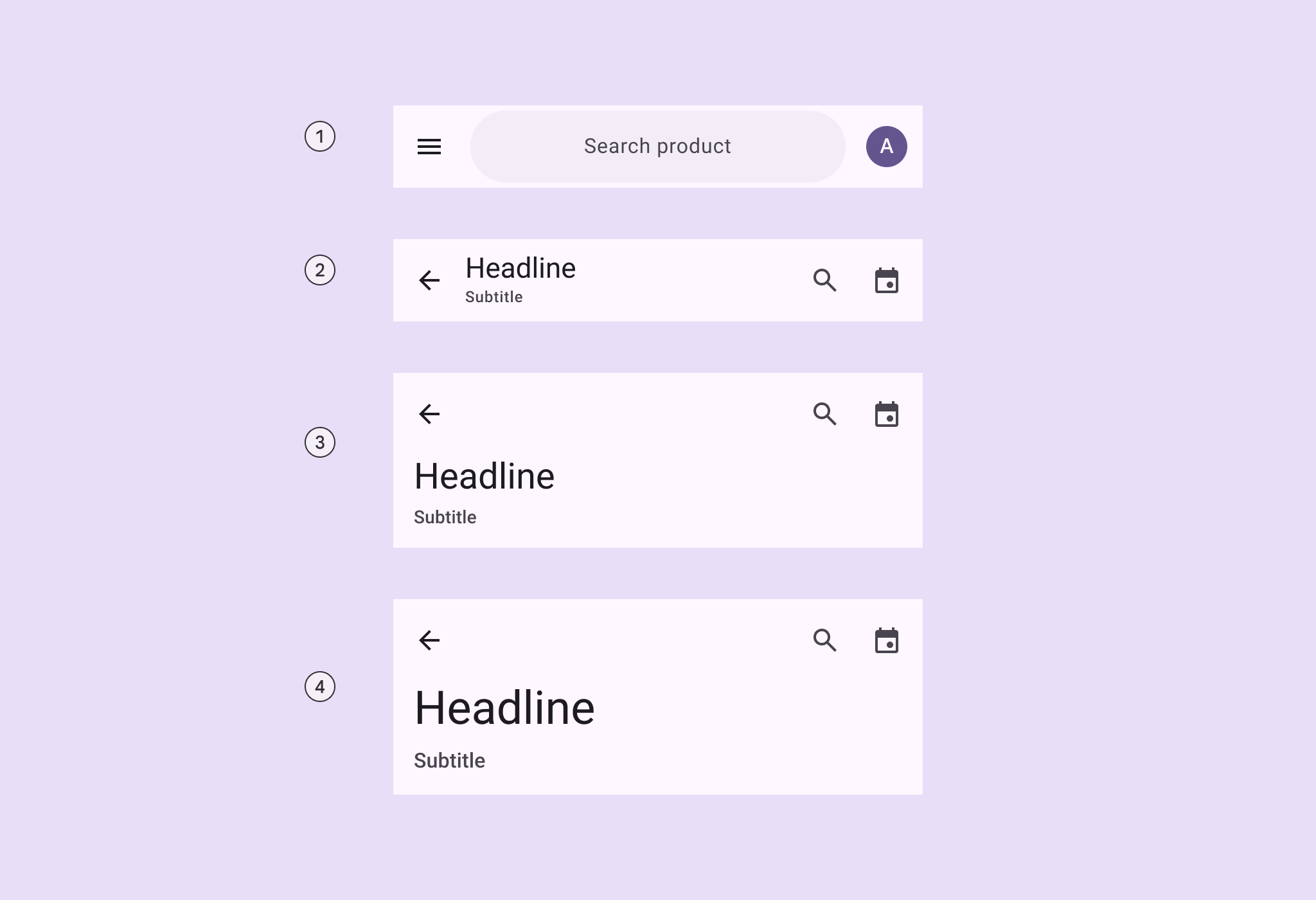
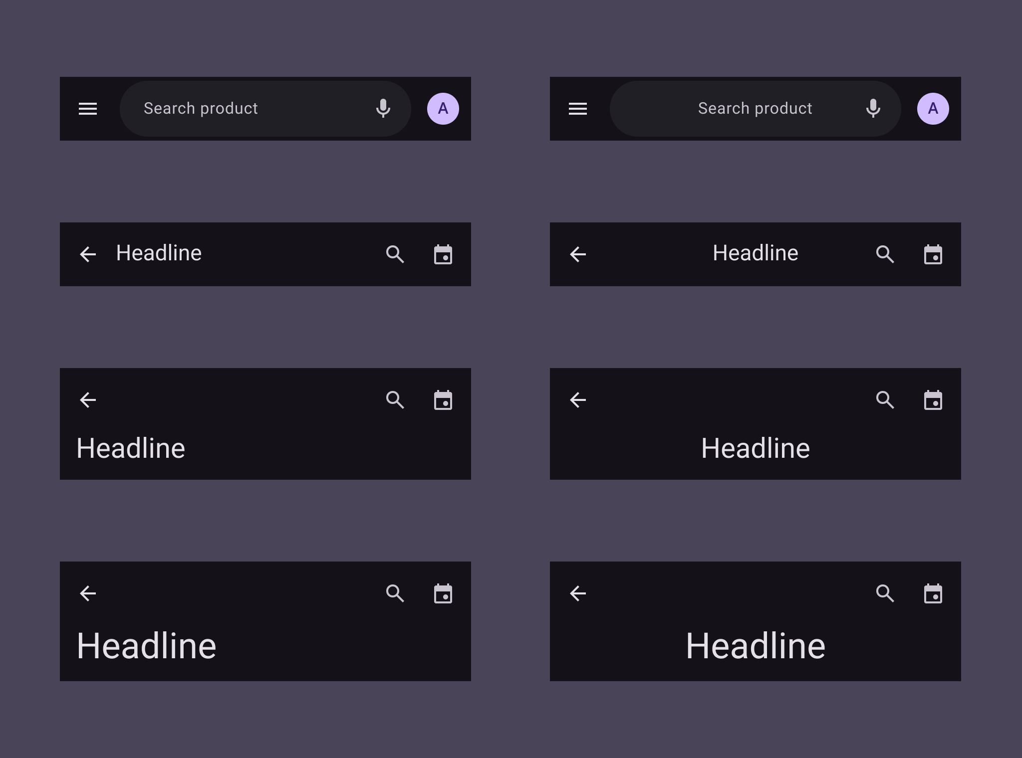
4 variants of app bars.
  1. Search app bar
  2. Small
  3. Medium flexible
  4. Large flexible

Baseline variants ​

The baseline M3 medium and large app bars are no longer recommended in M3 Expressive, and should be replaced with medium flexible and large flexible app bars, which are similar visually, but have multi-line support, a shorter height, and can contain a wide variety of elements, like images. Jump to baseline app bar specs
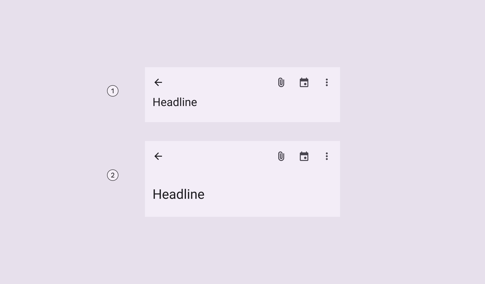
2 baseline app bar variants, medium and large.

Baseline variants

  1. Medium
  2. Large
VariantM3M3 Expressive
Search app bar--Available
SmallAvailableAvailable
Center-alignedAvailableMerged into small.
Use centered-text configuration.
Medium (baseline)AvailableNot recommended.
Use medium flexible
Medium flexible--Available
Large (baseline)AvailableNot recommended.
Use large flexible
Large flexible--Available

Configurations ​

Text alignment ​


4 variants of app bars with different left and center aligned text headlines.
Text labels, including supporting text, can be aligned to the leading edge or centered
CategoryConfigurationM3M3 Expressive
Text alignmentLeading edge (default)AvailableAvailable
Centered--Available

Tokens & specs ​

Select a token set to view in the table's menu. App bar token sets are organized into a common token set, and size-specific tokens. Learn about design tokens

App bar - Common ​

App bar - Size - Small ​

TokenValue
App bar small container height64dp
App bar small title fontRoboto
App bar small title font weight400
App bar small title font size22pt
App bar small title font tracking0
App bar small title line height28pt
App bar small subtitle fontRoboto
App bar small subtitle font weight500
App bar small subtitle font size12pt
App bar small subtitle font tracking0.5pt
App bar small subtitle line height16pt
App bar small icon button size24dp
Search container height56dp
Search container shapeCircular
Search title fontRoboto
Search title font weight400
Search title font size16pt
Search title font tracking0.5pt
Search title line height24pt

App bar - Size - Medium flexible ​

TokenValue
App bar medium flexible container height112dp
App bar medium flexible container height with subtitle136dp
App bar medium Title fontRoboto
App bar medium Title font weight400
App bar medium Title font size28pt
App bar medium Title font tracking0
App bar medium Title line height36pt
App bar medium Subtitle fontRoboto
App bar medium Subtitle font weight500
App bar medium Subtitle font size14pt
App bar medium Subtitle font tracking0.1pt
App bar medium Subtitle line height20pt

App bar - Size - Large flexible ​

TokenValue
App bar large flexible container height120dp
App bar large flexible container height with subtitle152dp
App bar large Title fontRoboto
App bar large Title font weight400
App bar large Title font size36pt
App bar large Title font tracking0
App bar large Title line height44pt
App bar large Subtitle fontRoboto
App bar large Subtitle font weight500
App bar large Subtitle font size16pt
App bar large Subtitle font tracking0.15pt
App bar large Subtitle line height24pt

Search component tokens & specs ​

The default searchSearch lets people enter a keyword or phrase to get relevant information.More on search component tokens are used in the search app bar.

Search - View ​

Theme
Contrast
TokenValue
Search view container surface tint layer color#6750A4

Search - Bar ​

Theme
Platform
Motion scheme
Contrast

Anatomy ​

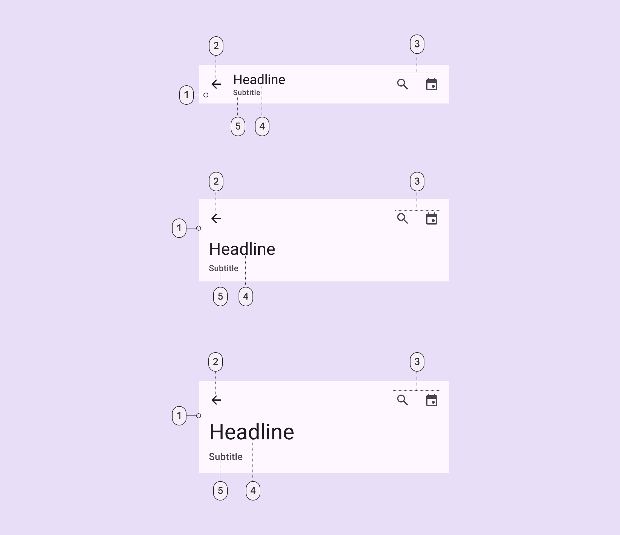
5 elements of the component.
  1. Container
  2. Leading button
  3. Trailing elements
  4. Headline
  5. Subtitle

App bars can be customized to include:

  • An image or logo
  • A subtitle
  • A filled icon button

Avoid customizing the size of the heading and subtitle, or adding too many actions.
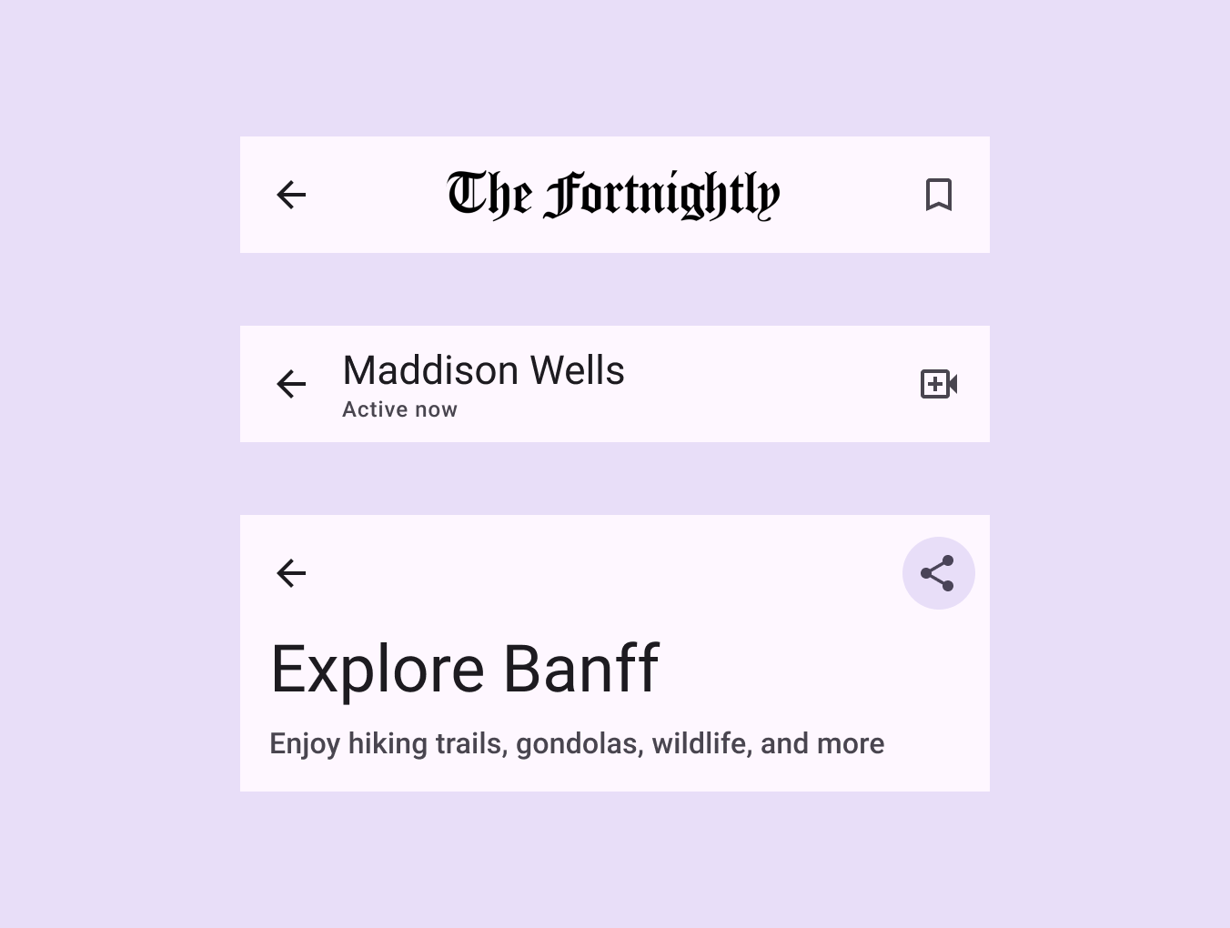
3 app bars: 1 with a newspaper logo, 1 with a subtitle, and 1 with a filled icon button.
The app bar can have different layouts depending on which elements are shown

Search ​

The search app bar can include trailing actions inside and outside the search bar. When the search bar is selected, it should open the search viewThe search view is a full-screen modal often used to display a list of search results. It can also be opened by selecting a search icon.More on search view component.

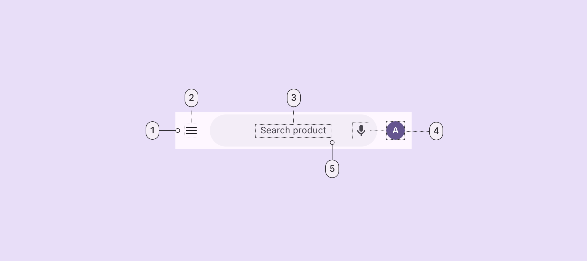
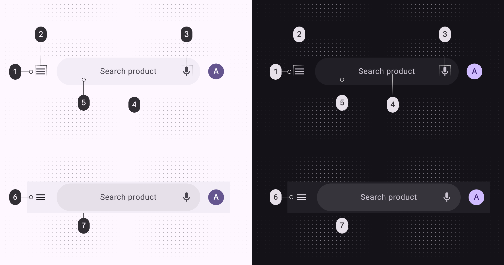
5 elements of the search app bar.
  1. Container
  2. Leading icon button
  3. Hinted search text
  4. Trailing icon or avatar
  5. Search container

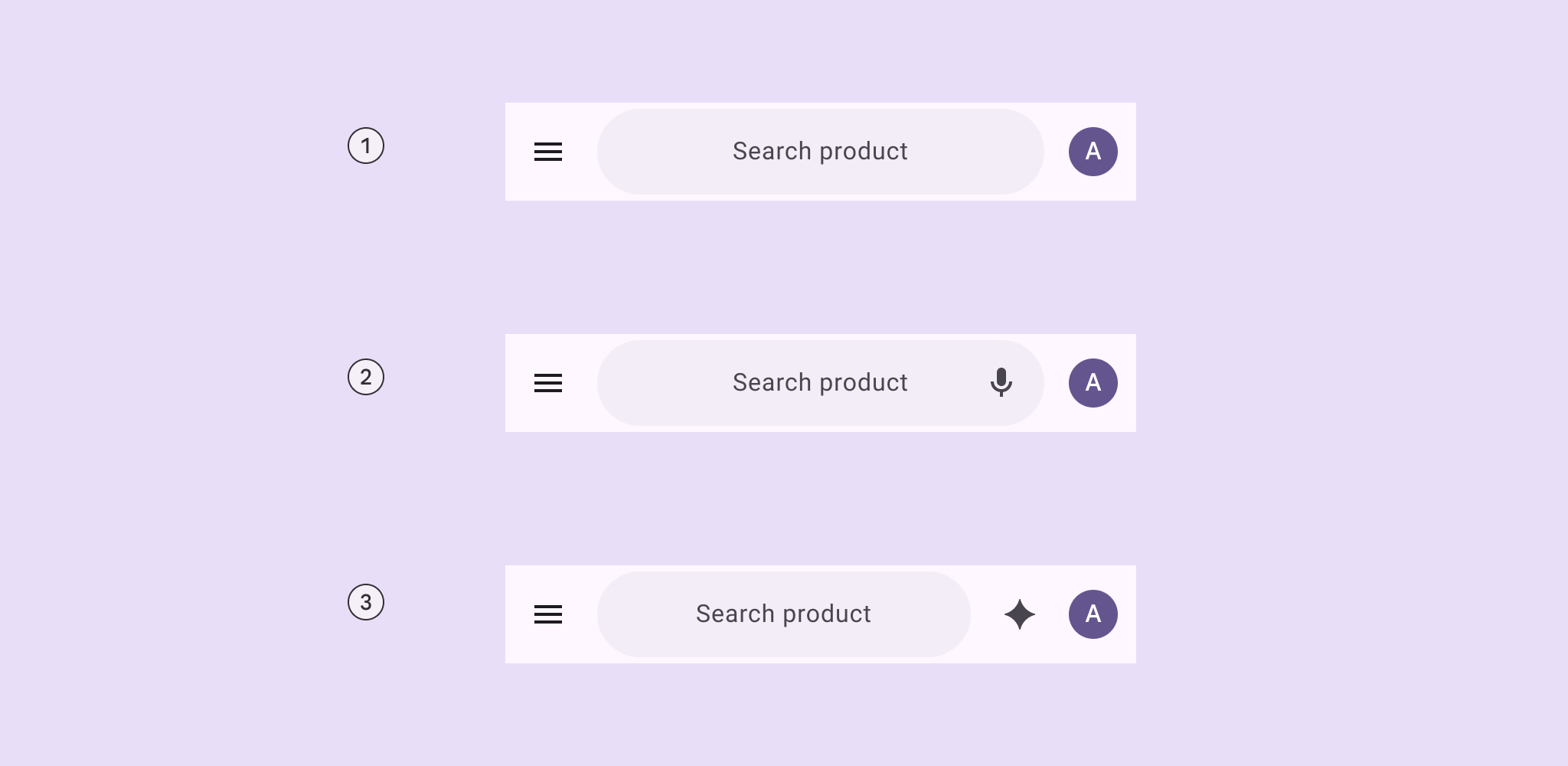
3 layouts of icons in the search app bar.
  1. A leading element and a trailing element outside search
  2. A leading element, a trailing element inside search, and a trailing element outside search
  3. A leading element and two trailing elements outside search

Image ​

An image can be placed in the app bar. In small app bars, this can replace the label text.
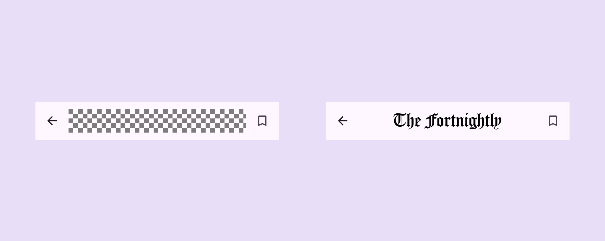
Graphic replacing text headline content.
Images can be added to app bars and can replace label text on small app bars

Filled trailing icon button ​

The app bar's trailing icon buttons can be replaced with a single, primary, or tonal filled icon button in default or wide sizes.
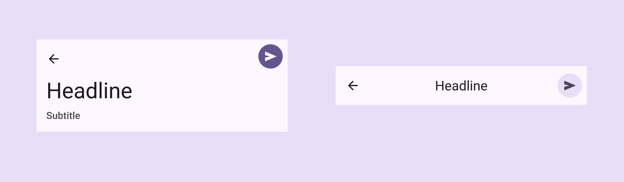
App bars configured with filled trailing icons.
The trailing icons can be configured to be a single filled icon button

Subtitle ​


App bars configured with subtitles below their headlines.

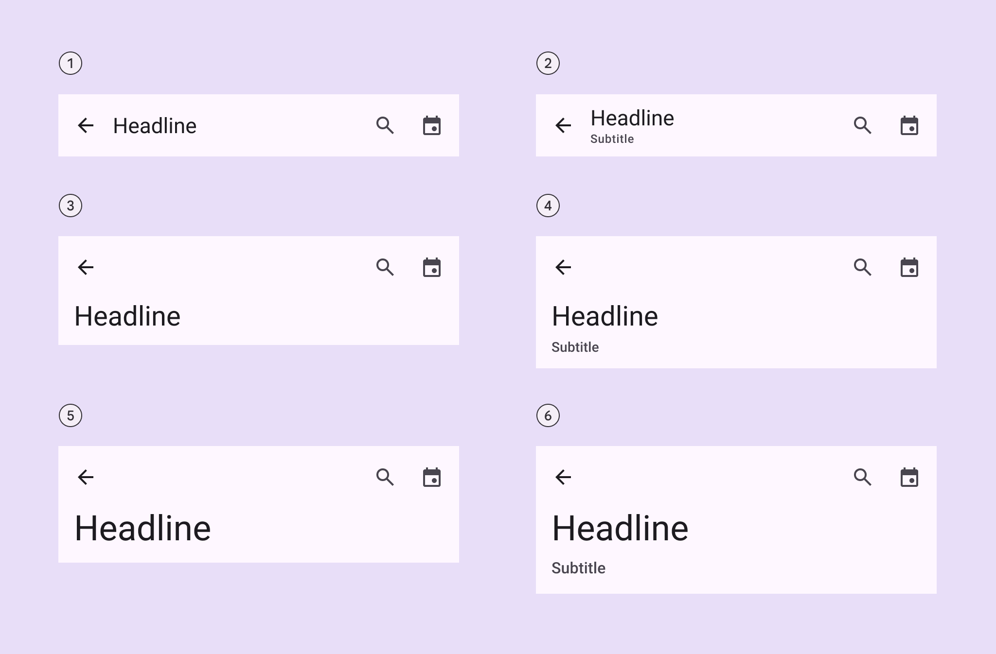
The medium flexible and large flexible app bars hug the text contents, so they are taller when a subtitle is visible

  1. Small
  2. Small with subtitle
  3. Medium flexible
  4. Medium flexible with subtitle
  5. Large flexible
  6. Large flexible with subtitle

Color ​

Color values are implemented through design tokens. For design, this means working with color values that correspond with tokens. For implementation, a color value will be a token that references a value. Learn more about design tokens

All app bars share the same color roles. On scroll, the container changes color to surface container.
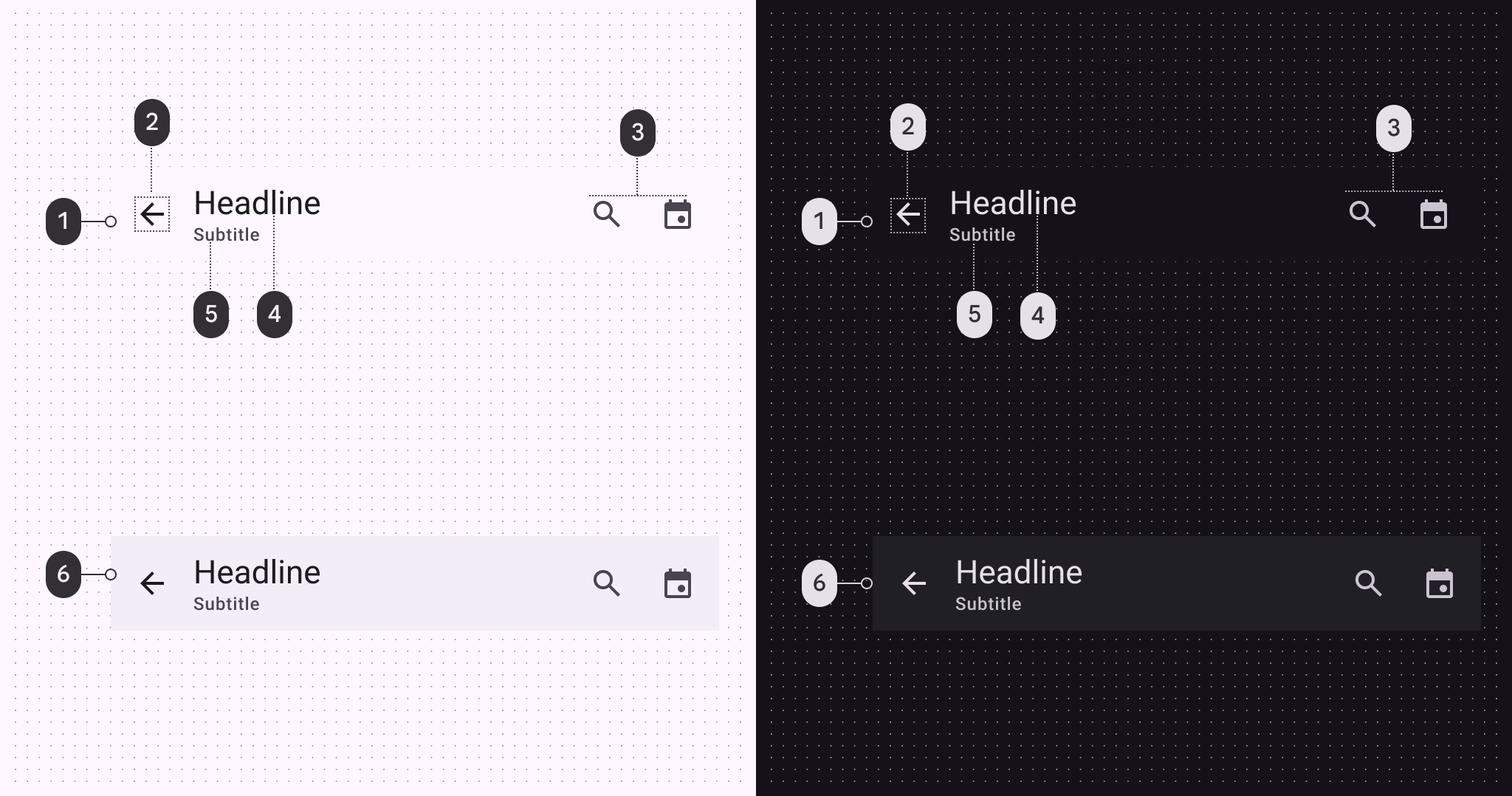
4 color roles of the leading edge app bar in light and dark scheme.

App bar color roles used for light and dark themes:

  1. Surface
  2. On surface
  3. On surface variant
  4. On surface
  5. On surface variant
  6. Surface container (on scroll)

4 color roles of the center-aligned app bar in light and dark scheme.

Search app bar color roles used for light and dark themes:

  1. Surface
  2. On surface variant
  3. On surface variant
  4. On surface variant
  5. Surface container
  6. Surface container
  7. Surface container highest

Scroll states ​
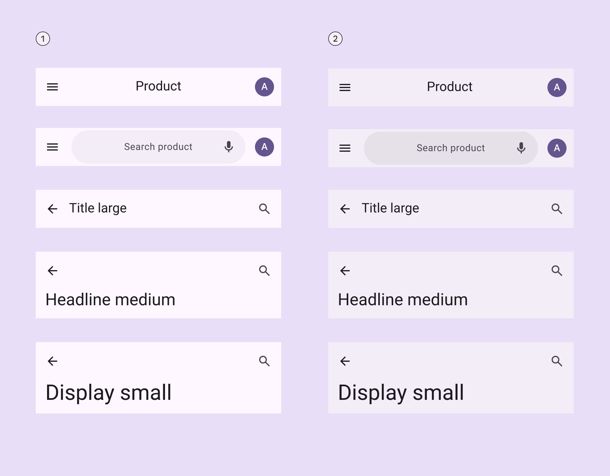

Color roles for app bars when flat and on scroll.

The app bar changes color when flat or on scroll. The search bar can also change color on scroll.

  1. Flat
  2. On scroll

Measurements ​

Search app bar ​


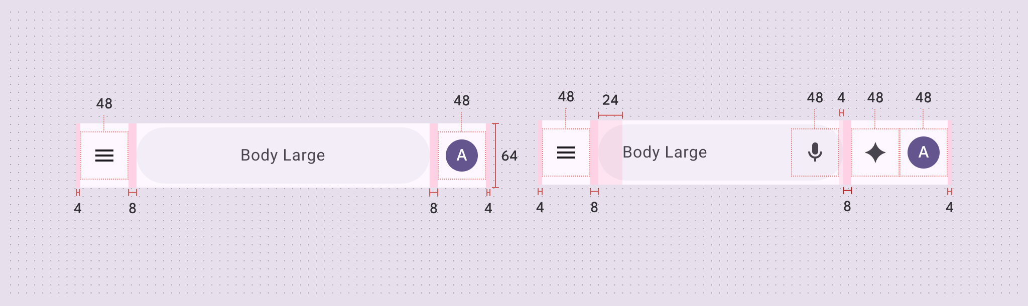
Search app bar size and padding measurements.
Search app bar padding and size measurements

Small app bar ​


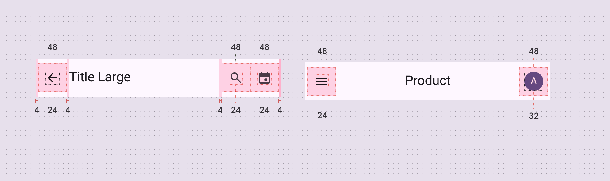
Small app bar size and padding measurements.
Small app bar padding and size measurements

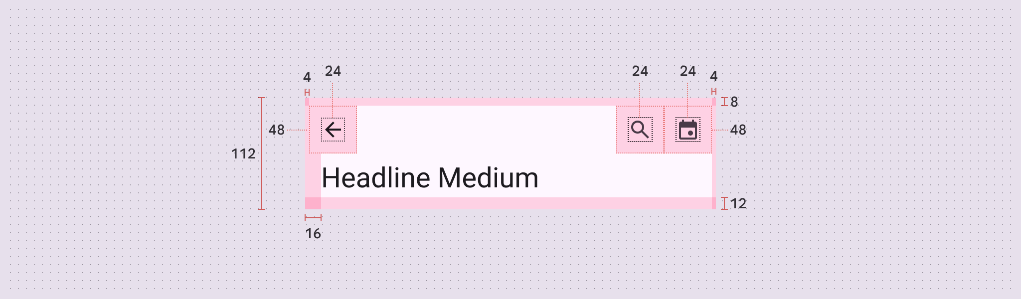
Medium flexible app bar ​


Medium flexible app bar padding and size measurements.
Medium flexible app bar padding and size measurements

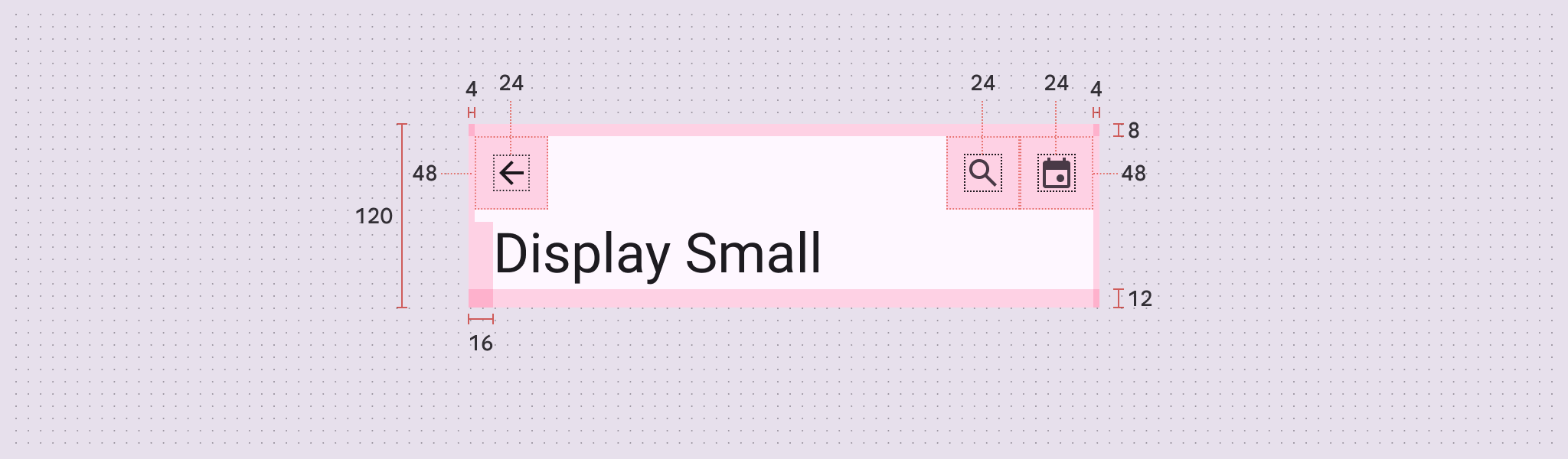
Large flexible app bar ​


Large flexible app bar padding and size measurements

Baseline app bars ​

The medium and large app bars are no longer recommended in M3 Expressive. Use the medium flexible and large flexible app bars in their place.
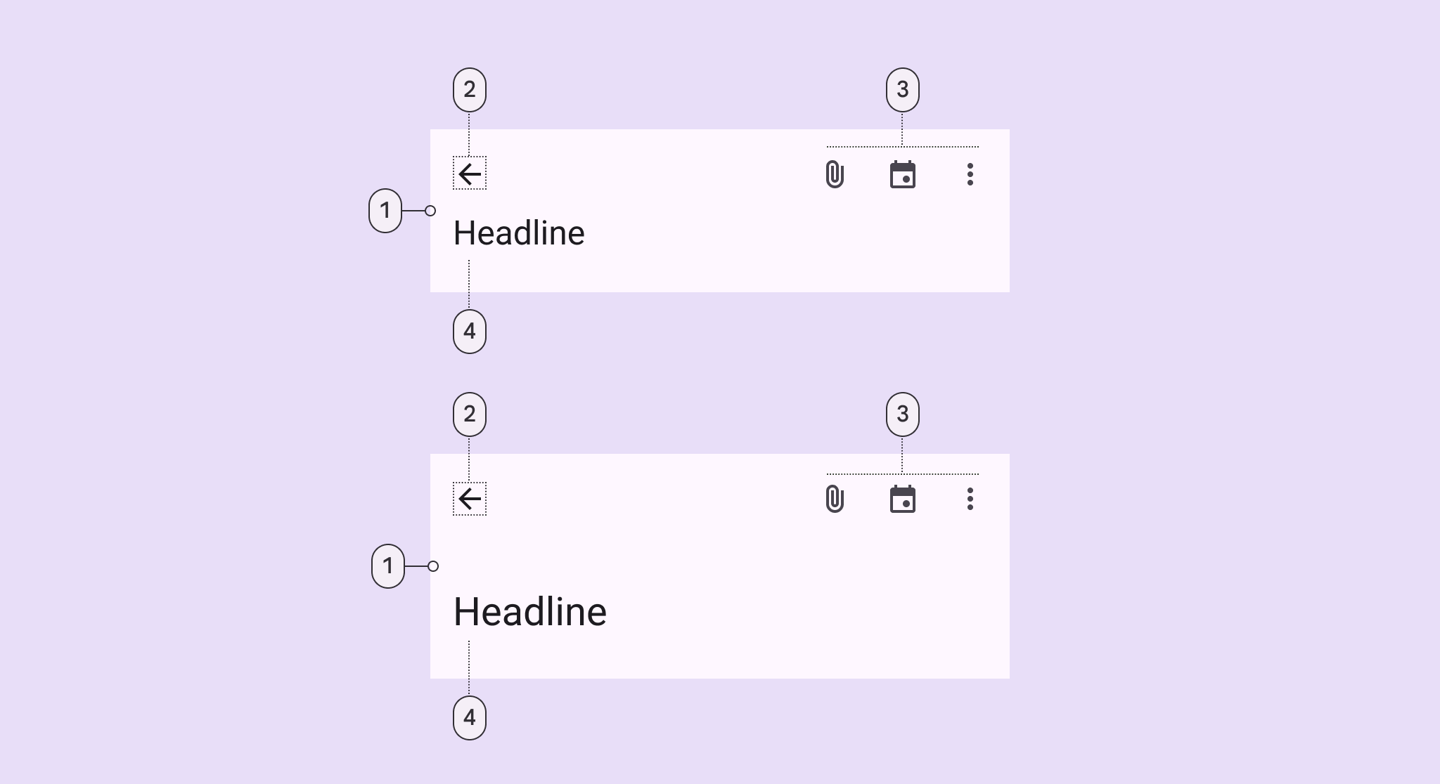
4 elements of medium and large app bars.

Medium and large app bars have the same elements:

  1. Container
  2. Leading button
  3. Trailing icons
  4. Headline

Tokens & specs ​

Select a token set to view in the table's menu. Baseline app bar token sets are organized into medium, large, and older baseline token sets. Learn about design tokens

App bar - Size - Medium (baseline) ​

TokenValue
App bar medium container height112dp
App bar medium title fontRoboto
App bar medium title font weight400
App bar medium title font size24pt
App bar medium title font tracking0
App bar medium title line height32pt
App bar medium icon button size24dp
App bar medium subtitle fontRoboto
App bar medium subtitle font weight500
App bar medium subtitle font size14pt
App bar medium subtitle font tracking0.1pt
App bar medium subtitle line height20pt

App bar - Size - Large (baseline) ​

TokenValue
App bar large container height152dp
App bar large title fontRoboto
App bar large title font weight400
App bar large title font size28pt
App bar large title font tracking0
App bar large title line height36pt
App bar large icon button size24dp
App bar large subtitle fontRoboto
App bar large subtitle font weight500
App bar large subtitle font size16pt
App bar large subtitle font tracking0.15pt
App bar large subtitle line height24pt

[Deprecated] Top app bar - Small ​

Theme
Contrast

[Deprecated] Top app bar - Medium ​

Theme
Contrast

[Deprecated] Top app bar - Large ​

Theme
Contrast

[Deprecated] Top app bar - Small, Center-aligned ​

Theme
Contrast

Color ​

Color values are implemented through design tokens. For designers, this means working with color values that correspond with tokens. In implementation, a color value will be a token that references a value. Learn more about design tokens
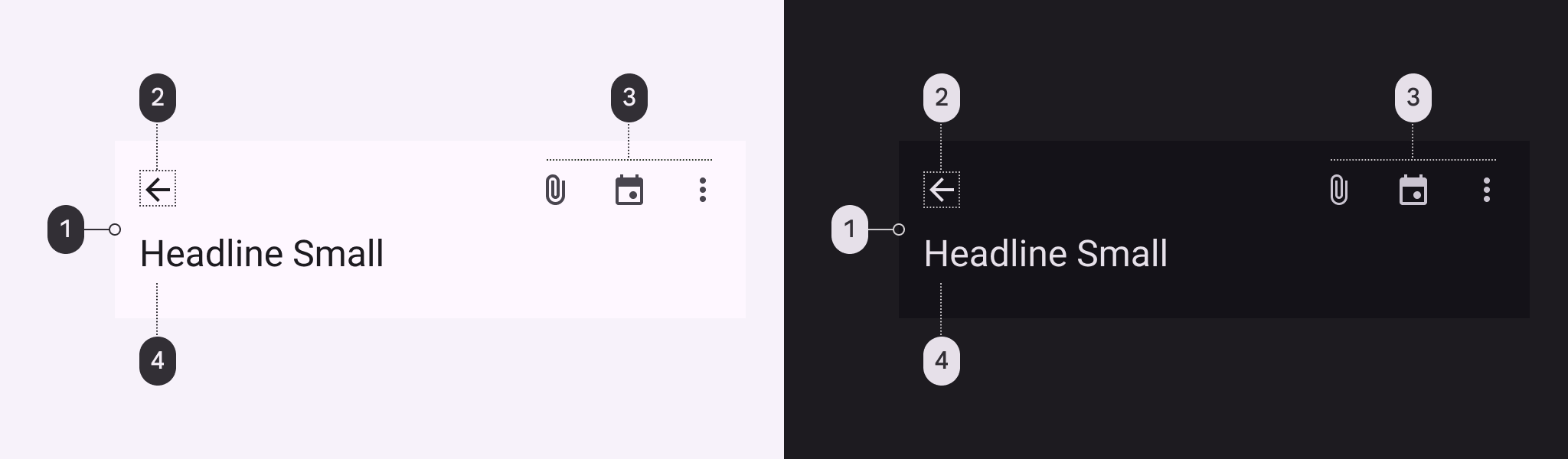
4 color roles of the medium top app bar in light and dark scheme.

Medium top app bar color roles used for light and dark schemes:

  1. Surface
  2. On surface
  3. On surface
  4. On surface variant

Measurements ​

Medium app bar ​


Diagram of medium app bar padding and size measurements.
Medium app bar padding and size measurements

Large app bar ​


Diagram of large app bar padding and size measurements.
Large app bar padding and size measurements
Pager
Previous pageApp bars: Overview
Next pageApp bars: Guidelines

Released under the Apache 2.0 or CC BY 4.0

Copyright © 2018-Present Google

https://m3.material.io/components/app-bars/specs

Released under the Apache 2.0 or CC BY 4.0

Copyright © 2018-Present Google