

Snackbar: Specs
Snackbars show short updates about app processes at the bottom of the screen

- Container
- Icon (optional close affordance)
- Action (optional)
- Supporting text
Tokens and specs
Browse the component elements, attributes, tokens, and their values. Learn more about design tokens
Color
Color values are implemented through design tokens. For design, this means working with color values that correspond with tokens. For implementation, a color value will be a token that references a value. Learn more about design tokens
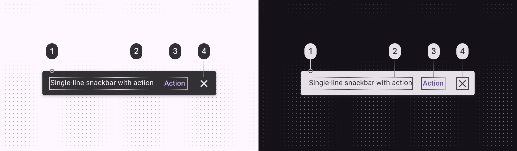
Snackbar color roles used for light and dark schemes:
- Inverse surface
- Inverse on surface
- Inverse primary
- Inverse on surface
Measurements

Configurations
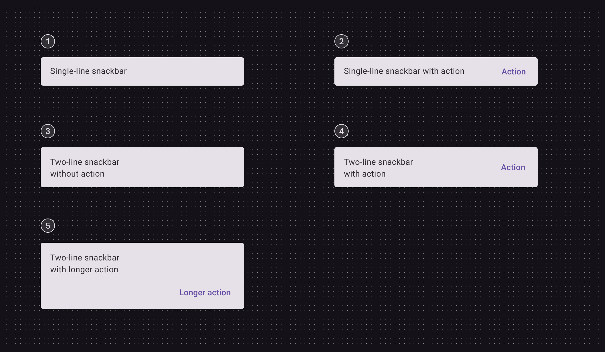
- Single line
- Single line with action
- Two lines
- Two lines with action
- Two lines with longer action