Skip to content
Material Design 3
Main Navigation
v3
v2
v1

English

简体中文
繁體中文
Español
Français
Русский
Português – Brasil
Deutsch
日本語
한국어
Italiano
Polski
Türkçe
čeština
magyar

English

简体中文
繁體中文
Español
Français
Русский
Português – Brasil
Deutsch
日本語
한국어
Italiano
Polski
Türkçe
čeština
magyar

Appearance

Sidebar Navigation

Foundations

Accessibility

Overview: Principles

Overview: Assistive technology

Designing: Overview

Designing: Color contrast

Designing: Structure

Designing: Flow

Designing: Elements

Writing and text: Best practices

Writing and text: Text truncation

Writing and text: Text resizing

Building for all: User needs

Building for all: Co-design

Content design

Overview

Alt text

Global writing: Overview

Global writing: Word choice

Notifications

Style guide: UX writing best practices

Style guide: Word choice

Style guide: Grammar and punctuation

Customizing Material

Devices

Watches: Overview

Watches: Foundations

Watches: Styles

Watches: Layout

XR

Design: Overview

Design: Interaction

Design: Layout

Design: Accessibility

Components: Overview

Components: App bars

Components: Dialogs

Components: Nav bar

Components: Nav rail

Components: Toolbars

Design tokens: Overview

Design tokens: How to use tokens

Interaction

Gestures

Inputs

Selection

States: Overview

States: State layers

States: Applying states

Layout

Overview: Overview

Overview: Parts of layout

Overview: Adaptive design

Scaffold: Overview

Scaffold: Bars

Scaffold: Rails

Scaffold: Panes

Grids & spacing: Overview

Grids & spacing: Grids

Grids & spacing: Spacing

Grids & spacing: Density

Breakpoints: Overview

Breakpoints: Compact

Breakpoints: Medium

Breakpoints: Expanded

Breakpoints: Large & extra-large

Bidirectionality & RTL

Canonical examples: Overview

Canonical examples: Feed

Canonical examples: List-detail

Canonical examples: Supporting pane

Usability: Overview

Usability: Applying M3 Expressive

Material A-Z

Styles

Color

Color system: Overview

Color system: How the system works

Color roles

Color schemes

Choosing a scheme

Static: Baseline

Static: Custom brand

Dynamic: Choosing a source

Dynamic: User-generated source

Dynamic: Content-based source

Advanced: Overview

Advanced: Apply colors

Advanced: Define new colors

Advanced: Adjust existing colors

Color resources

Elevation: Overview

Elevation: Applying elevation

Elevation: Tokens

Icons: Overview

Icons: Designing icons

Icons: Applying icons

Motion

Motion physics system: How it works

Motion physics system: Specs

Easing and duration: Applying easing and duration

Easing and duration: Tokens & specs

Transitions: Transition patterns

Transitions: Applying transitions

Shape: Overview & principles

Shape: Corner radius scale

Shape: Shape morph

Spacing: Overview

Spacing: Applying spacing

Spacing: Tokens

Typography: Overview

Typography: Fonts

Typography: Type scale & tokens

Typography: Applying type

Typography: Editorial treatments

Components

App bars: Overview

App bars: Specs

App bars: Guidelines

App bars: Accessibility

Badges: Overview

Badges: Specs

Badges: Guidelines

Badges: Accessibility

Buttons

All buttons

Button groups: Overview

Button groups: Specs

Button groups: Guidelines

Button groups: Accessibility

Buttons: Overview

Buttons: Specs

Buttons: Guidelines

Buttons: Accessibility

Extended FABs: Overview

Extended FABs: Specs

Extended FABs: Guidelines

Extended FABs: Accessibility

FAB menu: Overview

FAB menu: Specs

FAB menu: Guidelines

FAB menu: Accessibility

FABs: Overview

FABs: Specs

FABs: Guidelines

FABs: Accessibility

Icon buttons: Overview

Icon buttons: Specs

Icon buttons: Guidelines

Icon buttons: Accessibility

Segmented buttons: Overview

Segmented buttons: Specs

Segmented buttons: Guidelines

Segmented buttons: Accessibility

Split button: Overview

Split button: Specs

Split button: Guidelines

Split button: Accessibility

Cards: Overview

Cards: Specs

Cards: Guidelines

Cards: Accessibility

Carousel: Overview

Carousel: Specs

Carousel: Guidelines

Carousel: Accessibility

Checkbox: Overview

Checkbox: Specs

Checkbox: Guidelines

Checkbox: Accessibility

Chips: Overview

Chips: Specs

Chips: Guidelines

Chips: Accessibility

Date & time pickers

Date pickers: Overview

Date pickers: Specs

Date pickers: Guidelines

Date pickers: Accessibility

Time pickers: Overview

Time pickers: Specs

Time pickers: Guidelines

Time pickers: Accessibility

Dialogs: Overview

Dialogs: Specs

Dialogs: Guidelines

Dialogs: Accessibility

Divider: Overview

Divider: Specs

Divider: Guidelines

Divider: Accessibility

Lists: Overview

Lists: Specs

Lists: Guidelines

Lists: Accessibility

Loading & progress

Loading indicator: Overview

Loading indicator: Specs

Loading indicator: Guidelines

Loading indicator: Accessibility

Progress indicators: Overview

Progress indicators: Specs

Progress indicators: Guidelines

Progress indicators: Accessibility

Menus: Overview

Menus: Specs

Menus: Guidelines

Menus: Accessibility

Navigation

Navigation bar: Overview

Navigation bar: Specs

Navigation bar: Guidelines

Navigation bar: Accessibility

Navigation drawer: Overview

Navigation drawer: Specs

Navigation drawer: Guidelines

Navigation drawer: Accessibility

Navigation rail: Overview

Navigation rail: Specs

Navigation rail: Guidelines

Navigation rail: Accessibility

Radio button: Overview

Radio button: Specs

Radio button: Guidelines

Radio button: Accessibility

Search: Overview

Search: Specs

Search: Guidelines

Search: Accessibility

Sheets

Bottom sheets: Overview

Bottom sheets: Specs

Bottom sheets: Guidelines

Bottom sheets: Accessibility

Side sheets: Overview

Side sheets: Specs

Side sheets: Guidelines

Side sheets: Accessibility

Sliders: Overview

Sliders: Specs

Sliders: Guidelines

Sliders: Accessibility

Snackbar: Overview

Snackbar: Specs

Snackbar: Guidelines

Snackbar: Accessibility

Switch: Overview

Switch: Specs

Switch: Guidelines

Switch: Accessibility

Tabs: Overview

Tabs: Specs

Tabs: Guidelines

Tabs: Accessibility

Text fields: Overview

Text fields: Specs

Text fields: Guidelines

Text fields: Accessibility

Toolbars: Overview

Toolbars: Specs

Toolbars: Guidelines

Toolbars: Accessibility

Tooltips: Overview

Tooltips: Specs

Tooltips: Guidelines

Tooltips: Accessibility

On this page

Typography: Type scale & tokens ​

Use typography to make content readable and beautiful


Type scale ​

A type scale is a selection of type styles used across a product to ensure consistency.

M3 type scale ​

Material 3 has one type scale containing two sets of type styles: 15 baseline and 15 emphasized. Both of these style sets follow the same scale from Display Large to Label Small.

The emphasized styles were added in the expressive updateThe expressive update is a major update to Material 3, adding visually stunning features, components, and variants, plus updates to the shape, motion, and typography systems.More on M3 Expressive. They have a higher weight and other minor adjustments compared to the baseline styles, and are best applied to bold, selection, and other areas of emphasis. Baseline and emphasized styles are meant to be used together.
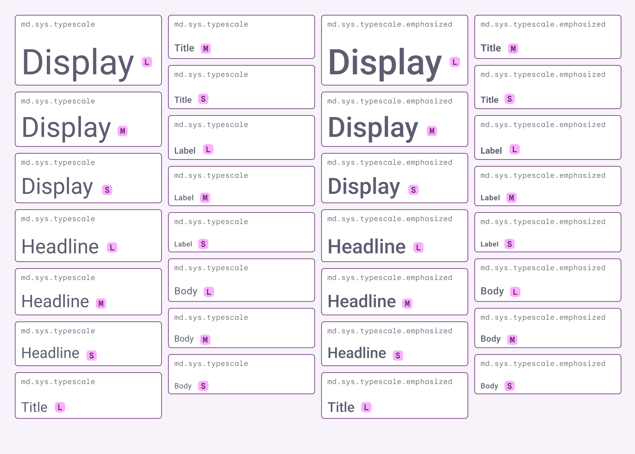
Diagram of the M3 type scale.
The scale is a range of contrasting styles that support the needs of various product contexts and content. No single product will use all the styles. Instead, select styles from the scale that are most appropriate.

Type scale tokens ​

Each of the 30 styles has a single tokenDesign tokens are the building blocks of all UI elements. The same tokens are used in designs, tools, and code.More on tokens that captures all the default properties. Tokens are separated into the baseline and emphasized sets. Each axis and property, such as font, line height, size, tracking, and weight, also has an individual token for greater customization. Learn more about design tokens

Baseline type style tokens ​

Emphasized type styles ​

The M3 type scale has 15 emphasized type styles. Use both baseline and emphasized type styles together to achieve expressive experiences. Material recommends using emphasized styles for selection, actions, headlines, and other editorial treatments.

Emphasized type style tokens ​

Where emphasized styles can be used ​

Components ​

When used in components, emphasized type styles can communicate hierarchy or importance, such as an active or selected component, or an unread message. The emphasized styles work well with:

  • Badges
  • Buttons (for primary actions)
  • Extended FAB
  • Selected list items
  • Selected menu items

Material components don’t use emphasized type styles by default. To use an emphasized type style, swap the baseline token for the emphasized token of the same style. For example:

  • Baseline: md.sys.typescale.display-large
  • Emphasized: md.sys.typescale.emphasized.display-large

Weight

Use the emphasized styles on text that already uses weight (such as medium, bold) to communicate hierarchy.

Context

Use emphasized styles to draw attention to specifics aspects of components, such as selected states, unread messages, or key interactions.

Emphasized context and weight can be used at the same time.
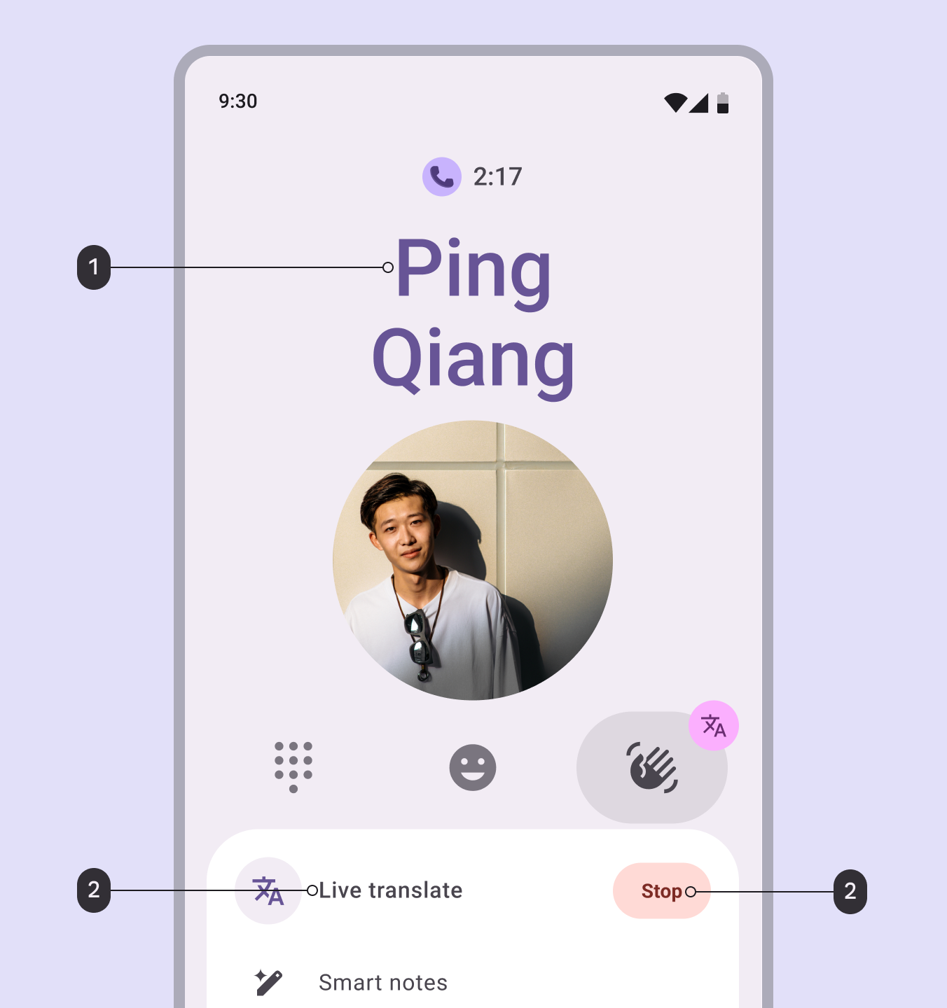
Diagram showing emphasized styles being applied in and UI of an active call with live translation turned on.
  1. Weight: Apply emphasized styles to text already bolded for an expressive style
  2. Context: Apply emphasized styles to text in selective places to better communicate hierarchy or state

Customize the typeface ​

The M3 type scale has the option to set different typefaces at different sizes.

  • The brand typeface is used for larger type styles, like Headline and Display, to focus on expression.
  • The plain typeface is used for smaller type styles, like Body and Label, to focus on readability.
  • Roboto is the default for both typefaces.

Consider replacing Roboto with different typefaces to boost brand expression in your product. On emphasized styles, this can help important text stand out even more.
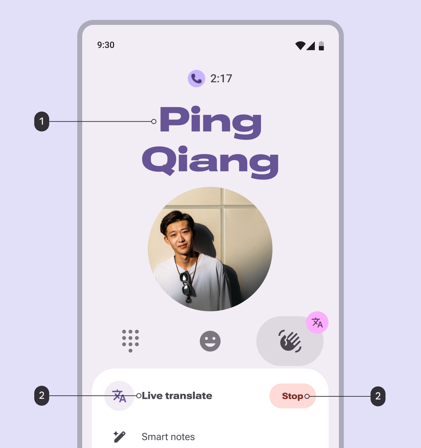
Diagram showing emphasized styles being applied in a UI of an active call with live translation turned on.
Roboto can be replaced with another font, like Roboto Flex

Brand and plain typeface tokens ​

Language height support ​

The type scale can adapt line height automatically based on language height category: small, medium, large, and extra large.

Development considerations:

  • It’s recommended to default to medium language height, as most languages fall in that category, and switch to other sizes based on detected language.
  • Material components that use vertical padding should adapt to language height automatically. Components with fixed heights are built for small values and may not adapt by default.
  • Ignoring language height can lead to overlapping text and broken UI elements, leading to major internationalization issues and failing readability standards.
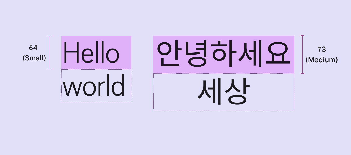
Different font stylings produced by Google Sans Flex.
Line heights for styles like display large can automatically adapt to language height category

Language script categories ​

  • Small (base): Cyrillic, Greek, Hebrew, Latin-based languages (except Vietnamese)
  • Medium (~7% taller): Amharic, Arabic, Armenian, Bangla, Chinese, Gujarati, Hindi, Japanese, Kannada, Khmer, Korean, Lao, Malayalam, Odia, Punjabi, Sinhala, Tamil, Thai, Vietnamese, most other languages.
  • Large (~30% taller): Burmese, Telugu
  • Extra large (~100% taller): Nastaliq

Language height tokens ​

To view the language height tokens:

  • Open the line height folder (Note: Other tokens like fonts and weights are in the same token set)
  • Change the language height context at the top of the token module
Language height

Customizing type styles ​

To customize existing type styles, follow these steps:

  1. If using a different typeface, change the brand and plain typeface tokens.
  2. Adjust properties like line height and letter spacing to refine the appearance. Avoid changing the type size; this can affect how components render and reflow.
  3. Repeat for both baseline and emphasized type styles. Try to keep emphasized styles visually consistent, like all wider than baseline.

Heavier fonts may require wider letter spacing, while fonts with long ascenders and descenders will require different line heights. Axes can be further adjusted as necessary.

Note: Customizing the M3 type scale or individual styles may prevent you from receiving typography token updates from Material.
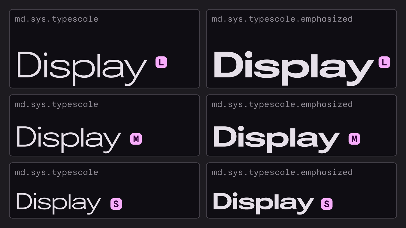
Example type scales with custom typefaces and weights.
Adjust variable axes, like weight and width, to customize fonts like Roboto Flex

Different typefaces can be used for baseline and emphasized type styles.
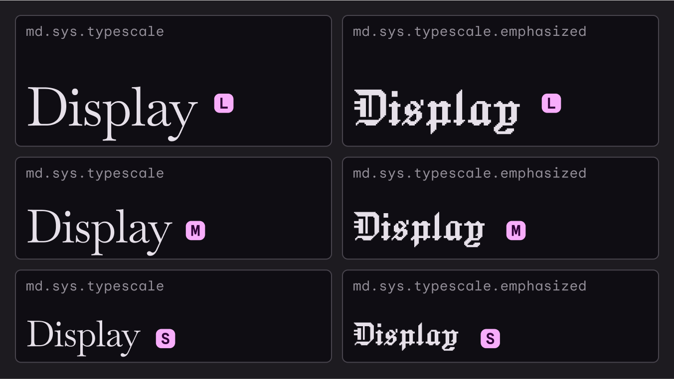
Example type scales with custom typefaces and weights.
Custom typefaces can be used together, like Baskervville and Jacquard

Customizing your type scale ​

When different sizes from the defaults are needed, such as for different devices, you can customize the type scale by adding or removing styles, and even swapping out Roboto for a font of your choice.

Material Design uses the Major Second type scale with 14 as its key base size. This anchors to the most essential style used most often for typesetting body text.
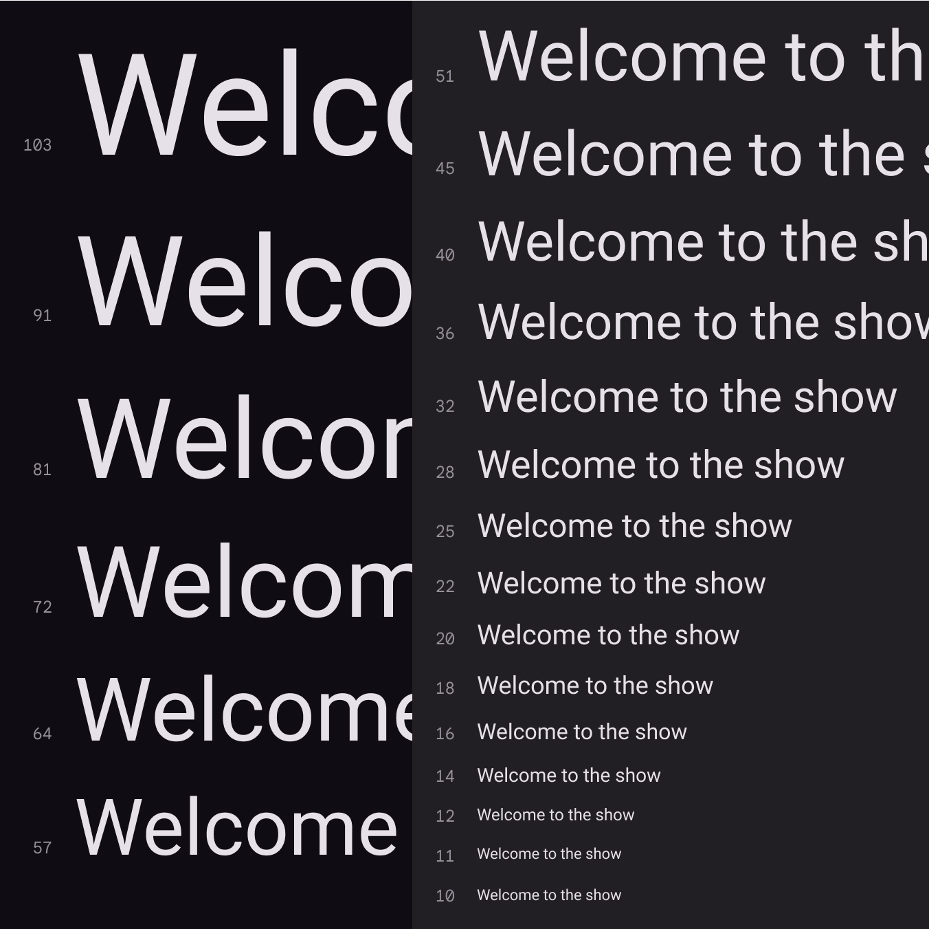
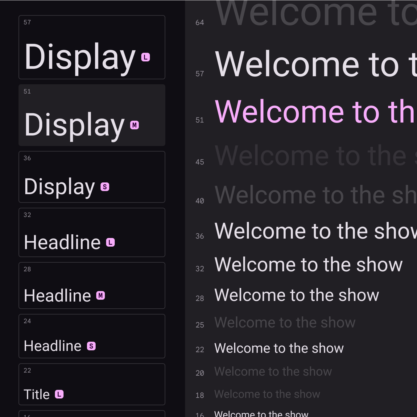
Material Design’s default type scale; showing display, headline, and title sizes shown next to the Major Second type scale.
The Material Design type scale uses the Major Second scale (1.125)

Sizes on the rendered type scale should aim to provide impactful contrast between sizes by avoiding small differences.
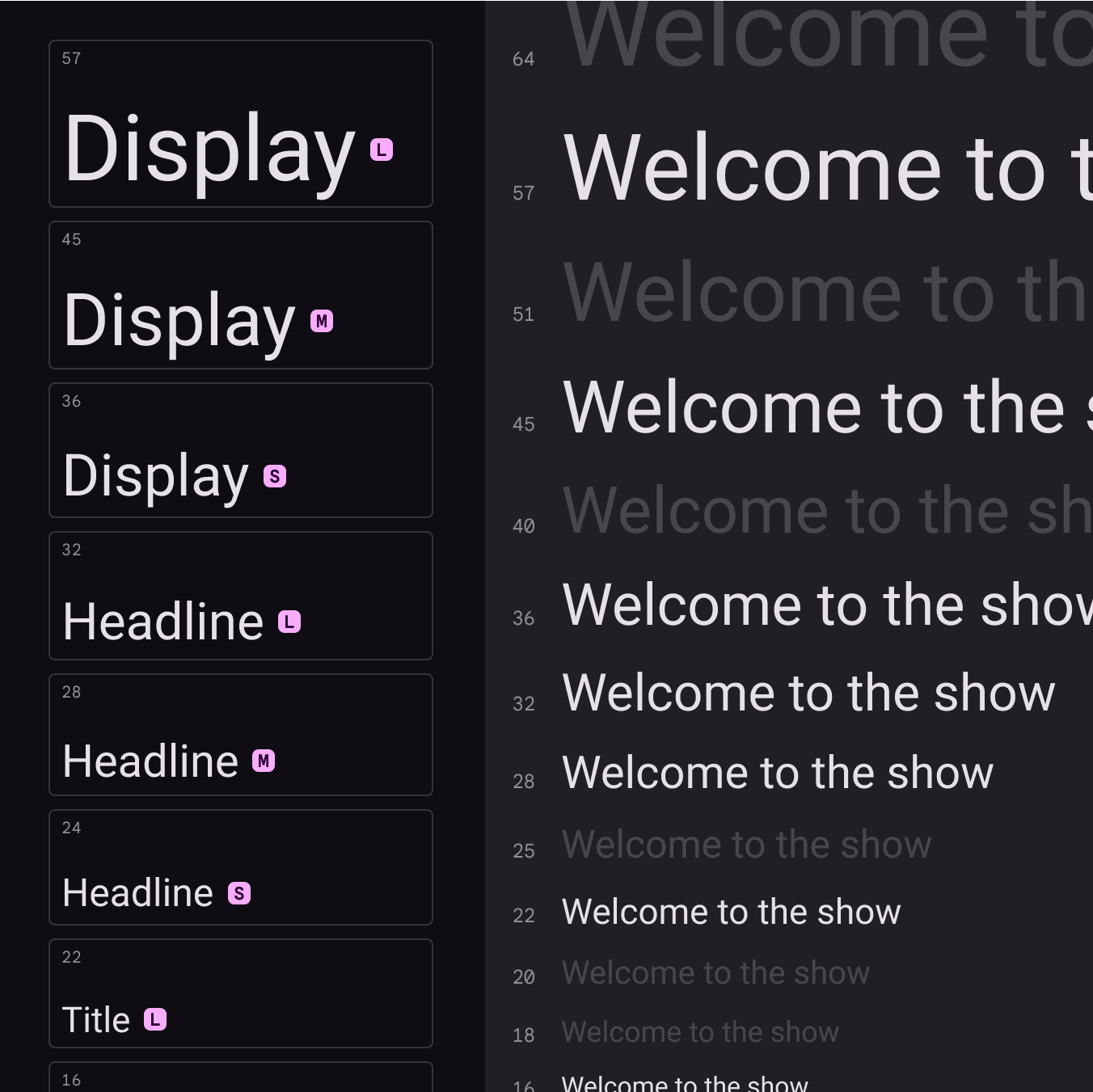
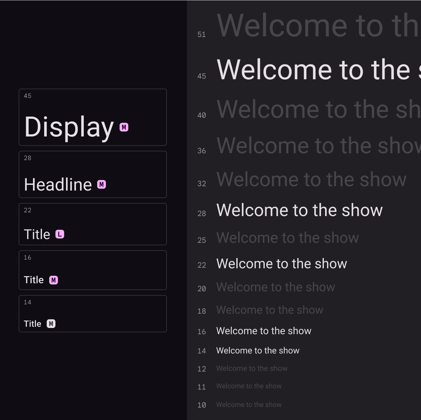
Material Design’s default type scale; showing display, headline, and title sizes shown next to the Major Second type scale
Material’s default typescale of 15 styles allows distinction between each
 Display, headline, and title sizes shown next to the Major Second type scale.
Your product likely will not need all 15 default styles from the Material Design type scale. In this example, five sizes are chosen for a reduced set while the rest are removed.
A size modification of Material Design’s default type scale where display medium is a larger size than the original scale.
If the default sizes from the Material Design type scale do not meet your needs, values can be changed instead. Here the default size of display medium is adjusted to another size from the Major Second type scale.

Font size units ​

The following units are used to express font size on Android and the web.

PlatformAndroidWeb
Font size unitsprem
Conversion ratio1.00.0625

Web browsers calculate the REM (the root em size) based on the root element size. The default for modern web browsers is 16px, so the conversion is SP_SIZE/16 = rem.

Example conversions ​

AndroidWeb
10sp0.625rem
12sp0.75rem
24sp1.5rem
60sp3.75rem

Letter spacing units ​

The following units are for spacing letters in a UI.

PlatformAndroidWeb
Letter spacing unitemrem
Conversion ratio(Tracking value in px / font size in sp) = letter spacing(Tracking value in px / font size in sp) = letter spacing

Letter spacing examples ​

AndroidWeb
(.2 tracking / 16sp font size) = 0.0125 em(.2 tracking / 16px font size) = 0.0125 rem
Pager
Previous pageTypography: Fonts
Next pageTypography: Applying type

Released under the Apache 2.0 or CC BY 4.0

Copyright © 2018-Present Google

https://m3.material.io/styles/typography/type-scale-tokens

Released under the Apache 2.0 or CC BY 4.0

Copyright © 2018-Present Google