Skip to content
Material Design 3
Main Navigation
v3
v2
v1

English

简体中文
繁體中文
Español
Français
Русский
Português – Brasil
Deutsch
日本語
한국어
Italiano
Polski
Türkçe
čeština
magyar

English

简体中文
繁體中文
Español
Français
Русский
Português – Brasil
Deutsch
日本語
한국어
Italiano
Polski
Türkçe
čeština
magyar

Appearance

Sidebar Navigation

Foundations

Accessibility

Overview: Principles

Overview: Assistive technology

Designing: Overview

Designing: Color contrast

Designing: Structure

Designing: Flow

Designing: Elements

Writing and text: Best practices

Writing and text: Text truncation

Writing and text: Text resizing

Building for all: User needs

Building for all: Co-design

Content design

Overview

Alt text

Global writing: Overview

Global writing: Word choice

Notifications

Style guide: UX writing best practices

Style guide: Word choice

Style guide: Grammar and punctuation

Customizing Material

Devices

Watches: Overview

Watches: Foundations

Watches: Styles

Watches: Layout

XR

Design: Overview

Design: Interaction

Design: Layout

Design: Accessibility

Components: Overview

Components: App bars

Components: Dialogs

Components: Nav bar

Components: Nav rail

Components: Toolbars

Design tokens: Overview

Design tokens: How to use tokens

Interaction

Gestures

Inputs

Selection

States: Overview

States: State layers

States: Applying states

Layout

Overview: Overview

Overview: Parts of layout

Overview: Adaptive design

Scaffold: Overview

Scaffold: Bars

Scaffold: Rails

Scaffold: Panes

Grids & spacing: Overview

Grids & spacing: Grids

Grids & spacing: Spacing

Grids & spacing: Density

Breakpoints: Overview

Breakpoints: Compact

Breakpoints: Medium

Breakpoints: Expanded

Breakpoints: Large & extra-large

Bidirectionality & RTL

Canonical examples: Overview

Canonical examples: Feed

Canonical examples: List-detail

Canonical examples: Supporting pane

Usability: Overview

Usability: Applying M3 Expressive

Material A-Z

Styles

Color

Color system: Overview

Color system: How the system works

Color roles

Color schemes

Choosing a scheme

Static: Baseline

Static: Custom brand

Dynamic: Choosing a source

Dynamic: User-generated source

Dynamic: Content-based source

Advanced: Overview

Advanced: Apply colors

Advanced: Define new colors

Advanced: Adjust existing colors

Color resources

Elevation: Overview

Elevation: Applying elevation

Elevation: Tokens

Icons: Overview

Icons: Designing icons

Icons: Applying icons

Motion

Motion physics system: How it works

Motion physics system: Specs

Easing and duration: Applying easing and duration

Easing and duration: Tokens & specs

Transitions: Transition patterns

Transitions: Applying transitions

Shape: Overview & principles

Shape: Corner radius scale

Shape: Shape morph

Spacing: Overview

Spacing: Applying spacing

Spacing: Tokens

Typography: Overview

Typography: Fonts

Typography: Type scale & tokens

Typography: Applying type

Typography: Editorial treatments

Components

App bars: Overview

App bars: Specs

App bars: Guidelines

App bars: Accessibility

Badges: Overview

Badges: Specs

Badges: Guidelines

Badges: Accessibility

Buttons

All buttons

Button groups: Overview

Button groups: Specs

Button groups: Guidelines

Button groups: Accessibility

Buttons: Overview

Buttons: Specs

Buttons: Guidelines

Buttons: Accessibility

Extended FABs: Overview

Extended FABs: Specs

Extended FABs: Guidelines

Extended FABs: Accessibility

FAB menu: Overview

FAB menu: Specs

FAB menu: Guidelines

FAB menu: Accessibility

FABs: Overview

FABs: Specs

FABs: Guidelines

FABs: Accessibility

Icon buttons: Overview

Icon buttons: Specs

Icon buttons: Guidelines

Icon buttons: Accessibility

Segmented buttons: Overview

Segmented buttons: Specs

Segmented buttons: Guidelines

Segmented buttons: Accessibility

Split button: Overview

Split button: Specs

Split button: Guidelines

Split button: Accessibility

Cards: Overview

Cards: Specs

Cards: Guidelines

Cards: Accessibility

Carousel: Overview

Carousel: Specs

Carousel: Guidelines

Carousel: Accessibility

Checkbox: Overview

Checkbox: Specs

Checkbox: Guidelines

Checkbox: Accessibility

Chips: Overview

Chips: Specs

Chips: Guidelines

Chips: Accessibility

Date & time pickers

Date pickers: Overview

Date pickers: Specs

Date pickers: Guidelines

Date pickers: Accessibility

Time pickers: Overview

Time pickers: Specs

Time pickers: Guidelines

Time pickers: Accessibility

Dialogs: Overview

Dialogs: Specs

Dialogs: Guidelines

Dialogs: Accessibility

Divider: Overview

Divider: Specs

Divider: Guidelines

Divider: Accessibility

Lists: Overview

Lists: Specs

Lists: Guidelines

Lists: Accessibility

Loading & progress

Loading indicator: Overview

Loading indicator: Specs

Loading indicator: Guidelines

Loading indicator: Accessibility

Progress indicators: Overview

Progress indicators: Specs

Progress indicators: Guidelines

Progress indicators: Accessibility

Menus: Overview

Menus: Specs

Menus: Guidelines

Menus: Accessibility

Navigation

Navigation bar: Overview

Navigation bar: Specs

Navigation bar: Guidelines

Navigation bar: Accessibility

Navigation drawer: Overview

Navigation drawer: Specs

Navigation drawer: Guidelines

Navigation drawer: Accessibility

Navigation rail: Overview

Navigation rail: Specs

Navigation rail: Guidelines

Navigation rail: Accessibility

Radio button: Overview

Radio button: Specs

Radio button: Guidelines

Radio button: Accessibility

Search: Overview

Search: Specs

Search: Guidelines

Search: Accessibility

Sheets

Bottom sheets: Overview

Bottom sheets: Specs

Bottom sheets: Guidelines

Bottom sheets: Accessibility

Side sheets: Overview

Side sheets: Specs

Side sheets: Guidelines

Side sheets: Accessibility

Sliders: Overview

Sliders: Specs

Sliders: Guidelines

Sliders: Accessibility

Snackbar: Overview

Snackbar: Specs

Snackbar: Guidelines

Snackbar: Accessibility

Switch: Overview

Switch: Specs

Switch: Guidelines

Switch: Accessibility

Tabs: Overview

Tabs: Specs

Tabs: Guidelines

Tabs: Accessibility

Text fields: Overview

Text fields: Specs

Text fields: Guidelines

Text fields: Accessibility

Toolbars: Overview

Toolbars: Specs

Toolbars: Guidelines

Toolbars: Accessibility

Tooltips: Overview

Tooltips: Specs

Tooltips: Guidelines

Tooltips: Accessibility

On this page

Breakpoints: Large & extra-large ​

Breakpoints ensure layouts work across a wide range of devices


These breakpoints are most useful for creating web experiences tailored to laptop and desktop devices. Some products may not need large and extra-large breakpoints. Consider your platform’s conventions and users when making decisions on which breakpoints to design for.

  • Layouts for large breakpointsBreakpoints are opinionated window sizes where a layout changes to match available space, device conventions, and ergonomics (previously window size classes).More on breakpoints are for screen widths from 1200dp to 1599dp
  • Layouts for extra-large breakpoints are for screen widths of 1600dp and larger
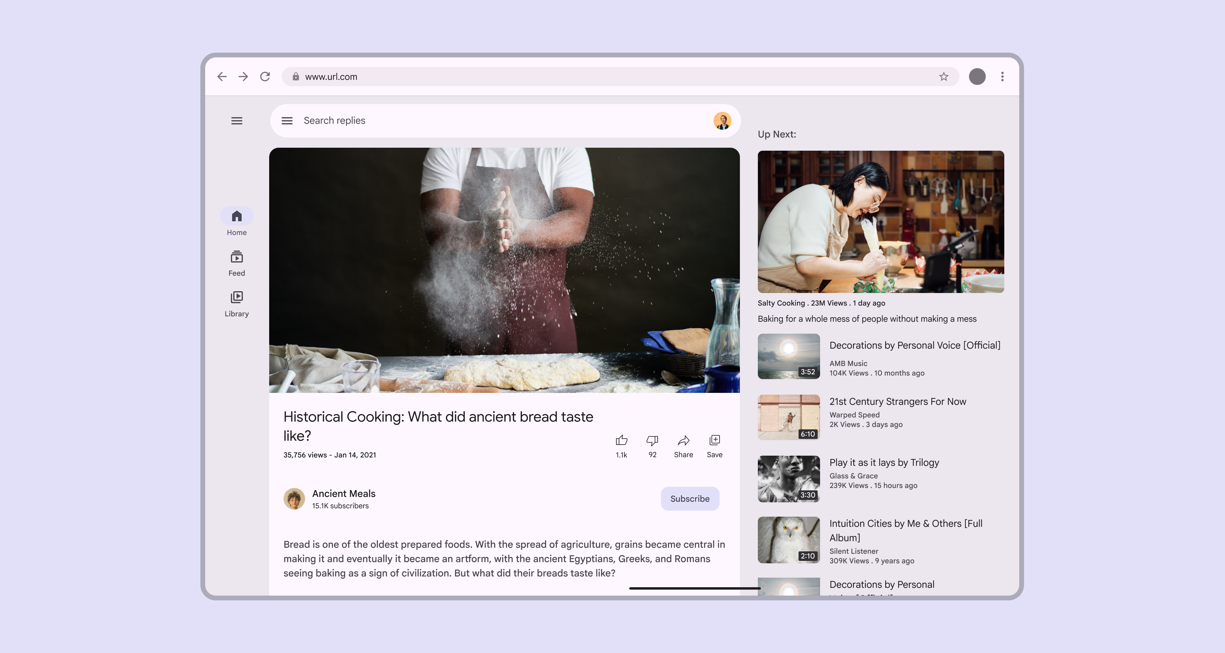
Large window with a video app in 2 pane layout.
A two-pane layout is recommended for large and extra-large breakpoints

Navigation ​

Use a navigation railNavigation rails let people switch between UI views on mid-sized devices.More on navigation rails, either collapsed or expanded, depending on the amount of content.

For sorting, filtering, or secondary navigation, use tabs or other components directly in the pane.
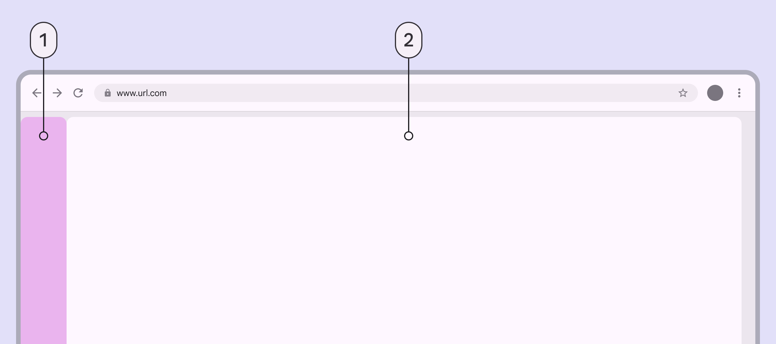
Large web browser with a small navigation area on the leading edge with 1 pane filling the rest of the window.
  1. Collapsed navigation area
  2. Single-pane layout

An expanded navigation rail is best suited for extra-large windows, where there's still plenty of room for content. Consider collapsing the navigation rail when space is needed, or when on pages deeper in the page hierarchy.
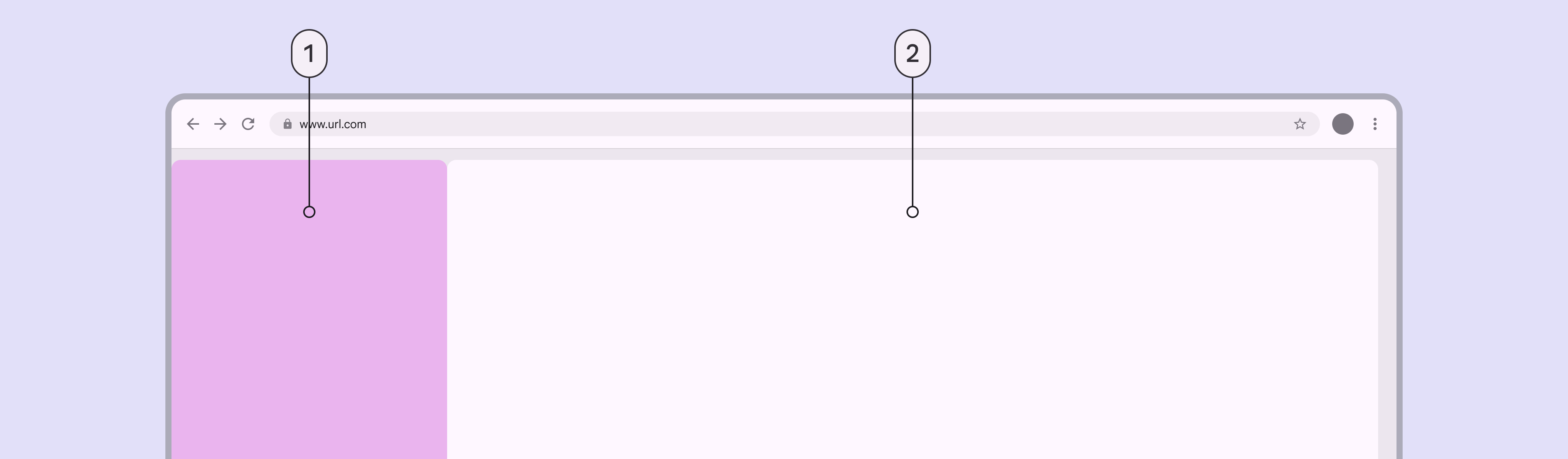
Extra-large web browser with an expanded navigation area and 1 pane filling the rest of the window.
  1. Expanded navigation area
  2. Single-pane layout

Panes ​

A two-pane layout is often best for large and extra-large breakpoints.

However, a single-pane layout can work when displaying visually- or information-dense content, such as videos.
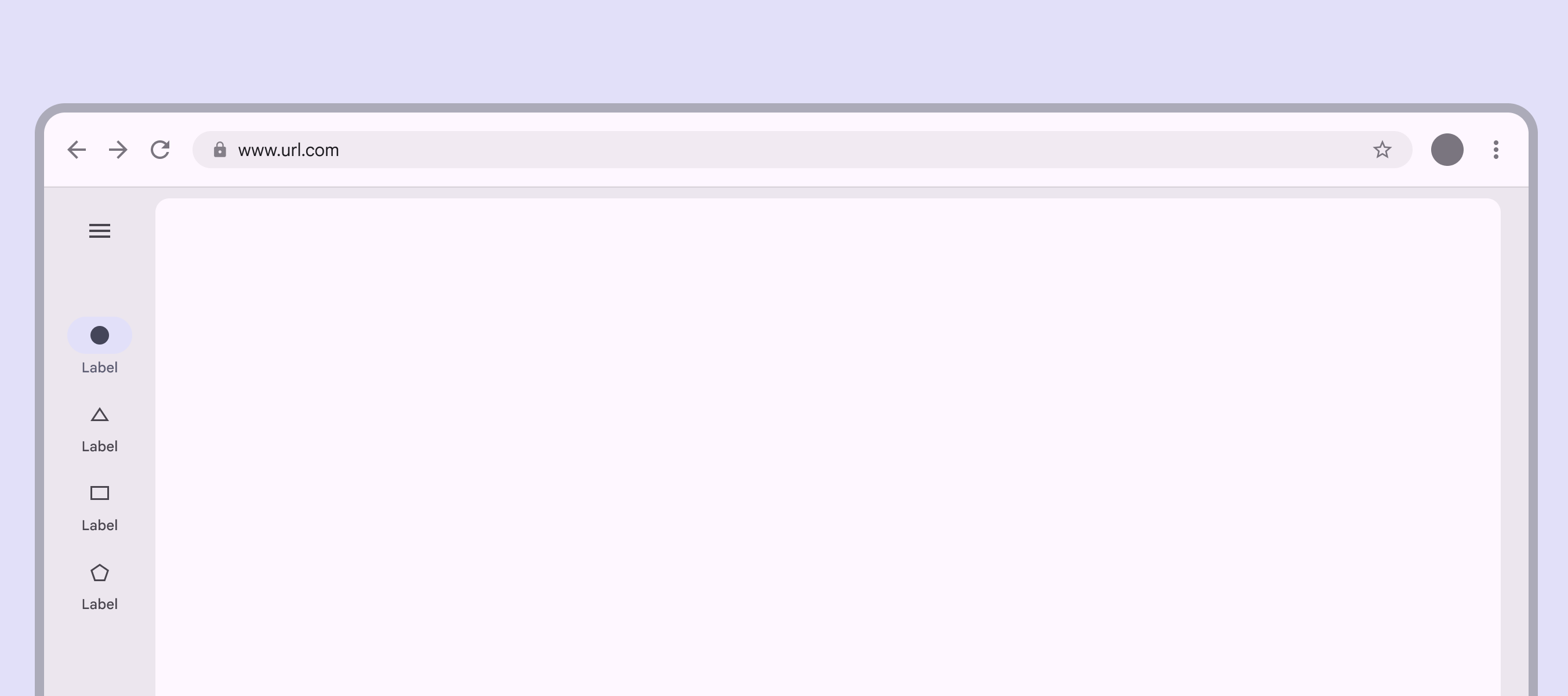
The single pane covers most of a large screen except for the navigation area and margins.
Only use a single-pane layout for dense content or media

When using a fixed-and-flexible layout, the fixed pane should have a width of 412dp by default.
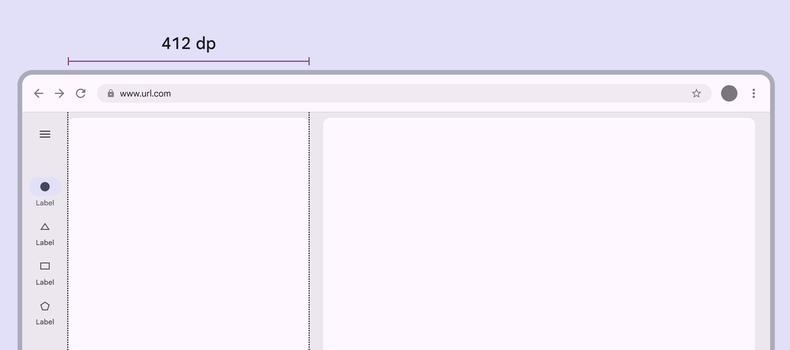
A 2-pane layout with 1 pane fixed at 412dp.
Fixed panes should be 412dp in large and extra-large layouts

When using a split-pane layout, the spacer should be visually centered by default, even when using an expanded navigation rail.
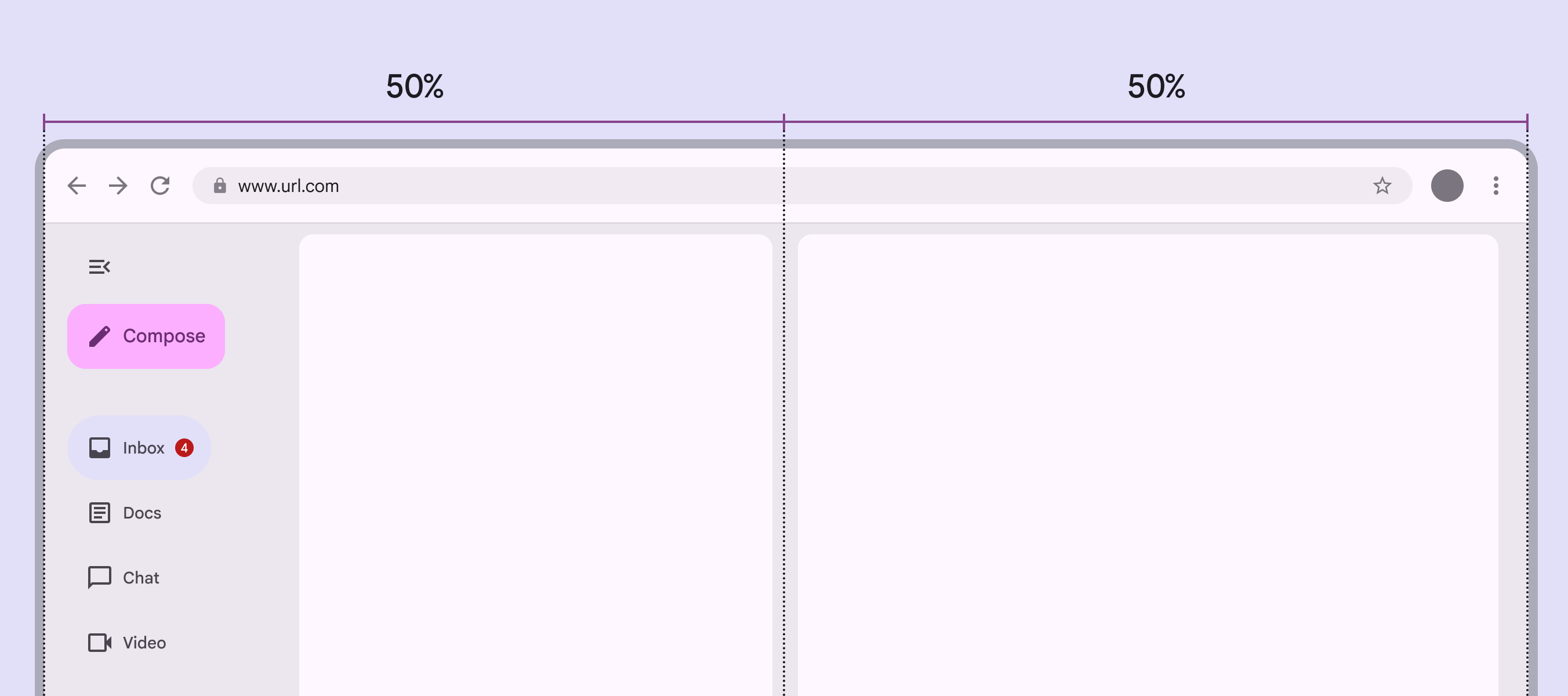
An expanded nav rail and the first pane take up 50% of the window, and the second pane takes up 50%.
In split-pane layouts, navigation components shrink the leading pane, so the spacer remains centered

Additional panes ​

The extra-large breakpoint supports using a standard side sheetStandard side sheets display content without blocking access to the screen’s primary content, such as an audio player at the side of a music app. They're often used in medium and expanded window sizes like tablet or desktop.More on side sheets as a third pane. When the side sheet is present, the navigation rail can remain visible, collapse, or hide completely. Don't use more than three panes.

Note: Fixed panes in this window size are recommended to be 412dp, but side sheets have a default maximum width of 400dp.
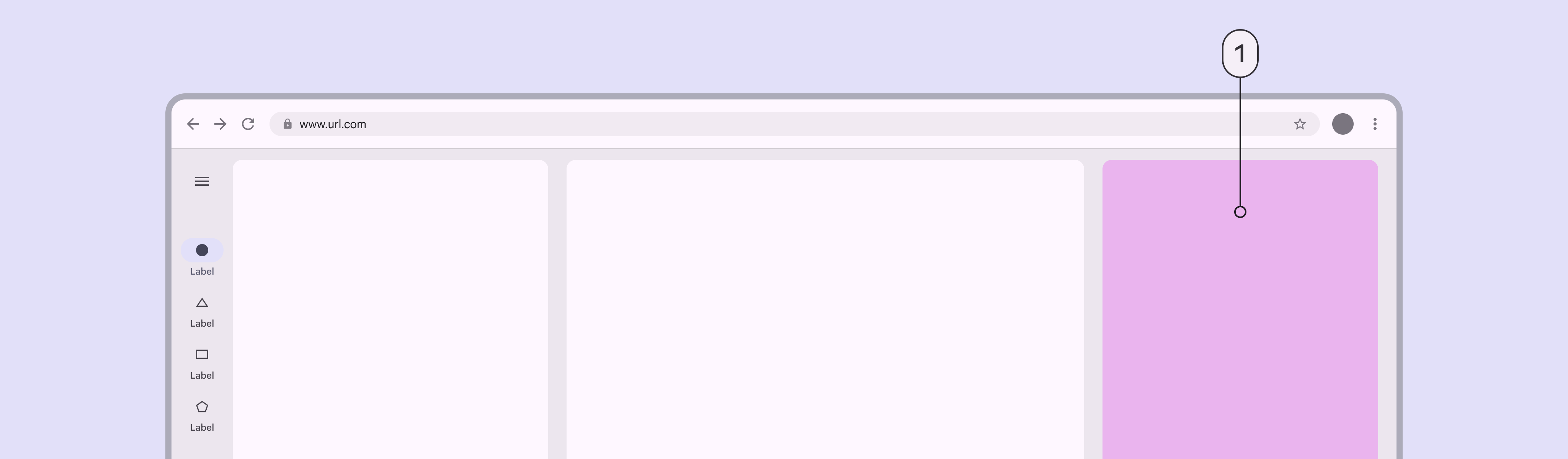
Extra-large window with 2 panes and a side sheet acting as a third pane.
  1. Standard side sheet (third pane)

Spacing ​

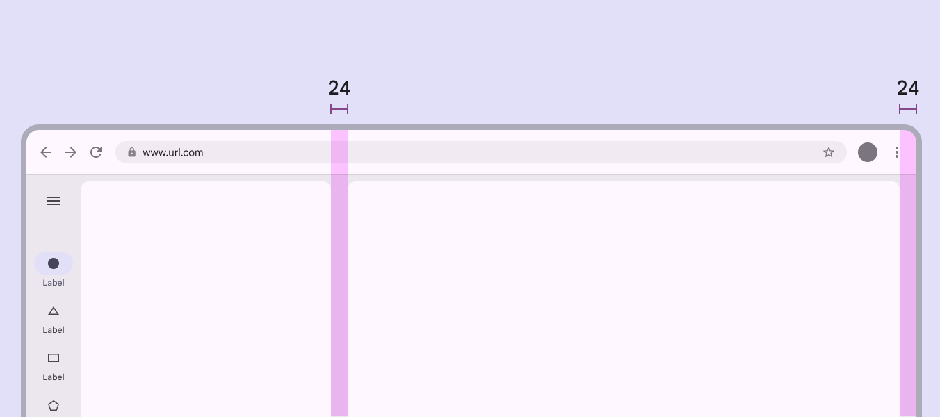
Large and extra-large layouts have a leading and trailing margin of 24dp.

The spacerA spacer is the space between two panes. If panes can be resized, the spacer contains a drag handle.More on spacer between panes is 24dp.

2 pane layout with 24dp margins and 24dp space between panes.
Use 24dp for margins and spacers in large and extra-large layouts

Special considerations ​

Large and extra-large layouts will need to transition dynamically to a smaller layout when:

  • The app goes from full-screen to split-screen
  • Multi-window mode is initiated
  • A free-form window is resized

Pay attention to typographic elements such as line length to ensure readability on large and extra-large layouts.
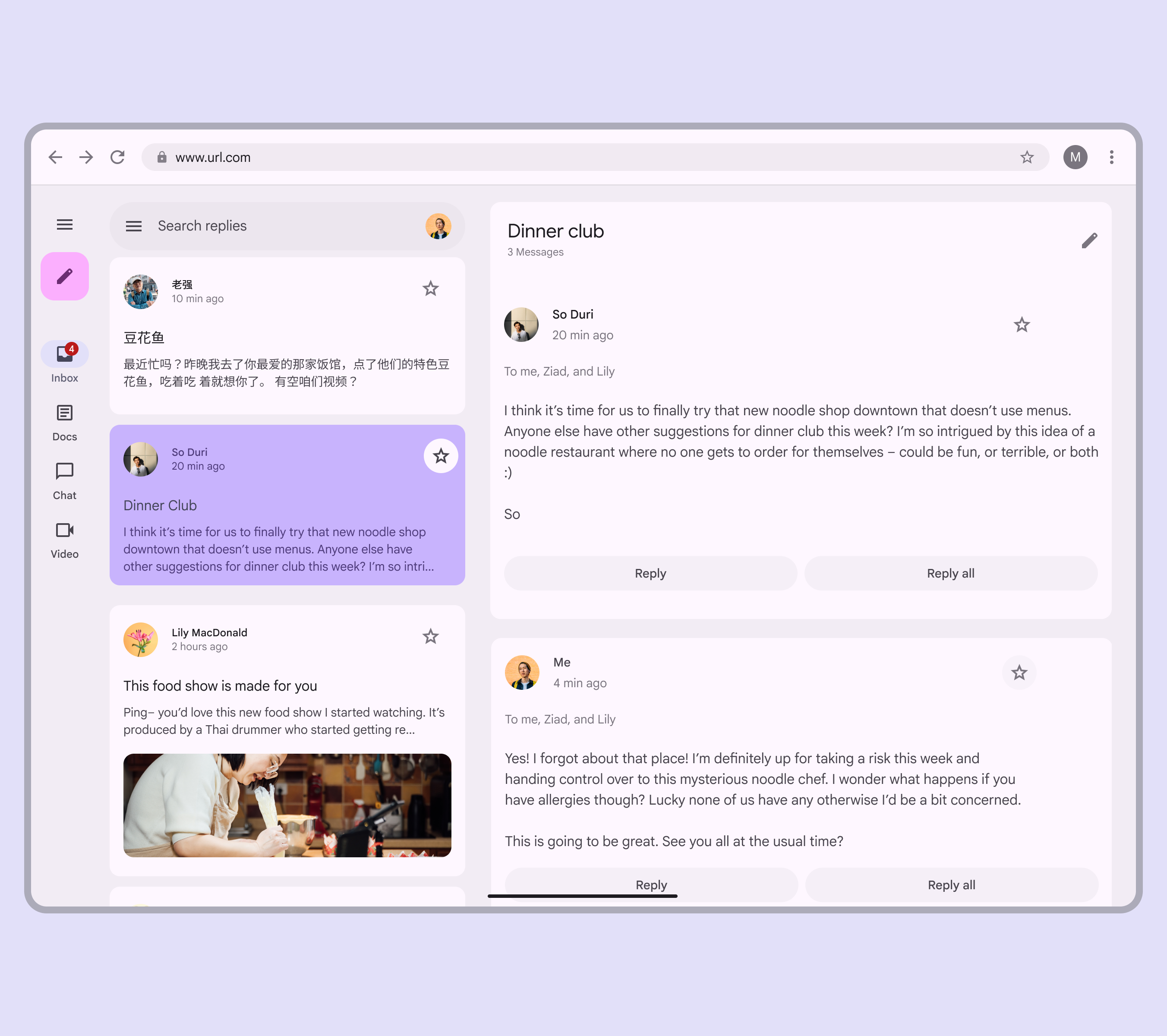
An email app with 2 panes in a large layout.
Consider how a large layout should change at smaller breakpoints
Pager
Previous pageBreakpoints: Expanded
Next pageBidirectionality & RTL

Released under the Apache 2.0 or CC BY 4.0

Copyright © 2018-Present Google

https://m3.material.io/foundations/layout/breakpoints/large-extra-large

Released under the Apache 2.0 or CC BY 4.0

Copyright © 2018-Present Google