Skip to content
Material Design 3
Main Navigation
v3
v2
v1

English

简体中文
繁體中文
Español
Français
Русский
Português – Brasil
Deutsch
日本語
한국어
Italiano
Polski
Türkçe
čeština
magyar

English

简体中文
繁體中文
Español
Français
Русский
Português – Brasil
Deutsch
日本語
한국어
Italiano
Polski
Türkçe
čeština
magyar

Appearance

Sidebar Navigation

Foundations

Accessibility

Overview: Principles

Overview: Assistive technology

Designing: Overview

Designing: Color contrast

Designing: Structure

Designing: Flow

Designing: Elements

Writing and text: Best practices

Writing and text: Text truncation

Writing and text: Text resizing

Building for all: User needs

Building for all: Co-design

Content design

Overview

Alt text

Global writing: Overview

Global writing: Word choice

Notifications

Style guide: UX writing best practices

Style guide: Word choice

Style guide: Grammar and punctuation

Customizing Material

Devices

Watches: Overview

Watches: Foundations

Watches: Styles

Watches: Layout

XR

Design: Overview

Design: Interaction

Design: Layout

Design: Accessibility

Components: Overview

Components: App bars

Components: Dialogs

Components: Nav bar

Components: Nav rail

Components: Toolbars

Design tokens: Overview

Design tokens: How to use tokens

Interaction

Gestures

Inputs

Selection

States: Overview

States: State layers

States: Applying states

Layout

Overview: Overview

Overview: Parts of layout

Overview: Adaptive design

Scaffold: Overview

Scaffold: Bars

Scaffold: Rails

Scaffold: Panes

Grids & spacing: Overview

Grids & spacing: Grids

Grids & spacing: Spacing

Grids & spacing: Density

Breakpoints: Overview

Breakpoints: Compact

Breakpoints: Medium

Breakpoints: Expanded

Breakpoints: Large & extra-large

Bidirectionality & RTL

Canonical examples: Overview

Canonical examples: Feed

Canonical examples: List-detail

Canonical examples: Supporting pane

Usability: Overview

Usability: Applying M3 Expressive

Material A-Z

Styles

Color

Color system: Overview

Color system: How the system works

Color roles

Color schemes

Choosing a scheme

Static: Baseline

Static: Custom brand

Dynamic: Choosing a source

Dynamic: User-generated source

Dynamic: Content-based source

Advanced: Overview

Advanced: Apply colors

Advanced: Define new colors

Advanced: Adjust existing colors

Color resources

Elevation: Overview

Elevation: Applying elevation

Elevation: Tokens

Icons: Overview

Icons: Designing icons

Icons: Applying icons

Motion

Motion physics system: How it works

Motion physics system: Specs

Easing and duration: Applying easing and duration

Easing and duration: Tokens & specs

Transitions: Transition patterns

Transitions: Applying transitions

Shape: Overview & principles

Shape: Corner radius scale

Shape: Shape morph

Spacing: Overview

Spacing: Applying spacing

Spacing: Tokens

Typography: Overview

Typography: Fonts

Typography: Type scale & tokens

Typography: Applying type

Typography: Editorial treatments

Components

App bars: Overview

App bars: Specs

App bars: Guidelines

App bars: Accessibility

Badges: Overview

Badges: Specs

Badges: Guidelines

Badges: Accessibility

Buttons

All buttons

Button groups: Overview

Button groups: Specs

Button groups: Guidelines

Button groups: Accessibility

Buttons: Overview

Buttons: Specs

Buttons: Guidelines

Buttons: Accessibility

Extended FABs: Overview

Extended FABs: Specs

Extended FABs: Guidelines

Extended FABs: Accessibility

FAB menu: Overview

FAB menu: Specs

FAB menu: Guidelines

FAB menu: Accessibility

FABs: Overview

FABs: Specs

FABs: Guidelines

FABs: Accessibility

Icon buttons: Overview

Icon buttons: Specs

Icon buttons: Guidelines

Icon buttons: Accessibility

Segmented buttons: Overview

Segmented buttons: Specs

Segmented buttons: Guidelines

Segmented buttons: Accessibility

Split button: Overview

Split button: Specs

Split button: Guidelines

Split button: Accessibility

Cards: Overview

Cards: Specs

Cards: Guidelines

Cards: Accessibility

Carousel: Overview

Carousel: Specs

Carousel: Guidelines

Carousel: Accessibility

Checkbox: Overview

Checkbox: Specs

Checkbox: Guidelines

Checkbox: Accessibility

Chips: Overview

Chips: Specs

Chips: Guidelines

Chips: Accessibility

Date & time pickers

Date pickers: Overview

Date pickers: Specs

Date pickers: Guidelines

Date pickers: Accessibility

Time pickers: Overview

Time pickers: Specs

Time pickers: Guidelines

Time pickers: Accessibility

Dialogs: Overview

Dialogs: Specs

Dialogs: Guidelines

Dialogs: Accessibility

Divider: Overview

Divider: Specs

Divider: Guidelines

Divider: Accessibility

Lists: Overview

Lists: Specs

Lists: Guidelines

Lists: Accessibility

Loading & progress

Loading indicator: Overview

Loading indicator: Specs

Loading indicator: Guidelines

Loading indicator: Accessibility

Progress indicators: Overview

Progress indicators: Specs

Progress indicators: Guidelines

Progress indicators: Accessibility

Menus: Overview

Menus: Specs

Menus: Guidelines

Menus: Accessibility

Navigation

Navigation bar: Overview

Navigation bar: Specs

Navigation bar: Guidelines

Navigation bar: Accessibility

Navigation drawer: Overview

Navigation drawer: Specs

Navigation drawer: Guidelines

Navigation drawer: Accessibility

Navigation rail: Overview

Navigation rail: Specs

Navigation rail: Guidelines

Navigation rail: Accessibility

Radio button: Overview

Radio button: Specs

Radio button: Guidelines

Radio button: Accessibility

Search: Overview

Search: Specs

Search: Guidelines

Search: Accessibility

Sheets

Bottom sheets: Overview

Bottom sheets: Specs

Bottom sheets: Guidelines

Bottom sheets: Accessibility

Side sheets: Overview

Side sheets: Specs

Side sheets: Guidelines

Side sheets: Accessibility

Sliders: Overview

Sliders: Specs

Sliders: Guidelines

Sliders: Accessibility

Snackbar: Overview

Snackbar: Specs

Snackbar: Guidelines

Snackbar: Accessibility

Switch: Overview

Switch: Specs

Switch: Guidelines

Switch: Accessibility

Tabs: Overview

Tabs: Specs

Tabs: Guidelines

Tabs: Accessibility

Text fields: Overview

Text fields: Specs

Text fields: Guidelines

Text fields: Accessibility

Toolbars: Overview

Toolbars: Specs

Toolbars: Guidelines

Toolbars: Accessibility

Tooltips: Overview

Tooltips: Specs

Tooltips: Guidelines

Tooltips: Accessibility

On this page

Typography: Fonts ​

Use typography to make content readable and beautiful


Static fonts like Roboto are currently applied by default to all Material 3 components. Variable fonts like Roboto Flex have many more axes for expression, but aren't yet part of the M3 typescale.

Default typefaces ​

Roboto

Roboto is the default typeface for Android, and is used in the M3 typescale.

Roboto includes over 3,300 glyphs for representing hundreds of languages around the world.
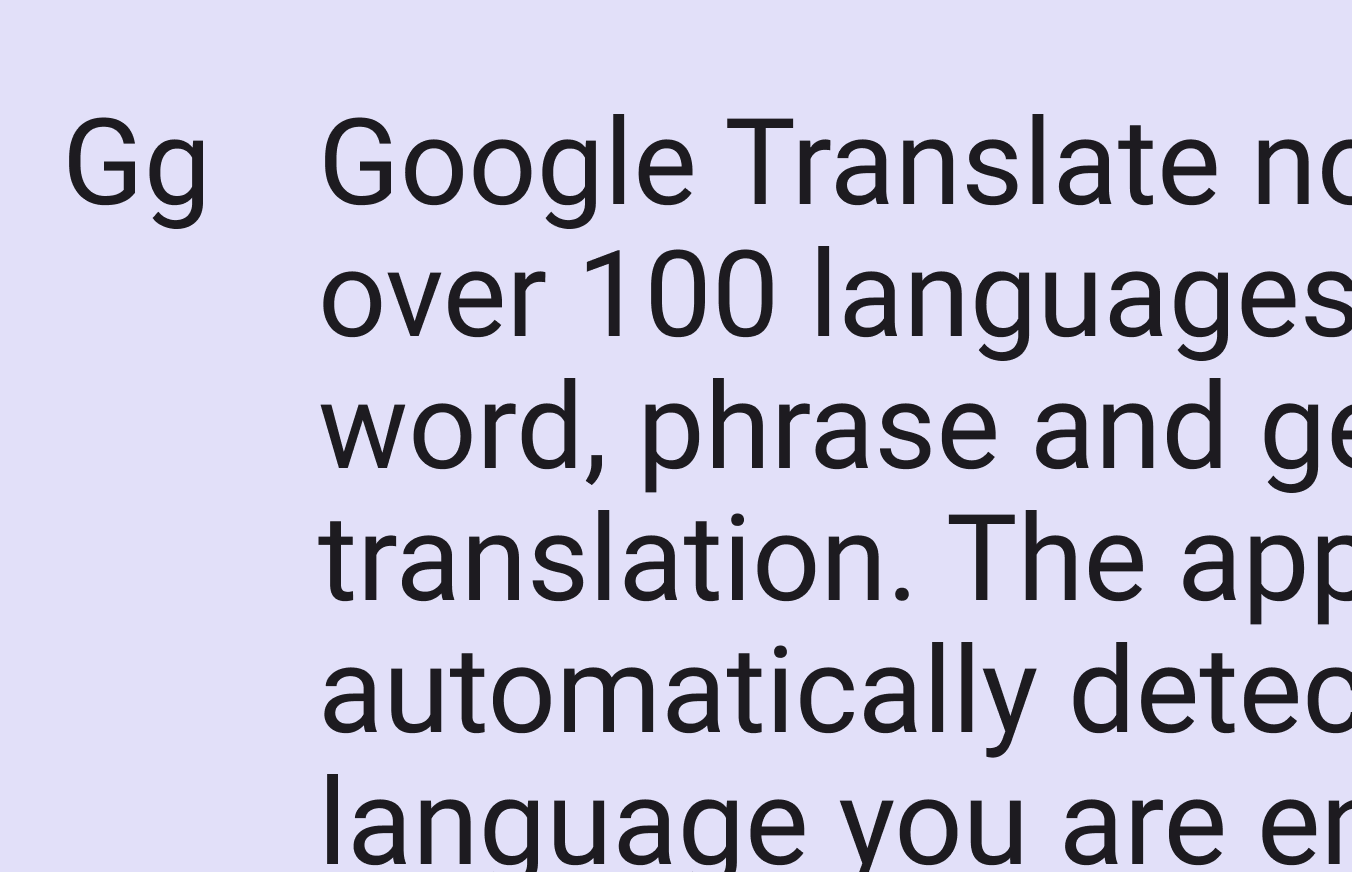
A type specimen of Roboto.
Roboto is the default typeface in Android and Material 3

Roboto Flex

Roboto Flex is a variable font which adds more flexibility to typography. It has an extended range of weights, widths, and additional customizable attributes (like size-specific designs), and includes over 900 glyphs with support for Latin, Greek, and Cyrillic.

Roboto Flex is available as a standalone font.

A type specimen of Roboto Flex.
Roboto Flex includes the styles of Roboto plus many more weights and widths optimized for larger and smaller sizes

Roboto Serif

Roboto Serif is another variable font family, designed to create a comfortable reading experience. Minimal and highly functional, it can be used anywhere (even in app interfaces) due to its extensive set of weights and widths across a broad range of sizes.
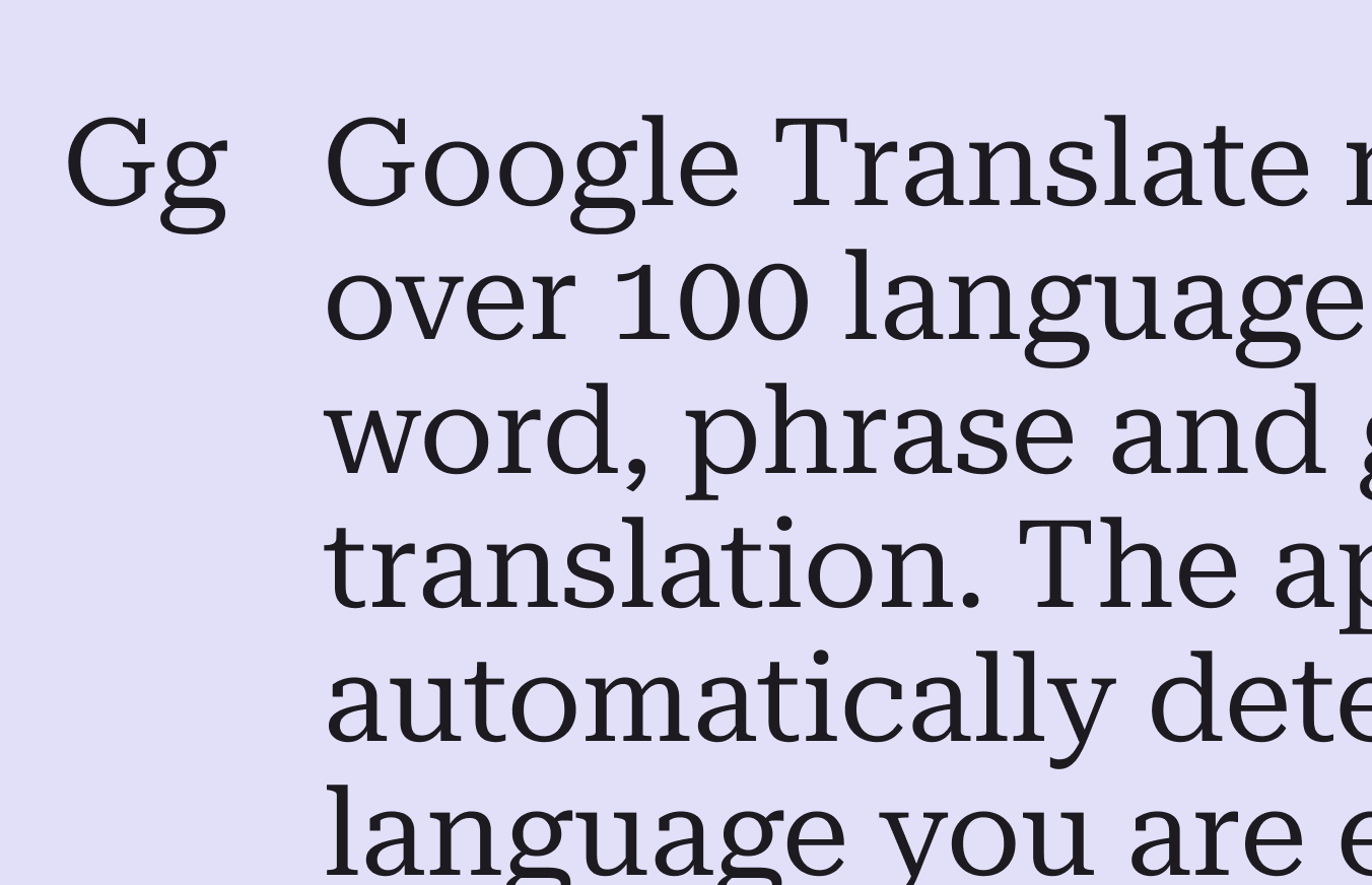
A type specimen of Roboto Serif.
Roboto Serif offers a functional set of weights and widths

Roboto Mono

Roboto Mono is a monospaced version of the classic Roboto design. Being monospaced means each letter has equal space, and letterforms are adjusted to properly fill the space.

Monospaced fonts are easier to scan vertically, so are particularly useful for code and keeping numbers aligned. Learn more about monospaced numbers
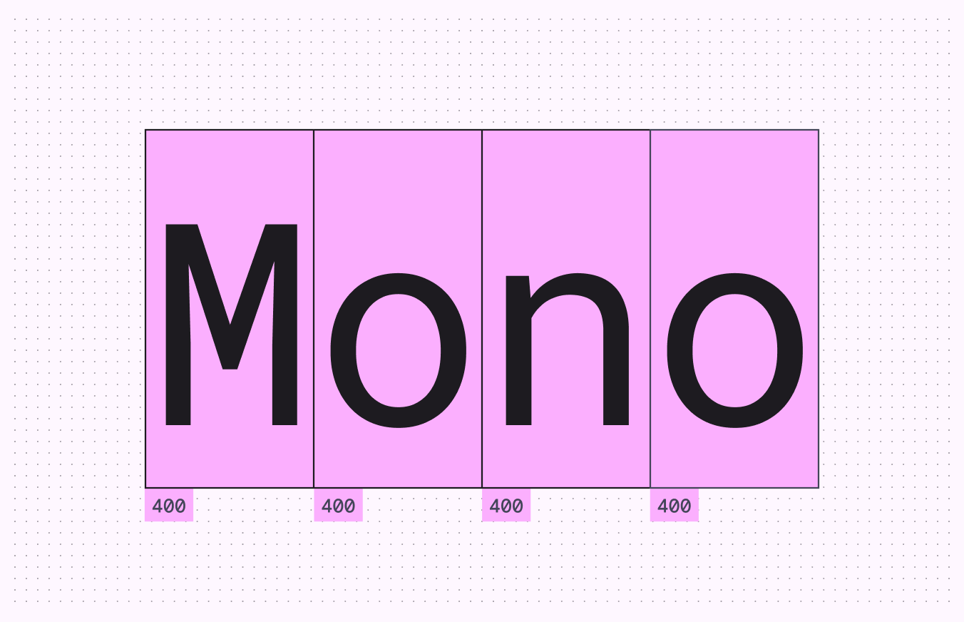
A type specimen of Roboto Mono.
Equal sizing for each character keeps uniformity of spacing

Noto Sans

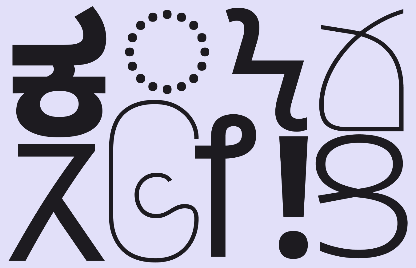
Noto Sans is a global font collection for all modern and ancient languages.

Each Noto Sans family is compatible with Roboto and Noto Sans supports more than 150 scripts and thousands of languages. It is used as a “fallback” font, when a language is unsupported.
Learn more about typography language considerations

A type specimen of several Noto Sans fonts.
Several Noto Sans fonts for different writing systems
Variable fontAvailable axes
Roboto Flex

Slant, Width, Weight, Grade, Optical Size.

Advanced axes: Thick stroke (XOPQ), thin stroke (YOPQ), counter width (XTRA), uppercase height (YTUC), lowercase height (YTLC), ascender height (YTAS), descender depth (YTDE), figure height (YTFI)

Roboto MonoWeight, Italic
Noto SansWidth, Weight, Italic

Fallback protection with variable fonts ​

Font fallback is when a similar font is used as a replacement when the current font doesn't support the text's characters.

For example, products using the variable font Roboto Flex should apply font fallback in the following order:

  1. Roboto Flex
  2. Roboto
  3. Noto Sans font collection

This ensures that text will have a consistent visual style regardless of font support. Designers should connect with their product and engineering partners to confirm that font fallback is available.
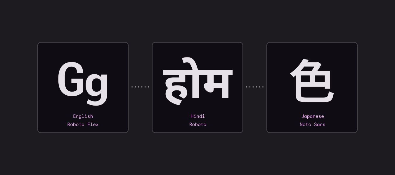
Text examples from Roboto Flex, Roboto, and Noto Sans all show similar styling.
Font branding is preserved when moving from Roboto Flex to Roboto to Noto Sans Japanese
Pager
Previous pageTypography: Overview
Next pageTypography: Type scale & tokens

Released under the Apache 2.0 or CC BY 4.0

Copyright © 2018-Present Google

https://m3.material.io/styles/typography/fonts

Released under the Apache 2.0 or CC BY 4.0

Copyright © 2018-Present Google