Skip to content
Material Design 3
Main Navigation
v3
v2
v1

English

简体中文
繁體中文
Español
Français
Русский
Português – Brasil
Deutsch
日本語
한국어
Italiano
Polski
Türkçe
čeština
magyar

English

简体中文
繁體中文
Español
Français
Русский
Português – Brasil
Deutsch
日本語
한국어
Italiano
Polski
Türkçe
čeština
magyar

Appearance

Sidebar Navigation

Foundations

Accessibility

Overview: Principles

Overview: Assistive technology

Designing: Overview

Designing: Color contrast

Designing: Structure

Designing: Flow

Designing: Elements

Writing and text: Best practices

Writing and text: Text truncation

Writing and text: Text resizing

Building for all: User needs

Building for all: Co-design

Content design

Overview

Alt text

Global writing: Overview

Global writing: Word choice

Notifications

Style guide: UX writing best practices

Style guide: Word choice

Style guide: Grammar and punctuation

Customizing Material

Devices

Watches: Overview

Watches: Foundations

Watches: Styles

Watches: Layout

XR

Design: Overview

Design: Interaction

Design: Layout

Design: Accessibility

Components: Overview

Components: App bars

Components: Dialogs

Components: Nav bar

Components: Nav rail

Components: Toolbars

Design tokens: Overview

Design tokens: How to use tokens

Interaction

Gestures

Inputs

Selection

States: Overview

States: State layers

States: Applying states

Layout

Overview: Overview

Overview: Parts of layout

Overview: Adaptive design

Scaffold: Overview

Scaffold: Bars

Scaffold: Rails

Scaffold: Panes

Grids & spacing: Overview

Grids & spacing: Grids

Grids & spacing: Spacing

Grids & spacing: Density

Breakpoints: Overview

Breakpoints: Compact

Breakpoints: Medium

Breakpoints: Expanded

Breakpoints: Large & extra-large

Bidirectionality & RTL

Canonical examples: Overview

Canonical examples: Feed

Canonical examples: List-detail

Canonical examples: Supporting pane

Usability: Overview

Usability: Applying M3 Expressive

Material A-Z

Styles

Color

Color system: Overview

Color system: How the system works

Color roles

Color schemes

Choosing a scheme

Static: Baseline

Static: Custom brand

Dynamic: Choosing a source

Dynamic: User-generated source

Dynamic: Content-based source

Advanced: Overview

Advanced: Apply colors

Advanced: Define new colors

Advanced: Adjust existing colors

Color resources

Elevation: Overview

Elevation: Applying elevation

Elevation: Tokens

Icons: Overview

Icons: Designing icons

Icons: Applying icons

Motion

Motion physics system: How it works

Motion physics system: Specs

Easing and duration: Applying easing and duration

Easing and duration: Tokens & specs

Transitions: Transition patterns

Transitions: Applying transitions

Shape: Overview & principles

Shape: Corner radius scale

Shape: Shape morph

Spacing: Overview

Spacing: Applying spacing

Spacing: Tokens

Typography: Overview

Typography: Fonts

Typography: Type scale & tokens

Typography: Applying type

Typography: Editorial treatments

Components

App bars: Overview

App bars: Specs

App bars: Guidelines

App bars: Accessibility

Badges: Overview

Badges: Specs

Badges: Guidelines

Badges: Accessibility

Buttons

All buttons

Button groups: Overview

Button groups: Specs

Button groups: Guidelines

Button groups: Accessibility

Buttons: Overview

Buttons: Specs

Buttons: Guidelines

Buttons: Accessibility

Extended FABs: Overview

Extended FABs: Specs

Extended FABs: Guidelines

Extended FABs: Accessibility

FAB menu: Overview

FAB menu: Specs

FAB menu: Guidelines

FAB menu: Accessibility

FABs: Overview

FABs: Specs

FABs: Guidelines

FABs: Accessibility

Icon buttons: Overview

Icon buttons: Specs

Icon buttons: Guidelines

Icon buttons: Accessibility

Segmented buttons: Overview

Segmented buttons: Specs

Segmented buttons: Guidelines

Segmented buttons: Accessibility

Split button: Overview

Split button: Specs

Split button: Guidelines

Split button: Accessibility

Cards: Overview

Cards: Specs

Cards: Guidelines

Cards: Accessibility

Carousel: Overview

Carousel: Specs

Carousel: Guidelines

Carousel: Accessibility

Checkbox: Overview

Checkbox: Specs

Checkbox: Guidelines

Checkbox: Accessibility

Chips: Overview

Chips: Specs

Chips: Guidelines

Chips: Accessibility

Date & time pickers

Date pickers: Overview

Date pickers: Specs

Date pickers: Guidelines

Date pickers: Accessibility

Time pickers: Overview

Time pickers: Specs

Time pickers: Guidelines

Time pickers: Accessibility

Dialogs: Overview

Dialogs: Specs

Dialogs: Guidelines

Dialogs: Accessibility

Divider: Overview

Divider: Specs

Divider: Guidelines

Divider: Accessibility

Lists: Overview

Lists: Specs

Lists: Guidelines

Lists: Accessibility

Loading & progress

Loading indicator: Overview

Loading indicator: Specs

Loading indicator: Guidelines

Loading indicator: Accessibility

Progress indicators: Overview

Progress indicators: Specs

Progress indicators: Guidelines

Progress indicators: Accessibility

Menus: Overview

Menus: Specs

Menus: Guidelines

Menus: Accessibility

Navigation

Navigation bar: Overview

Navigation bar: Specs

Navigation bar: Guidelines

Navigation bar: Accessibility

Navigation drawer: Overview

Navigation drawer: Specs

Navigation drawer: Guidelines

Navigation drawer: Accessibility

Navigation rail: Overview

Navigation rail: Specs

Navigation rail: Guidelines

Navigation rail: Accessibility

Radio button: Overview

Radio button: Specs

Radio button: Guidelines

Radio button: Accessibility

Search: Overview

Search: Specs

Search: Guidelines

Search: Accessibility

Sheets

Bottom sheets: Overview

Bottom sheets: Specs

Bottom sheets: Guidelines

Bottom sheets: Accessibility

Side sheets: Overview

Side sheets: Specs

Side sheets: Guidelines

Side sheets: Accessibility

Sliders: Overview

Sliders: Specs

Sliders: Guidelines

Sliders: Accessibility

Snackbar: Overview

Snackbar: Specs

Snackbar: Guidelines

Snackbar: Accessibility

Switch: Overview

Switch: Specs

Switch: Guidelines

Switch: Accessibility

Tabs: Overview

Tabs: Specs

Tabs: Guidelines

Tabs: Accessibility

Text fields: Overview

Text fields: Specs

Text fields: Guidelines

Text fields: Accessibility

Toolbars: Overview

Toolbars: Specs

Toolbars: Guidelines

Toolbars: Accessibility

Tooltips: Overview

Tooltips: Specs

Tooltips: Guidelines

Tooltips: Accessibility

On this page

Segmented buttons: Guidelines ​

Segmented buttons help people select options, switch views, or sort elements


TIP

Segmented buttons are no longer recommended in the Material 3 expressive update. For those who have updated, use the connected button group instead, which has mostly the same functionality but with an updated visual design.
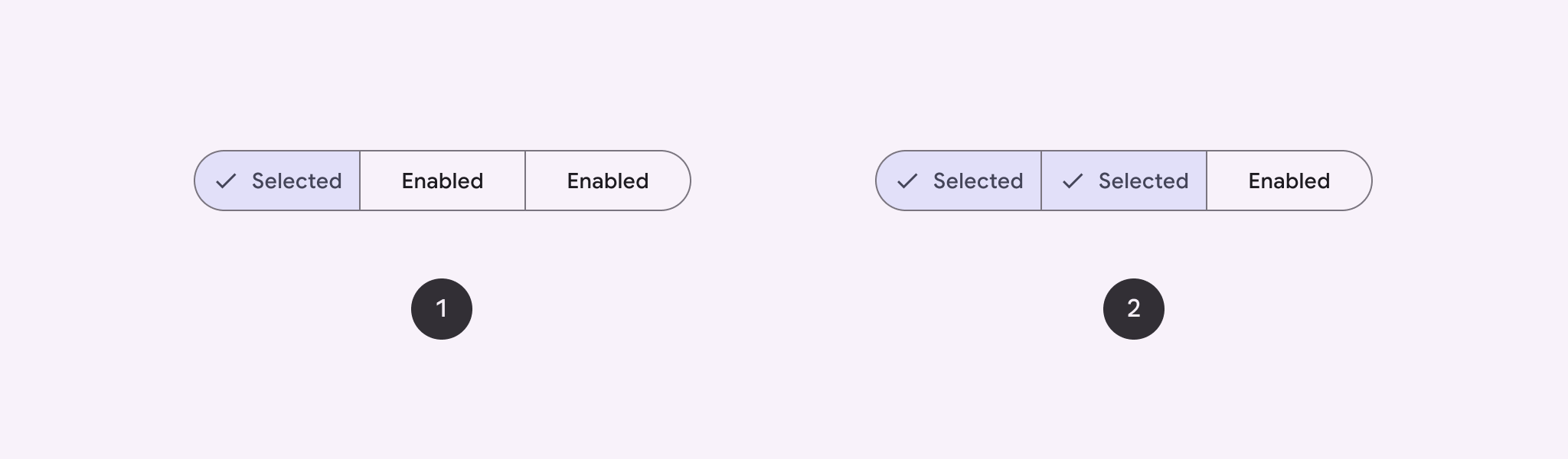

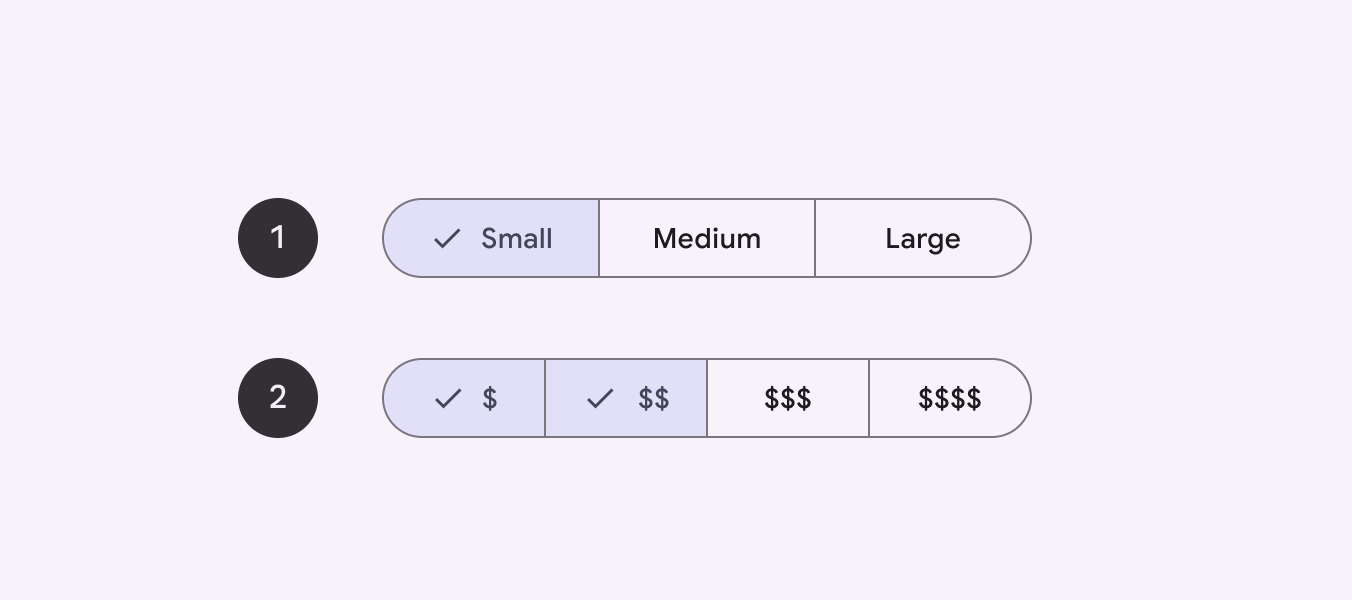
Two types of segmented buttons.
  1. Single-select
  2. Multi-select

Usage ​

Segmented buttons help people select options, switch views, or sort elements.
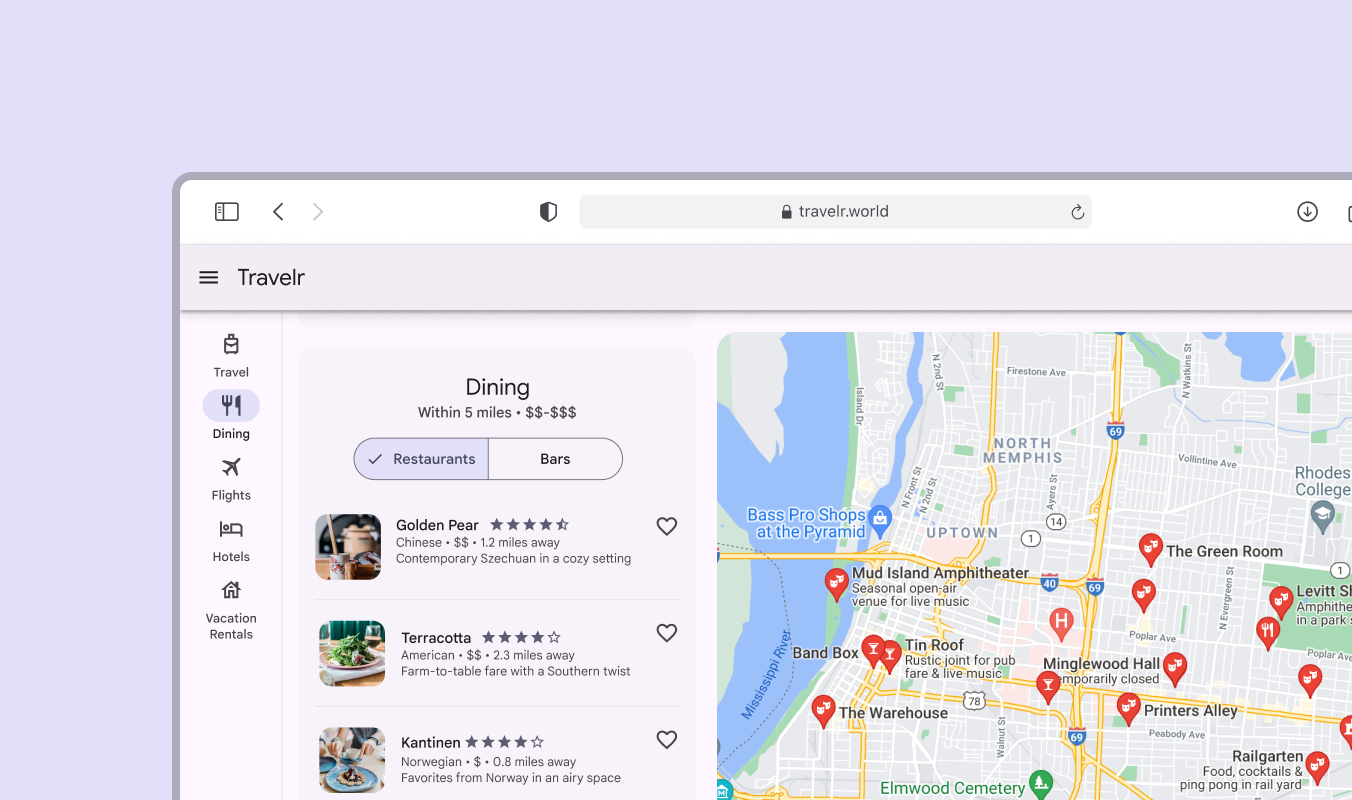
A segmented button for switching between restaurants and bar options.
A segmented button can help switch between viewing restaurant and bar options

There are 2 variants of segmented buttons:

  1. Single-select

  2. Multi-select

Side by side view of single and multi-select segmented buttons
  1. Single-select segmented button can only have 1 segment selected
  2. Multi-select segmented button can have multiple segments selected

Anatomy ​
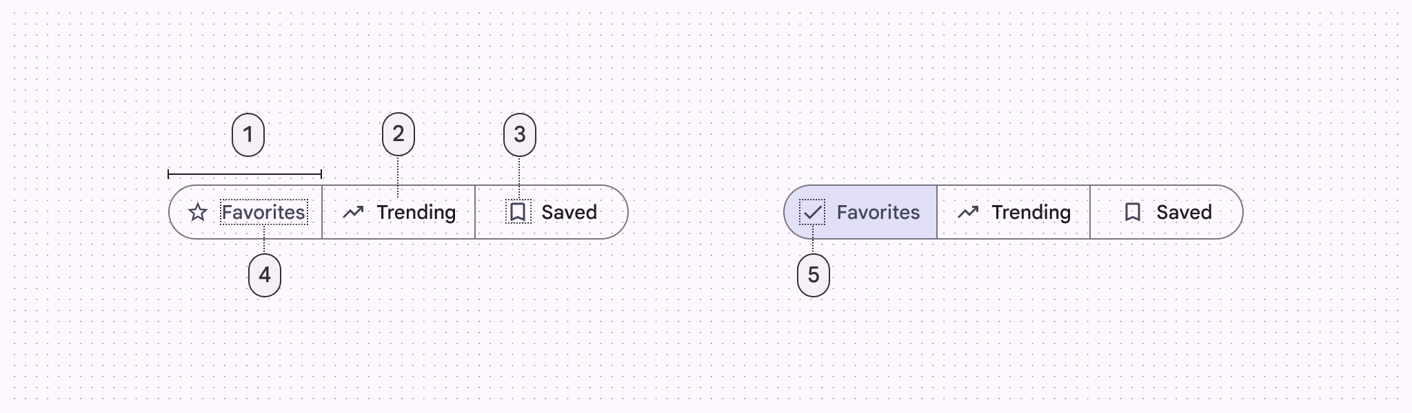
Diagram of segmented button indicating 5 parts of its anatomy
  1. Segment
  2. Container
  3. Icon (optional)
  4. Label text (optional)
  5. Selected icon

Segments

Segmented buttons can have 2-5 segments. Each segment is clearly divided and contains label text, an icon, or both.
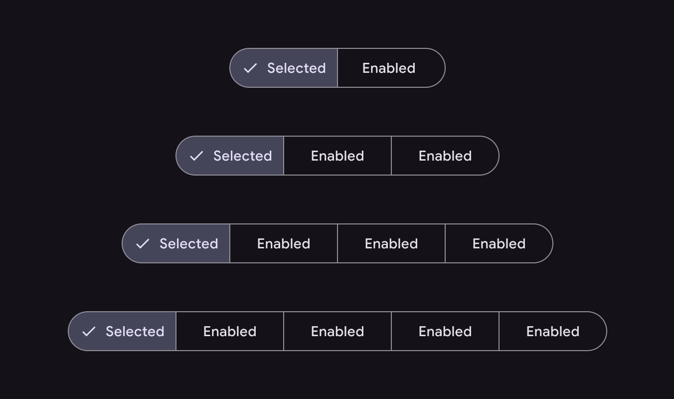
Side by side view of segmented buttons each with additional segment starting from 2 to 5
There can be anywhere from 2 to 5 segments in single-select and multi-select segmented buttons
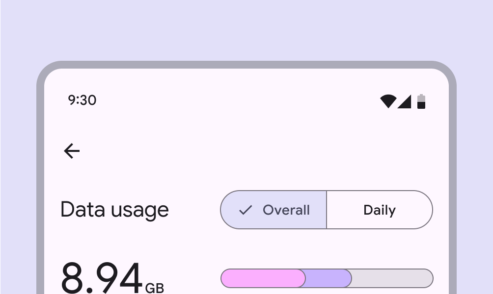
Mobile UI of data usage screen with segmented button
Do Segmented buttons are best used for selecting between 2 and 5 choices
Incorrect use of segmented button with 6 segments
Don’t Don’t use more than five segments in a single segmented button. Choices should be scoped. If you have more than five choices, consider using another component, such as chips.

Container

Like common buttonsButtons let people take action and make choices with one tap., segmented buttons have fully rounded corners by default.
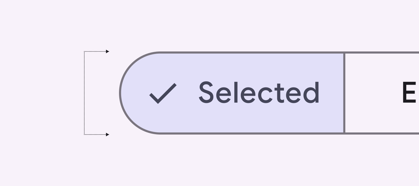
Close up detail of segmented button with fully rounded corners
Segmented buttons have fully rounded corners

Icons

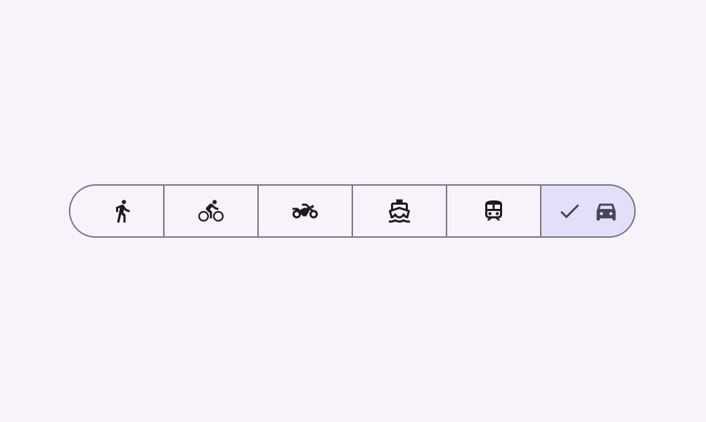
Icons may be used as labels by themselves or alongside text.

If an icon is used without label text, it must clearly communicate the option it represents.
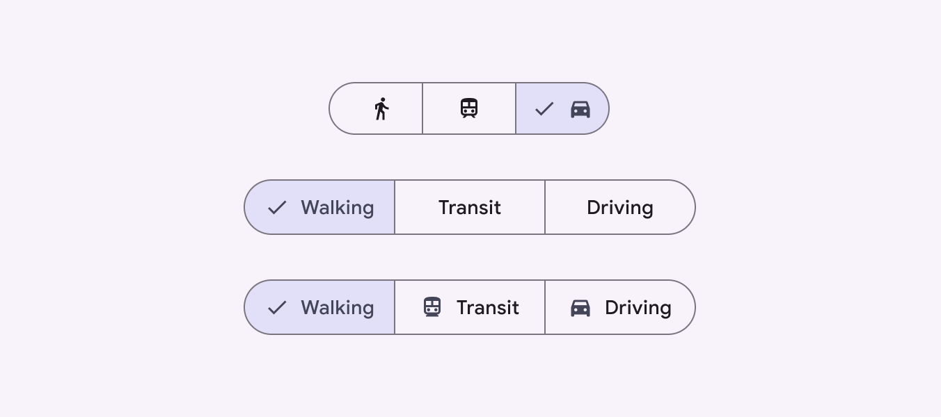
Side by side view of segmented buttons with different configurations of icons and label text
Segmented buttons can include icons

Label text

Labels should be short and succinct. If a label is too long to fit within its segment, consider using an icon alone.
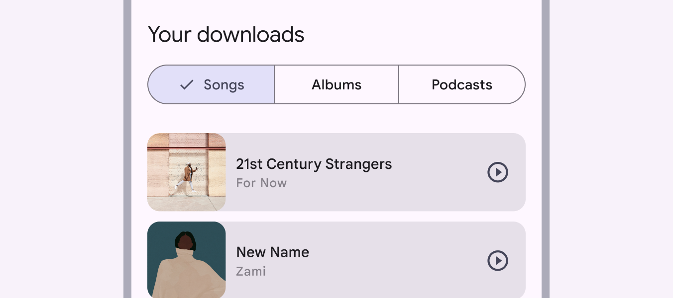
Mobile UI of music app showing a segmented button with options for music, albums, podcasts
Use labels that are as clear and short as possible
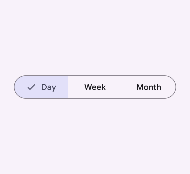
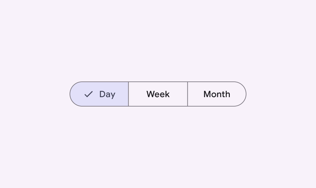
Segmented button with options for day, week, month
Do Keep labels short and consistent in length
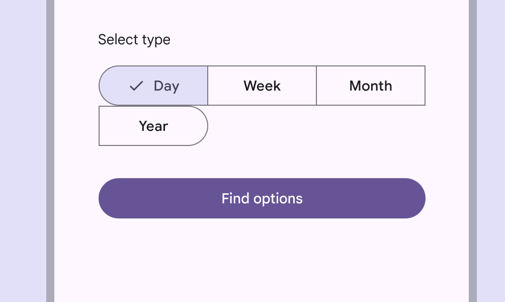
Segmented button with 4 segments. 3 are next to each other. The 4th is wrapped on a new line.
Don’t Don’t allow segments to wrap onto a new line
Segmented button with text labels reading day, week, month
Do Use consistent label types
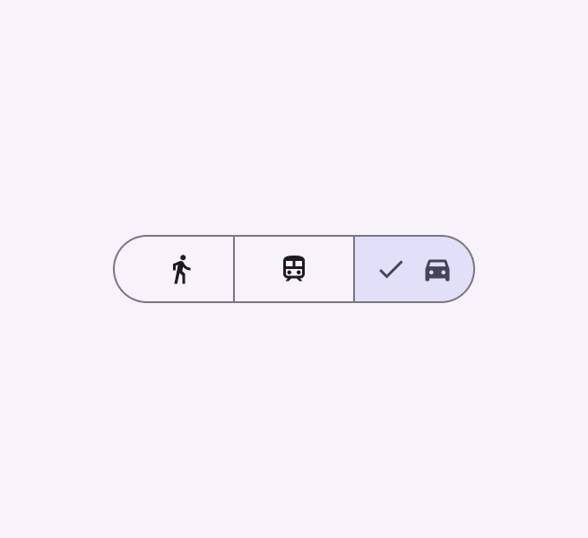
Segmented button with icons only labels for walking, transit, driving
Caution Icons can be used in place of labels, but they must clearly communicate their meaning
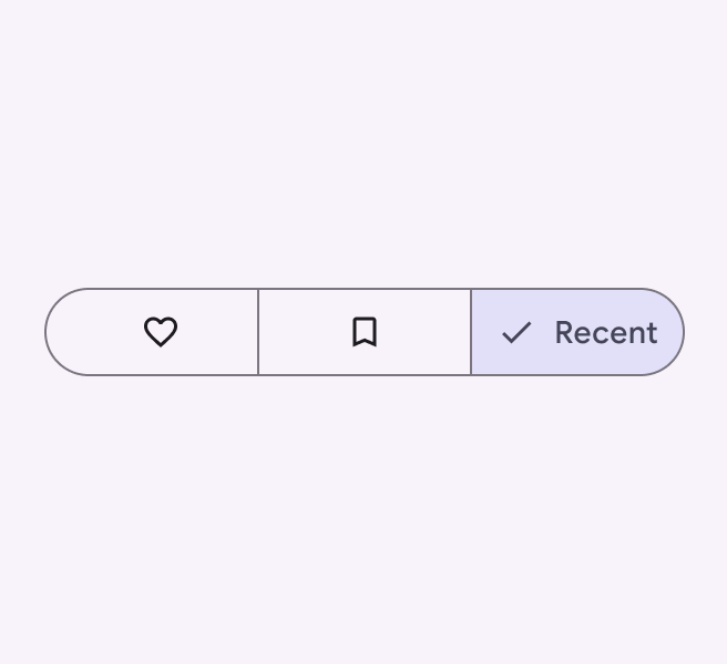
Segmented button with 2 icon only options indicating favorite and bookmark and 3rd option with text label reading recent
Don’t Avoid mixing icon-only labels with text labels. Choose one label type and use that type for all segments.

Single-select ​

Use a single-select segmented button to select one option from a set, switch between views, or sort elements from up to five options.

For example, use a single-select segmented button to choose one of a set of sizes, such as this beverage size selector.
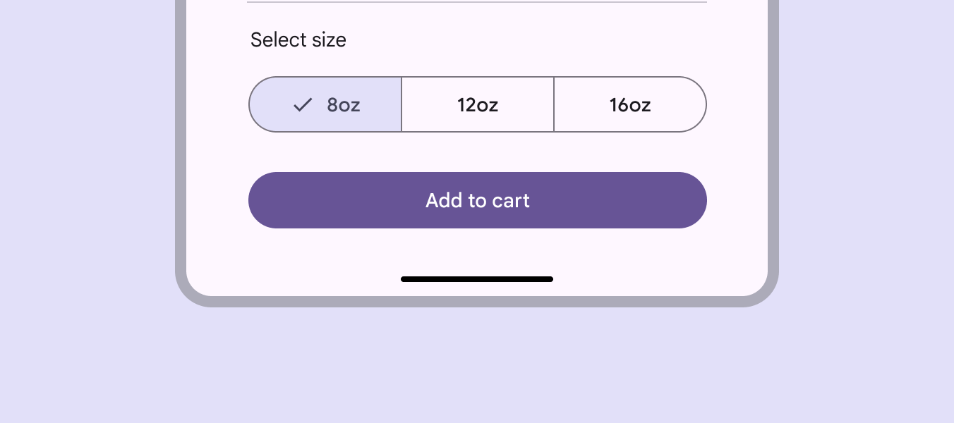
Mobile UI for ecommerce app with segmented button with 3 beverage size options
A single select segmented button for choosing beverage size

Multi-select ​

Use a multi-select segmented button to select or sort from two to five options. Unlike single-select, selection is not required and a user may concurrently select anywhere from all to none of the options.

For example, multi-select segmented buttons can be used to filter by price range when searching for a restaurant.
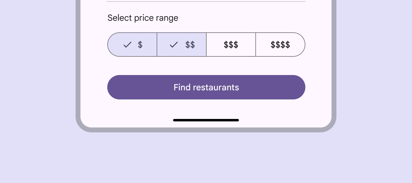
Mobile UI for ecommerce app with multi-select segmented button with 4 price range options
A multi-select segmented button for filtering restaurant search options

Placement ​

Segmented buttons should have adequate marginsMargins are the spaces between the edge of a nested element and its parent element, such as the space between a button's label text and the edge of its container.More on margins from the edge of the viewport or frame.

On larger screens, set a maximum padding for all button segments so the set doesn't fill the screen.
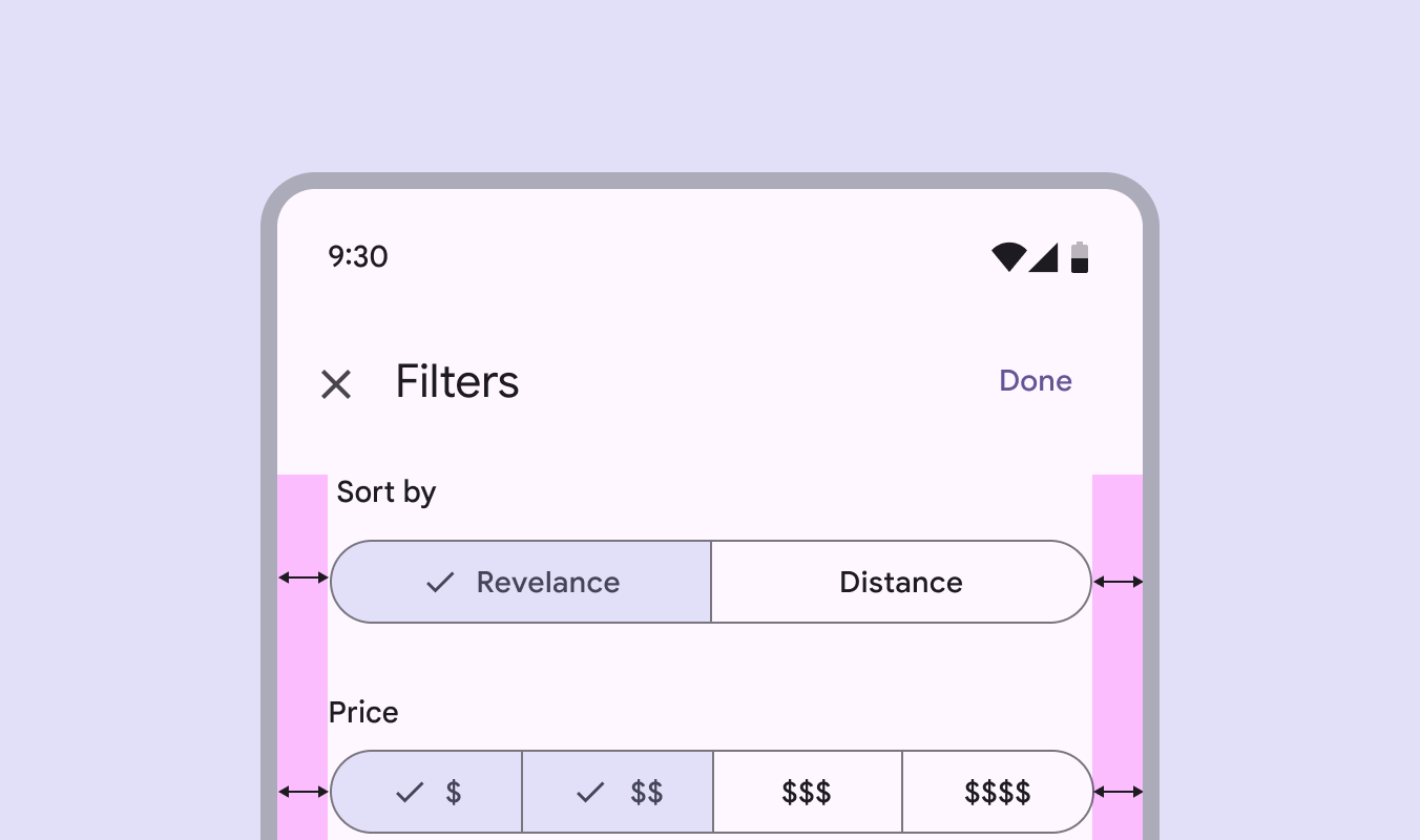
Mobile UI with 2-segment segmented button and 4-segment segmented button each with same margins to the viewport edge.
Do Allow adequate space for margins. The button container shouldn’t reach the edge of the viewport.
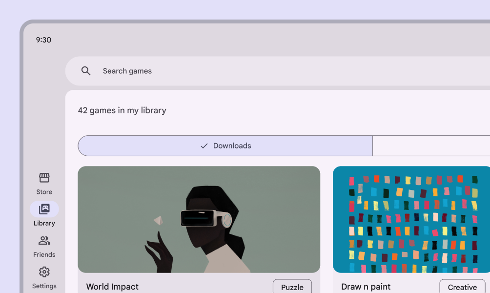
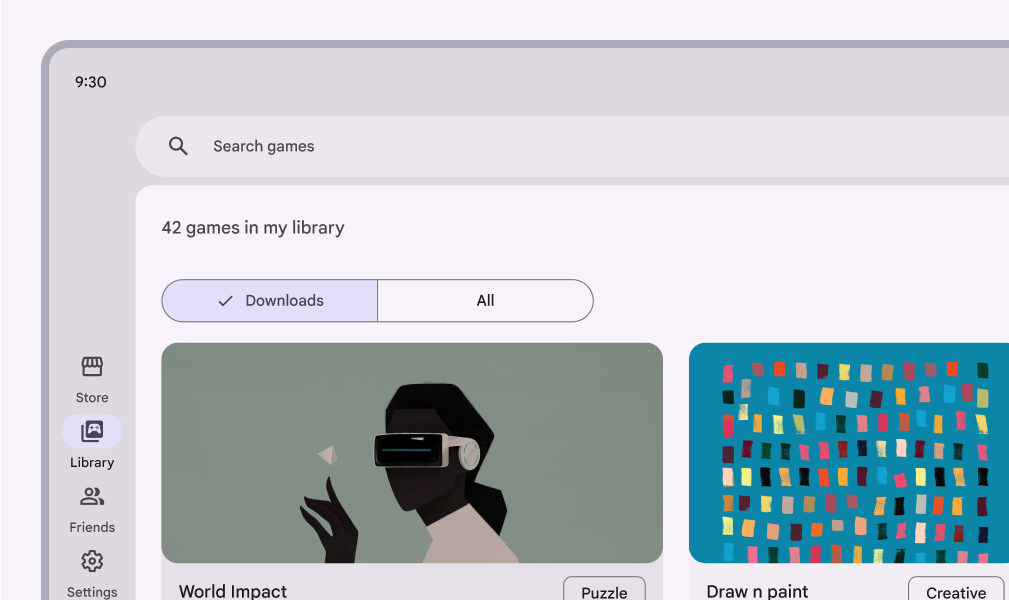
Game store UI with a segmented button the proper width
Do Set a maximum padding within the segments to ensure usability on larger screens
Game store UI with a segmented button improperly spanning the entire width of the screen
Don’t Don’t allow segmented buttons to span the full width of larger screens or panes. This can leave too much padding on either side of the segment label, making the button less usable.

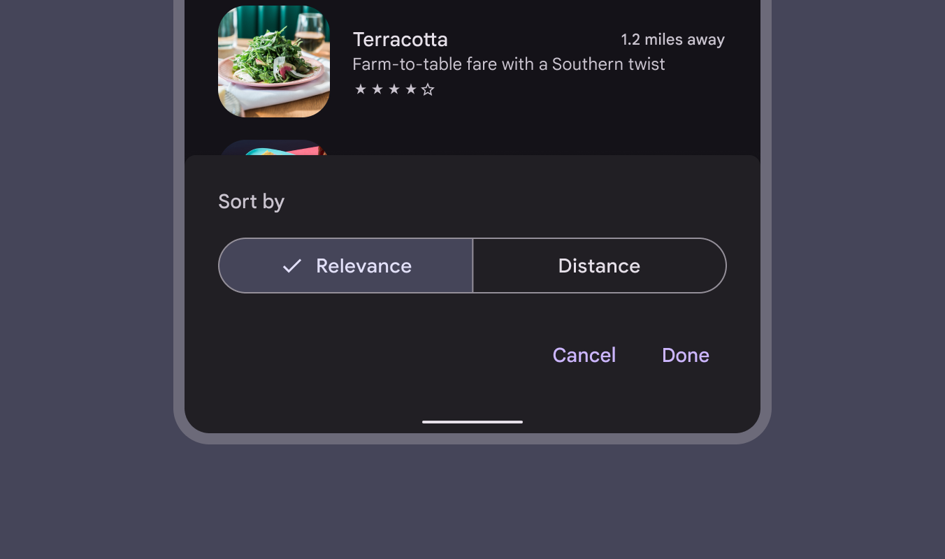
Segmented buttons can be placed on other components, such as bottom sheetsBottom sheets show secondary content anchored to the bottom of the screen.More on bottom sheets or full-screen dialogsFull-screen dialogs fill the entire screen, displaying actions that require a series of tasks to complete. They're often used for creating a calendar entry..

Mobile UI with segmented button in bottom sheet
A segmented button can be placed on a bottom sheet

Behavior ​

When using both icons and label text in segmented buttons, the icon label is replaced by the checkmark icon when the segment is selected.

Icons become checkmarks when selected in buttons that also use label text
Pager
Previous pageSegmented buttons: Specs
Next pageSegmented buttons: Accessibility

Released under the Apache 2.0 or CC BY 4.0

Copyright © 2018-Present Google

https://m3.material.io/components/segmented-buttons/guidelines

Released under the Apache 2.0 or CC BY 4.0

Copyright © 2018-Present Google