Skip to content
Material Design 3
Main Navigation
v3
v2
v1

English

简体中文
繁體中文
Español
Français
Русский
Português – Brasil
Deutsch
日本語
한국어
Italiano
Polski
Türkçe
čeština
magyar

English

简体中文
繁體中文
Español
Français
Русский
Português – Brasil
Deutsch
日本語
한국어
Italiano
Polski
Türkçe
čeština
magyar

Appearance

Sidebar Navigation

Foundations

Accessibility

Overview: Principles

Overview: Assistive technology

Designing: Overview

Designing: Color contrast

Designing: Structure

Designing: Flow

Designing: Elements

Writing and text: Best practices

Writing and text: Text truncation

Writing and text: Text resizing

Building for all: User needs

Building for all: Co-design

Content design

Overview

Alt text

Global writing: Overview

Global writing: Word choice

Notifications

Style guide: UX writing best practices

Style guide: Word choice

Style guide: Grammar and punctuation

Customizing Material

Devices

Watches: Overview

Watches: Foundations

Watches: Styles

Watches: Layout

XR

Design: Overview

Design: Interaction

Design: Layout

Design: Accessibility

Components: Overview

Components: App bars

Components: Dialogs

Components: Nav bar

Components: Nav rail

Components: Toolbars

Design tokens: Overview

Design tokens: How to use tokens

Interaction

Gestures

Inputs

Selection

States: Overview

States: State layers

States: Applying states

Layout

Overview: Overview

Overview: Parts of layout

Overview: Adaptive design

Scaffold: Overview

Scaffold: Bars

Scaffold: Rails

Scaffold: Panes

Grids & spacing: Overview

Grids & spacing: Grids

Grids & spacing: Spacing

Grids & spacing: Density

Breakpoints: Overview

Breakpoints: Compact

Breakpoints: Medium

Breakpoints: Expanded

Breakpoints: Large & extra-large

Bidirectionality & RTL

Canonical examples: Overview

Canonical examples: Feed

Canonical examples: List-detail

Canonical examples: Supporting pane

Usability: Overview

Usability: Applying M3 Expressive

Material A-Z

Styles

Color

Color system: Overview

Color system: How the system works

Color roles

Color schemes

Choosing a scheme

Static: Baseline

Static: Custom brand

Dynamic: Choosing a source

Dynamic: User-generated source

Dynamic: Content-based source

Advanced: Overview

Advanced: Apply colors

Advanced: Define new colors

Advanced: Adjust existing colors

Color resources

Elevation: Overview

Elevation: Applying elevation

Elevation: Tokens

Icons: Overview

Icons: Designing icons

Icons: Applying icons

Motion

Motion physics system: How it works

Motion physics system: Specs

Easing and duration: Applying easing and duration

Easing and duration: Tokens & specs

Transitions: Transition patterns

Transitions: Applying transitions

Shape: Overview & principles

Shape: Corner radius scale

Shape: Shape morph

Spacing: Overview

Spacing: Applying spacing

Spacing: Tokens

Typography: Overview

Typography: Fonts

Typography: Type scale & tokens

Typography: Applying type

Typography: Editorial treatments

Components

App bars: Overview

App bars: Specs

App bars: Guidelines

App bars: Accessibility

Badges: Overview

Badges: Specs

Badges: Guidelines

Badges: Accessibility

Buttons

All buttons

Button groups: Overview

Button groups: Specs

Button groups: Guidelines

Button groups: Accessibility

Buttons: Overview

Buttons: Specs

Buttons: Guidelines

Buttons: Accessibility

Extended FABs: Overview

Extended FABs: Specs

Extended FABs: Guidelines

Extended FABs: Accessibility

FAB menu: Overview

FAB menu: Specs

FAB menu: Guidelines

FAB menu: Accessibility

FABs: Overview

FABs: Specs

FABs: Guidelines

FABs: Accessibility

Icon buttons: Overview

Icon buttons: Specs

Icon buttons: Guidelines

Icon buttons: Accessibility

Segmented buttons: Overview

Segmented buttons: Specs

Segmented buttons: Guidelines

Segmented buttons: Accessibility

Split button: Overview

Split button: Specs

Split button: Guidelines

Split button: Accessibility

Cards: Overview

Cards: Specs

Cards: Guidelines

Cards: Accessibility

Carousel: Overview

Carousel: Specs

Carousel: Guidelines

Carousel: Accessibility

Checkbox: Overview

Checkbox: Specs

Checkbox: Guidelines

Checkbox: Accessibility

Chips: Overview

Chips: Specs

Chips: Guidelines

Chips: Accessibility

Date & time pickers

Date pickers: Overview

Date pickers: Specs

Date pickers: Guidelines

Date pickers: Accessibility

Time pickers: Overview

Time pickers: Specs

Time pickers: Guidelines

Time pickers: Accessibility

Dialogs: Overview

Dialogs: Specs

Dialogs: Guidelines

Dialogs: Accessibility

Divider: Overview

Divider: Specs

Divider: Guidelines

Divider: Accessibility

Lists: Overview

Lists: Specs

Lists: Guidelines

Lists: Accessibility

Loading & progress

Loading indicator: Overview

Loading indicator: Specs

Loading indicator: Guidelines

Loading indicator: Accessibility

Progress indicators: Overview

Progress indicators: Specs

Progress indicators: Guidelines

Progress indicators: Accessibility

Menus: Overview

Menus: Specs

Menus: Guidelines

Menus: Accessibility

Navigation

Navigation bar: Overview

Navigation bar: Specs

Navigation bar: Guidelines

Navigation bar: Accessibility

Navigation drawer: Overview

Navigation drawer: Specs

Navigation drawer: Guidelines

Navigation drawer: Accessibility

Navigation rail: Overview

Navigation rail: Specs

Navigation rail: Guidelines

Navigation rail: Accessibility

Radio button: Overview

Radio button: Specs

Radio button: Guidelines

Radio button: Accessibility

Search: Overview

Search: Specs

Search: Guidelines

Search: Accessibility

Sheets

Bottom sheets: Overview

Bottom sheets: Specs

Bottom sheets: Guidelines

Bottom sheets: Accessibility

Side sheets: Overview

Side sheets: Specs

Side sheets: Guidelines

Side sheets: Accessibility

Sliders: Overview

Sliders: Specs

Sliders: Guidelines

Sliders: Accessibility

Snackbar: Overview

Snackbar: Specs

Snackbar: Guidelines

Snackbar: Accessibility

Switch: Overview

Switch: Specs

Switch: Guidelines

Switch: Accessibility

Tabs: Overview

Tabs: Specs

Tabs: Guidelines

Tabs: Accessibility

Text fields: Overview

Text fields: Specs

Text fields: Guidelines

Text fields: Accessibility

Toolbars: Overview

Toolbars: Specs

Toolbars: Guidelines

Toolbars: Accessibility

Tooltips: Overview

Tooltips: Specs

Tooltips: Guidelines

Tooltips: Accessibility

On this page

Date pickers: Accessibility ​

Date pickers let people select a date, or a range of dates

Use cases ​

People should be able to:

  • Enter dates manually by inputting text, without using the picker
  • Use multiple input methods, making it accessible to those using assistive technology

On the docked date pickerDocked date pickers open from an onscreen input similar to a text field. They're often used within forms.More on docked date picker, the text field can be used for input.

On the modal date pickerModal date pickers extend full-screen. They're often used for selecting a date range.More on modal date picker, the date input option should be available using the edit icon.

Interaction & style ​

The edit icon indicates the ability to switch to the modal date inputModal date inputs allow the manual entry of dates using the numbers on a keyboard. They're often used in compact layouts.More on modal date inputs.

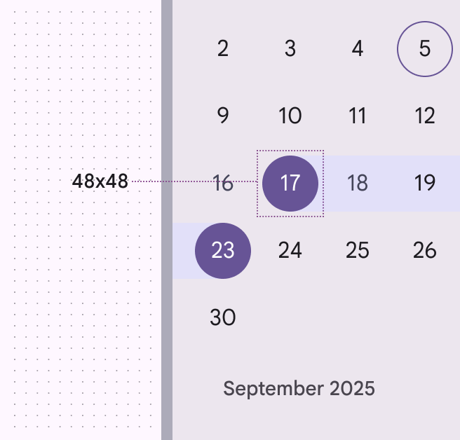
Interactive targets for all elements meet Material's 48x48dp minimum touch target requirement. Increasing density would negatively impact accessibilityAccessible design makes products usable for people with all kinds of abilities.More on accessibility by limiting tappable/clickable targets.
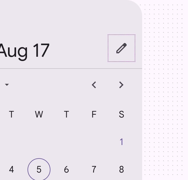
Date picker with the edit icon focused.
The edit icon indicates the ability to switch to the modal date input
Touch target used to select September 17 to 23 on a date picker.
Touch targets are 48x48dp

Date entry methods ​

The date entry component offers two ways to enter a date:

  • Direct text entry into a text field
  • Through the date picker

The calendar icon is the exclusive entry point for the date picker.

This improves efficiency for a screen reader and other keyboard users, as it makes interaction with the date picker optional and reduces the amount of key presses required to input a date.

Each input is a separate tab stop, which improves discoverability of the control.
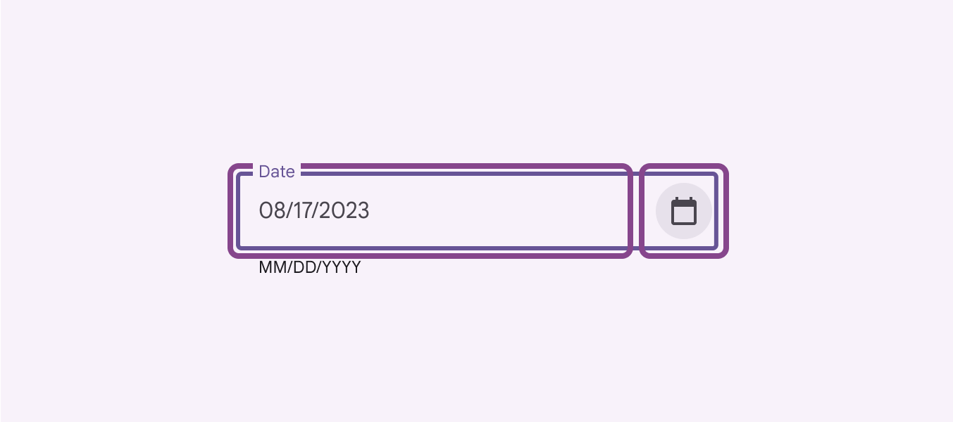
Text input field next to a date picker icon provides a choice of how to enter the date.
Entering a date either through direct text entry or the date picker

Accessible date input ​

Automatically format the date after the user hits "Enter" or navigates out of the text field. Don't automatically format the date by adding slashes or other special characters while the user is typing (also known as input masks). This can cause confusion for people using screen readers because it changes what they typed.

To reduce errors, accept a range of formats including dashes, spaces, slashes, dots, and 0 to the left of a single digit month/day. This is especially helpful for assistive technology users who might be more prone to errors when interacting with complex inputs.
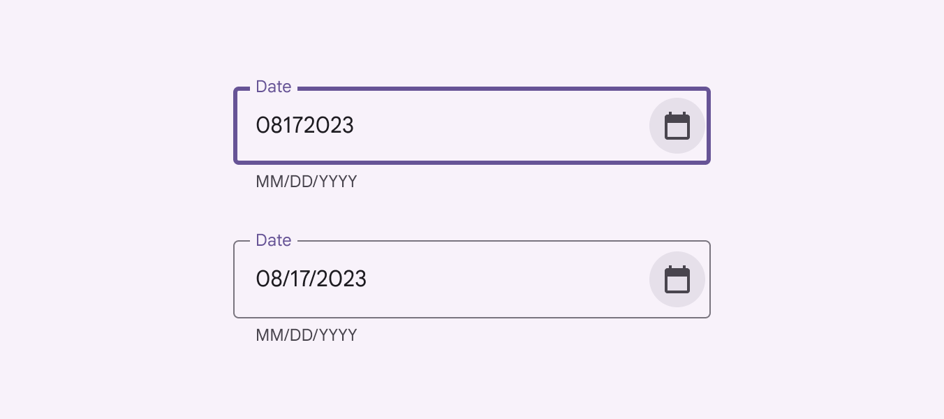
Numeric entry 08172323 automatically formatted to 08/17/2023.
The text field's logic can adapt to the user's actual input format, applying the correct formatting after the user has completed their text entry

Optional Clear button ​

If it's not needed for your use case, remove the Clear button from the screen to reduce the number of tab stops for keyboard users.
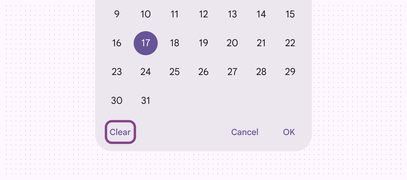
Optional clear button on lower left corner of a date picker.
Remove non-critical actions to reduce the number of tab stops for keyboard users

Affordance for keyboard shortcuts ​

Ensure keyboard shortcuts are readily available for keyboard and screen reader users by providing the shortcut key in the tooltipTooltips display brief labels or messages.More on tooltips. It should be included in the hint description to be read out by the screen reader.

As shown here, the previous year button is interactive and can therefore be focused via the keyboard. Upon focusA focused state communicates when a user has highlighted an element, using an input method such as a keyboard or voice.More on focused state, the tooltip explains the behavior of the button and shows the shortcut key.
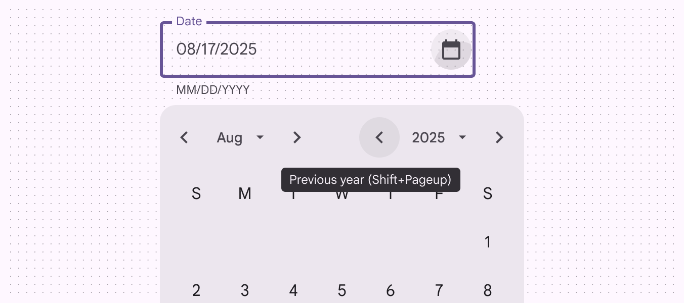
Shift + Page up is the keyboard shortcut to go to the previous year on a date picker.
Keyboard tooltip example for date picker

Truncated labels & tooltips ​

Truncating labels isn't ideal, but tooltips allow the full text to be shown on hoverA hover state communicates when a user has placed a cursor above an interactive element.More on hover state or keyboard focus.

Days of the week are not interactive and are therefore not focusable via keyboard, yet the tooltip is available on hover. The date picker relies on the conventionality of these abbreviations for some assistive technology users.
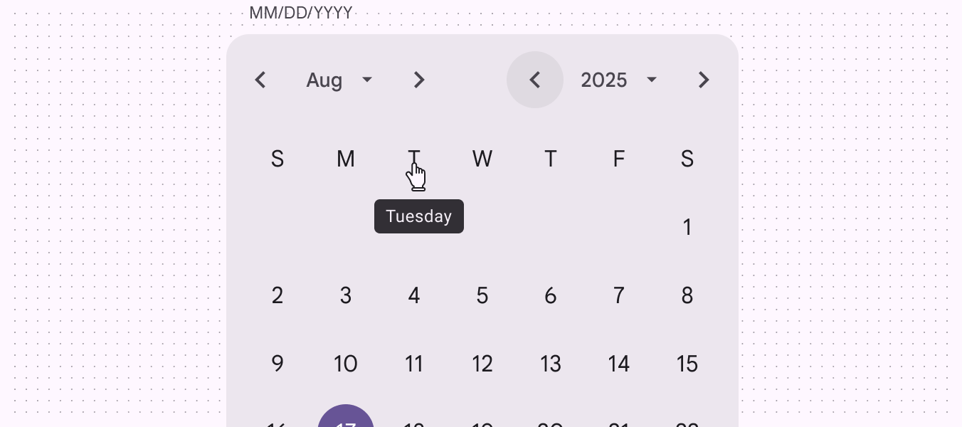
A pointer hover over the “T” day on a date picker produces the tooltip “Tuesday.”
Days of the week are not navigable via keyboard, so the tooltip is shown only on pointer hover

Color contrast between dates ​

Dates should have contrast of at least 4.5:1 between the link text colors and the background.
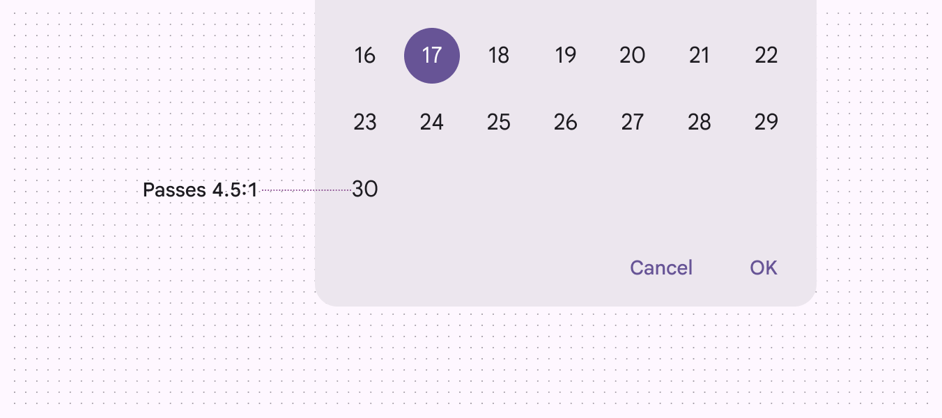
A date picker’s label text passes the color contrast minimum of 4.5:1.
Dates pass the 4.5:1 contrast minimum

Keyboard navigation ​

KeysActions
Enter/returnEnter/return
Enter/returnCloses the calendar and saves the selected date
Page up/downMove to the same date on next/previous month
Home/EndMove to the first day of the month
Shift + Page up/downMoves to the same date in the next/previous year
Shift + MMoves to the month list dropdown
Shift + YMoves to the year list dropdown

Labeling elements ​

The text field's accessibility label should clearly state the purpose of the input (for example, event date or reservation date) and should match the placeholder text when the field is empty.

The helper text (below the text field) should specify the date format (for example, MM/DD/YYYY or YYYY/MM/DD) and act as a description for the text field. The default helper text is "MM/DD/YYYY," but this can be customized.
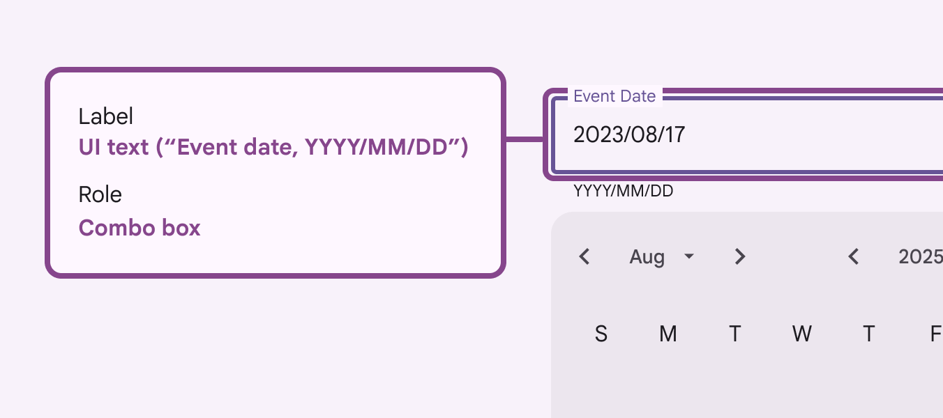
Text field accessibility labels.
The accessibility label clearly states the kind of input as an event date
ElementA11y labelRole
Previous / next month and year"{label}"Button
Month and year dropdowns"{label}"Button
Days of the weekColumn header
Month gridGrid

Screen reader verbalizations ​

To support screen reader users, labels are used to enumerate the complete date. This allows screen reader users to hear the full context of "Monday, August 17" instead of just part of the date.
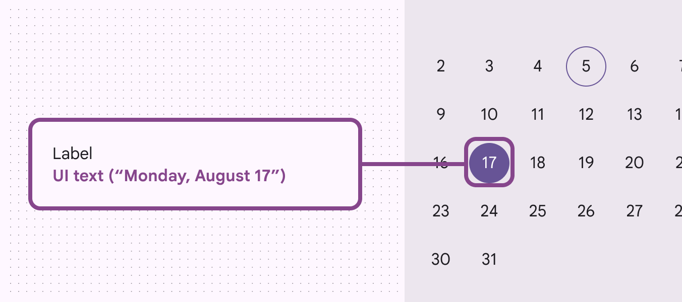
Current date label providing day, month, and year for screen reader accessibility.
Screen readers will state the full day, month, date, and year instead of just the number 17
Pager
Previous pageDate pickers: Guidelines
Next pageTime pickers: Overview

Released under the Apache 2.0 or CC BY 4.0

Copyright © 2018-Present Google

https://m3.material.io/components/date-pickers/accessibility

Released under the Apache 2.0 or CC BY 4.0

Copyright © 2018-Present Google