Skip to content
Material Design 3
Main Navigation
v3
v2
v1

English

简体中文
繁體中文
Español
Français
Русский
Português – Brasil
Deutsch
日本語
한국어
Italiano
Polski
Türkçe
čeština
magyar

English

简体中文
繁體中文
Español
Français
Русский
Português – Brasil
Deutsch
日本語
한국어
Italiano
Polski
Türkçe
čeština
magyar

Appearance

Sidebar Navigation

Foundations

Accessibility

Overview: Principles

Overview: Assistive technology

Designing: Overview

Designing: Color contrast

Designing: Structure

Designing: Flow

Designing: Elements

Writing and text: Best practices

Writing and text: Text truncation

Writing and text: Text resizing

Building for all: User needs

Building for all: Co-design

Content design

Overview

Alt text

Global writing: Overview

Global writing: Word choice

Notifications

Style guide: UX writing best practices

Style guide: Word choice

Style guide: Grammar and punctuation

Customizing Material

Devices

Watches: Overview

Watches: Foundations

Watches: Styles

Watches: Layout

XR

Design: Overview

Design: Interaction

Design: Layout

Design: Accessibility

Components: Overview

Components: App bars

Components: Dialogs

Components: Nav bar

Components: Nav rail

Components: Toolbars

Design tokens: Overview

Design tokens: How to use tokens

Interaction

Gestures

Inputs

Selection

States: Overview

States: State layers

States: Applying states

Layout

Overview: Overview

Overview: Parts of layout

Overview: Adaptive design

Scaffold: Overview

Scaffold: Bars

Scaffold: Rails

Scaffold: Panes

Grids & spacing: Overview

Grids & spacing: Grids

Grids & spacing: Spacing

Grids & spacing: Density

Breakpoints: Overview

Breakpoints: Compact

Breakpoints: Medium

Breakpoints: Expanded

Breakpoints: Large & extra-large

Bidirectionality & RTL

Canonical examples: Overview

Canonical examples: Feed

Canonical examples: List-detail

Canonical examples: Supporting pane

Usability: Overview

Usability: Applying M3 Expressive

Material A-Z

Styles

Color

Color system: Overview

Color system: How the system works

Color roles

Color schemes

Choosing a scheme

Static: Baseline

Static: Custom brand

Dynamic: Choosing a source

Dynamic: User-generated source

Dynamic: Content-based source

Advanced: Overview

Advanced: Apply colors

Advanced: Define new colors

Advanced: Adjust existing colors

Color resources

Elevation: Overview

Elevation: Applying elevation

Elevation: Tokens

Icons: Overview

Icons: Designing icons

Icons: Applying icons

Motion

Motion physics system: How it works

Motion physics system: Specs

Easing and duration: Applying easing and duration

Easing and duration: Tokens & specs

Transitions: Transition patterns

Transitions: Applying transitions

Shape: Overview & principles

Shape: Corner radius scale

Shape: Shape morph

Spacing: Overview

Spacing: Applying spacing

Spacing: Tokens

Typography: Overview

Typography: Fonts

Typography: Type scale & tokens

Typography: Applying type

Typography: Editorial treatments

Components

App bars: Overview

App bars: Specs

App bars: Guidelines

App bars: Accessibility

Badges: Overview

Badges: Specs

Badges: Guidelines

Badges: Accessibility

Buttons

All buttons

Button groups: Overview

Button groups: Specs

Button groups: Guidelines

Button groups: Accessibility

Buttons: Overview

Buttons: Specs

Buttons: Guidelines

Buttons: Accessibility

Extended FABs: Overview

Extended FABs: Specs

Extended FABs: Guidelines

Extended FABs: Accessibility

FAB menu: Overview

FAB menu: Specs

FAB menu: Guidelines

FAB menu: Accessibility

FABs: Overview

FABs: Specs

FABs: Guidelines

FABs: Accessibility

Icon buttons: Overview

Icon buttons: Specs

Icon buttons: Guidelines

Icon buttons: Accessibility

Segmented buttons: Overview

Segmented buttons: Specs

Segmented buttons: Guidelines

Segmented buttons: Accessibility

Split button: Overview

Split button: Specs

Split button: Guidelines

Split button: Accessibility

Cards: Overview

Cards: Specs

Cards: Guidelines

Cards: Accessibility

Carousel: Overview

Carousel: Specs

Carousel: Guidelines

Carousel: Accessibility

Checkbox: Overview

Checkbox: Specs

Checkbox: Guidelines

Checkbox: Accessibility

Chips: Overview

Chips: Specs

Chips: Guidelines

Chips: Accessibility

Date & time pickers

Date pickers: Overview

Date pickers: Specs

Date pickers: Guidelines

Date pickers: Accessibility

Time pickers: Overview

Time pickers: Specs

Time pickers: Guidelines

Time pickers: Accessibility

Dialogs: Overview

Dialogs: Specs

Dialogs: Guidelines

Dialogs: Accessibility

Divider: Overview

Divider: Specs

Divider: Guidelines

Divider: Accessibility

Lists: Overview

Lists: Specs

Lists: Guidelines

Lists: Accessibility

Loading & progress

Loading indicator: Overview

Loading indicator: Specs

Loading indicator: Guidelines

Loading indicator: Accessibility

Progress indicators: Overview

Progress indicators: Specs

Progress indicators: Guidelines

Progress indicators: Accessibility

Menus: Overview

Menus: Specs

Menus: Guidelines

Menus: Accessibility

Navigation

Navigation bar: Overview

Navigation bar: Specs

Navigation bar: Guidelines

Navigation bar: Accessibility

Navigation drawer: Overview

Navigation drawer: Specs

Navigation drawer: Guidelines

Navigation drawer: Accessibility

Navigation rail: Overview

Navigation rail: Specs

Navigation rail: Guidelines

Navigation rail: Accessibility

Radio button: Overview

Radio button: Specs

Radio button: Guidelines

Radio button: Accessibility

Search: Overview

Search: Specs

Search: Guidelines

Search: Accessibility

Sheets

Bottom sheets: Overview

Bottom sheets: Specs

Bottom sheets: Guidelines

Bottom sheets: Accessibility

Side sheets: Overview

Side sheets: Specs

Side sheets: Guidelines

Side sheets: Accessibility

Sliders: Overview

Sliders: Specs

Sliders: Guidelines

Sliders: Accessibility

Snackbar: Overview

Snackbar: Specs

Snackbar: Guidelines

Snackbar: Accessibility

Switch: Overview

Switch: Specs

Switch: Guidelines

Switch: Accessibility

Tabs: Overview

Tabs: Specs

Tabs: Guidelines

Tabs: Accessibility

Text fields: Overview

Text fields: Specs

Text fields: Guidelines

Text fields: Accessibility

Toolbars: Overview

Toolbars: Specs

Toolbars: Guidelines

Toolbars: Accessibility

Tooltips: Overview

Tooltips: Specs

Tooltips: Guidelines

Tooltips: Accessibility

On this page

Design for immersive XR: Layout ​

Resources and guidance for immersive extended reality (XR) devices


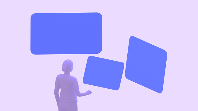
In XR, a layout extends beyond the screen into the physical world. Spatial panels, 3D models, and an immersive environment can be arranged anywhere on an infinite canvas.

Unlike mobile layouts which are constrained by screen edges, XR layouts must account for:

  • Depth on the Z-axis
  • Viewing distance
  • A person's field of view

More on Android XR layouts

An XR headset display can fully occlude the real world. This allows for complete immersion, with the physical environment replaced by a virtual one.

XR layout basics ​

The fundamental building block of an Android XR app is the spatial panel. Panels serve as containers for UI elements and can be spatially elevated alongside orbitersOrbiters are floating elements that control the content within spatial panels.More on orbiters, 3D models, and environments.

TIP

Spatial panels are available in full spaceFull space is Android XR’s immersive mode and supports spatial components.More on full space only. They aren't currently available in home spaceHome space is compatible with mobile and large screen apps, but doesn’t support spatial components.More on home space.

Spatial panels

In full space, spatial panelsIn Android XR, a spatial panel is a container for UI elements, interactive components, and immersive content.More on spatial panels are flexible canvases that can contain UI elements, media, and spatial video.

They often serve as the anchor for 3D models and orbiters.

Navigation UI can float in orbiters outside of a spatial panel

Size & position

Full space supports panel placement in both passthrough and virtual environments.

By default, spatial panels launch:

  • Size: 1024x720dp
  • 1.75 meters away from a person
  • With 32dp rounded corners

In full space, panels have no minimum size. The maximum panel size is 2560x1800dp.

When people switch from full space to home space, spatial panels usually stay in the same predictable position.
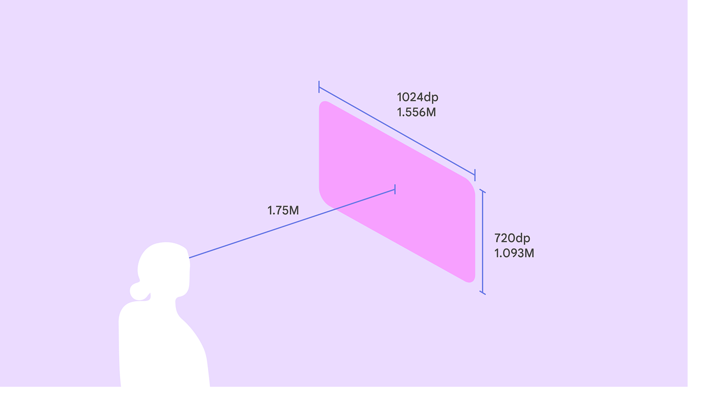
A visualization of a spatial panel 1.75 meters from a person.
At a 1.75 meter launch distance, a spatial panel's size is 1024x720dp
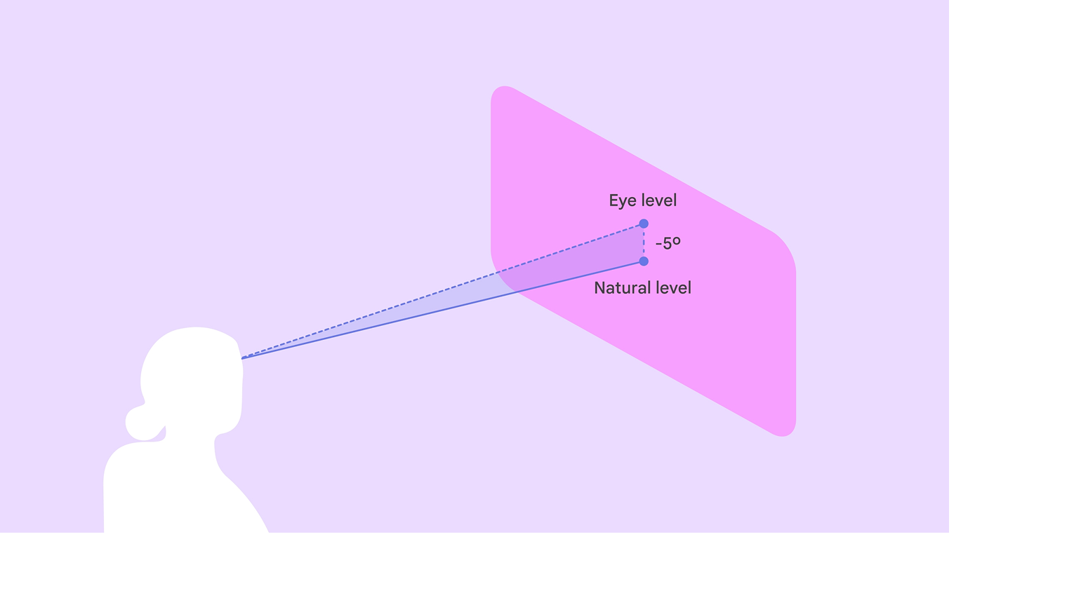
A diagram of a person looking at a spatial panel 5 degrees below eye level.
Place the panel's vertical center 5° below eye level to maximize comfort
An XR panel in the center 41 degrees of a person’s field of view.
Place primary content in the center 41° of a person’s field of view

Adaptive design

Spatial panels dynamically scale based on their distance from a person.

Material 3 components use adaptive design to ensure content automatically scales and reflows to remain legible and comfortable at any distance or angle.

To avoid system UI conflicts, stay within default movement limits:

  • Minimum depth: 0.75 meter
  • Maximum depth: 5 meters
A person can scale a spatial panel up or down so it's large enough to see clearly, no matter the distance. When they move the panel, Android XR automatically scales its size.

Grouping panels ​

In full spaceFull space is Android XR’s immersive mode and supports spatial components.More on full space, an app can be broken up into multiple spatial panels, arranged in a flat, curved, or arbitrary layout.
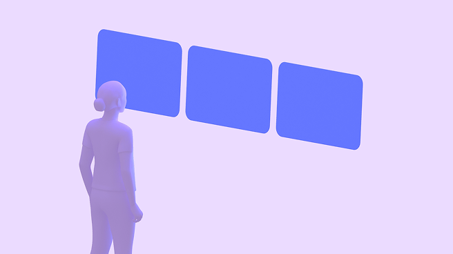
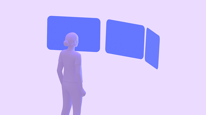
3 spatial panels in a flat, straight line in front of a person.
Flat layout: Panels are arranged in a straight line. Best for comparing information side by side.
3 spatial panels curved around a person.
Curved layout: Panels curve around the person. Best for immersive media or wide-format dashboards.
3 spatial panels, each in a unique position, angle, and size.
Arbitrary layout: Panels are placed freely in space. Best for multi-tasking.

Orbiters

An orbiterOrbiters are floating elements that control the content within spatial panels.More on orbiters is a floating element that accompanies a spatial panel.

Use orbiters for navigation UI that needs to stay accessible without obscuring the main content.

Material XR components automatically adapt into orbiters.

A navigation rail transforms into an orbiter in XR to give the UI more space

Spatial elevation & depth

Use the Z-axis to create volumetric UI. Unlike 2D elevation which uses shadows, volumetric UI uses actual depth.

  • Spatial elevation can create hierarchy, bring active elements forward, and push background elements back
  • Layering can separate UI layers physically. For example, a scrim can float several centimeters behind a dialog box.
A dialog using spatial elevation in Android XR

Behavior ​

Anchoring

In passthrough, layouts can interact with the physical world:

  • World-locked: Panels stay in a specific spot in the room, like a music player anchored to a table
  • Head-locked: Avoid locking UI directly to the person's head view, as it can feel jarring. Instead, use a lazy follow behavior where the UI gently drifts to catch up with the person's movement.
In passthrough, a spatial panel can be attached to a specific location in the real world, such as a table

Color contrast & dimming

When using standard surface tokensDesign tokens are the building blocks of all UI elements. The same tokens are used in designs, tools, and code.More on tokens, panels automatically handle contrast:

  • Passthrough: If the physical room is bright, the system dims the background to ensure the UI remains legible
  • Virtual environments: Panels adapt to the lighting of the virtual world

More on XR colors

Use bright, high-contrast colors to ensure the UI stands out against different backgrounds
Pager
Previous pageDesign: Interaction
Next pageDesign: Accessibility

Released under the Apache 2.0 or CC BY 4.0

Copyright © 2018-Present Google

https://m3.material.io/foundations/xr/design/layout

Released under the Apache 2.0 or CC BY 4.0

Copyright © 2018-Present Google