Skip to content
Material Design 3
Main Navigation
v3
v2
v1

English

简体中文
繁體中文
Español
Français
Русский
Português – Brasil
Deutsch
日本語
한국어
Italiano
Polski
Türkçe
čeština
magyar

English

简体中文
繁體中文
Español
Français
Русский
Português – Brasil
Deutsch
日本語
한국어
Italiano
Polski
Türkçe
čeština
magyar

Appearance

Sidebar Navigation

Foundations

Accessibility

Overview: Principles

Overview: Assistive technology

Designing: Overview

Designing: Color contrast

Designing: Structure

Designing: Flow

Designing: Elements

Writing and text: Best practices

Writing and text: Text truncation

Writing and text: Text resizing

Building for all: User needs

Building for all: Co-design

Content design

Overview

Alt text

Global writing: Overview

Global writing: Word choice

Notifications

Style guide: UX writing best practices

Style guide: Word choice

Style guide: Grammar and punctuation

Customizing Material

Devices

Watches: Overview

Watches: Foundations

Watches: Styles

Watches: Layout

XR

Design: Overview

Design: Interaction

Design: Layout

Design: Accessibility

Components: Overview

Components: App bars

Components: Dialogs

Components: Nav bar

Components: Nav rail

Components: Toolbars

Design tokens: Overview

Design tokens: How to use tokens

Interaction

Gestures

Inputs

Selection

States: Overview

States: State layers

States: Applying states

Layout

Overview: Overview

Overview: Parts of layout

Overview: Adaptive design

Scaffold: Overview

Scaffold: Bars

Scaffold: Rails

Scaffold: Panes

Grids & spacing: Overview

Grids & spacing: Grids

Grids & spacing: Spacing

Grids & spacing: Density

Breakpoints: Overview

Breakpoints: Compact

Breakpoints: Medium

Breakpoints: Expanded

Breakpoints: Large & extra-large

Bidirectionality & RTL

Canonical examples: Overview

Canonical examples: Feed

Canonical examples: List-detail

Canonical examples: Supporting pane

Usability: Overview

Usability: Applying M3 Expressive

Material A-Z

Styles

Color

Color system: Overview

Color system: How the system works

Color roles

Color schemes

Choosing a scheme

Static: Baseline

Static: Custom brand

Dynamic: Choosing a source

Dynamic: User-generated source

Dynamic: Content-based source

Advanced: Overview

Advanced: Apply colors

Advanced: Define new colors

Advanced: Adjust existing colors

Color resources

Elevation: Overview

Elevation: Applying elevation

Elevation: Tokens

Icons: Overview

Icons: Designing icons

Icons: Applying icons

Motion

Motion physics system: How it works

Motion physics system: Specs

Easing and duration: Applying easing and duration

Easing and duration: Tokens & specs

Transitions: Transition patterns

Transitions: Applying transitions

Shape: Overview & principles

Shape: Corner radius scale

Shape: Shape morph

Spacing: Overview

Spacing: Applying spacing

Spacing: Tokens

Typography: Overview

Typography: Fonts

Typography: Type scale & tokens

Typography: Applying type

Typography: Editorial treatments

Components

App bars: Overview

App bars: Specs

App bars: Guidelines

App bars: Accessibility

Badges: Overview

Badges: Specs

Badges: Guidelines

Badges: Accessibility

Buttons

All buttons

Button groups: Overview

Button groups: Specs

Button groups: Guidelines

Button groups: Accessibility

Buttons: Overview

Buttons: Specs

Buttons: Guidelines

Buttons: Accessibility

Extended FABs: Overview

Extended FABs: Specs

Extended FABs: Guidelines

Extended FABs: Accessibility

FAB menu: Overview

FAB menu: Specs

FAB menu: Guidelines

FAB menu: Accessibility

FABs: Overview

FABs: Specs

FABs: Guidelines

FABs: Accessibility

Icon buttons: Overview

Icon buttons: Specs

Icon buttons: Guidelines

Icon buttons: Accessibility

Segmented buttons: Overview

Segmented buttons: Specs

Segmented buttons: Guidelines

Segmented buttons: Accessibility

Split button: Overview

Split button: Specs

Split button: Guidelines

Split button: Accessibility

Cards: Overview

Cards: Specs

Cards: Guidelines

Cards: Accessibility

Carousel: Overview

Carousel: Specs

Carousel: Guidelines

Carousel: Accessibility

Checkbox: Overview

Checkbox: Specs

Checkbox: Guidelines

Checkbox: Accessibility

Chips: Overview

Chips: Specs

Chips: Guidelines

Chips: Accessibility

Date & time pickers

Date pickers: Overview

Date pickers: Specs

Date pickers: Guidelines

Date pickers: Accessibility

Time pickers: Overview

Time pickers: Specs

Time pickers: Guidelines

Time pickers: Accessibility

Dialogs: Overview

Dialogs: Specs

Dialogs: Guidelines

Dialogs: Accessibility

Divider: Overview

Divider: Specs

Divider: Guidelines

Divider: Accessibility

Lists: Overview

Lists: Specs

Lists: Guidelines

Lists: Accessibility

Loading & progress

Loading indicator: Overview

Loading indicator: Specs

Loading indicator: Guidelines

Loading indicator: Accessibility

Progress indicators: Overview

Progress indicators: Specs

Progress indicators: Guidelines

Progress indicators: Accessibility

Menus: Overview

Menus: Specs

Menus: Guidelines

Menus: Accessibility

Navigation

Navigation bar: Overview

Navigation bar: Specs

Navigation bar: Guidelines

Navigation bar: Accessibility

Navigation drawer: Overview

Navigation drawer: Specs

Navigation drawer: Guidelines

Navigation drawer: Accessibility

Navigation rail: Overview

Navigation rail: Specs

Navigation rail: Guidelines

Navigation rail: Accessibility

Radio button: Overview

Radio button: Specs

Radio button: Guidelines

Radio button: Accessibility

Search: Overview

Search: Specs

Search: Guidelines

Search: Accessibility

Sheets

Bottom sheets: Overview

Bottom sheets: Specs

Bottom sheets: Guidelines

Bottom sheets: Accessibility

Side sheets: Overview

Side sheets: Specs

Side sheets: Guidelines

Side sheets: Accessibility

Sliders: Overview

Sliders: Specs

Sliders: Guidelines

Sliders: Accessibility

Snackbar: Overview

Snackbar: Specs

Snackbar: Guidelines

Snackbar: Accessibility

Switch: Overview

Switch: Specs

Switch: Guidelines

Switch: Accessibility

Tabs: Overview

Tabs: Specs

Tabs: Guidelines

Tabs: Accessibility

Text fields: Overview

Text fields: Specs

Text fields: Guidelines

Text fields: Accessibility

Toolbars: Overview

Toolbars: Specs

Toolbars: Guidelines

Toolbars: Accessibility

Tooltips: Overview

Tooltips: Specs

Tooltips: Guidelines

Tooltips: Accessibility

On this page

Global writing: Word choice ​

Use global examples & explain local references

References to local places, holidays, and companies won’t always make sense to global audiences.

Empty wishlist screen that references the holidays
Do Use generalized, global examples. Most countries and cultures have holidays.
Empty wishlist screen that references Christmas
Don’t Don’t call out a specific country or culture’s holiday

If it doesn’t make sense to use a global example, explain the reference in the message description so the translator can substitute a locale-specific example. Some instances where local references should be called out include:

  • Locations
  • Names (common first names and nicknames)
  • Currencies
  • Temperatures
  • Date formats
  • Providers (internet and cable)
Empty state that references New York with message description about replacing New York with a well-known city in other languages
Caution Help translators understand the context by adding message descriptions

Use short, simple sentences

Break text into shorter sentences. Use bullets or separate content into sections with headings.

Other languages average at 1.5 times longer than English, so text that’s short may be long when translated.

2 screens side by side, in English and German
Many languages, like German, are longer than English

Avoid abbreviations

Abbreviations don’t translate well and can be confusing out of context. Spell things out whenever possible.

However, common abbreviations for time are acceptable.

Dialog with options that aren’t abbreviated
Do Use clear names to refer to things
Dialog with options that are abbreviated
Caution Avoid abbreviations. If they're used, provide their meaning in message descriptions.

Clarify pronouns

Using pronouns, like “it,” can get tricky when translators are working with small, unconnected strings of text and when nouns have genders in many languages. Repeat the noun, or clarify the noun in a message description.

Photo app with snackbar that reads “Couldn’t move photo”
Do Using nouns instead of, or in addition to, pronouns can help clarify future and past user actions
Photo app with snackbar that reads “Couldn’t move it to ‘Travel’ folder because it’s unavailable”
Don’t Avoid using pronouns when it’s unclear what nouns they’re referring to, especially when explaining user actions

Clarify “this” and “that”

Don’t start a sentence with "this" or "that" unless it's immediately followed by the noun. When the noun is unclear, the sentence is more difficult to translate.

Form with clear writing that doesn’t use “this” or “that”
Do Make sure it’s clear who text is referring to
Form with a subhead that reads “This can be seen by your IT administrator.” It’s not clear what “this” refers to.
Don’t Avoid using “this” and “that”

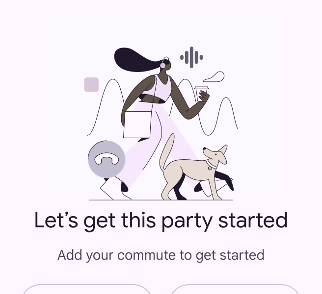
Avoid idiomatic, colloquial, and polite expressions

Idiomatic or colloquial phrases can be confusing if the meaning isn’t clear. If you use them, clarify the purpose and context of the phrase to help the translator choose an appropriate alternative.

Avoid polite expressions, such as “Please,” “Sorry,” and “Thank you,” especially in error messages. However, "please" may be used when asking the user to do something inconvenient.
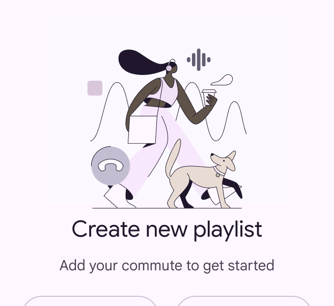
Empty state with illustration that reads “Let’s go”
Do Clear, everyday language can be used in an expressive and whimsical way when paired with imagery
Empty state with illustration that reads “Let’s get this party started”
Don’t Idiomatic phrases can be difficult for everyone to understand and for translators to localize

Reduce technical jargon

Technical terms don't always translate. Descriptions should be simple, and in some cases literal, to avoid confusion when translating.

Dialog that prompts people to sign up to try new products
Do Plain language is easier for everyone to understand
Wordy and confusing dialog that prompts people to sign up for new communication preferences
Don’t Confusing language makes it difficult for people to understand the actions they’re taking

Clarify ambiguities

Some words have multiple meanings. For example, “traffic,” “filter,” and “change” can be used as either nouns or verbs. Avoid using both meanings of the word in the same string or body of text. If a word has the potential to be confusing, provide as much context as possible in the message description so the translation will be accurate.

Screen displaying devices and speakers at home, next to bottom app bar with “home” button
Clarify words that have multiple meanings. “Home” could reference a homepage or where someone lives.
Pager
Previous pageGlobal writing: Overview
Next pageNotifications

Released under the Apache 2.0 or CC BY 4.0

Copyright © 2018-Present Google

https://m3.material.io/foundations/content-design/global-writing/word-choice

Released under the Apache 2.0 or CC BY 4.0

Copyright © 2018-Present Google