

Tabs: Specs
Tabs organize content across different screens and views
Tokens and specs
Browse the component elements, attributes, tokens, and their values. Learn about design tokens
Tabs - Primary navigation
Tabs - Secondary navigation
Primary tabs
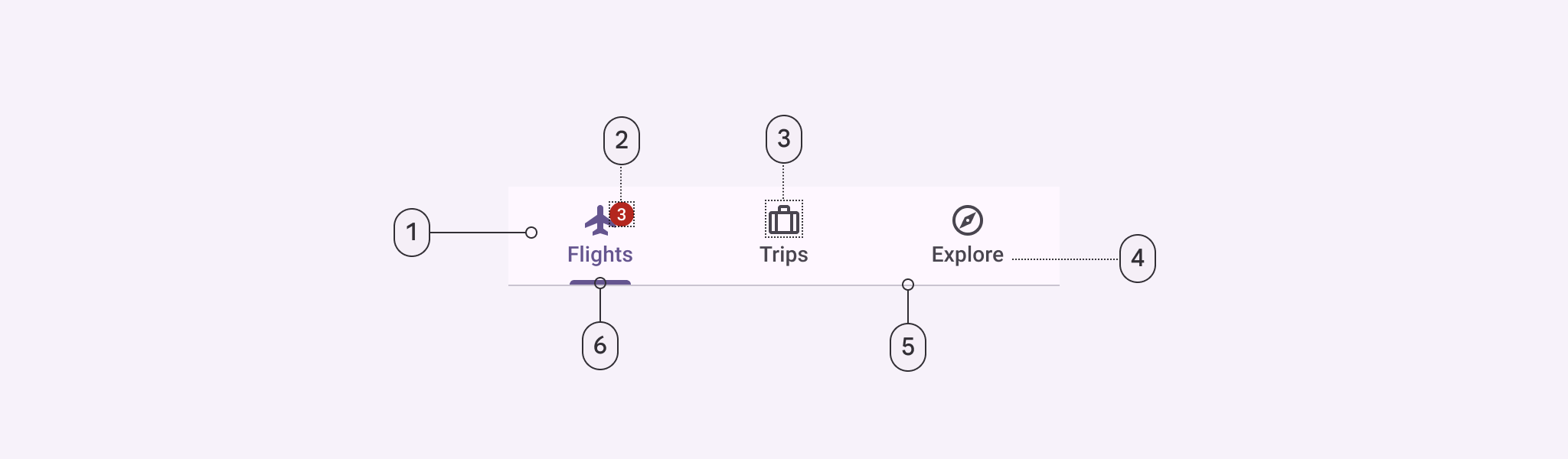
- Container
- Badge (optional)
- Icon (optional)
- Label
- Divider
- Active indicator
Primary tabs color
Color values are implemented through design tokens. For design, this means working with color values that correspond with tokens. For implementation, a color value will be a token that references a value. Learn more about design tokens
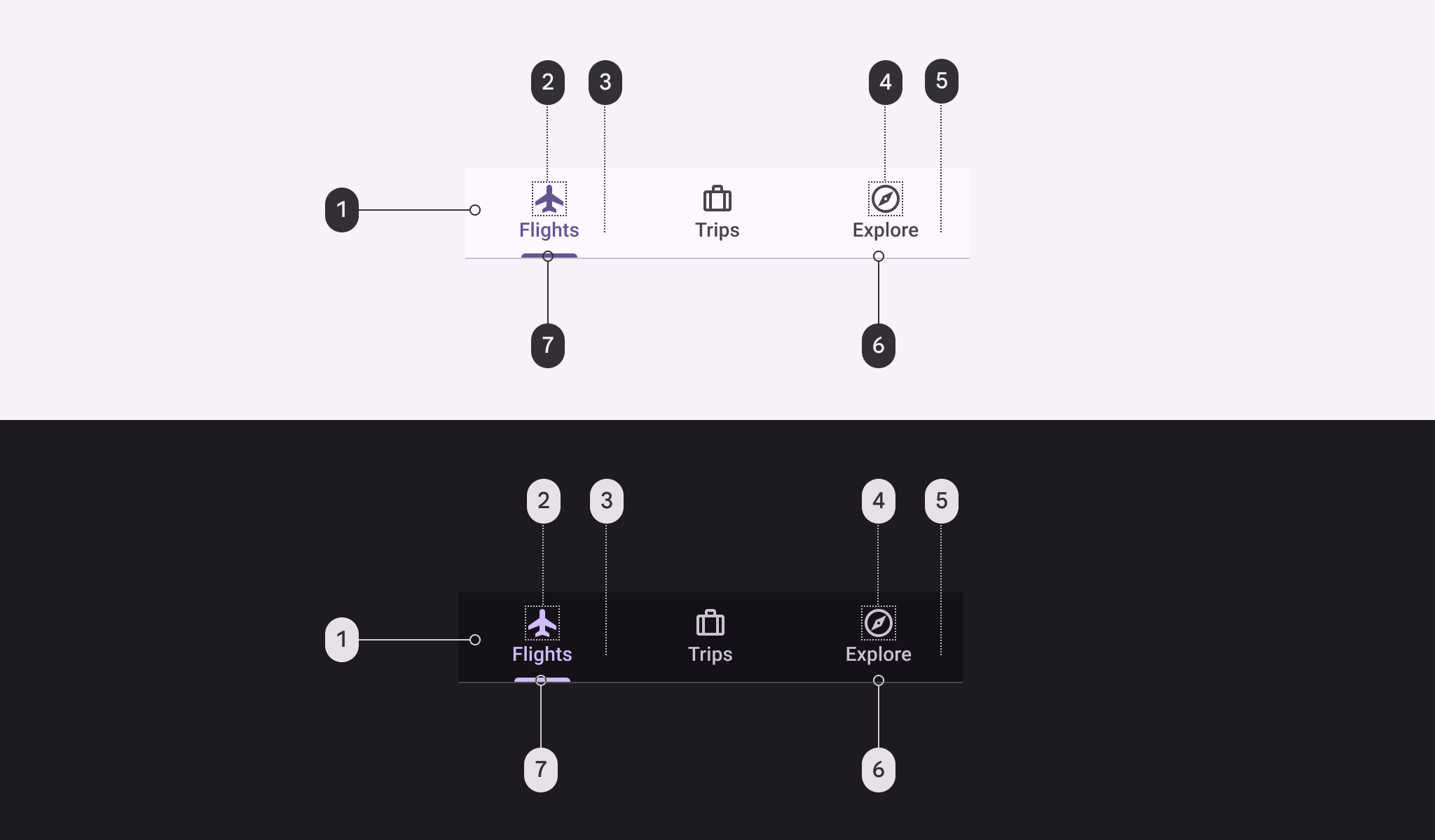
Primary tab color roles used for light and dark schemes:
- Surface
- Primary
- Primary
- On surface variant
- On surface variant
- Outline variant
- Primary
Primary tabs states
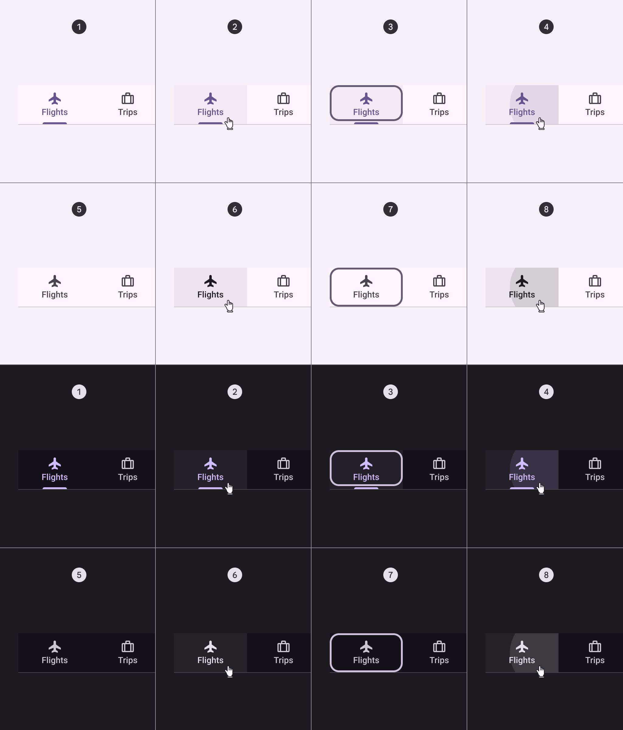
- Enabled (active destination)
- Hover (active destination)
- Focused (active destination)
- Pressed (active destination)
- Enabled (inactive destination)
- Hover (inactive destination)
- Focused (inactive destination)
- Pressed (inactive destination)
Secondary tabs
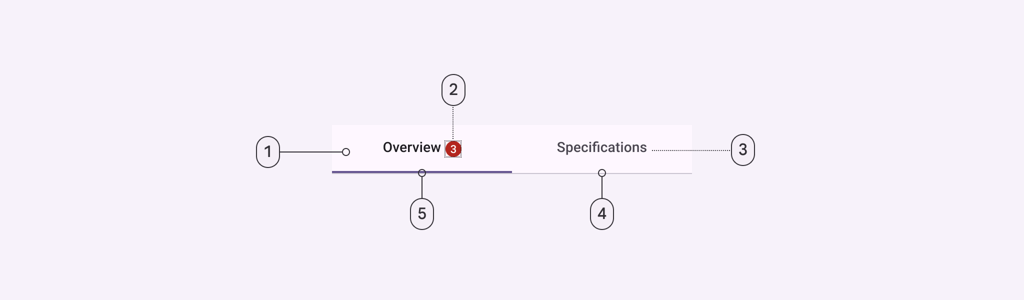
- Container
- Badge (optional)
- Label
- Divider
- Active indicator
Secondary tabs color
Color values are implemented through design tokens. For design, this means working with color values that correspond with tokens. For implementation, a color value will be a token that references a value. Learn more about design tokens
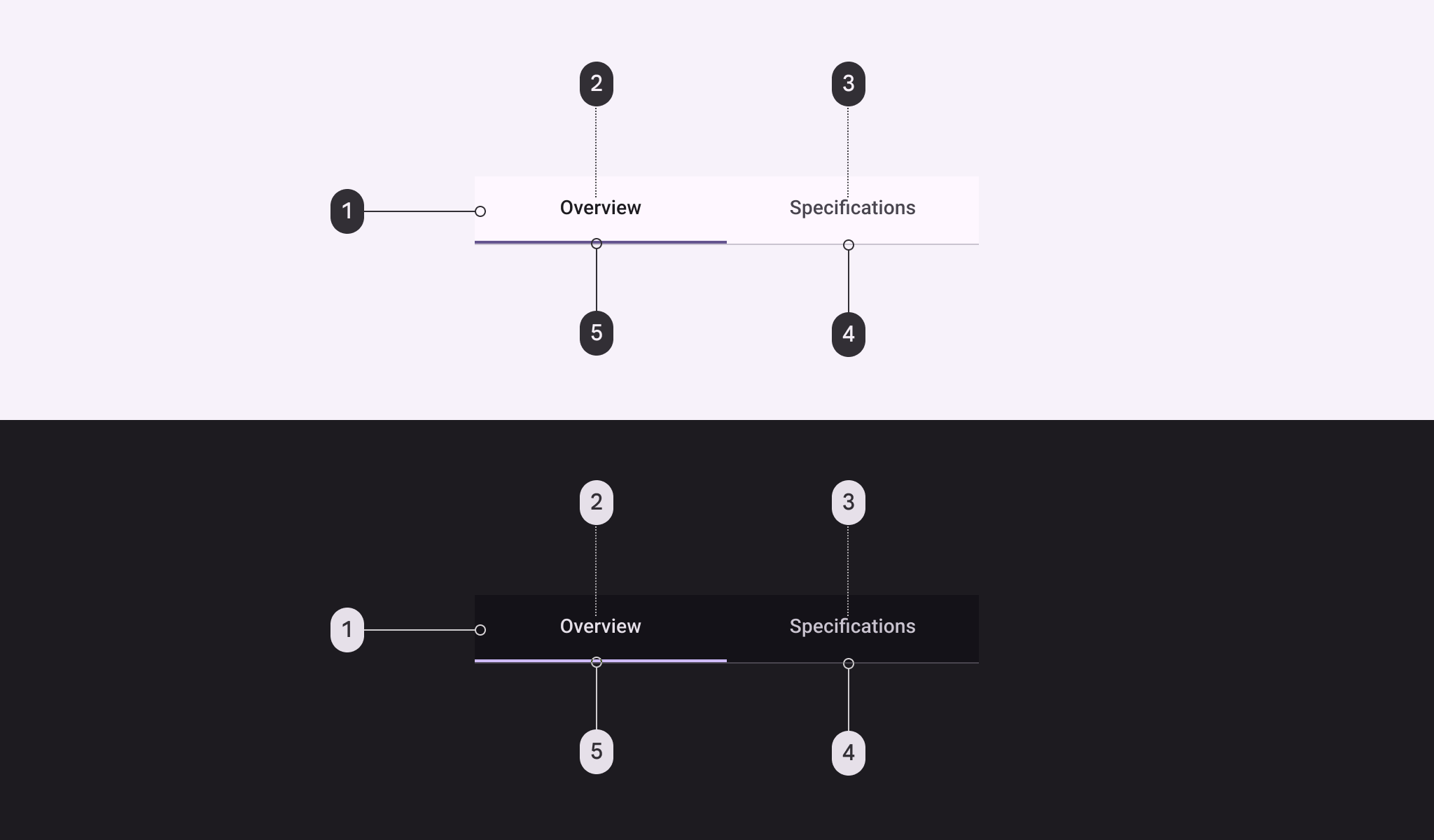
Secondary tab color roles used for light and dark schemes:
- Surface
- On surface
- On surface variant
- Outline variant
- Primary
Secondary tabs states
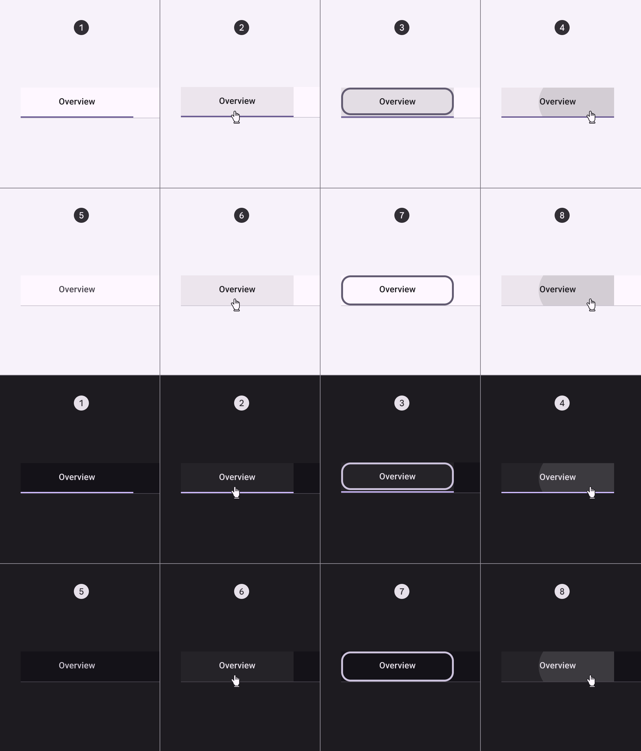
- Enabled (active destination)
- Hover (active destination)
- Focused (active destination)
- Pressed (active destination)
- Enabled (inactive destination)
- Hover (inactive destination)
- Focused (inactive destination)
- Pressed (inactive destination)
Measurements
| Attribute | Value |
|---|---|
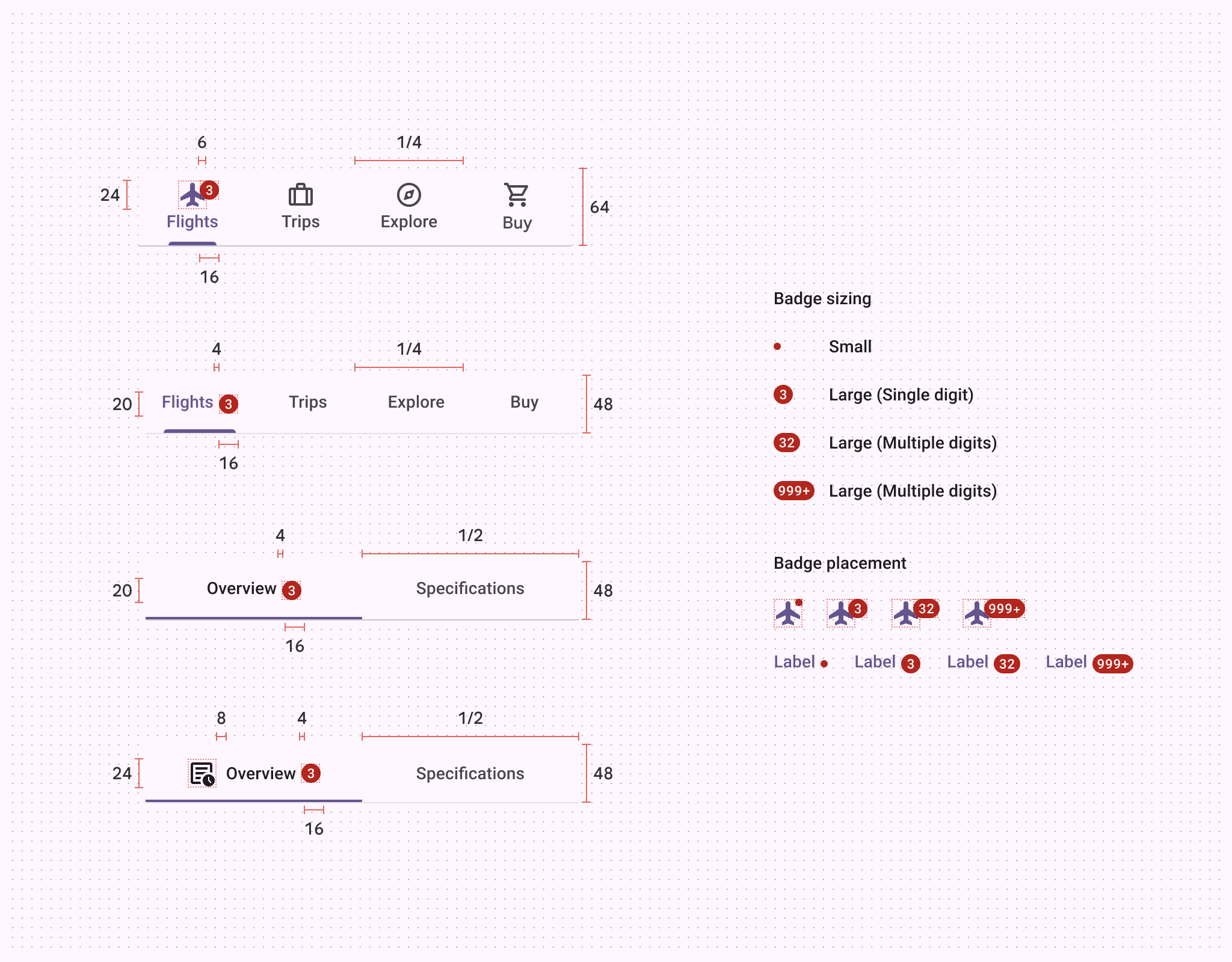
| Container height (label text only) | 48dp |
| Container height (icon and label text) | 64dp |
| Icon size | 24dp |
| Divider height | 1dp |
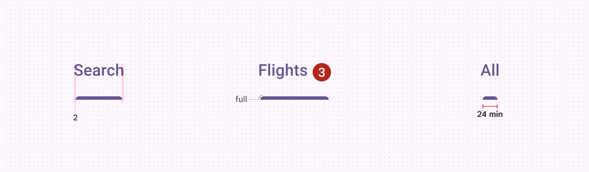
| Primary active indicator height | 3dp |
| Secondary active indicator height | 2dp |
| Active indicator shape | 3, 3, 0, 0 |
| Active indicator minimum length | 24dp |
| Padding between inline icon and text | 8dp |
| Padding between inline text and badge | 4dp |
| Overlap of badge on stacked icon | 6dp |