Skip to content
Material Design 3
Main Navigation
v3
v2
v1

English

简体中文
繁體中文
Español
Français
Русский
Português – Brasil
Deutsch
日本語
한국어
Italiano
Polski
Türkçe
čeština
magyar

English

简体中文
繁體中文
Español
Français
Русский
Português – Brasil
Deutsch
日本語
한국어
Italiano
Polski
Türkçe
čeština
magyar

Appearance

Sidebar Navigation

Foundations

Accessibility

Overview: Principles

Overview: Assistive technology

Designing: Overview

Designing: Color contrast

Designing: Structure

Designing: Flow

Designing: Elements

Writing and text: Best practices

Writing and text: Text truncation

Writing and text: Text resizing

Building for all: User needs

Building for all: Co-design

Content design

Overview

Alt text

Global writing: Overview

Global writing: Word choice

Notifications

Style guide: UX writing best practices

Style guide: Word choice

Style guide: Grammar and punctuation

Customizing Material

Devices

Watches: Overview

Watches: Foundations

Watches: Styles

Watches: Layout

XR

Design: Overview

Design: Interaction

Design: Layout

Design: Accessibility

Components: Overview

Components: App bars

Components: Dialogs

Components: Nav bar

Components: Nav rail

Components: Toolbars

Design tokens: Overview

Design tokens: How to use tokens

Interaction

Gestures

Inputs

Selection

States: Overview

States: State layers

States: Applying states

Layout

Overview: Overview

Overview: Parts of layout

Overview: Adaptive design

Scaffold: Overview

Scaffold: Bars

Scaffold: Rails

Scaffold: Panes

Grids & spacing: Overview

Grids & spacing: Grids

Grids & spacing: Spacing

Grids & spacing: Density

Breakpoints: Overview

Breakpoints: Compact

Breakpoints: Medium

Breakpoints: Expanded

Breakpoints: Large & extra-large

Bidirectionality & RTL

Canonical examples: Overview

Canonical examples: Feed

Canonical examples: List-detail

Canonical examples: Supporting pane

Usability: Overview

Usability: Applying M3 Expressive

Material A-Z

Styles

Color

Color system: Overview

Color system: How the system works

Color roles

Color schemes

Choosing a scheme

Static: Baseline

Static: Custom brand

Dynamic: Choosing a source

Dynamic: User-generated source

Dynamic: Content-based source

Advanced: Overview

Advanced: Apply colors

Advanced: Define new colors

Advanced: Adjust existing colors

Color resources

Elevation: Overview

Elevation: Applying elevation

Elevation: Tokens

Icons: Overview

Icons: Designing icons

Icons: Applying icons

Motion

Motion physics system: How it works

Motion physics system: Specs

Easing and duration: Applying easing and duration

Easing and duration: Tokens & specs

Transitions: Transition patterns

Transitions: Applying transitions

Shape: Overview & principles

Shape: Corner radius scale

Shape: Shape morph

Spacing: Overview

Spacing: Applying spacing

Spacing: Tokens

Typography: Overview

Typography: Fonts

Typography: Type scale & tokens

Typography: Applying type

Typography: Editorial treatments

Components

App bars: Overview

App bars: Specs

App bars: Guidelines

App bars: Accessibility

Badges: Overview

Badges: Specs

Badges: Guidelines

Badges: Accessibility

Buttons

All buttons

Button groups: Overview

Button groups: Specs

Button groups: Guidelines

Button groups: Accessibility

Buttons: Overview

Buttons: Specs

Buttons: Guidelines

Buttons: Accessibility

Extended FABs: Overview

Extended FABs: Specs

Extended FABs: Guidelines

Extended FABs: Accessibility

FAB menu: Overview

FAB menu: Specs

FAB menu: Guidelines

FAB menu: Accessibility

FABs: Overview

FABs: Specs

FABs: Guidelines

FABs: Accessibility

Icon buttons: Overview

Icon buttons: Specs

Icon buttons: Guidelines

Icon buttons: Accessibility

Segmented buttons: Overview

Segmented buttons: Specs

Segmented buttons: Guidelines

Segmented buttons: Accessibility

Split button: Overview

Split button: Specs

Split button: Guidelines

Split button: Accessibility

Cards: Overview

Cards: Specs

Cards: Guidelines

Cards: Accessibility

Carousel: Overview

Carousel: Specs

Carousel: Guidelines

Carousel: Accessibility

Checkbox: Overview

Checkbox: Specs

Checkbox: Guidelines

Checkbox: Accessibility

Chips: Overview

Chips: Specs

Chips: Guidelines

Chips: Accessibility

Date & time pickers

Date pickers: Overview

Date pickers: Specs

Date pickers: Guidelines

Date pickers: Accessibility

Time pickers: Overview

Time pickers: Specs

Time pickers: Guidelines

Time pickers: Accessibility

Dialogs: Overview

Dialogs: Specs

Dialogs: Guidelines

Dialogs: Accessibility

Divider: Overview

Divider: Specs

Divider: Guidelines

Divider: Accessibility

Lists: Overview

Lists: Specs

Lists: Guidelines

Lists: Accessibility

Loading & progress

Loading indicator: Overview

Loading indicator: Specs

Loading indicator: Guidelines

Loading indicator: Accessibility

Progress indicators: Overview

Progress indicators: Specs

Progress indicators: Guidelines

Progress indicators: Accessibility

Menus: Overview

Menus: Specs

Menus: Guidelines

Menus: Accessibility

Navigation

Navigation bar: Overview

Navigation bar: Specs

Navigation bar: Guidelines

Navigation bar: Accessibility

Navigation drawer: Overview

Navigation drawer: Specs

Navigation drawer: Guidelines

Navigation drawer: Accessibility

Navigation rail: Overview

Navigation rail: Specs

Navigation rail: Guidelines

Navigation rail: Accessibility

Radio button: Overview

Radio button: Specs

Radio button: Guidelines

Radio button: Accessibility

Search: Overview

Search: Specs

Search: Guidelines

Search: Accessibility

Sheets

Bottom sheets: Overview

Bottom sheets: Specs

Bottom sheets: Guidelines

Bottom sheets: Accessibility

Side sheets: Overview

Side sheets: Specs

Side sheets: Guidelines

Side sheets: Accessibility

Sliders: Overview

Sliders: Specs

Sliders: Guidelines

Sliders: Accessibility

Snackbar: Overview

Snackbar: Specs

Snackbar: Guidelines

Snackbar: Accessibility

Switch: Overview

Switch: Specs

Switch: Guidelines

Switch: Accessibility

Tabs: Overview

Tabs: Specs

Tabs: Guidelines

Tabs: Accessibility

Text fields: Overview

Text fields: Specs

Text fields: Guidelines

Text fields: Accessibility

Toolbars: Overview

Toolbars: Specs

Toolbars: Guidelines

Toolbars: Accessibility

Tooltips: Overview

Tooltips: Specs

Tooltips: Guidelines

Tooltips: Accessibility

On this page

Elevation: Applying elevation ​

Elevation is the distance between two surfaces on the z-axis


Material 3’s elevation system is deliberately limited to just a handful of levels. This creative constraint means you need to make thoughtful decisions about your UI’s elevation story.
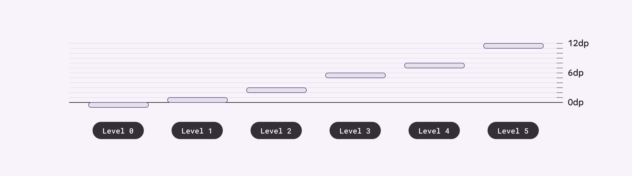
Diagram showing the 5 elevation levels and their respective dp values.
Material uses six levels of elevation, each with a corresponding dp value. These values are named for their relative distance above the UI’s surface: 0, +1, +2, +3, +4, and +5. An element’s resting state can be on levels 0 to +3, while levels +4 and +5 are reserved for user-interacted states such as hover and dragged.

Depicting elevation ​

Elevation can be depicted using shadows or other visual cues, such as surface fills with a tone difference or scrims.

To successfully depict elevation, a surface must show:

  • Surface edges, contrasting the surface from its surroundings
  • Overlap with other surfaces, either at rest or in motion
  • Distance from other surfaces
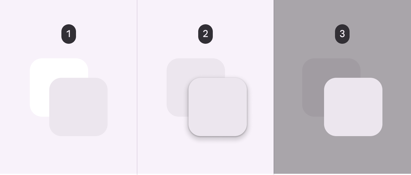
3 images. The first shows a violet square overlapping a white square. The second shows 2 overlapping squares with the same color, but with shadows beneath the top square. The third shows a violet square overlapping a dark gray square.
  1. Two overlapping surfaces with distinct tonal values
  2. Two overlapping surfaces with the same tonal values separated via shadow
  3. Two overlapping surfaces with the same tonal values separated via scrim

Tonal difference ​

Tonal difference between surfaces helps to express the tactile quality of Material surfaces. They show where one surface ends and another begins by separating different parts of a UI into identifiable components. For example, the edges of an app bar show that it's separate from a grid list, communicating to the user that the grid list scrolls independently of the app bar.

By default, Material 3's surfaces use tonal difference to indicate separation. Other methods can be used to indicate edges, such as:

  • Giving surfaces a drop shadow
  • Placing a scrim behind a surface
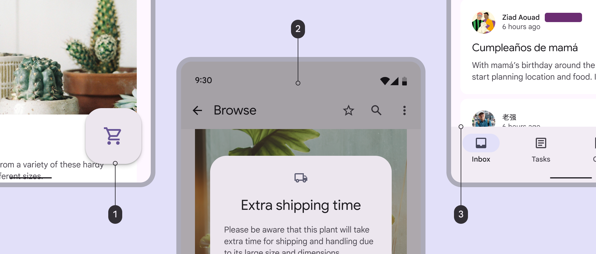
Elevation, scrim, and tonal differences used to indicate separation.
  1. A FAB's elevation helps separate it from body content

  2. A scrim appears below a modal to communicate importance

  3. Tonal differences between a navigation bar and body content indicate separate surfaces

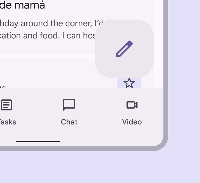
For interactive components, edges must create sufficient contrast between surfaces (by meeting or exceeding accessible contrast ratios) for them to be seen as separate from one another.
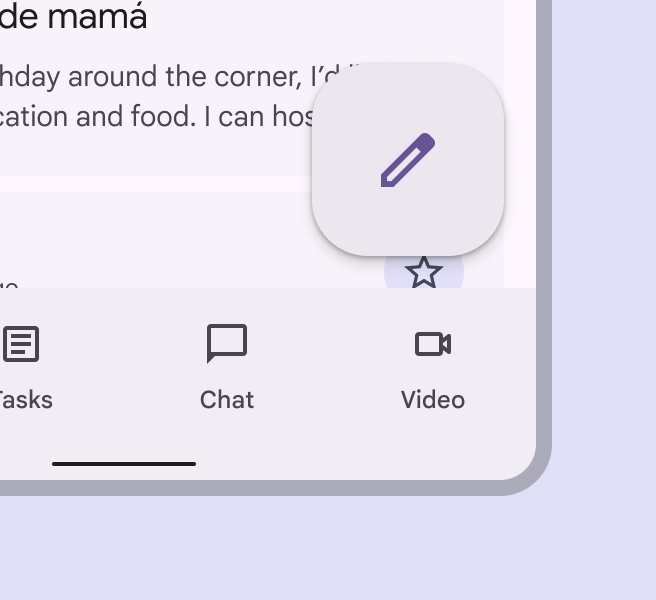
FAB separated from the surface beneath it using a shadow.
Do Ensure floating elements have sufficient contrast with surfaces beneath
FAB without shadows, insufficiently separated from the surface beneath it.
Don’t Don't use colors with insufficient contrast. The relationship between surfaces must be clear.

Surface color roles & elevation ​

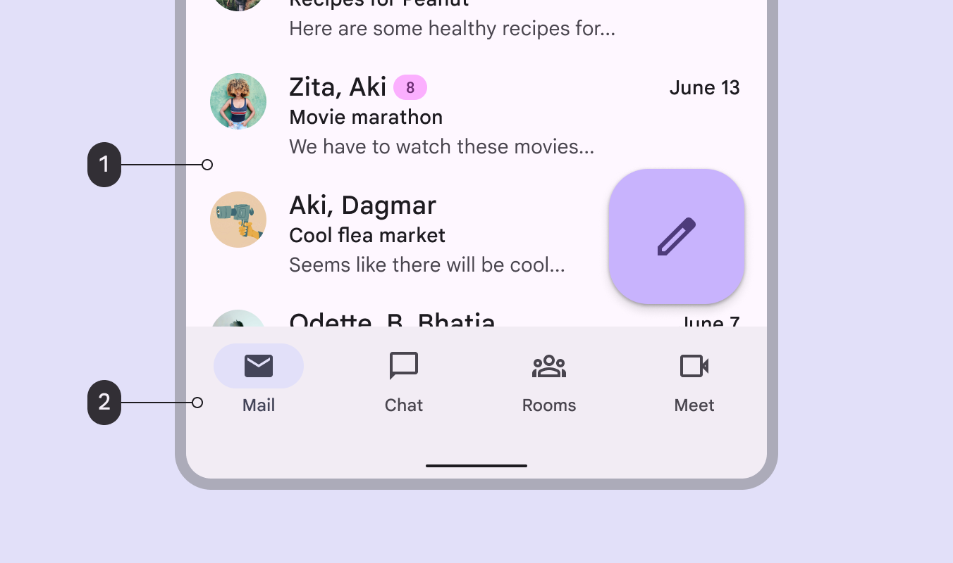
You can pick from a range of surface and surface container color roles. These roles are not tied to elevation, and provide flexibility for defining containment areas.

Any overlapping containment areas or components should have different color roles in order to visually communicate separation.
More on surface color roles

Diagram of email home screen with "1" indicating the list item background color and "2" indicating the navigation bar background color.
  1. Surface
  2. Surface container

Shadows ​

Shadows can express the degree of elevation between surfaces in ways that other techniques can't.

Both a shadow’s size and amount of softness or diffusion express the degree of distance between two surfaces. For example, a surface with a shadow that's small and sharp indicates a surface’s close proximity to the surface behind it. Larger, softer shadows express more distance.
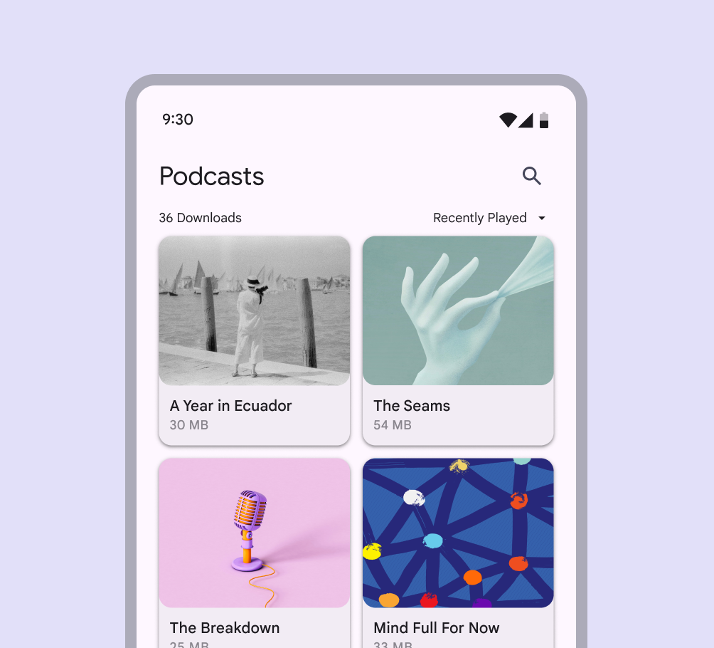
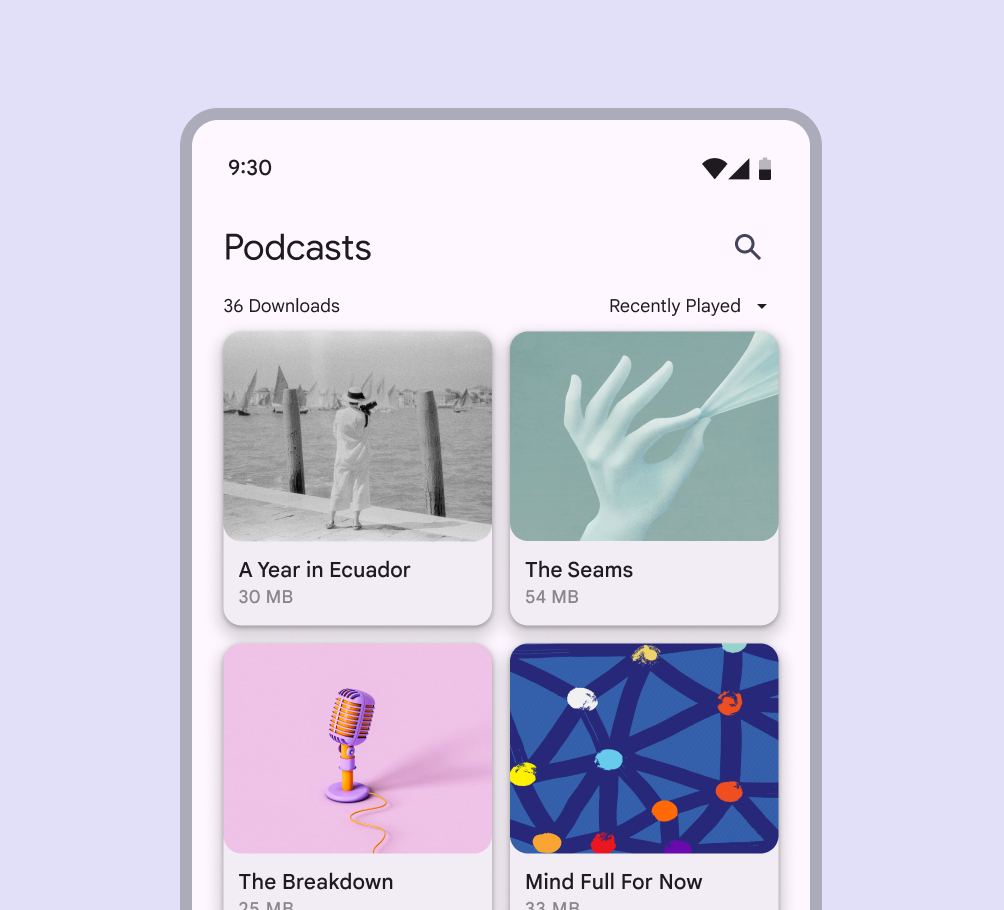
Podcast app with each show displayed as a card separated from the background using small dark shadows.
Smaller, sharper shadows indicate a surface’s close proximity to the surface behind it
Podcast app with each show displayed as a card separated from the background using more fuzzy and diffused shadows.
Larger, softer shadows express more distance between a surface and the one behind it

When it comes to applying shadows, less is more. The fewer levels in your UI, the more power they have to direct attention and action.

When to use visible shadows ​

Protect elements

When a background is patterned or visually busy, the hairline style might not provide sufficient protection. In these cases, use elevation to separate and emphasize elements such as cards, chips, or buttons.
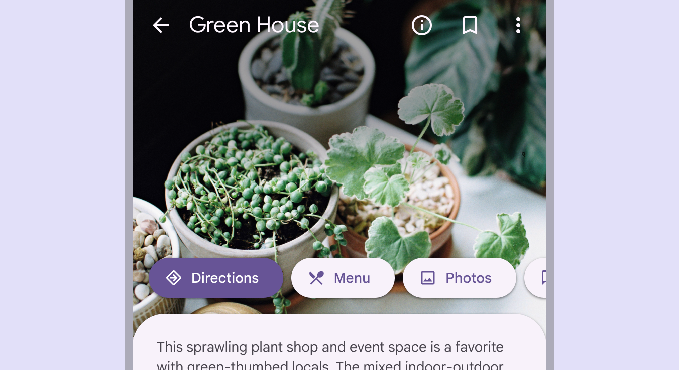
Buttons with shadows separating them from a background image.
Interactive elements are emphasized with elevation

Encourage interaction

Elements can temporarily lift on focus, selection, or another kind of interaction, like swipe. A raised element can also lower when a higher element appears.

Elevation encourages interaction

Scrims ​

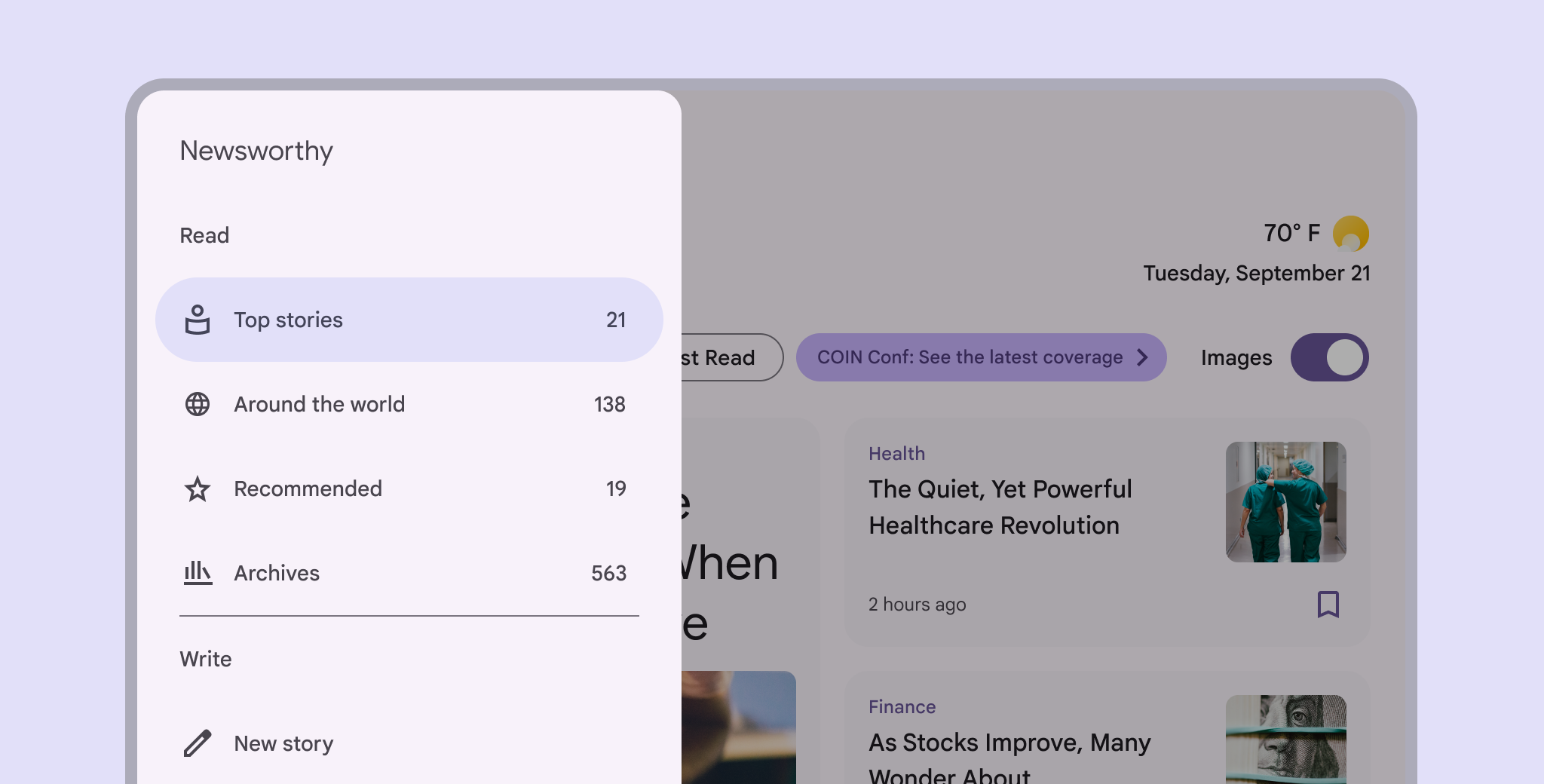
A scrim can bring focus to specific elements by increasing the visual contrast of a large layered surface. Use the scrim beneath elements like modals and expanded navigation menus.

Scrims use the scrim color roleColor roles are assigned to UI elements based on emphasis, container type, and relationship with other elements. This ensures proper contrast and usage in any color scheme. at an opacity of 32%.

Large screen news app with a navigation rail separated from the body content by a scrim.
Scrims help bring focus to important elements like the navigation rail
Pager
Previous pageElevation: Overview
Next pageElevation: Tokens

Released under the Apache 2.0 or CC BY 4.0

Copyright © 2018-Present Google

https://m3.material.io/styles/elevation/applying-elevation

Released under the Apache 2.0 or CC BY 4.0

Copyright © 2018-Present Google