Skip to content
Material Design 3
Main Navigation
v3
v2
v1

English

简体中文
繁體中文
Español
Français
Русский
Português – Brasil
Deutsch
日本語
한국어
Italiano
Polski
Türkçe
čeština
magyar

English

简体中文
繁體中文
Español
Français
Русский
Português – Brasil
Deutsch
日本語
한국어
Italiano
Polski
Türkçe
čeština
magyar

Appearance

Sidebar Navigation

Foundations

Accessibility

Overview: Principles

Overview: Assistive technology

Designing: Overview

Designing: Color contrast

Designing: Structure

Designing: Flow

Designing: Elements

Writing and text: Best practices

Writing and text: Text truncation

Writing and text: Text resizing

Building for all: User needs

Building for all: Co-design

Content design

Overview

Alt text

Global writing: Overview

Global writing: Word choice

Notifications

Style guide: UX writing best practices

Style guide: Word choice

Style guide: Grammar and punctuation

Customizing Material

Devices

Watches: Overview

Watches: Foundations

Watches: Styles

Watches: Layout

XR

Design: Overview

Design: Interaction

Design: Layout

Design: Accessibility

Components: Overview

Components: App bars

Components: Dialogs

Components: Nav bar

Components: Nav rail

Components: Toolbars

Design tokens: Overview

Design tokens: How to use tokens

Interaction

Gestures

Inputs

Selection

States: Overview

States: State layers

States: Applying states

Layout

Overview: Overview

Overview: Parts of layout

Overview: Adaptive design

Scaffold: Overview

Scaffold: Bars

Scaffold: Rails

Scaffold: Panes

Grids & spacing: Overview

Grids & spacing: Grids

Grids & spacing: Spacing

Grids & spacing: Density

Breakpoints: Overview

Breakpoints: Compact

Breakpoints: Medium

Breakpoints: Expanded

Breakpoints: Large & extra-large

Bidirectionality & RTL

Canonical examples: Overview

Canonical examples: Feed

Canonical examples: List-detail

Canonical examples: Supporting pane

Usability: Overview

Usability: Applying M3 Expressive

Material A-Z

Styles

Color

Color system: Overview

Color system: How the system works

Color roles

Color schemes

Choosing a scheme

Static: Baseline

Static: Custom brand

Dynamic: Choosing a source

Dynamic: User-generated source

Dynamic: Content-based source

Advanced: Overview

Advanced: Apply colors

Advanced: Define new colors

Advanced: Adjust existing colors

Color resources

Elevation: Overview

Elevation: Applying elevation

Elevation: Tokens

Icons: Overview

Icons: Designing icons

Icons: Applying icons

Motion

Motion physics system: How it works

Motion physics system: Specs

Easing and duration: Applying easing and duration

Easing and duration: Tokens & specs

Transitions: Transition patterns

Transitions: Applying transitions

Shape: Overview & principles

Shape: Corner radius scale

Shape: Shape morph

Spacing: Overview

Spacing: Applying spacing

Spacing: Tokens

Typography: Overview

Typography: Fonts

Typography: Type scale & tokens

Typography: Applying type

Typography: Editorial treatments

Components

App bars: Overview

App bars: Specs

App bars: Guidelines

App bars: Accessibility

Badges: Overview

Badges: Specs

Badges: Guidelines

Badges: Accessibility

Buttons

All buttons

Button groups: Overview

Button groups: Specs

Button groups: Guidelines

Button groups: Accessibility

Buttons: Overview

Buttons: Specs

Buttons: Guidelines

Buttons: Accessibility

Extended FABs: Overview

Extended FABs: Specs

Extended FABs: Guidelines

Extended FABs: Accessibility

FAB menu: Overview

FAB menu: Specs

FAB menu: Guidelines

FAB menu: Accessibility

FABs: Overview

FABs: Specs

FABs: Guidelines

FABs: Accessibility

Icon buttons: Overview

Icon buttons: Specs

Icon buttons: Guidelines

Icon buttons: Accessibility

Segmented buttons: Overview

Segmented buttons: Specs

Segmented buttons: Guidelines

Segmented buttons: Accessibility

Split button: Overview

Split button: Specs

Split button: Guidelines

Split button: Accessibility

Cards: Overview

Cards: Specs

Cards: Guidelines

Cards: Accessibility

Carousel: Overview

Carousel: Specs

Carousel: Guidelines

Carousel: Accessibility

Checkbox: Overview

Checkbox: Specs

Checkbox: Guidelines

Checkbox: Accessibility

Chips: Overview

Chips: Specs

Chips: Guidelines

Chips: Accessibility

Date & time pickers

Date pickers: Overview

Date pickers: Specs

Date pickers: Guidelines

Date pickers: Accessibility

Time pickers: Overview

Time pickers: Specs

Time pickers: Guidelines

Time pickers: Accessibility

Dialogs: Overview

Dialogs: Specs

Dialogs: Guidelines

Dialogs: Accessibility

Divider: Overview

Divider: Specs

Divider: Guidelines

Divider: Accessibility

Lists: Overview

Lists: Specs

Lists: Guidelines

Lists: Accessibility

Loading & progress

Loading indicator: Overview

Loading indicator: Specs

Loading indicator: Guidelines

Loading indicator: Accessibility

Progress indicators: Overview

Progress indicators: Specs

Progress indicators: Guidelines

Progress indicators: Accessibility

Menus: Overview

Menus: Specs

Menus: Guidelines

Menus: Accessibility

Navigation

Navigation bar: Overview

Navigation bar: Specs

Navigation bar: Guidelines

Navigation bar: Accessibility

Navigation drawer: Overview

Navigation drawer: Specs

Navigation drawer: Guidelines

Navigation drawer: Accessibility

Navigation rail: Overview

Navigation rail: Specs

Navigation rail: Guidelines

Navigation rail: Accessibility

Radio button: Overview

Radio button: Specs

Radio button: Guidelines

Radio button: Accessibility

Search: Overview

Search: Specs

Search: Guidelines

Search: Accessibility

Sheets

Bottom sheets: Overview

Bottom sheets: Specs

Bottom sheets: Guidelines

Bottom sheets: Accessibility

Side sheets: Overview

Side sheets: Specs

Side sheets: Guidelines

Side sheets: Accessibility

Sliders: Overview

Sliders: Specs

Sliders: Guidelines

Sliders: Accessibility

Snackbar: Overview

Snackbar: Specs

Snackbar: Guidelines

Snackbar: Accessibility

Switch: Overview

Switch: Specs

Switch: Guidelines

Switch: Accessibility

Tabs: Overview

Tabs: Specs

Tabs: Guidelines

Tabs: Accessibility

Text fields: Overview

Text fields: Specs

Text fields: Guidelines

Text fields: Accessibility

Toolbars: Overview

Toolbars: Specs

Toolbars: Guidelines

Toolbars: Accessibility

Tooltips: Overview

Tooltips: Specs

Tooltips: Guidelines

Tooltips: Accessibility

On this page

Style guide: Grammar and punctuation ​

UI text should be understandable by anyone, anywhere


This style guide is specific to English-language UX writing. Google generally follows Associated Press (AP) style.

Skip periods and unnecessary punctuation

To help readers scan text, avoid using periods and other unnecessary punctuation.

Avoid using periods to end single sentences, particularly in:

  • Labels
  • Tooltip text
  • Bulleted lists
  • Dialog body text
  • Hyperlinked text

Use periods on:

  • Multiple sentences
  • Long or complex sentences, if it suits the context
Example of a period removed at the end of a short sentence on a snackbar.
Do Omit punctuation on single-line sentences
Example of a period used at the end of a short sentence on a snackbar.
Don't Avoid using periods to end single sentences

Use contractions

Contractions can make a sentence easier to understand and scan.

However, sometimes "do not" can give more emphasis than "don't" when caution is needed.
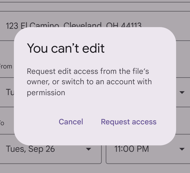
Dialog with the title "You can't edit".
Do Avoid spelling out words that can be contractions
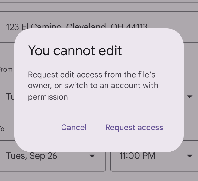
Dialog with the title "You cannot edit".
Don't Phrases that aren't contracted can feel stiff or overly formal

Use serial commas

Use the serial (or Oxford) comma, except before an ampersand.

Always place commas inside quotation marks.
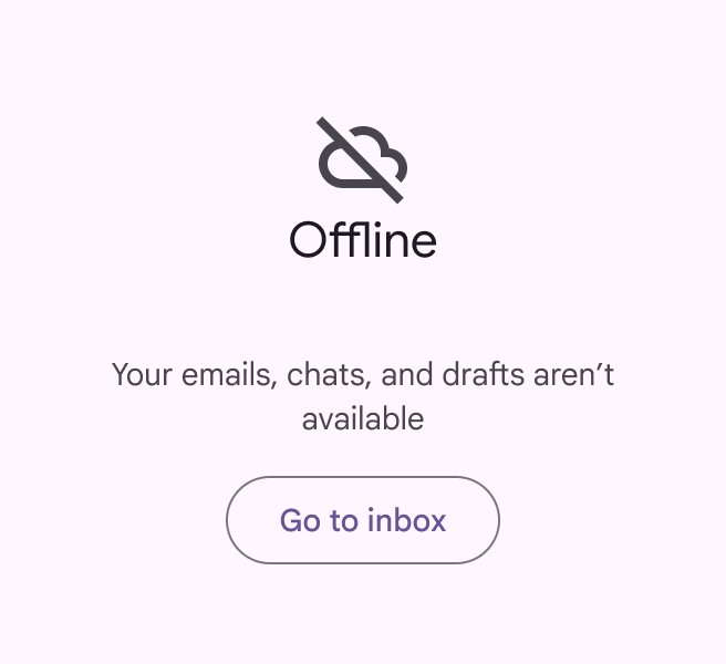
Serial comma used in an information text containing 3 items.
Do Use a serial comma in lists of three or more items
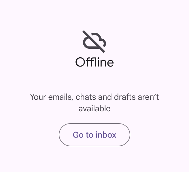
Serial comma not used in an information text containing 3 items.
Don't Don't skip serial commas before "and"

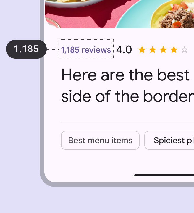
Use commas for numbers between 1,000 and 1 million

Use commas for numbers over 1,000. Don't use commas when identifying something, such as a:

  • Street address
  • Radio frequency
  • Year

For numbers over 1 million, comma use depends on context. "Million" can be abbreviated with "M" and the value can be rounded when the intent is to give people a sense of the volume, rather than the exact numbers.

Music app showing song with 23 million views, which is abbreviated to 23M
Do Abbreviate "million" with "M" and don't use commas when giving people a sense of volume
Restaurant with 1,185 reviews, without abbreviation
Do Use commas in numbers between 1,000 and 1 million

Skip colons in headings

For headings on lists of items, do not use colons. For lists within body text, use a colon.
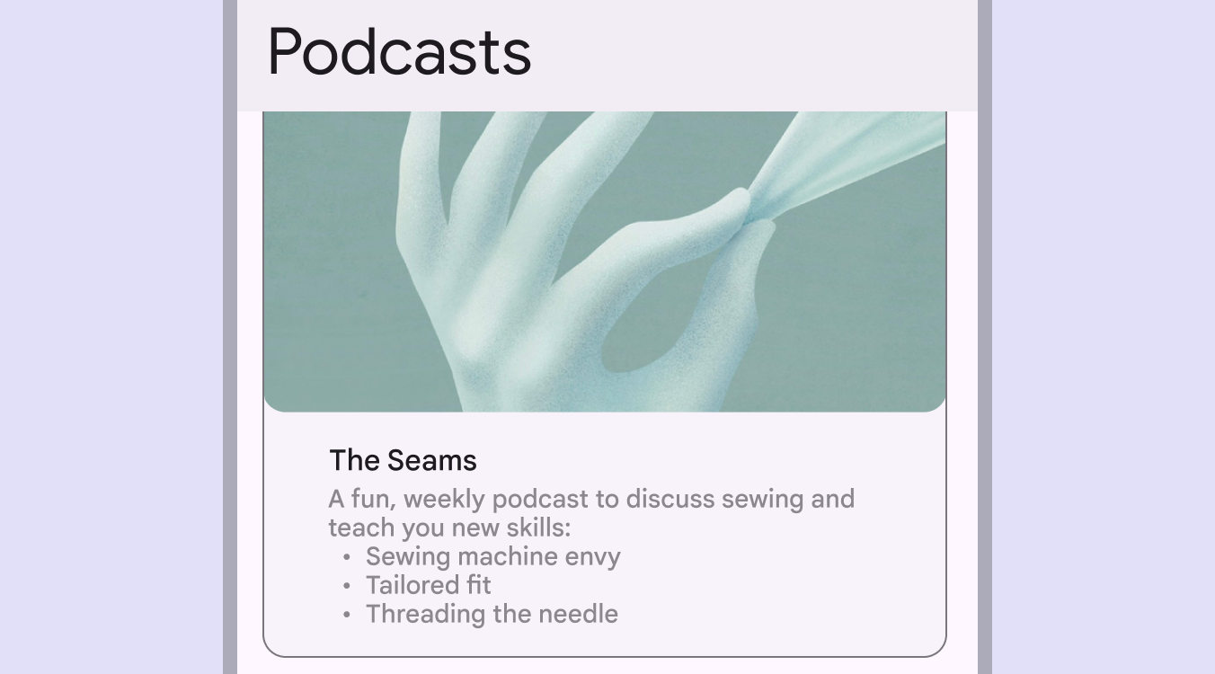
Colon used after the introduction statement for a list.
Use colons for lists within body text

Use exclamation points sparingly

Exclamation points can come across as shouting or overly friendly. Some exceptions include greetings or congratulatory messages.

Exclamation mark used after "Congratulations".
Do Exclamation marks can be used to emphasize celebratory moments
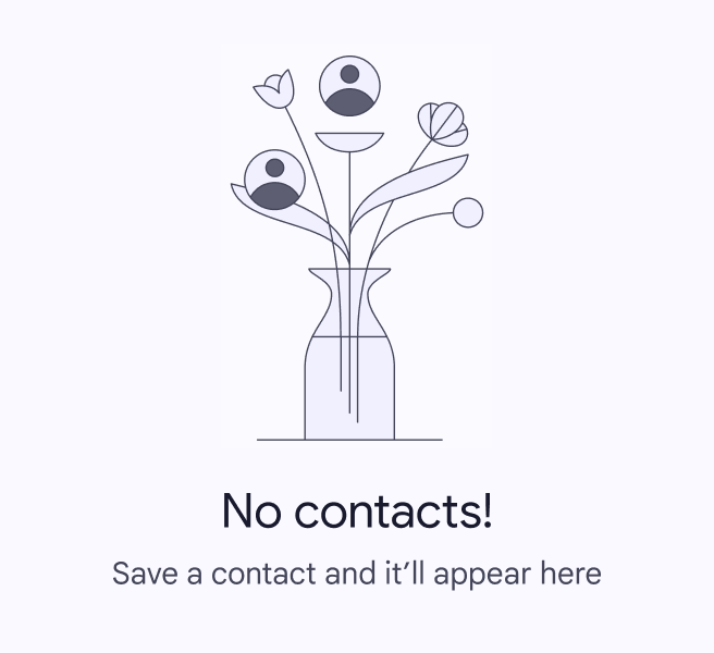
Exclamation mark used after a general statement.
Don't Avoid using exclamation marks for empty states and common tasks. Save it for bigger accomplishments.

Use ellipses sparingly

Use ellipses to indicate an action in progress or incomplete text. Truncated text may appear with ellipses, but check with your engineering partners before implementing, as this often happens automatically.

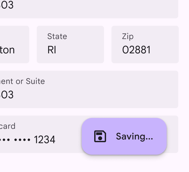
Don't add a space before ellipses. Omit ellipses from menu items or buttons that open a dialog or start a process.
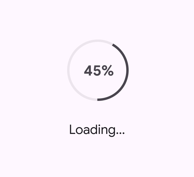
A process indicator shows a 45% completion state.
Do Ellipses show an action in progress
A button as part of a form has text saying "Saving" following by an ellipses.
Don't Don't use ellipses in buttons or menu items

Use parentheses to define terms

Parentheses can be used to define acronyms or jargon or when referencing a source. They shouldn't be used when adding a side note or an afterthought of a sentence.

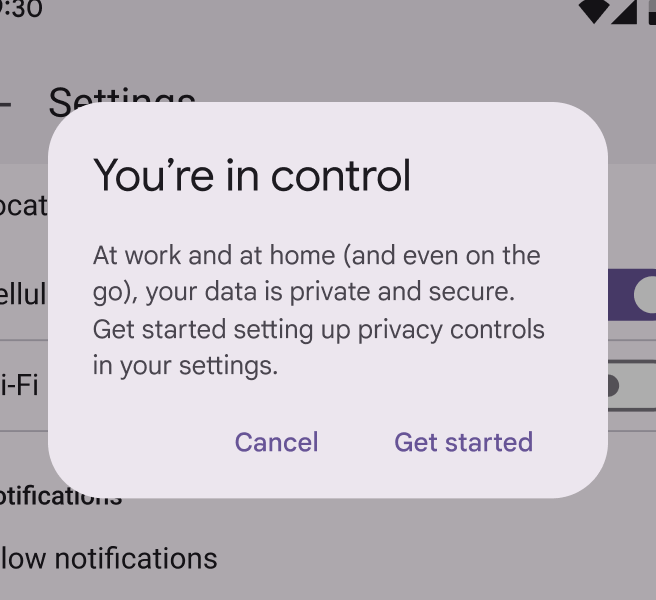
Parentheses used to define an acronym.
Do Use parentheses to define terms and jargon
Parentheses used for adding an additional thought to a statement.
Don't Don't use parentheses to add extra thoughts. If information is needed, include it in the sentence without parentheses for easier scanning and improved comprehension.

Skip ampersands in body text

The "&" symbol can be used instead of "and" in headlines, column headers, table headers, navigation labels, and buttons. However, when there's room, spelling out "and" can improve readability and make scanning easier.

"And" should be spelled out in sentences and paragraphs, before the final item in a 3+ item list, and in email subject lines.

Ampersand used in a heading.
Caution Ampersands can be used in headlines where there's limited space
Ampersand used in an email subject line.
Don't Avoid ampersands in email subject lines

Use dashes with caution

Dashes and hyphens can interrupt a sentence and lead to a fragmented experience, so they should be used with caution. There are three kinds of dashes:

  • Em dash: —
  • En dash: –
  • Hyphen: -

Em dashes are best avoided in UX writing, as they indicate a break in the flow of a sentence that could be simplified using a comma, period, or new sentence.

Use an en dash without spaces to indicate a range, such as 9 AM–Noon.
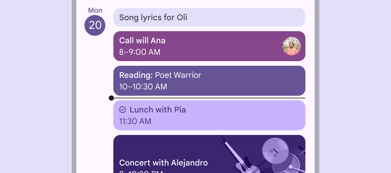
En dash used for time range.
Use an en dash without spaces for ranges

Use hyphens with care ​

Hyphens can help readers better understand how words relate to each other by binding closely related words. They can also be used to represent negative numbers, such as -100. Spaces should never be used surrounding hyphens.

Refer to the Associated Press (AP) style guidelines if you are unsure whether an adjective or noun phrase needs a hyphen.

RuleExamplesWhy
Hyphenate adjective phrasesCase-by-case basis
Best-in-class performance
Once-in-a-lifetime opportunity
When multiple words are used together as an adjective, they should be hyphenated
Cell phone number
Chocolate chip cookie
However, proper nouns and common, easily understood adjective phrases don't need to be, such as "cell phone number" or "chocolate chip cookie"
Hyphenate noun phrases
A noun phrase is two or more words acting as a noun. These phrases are hyphenated in certain cases:
Sign-off
Drive-through
Go-ahead
Hyphenate a noun phrase if it contains a verb followed by an adverb
Higher-up
Most-read
Hyphenate an adjective phrase that is functioning as a noun
Jack-of-all-trades
Stick-in-the-mud
Some noun phrases, especially long or complicated ones, are always hyphenated
Don't hyphenate verb phrases
A verb phrase is two or more words acting as a verb. These should not be hyphenated.
Look out for falling rocks
Please drive in and drop off your car
Check in to the room when you arrive
Don't hyphenate a verb followed by an adverb or preposition if it's functioning as a verb phrase. For example, "check in" would not need a hyphen when used as a verb, such as "check in to the room," rather than as a noun, like "the next check-in." Also, note that since "in" is a part of the verb, it can't be combined with "to" to form "into," since check into doesn't mean the same as check in to.

Use italics sparingly

Italics typically aren't easy to read. When emphasizing text, use bold weight instead.

However, italics can provide unique emphasis when applied to a single word or phrase, like a name or title.

Dialog with Home Laptop in italics while rest of supporting text is not italicized.
Do Italicize a word or phrase
Dialog with all supporting text in italics.
Don't Don't italicize a sentence

Don't use caps blocks

Avoid using caps blocks altogether; they're not accessible.
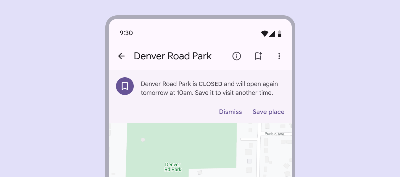
UI for Maps showing description of a location with a single word in a caps block.
Don't Don't use caps block. Use sentence case for all product text.
Pager
Previous pageStyle guide: Word choice
Next pageCustomizing Material

Released under the Apache 2.0 or CC BY 4.0

Copyright © 2018-Present Google

https://m3.material.io/foundations/content-design/style-guide/grammar-and-punctuation

Released under the Apache 2.0 or CC BY 4.0

Copyright © 2018-Present Google