

Side sheets: Specs
Side sheets show secondary content anchored to the side of the screen
Tokens & specs
Browse the component elements, attributes, tokens, and their values. Learn more about design tokens
Standard side sheet
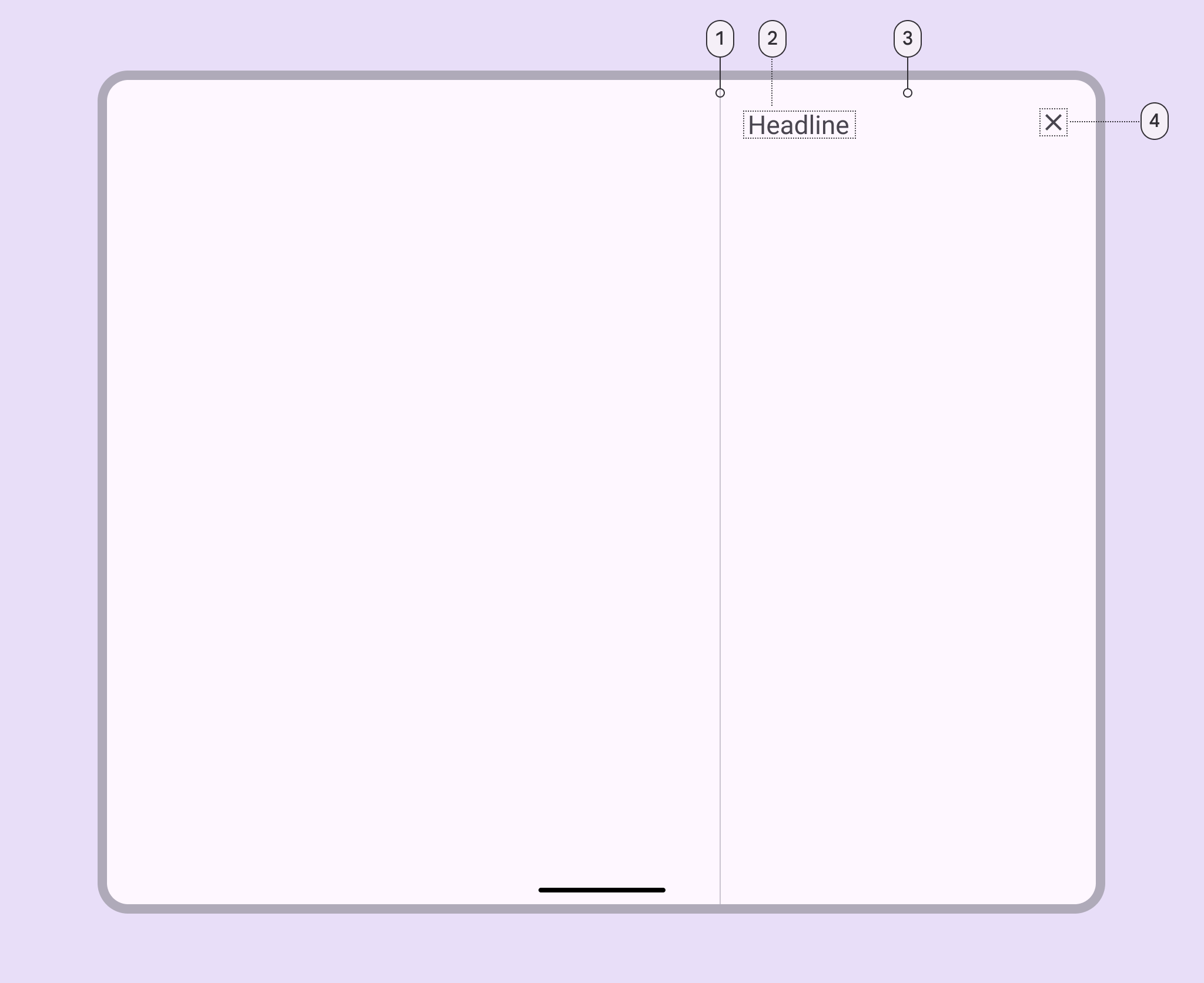
- Divider (optional)
- Headline
- Container
- Close icon button
Standard side sheet color
Color values are implemented through design tokens. For design, this means working with color values that correspond with tokens. For implementation, a color value will be a token that references a value. Learn more about design tokens
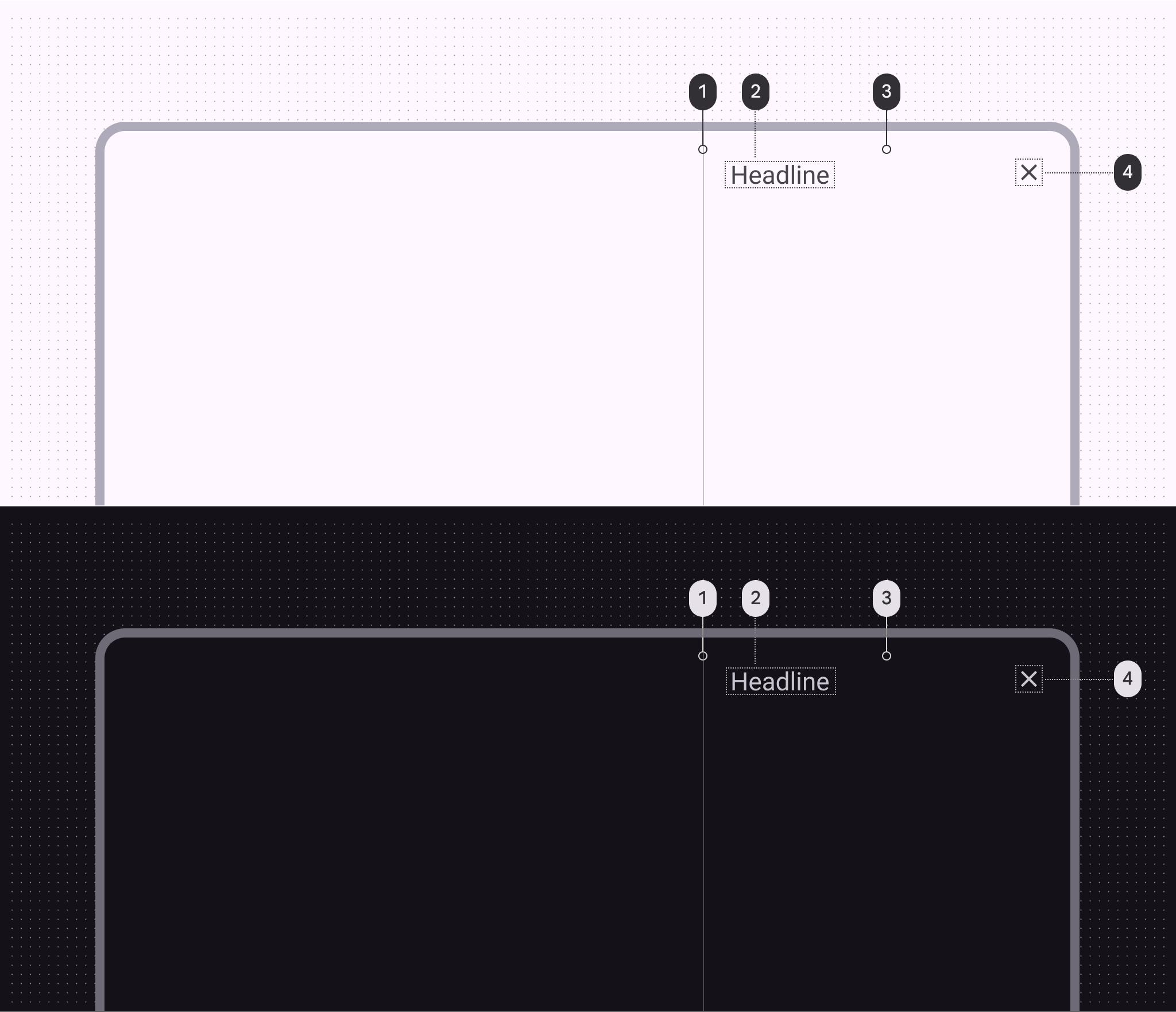
Side sheet color roles used for light and dark themes:
- Outline variant
- On surface variant
- Surface
- On surface variant
Standard side sheet measurements
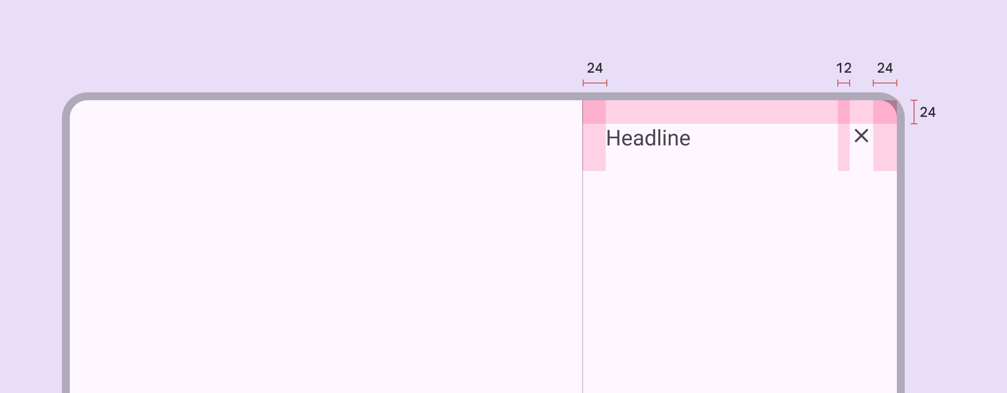
| Attribute | Value |
|---|---|
| Start/end padding | 24dp |
| Padding between top elements | 12dp |
| Bottom actions height | 72dp |
| Bottom actions top padding | 16dp |
| Bottom actions bottom padding | 24dp |
| Bottom actions alignment (horizontal) | Left |
| Max-width | 400dp |
| Margins (when detached) | 16dp |
Modal side sheet
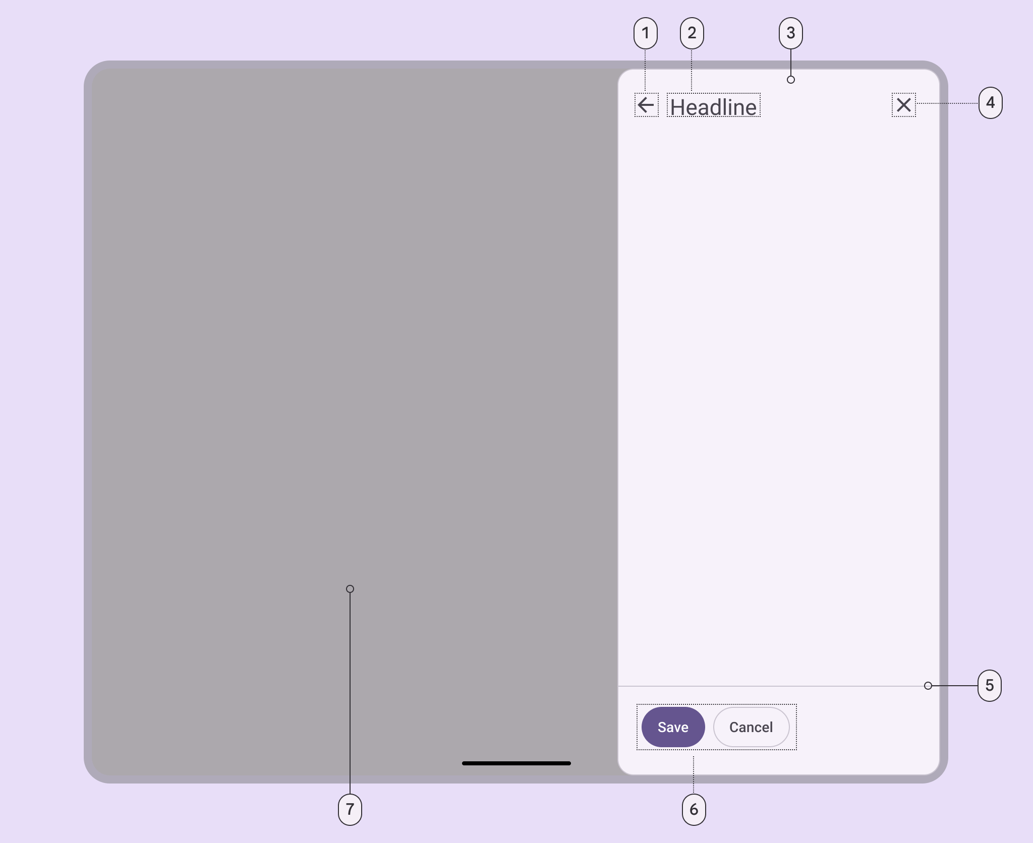
- Back icon button (optional)
- Headline
- Container
- Close icon button
- Divider (optional)
- Action buttons (optional)
- Scrim
Modal side sheet color
Color values are implemented through design tokens. For design, this means working with color values that correspond with tokens. For implementation, a color value will be a token that references a value. Learn more about design tokens.
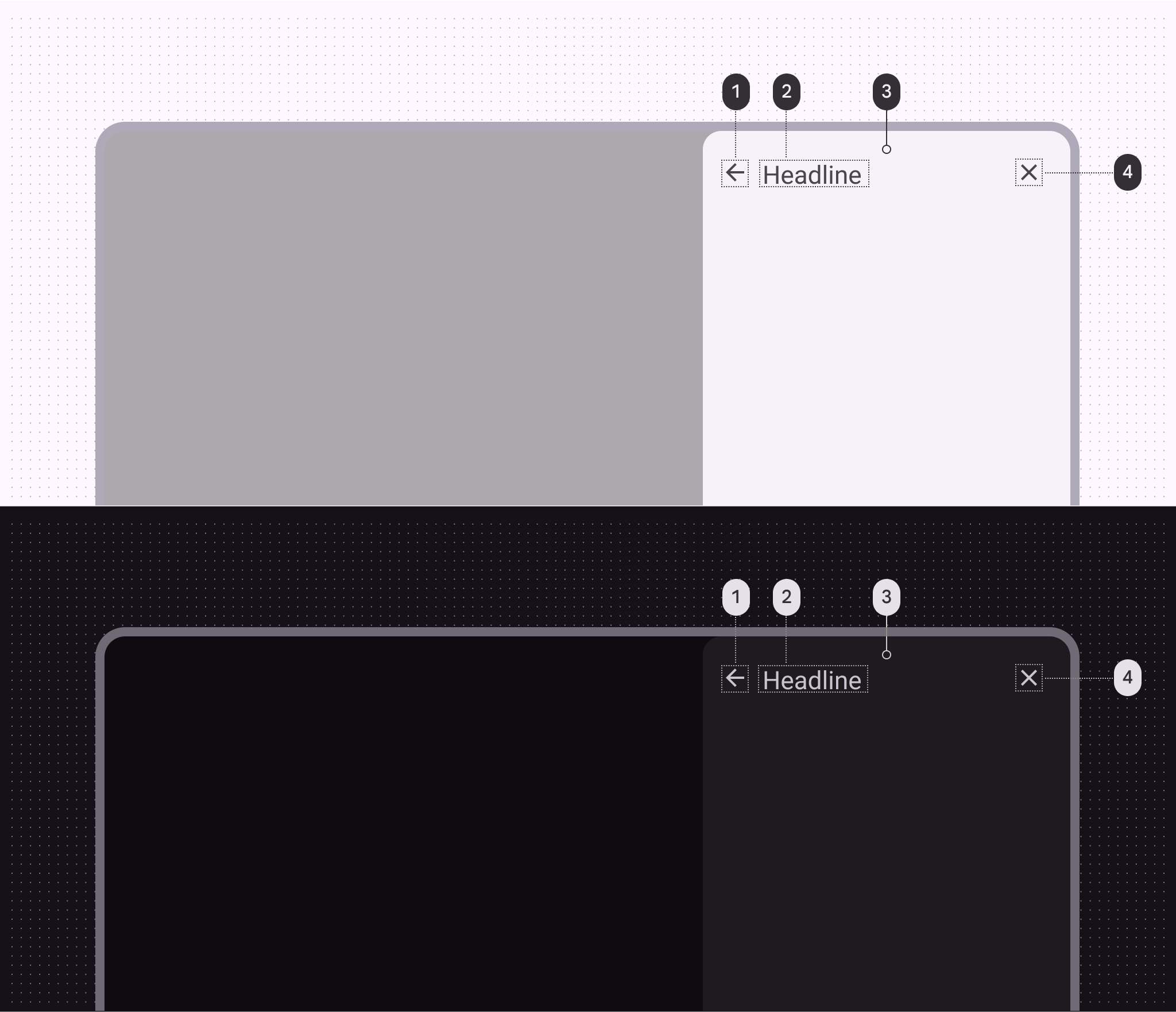
Side sheet color roles used for light and dark themes:
- On surface variant
- On surface variant
- Surface container low
- On surface variant
Modal side sheet measurements
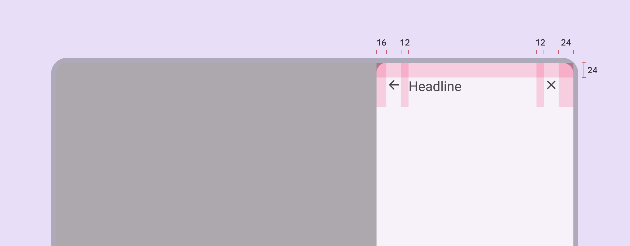
| Attribute | Value |
|---|---|
| Start/end padding | 24dp |
| Start padding with icon | 16dp |
| Padding between top elements | 12dp |
| Bottom actions height | 72dp |
| Bottom actions top padding | 16dp |
| Bottom actions bottom padding | 24dp |
| Bottom actions alignment (horizontal) | Left |
| Max-width | 400dp |
| Margins (when detached) | 16dp |