Skip to content
Material Design 3
Main Navigation
v3
v2
v1

English

简体中文
繁體中文
Español
Français
Русский
Português – Brasil
Deutsch
日本語
한국어
Italiano
Polski
Türkçe
čeština
magyar

English

简体中文
繁體中文
Español
Français
Русский
Português – Brasil
Deutsch
日本語
한국어
Italiano
Polski
Türkçe
čeština
magyar

Appearance

Sidebar Navigation

Foundations

Accessibility

Overview: Principles

Overview: Assistive technology

Designing: Overview

Designing: Color contrast

Designing: Structure

Designing: Flow

Designing: Elements

Writing and text: Best practices

Writing and text: Text truncation

Writing and text: Text resizing

Building for all: User needs

Building for all: Co-design

Content design

Overview

Alt text

Global writing: Overview

Global writing: Word choice

Notifications

Style guide: UX writing best practices

Style guide: Word choice

Style guide: Grammar and punctuation

Customizing Material

Devices

Watches: Overview

Watches: Foundations

Watches: Styles

Watches: Layout

XR

Design: Overview

Design: Interaction

Design: Layout

Design: Accessibility

Components: Overview

Components: App bars

Components: Dialogs

Components: Nav bar

Components: Nav rail

Components: Toolbars

Design tokens: Overview

Design tokens: How to use tokens

Interaction

Gestures

Inputs

Selection

States: Overview

States: State layers

States: Applying states

Layout

Overview: Overview

Overview: Parts of layout

Overview: Adaptive design

Scaffold: Overview

Scaffold: Bars

Scaffold: Rails

Scaffold: Panes

Grids & spacing: Overview

Grids & spacing: Grids

Grids & spacing: Spacing

Grids & spacing: Density

Breakpoints: Overview

Breakpoints: Compact

Breakpoints: Medium

Breakpoints: Expanded

Breakpoints: Large & extra-large

Bidirectionality & RTL

Canonical examples: Overview

Canonical examples: Feed

Canonical examples: List-detail

Canonical examples: Supporting pane

Usability: Overview

Usability: Applying M3 Expressive

Material A-Z

Styles

Color

Color system: Overview

Color system: How the system works

Color roles

Color schemes

Choosing a scheme

Static: Baseline

Static: Custom brand

Dynamic: Choosing a source

Dynamic: User-generated source

Dynamic: Content-based source

Advanced: Overview

Advanced: Apply colors

Advanced: Define new colors

Advanced: Adjust existing colors

Color resources

Elevation: Overview

Elevation: Applying elevation

Elevation: Tokens

Icons: Overview

Icons: Designing icons

Icons: Applying icons

Motion

Motion physics system: How it works

Motion physics system: Specs

Easing and duration: Applying easing and duration

Easing and duration: Tokens & specs

Transitions: Transition patterns

Transitions: Applying transitions

Shape: Overview & principles

Shape: Corner radius scale

Shape: Shape morph

Spacing: Overview

Spacing: Applying spacing

Spacing: Tokens

Typography: Overview

Typography: Fonts

Typography: Type scale & tokens

Typography: Applying type

Typography: Editorial treatments

Components

App bars: Overview

App bars: Specs

App bars: Guidelines

App bars: Accessibility

Badges: Overview

Badges: Specs

Badges: Guidelines

Badges: Accessibility

Buttons

All buttons

Button groups: Overview

Button groups: Specs

Button groups: Guidelines

Button groups: Accessibility

Buttons: Overview

Buttons: Specs

Buttons: Guidelines

Buttons: Accessibility

Extended FABs: Overview

Extended FABs: Specs

Extended FABs: Guidelines

Extended FABs: Accessibility

FAB menu: Overview

FAB menu: Specs

FAB menu: Guidelines

FAB menu: Accessibility

FABs: Overview

FABs: Specs

FABs: Guidelines

FABs: Accessibility

Icon buttons: Overview

Icon buttons: Specs

Icon buttons: Guidelines

Icon buttons: Accessibility

Segmented buttons: Overview

Segmented buttons: Specs

Segmented buttons: Guidelines

Segmented buttons: Accessibility

Split button: Overview

Split button: Specs

Split button: Guidelines

Split button: Accessibility

Cards: Overview

Cards: Specs

Cards: Guidelines

Cards: Accessibility

Carousel: Overview

Carousel: Specs

Carousel: Guidelines

Carousel: Accessibility

Checkbox: Overview

Checkbox: Specs

Checkbox: Guidelines

Checkbox: Accessibility

Chips: Overview

Chips: Specs

Chips: Guidelines

Chips: Accessibility

Date & time pickers

Date pickers: Overview

Date pickers: Specs

Date pickers: Guidelines

Date pickers: Accessibility

Time pickers: Overview

Time pickers: Specs

Time pickers: Guidelines

Time pickers: Accessibility

Dialogs: Overview

Dialogs: Specs

Dialogs: Guidelines

Dialogs: Accessibility

Divider: Overview

Divider: Specs

Divider: Guidelines

Divider: Accessibility

Lists: Overview

Lists: Specs

Lists: Guidelines

Lists: Accessibility

Loading & progress

Loading indicator: Overview

Loading indicator: Specs

Loading indicator: Guidelines

Loading indicator: Accessibility

Progress indicators: Overview

Progress indicators: Specs

Progress indicators: Guidelines

Progress indicators: Accessibility

Menus: Overview

Menus: Specs

Menus: Guidelines

Menus: Accessibility

Navigation

Navigation bar: Overview

Navigation bar: Specs

Navigation bar: Guidelines

Navigation bar: Accessibility

Navigation drawer: Overview

Navigation drawer: Specs

Navigation drawer: Guidelines

Navigation drawer: Accessibility

Navigation rail: Overview

Navigation rail: Specs

Navigation rail: Guidelines

Navigation rail: Accessibility

Radio button: Overview

Radio button: Specs

Radio button: Guidelines

Radio button: Accessibility

Search: Overview

Search: Specs

Search: Guidelines

Search: Accessibility

Sheets

Bottom sheets: Overview

Bottom sheets: Specs

Bottom sheets: Guidelines

Bottom sheets: Accessibility

Side sheets: Overview

Side sheets: Specs

Side sheets: Guidelines

Side sheets: Accessibility

Sliders: Overview

Sliders: Specs

Sliders: Guidelines

Sliders: Accessibility

Snackbar: Overview

Snackbar: Specs

Snackbar: Guidelines

Snackbar: Accessibility

Switch: Overview

Switch: Specs

Switch: Guidelines

Switch: Accessibility

Tabs: Overview

Tabs: Specs

Tabs: Guidelines

Tabs: Accessibility

Text fields: Overview

Text fields: Specs

Text fields: Guidelines

Text fields: Accessibility

Toolbars: Overview

Toolbars: Specs

Toolbars: Guidelines

Toolbars: Accessibility

Tooltips: Overview

Tooltips: Specs

Tooltips: Guidelines

Tooltips: Accessibility

On this page

Badges: Guidelines ​

Badges show notifications, counts, or status information on navigation items and icons
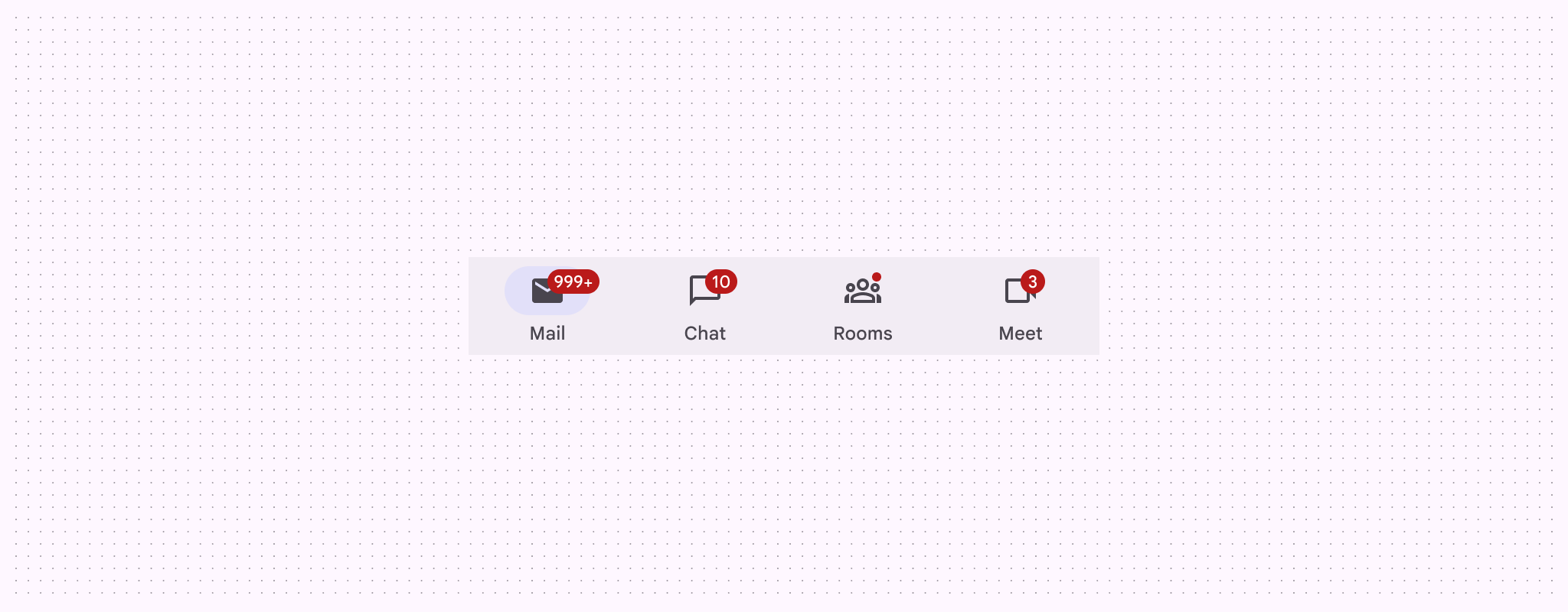

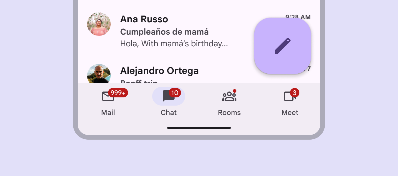
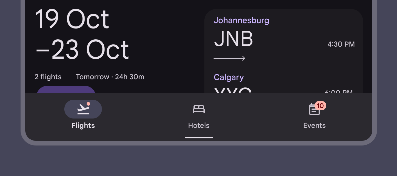
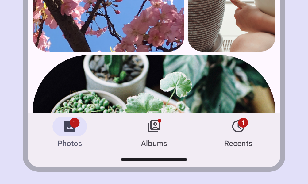
Diagram of 4 badges in different configurations on a navigation bar's destination icons.
Large badges and a small badge in a navigation bar

Usage ​

Badges are used to indicate a notification, item count, or other information relating to a navigation destination. They are placed on the ending edge of icons, typically within other components.

There are two variants:

  1. Small badge
  2. Large badge
Diagram of 4 badges in different configurations on a navigation bar's destination icons.
Navigation bar with four badges

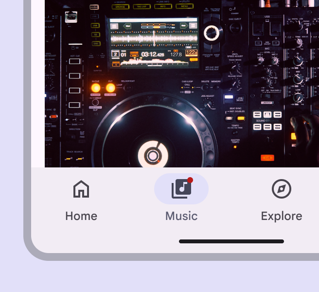
A small badge is a simple circle, used to indicate an unread notification.

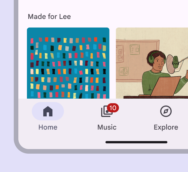
A large badge contains label text communicating item count information.
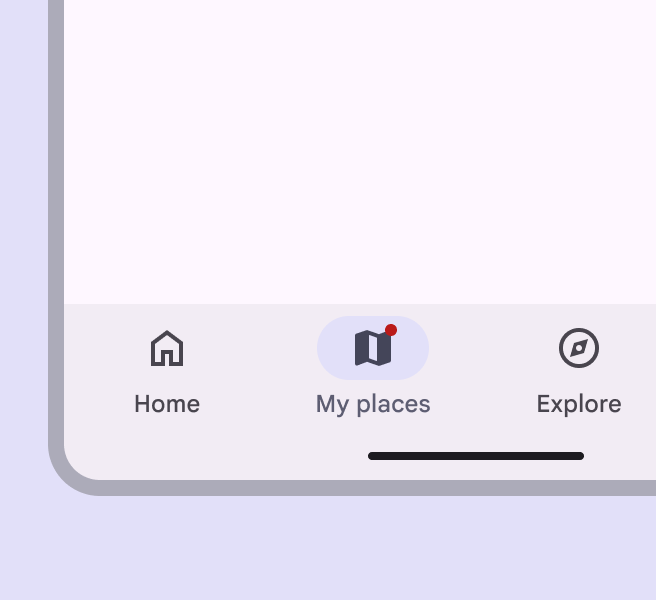
A small badge is a circle with no characters.
Small badge
A large badge holds 4 characters and expands its container's width but not height.
Large badge

With other components

Badges are most commonly used within other components, such as navigation barNavigation bars let people switch between UI views on smaller devices.More on navigation bars, navigation railNavigation rails let people switch between UI views on mid-sized devices.More on navigation rails, app barsApp bars display navigation, actions, and text at the top of a screen.More on app bars, and tabsTabs organize content across different screens and views.More on tabs.

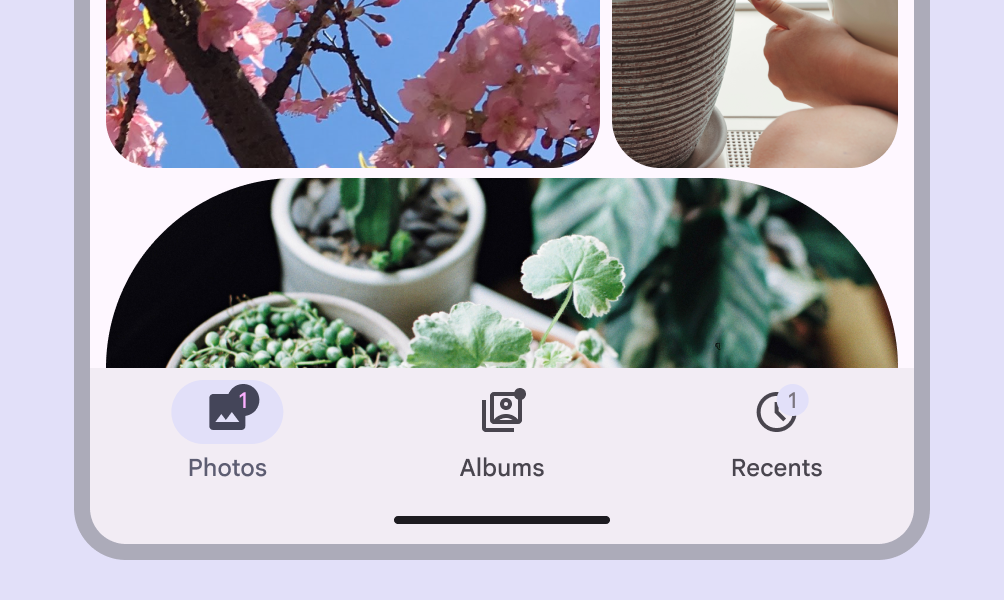
Navigation bar with 3 icon buttons. 2 icons buttons have badges and 1 doesn't.
In navigation bars, hide the badge once the destination has been selected

Anatomy ​

Small and large badges on 2 icon buttons.
  1. Small badge
  2. Large badge container
  3. Large badge label

Container ​

There are two container options for the badge:

  • Small badgeSmall badges are a simple circle used to indicate an unread notification. with no text
  • Large badgeLarge badges contain label text communicating item count information. with text
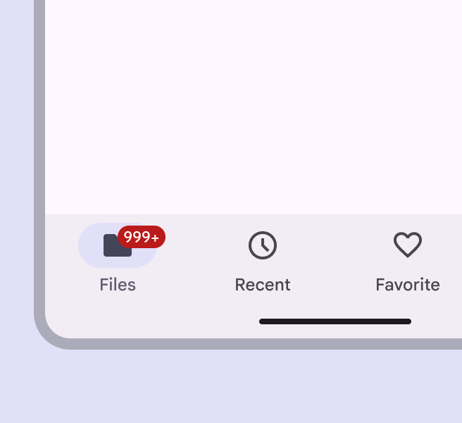
A small badge on a navigation item.
A small badge uses only shape to indicate a status change or new notification
Number 10 displayed within large badge on a navigation item.
A large badge displays a number within a container to indicate a quantifiable status change related to a destination

Badge containers are anchored inside the icon bounding box. As the number count increases for large badgesLarge badges contain label text communicating item count information., their width expands, but keeps the same placement.

Badges use a color intended to stand out against labels, icons, and navigation elements. Use the default color mapping to avoid color conflict issues.
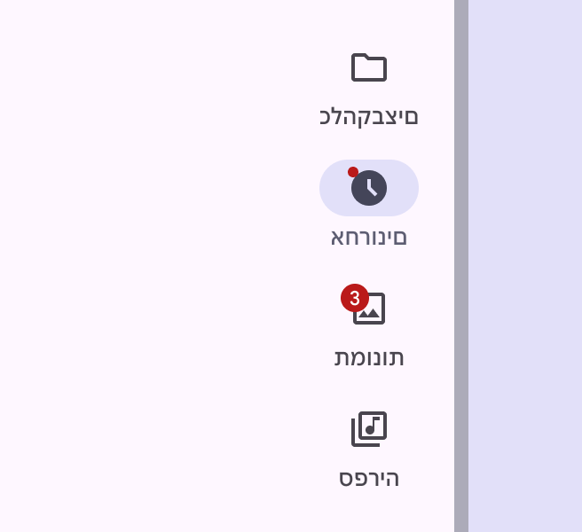
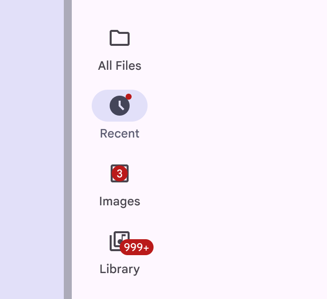
Small and large badges on the left side of 2 navigation items in a right-to-left language.
Do Change the position of the badge for right-to-left languages
Small and large badges at random positions on 3 icon buttons on a navigation rail.
Don't Badges have fixed positions. Don’t change the position of the badge arbitrarily or place the badge over the icon.
Small and large badges in default red color on 3 navigation items.
Do Use the default badge color
Small and large badges in custom colors on 3 navigation items.
Don't Avoid using custom color roles for the badge container and label text. If custom roles are necessary, make sure they have contrast of at least 3:1.

Label text

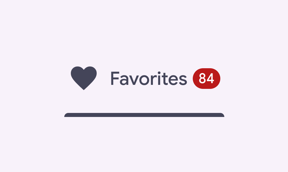
Label large badgesLarge badges contain label text communicating item count information. with counts or a status. The maximum number of characters within large badge label text is four, including a + to indicate more.
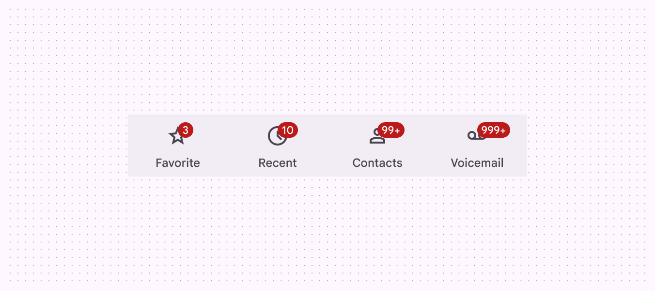
4 icons with increasing number badges. The badges represent quantities, using a "+" symbol for quantities over 999.
Large badges with one to four characters

Use the recommended maximum character count to ensure labels don’t extend beyond the badge container.
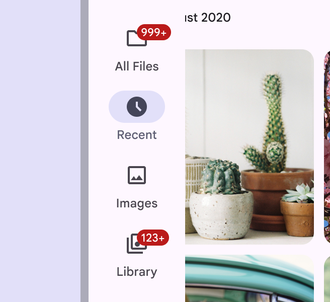
4-digit numbers condensed to a 3-digit badge with "+" to fit the badge container's width.
Do Truncate badge labels as needed
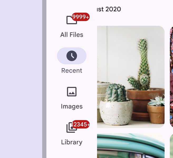
4-digit and 5-digit number badges on navigation items exceed the badge container's width and get cut off at the edge.
Don't Don’t let the badge get cut off or collide with another element

Placement ​

Large badge to the right of a navigation rail item.
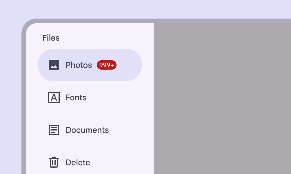
Do Use a large badge to show count information when visual collisions aren’t an issue, such as in a navigation rail
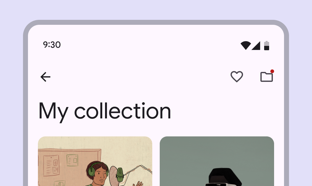
Small badge on an icon button in an app bar.
Caution Use a small badge when spaces are tightly constrained, such as app bars. Small badges won’t run into the edge of the screen.
Large badge placed at the end of a tab.
Do When an icon with a badge is followed by text or another element, place a large badge at the trailing edge
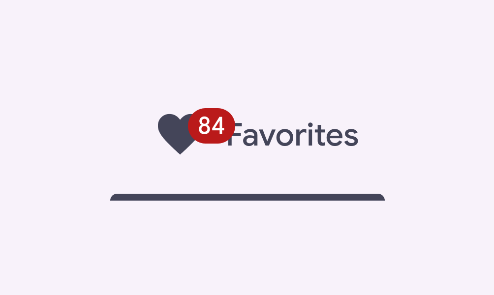
Large badge overlapping the icon and text in a tab.
Don't Avoid using a large badge when it might overlap with a trailing element. Either place it at the trailing edge or use a small badge instead.
Pager
Previous pageBadges: Specs
Next pageBadges: Accessibility

Released under the Apache 2.0 or CC BY 4.0

Copyright © 2018-Present Google

https://m3.material.io/components/badges/guidelines

Released under the Apache 2.0 or CC BY 4.0

Copyright © 2018-Present Google