Skip to content
Material Design 3
Main Navigation
v3
v2
v1

English

简体中文
繁體中文
Español
Français
Русский
Português – Brasil
Deutsch
日本語
한국어
Italiano
Polski
Türkçe
čeština
magyar

English

简体中文
繁體中文
Español
Français
Русский
Português – Brasil
Deutsch
日本語
한국어
Italiano
Polski
Türkçe
čeština
magyar

Appearance

Sidebar Navigation

Foundations

Accessibility

Overview: Principles

Overview: Assistive technology

Designing: Overview

Designing: Color contrast

Designing: Structure

Designing: Flow

Designing: Elements

Writing and text: Best practices

Writing and text: Text truncation

Writing and text: Text resizing

Building for all: User needs

Building for all: Co-design

Content design

Overview

Alt text

Global writing: Overview

Global writing: Word choice

Notifications

Style guide: UX writing best practices

Style guide: Word choice

Style guide: Grammar and punctuation

Customizing Material

Devices

Watches: Overview

Watches: Foundations

Watches: Styles

Watches: Layout

XR

Design: Overview

Design: Interaction

Design: Layout

Design: Accessibility

Components: Overview

Components: App bars

Components: Dialogs

Components: Nav bar

Components: Nav rail

Components: Toolbars

Design tokens: Overview

Design tokens: How to use tokens

Interaction

Gestures

Inputs

Selection

States: Overview

States: State layers

States: Applying states

Layout

Overview: Overview

Overview: Parts of layout

Overview: Adaptive design

Scaffold: Overview

Scaffold: Bars

Scaffold: Rails

Scaffold: Panes

Grids & spacing: Overview

Grids & spacing: Grids

Grids & spacing: Spacing

Grids & spacing: Density

Breakpoints: Overview

Breakpoints: Compact

Breakpoints: Medium

Breakpoints: Expanded

Breakpoints: Large & extra-large

Bidirectionality & RTL

Canonical examples: Overview

Canonical examples: Feed

Canonical examples: List-detail

Canonical examples: Supporting pane

Usability: Overview

Usability: Applying M3 Expressive

Material A-Z

Styles

Color

Color system: Overview

Color system: How the system works

Color roles

Color schemes

Choosing a scheme

Static: Baseline

Static: Custom brand

Dynamic: Choosing a source

Dynamic: User-generated source

Dynamic: Content-based source

Advanced: Overview

Advanced: Apply colors

Advanced: Define new colors

Advanced: Adjust existing colors

Color resources

Elevation: Overview

Elevation: Applying elevation

Elevation: Tokens

Icons: Overview

Icons: Designing icons

Icons: Applying icons

Motion

Motion physics system: How it works

Motion physics system: Specs

Easing and duration: Applying easing and duration

Easing and duration: Tokens & specs

Transitions: Transition patterns

Transitions: Applying transitions

Shape: Overview & principles

Shape: Corner radius scale

Shape: Shape morph

Spacing: Overview

Spacing: Applying spacing

Spacing: Tokens

Typography: Overview

Typography: Fonts

Typography: Type scale & tokens

Typography: Applying type

Typography: Editorial treatments

Components

App bars: Overview

App bars: Specs

App bars: Guidelines

App bars: Accessibility

Badges: Overview

Badges: Specs

Badges: Guidelines

Badges: Accessibility

Buttons

All buttons

Button groups: Overview

Button groups: Specs

Button groups: Guidelines

Button groups: Accessibility

Buttons: Overview

Buttons: Specs

Buttons: Guidelines

Buttons: Accessibility

Extended FABs: Overview

Extended FABs: Specs

Extended FABs: Guidelines

Extended FABs: Accessibility

FAB menu: Overview

FAB menu: Specs

FAB menu: Guidelines

FAB menu: Accessibility

FABs: Overview

FABs: Specs

FABs: Guidelines

FABs: Accessibility

Icon buttons: Overview

Icon buttons: Specs

Icon buttons: Guidelines

Icon buttons: Accessibility

Segmented buttons: Overview

Segmented buttons: Specs

Segmented buttons: Guidelines

Segmented buttons: Accessibility

Split button: Overview

Split button: Specs

Split button: Guidelines

Split button: Accessibility

Cards: Overview

Cards: Specs

Cards: Guidelines

Cards: Accessibility

Carousel: Overview

Carousel: Specs

Carousel: Guidelines

Carousel: Accessibility

Checkbox: Overview

Checkbox: Specs

Checkbox: Guidelines

Checkbox: Accessibility

Chips: Overview

Chips: Specs

Chips: Guidelines

Chips: Accessibility

Date & time pickers

Date pickers: Overview

Date pickers: Specs

Date pickers: Guidelines

Date pickers: Accessibility

Time pickers: Overview

Time pickers: Specs

Time pickers: Guidelines

Time pickers: Accessibility

Dialogs: Overview

Dialogs: Specs

Dialogs: Guidelines

Dialogs: Accessibility

Divider: Overview

Divider: Specs

Divider: Guidelines

Divider: Accessibility

Lists: Overview

Lists: Specs

Lists: Guidelines

Lists: Accessibility

Loading & progress

Loading indicator: Overview

Loading indicator: Specs

Loading indicator: Guidelines

Loading indicator: Accessibility

Progress indicators: Overview

Progress indicators: Specs

Progress indicators: Guidelines

Progress indicators: Accessibility

Menus: Overview

Menus: Specs

Menus: Guidelines

Menus: Accessibility

Navigation

Navigation bar: Overview

Navigation bar: Specs

Navigation bar: Guidelines

Navigation bar: Accessibility

Navigation drawer: Overview

Navigation drawer: Specs

Navigation drawer: Guidelines

Navigation drawer: Accessibility

Navigation rail: Overview

Navigation rail: Specs

Navigation rail: Guidelines

Navigation rail: Accessibility

Radio button: Overview

Radio button: Specs

Radio button: Guidelines

Radio button: Accessibility

Search: Overview

Search: Specs

Search: Guidelines

Search: Accessibility

Sheets

Bottom sheets: Overview

Bottom sheets: Specs

Bottom sheets: Guidelines

Bottom sheets: Accessibility

Side sheets: Overview

Side sheets: Specs

Side sheets: Guidelines

Side sheets: Accessibility

Sliders: Overview

Sliders: Specs

Sliders: Guidelines

Sliders: Accessibility

Snackbar: Overview

Snackbar: Specs

Snackbar: Guidelines

Snackbar: Accessibility

Switch: Overview

Switch: Specs

Switch: Guidelines

Switch: Accessibility

Tabs: Overview

Tabs: Specs

Tabs: Guidelines

Tabs: Accessibility

Text fields: Overview

Text fields: Specs

Text fields: Guidelines

Text fields: Accessibility

Toolbars: Overview

Toolbars: Specs

Toolbars: Guidelines

Toolbars: Accessibility

Tooltips: Overview

Tooltips: Specs

Tooltips: Guidelines

Tooltips: Accessibility

On this page

Color system: How the system works ​

Create accessible, personal color schemes communicating your product's hierarchy, state, and brand

It's like paint-by-number ​

Imagine your product screen as a paint-by-number canvas:

  • Each element on the screen has a number
  • Each number is assigned a color
UI in "x-ray" view where each element has a number instead of a color
Each part of a UI is assigned a "number," and each "number" is assigned a color

You can hand-pick a color for every "number" to create a static color scheme.

Green icon button in the UI, assigned a hand-picked color using a color picker
Static colors are hand-picked, like this green icon button

But now, you can also use Material's dynamic color system to automatically generate an entire palette of accessible colors for each "number" from a single source.

This source can be a user's wallpaper, or in-app content like imagery. If the source changes, the product colors update to match.
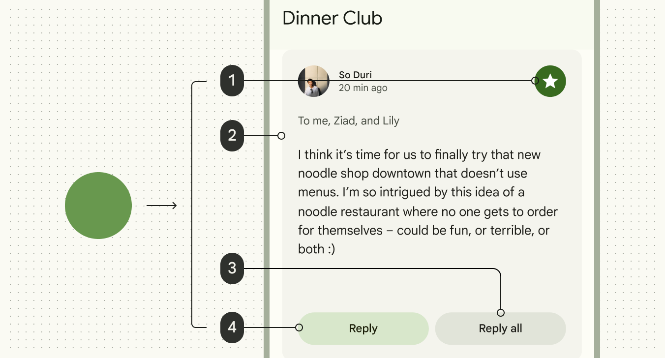
Image showcasing how a source color is automatically applied to each "number"
Colors are generated dynamically from a user's wallpaper or in-app content

You can customize how dynamic color appears in your product by:

  • Setting the color source
  • Adding static or harmonized colors
  • Changing which "numbers" are assigned to which elements
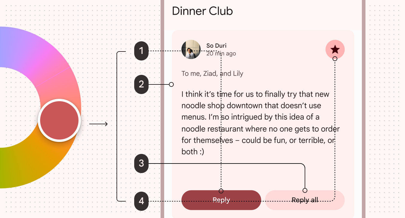
Learn about advanced customizations

Image showing a color wheel where a light red color is picked, which then populates the UI. In this example, some UI elements have been mapped to different "numbers"
The color source can be changed, automatically changing the color scheme. The UI elements can have other "numbers" assigned to them.

Essential terms ​

Color role ​

Like the "numbers" on a paint-by-number canvas, color roles are assigned to specific UI elements. They have semantic names like primary, on primary, and primary container, and matching color tokens. See all color roles

Dynamic color ​

Dynamic color takes a single color from a user's wallpaper or in-app content and creates an accessible color scheme assigned to elements in the UI. If the user's wallpaper or the in-app content changes, the colors in the UI will change to match.

Static color ​

UI colors that don't change based on the user's wallpaper or in-app content. Static colors can be hand-picked or generated in design tools like the Material Theme BuilderMaterial Theme Builder (MTB) is a Figma plugin that allows markers to emulate the color extraction process for dynamic color and create custom tonal schemes.Material Theme Builder. Once assigned to their respective color roles and UX elements, the colors remain constant.

Baseline static color ​

The default static color scheme for Material products. See the baseline color scheme
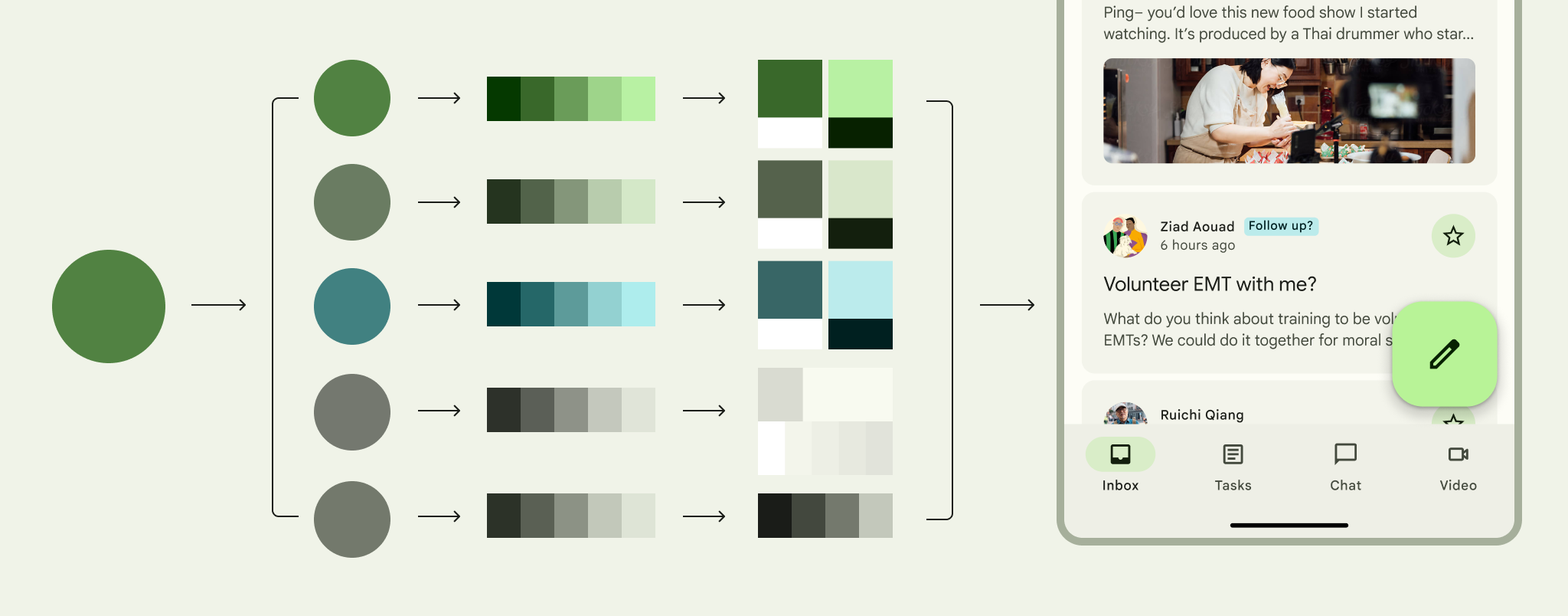
Diagram illustrating the steps from source color to key colors to tonal palettes to color roles to the UI
The dynamic color process is automatic. A single source color is used to generate five key colors, which are used to make tonal palettes. Tones from the palettes are then assigned to color roles, which are in turn assigned to elements of the UI.

The system generates dynamic color schemes using colors from images like wallpapers and in-app content

How dynamic color generates color schemes ​

1. It starts with a source color ​

There are three ways to get a source color.

A. Generate it from a wallpaper

User-generated color is sourced from a user's personal wallpaper. The wallpaper is digitally analyzed through a process called quantization, and a single color is selected as the source color.

Red source color is extracted from a wallpaper
Source color from a user's wallpaper

B. Generate it from in-app content

Content-based color is sources from in-app content, like an album thumbnail image, logo, or video preview.

Like user-generated color, the image is digitally analyzed through quantization, and a single color selected as the source color.

Blue source color is extracted from an podcast cover
Source color from in-app-content

C. Pick it by hand

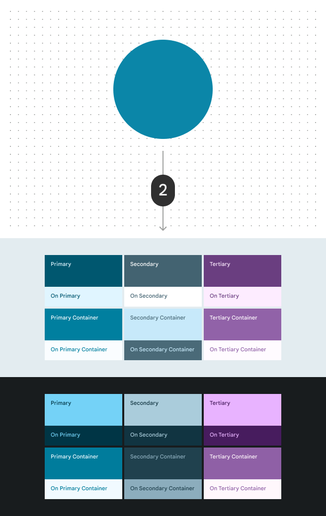
A hand-picked source color is deliberately selected by a designer.

Did you know? The baseline static color schemeBaseline is the default static color scheme for Material products. It includes colors for both light and dark themes.More on baseline color uses a hand-picked source color.

Green source color selected from a color picker
Source color hand-picked by a designer

2. Feed the source color into an algorithm ​

Dynamic color is powered by the Material Color Utilities (MCU), a set of color libraries containing algorithms and utilities that develop color themes and schemes in your app.

There are many color algorithms, but the most common ones are:

  • User-generated color algorithm
    Uses personal wallpaper to identify source color. Maps colors of specific tones (lighter or darker) into the scheme according to a combination of system design choices and user preferences.
  • Content-based color algorithm
    Uses image for source color. Tones are adjusted to match the appearance of the source image, while maintaining accessible contrast.
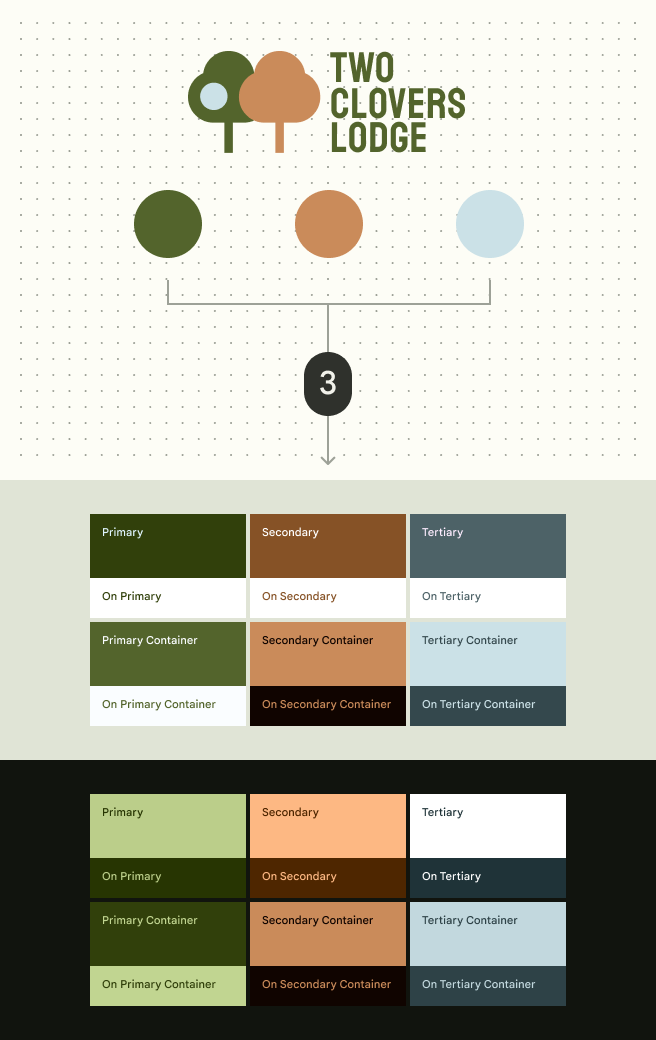
  • Custom colors
    Colors closely match the chosen input colors, such as those representing brand or semantic meaning.
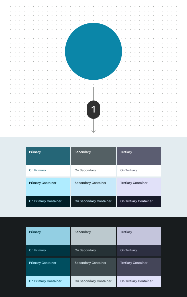
Color palette made by the user-generated algorithm
1. When run through the user-generated color algorithm, the source color is turned into a full color scheme
Color palette made by the content-based algorithm
2. When run through content-based color algorithm, the same source color creates a slightly different color scheme. Some tones are adjusted to better match the appearance of the source image.
Color palette made by the custom color algorithm
3. Custom colors, such as brand colors, can individually run through the algorithm to create a custom scheme that matches the brand

3. The algorithm generates key colors ​

Material's color algorithms manipulate the source color's hueHue is the perception of a color as red, orange, yellow, green, blue, violet, and so on.More on hue, chrome, and tone and chromaChroma is how colorful or neutral (grey, black or white) a color appears.More on hue, chrome, and tone to generate five complimentary key colors.

  1. Primary
  2. Secondary
  3. Tertiary
  4. Neutral
  5. Neutral variant
Diagram of a source color generating five key colors: primary, secondary, tertiary, neutral and neutral variant
A source color generates five key colors

4. The algorithm creates tonal palettes ​

The system then manipulates toneTone is how light or dark a color appears. Tone is sometimes also referred to as luminance.More on hue, chroma, and tone and chromaChroma is how colorful or neutral (grey, black or white) a color appears.More on hue, chroma, and tone values to create a tonal palette for each key color. Colors in these palettes are given a number from 0 to 100 in increments of 10, as well as 95, 98, and 99. Some palettes include more values.

Primary, secondary, tertiary, neutral and neutral variant tonal palettes, consisting of 13 tonal steps
The smaller the tonal value, the darker the color

5. The algorithm assigns tones to color roles ​

The algorithm uses accessible color relationshipsFor example, a dark surface color is algorithmically paired with a light text label color so the UI automatically meets contrast requirements.More on color relationships to assign specific tones to the 26 color rolesColor roles are assigned to UI elements based on emphasis, container type, and relationship with other elements. This ensures proper contrast and usage in any color scheme.More on color roles in both light and dark theme.

For example, the algorithm assigns the color tone primary40 to the primary role and the tone primary100 to the on primary role.

See all color roles

Diagram mapping color tones to roles
Tones from the tonal palette are assigned to different roles
Diagram of tonal palettes mapped to all color roles across light and dark themes
Colors from the five tonal palettes are assigned to color roles. For example, primary roles are picked from the primary tonal palette, while surface roles are picked from the neutral tonal palette.

Dark themeA dark theme is a low-light version of a UI that displays mostly dark surfaces. colors are also automatically assigned so that apps receive both light and dark themes through a single set of color roles.

Diagram of dark theme colors
The same color roles are used in light and dark themes

6. The new colors are applied to the UI ​

The 26 standard color roles are already assigned to elements of the UI. When a new source color is picked, the UI dynamically changes color.

Diagram of all the color roles with an example of how it would look applied to a UI
Color roles assigned to the UI

Color roles support three levels of contrast ​

In addition to light and dark theme, color roles also support three levels of contrast. This helps people select the contrast setting that best suits their vision needs:

  • Standard (default)
  • Medium
  • High

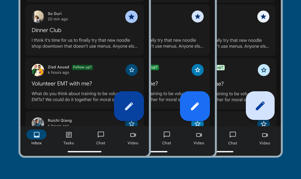
The standard contrast emphasizes visual hierarchy using high and low contrast elements. People with vision disabilities may choose medium or high contrast options for better support.

Email app in standard contrast.

Standard contrast

The baseline color scheme already uses mixed levels of contrast to reduce cognitive load
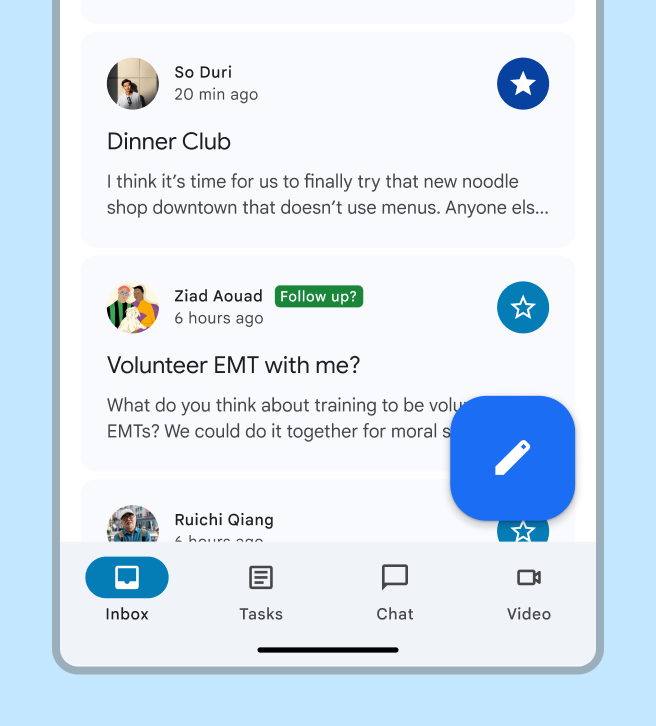
Email app in medium contrast.

Medium contrast

Provides a minimum contrast ratio of 3:1 for those who need more contrast, but may experience visual discomfort with higher contrasts from effects like halation.
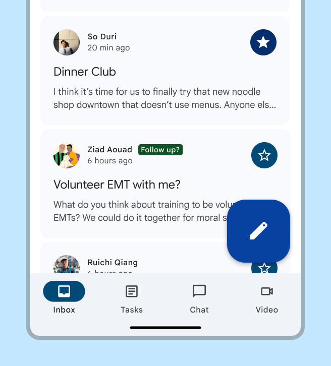
Email app in high contrast.

High contrast

Further emphasizes essential elements with a 7:1 contrast ratio to reduce visual distractions and enable users to focus. For example, high contrast is applied to the content in a card but not the card container.

The contrast settings are automatically applied to both light and dark themes.
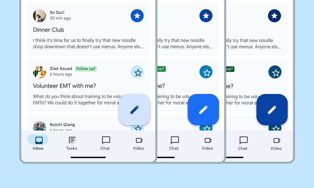
The same mail app at three contrast levels, all in light theme.
Light theme
The same mail app at three contrast levels, all in dark theme.
Dark theme

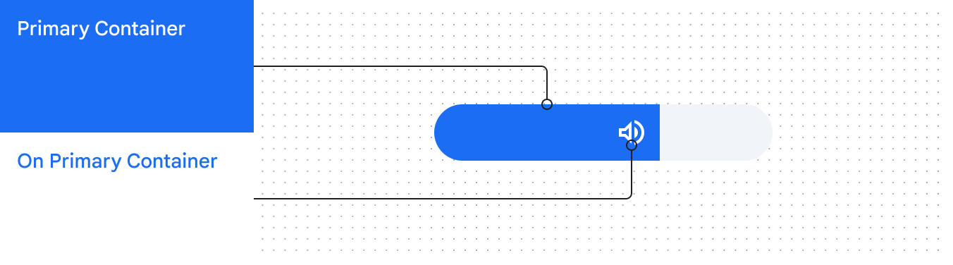
Custom components can support contrast levels by using Material's appropriate color rolesColor roles are assigned to UI elements based on emphasis, container type, and relationship with other elements. This ensures proper contrast and usage in any color scheme.More on color roles. For example, use primary container and on primary container.

Use design tokensDesign tokens are the building blocks of all UI elements. The same tokens are used in designs, tools, and code.More on design tokens to apply color roles to custom components.

Custom volume slider component using Primary Container and On Primary Container roles, whose colors change automatically at standard contrast.
A custom volume slider can use primary container and on primary container color roles to support contrast levels

Custom volume slider component using Primary Container and On Primary Container roles, whose colors change automatically at standard contrast.
At medium and other contrast levels, those color roles apply the necessary new color values

Pairing accessible tones ​

The system manipulates hue, chroma, and tone (HCT) valuesHCT is a color space which defines all colors by assigning number values for three dimensions: hue, chroma, and tone.More on hue, chroma, and tone to create a tonal palette for each color with tones ranging from 0 to 100.

Color has physical limitations—whether it's actual physics, our own biological visual limitations, or the limitations of on-screen color rendering. For example, some hues cannot exist with certain chroma or tones. Color limitations are the reason colors such as bright light blue or bright light red are not quite possible. This is why the chroma value may increase or decrease for some tones in a tonal palette.
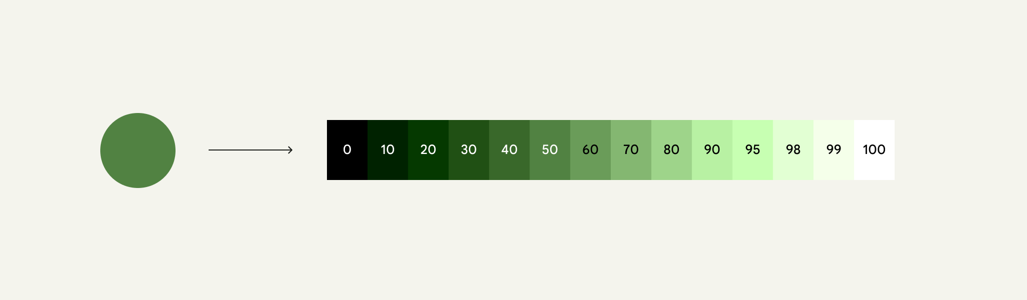

13 tones derived from a key color.
Tonal values range from 0 (black) to 100 (white). The smaller the tonal value, the darker the color.

Material's color algorithms use these palettes to find and pair contrasting tones, creating accessible color combinations.

Because tone can describe the lightness or darkness of a color, it's used to define accessible color relationships. Those relationships are built into Material's color algorithms.

For example, the algorithms assign a dark tone to a button's container color and a light tone to its label color, ensuring that the colors have a 3:1 contrast.

Colors of tones 50 and 98 used for button fill color and background fill color, which create a contrast greater than 3:1 between a button and its background.
Using tones 50 and 98 for a button and its label creates an accessible 3:1 contrast

For even more contrast, the algorithms assign tones even farther apart, achieving a 7:1 contrast.

This is the concept powering user-controlled contrast features.

Colors of tones 30 and 98 used for button fill color and background fill color, which create a contrast greater than 7:1 between a button and its background.
Using colors of tones 30 and 98 for a button and its label create a 7:1 contrast

Defining colors with hue, chroma, and tone (HCT) ​

The system uses a color space called HCT, which defines all colors using three dimensions: hue, chroma, and tone.

Changing HCT values lets you manipulate colors in flexible but predictable ways. Unlike other color spaces (like HSL or RGB), HCT allows the manipulation of a color's hue and chroma without affecting its tone. Watch to learn more:

Hue, chroma, and tone are the three color dimensions used to create accessible color schemes

Hue

Hue is the perception of a color as red, orange, yellow, green, blue, violet, and so on. Hue is quantified by a number ranging from 0-360 and is a circular spectrum (values 0 and 360 are the same hue).

The hue spectrum looks like a rainbow circle.
360 degree hue spectrum

Chroma

Chroma is how colorful or neutral (grey, black or white) a color appears. Chroma is quantified by a number ranging from 0 (completely grey, black or white) to infinity (most vibrant), though Chroma values in HCT top out at roughly 120.

Because of biological and screen rendering limitations, different hues and different tones will have different maximal chroma values.
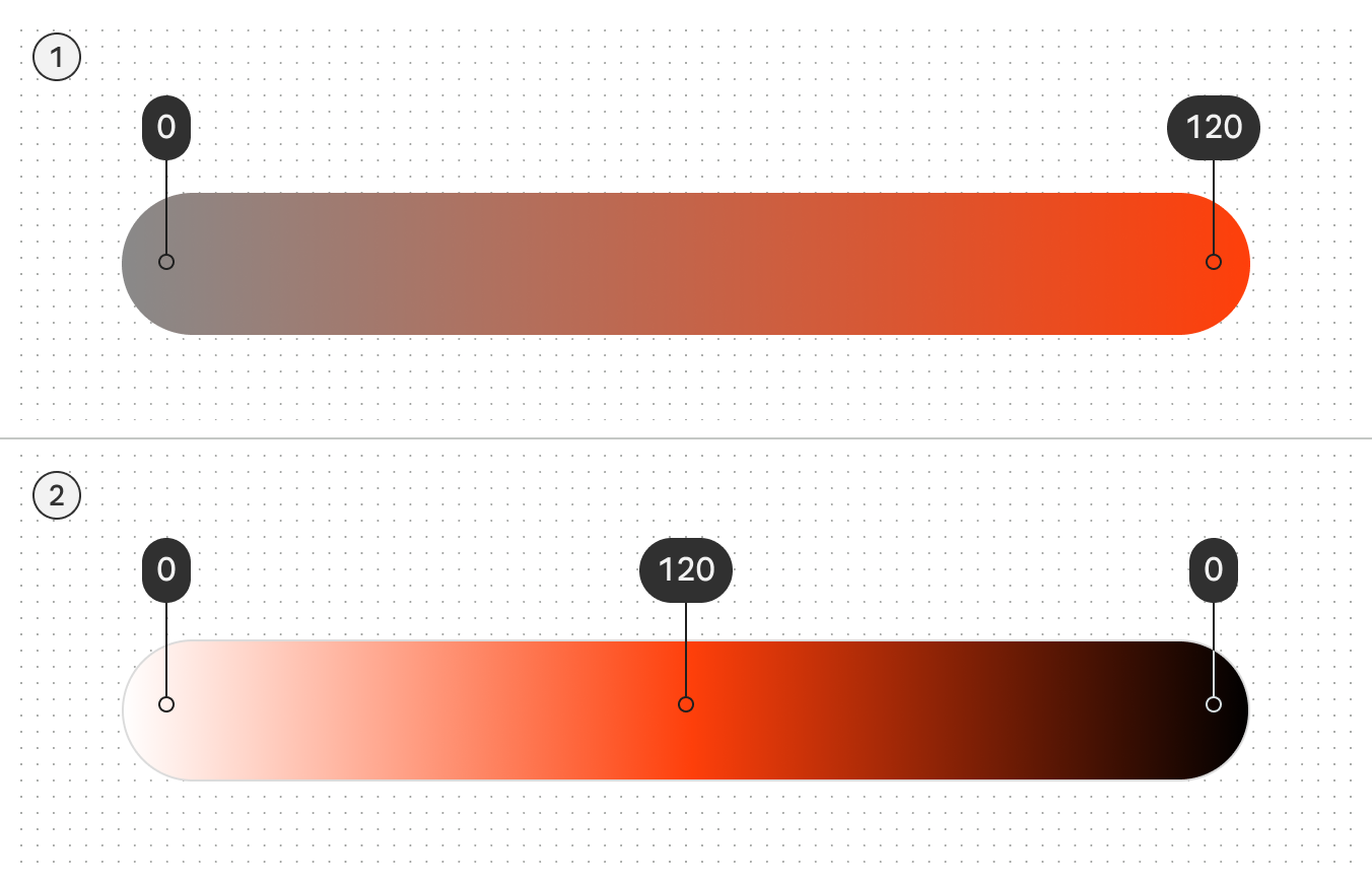
Diagram showing chroma range from 120 (maximum intensity) to 0 (pure grey). A second diagram shows how pure black and pure white also correspond to 0 chroma
  1. The higher the color purity, the higher the chroma
  2. Note how lightening and darkening a hue also affects its chroma value

Tone

Tone is how light or dark a color appears. Tone is sometimes also referred to as luminance. Tone is quantified by a number ranging from 0 (pure black, no luminance) to 100 (pure white, complete luminance).

Tone is crucial for visual accessibility because it determines contrast. Colors with a greater difference in tone create higher contrast, while those with a smaller difference create lower contrast.
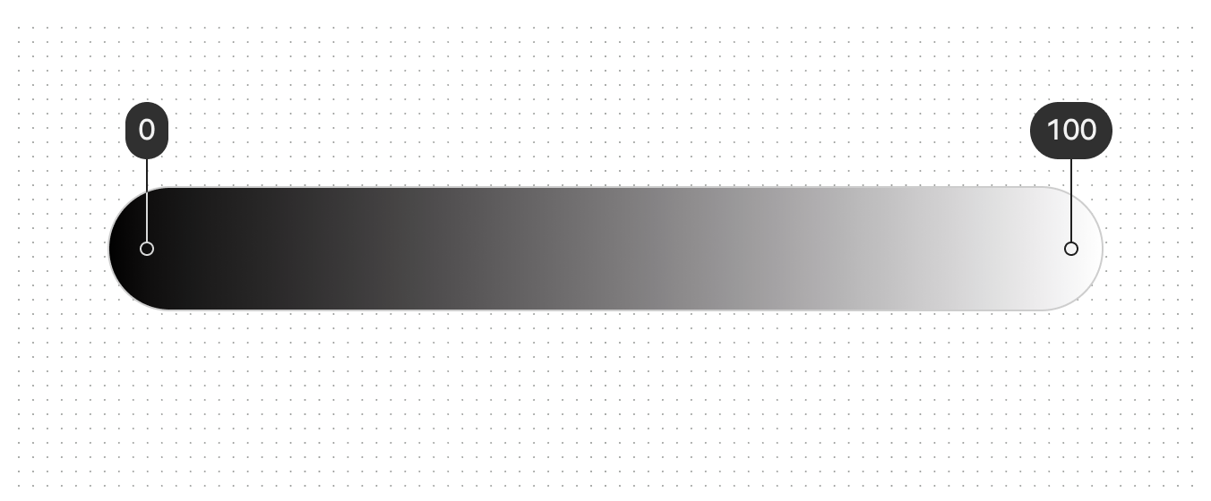
Gradient showing the range of tones from 1 (black) to 100 (white)
The 100 tone is always 100% white, the lightest tone in the range; the 0 tone is 100% black, the darkest tone in the range

HCT isn't interchangeable with other color spaces

Values from models like hue, saturation, and lightness (HSL) won't perfectly map to Material's hue, chroma, and tone (HCT). Don't conflate color spaces when inspecting or adjusting colors.

For example, colors with the same perceived brightness share the same tone value in HCT, but can have different HSL lightness values.

3 color dots with the same HCT tone of 78, and varying HSL lightness values of 83, 65, and 77.
HCT tone values remain constant when they have the same perceived brightness, while HSL lightness values can vary
Pager
Previous pageColor system: Overview
Next pageColor roles

Released under the Apache 2.0 or CC BY 4.0

Copyright © 2018-Present Google

https://m3.material.io/styles/color/system/how-the-system-works

Released under the Apache 2.0 or CC BY 4.0

Copyright © 2018-Present Google