Skip to content
Material Design 3
Main Navigation
v3
v2
v1

English

简体中文
繁體中文
Español
Français
Русский
Português – Brasil
Deutsch
日本語
한국어
Italiano
Polski
Türkçe
čeština
magyar

English

简体中文
繁體中文
Español
Français
Русский
Português – Brasil
Deutsch
日本語
한국어
Italiano
Polski
Türkçe
čeština
magyar

Appearance

Sidebar Navigation

Foundations

Accessibility

Overview: Principles

Overview: Assistive technology

Designing: Overview

Designing: Color contrast

Designing: Structure

Designing: Flow

Designing: Elements

Writing and text: Best practices

Writing and text: Text truncation

Writing and text: Text resizing

Building for all: User needs

Building for all: Co-design

Content design

Overview

Alt text

Global writing: Overview

Global writing: Word choice

Notifications

Style guide: UX writing best practices

Style guide: Word choice

Style guide: Grammar and punctuation

Customizing Material

Devices

Watches: Overview

Watches: Foundations

Watches: Styles

Watches: Layout

XR

Design: Overview

Design: Interaction

Design: Layout

Design: Accessibility

Components: Overview

Components: App bars

Components: Dialogs

Components: Nav bar

Components: Nav rail

Components: Toolbars

Design tokens: Overview

Design tokens: How to use tokens

Interaction

Gestures

Inputs

Selection

States: Overview

States: State layers

States: Applying states

Layout

Overview: Overview

Overview: Parts of layout

Overview: Adaptive design

Scaffold: Overview

Scaffold: Bars

Scaffold: Rails

Scaffold: Panes

Grids & spacing: Overview

Grids & spacing: Grids

Grids & spacing: Spacing

Grids & spacing: Density

Breakpoints: Overview

Breakpoints: Compact

Breakpoints: Medium

Breakpoints: Expanded

Breakpoints: Large & extra-large

Bidirectionality & RTL

Canonical examples: Overview

Canonical examples: Feed

Canonical examples: List-detail

Canonical examples: Supporting pane

Usability: Overview

Usability: Applying M3 Expressive

Material A-Z

Styles

Color

Color system: Overview

Color system: How the system works

Color roles

Color schemes

Choosing a scheme

Static: Baseline

Static: Custom brand

Dynamic: Choosing a source

Dynamic: User-generated source

Dynamic: Content-based source

Advanced: Overview

Advanced: Apply colors

Advanced: Define new colors

Advanced: Adjust existing colors

Color resources

Elevation: Overview

Elevation: Applying elevation

Elevation: Tokens

Icons: Overview

Icons: Designing icons

Icons: Applying icons

Motion

Motion physics system: How it works

Motion physics system: Specs

Easing and duration: Applying easing and duration

Easing and duration: Tokens & specs

Transitions: Transition patterns

Transitions: Applying transitions

Shape: Overview & principles

Shape: Corner radius scale

Shape: Shape morph

Spacing: Overview

Spacing: Applying spacing

Spacing: Tokens

Typography: Overview

Typography: Fonts

Typography: Type scale & tokens

Typography: Applying type

Typography: Editorial treatments

Components

App bars: Overview

App bars: Specs

App bars: Guidelines

App bars: Accessibility

Badges: Overview

Badges: Specs

Badges: Guidelines

Badges: Accessibility

Buttons

All buttons

Button groups: Overview

Button groups: Specs

Button groups: Guidelines

Button groups: Accessibility

Buttons: Overview

Buttons: Specs

Buttons: Guidelines

Buttons: Accessibility

Extended FABs: Overview

Extended FABs: Specs

Extended FABs: Guidelines

Extended FABs: Accessibility

FAB menu: Overview

FAB menu: Specs

FAB menu: Guidelines

FAB menu: Accessibility

FABs: Overview

FABs: Specs

FABs: Guidelines

FABs: Accessibility

Icon buttons: Overview

Icon buttons: Specs

Icon buttons: Guidelines

Icon buttons: Accessibility

Segmented buttons: Overview

Segmented buttons: Specs

Segmented buttons: Guidelines

Segmented buttons: Accessibility

Split button: Overview

Split button: Specs

Split button: Guidelines

Split button: Accessibility

Cards: Overview

Cards: Specs

Cards: Guidelines

Cards: Accessibility

Carousel: Overview

Carousel: Specs

Carousel: Guidelines

Carousel: Accessibility

Checkbox: Overview

Checkbox: Specs

Checkbox: Guidelines

Checkbox: Accessibility

Chips: Overview

Chips: Specs

Chips: Guidelines

Chips: Accessibility

Date & time pickers

Date pickers: Overview

Date pickers: Specs

Date pickers: Guidelines

Date pickers: Accessibility

Time pickers: Overview

Time pickers: Specs

Time pickers: Guidelines

Time pickers: Accessibility

Dialogs: Overview

Dialogs: Specs

Dialogs: Guidelines

Dialogs: Accessibility

Divider: Overview

Divider: Specs

Divider: Guidelines

Divider: Accessibility

Lists: Overview

Lists: Specs

Lists: Guidelines

Lists: Accessibility

Loading & progress

Loading indicator: Overview

Loading indicator: Specs

Loading indicator: Guidelines

Loading indicator: Accessibility

Progress indicators: Overview

Progress indicators: Specs

Progress indicators: Guidelines

Progress indicators: Accessibility

Menus: Overview

Menus: Specs

Menus: Guidelines

Menus: Accessibility

Navigation

Navigation bar: Overview

Navigation bar: Specs

Navigation bar: Guidelines

Navigation bar: Accessibility

Navigation drawer: Overview

Navigation drawer: Specs

Navigation drawer: Guidelines

Navigation drawer: Accessibility

Navigation rail: Overview

Navigation rail: Specs

Navigation rail: Guidelines

Navigation rail: Accessibility

Radio button: Overview

Radio button: Specs

Radio button: Guidelines

Radio button: Accessibility

Search: Overview

Search: Specs

Search: Guidelines

Search: Accessibility

Sheets

Bottom sheets: Overview

Bottom sheets: Specs

Bottom sheets: Guidelines

Bottom sheets: Accessibility

Side sheets: Overview

Side sheets: Specs

Side sheets: Guidelines

Side sheets: Accessibility

Sliders: Overview

Sliders: Specs

Sliders: Guidelines

Sliders: Accessibility

Snackbar: Overview

Snackbar: Specs

Snackbar: Guidelines

Snackbar: Accessibility

Switch: Overview

Switch: Specs

Switch: Guidelines

Switch: Accessibility

Tabs: Overview

Tabs: Specs

Tabs: Guidelines

Tabs: Accessibility

Text fields: Overview

Text fields: Specs

Text fields: Guidelines

Text fields: Accessibility

Toolbars: Overview

Toolbars: Specs

Toolbars: Guidelines

Toolbars: Accessibility

Tooltips: Overview

Tooltips: Specs

Tooltips: Guidelines

Tooltips: Accessibility

On this page

Dynamic color schemes: User-generated source ​

Dynamic color can change a color palette to match user settings, like wallpapers, or in-product content


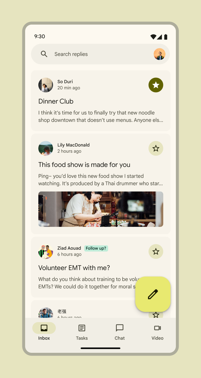
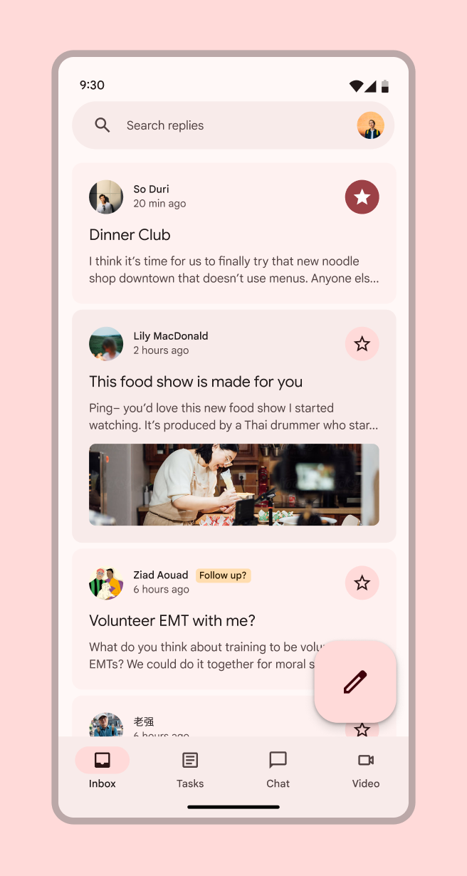
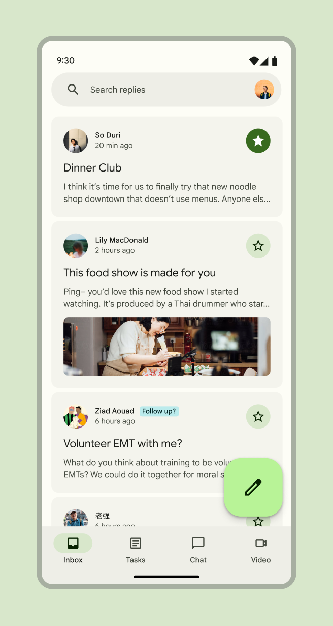
User-generated color comes from an Android user's personal wallpaper. The wallpaper is digitally analyzed, a single color is selected as the source color, and tones are chosen and assigned to each color role.

With a dynamic user-generated color scheme, end-users see

  • Their apps and system UI change to a color pulled from their device wallpaper
  • A product that looks personalized
Mobile screenshot of Google Photos
Dynamic color in a work app
Mobile screenshot of Gmail in light theme.
Dynamic color in a work app
Mobile screenshot of Gmail.
Dynamic color in a work app

Design with user-generated color ​

Because the final colors will be dynamically generated on each user's personal device, it's more important to understand and apply the system's color rolesColor roles are assigned to UI elements based on emphasis, container type, and relationship with other elements. This ensures proper contrast and usage in any color scheme.More on color roles in your designs rather than use a particular hex value.

The easiest way to do this is by using a color scheme generated by the Material Theme BuilderMaterial Theme Builder (MTB) is a Figma plugin that allows markers to emulate the color extraction process for dynamic color and create custom tonal schemes.Get the MTB and focus on applying the color roles to your designs instead of particular hex values. Then you can use the Material Theme Builder to test how well the design functions across potential user-generated color options.

Use Material color roles in new design files ​

First, get the color roles by creating a new theme with the Material Theme Builder

  1. Open your Figma file. Select the Resources button in the Figma toolbar
  2. Find the Material Theme Builder plugin and select Run. This will open a plugin dialog showing the default color scheme, including Core colors and Extended colors.
  3. Open the plugin's Settings (gear icon at lower right of dialog) and select the checkboxes for both New theme color diagram and Generate State Layers. This will create a handy visualization of your branded color scheme and also generate state layers essential for designing interactions. Learn more about state layers
  4. Navigate out of settings
  5. Open the Current Theme dropdown at the top of the dialog and select + ADD NEW THEME
  6. Give your theme a short name (this name will become the prefix of your color roles in Figma)
  7. Select ADD THEME
  8. With Custom selected, select Primary. This opens a dialog prompting you to select a custom source color.
  9. Enter the Hex value for a color and hit Apply. This will generate a full color scheme.
  10. With the Current Theme dropdown at the top of the dialog, select your theme
  11. Select the frames or components in your file and then hit Swap in the bottom right of the dialog. This will automatically update the colors for any M3 Design Kit components.

Apply color roles to an existing file or M3 Design Kit components ​

First, get the color roles into your file

  1. Copy your preferred scheme's color diagram from your Material Theme Builder file and paste it into your file (this makes the color roles available in the Design panel on the right of the screen as part of your local styles)

Swap colors in M3 Design Kit components for your preferred colors

  1. Select the Resources button in the Figma toolbar.
  2. Find the Material Theme Builder plugin and select Run. This will open a plugin dialog showing the default color scheme, including Core colors and Extended colors.
  3. In the Current Theme dropdown at the top of the dialog, select your color scheme
  4. Select the frames or M3 Design Kit components in your file that need a color update and then hit Swap in the bottom right of the dialog. This will automatically update their colors from baseline colors to your selected scheme colors

Then, update any remaining non-color-role-based colors

  1. Manually change any hex values or non-color-role-based color styles by selecting all and looking through the Selection colors in the Design panel on the right of the screen
  2. Any colors that don't start with your selected scheme name need to be replaced with a corresponding color role
  3. Hover on a non-color-role-based color row in the Design panel and select the Style icon (four dots). This opens a selection dialog.
  4. Search for your scheme name to see the color roles
  5. Select the color-role-based color that most closely matches that color's use case (see Color roles for more information on what color to use where) and select Use style to apply it to the selected objects
  6. Repeat until all non-color-role-based colors in the file have been replaced with color roles

Try out how your designs will look with dynamic color ​

  1. Select the Resources button in the Figma toolbar.
  2. Find the Material Theme Builder plugin and select Run. This will open a plugin dialog showing the default color scheme, including Core colors and Extended colors.
  3. Select Dynamic
  4. Add an image, or select the Shuffle icon to get a random source color
  5. Select the frames or components in your file that you want to see with dynamic color and then hit Swap in the bottom right of the dialog. This will automatically update their colors to the user-generated dynamic colors.
  6. Repeat with a range of colors to get a sense of how your product will appear across different users' devices

Need to make adjustments to the scheme? Check out Advanced customizations

Develop with user-generated color ​

  • Android Views (MDC-Android) – Color docs
Pager
Previous pageDynamic: Choosing a source
Next pageDynamic: Content-based source

Released under the Apache 2.0 or CC BY 4.0

Copyright © 2018-Present Google

https://m3.material.io/styles/color/dynamic/user-generated-source

Released under the Apache 2.0 or CC BY 4.0

Copyright © 2018-Present Google