Skip to content
Material Design 3
Main Navigation
v3
v2
v1

English

简体中文
繁體中文
Español
Français
Русский
Português – Brasil
Deutsch
日本語
한국어
Italiano
Polski
Türkçe
čeština
magyar

English

简体中文
繁體中文
Español
Français
Русский
Português – Brasil
Deutsch
日本語
한국어
Italiano
Polski
Türkçe
čeština
magyar

Appearance

Sidebar Navigation

Foundations

Accessibility

Overview: Principles

Overview: Assistive technology

Designing: Overview

Designing: Color contrast

Designing: Structure

Designing: Flow

Designing: Elements

Writing and text: Best practices

Writing and text: Text truncation

Writing and text: Text resizing

Building for all: User needs

Building for all: Co-design

Content design

Overview

Alt text

Global writing: Overview

Global writing: Word choice

Notifications

Style guide: UX writing best practices

Style guide: Word choice

Style guide: Grammar and punctuation

Customizing Material

Devices

Watches: Overview

Watches: Foundations

Watches: Styles

Watches: Layout

XR

Design: Overview

Design: Interaction

Design: Layout

Design: Accessibility

Components: Overview

Components: App bars

Components: Dialogs

Components: Nav bar

Components: Nav rail

Components: Toolbars

Design tokens: Overview

Design tokens: How to use tokens

Interaction

Gestures

Inputs

Selection

States: Overview

States: State layers

States: Applying states

Layout

Overview: Overview

Overview: Parts of layout

Overview: Adaptive design

Scaffold: Overview

Scaffold: Bars

Scaffold: Rails

Scaffold: Panes

Grids & spacing: Overview

Grids & spacing: Grids

Grids & spacing: Spacing

Grids & spacing: Density

Breakpoints: Overview

Breakpoints: Compact

Breakpoints: Medium

Breakpoints: Expanded

Breakpoints: Large & extra-large

Bidirectionality & RTL

Canonical examples: Overview

Canonical examples: Feed

Canonical examples: List-detail

Canonical examples: Supporting pane

Usability: Overview

Usability: Applying M3 Expressive

Material A-Z

Styles

Color

Color system: Overview

Color system: How the system works

Color roles

Color schemes

Choosing a scheme

Static: Baseline

Static: Custom brand

Dynamic: Choosing a source

Dynamic: User-generated source

Dynamic: Content-based source

Advanced: Overview

Advanced: Apply colors

Advanced: Define new colors

Advanced: Adjust existing colors

Color resources

Elevation: Overview

Elevation: Applying elevation

Elevation: Tokens

Icons: Overview

Icons: Designing icons

Icons: Applying icons

Motion

Motion physics system: How it works

Motion physics system: Specs

Easing and duration: Applying easing and duration

Easing and duration: Tokens & specs

Transitions: Transition patterns

Transitions: Applying transitions

Shape: Overview & principles

Shape: Corner radius scale

Shape: Shape morph

Spacing: Overview

Spacing: Applying spacing

Spacing: Tokens

Typography: Overview

Typography: Fonts

Typography: Type scale & tokens

Typography: Applying type

Typography: Editorial treatments

Components

App bars: Overview

App bars: Specs

App bars: Guidelines

App bars: Accessibility

Badges: Overview

Badges: Specs

Badges: Guidelines

Badges: Accessibility

Buttons

All buttons

Button groups: Overview

Button groups: Specs

Button groups: Guidelines

Button groups: Accessibility

Buttons: Overview

Buttons: Specs

Buttons: Guidelines

Buttons: Accessibility

Extended FABs: Overview

Extended FABs: Specs

Extended FABs: Guidelines

Extended FABs: Accessibility

FAB menu: Overview

FAB menu: Specs

FAB menu: Guidelines

FAB menu: Accessibility

FABs: Overview

FABs: Specs

FABs: Guidelines

FABs: Accessibility

Icon buttons: Overview

Icon buttons: Specs

Icon buttons: Guidelines

Icon buttons: Accessibility

Segmented buttons: Overview

Segmented buttons: Specs

Segmented buttons: Guidelines

Segmented buttons: Accessibility

Split button: Overview

Split button: Specs

Split button: Guidelines

Split button: Accessibility

Cards: Overview

Cards: Specs

Cards: Guidelines

Cards: Accessibility

Carousel: Overview

Carousel: Specs

Carousel: Guidelines

Carousel: Accessibility

Checkbox: Overview

Checkbox: Specs

Checkbox: Guidelines

Checkbox: Accessibility

Chips: Overview

Chips: Specs

Chips: Guidelines

Chips: Accessibility

Date & time pickers

Date pickers: Overview

Date pickers: Specs

Date pickers: Guidelines

Date pickers: Accessibility

Time pickers: Overview

Time pickers: Specs

Time pickers: Guidelines

Time pickers: Accessibility

Dialogs: Overview

Dialogs: Specs

Dialogs: Guidelines

Dialogs: Accessibility

Divider: Overview

Divider: Specs

Divider: Guidelines

Divider: Accessibility

Lists: Overview

Lists: Specs

Lists: Guidelines

Lists: Accessibility

Loading & progress

Loading indicator: Overview

Loading indicator: Specs

Loading indicator: Guidelines

Loading indicator: Accessibility

Progress indicators: Overview

Progress indicators: Specs

Progress indicators: Guidelines

Progress indicators: Accessibility

Menus: Overview

Menus: Specs

Menus: Guidelines

Menus: Accessibility

Navigation

Navigation bar: Overview

Navigation bar: Specs

Navigation bar: Guidelines

Navigation bar: Accessibility

Navigation drawer: Overview

Navigation drawer: Specs

Navigation drawer: Guidelines

Navigation drawer: Accessibility

Navigation rail: Overview

Navigation rail: Specs

Navigation rail: Guidelines

Navigation rail: Accessibility

Radio button: Overview

Radio button: Specs

Radio button: Guidelines

Radio button: Accessibility

Search: Overview

Search: Specs

Search: Guidelines

Search: Accessibility

Sheets

Bottom sheets: Overview

Bottom sheets: Specs

Bottom sheets: Guidelines

Bottom sheets: Accessibility

Side sheets: Overview

Side sheets: Specs

Side sheets: Guidelines

Side sheets: Accessibility

Sliders: Overview

Sliders: Specs

Sliders: Guidelines

Sliders: Accessibility

Snackbar: Overview

Snackbar: Specs

Snackbar: Guidelines

Snackbar: Accessibility

Switch: Overview

Switch: Specs

Switch: Guidelines

Switch: Accessibility

Tabs: Overview

Tabs: Specs

Tabs: Guidelines

Tabs: Accessibility

Text fields: Overview

Text fields: Specs

Text fields: Guidelines

Text fields: Accessibility

Toolbars: Overview

Toolbars: Specs

Toolbars: Guidelines

Toolbars: Accessibility

Tooltips: Overview

Tooltips: Specs

Tooltips: Guidelines

Tooltips: Accessibility

On this page

Designing: Elements ​

Implement intuitive, accessible layouts, considering structure, color, and flow

Labeling elements ​

Elements can be defined and labeled to enhance understanding of their function and reduce confusion for those navigating with assistive technology. Add accessibility labels to define roles and indicate decorative elements.

Visual elements that need labels ​

  • Interactive icons or buttons with no visible text or not enough context in the text (for example, an edit button with a pencil icon)
  • Interactive images
  • Visual cues (including progress bars and error handling)
  • Meaningful icons (such as status icons)
  • Meaningful images (for example, diagrams, substantive photos, and illustrations)

Text elements need labels to add additional context ​

  • Generic links (for example, "Learn more")
  • Buttons with generic text (for example, "Save" when there are multiple such buttons on a page)

Elements that do not need labels ​

  • Non-interactive UI text, as this will be automatically read by the screen reader
  • Buttons with sufficient text (for example, "Download image")

Do not include the element name in labels ​

Do not use an element role (for example, button or menu) in your label. This identifier is automatically added when the element is assigned its proper role, typically by a developer.

Label language style ​

This article uses the general term accessibility label to refer to several different types, including ARIA labels and alt tags. When accessibility labels are implemented in code, they'll be translated to the appropriate type for the intended platform. Additionally, the term role is used to cover both general component control types and ARIA roles for web apps. Learn more about writing alt text

How to add labels ​

1. Label elements

Accessibility labels assist users who cannot rely on a product's visual interface. Thoughtful labels help make the text-based experience as usable as the visual experience. Labels should concisely describe an element's content, purpose and behavior.
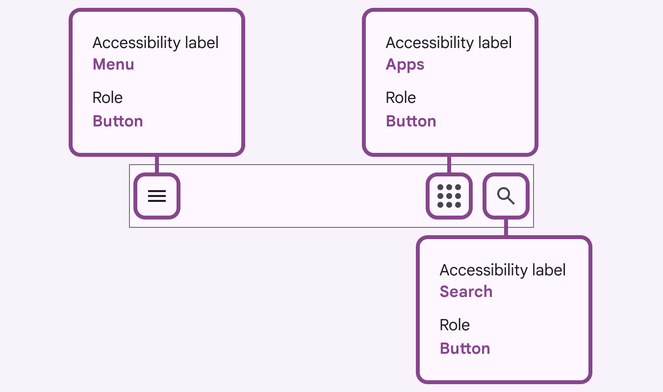
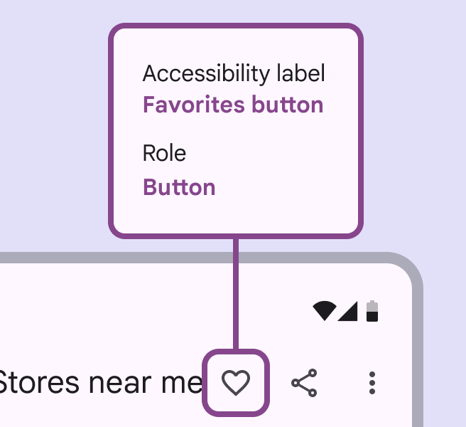
Diagram showing the labels and roles assigned to on-screen icon buttons.
Example: The accessibility labels for these icons describe their purpose—NOT what the icon looks like (for example, "magnifying glass")

2. Add labels for meaningful images and interactive elements

Add labels to visuals that convey meaning or enhance content.

Labels should be concise, descriptive, and convey the content and context of the image.

This applies to infographics and other instructive images found in support docs.
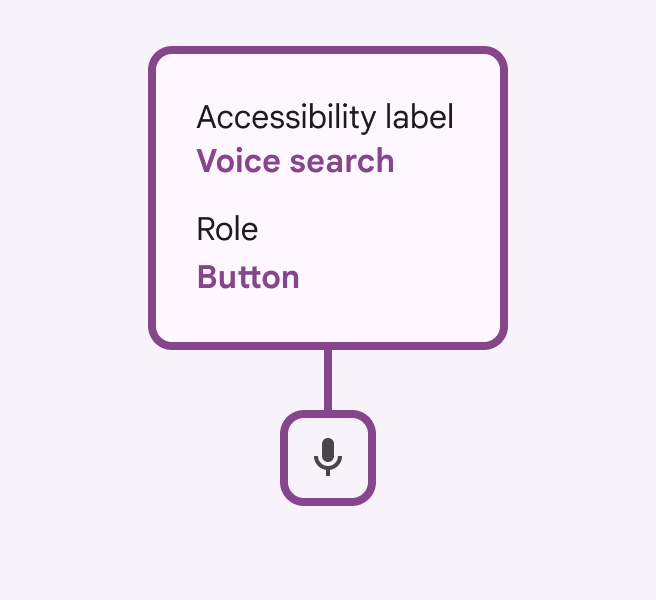
A microphone icon with the accessibility label "Voice Search."
Do The label “voice search” describes the user task (search) paired with the input method (voice)
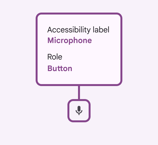
A microphone icon with the accessibility label "Microphone."
Don’t Don't include the element type (button, menu, etc.) in your label. This will automatically be added by assigning the element the proper role.

Hiding images

Decorative icons and images that don't enhance the experience for a visually-impaired user should be annotated as decorative in order to hide them in code.
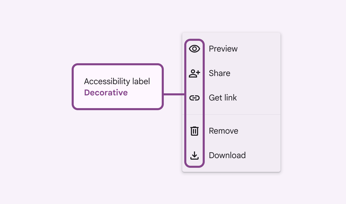
Group of icons in a menu collectively described by the accessibility label N/A Hide Images.
Mark decorative visual elements to "hide"

3. Assign a role to interactive elements

ARIA roles apply to web apps and specify how to increase the accessibility of web pages on top of HTML.

  • For web, assign ARIA roles for all interactive elements
  • For non-web, assign roles based on your design system components (button, slider, menu, etc.)

Assign ARIA roles (web) or component type (mobile) to communicate desired interaction patterns into engineering action. Note that some visual elements may look the same, but are intended to behave differently.

Defining an interactive element's category by assigning it a role helps users of assistive technology establish expectations for how to interact with that element and anticipate what is likely to happen upon interaction.
Element with the label "Got it button" and the role "Button."
Don’t Don't include the control type in the label. Screen readers automatically add the control, so you’d be having it repeat (for example, “Got it button button”).
Pager
Previous pageDesigning: Flow
Next pageWriting and text: Best practices

Released under the Apache 2.0 or CC BY 4.0

Copyright © 2018-Present Google

https://m3.material.io/foundations/designing/elements

Released under the Apache 2.0 or CC BY 4.0

Copyright © 2018-Present Google