Skip to content
Material Design 3
Main Navigation
v3
v2
v1

English

简体中文
繁體中文
Español
Français
Русский
Português – Brasil
Deutsch
日本語
한국어
Italiano
Polski
Türkçe
čeština
magyar

English

简体中文
繁體中文
Español
Français
Русский
Português – Brasil
Deutsch
日本語
한국어
Italiano
Polski
Türkçe
čeština
magyar

Appearance

Sidebar Navigation

Foundations

Accessibility

Overview: Principles

Overview: Assistive technology

Designing: Overview

Designing: Color contrast

Designing: Structure

Designing: Flow

Designing: Elements

Writing and text: Best practices

Writing and text: Text truncation

Writing and text: Text resizing

Building for all: User needs

Building for all: Co-design

Content design

Overview

Alt text

Global writing: Overview

Global writing: Word choice

Notifications

Style guide: UX writing best practices

Style guide: Word choice

Style guide: Grammar and punctuation

Customizing Material

Devices

Watches: Overview

Watches: Foundations

Watches: Styles

Watches: Layout

XR

Design: Overview

Design: Interaction

Design: Layout

Design: Accessibility

Components: Overview

Components: App bars

Components: Dialogs

Components: Nav bar

Components: Nav rail

Components: Toolbars

Design tokens: Overview

Design tokens: How to use tokens

Interaction

Gestures

Inputs

Selection

States: Overview

States: State layers

States: Applying states

Layout

Overview: Overview

Overview: Parts of layout

Overview: Adaptive design

Scaffold: Overview

Scaffold: Bars

Scaffold: Rails

Scaffold: Panes

Grids & spacing: Overview

Grids & spacing: Grids

Grids & spacing: Spacing

Grids & spacing: Density

Breakpoints: Overview

Breakpoints: Compact

Breakpoints: Medium

Breakpoints: Expanded

Breakpoints: Large & extra-large

Bidirectionality & RTL

Canonical examples: Overview

Canonical examples: Feed

Canonical examples: List-detail

Canonical examples: Supporting pane

Usability: Overview

Usability: Applying M3 Expressive

Material A-Z

Styles

Color

Color system: Overview

Color system: How the system works

Color roles

Color schemes

Choosing a scheme

Static: Baseline

Static: Custom brand

Dynamic: Choosing a source

Dynamic: User-generated source

Dynamic: Content-based source

Advanced: Overview

Advanced: Apply colors

Advanced: Define new colors

Advanced: Adjust existing colors

Color resources

Elevation: Overview

Elevation: Applying elevation

Elevation: Tokens

Icons: Overview

Icons: Designing icons

Icons: Applying icons

Motion

Motion physics system: How it works

Motion physics system: Specs

Easing and duration: Applying easing and duration

Easing and duration: Tokens & specs

Transitions: Transition patterns

Transitions: Applying transitions

Shape: Overview & principles

Shape: Corner radius scale

Shape: Shape morph

Spacing: Overview

Spacing: Applying spacing

Spacing: Tokens

Typography: Overview

Typography: Fonts

Typography: Type scale & tokens

Typography: Applying type

Typography: Editorial treatments

Components

App bars: Overview

App bars: Specs

App bars: Guidelines

App bars: Accessibility

Badges: Overview

Badges: Specs

Badges: Guidelines

Badges: Accessibility

Buttons

All buttons

Button groups: Overview

Button groups: Specs

Button groups: Guidelines

Button groups: Accessibility

Buttons: Overview

Buttons: Specs

Buttons: Guidelines

Buttons: Accessibility

Extended FABs: Overview

Extended FABs: Specs

Extended FABs: Guidelines

Extended FABs: Accessibility

FAB menu: Overview

FAB menu: Specs

FAB menu: Guidelines

FAB menu: Accessibility

FABs: Overview

FABs: Specs

FABs: Guidelines

FABs: Accessibility

Icon buttons: Overview

Icon buttons: Specs

Icon buttons: Guidelines

Icon buttons: Accessibility

Segmented buttons: Overview

Segmented buttons: Specs

Segmented buttons: Guidelines

Segmented buttons: Accessibility

Split button: Overview

Split button: Specs

Split button: Guidelines

Split button: Accessibility

Cards: Overview

Cards: Specs

Cards: Guidelines

Cards: Accessibility

Carousel: Overview

Carousel: Specs

Carousel: Guidelines

Carousel: Accessibility

Checkbox: Overview

Checkbox: Specs

Checkbox: Guidelines

Checkbox: Accessibility

Chips: Overview

Chips: Specs

Chips: Guidelines

Chips: Accessibility

Date & time pickers

Date pickers: Overview

Date pickers: Specs

Date pickers: Guidelines

Date pickers: Accessibility

Time pickers: Overview

Time pickers: Specs

Time pickers: Guidelines

Time pickers: Accessibility

Dialogs: Overview

Dialogs: Specs

Dialogs: Guidelines

Dialogs: Accessibility

Divider: Overview

Divider: Specs

Divider: Guidelines

Divider: Accessibility

Lists: Overview

Lists: Specs

Lists: Guidelines

Lists: Accessibility

Loading & progress

Loading indicator: Overview

Loading indicator: Specs

Loading indicator: Guidelines

Loading indicator: Accessibility

Progress indicators: Overview

Progress indicators: Specs

Progress indicators: Guidelines

Progress indicators: Accessibility

Menus: Overview

Menus: Specs

Menus: Guidelines

Menus: Accessibility

Navigation

Navigation bar: Overview

Navigation bar: Specs

Navigation bar: Guidelines

Navigation bar: Accessibility

Navigation drawer: Overview

Navigation drawer: Specs

Navigation drawer: Guidelines

Navigation drawer: Accessibility

Navigation rail: Overview

Navigation rail: Specs

Navigation rail: Guidelines

Navigation rail: Accessibility

Radio button: Overview

Radio button: Specs

Radio button: Guidelines

Radio button: Accessibility

Search: Overview

Search: Specs

Search: Guidelines

Search: Accessibility

Sheets

Bottom sheets: Overview

Bottom sheets: Specs

Bottom sheets: Guidelines

Bottom sheets: Accessibility

Side sheets: Overview

Side sheets: Specs

Side sheets: Guidelines

Side sheets: Accessibility

Sliders: Overview

Sliders: Specs

Sliders: Guidelines

Sliders: Accessibility

Snackbar: Overview

Snackbar: Specs

Snackbar: Guidelines

Snackbar: Accessibility

Switch: Overview

Switch: Specs

Switch: Guidelines

Switch: Accessibility

Tabs: Overview

Tabs: Specs

Tabs: Guidelines

Tabs: Accessibility

Text fields: Overview

Text fields: Specs

Text fields: Guidelines

Text fields: Accessibility

Toolbars: Overview

Toolbars: Specs

Toolbars: Guidelines

Toolbars: Accessibility

Tooltips: Overview

Tooltips: Specs

Tooltips: Guidelines

Tooltips: Accessibility

On this page

XR components: Toolbars ​

Learn how Material 3 Expressive components adapt to extended reality devices


TIP

XR guidelines are primarily intended for designers. Find what’s implemented in code in the design kit.

Extended reality (XR) interfaces have special design requirements, like showing apps in 3D space. Material has an XR toolbar with custom specs and guidance. Read XR developer documentation for more details.

Variants ​

There is one toolbar orbiterOrbiters are floating elements that control the content within spatial panels.More on orbiters. It closely aligns with the floating toolbarFloating toolbars float on top of page content and can provide contextual, dynamic actions.More on toolbars. It can be configured to be horizontal or vertical. Go to XR toolbar API reference
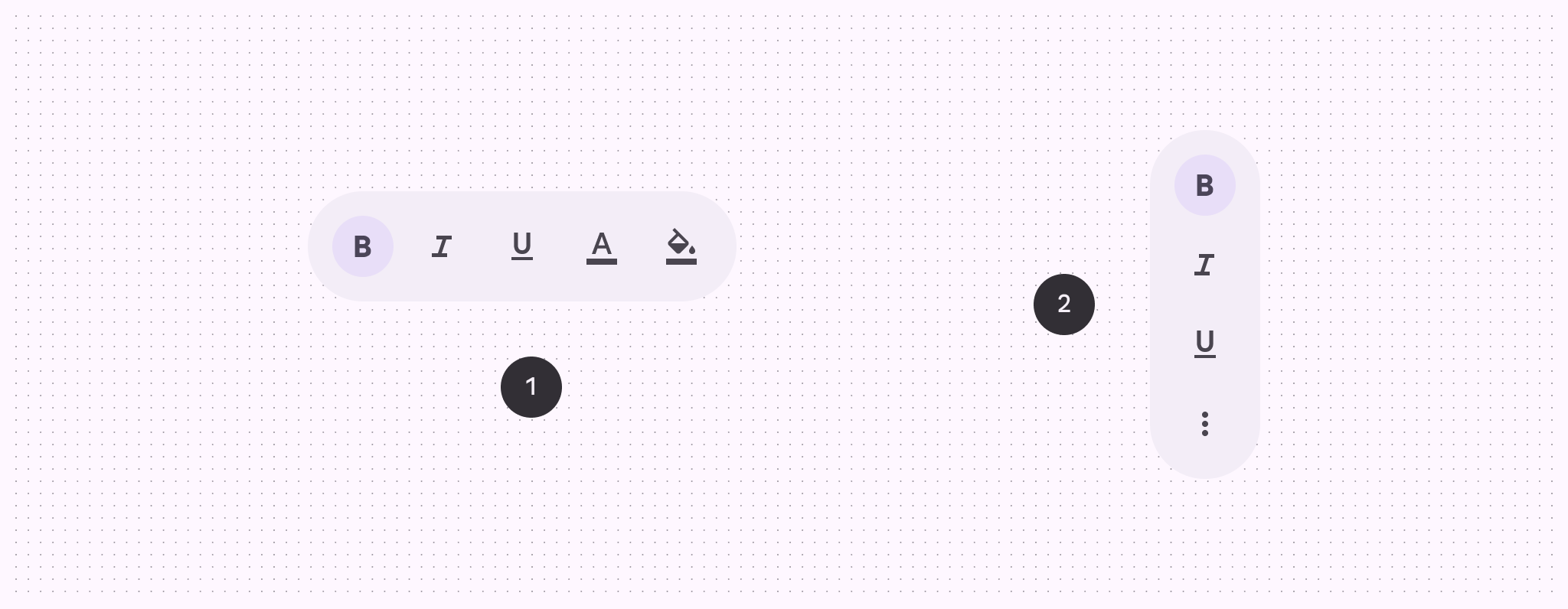
Horizontal and vertical toolbar orbiters
  1. Horizontal floating toolbar
  2. Vertical floating toolbar

Anatomy ​

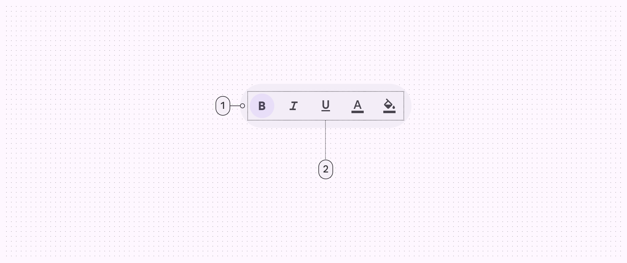
2 elements of a toolbar orbiter: container and placed components
  1. Container
  2. Placed components

Color & elevation ​

XR uses color to communicate the elevation of UI elements and orbiters. With spatial elevation, the toolbar displays above the spatial panelIn Android XR, a spatial panel is a container for UI elements, interactive components, and immersive content.More on spatial panels on the Z-axis. Elevated toolbars can use any of these color options:
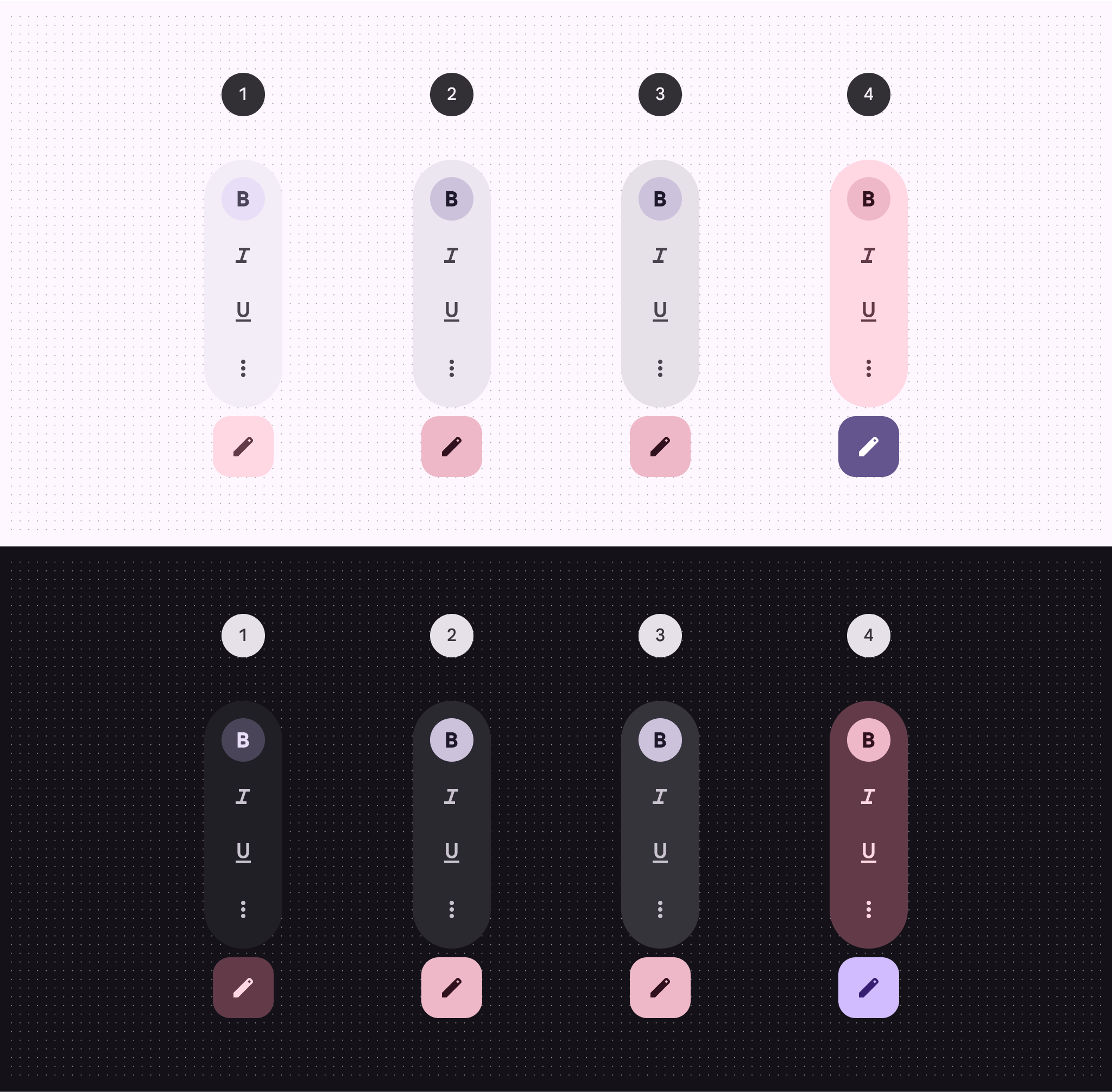
4 versions of toolbar elevation color strategy
  1. Surface container
  2. Surface container high
  3. Surface container highest
  4. Tertiary container

Measurements ​

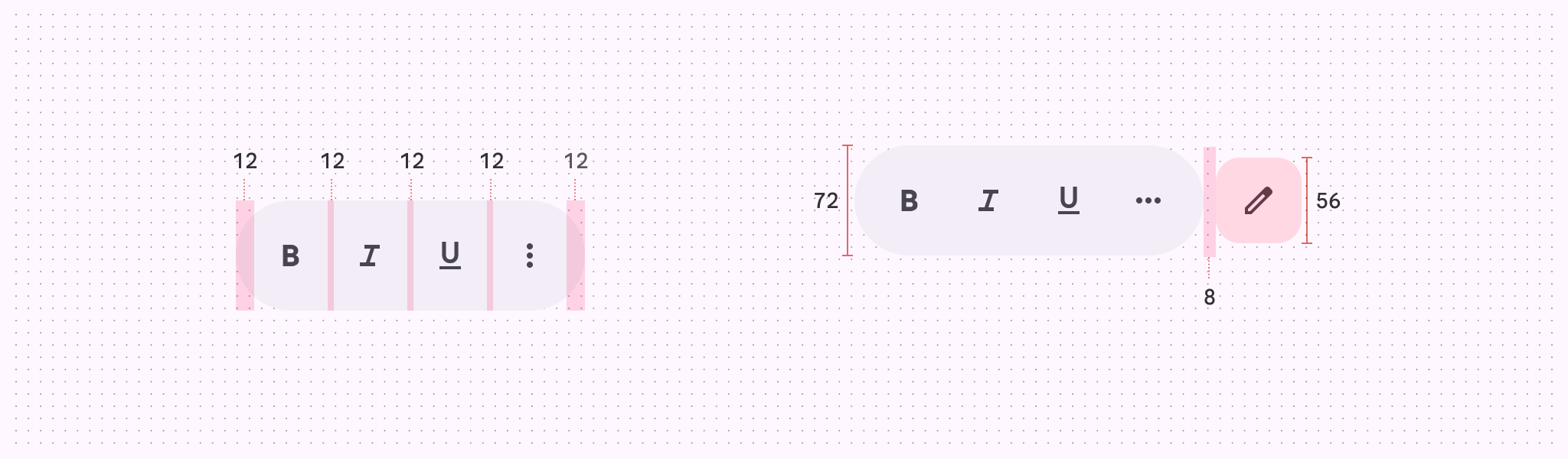
Diagram with measurements for toolbar orbiters
Measurements for toolbar orbiters

Diagram with 12dp padding for toolbar orbiters
Padding for toolbar orbiters

Usage ​

A toolbar can appear in an orbiterOrbiters are floating elements that control the content within spatial panels.More on orbiters for a more immersive experience. Currently, this spatial capability is only available in full spaceFull space is Android XR’s immersive mode and supports spatial components.More on full space. In home spaceHome space is compatible with mobile and large screen apps, but doesn’t support spatial components.More on home space, use a regular toolbar on the same plane as the body content to mimic a 2D experience.

A toolbar's behavior and placement changes from a 2D to a 3D experience

Behavior ​

Local context (recommended)

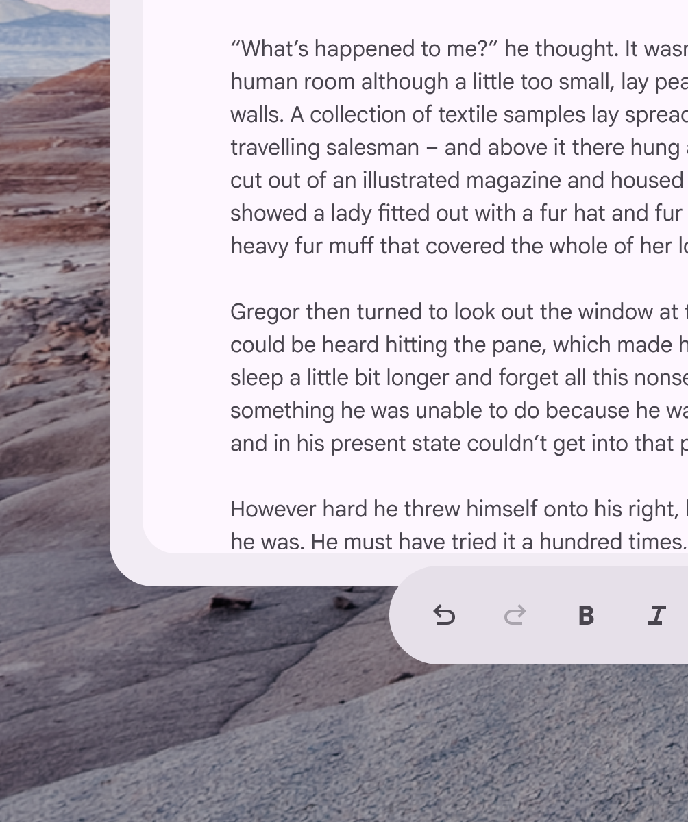
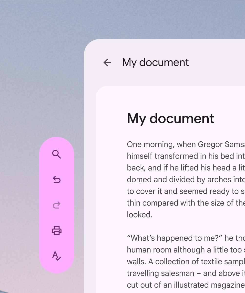
When placed in local context, the toolbar orbiter is centered at the bottom of the spatial panel it controls.

It repositions in response to layout or content changes.

In most cases, toolbars should be placed in local context. The orbiter is centered and anchored to the bottom of the panel it controls.

Global context

When placed in global context, the toolbar orbiter is centered at the bottom of the app.

It stays anchored to the app during layout or content changes.

Caution In global context, toolbar orbiters are centered and anchored to the bottom of the app. This use case is less common, as toolbars usually contain actions that control a specific panel.

Expand & collapse

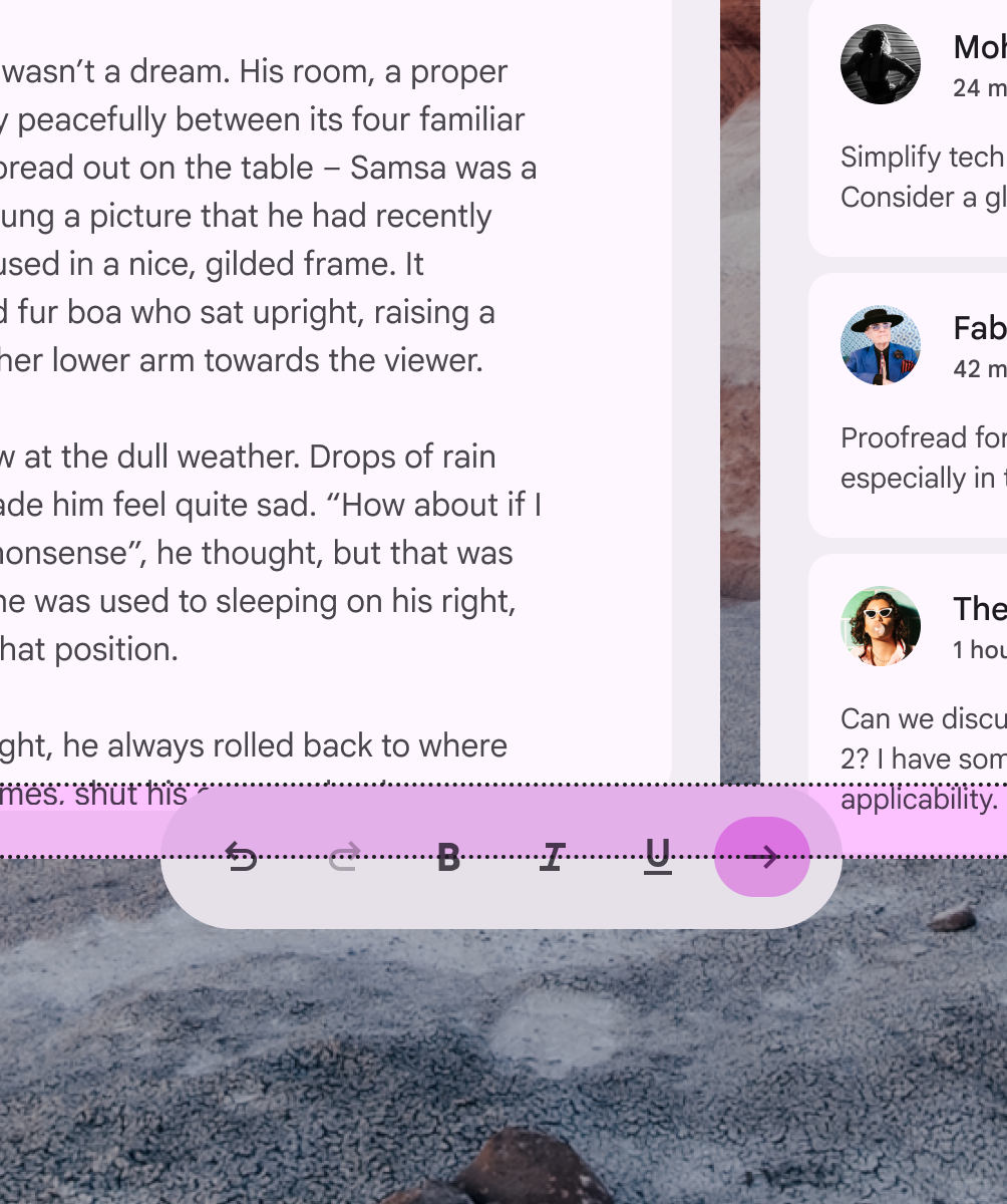
Toolbar orbiters with more than five items can expand and collapse to reveal or hide additional content.

When a toolbar orbiter expands, it stays within the bounds of the adjacent spatial panel.

Alternatively, more complex toolbars can be split into multiple toolbars.

Toolbar orbiters can expand to reveal additional content, but should stay within the bounds of the adjacent spatial panel

Additional toolbars ​

In some cases, full space apps can have more than one toolbar orbiter, placed in either global or local context.

Caution Limit the use of multiple toolbars to rare cases when additional spatialization improves usability

Placement ​

Offset & inset positioning ​

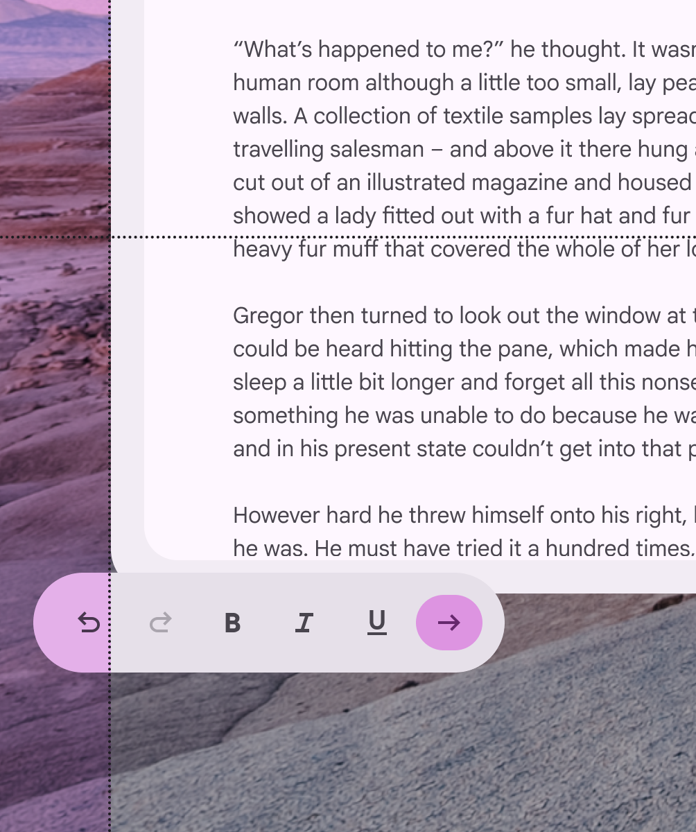
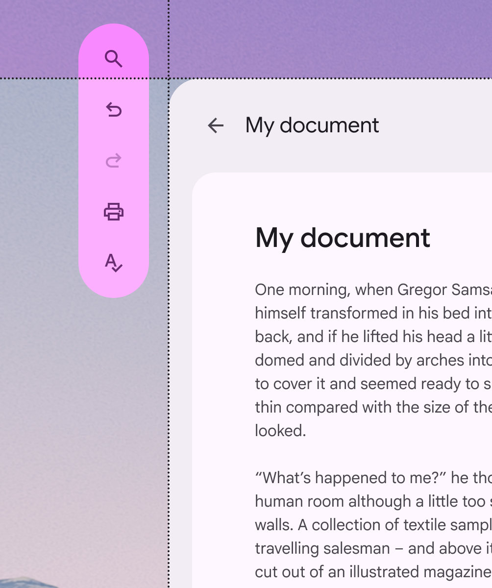
In full space, a toolbar orbiter can be positioned adjacent to or overlap a spatial panel.
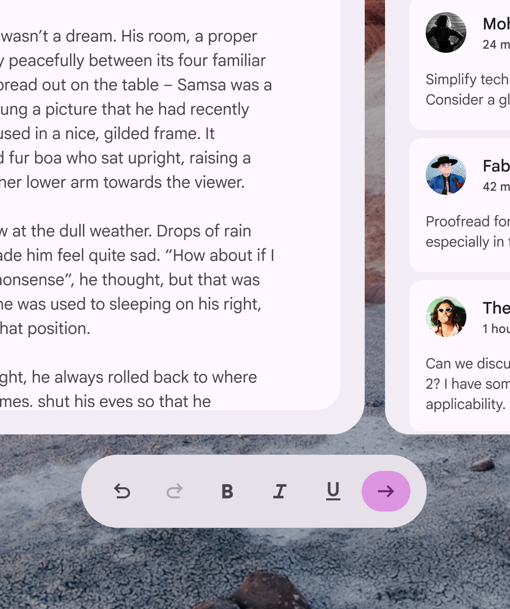
Toolbar orbiter with offset positioning
Do The recommended toolbar orbiter position from the spatial panel is:
  • Offset by 20dp or
  • Inset by 12dp
Toolbar orbiter with inset positioning above 12dp that obstructs content on the spatial panel
Don’t To prevent content obstruction, don’t overlap the toolbar orbiter and spatial panel above 12dp

Horizontal alignment ​

A horizontal toolbar orbiter placed within the bounds of its spatial panel
Do Always align the toolbar orbiter within the horizontal bounds of nearby spatial panels
A horizontal toolbar orbiter that extends beyond the width of its spatial panel
Don’t The toolbar orbiter shouldn’t exceed the width of adjacent spatial panels

Vertical alignment ​

A vertical toolbar orbiter placed within the bounds of its spatial panel
Do Always align the toolbar orbiter within the vertical bounds of nearby spatial panels
A vertical toolbar orbiter that extends beyond the height of its spatial panel
Don’t The toolbar orbiter shouldn’t exceed the height of adjacent spatial panels

Spatial panel alignment ​

By default, toolbar orbiters are center-aligned to the spatial panel. Their placement can be adjusted to accommodate specific user needs, such as improved ergonomics or right-to-left (RTL) languages.
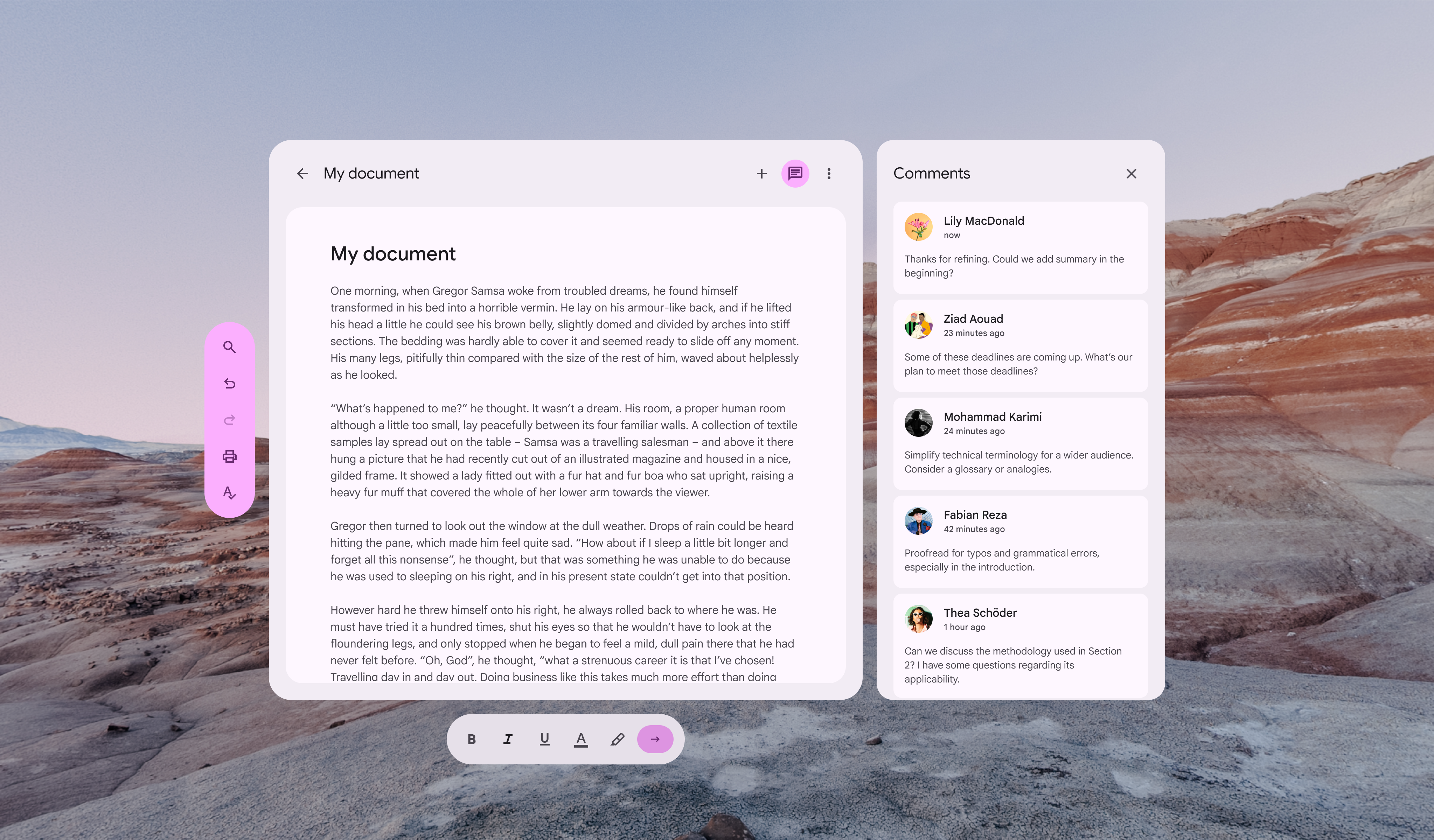
Toolbar orbiter alignment options in relation to spatial panels
Depending on the configuration (horizontal or vertical) of the toolbar orbiter, it can align to the center, left, right, top, or bottom of a spatial panel

Avoid placing a vertical toolbar orbiter between spatial panels.

This negatively affects the interface structure and can make it difficult to find.
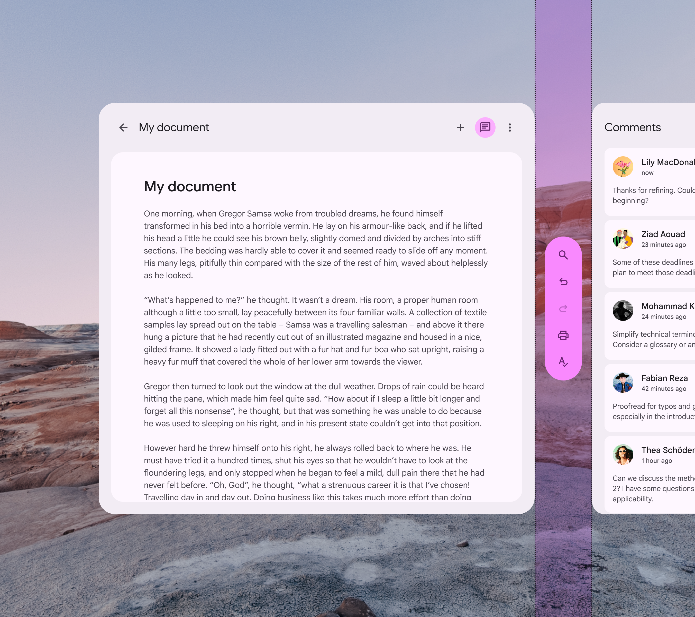
A vertical toolbar orbiter is placed between 2 spatial panels
Don’t Don't place a vertical toolbar orbiter between spatial panels

Accessibility considerations ​

XR accessibility guidelines are still evolving. XR toolbars should follow applicable Material toolbar accessibility standards.

Pager
Previous pageComponents: Nav rail
Next pageDesign tokens: Overview

Released under the Apache 2.0 or CC BY 4.0

Copyright © 2018-Present Google

https://m3.material.io/foundations/xr/components/toolbars

Released under the Apache 2.0 or CC BY 4.0

Copyright © 2018-Present Google