

Cards: Specs
Cards display content and actions about a single subject
Tokens & specs
Select a component variant below to see its elements, attributes, tokens, and their values.
Card - Elevated
Card - Filled
Card - Outlined
Elevated card

- Container
Elevated card color
Color values are implemented through design tokens. For design, this means working with color values that correspond with tokens. For implementation, a color value will be a token that references a value. Learn more about design tokens
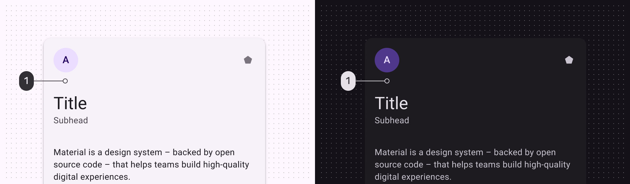
Elevated card color roles used for light and dark themes:
- Surface container low
Elevated card states
States are visual representations used to communicate the status of a component or interactive element. Learn more about interaction states
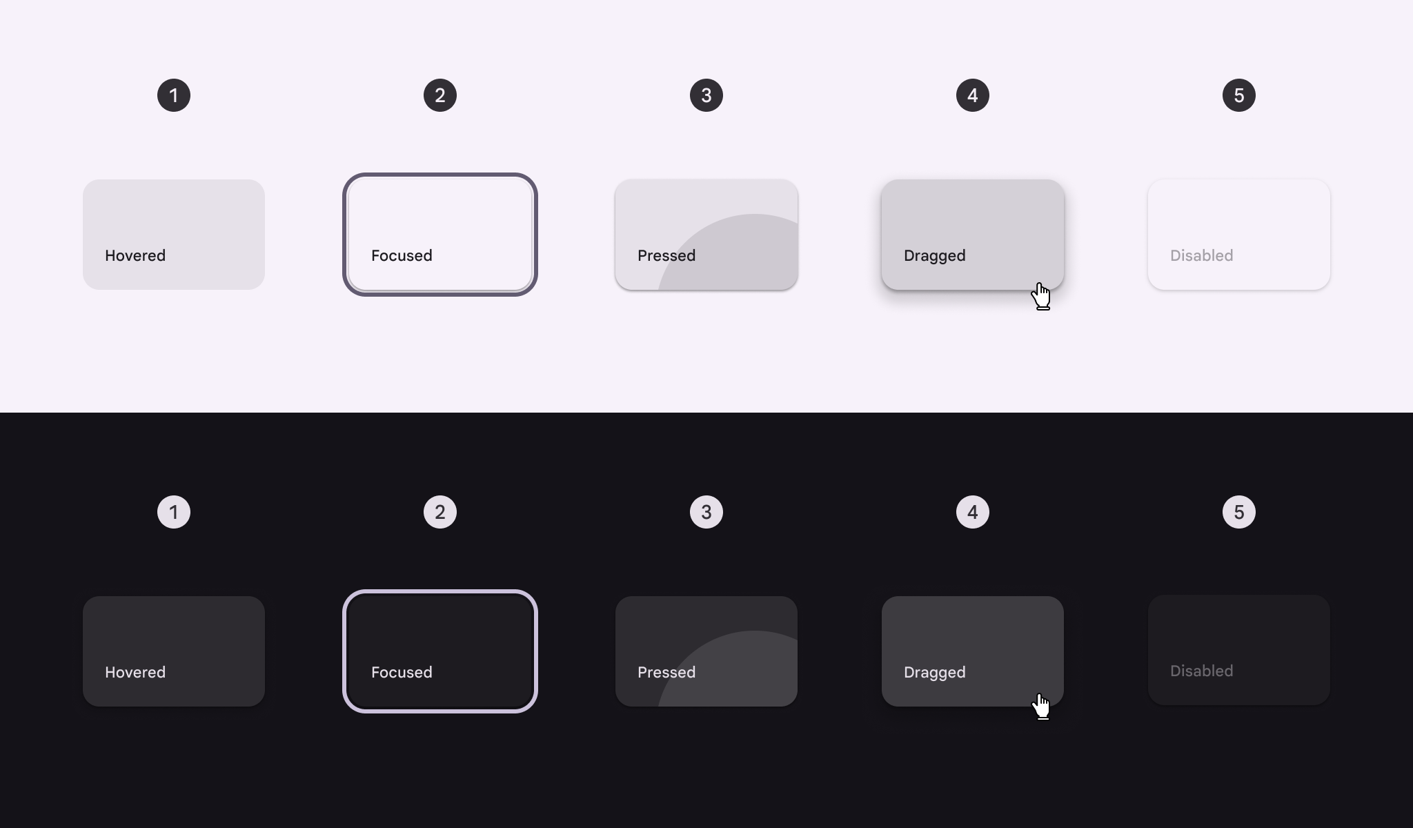
Elevated card states:
- Hovered
- Focused
- Pressed
- Dragged
- Disabled
Filled card

- Container
Filled card color
Color values are implemented through design tokens. For design, this means working with color values that correspond with tokens. For implementation, a color value will be a token that references a value. Learn more about design tokens
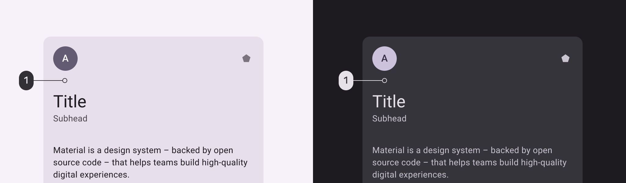
Filled card color roles used for light and dark themes:
- Surface container highest
Filled card states
States are visual representations used to communicate the status of a component or interactive element. Learn more about interaction states
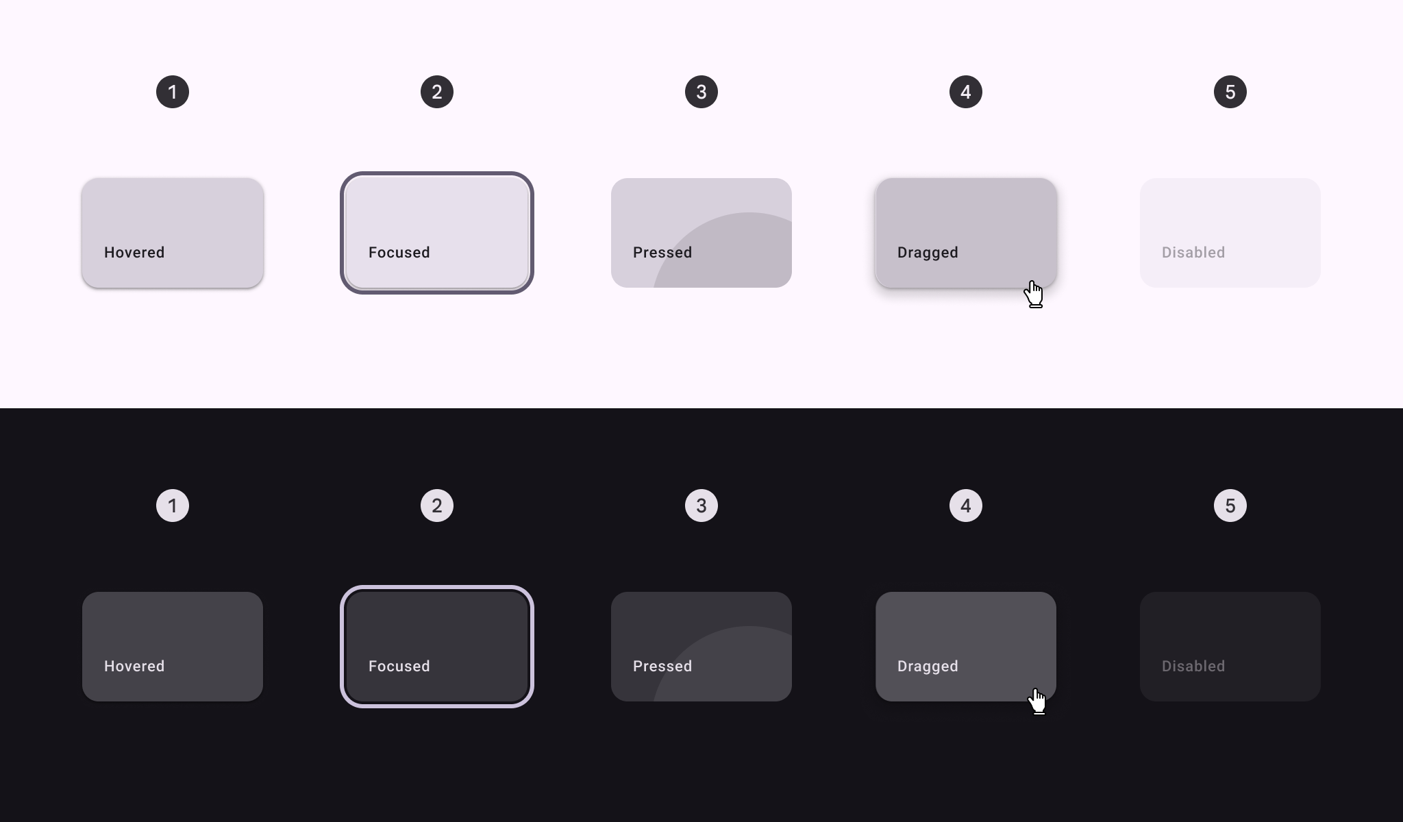
Filled card states:
- Hovered
- Focused
- Pressed
- Dragged
- Disabled
Outlined card

- Container
- Outline
Outlined card color
Color values are implemented through design tokens. For design, this means working with color values that correspond with tokens. For implementation, a color value will be a token that references a value. Learn more about design tokens
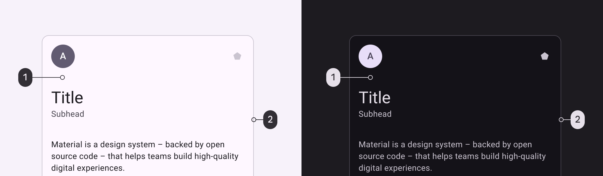
Outlined card color roles used for light and dark themes:
- Surface
- Outline variant
Outlined card states
States are visual representations used to communicate the status of a component or interactive element. Learn more about interaction states
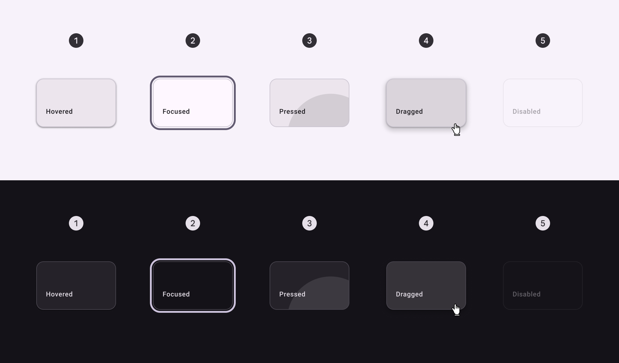
Outlined card states:
- Hovered
- Focused
- Pressed
- Dragged
- Disabled
Measurements
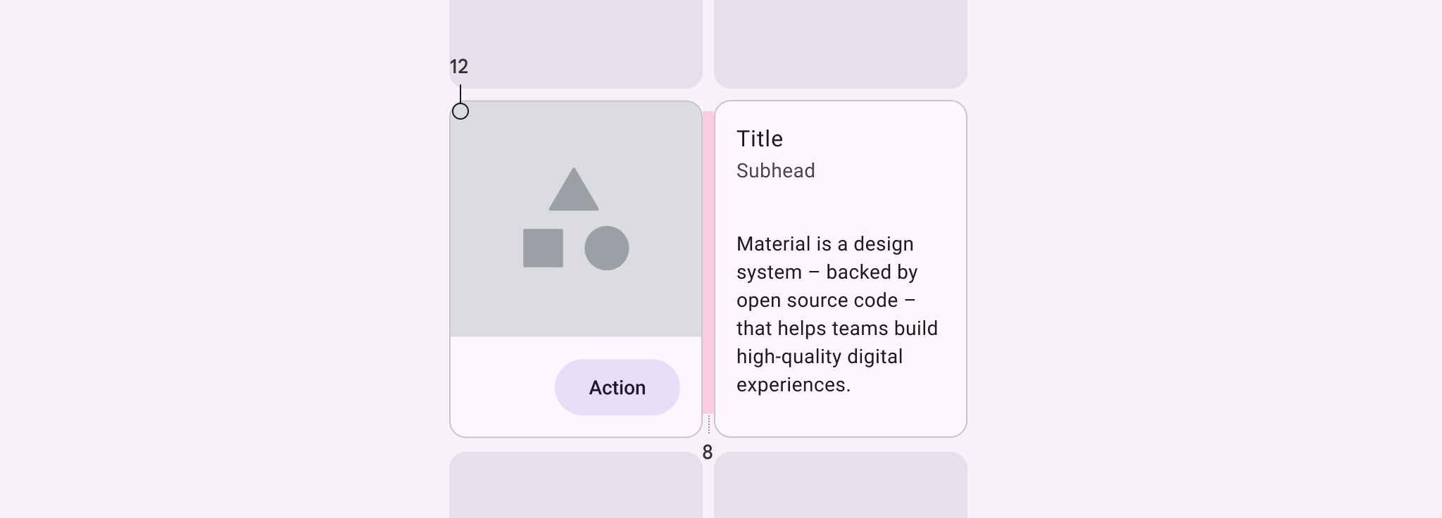
Card padding and size measurements
| Attribute | Value |
|---|---|
| Shape | 12dp corner radius |
| Left/right padding | 16dp |
| Padding between cards | 8dp max |
| Label text alignment | Start-aligned |