

Text fields: Specs
Text fields let users enter text into a UI
Tokens & specs
Browse the component elements, attributes, tokens, and their values. Learn about design tokens
Text field - Filled
Text field - Outlined
Filled text field
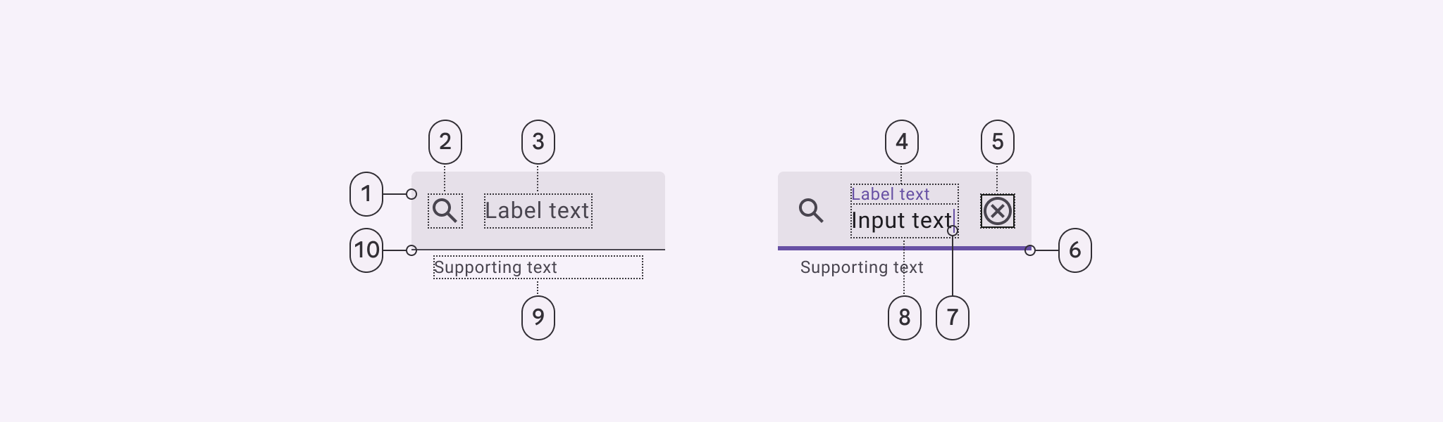
- Container
- Leading icon (optional)
- Label text in empty field
- Label text in populated field
- Trailing icon (optional)
- Focused active Indicator
- Caret
- Input text
- Supporting text (optional)
- Enabled active indicator
Filled text field color
Color values are implemented through design tokens. For design, this means working with color values that correspond with tokens. For implementation, a color value will be a token that references a value. Learn more about design tokens
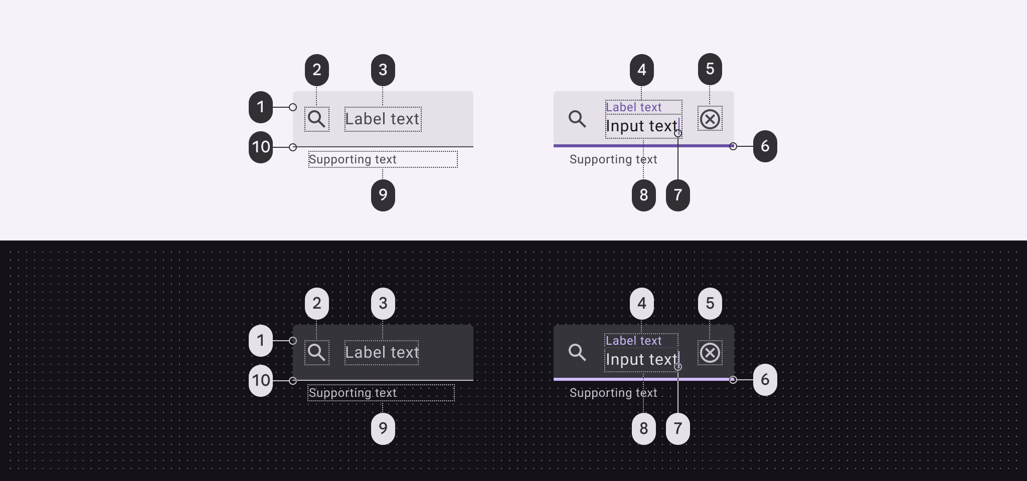
Filled text field color roles used for light and dark schemes:
- Surface container highest
- On surface variant
- On surface variant
- Primary
- On surface variant
- Primary
- Primary
- On surface
- On surface variant
- On surface
Filled text field states
States are visual representations used to communicate the status of a component or interactive element. Learn more about interaction states
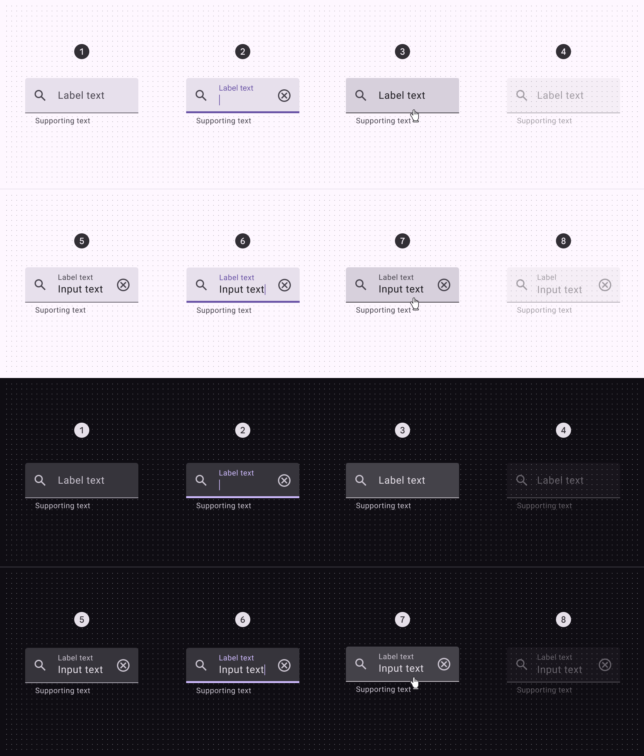
- Enabled (empty)
- Focused (empty)
- Hovered (empty)
- Disabled (empty)
- Enabled (populated)
- Focused (populated)
- Hovered (populated)
- Disabled (populated)
Filled text field error states
Error states are visual representations used to communicate the status of a component or interactive element. An error message can display instructions on how to fix it. Error messages are displayed below the text field as supporting text until fixed.
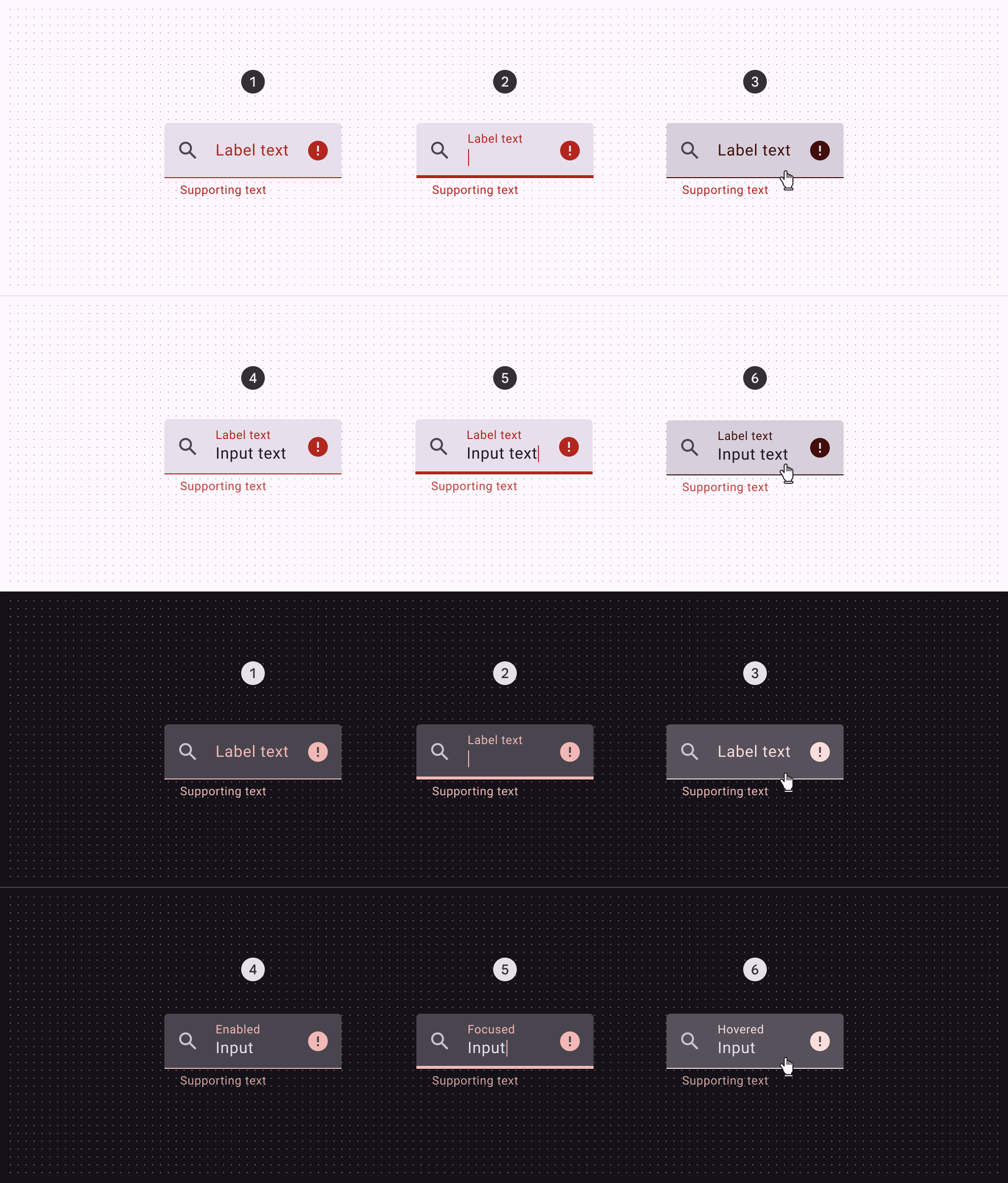
- Enabled (empty)
- Focused (empty)
- Hovered (empty)
- Enabled (populated)
- Focused (populated)
- Hovered (populated)
Filled text field measurements
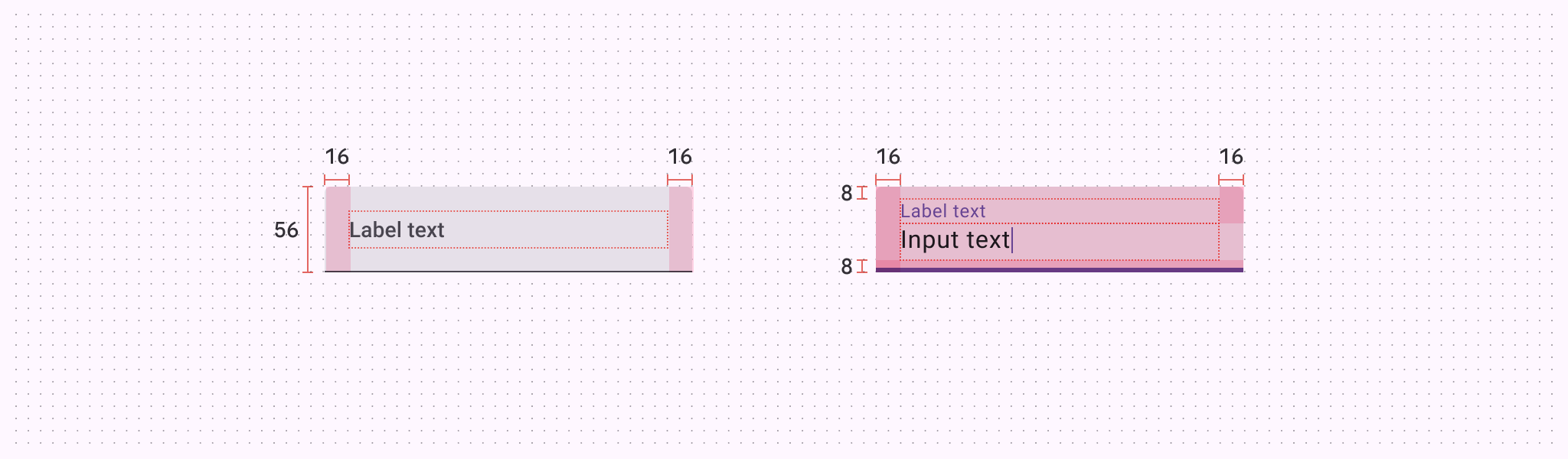
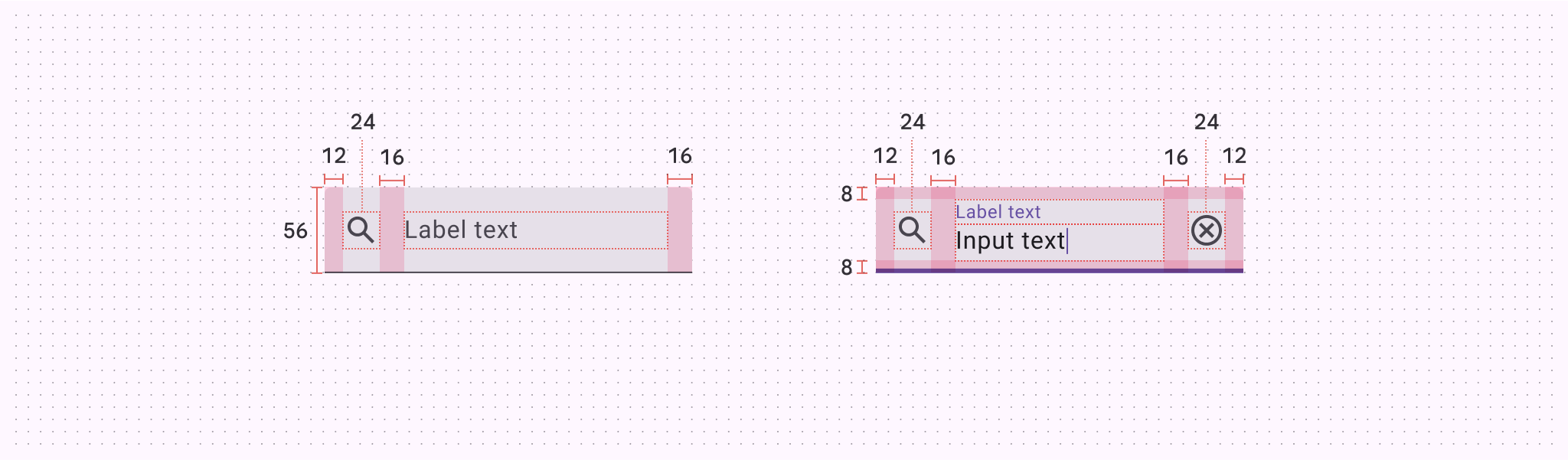
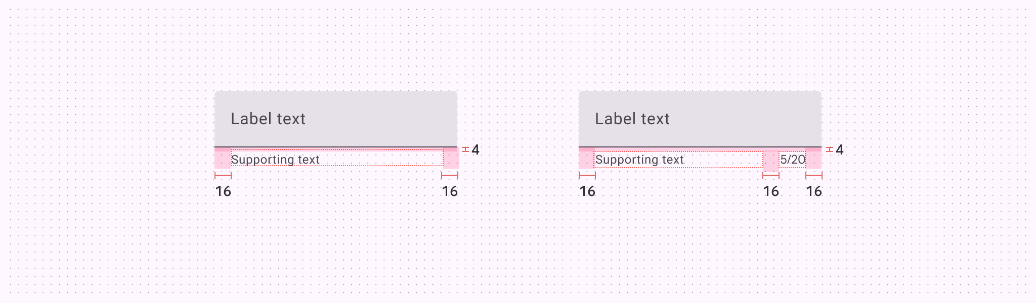
| Attribute | Value |
|---|---|
| Default container height | 56dp |
| Label alignment (unpopulated) | Vertically centered |
| Top/bottom padding | 8dp |
| Left/right padding without icons | 16dp |
| Left/right padding with icons | 12dp |
| Icon alignment | Vertically centered |
| Padding between icons and text | 16dp |
| Supporting text and character counter top padding | 4dp |
| Padding between supporting text and character counter | 16dp |
| Target size | 56dp |
Filled text field configurations
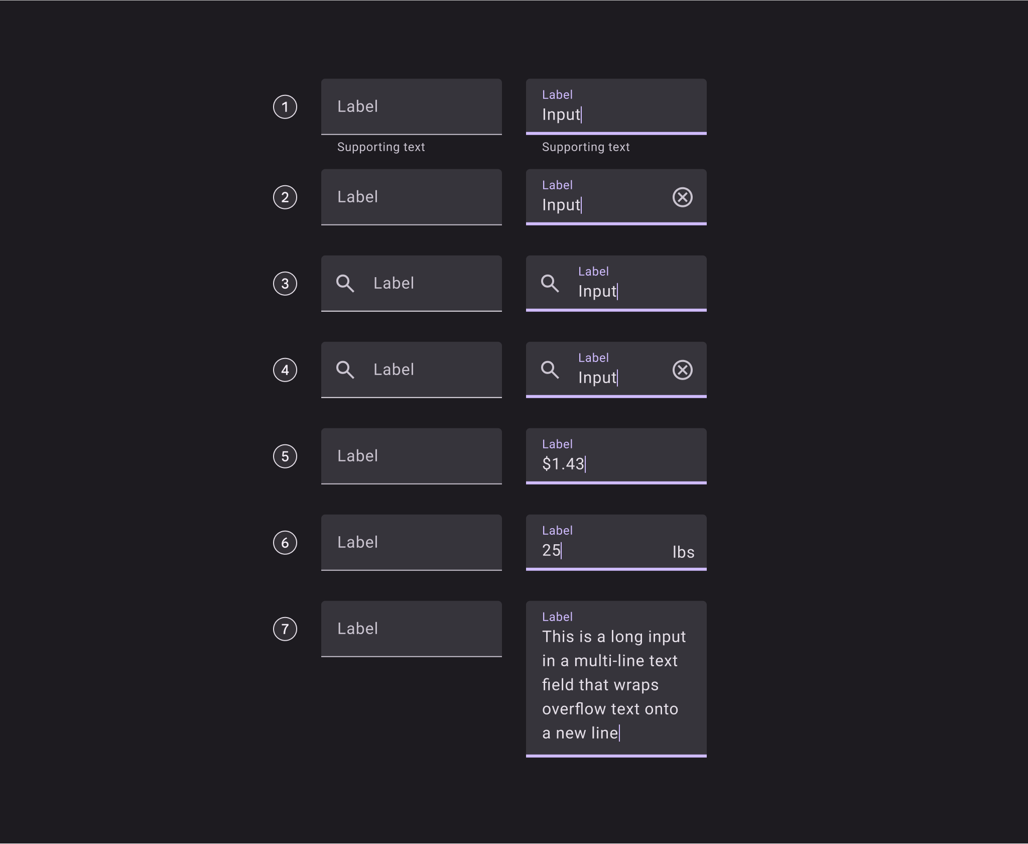
Empty and populated filled text fields with:
- Supporting text
- Trailing icon
- Leading icon
- Leading and trailing icons
- Prefix
- Suffix
- Multi-line text field
Outlined text field
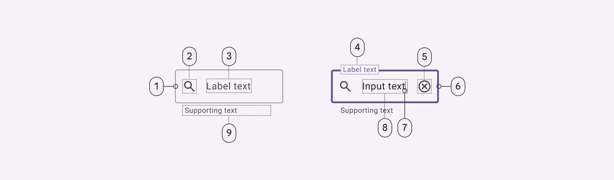
- Enabled container outline
- Leading icon (optional)
- Label text in empty field
- Label text in populated field
- Trailing icon (optional)
- Focused container outline
- Caret
- Input text
- Supporting text (optional)
Outlined text field color
Color values are implemented through design tokens. For design, this means working with color values that correspond with tokens. For implementation, a color value will be a token that references a value. Learn more about design tokens
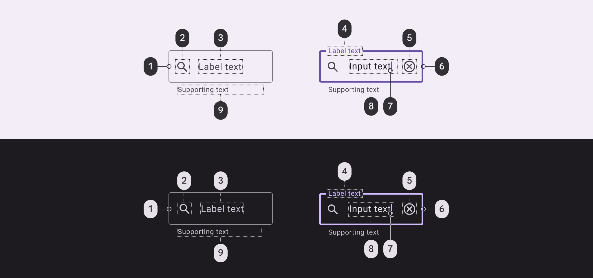
Outlined text field color roles used for light and dark schemes:
- Outline
- On surface variant
- On surface variant
- Primary
- On surface variant
- Primary
- Primary
- On surface
- On surface variant
Outlined text field states
States are visual representations used to communicate the status of a component or interactive element. Learn more about interaction states
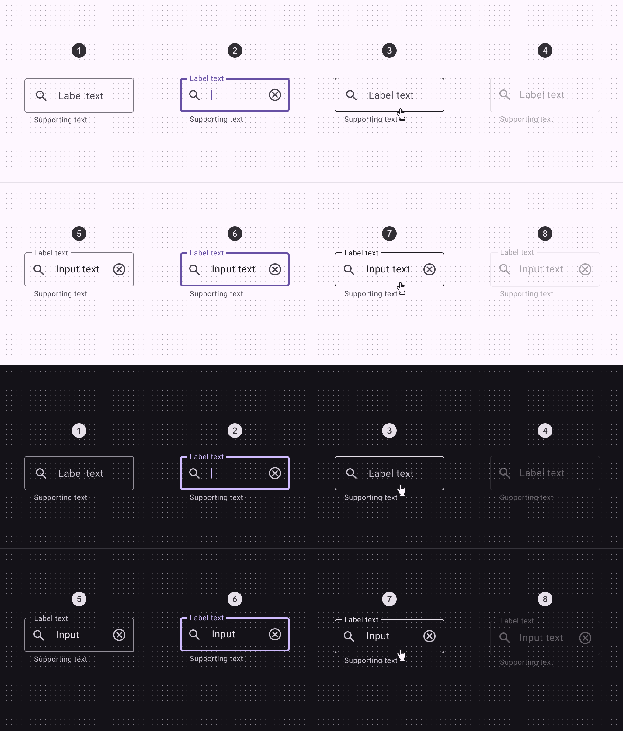
- Enabled (empty)
- Focused (empty)
- Hovered (empty)
- Disabled (empty)
- Enabled (populated)
- Focused (populated)
- Hovered (populated)
- Disabled (populated)
Outlined text field error states
Error states are visual representations used to communicate the status of a component or interactive element. An error message can display instructions on how to fix it. Error messages are displayed below the text field as supporting text until fixed.
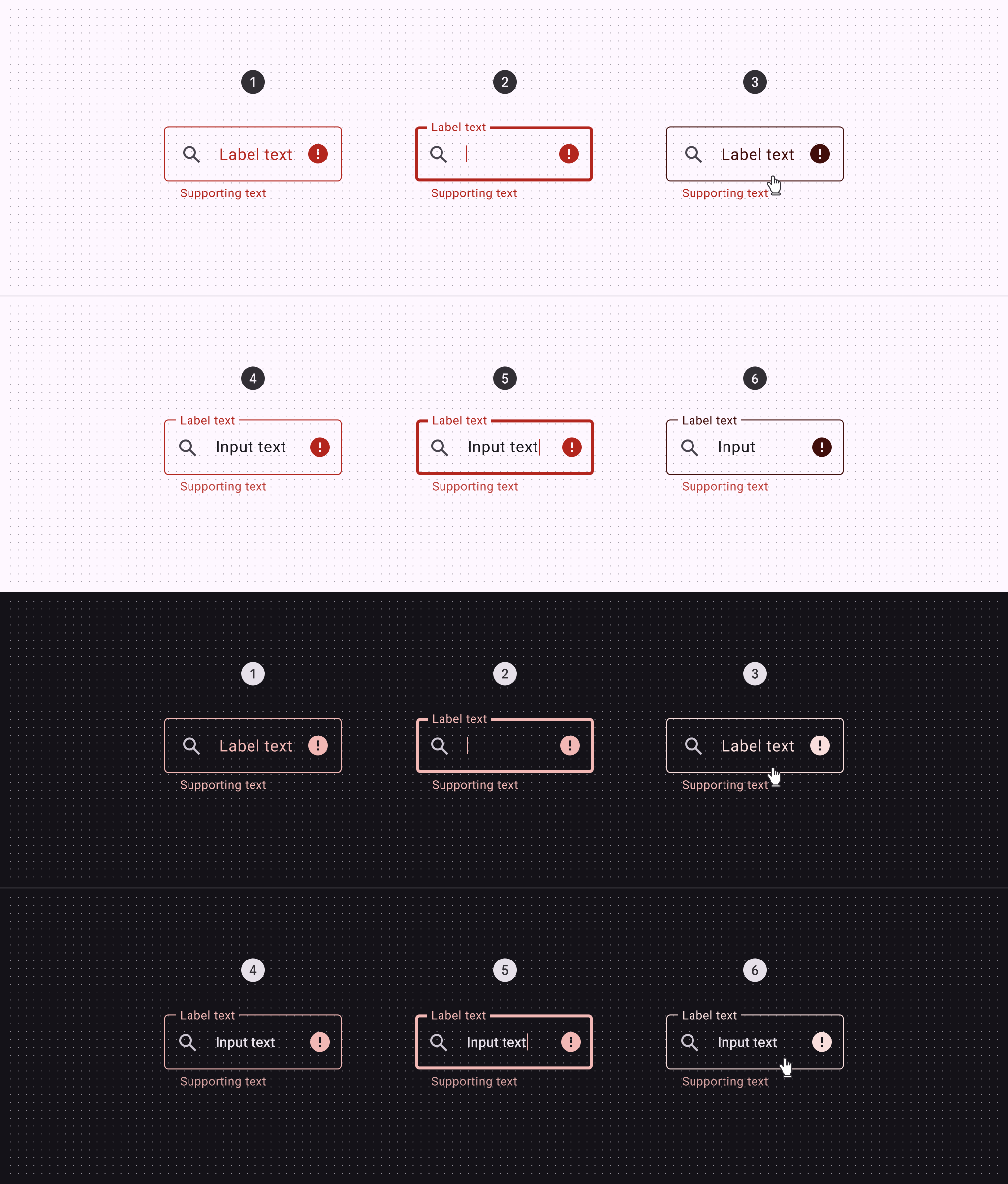
- Enabled (empty)
- Focused (empty)
- Hovered (empty)
- Enabled (populated)
- Focused (populated)
- Hovered (populated)
Outlined text field measurements
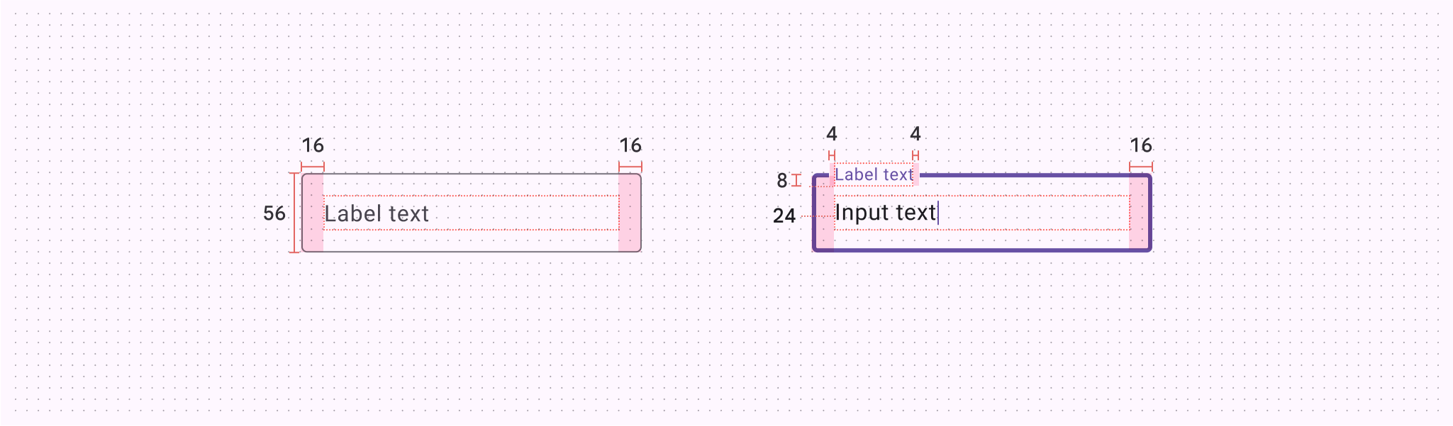
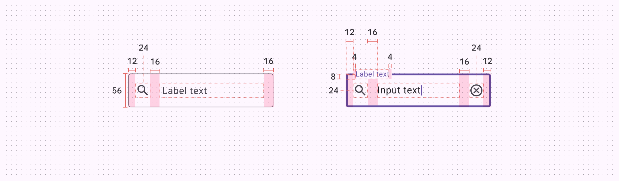
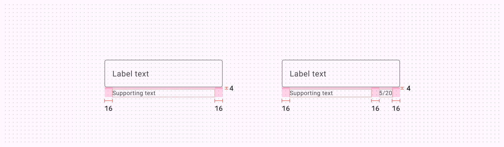
| Attribute | Value |
|---|---|
| Container height | 56dp |
| Left/right padding without icons | 16dp |
| Left/right padding with icons | 12dp |
| Padding between icons and text | 16dp |
| Icon alignment | Vertically centered |
| Supporting text and character counter top padding | 4dp |
| Padding between supporting text and character counter | 16dp |
| Label alignment | Vertically centered |
| Left/right padding populated label text | 4dp |
| Target size | 56dp |
Outlined text field configurations
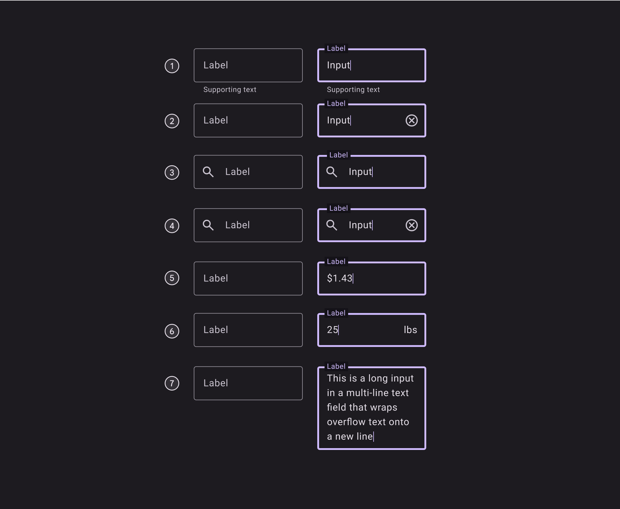
Empty and populated outlined text fields with:
- Supporting text
- Trailing icon
- Leading icon
- Leading and trailing icons
- Prefix
- Suffix
- Multi-line text field